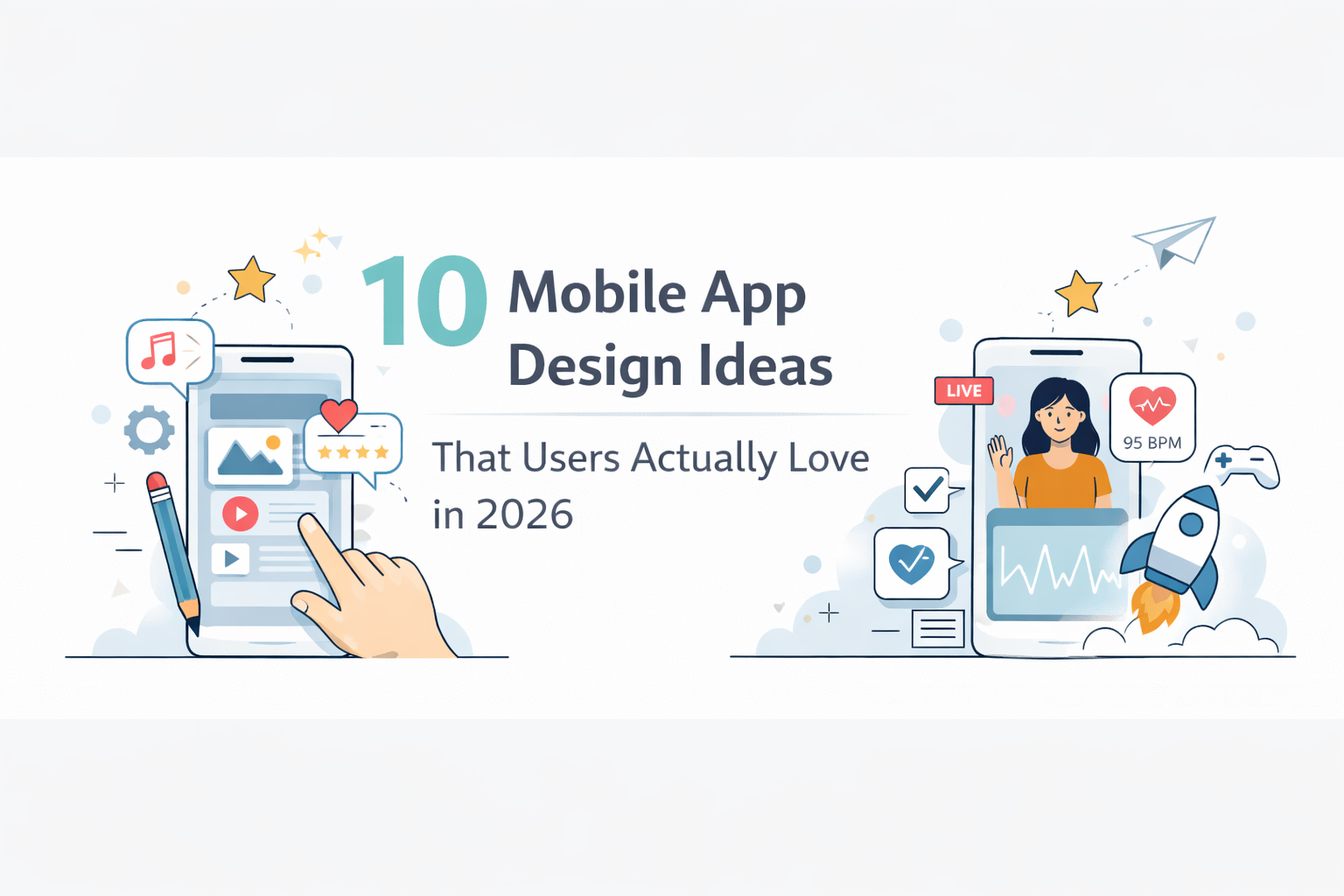
Most apps look fine. But the ones users actually love — the ones they recommend to friends and open every day — are built differently. They feel intentional. Every screen has a clear purpose, every interaction gives feedback, and the experience flows without friction.
That quality doesn't come from budget. It comes from smart design decisions made early. Here are ten mobile app design ideas gaining momentum in 2026, backed by UX research and real-world patterns. Each one includes the underlying principle so you can apply it to your own project.
Every $1 invested in UX returns $100 in value. And 88% of users won't return to an app after a bad experience. — SPD Load, 2026
01 — The Single-Screen Utility App
Do one thing on one screen. Think water intake trackers, word counters, or Pomodoro timers. Constraints create clarity — and clarity keeps users coming back.
Best for: Solo founders validating a focused problem fast.
02 — Progress-First Dashboard
Show the user how far they've come before showing them anything else. Streaks, completion rings, and milestone badges tap into the psychology of habit formation — the same loops that make Duolingo sticky.
Best for: Health, fitness, learning, and habit-building apps.
03 — Card-Based Content Layouts
Cards create visual boundaries around distinct items, making it easy to scan, tap, and dismiss. Modern cards with rounded corners and subtle elevation look polished without feeling heavy.
Best for: E-commerce, media feeds, and discovery experiences.
04 — Dark Mode as Default
The top apps in 2026 design for dark mode first and treat light mode as the fallback. Dark interfaces feel premium, reduce eye strain, and make accent colors pop.
Best for: Fintech, developer tools, and media/entertainment apps.
05 — Conversational Onboarding
Replace long tutorial flows with a short "chat" that collects preferences, personalizes the experience, and gets users to the aha moment in under a minute.
Best for: Health, finance, and education apps — anything where personalization matters.
06 — Bottom Sheet Navigation
A panel that slides up from the bottom of the screen replaces full-screen modals for actions and secondary content. It's faster, thumb-friendly, and keeps users oriented.
Best for: Maps, shopping, and booking apps.
07 — Micro-Animations That Confirm
Button presses that respond, checkmarks that draw themselves, ripple effects on tap. Micro-interactions make apps feel alive — they're a defining UX pattern of 2026 because they close the loop between action and feedback.
Best for: Productivity tools, social apps, and payment flows.
08 — Permissions-Later Model
Don't ask for any permissions at launch. Request each one individually, at the exact moment it unlocks a feature the user wants. No preemptive permission walls.
Best for: Every app. This is the 2026 standard, not an edge case.
09 — Gesture-First Navigation
Swipe to archive, swipe to complete, pinch to expand. This removes UI buttons and replaces them with natural hand movements users already know from iOS and Android.
Best for: Calendar apps, photo apps, and fast-action tools.
10 — AI-Personalized Home Screens
Instead of a static layout, home screens rearrange based on individual usage patterns — surfacing the features you use most at the times you typically use them.
Best for: Super-apps and multi-feature platforms.
Design Principles Behind Every Great Idea
These ten ideas look different, but they share three principles underneath.
One Action Per Screen
Every screen should have one primary action. If there are two things competing equally for attention, the screen is doing too much. Make the most important thing the most obvious thing — and de-emphasize everything else.
The first screen a user sees after login should answer one question: "Where am I in my journey?"
Speed to the Aha Moment
The aha moment is when users first experience the core value of your product. Netflix's 93% viewer retention rate is partly driven by personalization that makes users feel invested from the first session. Remove every step between signup and that moment.
Rule of thumb: Count the taps it takes to hit core value. If it's more than two, you're burying the lead.
Feedback for Every Action
Every primary action needs a visual response within 100ms. Silent interfaces feel broken. Users who get no feedback will tap again, go back, refresh, or leave.
The hard truth: An unconfirmed action is a broken interaction — no matter how good the rest of the design looks.
How to Bring These Ideas to Life
The fastest way to explore these patterns is to describe them in plain English and let AI do the heavy lifting. floow.design turns simple descriptions into polished, production-quality mobile screens in seconds — no design skills or template browsing required.
The workflow: Describe your idea. Generate real screens. Test with real users. Iterate in hours, not weeks.
Whether you're building a single-screen utility app or an AI-personalized dashboard, starting with a visual prototype lets you validate the concept before writing a line of code.
FAQ
What are the best mobile app design ideas for beginners?
Start with single-purpose apps — they need fewer screens, validate faster, and are easier to design well. Combining a clean one-screen layout (Idea 01) with a progress dashboard (Idea 02) gives you a strong foundation for most starter projects. Tools like floow.design generate professional screens from a text description, so you don't need design experience to get started.
How do I make my mobile app design stand out in 2026?
Focus on the first-run experience and the aha moment. Aesthetics matter, but they only show up after onboarding. The apps that stand out are the ones that make users feel something positive in the first 60 seconds. Conversational onboarding and progress-first dashboards are the two ideas with the strongest impact on first-session retention.
What app design style is trending in 2026?
Clean dark interfaces with subtle animations, card-based content, and gesture-driven navigation dominate 2026. The common thread: fast, responsive, and designed for thumb use. The underlying principle is simple — remove anything that doesn't serve a purpose, and make everything that remains feel intentional.
Do I need a professional designer to build these ideas?
Not for early-stage work. AI design tools can generate polished screens from text descriptions with no prior design knowledge. For MVP validation, investor decks, and user testing, AI-generated designs get you there faster and cheaper than hiring a designer. For production apps with full design systems and accessibility audits, a professional designer still adds real value.
How many screens does a mobile app MVP need?
Most successful MVPs launch with 5–8 screens: signup, login, main dashboard, 1–2 feature screens, and settings. Ship that, then iterate based on real user feedback — don't build features on speculation before launch.
All references verified April 2026.