You have an app idea. You don't have a developer — or a design degree. Here's exactly how to go from blank page to beautiful mobile screens in 2026, step by step.
Let's be honest. When most people get an app idea, the first thought is: "But I can't code." And for years, that was a real blocker. Getting a mobile app designed meant hiring someone — a designer, a developer, or both — and spending months and thousands of dollars before you even knew if the idea was any good.
2026 changed all of that.
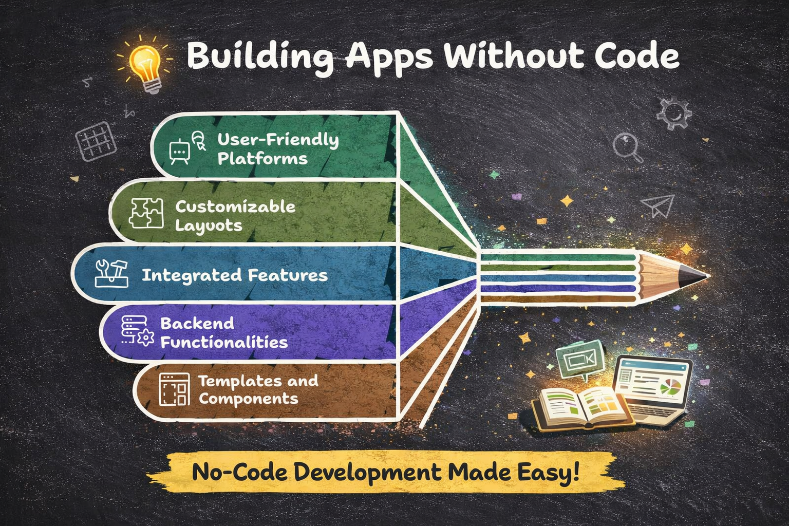
Today, the tools exist for anyone — a first-time founder, a freelancer, a small business owner — to design a polished, high-fidelity mobile app without touching code. This guide walks you through the whole process, from your very first idea to a design ready to share, test, or hand off to developers.
No jargon. No assumed experience. Just the steps.
First, Let's Clear Something Up: Design vs. Build
Before we dive in, it's worth separating two things people often confuse: designing an app and building one.
- •Designing = what the app looks like and how it flows
- •Building = making it actually work with real users and data
This guide focuses on design — the screens, the layouts, the user experience. That's the part you need first. A great design lets you test your idea, get real feedback, attract investors, and brief a developer clearly — all before you spend a cent on actual development.
And in 2026, AI tools have made this stage dramatically faster. According to Gartner research cited by Adalo, no-code and AI tools now help apps launch 90% faster than traditional development methods. That's not a marginal improvement — it's a completely different timeline.
75% of new enterprise applications will be built using low-code or no-code technologies by 2026 — up from less than 25% just a few years ago. (Gartner via Codewave, 2026)
The no-code and AI design movement isn't a workaround for people who "can't do it the real way." It's fast becoming the standard way to start.
What You'll Need Before You Start
Good news: the list is short. You need three things before you open any design tool.
- •A clear app idea — Not a finished product vision. Just an answer to: what problem does this app solve, and for whom? One sentence is enough to start.
- •A rough idea of the key screens — Think about the 3–5 screens a user would see first: a welcome screen, a main dashboard, a settings page. You don't need to know exactly what they look like — just what they need to do.
- •20–30 minutes — That's genuinely all it takes to produce a first draft of your app's design using the right tools in 2026. Not days. Not hours. Minutes.
You don't need a wireframe. You don't need a mood board. You don't need to have used design software before. Just show up with your idea and follow the steps below.
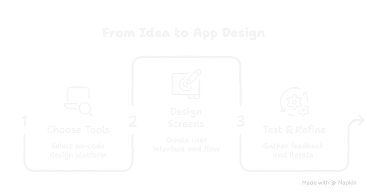
Step-by-Step: How to Design Your Mobile App Without Coding
Step 1: Write your one-sentence app brief
Before you open any tool, write down what your app is in one sentence. Something like: "A habit tracking app for students that sends daily reminders and shows a weekly progress chart." This becomes your prompt — the instruction you'll give the AI design tool. The clearer it is, the better your output will be.
A good brief names the user, the main action, and one key outcome. Nail those three things and the AI has everything it needs.
Step 2: Choose your AI design tool
For pure design — beautiful, high-fidelity mobile screens — floow.design is built exactly for this step. You paste in your idea and instantly get production-quality mobile screens back. No learning curve, no templates to wrestle with. If you also want to eventually build a working prototype on top of your designs, tools like Uizard or Adalo are worth exploring.
Start with design first, then worry about functionality. Getting the visuals right early saves huge time later.
Step 3: Generate your first designs
Paste your brief into the tool and let the AI generate your screens. On floow.design, this happens in seconds. You'll typically get multiple screens — a home view, key feature screens, maybe an onboarding flow — all designed with proper mobile UI conventions (thumb-friendly tap targets, readable fonts, clean navigation). Don't overthink this step. The goal is to get something on screen fast so you have something real to react to.
Step 4: Iterate with follow-up prompts
Your first output won't be perfect — and that's completely fine. The power of AI tools is how cheap iteration is. Want a darker color scheme? Ask for it. Need a screen for user settings? Request one. Prefer a more minimal layout? Describe it. According to Lovable's 2026 trends guide, non-technical builders using modern AI platforms can realistically refine a full design in a single focused session. Treat it like a conversation, not a one-shot command.
Change one thing at a time. Asking for too many changes in one prompt can produce muddled results.
Step 5: Map your user flow
Once you have a set of screens you're happy with, step back and think through how a user would move between them. What happens after they log in? Where does the main action live? Can they get back easily if they go somewhere unexpected? You don't need special software for this — a simple list or a sketch on paper works. This thinking will make your app dramatically easier to use and will make any developer you work with later very happy.
Step 6: Share it and get real feedback
This step is where the value of moving fast really pays off. Share your designs with 5–10 people who represent your target user. You can export screens as images, share a link, or walk someone through the screens on screen-share. Ask them: What do you think this app does? What would you tap first? What's confusing? Their answers will tell you more than any market research document. As IPH Technologies notes, retrofitting good UX into a poorly designed app is exponentially more expensive than getting it right from the start — and real feedback early is the surest way to get it right.
Don't explain the app before showing it. Let them discover it on their own — their first impressions are the most valuable data you'll get.
Step 7: Refine, then decide your next step
After a round of feedback, go back to your tool and refine. Then you have a real decision: do you want to build a working version yourself (using a no-code builder on top of your design), or hand the designs off to a developer? Either path is now much smoother because you have a concrete, tested visual reference — not just a vague idea in your head.
The 4 Mistakes First-Timers Almost Always Make
Most beginner app designers run into the same few traps. Here's how to sidestep them before they slow you down.
Mistake 1: Designing too many screens upfront
You don't need 40 screens. You need the 5–8 that cover your core user journey. Everything else can be added later. Lovable's build guide is direct on this: ignore features that don't serve your first 1,000 users.
Mistake 2: Skipping the feedback step entirely
It's tempting to keep polishing until it feels "ready." But the most common reason apps fail is building something nobody wants — and only discovering that after launch. Five early conversations with real users can save you months of wasted effort.
Mistake 3: Choosing the wrong tool for the job
A tool built for web apps won't give you great mobile output. A developer-focused tool will confuse a non-technical founder. NxCode's 2026 guide flags this as one of the most common beginner errors — always match your tool to your actual output type.
Mistake 4: Treating your first design as the final design
The first version of anything is a starting point, not a destination. The designers who make the best apps iterate constantly. Zapier's no-code guide recommends setting up a "sandbox" project to test ideas freely — separate from your main design — so you can experiment without worrying about breaking anything.
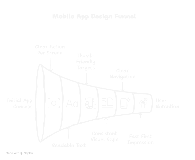
What Does "Good" Mobile App Design Actually Look Like?
If you're new to this, it helps to know what you're aiming for. Here are the hallmarks of a well-designed mobile app — the things that make the difference between an app people keep and one they delete within a day.
- •One clear action per screen. Every screen should have one primary thing a user can do. If there are three equally prominent buttons, that's a sign the screen is trying to do too much.
- •Readable text at a glance. Mobile screens are small. Body text should be at least 15–16pt. Headers should be bold and clear. If you squint and can't read it, it needs to be bigger.
- •Thumb-friendly tap targets. Buttons and interactive elements should be large enough to tap comfortably with a thumb — a minimum of 44px is the standard. If you have to aim precisely to hit a button, it's too small.
- •Consistent visual style. Fonts, colors, and spacing should be uniform across all screens. Inconsistency signals "unfinished" to users — even if they can't articulate why.
- •Clear navigation. A user should never feel lost. A bottom navigation bar, a back arrow, or a clear menu makes the difference between an app that feels natural and one that feels like a maze.
- •Fast first impression. MobiLoud's design trends report is blunt about this: when someone opens your app, you've got seconds to make an impression. Your first screen is a promise — make it count.
A Real Example: From Idea to Design in One Session
To make this concrete, here's what the process looks like in practice.
Say you want to build a simple app for freelancers to track their working hours and send invoices. Here's how it plays out:
The brief: "A time tracking app for freelancers with a timer, a project list, an hourly rate input, and a one-tap invoice generator."
The output: Using floow.design, that prompt generates a home screen with an active timer and project selector, a project list view, a rate settings screen, and an invoice preview. High-fidelity. Ready to share. Done in under two minutes.
The refinement: After sharing with three freelancers, the feedback is clear: the invoice screen needs a client name field. One follow-up prompt. Updated in seconds. Ship.
That's the whole loop. Idea → design → feedback → refine. In a single afternoon. Without writing a single line of code, and without hiring anyone.
$456K ARR achieved in the first year by Plinq — a women's safety app built entirely without code by a growth marketer with no engineering background. (Lovable, 2026)
Frequently Asked Questions
Do I need any design experience to use AI mobile app design tools?
None at all. Tools like floow.design are built specifically for people without a design background. You describe what you want in plain English, and the AI handles all the design decisions — layouts, typography, color, spacing. The only skill you need is the ability to describe your idea clearly, and that's something everyone has. Adalo's no-code guide describes the modern visual builder experience as "as easy as PowerPoint" — and that's a fair benchmark.
How long does it take to design a mobile app without coding?
With an AI design tool, a first set of screens can be generated in under five minutes. A full, tested, refined design covering your core user flow typically takes a few hours spread across a day or two — mostly because good iteration involves gathering feedback, reflecting, and returning with clearer direction. Startup House's 2026 product design report puts AI-assisted prototype creation at 70% faster than traditional methods. What used to take a designer three to five days can now be done in an afternoon.
Can I use my no-code design to build a real, working app?
Yes — with two distinct paths. If you want to build it yourself without a developer, platforms like Adalo, Bubble, or Glide let you turn your design into a functional app using visual drag-and-drop builders. If you want to hand off to a developer, your AI-generated designs serve as a concrete visual brief — far more useful than a verbal description. Adalo reports that no-code platforms have scaled to support over 1 million monthly active users, so the "you can't build anything serious without code" assumption no longer holds.
Is designing without code only for simple apps, or can it work for complex ideas too?
For the design phase specifically, complexity isn't really a limitation — AI tools can generate screens for complex apps just as easily as simple ones. Where no-code tools start to show limitations is at the build and logic layer: highly customised backend logic, complex integrations, or niche hardware features may eventually need a developer. But for designing the app — visualising the screens, mapping the flow, testing with users — no-code and AI tools handle even ambitious ideas well. Kissflow's no-code guide puts it clearly: highly customised UI is the challenge, not screen complexity itself.
What's the difference between an AI design tool and a no-code app builder?
Think of it this way: an AI design tool (like floow.design) creates the look and feel of your app — the screens, layouts, and visual design. A no-code app builder (like Bubble or Adalo) lets you create the working logic — user accounts, databases, buttons that actually do things. Most people start with an AI design tool to visualise their idea, then use a no-code builder to bring it to life — or hand the designs to a developer to build. The two stages complement each other rather than competing. RapidNative's tools guide makes this distinction clearly: your desired output type (mockup vs. working app) determines which kind of tool you need.