
%20by%20%E2%80%9EPablo%20Stanley%E2%80%9D%2C%20licensed%20under%20%E2%80%9ECC0%201.0%E2%80%9D%20(https%3A%2F%2Fcreativecommons.org%2Fpublicdomain%2Fzero%2F1.0%2F)%3C%2Fdc%3Arights%3E%3C%2Frdf%3ADescription%3E%3C%2Frdf%3ARDF%3E%3C%2Fmetadata%3E%3Cmask%20id%3D%22viewboxMask%22%3E%3Crect%20width%3D%22704%22%20height%3D%22704%22%20rx%3D%220%22%20ry%3D%220%22%20x%3D%220%22%20y%3D%220%22%20fill%3D%22%23fff%22%20%2F%3E%3C%2Fmask%3E%3Cg%20mask%3D%22url(%23viewboxMask)%22%3E%3Cg%20fill-rule%3D%22evenodd%22%20clip-rule%3D%22evenodd%22%3E%3Cpath%20d%3D%22M705.3%201074a2351.1%202351.1%200%200%201-15.6-101c-1-7.7-2.5-16.4%202.7-22%207.3-8%2014-14.8%2014.8-26.2.8-10.7-2.8-22.4-5-32.8a809.4%20809.4%200%200%200-17.3-64.7c-6.6-21.7-13.9-43.2-21.3-64.6-6.9-20-13.5-40.3-22.5-59.5-17-36.5-46-63.5-81.6-81.6-9-4.5-27-20.5-36.3-24-8.5-3.4-8.5%206.3-16.9%202.6-6.7-2.9-13-6.7-16.7-13.2-4-7-14.3-16.9-15.9-25-3.3-17.4.3-32.2-12-45.3a90%2090%200%200%200-41.1-23.8c-33.7-9.3-78.5-2.8-98.8%2028.5-9.7%2014.9-13%2033-26.2%2045.1-11.4%2010.7-8.8%2018-23.6%2023.4-.9.3-23.6-4.5-24.4-4.2-16.2-3.5-31.7%206.2-46.5%2011.8a325.4%20325.4%200%200%200-63%2032.3%20399.2%20399.2%200%200%200-102.3%2098.5%20482.5%20482.5%200%200%200-76.4%20161c-1.7%206.4-3.5%2013-1.5%2019.4%201.7%205.3%205.4%209.2%209.8%2012.4%206%204.3%2018%207%2017.7%2015.7-.1%206.6-2.4%2013.5-3.5%2020-1.3%207.7-2.3%2015.5-3.4%2023.2-4.8%2035.4-8.6%2071-10.3%20106.6a920%20920%200%200%200-.5%20106c.1%202.3.8%204.5%202%206.2-1%20.4-1.2%202.4.1%202.7l2.7.5a12%2012%200%200%200%207%202.4l5.5.2c19.3%204%2038.6%207.9%2058.1%2010.8%2023.8%203.5%2047.6%206.3%2071.5%208.7%2049.2%204.8%2098%203.2%20147.1.6a1877%201877%200%200%201%20147.4-2c49.2%201.4%2098.4%203.5%20147.6%204.4%2055%201%20110-.5%20164.8-5%207.5-.5%2012.2-6.5%2010.7-14-8.9-44.7-19-89.1-27-134Z%22%20fill%3D%22%23694d3d%22%2F%3E%3Cpath%20d%3D%22m201%20597.5%201.2-.4c14.5-5.7%2029.6-14.8%2045.4-11.4.5-.2%2010.8%201.9%2017.9%203.2l-6.7%207L247%20598c40.7%2067.1%2088.8%20100.7%20144.3%20100.7%2055.5%200%2097.7-33.6%20126.4-100.7l4-1c.4%200%201%20.2%201.5.4%209.3%203.6%2027.4%2019.6%2036.3%2024.1%2035.6%2018%2064.5%2045%2081.6%2081.6%208.7%2018.6%2015.2%2038%2021.8%2057.5l.7%202c7.4%2021.4%2014.7%2043%2021.3%2064.6%206.3%2020.4%2012%2041%2016.6%2061.8l.7%202.9c2.2%2010.4%205.8%2022%205%2032.8a29%2029%200%200%201-3%2010.7l-80.4%2029%2038.4%20261.3c-35.1%201.5-70.3%202-105.5%201.3-49.2-.9-98.4-3-147.6-4.3-47.7-1.2-95.3-.7-143%201.7l-12%20.6a946.3%20946.3%200%200%201-139.5-1l-3.1-.3v-38.3l16.3-212.9-83-15.6-81.3-39.5a21.7%2021.7%200%200%201-5.6-8.8c-1.9-6-.5-12%201-18l.5-1.3a492.8%20492.8%200%200%201%2076.4-161A399.3%20399.3%200%200%201%20138%20629.7c19.8-13%2040.9-23.9%2063-32.3Z%22%20fill%3D%22%23ffcf77%22%2F%3E%3Cpath%20d%3D%22M232.2%20584.6c5.1-.3%2010.3.6%2015.4%201%20.4.1.6.8%200%20.9-9%201.9-18%204.5-26.9%207.1l-3.8%201.2c-10%203-19.8%206-29.6%2010-19.4%207.9-37.8%2018.5-54.8%2030.8C67.2%20682.8%2020%20754.3-9.9%20828.3a526%20526%200%200%200-24.3%2077c-.4%201.6-2%205.4-1%207%20.7%201.3%203.6%202.1%205%202.9l4.5%202.3%2025.2%2012.9%202.3%201.1c38%2018.6%2078.4%2034.4%20121%2035.5l.4-3.7a342%20342%200%200%201%209.9-60c.3-1%201.6-.6%201.7.3%203%2023.1%202%2046.4%201%2069.7-1.8%2041-4.3%2082.2-6.5%20123.3-1.2%2020.6-2.6%2041-3.9%2061.7-1.3%2020.5-1.7%2041.6-4.7%2062-.6%204.6-6%207-10%206.6-4.4-.5-7.9-4.5-8-9%200-11.9%201.5-24%202.4-35.8l2.5-33.8c3.1-41.1%206.8-82.2%2010.2-123.3a4771%204771%200%200%201%203.8-43.7C76.4%20979.8%2034.2%20963-6.1%20943.5c-.6%2013.2-2%2026.5-3.4%2039.6-3.8%2036.8-7.1%2073.6-9.6%20110.5a2254.2%202254.2%200%200%200-4.2%2092.7l-.2%207c0%204.4-.5%208.5-4.3%2011.7-3.7%203.3-8.9%203.5-12.6%200-5-4.6-4.2-10.9-4-17.1a1675.6%201675.6%200%200%201%201.8-47.2%201321%201321%200%200%201%2010.5-109.5l2-14c3.5-26%207.5-52.7%2015.5-77.9-3.1-1.5-6.2-3-9.3-4.7-5.5-2.7-11.2-5.4-16.6-8.4-4.2-2.5-7.9-5.8-9-10.8-1.4-5.5.6-11.5%202-16.9v-.4a502%20502%200%200%201%2026.6-80%20523.2%20523.2%200%200%201%2067.8-117%20353.8%20353.8%200%200%201%2088.7-83.3%20239%20239%200%200%201%2053.8-25.7%20142.6%20142.6%200%200%201%2042.8-7.5Zm90.1-66c6-6.5%2018.1.2%2015.2%208.8a108.2%20108.2%200%200%201-34.7%2052A79.4%2079.4%200%200%201%20247%20598l1.7%202.4a321.1%20321.1%200%200%200%2046.1%2052.6c36%2031.2%2084.8%2048%20132%2036%2037.1-9.4%2069.8-38.8%2079.4-76.2-1.3.6-3%20.9-4.8.5-7.7-1.7-15.3-9.8-20.3-15.6-5.3-6.3-9.5-13-12.6-20.7-5.6-14-7.4-32.1.3-45.7%201-1.7%203-.7%203.3%201l.3%202.5c1.5%2012.7%203.3%2025%209.3%2036.6a76%2076%200%200%200%2018.2%2023.1c2.6%202%205.8%203.6%208.1%206l.5.4c.6-5%204.1-7.3%207.6-7.2%203.3.2%207.3%201.6%208.8%202.3l.1.1a341%20341%200%200%201%2065.1%2042%20259%20259%200%200%201%2088.4%20129c7.5%2025.3%2011.8%2051.4%2016.3%2077.4l2.8%2016c4.2%2023.9%208.9%2048.4%2018.4%2070.7%202.5%205.7.6%2011.1-5.5%2013.4A1493%201493%200%200%201%20688%20953c3.7%2016%206%2032.5%208.7%2048.5%206%2034.1%2013.2%2068%2019.4%20102%203.2%2017.5%206.1%2035%209.3%2052.3l4.7%2025.2%202.4%2013.6.1.7c.5%202.4%201%204.9.4%207.3-.8%202.7-2.9%204.6-4.8%206.6-1.6%201.6-3.8%201.6-5.7.7l-.7-.3c-3.4-1.6-6-3.2-7.3-7-.7-2.5-1-5.2-1.5-7.7a3535.6%203535.6%200%200%201-7.8-43.6l-1.6-9.1c-5.2-31.4-10.2-62.9-12.8-94.5-1-14-2.3-28.1-3.5-42.2l-.9-10.5c-1.1-13.3-2.5-27-2.7-40.5l-4.5%201.6L657%20964c-5.5%202-12.5%206-18.4%205.2-2.9-.3-5-1.2-6.8-2.9%202%2028.8%204.8%2057.4%208.5%2086a1965.7%201965.7%200%200%200%2022%20135c.6%203.2%201.4%206.4%201.9%209.6.5%203.7-.5%205.9-2.5%209-1.7%202.4-5%203.7-7.8%202-3.6-2.3-5.5-4.3-6.5-8.4-1-3.7-1.6-7.6-2.3-11.4a1654.2%201654.2%200%200%201-11.4-65.2c-7.8-52-12.7-104.4-15.2-156.8a1388%201388%200%200%201-1.4-77.8c0-13.3.5-26.6%201.4-39.9%201-13.4%203-26.5%204.8-39.8%200-.5.7-.5.7%200%20.8%2014.9%202.1%2029.8%202.8%2044.7.6%2014.3.9%2028.5%201.4%2042.8.6%2018.7%201.5%2037.5%202.7%2056.2a9.6%209.6%200%200%201%208.5-3.1c4.7-1%209.7-3.4%2014.1-5l16.8-5.5%2026.4-8.7a679%20679%200%200%201-18-80.8l-2-12.3c-4-24.2-8.5-48.5-15.8-72a229.8%20229.8%200%200%200-34.8-68.2%20370.2%20370.2%200%200%200-52.7-55.3C557%20627%20539.7%20614%20523%20600c.1.9.2%202%200%203-3.5%2025.9-17%2050-35.8%2067.9-37.7%2036-93.6%2043.4-142%2026.5-46.7-16.3-88-55-102.6-102.8-.3-.8.8-1%201.3-.5l2.4%203.3c0-.4.2-.9.7-1a129%20129%200%200%200%2046.6-29.2%20100.2%20100.2%200%200%200%2021.3-33.3l.4-1c1.7-5%203.2-10.2%207-14.2Z%22%20fill%3D%22%23000%22%2F%3E%3C%2Fg%3E%3Cg%20transform%3D%22matrix(.99789%200%200%201%20156%2062)%22%3E%3Cg%20fill-rule%3D%22evenodd%22%20clip-rule%3D%22evenodd%22%3E%3Cpath%20d%3D%22m154%2059.3%208.6%2010.3c-4.7%203.4-9.2%206.8-13.5%2010.2a118%20118%200%200%201%2065-20.5c45.3%200%20137.4%2039%20158.2%2067%2010.3%2014%2029.5%2056.8%2039.5%20103.3%208%2037.4%2019.9%20143%208%20182.7-15.2%2050.7-65.3%2097.7-117%2097.7s-131.9-37.3-189-119c-2.6-3.8-32.5-8.1-54-22.2l5.7%2061.9%204.3%2036-1%202.5c-15.3%2041.4-27.4%2063-36.4%2064.8-9.1%201.9-27.7-13.1-55.8-44.9l-3.6-15c-9.1-38.5-13.7-59.1-13.7-62v-.5c.2-6.5%202.4-43.3%202.4-53.2V210C-8%20109.5%2020.7%2059.3%2048.2%2059.3H154Z%22%20fill%3D%22%23694d3d%22%2F%3E%3Cpath%20d%3D%22M82.4%2025.1a31.3%2031.3%200%200%201%2027.6%202.4%2048%2048%200%200%201%2041.7%2023.1l.5.6%201.8%202.2c1.8%202%203.6%204.2%205%206.6-7%20.1-13%203-17%208.8-3%204.2%203.7%208.2%206.7%204.2l.1-.1c2.5-3.5%206.3-4.9%2010.4-5%201.2%200%202.1-.4%202.8-1.1l.6%202.8c21-8.1%2043.6-10.3%2066-8.4-1%201.6-1.8%203.3-2.4%205.1-.7%202%20.8%204.4%202.8%205%202.1.5%204-.7%204.9-2.6v-.2c.9-2.5%202.3-4.6%204.2-6.2%2010.6%201.4%2021%203.7%2031.3%206.6%2012.4%203.6%2024.6%208%2036.5%2012.9-2%20.7-3.8%202-5%204.3-2.4%204.5%204.3%208.5%206.8%204.2l.1-.1.7-1%20.4-.1.6-.2h.3l.9-.2h2.3c1.8%200%203-1%203.5-2.3%206%202.6%2011.7%205.4%2017.5%208.3l1.3.8c17.7%209.2%2034.4%2021.3%2044%2039%20.7%201.3.9%202.6.7%203.8l6%207.6c5.9%208%2010.2%2017%2014.2%2026a282%20282%200%200%201%2018%2056c4.1%2018.5%207.5%2037.3%2010.6%2056.2%203.4%2020.9%206.3%2042%207%2063.2%201%2037.8-6.4%2075.8-27.6%20107.6-19%2028.4-47.5%2051-81.3%2058.2a114%20114%200%200%201-98-22.7c-4.3-3.7-3.7-11.2%200-15%204.3-4.2%2010.6-3.6%2015%200%2025.5%2021.6%2062.7%2025%2093.4%2014%2028.5-10.2%2050.8-33.7%2064.4-60%2016.7-32.2%2019.5-69.2%2017-104.7-1.4-19.6-4.4-39-7.4-58.3l-1.8-11.6c-2-12.7-4-25.3-6.7-37.8l-.7-2.9a256%20256%200%200%200-13.1-44.6%20240.2%20240.2%200%200%200-13.1-25.8c-1%20.3-2.3.4-3.6%200a145.6%20145.6%200%200%200-49.2-6.7c-9-.5-18%20.3-26.6%203a187%20187%200%200%200-2.5-2%206.6%206.6%200%200%201-5.4-4.3c-1-.9-2.2-1.7-3.3-2.5-2.7.7-5-1.6-5.7-4l-1.8-1.2-1.4.2c-2%20.2-4-.1-5.7-1a10.5%2010.5%200%200%201-4.6-5.4c-3.3.2-6.8-.9-9.8-2.9a29.7%2029.7%200%200%201-6.1-6%20209.5%20209.5%200%200%200-72-17.6%2099%2099%200%200%200-9.6%202.5c5.5-.7%2011-.8%2016.7%200%2026.9%204%2047.8%2024%2065.8%2043%204.3-.8%208.6%204.7%204.7%208.4l-31%2028.6c.8%203.2-2.9%206.4-6%205.6l-16.3-3.8a17.2%2017.2%200%200%201-17.8-1.7l-1.2-.8-1.2.9a8.7%208.7%200%200%201-6.2%201.2c-2.2-.3-4.2-1.5-5.9-2.8-1-1-3.6-4.6-5-4.9h-.1c1%200-2%202.9-2.9%203.4a9%209%200%200%201-6.3%201.8c-4.1-.4-7.6-4.1-9.6-7.6l-.2-.3v-.1.2h-.1c-.3.9-1.3%201.8-2%202.4a7.6%207.6%200%200%201-6.4%201.9c-2-.4-3.8-1.6-5.1-3.1l-.3-.3c-.4-.4-3-4-2.6-5h-.1c-1.7.4-3%200-4-.8-5.6-1.3-11.2-2.7-16.5-4.5l-1.3%203.5c3%201.8%205.7%204.4%208.1%206.2l14.2%2010.5%2018.7%2013.8%202-.6c2.8-.7%205.2.8%206.2%203.3v.2l1.5%203a9.8%209.8%200%200%201%209.9%206.8l3.5.1c3.2.4%205.4%202.8%204.8%206.1V211c1.8.8%203.2%202.4%203.5%204.7.5.8.9%201.6%201.2%202.5%201.3%204.8-1.3%2010.7-2.7%2015.3l-.2.3-2.7%209-2.4%207.5c-6.6%2020.7-13%2042.6-7.7%2064.3%201.2%204.6-4.7%206.7-7.3%203-6.1-8.6-12.8-16.8-19.8-24.7h-.4c-4.9-1-6.8-4.5-9-8-1.4.3-2.8.4-4.2.2-2-.4-3.8-1.6-5.2-3-1.2-1.2-2.3-4.4-3.7-5.1-1.8-1-5.3.4-7.4%200-1.7-.2-3.3-.8-5-1.5a27%2027%200%200%200-5.1%2013.4%2011%2011%200%200%201-1.6%204.8c3-.1%206%200%209%20.6%2010.9%202%2018.7%208.8%2023%2018.9.3.4-.3.8-.6.3-6.5-10-20.7-10.5-31-7-11%203.8-17.1%2013.4-19.3%2024.4-2.4%2012.1.7%2025.1%207.2%2035.4%203%204.8%207.2%209.1%2012.8%2010.9%206.5%202%2012.6-1.7%2019.3.3%204.6%201.3%206.7%205.7%205.8%2010.1-.3%201.8-1%203.3-1.7%204.6%202.4%204.8%204.6%209.8%207.5%2014.3%204.4%207%209.7%2012.8%2015.5%2018.7%206%206%2012%2012%2018.5%2017.5%206.1%205.4%2013.2%209.2%2019.6%2014.1%204.5%203.5%206.8%208.3%204.5%2013.9-1.8%204.5-8%208.4-13%206.4-9.6-4-18-10.7-25.7-17.7a89.8%2089.8%200%200%201-18-22.5c-4.4-7.8-7.6-16.8-10.3-25.4l-.4-1c-1.3-4.2-2.6-8.8-3.5-13.5a30.8%2030.8%200%200%201-18%202.6A40.2%2040.2%200%200%201%2074.2%20387c-2.9-3-5.5-6.6-7.7-10.5l.4%206.7c5.3%205.7%207.3%2014%205.5%2021.5a16%2016%200%200%201%203.3%2017c4.8%204.7%204.6%2012.3%202.5%2019.1a19.9%2019.9%200%200%201%201.8%2023.3l-.1.5c4.4%207.5%203.4%2017.1-2.1%2023.7%203.8%207.4%203.2%2017.3-6.4%2020.2-3.4%201-6.8.2-9.3-1.8%202.3%2011.5%203.3%2023%20.2%2034.6a11%2011%200%200%201-10.3%207.9c-4%200-6.8-2-8.8-5%20.3%205.9%200%2011.7-1.3%2017.5-.8%203.5-4%206.3-7.5%207.1a4.6%204.6%200%200%201%20.5%205.6c-5%209-17.4%205.3-18.2-3.3-3.5-2.6-5.1-6.9-5.8-11.5-1-6.7-1.3-13.3-2.4-20l-.4.4-.3.2v.5a10%2010%200%200%201-5%207c.6%205.7-.4%2011.5-4%2015.8-2.4%203-6.5%204-10%203.4h-.7c-8-1-12.7-8.6-10.6-15.6-3.2-4-4.5-9-3.6-13.9-6.2-4.1-6-13.2-4-20.5-6.5-5.1-9-14.7-5.6-22.4a24.5%2024.5%200%200%201-2.7-25.8%2013.9%2013.9%200%200%201%200-21c-3.5-6.9-5.5-15-2.1-21.2a13.8%2013.8%200%200%201-3.5-10.1c.4-5.4%204-9.1%208.4-11.6l.3-1.7c1%20.1%202.2-.2%203.1-1%201-1%202-1.8%203-2.4%201.2%200%202.2-.5%202.9-1.3%202-.7%204-1%206.3-1%205%200%205.1-7.5.5-8a4%204%200%200%200-2.8-1.1h-.9c-2%200-4%20.1-5.8%201a6.6%206.6%200%200%200-2.8%202.1c-.2%201.5-1%203-2.6%204a6.3%206.3%200%200%201-6.7.4c-3-1.8-3-4.4-2.7-7.4.8-6.4-3-12.4-2-19%20.4-2.9%201.3-5.4%202.9-7.4-3.3-5-4-11.4-1.4-16.9a19.4%2019.4%200%200%201-2.8-21.4l.1-.5c.4-1.2%201-2.3%201.5-3.3-3-5.1-3-11.5.1-16.6a16.4%2016.4%200%200%201-.6-19.7v-1.4a18.3%2018.3%200%200%201%201-15c-.8-1.9-1.5-4-1.9-6.2a36.8%2036.8%200%200%201%202-19.7c0-3.9.1-7.7.3-11.6-.7-3.2-.9-6.8-.9-10.1v-2.2c0-5.4-.4-13.4%203-18-2.2-5.1-1.2-11.4%202.5-15.4a15.2%2015.2%200%200%201%20.9-17.2c-.2-4.6.7-9.2%203.1-13.8%201.6-3%204-5.5%206.8-7.5l-.1-1.8c0-2.6.6-5.3%201.6-7.8-1.8-3-2.6-6.4-1.5-10%201.1-4.2%204.2-7.8%208-9.8.3-4%20.9-7.9%201.8-11.7-2.4-5.2-.5-12.1%204.8-15.2-.7-4.1%200-8.5%203-11.7%201.1-1.2%202.5-2.2%204-2.8A13.8%2013.8%200%200%201%204.8%2058a15.4%2015.4%200%200%201%2015.6-12.3%2011.2%2011.2%200%200%201%209.2-8.1%2052%2052%200%200%201%2022.5-12.2%2037%2037%200%200%201%2022.2%200l.5.3h.5c2.4-.4%204.7-.5%207-.6ZM23.8%20519c-2-.7-4.4.7-5%202.8a4%204%200%200%200%202.8%204.9c2.6.8%205.3%201%208%201a4%204%200%200%200%204-4%204%204%200%200%200-4-4%2018%2018%200%200%201-5.8-.7ZM5.4%20476.4c-3%200-5.7.7-8%202.9-1.5%201.4-1.5%204.2%200%205.7a4%204%200%200%200%205.5.1l.3-.3h.1l.4-.3-.3.2.6-.2h.3l1.1-.1c2.1%200%204.1-1.8%204-4a4%204%200%200%200-4-4ZM63.6%20451c4.3-2.6.5-9.4-3.9-7l-.1.1c-2.3%201.4-5%201.2-7.5%201.2-5.2%200-5.2%208%200%208h.8c3.7%200%207.5-.3%2010.7-2.3Zm-34-29.2c-3.3-.6-7-1.1-10.4-.8h-1.6a4%204%200%200%200-2.6%201c-1.1.5-2.2%201.2-3.2%202-3.9%203.4%201.8%209%205.7%205.7l.7-.5.2-.1h4.3c.4%200%20.8%200%201.1-.2l3.6.6c5%201%207.2-6.7%202.1-7.7ZM25.8%20345c-6.3-2.9-13.2-2.8-19%201.2-4.2%202.9-.3%209.7%203.9%207l.1-.1%201.6-1c3%201%206%201%208.7%200l.4-.2h.2c4.7%202.2%208.7-4.7%204-6.9Zm68.3-12.5c-6.4-.7-6.4-10.7%200-10a53.1%2053.1%200%200%201%2034.6%2017.8c4.2%204.8-2.7%2011.8-7%207.2v-.1a43%2043%200%200%200-27.6-14.9Zm-71-51.4c-1.4-.1-2.8-.2-4.2-.1-3.3.1-7.4%202.3-6%206.3%201.3%203.3%205%203.4%207%201.7l2.3.1c2.1.2%204.2.6%206.3%201%205%201%207.1-6.7%202-7.7l-2.2-.4a107.6%20107.6%200%200%200-3.7-.9h-1.5Zm-39.8-62h-.4c-6.8-1-17.6-.2-18.4%208.4-.5%204.8%206.4%205%207.7%201%205-.9%2010-1%2015-.5%202-2%202-5.6-1.2-6.5-.5-1.2-1.4-2.3-2.7-2.4ZM138%20204.5c-1.6-1.4-4.2-1.6-5.7%200-.9%201-1.6%202-2.2%203.2l-.4.7-.2.4-.4.7h-.1l-.2.2c-1.4%201.5-1.6%204.2%200%205.7%201.6%201.4%204.2%201.6%205.7%200%20.9-1%201.6-2%202.2-3.1l.4-.8.2-.4.4-.7.2-.1v-.1c1.5-1.5%201.7-4.2%200-5.7Zm-82-10.4c-5.7-4-12.4-4.2-17.6.7-3.7%203.4%201.8%209%205.5%205.7h.2l.4-.4c.7.5%201.5%201%202.5%201h1.6c.3.2.7.4.1%200%20.2%200%20.3.2.4.3l.3.2c1.5%201.4%204%201.6%205.6%200%202.6-.9%204-5.3%201-7.5Zm55-13%20.1-.1c5-1.4%202.9-9.1-2-7.7-5.4%201.5-7.9%206.4-9%2011.4-.4%202.1.7%204.3%202.9%205%202%20.5%204.4-.7%204.9-2.9.3-1.5.7-2.7%201.2-4l.4-.6c.1-.3.2-.3.7-.8l.8-.4Zm-83.7-40.4-.7-.1c-4.9-1.1-11.3-1.7-14.2%203.1-2.6%204.4%204%208.3%206.8%204.2h1.5c1.5%200%203%20.2%204.5.5%205%201.2%207.1-6.5%202.1-7.7ZM200.1%20110c3.6-3.7-2-9.3-5.7-5.7a38.4%2038.4%200%200%200-7.5%209.5c-1%201.9-.5%204.3%201.4%205.4%201.8%201%204.5.5%205.5-1.4%201.6-3.2%203.6-5.2%206.3-7.8Zm-46-9.6c-3.6%202.1-6%205.7-7.4%209.7-.7%202%20.8%204.4%202.8%205%202.1.5%204-.7%204.9-2.7v-.2c.4-1%201-2.3%201.8-3.3.6-.8%201.6-1.7%202.4-2%201.8-.6%203-2.2%202.9-4.1-3%201-5.8-.2-7.4-2.4ZM46.3%2083a11.4%2011.4%200%200%200-13-1.8c-2%201-2.4%203.8-1.4%205.5%201.2%202%203.5%202.4%205.5%201.4-.5.3.4%200%20.8-.1h1.2-.2l.6.1h.2l.6.5c3.8%203.6%209.5-2%205.7-5.6Z%22%20fill%3D%22%23000%22%2F%3E%3C%2Fg%3E%3C%2Fg%3E%3Cg%20transform%3D%22translate(315%20248)%22%3E%3Cpath%20fill-rule%3D%22evenodd%22%20clip-rule%3D%22evenodd%22%20d%3D%22M146.6%20241a40.7%2040.7%200%200%201-17.1-13.2c-1.5-2-2-4.2-1.6-6.2a8.9%208.9%200%200%201%209.6-7.2c1.9.3%203.7%201.3%205.2%203.5l.3.4a27%2027%200%200%200%2010%208.3c3.6%201.8%207.8%202.6%2012.1%202.1%208.3-1%2014-5.4%2020-11.4l2.2-2.3c.5-.8%201.1-1.2%201.9-1.5a4%204%200%200%201%204.6%201.6c.4.7.7%201.5.6%202.5a25.7%2025.7%200%200%201-8.5%2016.2c-5.1%204.9-12%208.2-18.4%209.4-7.1%201.3-14.4.4-21-2.3Zm24.2-96.6c7.6%204.6%2019%2015.3%2011%2026.6-9.6%2010-23.4-1.4-30.2-6.6-6.3-4-13.3%206.3-7.5%2011%2049%2036.3%2069-29.8%2030.5-36.4-4.2-.8-5.8%204-3.8%205.4ZM83%20102c.8-10.3%2016.6-12.7%2018.1-2.4a42%2042%200%200%201-4.3%2025.9c-4%207.9-14%204.2-14.7-3-1-9.7.3-14%20.9-20.5Zm120-4.5c2.2-3%205.4-4.9%209.2-3.8%2011.9%203.5%208.4%2020.4%204.2%2028.6-2.3%204.4-9.6%205.6-12.9%201.6-5.4-6.4-8-19.1-1.1-25.5l.6-1ZM96.6%2056.8l1.9-.3c5.8-1%2013-2%2017.1%202.7%202.2%202.5%203%207%200%209.4-5.1%204.2-10.8%202.6-17%203-5.1.2-10%201-14.9%202.5C73%2077%2064.2%2082.8%2055%2088.9c-1.2.8-2.4-.7-1.9-1.8a59.3%2059.3%200%200%201%2026-24.1%2064%2064%200%200%201%2017.5-6.2Zm95.6-4.6%201.4.3c15.7%203.2%2036%209.8%2043.4%2025.1.3%202.2%200%202.7-.3%203-.2.3-.4.7-1.4%201A36%2036%200%200%201%20226%2078l-2.8-1.4a77.7%2077.7%200%200%200-10.1-4.3c-7.5-2.4-15.1-4.1-23-5a9.4%209.4%200%200%201-4.5-1.8%207%207%200%200%201-2.6-4%207%207%200%200%201%20.8-5.8%207.4%207.4%200%200%201%203.6-3.1c1.5-.6%203.2-.8%204.9-.4Z%22%20fill%3D%22%23000%22%2F%3E%3C%2Fg%3E%3Cg%20transform%3D%22translate(279%20400)%22%3E%3C%2Fg%3E%3Cg%20transform%3D%22translate(179%20343)%22%3E%3C%2Fg%3E%3Cg%20transform%3D%22translate(203%20303)%22%3E%3C%2Fg%3E%3C%2Fg%3E%3C%2Fsvg%3E)
TL;DR
App design goes far beyond a polished screen. A shippable product needs coherent flows, complete states, platform-aware UI, accessibility, testing, reusable components, and clear implementation specifications. We recommend validating structure and task logic first, then using AI to explore and refine editable mobile interfaces.
Table of Contents
- •What App Design Means—and Why One Polished Screen Is Not Enough
- •How to Design Your Own App: A Research-to-Release Process
- •Plan the Information Architecture and Complete User Flow First
- •Create a Screen Inventory That Includes Every Important State
- •Design iOS and Android UI Without Forcing Pixel Parity
- •Turn App UI Screens Into a Coherent Design System
- •Use AI for Faster App UI Design Without Giving Up Control
- •Prepare an Implementation-Ready Developer Handoff
- •App Design Cost, Quality, and Common Questions
- •FAQ
- •Design Your Mobile App Screens
What App Design Means—and Why One Polished Screen Is Not Enough
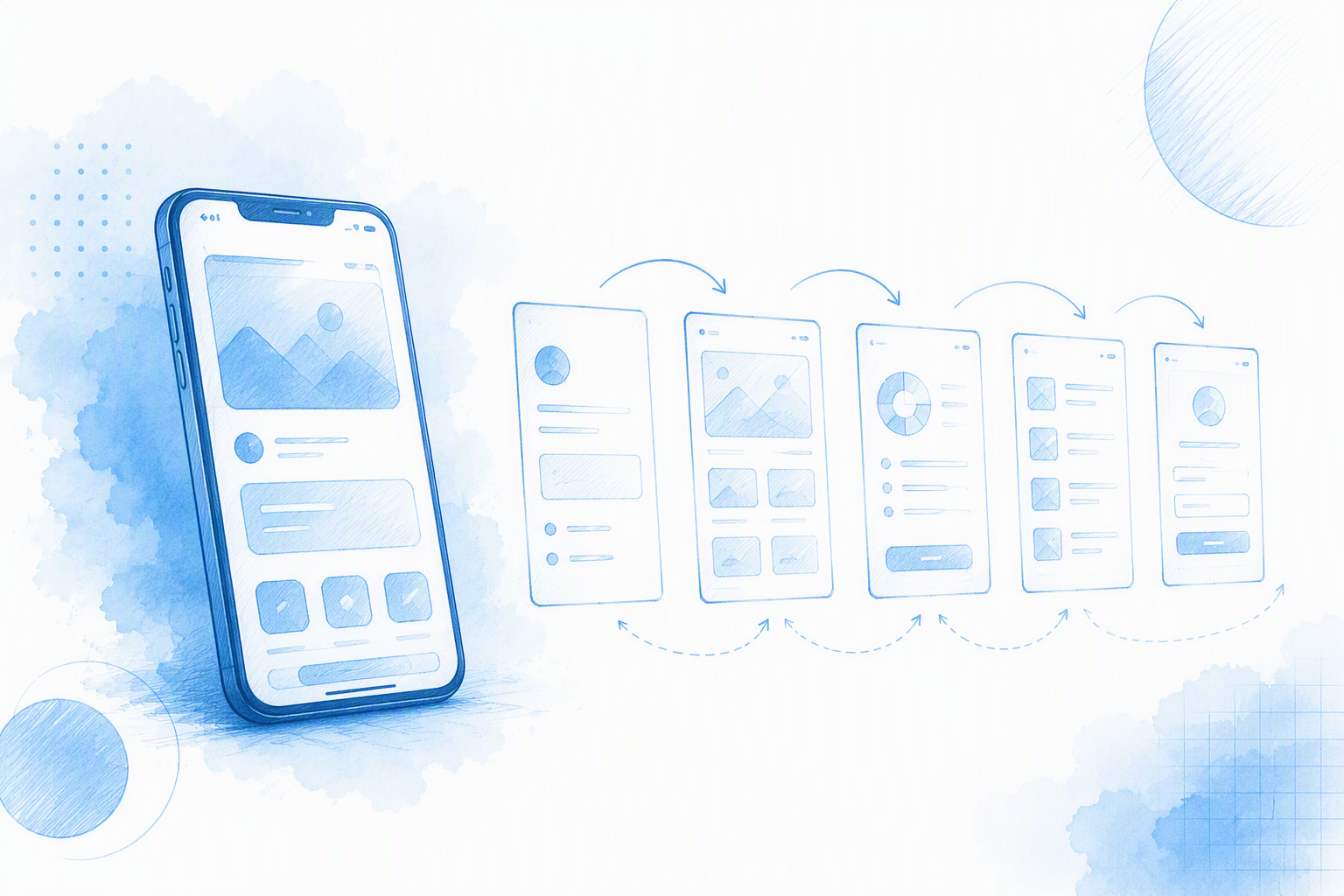
App design covers the research, structure, interface, validation, handoff, and improvement of a mobile product. App UI design is its visual and interactive layer: hierarchy, typography, color, spacing, controls, motion, states, and feedback.
A polished interface proves little if people cannot finish a task, recover from an error, understand system status, or use the app with accessibility settings enabled. Strong design supports clarity, consistency, platform fit, and task completion.
UX, UI, and product design for mobile apps
UX defines how a journey reflects users’ goals and expectations. UI expresses that journey through understandable, accessible screens and interactions.
Product design connects both disciplines to business goals, technical constraints, measurement, and iteration. We treat them as connected responsibilities rather than isolated phases.
The deliverables behind a shippable app interface
A complete design package may include:
- •Research findings and product goals
- •Information architecture and user flows
- •Wireframes and interface screens
- •Components, tokens, and platform variants
- •Interactive prototypes
- •Usability and accessibility findings
- •Handoff specifications and acceptance criteria
Inspiration galleries can establish a visual direction, but screenshots rarely reveal edge cases, accessibility rules, or implementation behavior.
How to Design Your Own App: A Research-to-Release Process
We recommend moving from evidence to structure, then from structure to visual detail. Define the problem, research existing behavior, map tasks, inventory states, create wireframes, test the flow, build the UI, standardize components, and prepare the handoff.
AI can accelerate exploration and production, but designers still own the logic, accessibility, validation, and final decisions. Our AI mockup generator guide for mobile app designers explains how generated screens can support this process.
Define the problem before drawing screens
Record the user, situation, desired outcome, obstacle, and measure of success in plain language. Separate evidence from assumptions, then test the riskiest unknown before polishing straightforward screens.
Choose research methods by uncertainty
Use methods that match the question:
- •Interviews for motivations and mental models
- •Analytics for observed behavior
- •Support data for recurring problems
- •Pattern audits for platform conventions
- •Usability tests for interaction failures
We also involve engineering, content, accessibility, security, legal, or compliance specialists when the product risk requires it.
Move from evidence to measurable goals
Connect each primary task to a relevant outcome, such as successful completion, fewer errors, faster recovery, or lower support demand. More engagement is not automatically better; extra time may signal friction when someone is trying to complete a simple task.
Plan the Information Architecture and Complete User Flow First
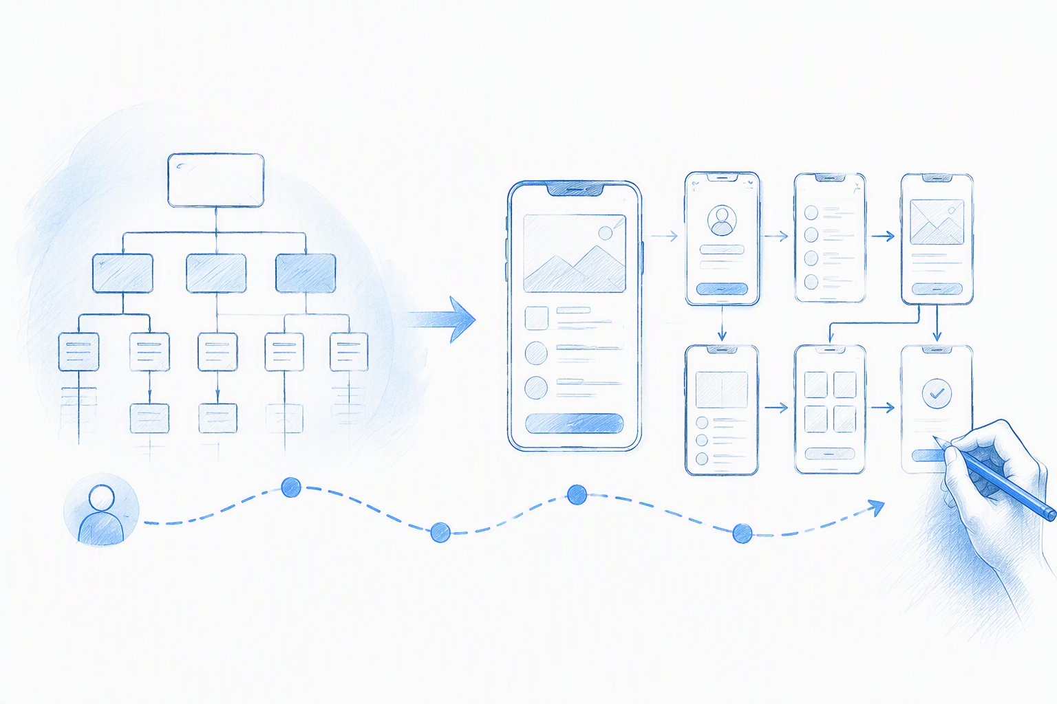
Starting with high-fidelity UI often creates avoidable rework. Labels, navigation, content hierarchy, and task order should be coherent before detailed styling begins.
Map content groups, entry points, interruptions, resumptions, permissions, recovery, and account events. Templates can provide references, but combining unrelated layouts often produces inconsistent behavior.
Build a task model and navigation structure
For each task, identify the goal, prerequisites, required information, choices, system actions, decision points, and completion condition.
Navigation should reflect hierarchy and frequency rather than visual fashion. Persistent navigation suits important destinations; occasional settings should not compete with core tasks.
Diagram the happy path and recovery paths
Document cancellation, back behavior, retry, undo, expiration, interruption, and irreversible actions. Each step should explain the current status, consequences, and available next action.
Decide when the flow is ready for visual design
Move forward when the primary route, labels, data requirements, and recovery paths are stable enough to test. Stay low fidelity while major structural questions remain unresolved.
Floow Design can help us turn written requirements into connected interface directions, making alternatives easier to compare before detailed refinement.
Create a Screen Inventory That Includes Every Important State
Raw screen count is a poor measure of design effort. We inventory distinct views, states, platform variants, and risk conditions instead.
A single payment view may need loading, validation, offline, failure, retry, success, and interrupted-session states. Designs may also need to accommodate keyboards, enlarged text, localization, themes, and changing device sizes.
Core screen inventory checklist
Include each entry point, primary task screen, supporting view, settings area, confirmation, and exit state. Connect every view to its previous step, next action, data dependency, and platform variant.
Non-happy-path state checklist
Specify relevant loading, empty, error, offline, success, disabled, validation, permission, expired-session, and destructive-action states. For each one, document its cause, visible message, available actions, and recovery behavior.
Example prompt for complete state coverage
A useful prompt is:
Generate a sign-up flow for iOS and Android with default, focused, invalid, loading, disabled, success, network-error, existing-account, permission, and account-recovery states.
We then review the output for logic, content, accessibility, and platform fit. Generated work is a starting point, not approval evidence.
Design iOS and Android UI Without Forcing Pixel Parity
iOS and Android interfaces do not need to be pixel-identical. Brand meaning can remain consistent while navigation, controls, icons, permissions, dialogs, system bars, and interaction behavior follow platform expectations.
Apple publishes Human Interface Guidelines and official design resources for its platforms. Android designs should likewise be checked against current Android and Material guidance.
| Specification | iOS | Android |
|---|---|---|
| Layout | Use logical units and safe areas | Use density-independent units and system insets |
| Text | Support Dynamic Type | Support system font scaling |
| Navigation | Follow Apple conventions | Follow Android conventions |
| Icons and controls | Use familiar Apple patterns | Use familiar Android patterns |
| Edge-to-edge UI | Respect safe areas and overlays | Handle system insets explicitly |
iOS layout specifications to verify
Use responsive constraints, system-reported safe areas, and controls that remain usable when text is enlarged. Validate the design across supported devices rather than relying on one reference frame.
Android layout specifications to verify
Account for scalable text, system insets, edge-to-edge layouts, and expected Android behavior. A starting frame does not replace responsive testing.
Cross-platform test matrix
We test different phone sizes, supported orientations, themes, keyboard states, enlarged text, system overlays, platform variants, and tablets when applicable. The aim is to catch clipping, overlap, unreachable controls, and unfamiliar behavior.
Turn App UI Screens Into a Coherent Design System
A design system organizes typography, color, spacing, icons, motion, components, and states. Without shared rules, screens drift apart and implementation becomes harder to maintain.
Foundations and semantic tokens
Use semantic roles such as surface, primary text, border, primary action, success, warning, error, focus, and disabled. Semantic tokens allow themes and platform variants to change without losing meaning.
Components, variants, and states
Build reusable buttons, fields, navigation, cards, lists, sheets, dialogs, and feedback patterns. Document their anatomy, content rules, behavior, accessibility, and relevant states.
Governance without blocking speed
Define ownership, naming, review, versioning, and deprecation rules. We want controlled experimentation without letting temporary patterns fragment the product.
Use AI for Faster App UI Design Without Giving Up Control
AI can support requirements, flows, interface concepts, content, and code suggestions. It does not automatically produce secure, tested, store-ready software.
When assessing tools, we look for mobile specificity, connected flows, platform awareness, conversational editing, component consistency, export options, collaboration, and precise control. A capable AI-powered design platform can reduce blank-canvas work without removing designer oversight.
What AI can accelerate
AI can quickly produce first-pass flows, state variations, hierarchy options, and visual directions. Natural language UI workflows also let teams revise requirements through prompts before committing to manual production.
What the designer still owns
Designers remain responsible for research, information architecture, interaction logic, accessibility, testing, technical review, and approval. We check generated work for missing states, invented behavior, privacy risks, inconsistency, and technical limitations.
When to export to Figma
Export when a direction is stable enough for component management, collaborative review, prototyping, developer inspection, or handoff. Figma can support the downstream workflow without being required for initial exploration.
Prepare an Implementation-Ready Developer Handoff
Handoff is an agreement about behavior, constraints, content, states, and acceptance criteria—not simply a file export.
Handoff package checklist
Provide source files, prototypes, state inventories, platform variants, component documentation, tokens, assets, content rules, change history, and acceptance criteria.
Responsive and accessibility specifications
Document viewport behavior, keyboard effects, text expansion, localization, focus order, labels, contrast expectations, error identification, and reduced-motion treatment.
Design QA after handoff
Review the built product against its state inventory, responsive rules, platform variants, and accessibility requirements. When implementation reveals a better reusable pattern, update the shared system rather than leaving it isolated in code.
App Design Cost, Quality, and Common Questions
Cost depends on flows, states, platform variants, research, testing, accessibility, localization, novelty, and product risk. We do not recommend estimating from screen count alone.
How much does it cost to design an app?
There is no reliable universal price. A useful estimate requires consistent assumptions about scope, platforms, engagement model, custom interactions, testing, regulation, and handoff detail.
Can ChatGPT create an app for me?
ChatGPT can support planning, interface concepts, content, and code. Production still requires architecture, data services, security, testing, release operations, monitoring, and maintenance.
What is the best app design?
The best design helps its intended users complete important tasks clearly, safely, and efficiently under realistic conditions.
How many screens does an app need, and is Figma required?
An app needs enough screens and states to support its complete journeys. Figma is optional at the start but useful for detailed collaboration and production workflows.
FAQ
How do I start designing an app?
Define the user problem, evidence, assumptions, desired outcome, and success criteria. Then map the flow and edge states before creating polished UI.
How should app design quality be measured?
We assess task completion, error prevention and recovery, accessibility, consistency, responsiveness, platform fit, maintainability, and relevant product outcomes.
Should iOS and Android designs match exactly?
No. Brand and product meaning should remain consistent, but platform conventions and system behavior should guide the implementation.
Can AI replace an app designer?
AI can accelerate exploration and routine production. Designers still need to make and validate decisions about users, logic, accessibility, risk, and feasibility.
Is Figma required for app design?
No. Teams can begin with research notes, flow diagrams, wireframes, or AI-assisted tools, then use Figma when detailed collaboration or handoff requires it.
Design Your Mobile App Screens
Start designing connected mobile screens with Floow Design, refine the direction through prompts, and export the approved work to Figma when the team is ready.