
%20by%20%E2%80%9EPablo%20Stanley%E2%80%9D%2C%20licensed%20under%20%E2%80%9ECC0%201.0%E2%80%9D%20(https%3A%2F%2Fcreativecommons.org%2Fpublicdomain%2Fzero%2F1.0%2F)%3C%2Fdc%3Arights%3E%3C%2Frdf%3ADescription%3E%3C%2Frdf%3ARDF%3E%3C%2Fmetadata%3E%3Cmask%20id%3D%22viewboxMask%22%3E%3Crect%20width%3D%22704%22%20height%3D%22704%22%20rx%3D%220%22%20ry%3D%220%22%20x%3D%220%22%20y%3D%220%22%20fill%3D%22%23fff%22%20%2F%3E%3C%2Fmask%3E%3Cg%20mask%3D%22url(%23viewboxMask)%22%3E%3Cg%20fill-rule%3D%22evenodd%22%20clip-rule%3D%22evenodd%22%3E%3Cpath%20d%3D%22M705.3%201074a2351.1%202351.1%200%200%201-15.6-101c-1-7.7-2.5-16.4%202.7-22%207.3-8%2014-14.8%2014.8-26.2.8-10.7-2.8-22.4-5-32.8a809.4%20809.4%200%200%200-17.3-64.7c-6.6-21.7-13.9-43.2-21.3-64.6-6.9-20-13.5-40.3-22.5-59.5-17-36.5-46-63.5-81.6-81.6-9-4.5-27-20.5-36.3-24-8.5-3.4-8.5%206.3-16.9%202.6-6.7-2.9-13-6.7-16.7-13.2-4-7-14.3-16.9-15.9-25-3.3-17.4.3-32.2-12-45.3a90%2090%200%200%200-41.1-23.8c-33.7-9.3-78.5-2.8-98.8%2028.5-9.7%2014.9-13%2033-26.2%2045.1-11.4%2010.7-8.8%2018-23.6%2023.4-.9.3-23.6-4.5-24.4-4.2-16.2-3.5-31.7%206.2-46.5%2011.8a325.4%20325.4%200%200%200-63%2032.3%20399.2%20399.2%200%200%200-102.3%2098.5%20482.5%20482.5%200%200%200-76.4%20161c-1.7%206.4-3.5%2013-1.5%2019.4%201.7%205.3%205.4%209.2%209.8%2012.4%206%204.3%2018%207%2017.7%2015.7-.1%206.6-2.4%2013.5-3.5%2020-1.3%207.7-2.3%2015.5-3.4%2023.2-4.8%2035.4-8.6%2071-10.3%20106.6a920%20920%200%200%200-.5%20106c.1%202.3.8%204.5%202%206.2-1%20.4-1.2%202.4.1%202.7l2.7.5a12%2012%200%200%200%207%202.4l5.5.2c19.3%204%2038.6%207.9%2058.1%2010.8%2023.8%203.5%2047.6%206.3%2071.5%208.7%2049.2%204.8%2098%203.2%20147.1.6a1877%201877%200%200%201%20147.4-2c49.2%201.4%2098.4%203.5%20147.6%204.4%2055%201%20110-.5%20164.8-5%207.5-.5%2012.2-6.5%2010.7-14-8.9-44.7-19-89.1-27-134Z%22%20fill%3D%22%23694d3d%22%2F%3E%3Cpath%20d%3D%22m201%20597.5%201.2-.4c14.5-5.7%2029.6-14.8%2045.4-11.4.5-.2%2010.8%201.9%2017.9%203.2l-6.7%207L247%20598c40.7%2067.1%2088.8%20100.7%20144.3%20100.7%2055.5%200%2097.7-33.6%20126.4-100.7l4-1c.4%200%201%20.2%201.5.4%209.3%203.6%2027.4%2019.6%2036.3%2024.1%2035.6%2018%2064.5%2045%2081.6%2081.6%208.7%2018.6%2015.2%2038%2021.8%2057.5l.7%202c7.4%2021.4%2014.7%2043%2021.3%2064.6%206.3%2020.4%2012%2041%2016.6%2061.8l.7%202.9c2.2%2010.4%205.8%2022%205%2032.8a29%2029%200%200%201-3%2010.7l-80.4%2029%2038.4%20261.3c-35.1%201.5-70.3%202-105.5%201.3-49.2-.9-98.4-3-147.6-4.3-47.7-1.2-95.3-.7-143%201.7l-12%20.6a946.3%20946.3%200%200%201-139.5-1l-3.1-.3v-38.3l16.3-212.9-83-15.6-81.3-39.5a21.7%2021.7%200%200%201-5.6-8.8c-1.9-6-.5-12%201-18l.5-1.3a492.8%20492.8%200%200%201%2076.4-161A399.3%20399.3%200%200%201%20138%20629.7c19.8-13%2040.9-23.9%2063-32.3Z%22%20fill%3D%22%23ffcf77%22%2F%3E%3Cpath%20d%3D%22M232.2%20584.6c5.1-.3%2010.3.6%2015.4%201%20.4.1.6.8%200%20.9-9%201.9-18%204.5-26.9%207.1l-3.8%201.2c-10%203-19.8%206-29.6%2010-19.4%207.9-37.8%2018.5-54.8%2030.8C67.2%20682.8%2020%20754.3-9.9%20828.3a526%20526%200%200%200-24.3%2077c-.4%201.6-2%205.4-1%207%20.7%201.3%203.6%202.1%205%202.9l4.5%202.3%2025.2%2012.9%202.3%201.1c38%2018.6%2078.4%2034.4%20121%2035.5l.4-3.7a342%20342%200%200%201%209.9-60c.3-1%201.6-.6%201.7.3%203%2023.1%202%2046.4%201%2069.7-1.8%2041-4.3%2082.2-6.5%20123.3-1.2%2020.6-2.6%2041-3.9%2061.7-1.3%2020.5-1.7%2041.6-4.7%2062-.6%204.6-6%207-10%206.6-4.4-.5-7.9-4.5-8-9%200-11.9%201.5-24%202.4-35.8l2.5-33.8c3.1-41.1%206.8-82.2%2010.2-123.3a4771%204771%200%200%201%203.8-43.7C76.4%20979.8%2034.2%20963-6.1%20943.5c-.6%2013.2-2%2026.5-3.4%2039.6-3.8%2036.8-7.1%2073.6-9.6%20110.5a2254.2%202254.2%200%200%200-4.2%2092.7l-.2%207c0%204.4-.5%208.5-4.3%2011.7-3.7%203.3-8.9%203.5-12.6%200-5-4.6-4.2-10.9-4-17.1a1675.6%201675.6%200%200%201%201.8-47.2%201321%201321%200%200%201%2010.5-109.5l2-14c3.5-26%207.5-52.7%2015.5-77.9-3.1-1.5-6.2-3-9.3-4.7-5.5-2.7-11.2-5.4-16.6-8.4-4.2-2.5-7.9-5.8-9-10.8-1.4-5.5.6-11.5%202-16.9v-.4a502%20502%200%200%201%2026.6-80%20523.2%20523.2%200%200%201%2067.8-117%20353.8%20353.8%200%200%201%2088.7-83.3%20239%20239%200%200%201%2053.8-25.7%20142.6%20142.6%200%200%201%2042.8-7.5Zm90.1-66c6-6.5%2018.1.2%2015.2%208.8a108.2%20108.2%200%200%201-34.7%2052A79.4%2079.4%200%200%201%20247%20598l1.7%202.4a321.1%20321.1%200%200%200%2046.1%2052.6c36%2031.2%2084.8%2048%20132%2036%2037.1-9.4%2069.8-38.8%2079.4-76.2-1.3.6-3%20.9-4.8.5-7.7-1.7-15.3-9.8-20.3-15.6-5.3-6.3-9.5-13-12.6-20.7-5.6-14-7.4-32.1.3-45.7%201-1.7%203-.7%203.3%201l.3%202.5c1.5%2012.7%203.3%2025%209.3%2036.6a76%2076%200%200%200%2018.2%2023.1c2.6%202%205.8%203.6%208.1%206l.5.4c.6-5%204.1-7.3%207.6-7.2%203.3.2%207.3%201.6%208.8%202.3l.1.1a341%20341%200%200%201%2065.1%2042%20259%20259%200%200%201%2088.4%20129c7.5%2025.3%2011.8%2051.4%2016.3%2077.4l2.8%2016c4.2%2023.9%208.9%2048.4%2018.4%2070.7%202.5%205.7.6%2011.1-5.5%2013.4A1493%201493%200%200%201%20688%20953c3.7%2016%206%2032.5%208.7%2048.5%206%2034.1%2013.2%2068%2019.4%20102%203.2%2017.5%206.1%2035%209.3%2052.3l4.7%2025.2%202.4%2013.6.1.7c.5%202.4%201%204.9.4%207.3-.8%202.7-2.9%204.6-4.8%206.6-1.6%201.6-3.8%201.6-5.7.7l-.7-.3c-3.4-1.6-6-3.2-7.3-7-.7-2.5-1-5.2-1.5-7.7a3535.6%203535.6%200%200%201-7.8-43.6l-1.6-9.1c-5.2-31.4-10.2-62.9-12.8-94.5-1-14-2.3-28.1-3.5-42.2l-.9-10.5c-1.1-13.3-2.5-27-2.7-40.5l-4.5%201.6L657%20964c-5.5%202-12.5%206-18.4%205.2-2.9-.3-5-1.2-6.8-2.9%202%2028.8%204.8%2057.4%208.5%2086a1965.7%201965.7%200%200%200%2022%20135c.6%203.2%201.4%206.4%201.9%209.6.5%203.7-.5%205.9-2.5%209-1.7%202.4-5%203.7-7.8%202-3.6-2.3-5.5-4.3-6.5-8.4-1-3.7-1.6-7.6-2.3-11.4a1654.2%201654.2%200%200%201-11.4-65.2c-7.8-52-12.7-104.4-15.2-156.8a1388%201388%200%200%201-1.4-77.8c0-13.3.5-26.6%201.4-39.9%201-13.4%203-26.5%204.8-39.8%200-.5.7-.5.7%200%20.8%2014.9%202.1%2029.8%202.8%2044.7.6%2014.3.9%2028.5%201.4%2042.8.6%2018.7%201.5%2037.5%202.7%2056.2a9.6%209.6%200%200%201%208.5-3.1c4.7-1%209.7-3.4%2014.1-5l16.8-5.5%2026.4-8.7a679%20679%200%200%201-18-80.8l-2-12.3c-4-24.2-8.5-48.5-15.8-72a229.8%20229.8%200%200%200-34.8-68.2%20370.2%20370.2%200%200%200-52.7-55.3C557%20627%20539.7%20614%20523%20600c.1.9.2%202%200%203-3.5%2025.9-17%2050-35.8%2067.9-37.7%2036-93.6%2043.4-142%2026.5-46.7-16.3-88-55-102.6-102.8-.3-.8.8-1%201.3-.5l2.4%203.3c0-.4.2-.9.7-1a129%20129%200%200%200%2046.6-29.2%20100.2%20100.2%200%200%200%2021.3-33.3l.4-1c1.7-5%203.2-10.2%207-14.2Z%22%20fill%3D%22%23000%22%2F%3E%3C%2Fg%3E%3Cg%20transform%3D%22matrix(.99789%200%200%201%20156%2062)%22%3E%3Cg%20fill-rule%3D%22evenodd%22%20clip-rule%3D%22evenodd%22%3E%3Cpath%20d%3D%22m154%2059.3%208.6%2010.3c-4.7%203.4-9.2%206.8-13.5%2010.2a118%20118%200%200%201%2065-20.5c45.3%200%20137.4%2039%20158.2%2067%2010.3%2014%2029.5%2056.8%2039.5%20103.3%208%2037.4%2019.9%20143%208%20182.7-15.2%2050.7-65.3%2097.7-117%2097.7s-131.9-37.3-189-119c-2.6-3.8-32.5-8.1-54-22.2l5.7%2061.9%204.3%2036-1%202.5c-15.3%2041.4-27.4%2063-36.4%2064.8-9.1%201.9-27.7-13.1-55.8-44.9l-3.6-15c-9.1-38.5-13.7-59.1-13.7-62v-.5c.2-6.5%202.4-43.3%202.4-53.2V210C-8%20109.5%2020.7%2059.3%2048.2%2059.3H154Z%22%20fill%3D%22%23694d3d%22%2F%3E%3Cpath%20d%3D%22M82.4%2025.1a31.3%2031.3%200%200%201%2027.6%202.4%2048%2048%200%200%201%2041.7%2023.1l.5.6%201.8%202.2c1.8%202%203.6%204.2%205%206.6-7%20.1-13%203-17%208.8-3%204.2%203.7%208.2%206.7%204.2l.1-.1c2.5-3.5%206.3-4.9%2010.4-5%201.2%200%202.1-.4%202.8-1.1l.6%202.8c21-8.1%2043.6-10.3%2066-8.4-1%201.6-1.8%203.3-2.4%205.1-.7%202%20.8%204.4%202.8%205%202.1.5%204-.7%204.9-2.6v-.2c.9-2.5%202.3-4.6%204.2-6.2%2010.6%201.4%2021%203.7%2031.3%206.6%2012.4%203.6%2024.6%208%2036.5%2012.9-2%20.7-3.8%202-5%204.3-2.4%204.5%204.3%208.5%206.8%204.2l.1-.1.7-1%20.4-.1.6-.2h.3l.9-.2h2.3c1.8%200%203-1%203.5-2.3%206%202.6%2011.7%205.4%2017.5%208.3l1.3.8c17.7%209.2%2034.4%2021.3%2044%2039%20.7%201.3.9%202.6.7%203.8l6%207.6c5.9%208%2010.2%2017%2014.2%2026a282%20282%200%200%201%2018%2056c4.1%2018.5%207.5%2037.3%2010.6%2056.2%203.4%2020.9%206.3%2042%207%2063.2%201%2037.8-6.4%2075.8-27.6%20107.6-19%2028.4-47.5%2051-81.3%2058.2a114%20114%200%200%201-98-22.7c-4.3-3.7-3.7-11.2%200-15%204.3-4.2%2010.6-3.6%2015%200%2025.5%2021.6%2062.7%2025%2093.4%2014%2028.5-10.2%2050.8-33.7%2064.4-60%2016.7-32.2%2019.5-69.2%2017-104.7-1.4-19.6-4.4-39-7.4-58.3l-1.8-11.6c-2-12.7-4-25.3-6.7-37.8l-.7-2.9a256%20256%200%200%200-13.1-44.6%20240.2%20240.2%200%200%200-13.1-25.8c-1%20.3-2.3.4-3.6%200a145.6%20145.6%200%200%200-49.2-6.7c-9-.5-18%20.3-26.6%203a187%20187%200%200%200-2.5-2%206.6%206.6%200%200%201-5.4-4.3c-1-.9-2.2-1.7-3.3-2.5-2.7.7-5-1.6-5.7-4l-1.8-1.2-1.4.2c-2%20.2-4-.1-5.7-1a10.5%2010.5%200%200%201-4.6-5.4c-3.3.2-6.8-.9-9.8-2.9a29.7%2029.7%200%200%201-6.1-6%20209.5%20209.5%200%200%200-72-17.6%2099%2099%200%200%200-9.6%202.5c5.5-.7%2011-.8%2016.7%200%2026.9%204%2047.8%2024%2065.8%2043%204.3-.8%208.6%204.7%204.7%208.4l-31%2028.6c.8%203.2-2.9%206.4-6%205.6l-16.3-3.8a17.2%2017.2%200%200%201-17.8-1.7l-1.2-.8-1.2.9a8.7%208.7%200%200%201-6.2%201.2c-2.2-.3-4.2-1.5-5.9-2.8-1-1-3.6-4.6-5-4.9h-.1c1%200-2%202.9-2.9%203.4a9%209%200%200%201-6.3%201.8c-4.1-.4-7.6-4.1-9.6-7.6l-.2-.3v-.1.2h-.1c-.3.9-1.3%201.8-2%202.4a7.6%207.6%200%200%201-6.4%201.9c-2-.4-3.8-1.6-5.1-3.1l-.3-.3c-.4-.4-3-4-2.6-5h-.1c-1.7.4-3%200-4-.8-5.6-1.3-11.2-2.7-16.5-4.5l-1.3%203.5c3%201.8%205.7%204.4%208.1%206.2l14.2%2010.5%2018.7%2013.8%202-.6c2.8-.7%205.2.8%206.2%203.3v.2l1.5%203a9.8%209.8%200%200%201%209.9%206.8l3.5.1c3.2.4%205.4%202.8%204.8%206.1V211c1.8.8%203.2%202.4%203.5%204.7.5.8.9%201.6%201.2%202.5%201.3%204.8-1.3%2010.7-2.7%2015.3l-.2.3-2.7%209-2.4%207.5c-6.6%2020.7-13%2042.6-7.7%2064.3%201.2%204.6-4.7%206.7-7.3%203-6.1-8.6-12.8-16.8-19.8-24.7h-.4c-4.9-1-6.8-4.5-9-8-1.4.3-2.8.4-4.2.2-2-.4-3.8-1.6-5.2-3-1.2-1.2-2.3-4.4-3.7-5.1-1.8-1-5.3.4-7.4%200-1.7-.2-3.3-.8-5-1.5a27%2027%200%200%200-5.1%2013.4%2011%2011%200%200%201-1.6%204.8c3-.1%206%200%209%20.6%2010.9%202%2018.7%208.8%2023%2018.9.3.4-.3.8-.6.3-6.5-10-20.7-10.5-31-7-11%203.8-17.1%2013.4-19.3%2024.4-2.4%2012.1.7%2025.1%207.2%2035.4%203%204.8%207.2%209.1%2012.8%2010.9%206.5%202%2012.6-1.7%2019.3.3%204.6%201.3%206.7%205.7%205.8%2010.1-.3%201.8-1%203.3-1.7%204.6%202.4%204.8%204.6%209.8%207.5%2014.3%204.4%207%209.7%2012.8%2015.5%2018.7%206%206%2012%2012%2018.5%2017.5%206.1%205.4%2013.2%209.2%2019.6%2014.1%204.5%203.5%206.8%208.3%204.5%2013.9-1.8%204.5-8%208.4-13%206.4-9.6-4-18-10.7-25.7-17.7a89.8%2089.8%200%200%201-18-22.5c-4.4-7.8-7.6-16.8-10.3-25.4l-.4-1c-1.3-4.2-2.6-8.8-3.5-13.5a30.8%2030.8%200%200%201-18%202.6A40.2%2040.2%200%200%201%2074.2%20387c-2.9-3-5.5-6.6-7.7-10.5l.4%206.7c5.3%205.7%207.3%2014%205.5%2021.5a16%2016%200%200%201%203.3%2017c4.8%204.7%204.6%2012.3%202.5%2019.1a19.9%2019.9%200%200%201%201.8%2023.3l-.1.5c4.4%207.5%203.4%2017.1-2.1%2023.7%203.8%207.4%203.2%2017.3-6.4%2020.2-3.4%201-6.8.2-9.3-1.8%202.3%2011.5%203.3%2023%20.2%2034.6a11%2011%200%200%201-10.3%207.9c-4%200-6.8-2-8.8-5%20.3%205.9%200%2011.7-1.3%2017.5-.8%203.5-4%206.3-7.5%207.1a4.6%204.6%200%200%201%20.5%205.6c-5%209-17.4%205.3-18.2-3.3-3.5-2.6-5.1-6.9-5.8-11.5-1-6.7-1.3-13.3-2.4-20l-.4.4-.3.2v.5a10%2010%200%200%201-5%207c.6%205.7-.4%2011.5-4%2015.8-2.4%203-6.5%204-10%203.4h-.7c-8-1-12.7-8.6-10.6-15.6-3.2-4-4.5-9-3.6-13.9-6.2-4.1-6-13.2-4-20.5-6.5-5.1-9-14.7-5.6-22.4a24.5%2024.5%200%200%201-2.7-25.8%2013.9%2013.9%200%200%201%200-21c-3.5-6.9-5.5-15-2.1-21.2a13.8%2013.8%200%200%201-3.5-10.1c.4-5.4%204-9.1%208.4-11.6l.3-1.7c1%20.1%202.2-.2%203.1-1%201-1%202-1.8%203-2.4%201.2%200%202.2-.5%202.9-1.3%202-.7%204-1%206.3-1%205%200%205.1-7.5.5-8a4%204%200%200%200-2.8-1.1h-.9c-2%200-4%20.1-5.8%201a6.6%206.6%200%200%200-2.8%202.1c-.2%201.5-1%203-2.6%204a6.3%206.3%200%200%201-6.7.4c-3-1.8-3-4.4-2.7-7.4.8-6.4-3-12.4-2-19%20.4-2.9%201.3-5.4%202.9-7.4-3.3-5-4-11.4-1.4-16.9a19.4%2019.4%200%200%201-2.8-21.4l.1-.5c.4-1.2%201-2.3%201.5-3.3-3-5.1-3-11.5.1-16.6a16.4%2016.4%200%200%201-.6-19.7v-1.4a18.3%2018.3%200%200%201%201-15c-.8-1.9-1.5-4-1.9-6.2a36.8%2036.8%200%200%201%202-19.7c0-3.9.1-7.7.3-11.6-.7-3.2-.9-6.8-.9-10.1v-2.2c0-5.4-.4-13.4%203-18-2.2-5.1-1.2-11.4%202.5-15.4a15.2%2015.2%200%200%201%20.9-17.2c-.2-4.6.7-9.2%203.1-13.8%201.6-3%204-5.5%206.8-7.5l-.1-1.8c0-2.6.6-5.3%201.6-7.8-1.8-3-2.6-6.4-1.5-10%201.1-4.2%204.2-7.8%208-9.8.3-4%20.9-7.9%201.8-11.7-2.4-5.2-.5-12.1%204.8-15.2-.7-4.1%200-8.5%203-11.7%201.1-1.2%202.5-2.2%204-2.8A13.8%2013.8%200%200%201%204.8%2058a15.4%2015.4%200%200%201%2015.6-12.3%2011.2%2011.2%200%200%201%209.2-8.1%2052%2052%200%200%201%2022.5-12.2%2037%2037%200%200%201%2022.2%200l.5.3h.5c2.4-.4%204.7-.5%207-.6ZM23.8%20519c-2-.7-4.4.7-5%202.8a4%204%200%200%200%202.8%204.9c2.6.8%205.3%201%208%201a4%204%200%200%200%204-4%204%204%200%200%200-4-4%2018%2018%200%200%201-5.8-.7ZM5.4%20476.4c-3%200-5.7.7-8%202.9-1.5%201.4-1.5%204.2%200%205.7a4%204%200%200%200%205.5.1l.3-.3h.1l.4-.3-.3.2.6-.2h.3l1.1-.1c2.1%200%204.1-1.8%204-4a4%204%200%200%200-4-4ZM63.6%20451c4.3-2.6.5-9.4-3.9-7l-.1.1c-2.3%201.4-5%201.2-7.5%201.2-5.2%200-5.2%208%200%208h.8c3.7%200%207.5-.3%2010.7-2.3Zm-34-29.2c-3.3-.6-7-1.1-10.4-.8h-1.6a4%204%200%200%200-2.6%201c-1.1.5-2.2%201.2-3.2%202-3.9%203.4%201.8%209%205.7%205.7l.7-.5.2-.1h4.3c.4%200%20.8%200%201.1-.2l3.6.6c5%201%207.2-6.7%202.1-7.7ZM25.8%20345c-6.3-2.9-13.2-2.8-19%201.2-4.2%202.9-.3%209.7%203.9%207l.1-.1%201.6-1c3%201%206%201%208.7%200l.4-.2h.2c4.7%202.2%208.7-4.7%204-6.9Zm68.3-12.5c-6.4-.7-6.4-10.7%200-10a53.1%2053.1%200%200%201%2034.6%2017.8c4.2%204.8-2.7%2011.8-7%207.2v-.1a43%2043%200%200%200-27.6-14.9Zm-71-51.4c-1.4-.1-2.8-.2-4.2-.1-3.3.1-7.4%202.3-6%206.3%201.3%203.3%205%203.4%207%201.7l2.3.1c2.1.2%204.2.6%206.3%201%205%201%207.1-6.7%202-7.7l-2.2-.4a107.6%20107.6%200%200%200-3.7-.9h-1.5Zm-39.8-62h-.4c-6.8-1-17.6-.2-18.4%208.4-.5%204.8%206.4%205%207.7%201%205-.9%2010-1%2015-.5%202-2%202-5.6-1.2-6.5-.5-1.2-1.4-2.3-2.7-2.4ZM138%20204.5c-1.6-1.4-4.2-1.6-5.7%200-.9%201-1.6%202-2.2%203.2l-.4.7-.2.4-.4.7h-.1l-.2.2c-1.4%201.5-1.6%204.2%200%205.7%201.6%201.4%204.2%201.6%205.7%200%20.9-1%201.6-2%202.2-3.1l.4-.8.2-.4.4-.7.2-.1v-.1c1.5-1.5%201.7-4.2%200-5.7Zm-82-10.4c-5.7-4-12.4-4.2-17.6.7-3.7%203.4%201.8%209%205.5%205.7h.2l.4-.4c.7.5%201.5%201%202.5%201h1.6c.3.2.7.4.1%200%20.2%200%20.3.2.4.3l.3.2c1.5%201.4%204%201.6%205.6%200%202.6-.9%204-5.3%201-7.5Zm55-13%20.1-.1c5-1.4%202.9-9.1-2-7.7-5.4%201.5-7.9%206.4-9%2011.4-.4%202.1.7%204.3%202.9%205%202%20.5%204.4-.7%204.9-2.9.3-1.5.7-2.7%201.2-4l.4-.6c.1-.3.2-.3.7-.8l.8-.4Zm-83.7-40.4-.7-.1c-4.9-1.1-11.3-1.7-14.2%203.1-2.6%204.4%204%208.3%206.8%204.2h1.5c1.5%200%203%20.2%204.5.5%205%201.2%207.1-6.5%202.1-7.7ZM200.1%20110c3.6-3.7-2-9.3-5.7-5.7a38.4%2038.4%200%200%200-7.5%209.5c-1%201.9-.5%204.3%201.4%205.4%201.8%201%204.5.5%205.5-1.4%201.6-3.2%203.6-5.2%206.3-7.8Zm-46-9.6c-3.6%202.1-6%205.7-7.4%209.7-.7%202%20.8%204.4%202.8%205%202.1.5%204-.7%204.9-2.7v-.2c.4-1%201-2.3%201.8-3.3.6-.8%201.6-1.7%202.4-2%201.8-.6%203-2.2%202.9-4.1-3%201-5.8-.2-7.4-2.4ZM46.3%2083a11.4%2011.4%200%200%200-13-1.8c-2%201-2.4%203.8-1.4%205.5%201.2%202%203.5%202.4%205.5%201.4-.5.3.4%200%20.8-.1h1.2-.2l.6.1h.2l.6.5c3.8%203.6%209.5-2%205.7-5.6Z%22%20fill%3D%22%23000%22%2F%3E%3C%2Fg%3E%3C%2Fg%3E%3Cg%20transform%3D%22translate(315%20248)%22%3E%3Cpath%20fill-rule%3D%22evenodd%22%20clip-rule%3D%22evenodd%22%20d%3D%22M146.6%20241a40.7%2040.7%200%200%201-17.1-13.2c-1.5-2-2-4.2-1.6-6.2a8.9%208.9%200%200%201%209.6-7.2c1.9.3%203.7%201.3%205.2%203.5l.3.4a27%2027%200%200%200%2010%208.3c3.6%201.8%207.8%202.6%2012.1%202.1%208.3-1%2014-5.4%2020-11.4l2.2-2.3c.5-.8%201.1-1.2%201.9-1.5a4%204%200%200%201%204.6%201.6c.4.7.7%201.5.6%202.5a25.7%2025.7%200%200%201-8.5%2016.2c-5.1%204.9-12%208.2-18.4%209.4-7.1%201.3-14.4.4-21-2.3Zm24.2-96.6c7.6%204.6%2019%2015.3%2011%2026.6-9.6%2010-23.4-1.4-30.2-6.6-6.3-4-13.3%206.3-7.5%2011%2049%2036.3%2069-29.8%2030.5-36.4-4.2-.8-5.8%204-3.8%205.4ZM83%20102c.8-10.3%2016.6-12.7%2018.1-2.4a42%2042%200%200%201-4.3%2025.9c-4%207.9-14%204.2-14.7-3-1-9.7.3-14%20.9-20.5Zm120-4.5c2.2-3%205.4-4.9%209.2-3.8%2011.9%203.5%208.4%2020.4%204.2%2028.6-2.3%204.4-9.6%205.6-12.9%201.6-5.4-6.4-8-19.1-1.1-25.5l.6-1ZM96.6%2056.8l1.9-.3c5.8-1%2013-2%2017.1%202.7%202.2%202.5%203%207%200%209.4-5.1%204.2-10.8%202.6-17%203-5.1.2-10%201-14.9%202.5C73%2077%2064.2%2082.8%2055%2088.9c-1.2.8-2.4-.7-1.9-1.8a59.3%2059.3%200%200%201%2026-24.1%2064%2064%200%200%201%2017.5-6.2Zm95.6-4.6%201.4.3c15.7%203.2%2036%209.8%2043.4%2025.1.3%202.2%200%202.7-.3%203-.2.3-.4.7-1.4%201A36%2036%200%200%201%20226%2078l-2.8-1.4a77.7%2077.7%200%200%200-10.1-4.3c-7.5-2.4-15.1-4.1-23-5a9.4%209.4%200%200%201-4.5-1.8%207%207%200%200%201-2.6-4%207%207%200%200%201%20.8-5.8%207.4%207.4%200%200%201%203.6-3.1c1.5-.6%203.2-.8%204.9-.4Z%22%20fill%3D%22%23000%22%2F%3E%3C%2Fg%3E%3Cg%20transform%3D%22translate(279%20400)%22%3E%3C%2Fg%3E%3Cg%20transform%3D%22translate(179%20343)%22%3E%3C%2Fg%3E%3Cg%20transform%3D%22translate(203%20303)%22%3E%3C%2Fg%3E%3C%2Fg%3E%3C%2Fsvg%3E)
TL;DR
Strong mobile apps design starts with a critical user journey—not colors, templates, or an oversized component library. We map the flow, create the necessary screens, test them against mobile constraints, cover important states, and then build the visual system. AI can accelerate the first draft, but sound product decisions and device testing remain essential.
Table of Contents
- •What Is Mobile App Design?
- •How to Design a Mobile App From a Blank Page
- •Generate a Complete First Flow With One Prompt
- •Plan the Screen Inventory and Core User Flow
- •Design for iOS and Android Without Forcing One Layout
- •Make Layouts Work Around Thumbs, Notches, and Gestures
- •Choose Navigation Patterns Based on the Task
- •Build Accessibility and Dark Mode Into the Visual System
- •Design Every State Before Developer Handoff
- •Test, Hand Off, and Estimate Mobile App Design Work
- •FAQ
- •Generate Your First Mobile App Flow
What Is Mobile App Design?
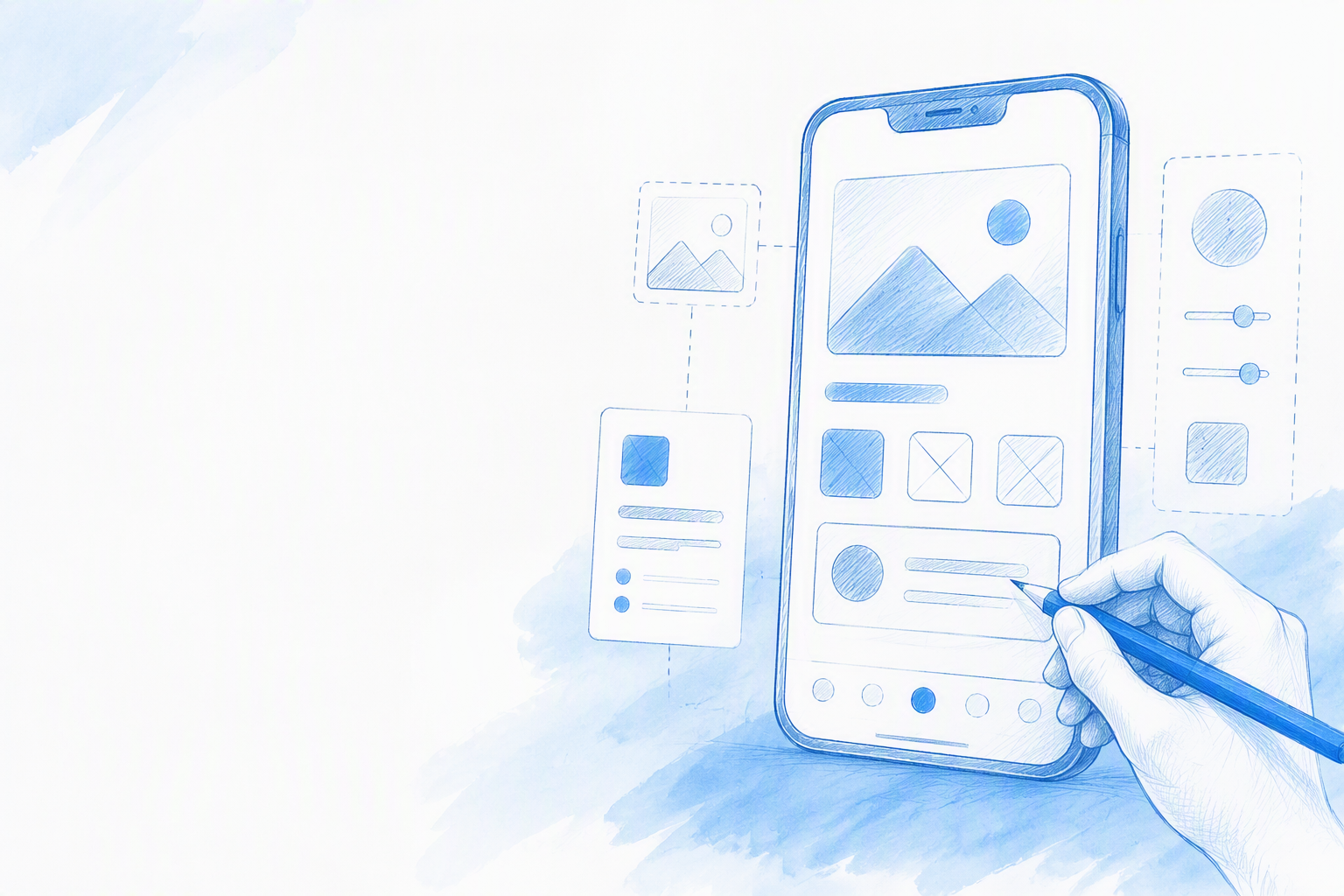
Mobile app design covers the interfaces, navigation, interactions, responsive states, and implementation guidance for native or cross-platform iOS and Android products. Effective design turns a user goal into a clear, touch-friendly journey.
An attractive mockup is not a finished app. We consider a design ready only when its core flow, platform constraints, accessibility requirements, edge cases, and developer specifications work together.
Mobile UI Design Versus Mobile UX Design
Mobile UI design covers visual hierarchy, typography, color, spacing, icons, and components. Mobile UX design determines how people enter a flow, understand their options, complete tasks, receive feedback, and recover from problems.
The disciplines depend on each other. A polished payment screen cannot compensate for confusing navigation, missing processing feedback, or no recovery path after a failed transaction.
Why Mobile-First Does Not Mean Desktop Made Smaller
Mobile experiences must account for touch, limited screen space, interruptions, on-screen keyboards, changing connectivity, and one-handed reach. Devices also introduce platform conventions, display cutouts, system bars, and gestures.
We recommend rebuilding the hierarchy around the main mobile task. Remove secondary content, shorten paths, and place frequent actions within comfortable reach rather than compressing a desktop interface.
How to Design a Mobile App From a Blank Page
We move from constraints to a testable flow before refining visual details. A large design system should not be the first deliverable; otherwise, the team may build a polished component library for a journey that has not been validated.
A Focused Blank-Page-to-Handoff Workflow
Use this sequence:
- •Define the brief. Record the user, task, platform, business goal, accessibility needs, and technical limits.
- •Map the core flow. Identify the shortest useful path from entry to success.
- •Create the first screen set. Connect enough screens to test the journey.
- •Cover interactions and states. Add validation, loading, errors, interruptions, and recovery.
- •Test accessibility and devices. Review reach, scaling, contrast, gestures, and keyboard behavior.
- •Prepare the handoff. Document components, behavior, platform differences, and acceptance criteria.
This order maintains momentum without treating the first draft as final.
Start With the Task, Not the Component Library
Before opening a design tool, we define:
- •The primary user
- •The primary goal
- •The entry point
- •The success condition
- •Likely failure points
Once the shortest useful journey works, repeated patterns can become components and tokens. This is more efficient than predicting every possible variant in advance.
Generate a Complete First Flow With One Prompt
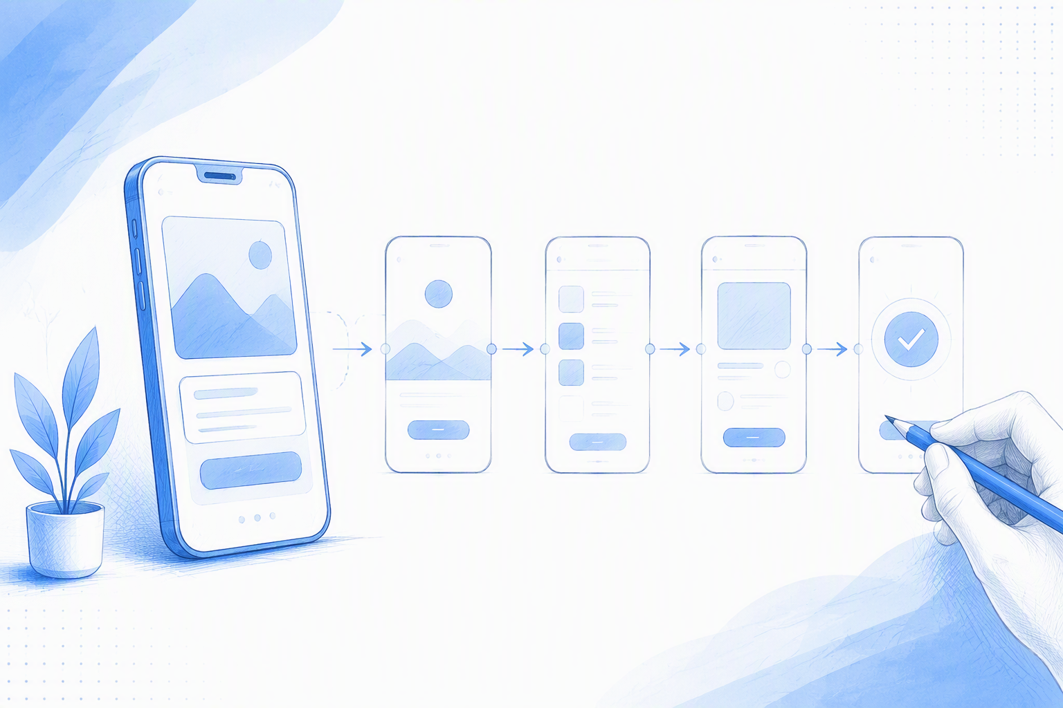
An AI mobile app design tool can reduce blank-page work by generating an initial screen set from a detailed prompt. At floow.design, we treat AI as a speed layer: it creates structure while designers retain control over product decisions, platform behavior, and validation.
Generated output is a starting point, not evidence that the experience works. Our guide to an AI design assistant for editable mobile app flows explains how generated screens can become a connected, revisable design rather than static inspiration.
The Mobile App Design Prompt Framework
A useful prompt should specify:
- •App name and product type
- •Target user and primary task
- •Required screens
- •Target platform
- •Navigation model
- •Visual direction
- •Accessibility requirements
- •Loading, empty, error, offline, and permission states
Vague requests such as “make a modern booking app” leave too many product decisions unresolved. Explicit constraints produce more relevant results and reduce missing screens.
Example Prompt for floow.design
Design a mobile booking app for busy travelers. Create search, filters, results, property details, date and guest selection, checkout, payment, confirmation, and booking management screens. Target iOS with bottom-tab navigation, clear accessible type, generous touch targets, and a calm neutral style. Include loading, empty results, validation error, payment failure, offline, location-permission denied, and expired-session states.
We recommend revising one constraint at a time. Changing navigation, platform, density, or state requirements separately makes each result easier to assess.
A natural language UI workflow works best when prompts describe behavior and constraints, not aesthetics alone.
Plan the Screen Inventory and Core User Flow
Turn the brief into a screen inventory before styling individual views. Each screen needs an entry point, an action, a next step, an alternate path, and a recovery route.
Visual galleries contain thousands of mobile concepts, but isolated examples rarely show complete behavior. We use them to study patterns, not as layouts to copy.
Core Screens to Consider
Depending on the product, the inventory may include:
- •Onboarding and authentication
- •Home, search, results, and details
- •Creation, booking, or checkout
- •Profile and settings
- •Notifications and permissions
A screen should support the primary task or communicate a necessary system response. More screens do not automatically make a product more complete.
Map Successful, Alternate, and Recovery Paths
Begin with the shortest successful journey, then add cancellation, interruption, validation, and retry paths. A checkout needs processing and payment-failure states. Chat requires sending, failed, offline, permission, and keyboard-open behavior. AI scanning may require camera permission, processing, uncertain results, retakes, and unsupported-input states.
Design for iOS and Android Without Forcing One Layout
Using one identical cross-platform layout can create usability and engineering problems. We preserve shared brand tokens while following platform conventions where they make behavior more predictable.
| Constraint | iOS approach | Android approach | Design action |
|---|---|---|---|
| Touch targets | Follow current Apple guidance | Follow current Material guidance | Enlarge frequent actions where useful |
| Safe content | Respect safe areas | Respect window insets | Avoid guessed fixed padding |
| System navigation | Support native back behavior | Support system back behavior | Document platform differences |
| Main destinations | Use appropriate tab patterns | Use appropriate bottom navigation | Keep hierarchy and labels clear |
| Temporary surfaces | Use suitable sheets or modals | Use suitable sheets or dialogs | Define dismissal and focus |
| Typography | Support scalable text | Support scalable text | Test wrapping and layout growth |
Touch Targets, Typography, and System Surfaces
Platform target sizes are minimum guidance, not a complete usability strategy. Frequent actions may need larger hit areas and more separation to reduce accidental taps.
We test type scaling alongside safe areas, status bars, window insets, and edge-to-edge layouts. Components that work at default text size can fail when labels wrap or controls grow.
Navigation and Modal Behavior by Platform
Compare tab bars, bottom navigation, drawers, sheets, modals, back behavior, and full-screen tasks. Familiar platform patterns usually reduce friction.
Intentional differences should be documented for developers. Hiding them inside one generic mockup only postpones the decision.
Make Layouts Work Around Thumbs, Notches, and Gestures
No single canvas represents every phone. We test smaller and larger devices, text scaling, keyboard-open layouts, and orientation where relevant.
Design for Thumb Zones and One-Handed Use
Frequent actions should sit within comfortable reach. A fitness app, for example, may keep start, pause, and resume controls near the lower portion of the screen while separating the destructive “end workout” action.
Reach, spacing, frequency, and error cost matter alongside target size. Repeated dependence on top-corner controls can make common tasks harder.
Handle Cutouts, System Bars, Keyboards, and Gesture Regions
Layouts must account for display cutouts, status bars, home indicators, system bars, and changing viewport height when the keyboard opens.
We also avoid placing draggable controls against system gesture edges. Bottom sheets, maps, carousels, swipe actions, and bottom controls all require conflict testing.
Choose Navigation Patterns Based on the Task
Navigation should reflect task depth and frequency rather than visual fashion. Clear labels, persistent destinations, predictable back behavior, and interruption recovery help people understand where they are.
When to Use Tabs, Bottom Navigation, Stacks, and Drawers
Tabs or bottom navigation suit frequently accessed peer destinations. Stacks support hierarchical movement from summaries to deeper detail.
Drawers are better reserved for lower-frequency destinations when the product and platform support them. The primary task should not be hidden behind a menu.
When to Use Bottom Sheets, Modals, and Full-Screen Flows
Bottom sheets can present contextual choices, while modals handle focused interruptions. Complex or high-attention tasks, such as checkout or identity verification, often need full-screen flows.
For every temporary surface, we define dismissal, back behavior, unsaved-data handling, keyboard interaction, focus restoration, and interruption recovery.
Build Accessibility and Dark Mode Into the Visual System
Once the main flow works, build a compact foundation of semantic tokens and reusable components. Include scalable type, accessible labels, focus behavior, reduced-motion support, suitable spacing, and status cues that do not rely on color alone.
An AI-powered design platform can accelerate exploration, but accessibility still requires deliberate review across screens, states, and devices.
Create the Smallest Useful Mobile Design System
Start with semantic colors, typography, spacing, elevation, icons, inputs, buttons, navigation, and feedback components. Add variants when actual screens require them.
Review Dark Mode State by State
Dark mode is not an automatic inversion. We inspect text, controls, borders, selected states, charts, images, feedback, and elevated surfaces separately. Semantic tokens help preserve hierarchy, but each state still needs visual review.
Design Every State Before Developer Handoff
Default screens are not handoff-ready when critical states are missing. Build a state matrix for important components and flows, prioritizing situations that can block completion, cause data loss, or create uncertainty.
The Mobile State Coverage Checklist
Review:
- •Default, pressed, focused, selected, and disabled
- •Loading, empty, error, success, and offline
- •Permission denied and keyboard open
- •Interrupted and expired sessions
- •Validation, retry, and partial data
For each state, specify its trigger, message, available actions, persistence, and recovery behavior.
State Examples From Mobile Flows
Checkout requires processing, failure, retry, interruption recovery, and protection against repeated submissions. Chat needs sending, failed, offline, attachment-permission, and keyboard-open states. Without these views, developers are forced to define product behavior during implementation.
Test, Hand Off, and Estimate Mobile App Design Work
Templates and generated screens can accelerate the starting point, but they do not validate navigation, accessibility, state coverage, or platform fit.
Device and Usability Testing Checklist
We test representative devices on every target platform and review:
- •Text scaling and screen-reader labels
- •Contrast and non-color cues
- •Keyboard behavior
- •Safe areas and gestures
- •Loading, errors, and interruptions
- •One-handed reach
Task-based testing is more useful than asking whether a screen looks good. Participants should attempt a realistic action, such as completing a booking or recovering from payment failure.
What Developers Need at Handoff
Provide connected flows, screen specifications, tokens, component states, responsive rules, assets, motion notes, accessibility requirements, and documented platform differences.
Edge cases and acceptance criteria also need annotation. Developers should not have to infer validation, offline behavior, or loading transitions from default mockups.
Cost, Tools, Templates, Systems, and App Ideas
Cost depends on scope rather than screen count alone. Complexity comes from user flows, target platforms, states, testing, and handoff depth.
Useful app ideas begin with a specific recurring problem. We define the user, task, constraint, and success condition before choosing features or visual styles.
FAQ
How Can I Design a Mobile App?
Start with one primary task and map the shortest path to success. Create a connected flow, test it on representative devices, then add alternate paths, accessibility requirements, failure states, components, visual polish, and developer specifications.
How Much Does Mobile App Design Cost?
Cost depends on flow complexity, platforms, research, component needs, state coverage, testing, and handoff detail. A prototype requires less work than a production-ready cross-platform product with payments, permissions, offline behavior, and extensive edge cases.
What Design System Should a Mobile App Use?
The right system fits the platform, product, team, and implementation stack. We recommend evaluating accessibility, native behavior, customization needs, component maturity, and engineering alignment before adopting one.
When Should I Use Mobile App Design Templates?
Templates are useful for early structure, pattern research, and rapid experiments. Before production, validate navigation, content, platform conventions, accessibility, responsive behavior, and all critical states.
What Makes a Useful Mobile App Idea?
Start with a narrow, recurring task and identify who performs it, what makes it difficult, and what result would show improvement. Clear problems lead to more focused products than long feature lists.
Generate Your First Mobile App Flow
Turn a clear product prompt into a connected iOS or Android design direction with floow.design, then refine and test the flow with your team.