

%20by%20%E2%80%9EPablo%20Stanley%E2%80%9D%2C%20licensed%20under%20%E2%80%9ECC0%201.0%E2%80%9D%20(https%3A%2F%2Fcreativecommons.org%2Fpublicdomain%2Fzero%2F1.0%2F)%3C%2Fdc%3Arights%3E%3C%2Frdf%3ADescription%3E%3C%2Frdf%3ARDF%3E%3C%2Fmetadata%3E%3Cmask%20id%3D%22viewboxMask%22%3E%3Crect%20width%3D%22704%22%20height%3D%22704%22%20rx%3D%220%22%20ry%3D%220%22%20x%3D%220%22%20y%3D%220%22%20fill%3D%22%23fff%22%20%2F%3E%3C%2Fmask%3E%3Cg%20mask%3D%22url(%23viewboxMask)%22%3E%3Cg%20fill-rule%3D%22evenodd%22%20clip-rule%3D%22evenodd%22%3E%3Cpath%20d%3D%22M705.3%201074a2351.1%202351.1%200%200%201-15.6-101c-1-7.7-2.5-16.4%202.7-22%207.3-8%2014-14.8%2014.8-26.2.8-10.7-2.8-22.4-5-32.8a809.4%20809.4%200%200%200-17.3-64.7c-6.6-21.7-13.9-43.2-21.3-64.6-6.9-20-13.5-40.3-22.5-59.5-17-36.5-46-63.5-81.6-81.6-9-4.5-27-20.5-36.3-24-8.5-3.4-8.5%206.3-16.9%202.6-6.7-2.9-13-6.7-16.7-13.2-4-7-14.3-16.9-15.9-25-3.3-17.4.3-32.2-12-45.3a90%2090%200%200%200-41.1-23.8c-33.7-9.3-78.5-2.8-98.8%2028.5-9.7%2014.9-13%2033-26.2%2045.1-11.4%2010.7-8.8%2018-23.6%2023.4-.9.3-23.6-4.5-24.4-4.2-16.2-3.5-31.7%206.2-46.5%2011.8a325.4%20325.4%200%200%200-63%2032.3%20399.2%20399.2%200%200%200-102.3%2098.5%20482.5%20482.5%200%200%200-76.4%20161c-1.7%206.4-3.5%2013-1.5%2019.4%201.7%205.3%205.4%209.2%209.8%2012.4%206%204.3%2018%207%2017.7%2015.7-.1%206.6-2.4%2013.5-3.5%2020-1.3%207.7-2.3%2015.5-3.4%2023.2-4.8%2035.4-8.6%2071-10.3%20106.6a920%20920%200%200%200-.5%20106c.1%202.3.8%204.5%202%206.2-1%20.4-1.2%202.4.1%202.7l2.7.5a12%2012%200%200%200%207%202.4l5.5.2c19.3%204%2038.6%207.9%2058.1%2010.8%2023.8%203.5%2047.6%206.3%2071.5%208.7%2049.2%204.8%2098%203.2%20147.1.6a1877%201877%200%200%201%20147.4-2c49.2%201.4%2098.4%203.5%20147.6%204.4%2055%201%20110-.5%20164.8-5%207.5-.5%2012.2-6.5%2010.7-14-8.9-44.7-19-89.1-27-134Z%22%20fill%3D%22%23694d3d%22%2F%3E%3Cpath%20d%3D%22m201%20597.5%201.2-.4c14.5-5.7%2029.6-14.8%2045.4-11.4.5-.2%2010.8%201.9%2017.9%203.2l-6.7%207L247%20598c40.7%2067.1%2088.8%20100.7%20144.3%20100.7%2055.5%200%2097.7-33.6%20126.4-100.7l4-1c.4%200%201%20.2%201.5.4%209.3%203.6%2027.4%2019.6%2036.3%2024.1%2035.6%2018%2064.5%2045%2081.6%2081.6%208.7%2018.6%2015.2%2038%2021.8%2057.5l.7%202c7.4%2021.4%2014.7%2043%2021.3%2064.6%206.3%2020.4%2012%2041%2016.6%2061.8l.7%202.9c2.2%2010.4%205.8%2022%205%2032.8a29%2029%200%200%201-3%2010.7l-80.4%2029%2038.4%20261.3c-35.1%201.5-70.3%202-105.5%201.3-49.2-.9-98.4-3-147.6-4.3-47.7-1.2-95.3-.7-143%201.7l-12%20.6a946.3%20946.3%200%200%201-139.5-1l-3.1-.3v-38.3l16.3-212.9-83-15.6-81.3-39.5a21.7%2021.7%200%200%201-5.6-8.8c-1.9-6-.5-12%201-18l.5-1.3a492.8%20492.8%200%200%201%2076.4-161A399.3%20399.3%200%200%201%20138%20629.7c19.8-13%2040.9-23.9%2063-32.3Z%22%20fill%3D%22%23ffcf77%22%2F%3E%3Cpath%20d%3D%22M232.2%20584.6c5.1-.3%2010.3.6%2015.4%201%20.4.1.6.8%200%20.9-9%201.9-18%204.5-26.9%207.1l-3.8%201.2c-10%203-19.8%206-29.6%2010-19.4%207.9-37.8%2018.5-54.8%2030.8C67.2%20682.8%2020%20754.3-9.9%20828.3a526%20526%200%200%200-24.3%2077c-.4%201.6-2%205.4-1%207%20.7%201.3%203.6%202.1%205%202.9l4.5%202.3%2025.2%2012.9%202.3%201.1c38%2018.6%2078.4%2034.4%20121%2035.5l.4-3.7a342%20342%200%200%201%209.9-60c.3-1%201.6-.6%201.7.3%203%2023.1%202%2046.4%201%2069.7-1.8%2041-4.3%2082.2-6.5%20123.3-1.2%2020.6-2.6%2041-3.9%2061.7-1.3%2020.5-1.7%2041.6-4.7%2062-.6%204.6-6%207-10%206.6-4.4-.5-7.9-4.5-8-9%200-11.9%201.5-24%202.4-35.8l2.5-33.8c3.1-41.1%206.8-82.2%2010.2-123.3a4771%204771%200%200%201%203.8-43.7C76.4%20979.8%2034.2%20963-6.1%20943.5c-.6%2013.2-2%2026.5-3.4%2039.6-3.8%2036.8-7.1%2073.6-9.6%20110.5a2254.2%202254.2%200%200%200-4.2%2092.7l-.2%207c0%204.4-.5%208.5-4.3%2011.7-3.7%203.3-8.9%203.5-12.6%200-5-4.6-4.2-10.9-4-17.1a1675.6%201675.6%200%200%201%201.8-47.2%201321%201321%200%200%201%2010.5-109.5l2-14c3.5-26%207.5-52.7%2015.5-77.9-3.1-1.5-6.2-3-9.3-4.7-5.5-2.7-11.2-5.4-16.6-8.4-4.2-2.5-7.9-5.8-9-10.8-1.4-5.5.6-11.5%202-16.9v-.4a502%20502%200%200%201%2026.6-80%20523.2%20523.2%200%200%201%2067.8-117%20353.8%20353.8%200%200%201%2088.7-83.3%20239%20239%200%200%201%2053.8-25.7%20142.6%20142.6%200%200%201%2042.8-7.5Zm90.1-66c6-6.5%2018.1.2%2015.2%208.8a108.2%20108.2%200%200%201-34.7%2052A79.4%2079.4%200%200%201%20247%20598l1.7%202.4a321.1%20321.1%200%200%200%2046.1%2052.6c36%2031.2%2084.8%2048%20132%2036%2037.1-9.4%2069.8-38.8%2079.4-76.2-1.3.6-3%20.9-4.8.5-7.7-1.7-15.3-9.8-20.3-15.6-5.3-6.3-9.5-13-12.6-20.7-5.6-14-7.4-32.1.3-45.7%201-1.7%203-.7%203.3%201l.3%202.5c1.5%2012.7%203.3%2025%209.3%2036.6a76%2076%200%200%200%2018.2%2023.1c2.6%202%205.8%203.6%208.1%206l.5.4c.6-5%204.1-7.3%207.6-7.2%203.3.2%207.3%201.6%208.8%202.3l.1.1a341%20341%200%200%201%2065.1%2042%20259%20259%200%200%201%2088.4%20129c7.5%2025.3%2011.8%2051.4%2016.3%2077.4l2.8%2016c4.2%2023.9%208.9%2048.4%2018.4%2070.7%202.5%205.7.6%2011.1-5.5%2013.4A1493%201493%200%200%201%20688%20953c3.7%2016%206%2032.5%208.7%2048.5%206%2034.1%2013.2%2068%2019.4%20102%203.2%2017.5%206.1%2035%209.3%2052.3l4.7%2025.2%202.4%2013.6.1.7c.5%202.4%201%204.9.4%207.3-.8%202.7-2.9%204.6-4.8%206.6-1.6%201.6-3.8%201.6-5.7.7l-.7-.3c-3.4-1.6-6-3.2-7.3-7-.7-2.5-1-5.2-1.5-7.7a3535.6%203535.6%200%200%201-7.8-43.6l-1.6-9.1c-5.2-31.4-10.2-62.9-12.8-94.5-1-14-2.3-28.1-3.5-42.2l-.9-10.5c-1.1-13.3-2.5-27-2.7-40.5l-4.5%201.6L657%20964c-5.5%202-12.5%206-18.4%205.2-2.9-.3-5-1.2-6.8-2.9%202%2028.8%204.8%2057.4%208.5%2086a1965.7%201965.7%200%200%200%2022%20135c.6%203.2%201.4%206.4%201.9%209.6.5%203.7-.5%205.9-2.5%209-1.7%202.4-5%203.7-7.8%202-3.6-2.3-5.5-4.3-6.5-8.4-1-3.7-1.6-7.6-2.3-11.4a1654.2%201654.2%200%200%201-11.4-65.2c-7.8-52-12.7-104.4-15.2-156.8a1388%201388%200%200%201-1.4-77.8c0-13.3.5-26.6%201.4-39.9%201-13.4%203-26.5%204.8-39.8%200-.5.7-.5.7%200%20.8%2014.9%202.1%2029.8%202.8%2044.7.6%2014.3.9%2028.5%201.4%2042.8.6%2018.7%201.5%2037.5%202.7%2056.2a9.6%209.6%200%200%201%208.5-3.1c4.7-1%209.7-3.4%2014.1-5l16.8-5.5%2026.4-8.7a679%20679%200%200%201-18-80.8l-2-12.3c-4-24.2-8.5-48.5-15.8-72a229.8%20229.8%200%200%200-34.8-68.2%20370.2%20370.2%200%200%200-52.7-55.3C557%20627%20539.7%20614%20523%20600c.1.9.2%202%200%203-3.5%2025.9-17%2050-35.8%2067.9-37.7%2036-93.6%2043.4-142%2026.5-46.7-16.3-88-55-102.6-102.8-.3-.8.8-1%201.3-.5l2.4%203.3c0-.4.2-.9.7-1a129%20129%200%200%200%2046.6-29.2%20100.2%20100.2%200%200%200%2021.3-33.3l.4-1c1.7-5%203.2-10.2%207-14.2Z%22%20fill%3D%22%23000%22%2F%3E%3C%2Fg%3E%3Cg%20transform%3D%22matrix(.99789%200%200%201%20156%2062)%22%3E%3Cg%20fill-rule%3D%22evenodd%22%20clip-rule%3D%22evenodd%22%3E%3Cpath%20d%3D%22m154%2059.3%208.6%2010.3c-4.7%203.4-9.2%206.8-13.5%2010.2a118%20118%200%200%201%2065-20.5c45.3%200%20137.4%2039%20158.2%2067%2010.3%2014%2029.5%2056.8%2039.5%20103.3%208%2037.4%2019.9%20143%208%20182.7-15.2%2050.7-65.3%2097.7-117%2097.7s-131.9-37.3-189-119c-2.6-3.8-32.5-8.1-54-22.2l5.7%2061.9%204.3%2036-1%202.5c-15.3%2041.4-27.4%2063-36.4%2064.8-9.1%201.9-27.7-13.1-55.8-44.9l-3.6-15c-9.1-38.5-13.7-59.1-13.7-62v-.5c.2-6.5%202.4-43.3%202.4-53.2V210C-8%20109.5%2020.7%2059.3%2048.2%2059.3H154Z%22%20fill%3D%22%23694d3d%22%2F%3E%3Cpath%20d%3D%22M82.4%2025.1a31.3%2031.3%200%200%201%2027.6%202.4%2048%2048%200%200%201%2041.7%2023.1l.5.6%201.8%202.2c1.8%202%203.6%204.2%205%206.6-7%20.1-13%203-17%208.8-3%204.2%203.7%208.2%206.7%204.2l.1-.1c2.5-3.5%206.3-4.9%2010.4-5%201.2%200%202.1-.4%202.8-1.1l.6%202.8c21-8.1%2043.6-10.3%2066-8.4-1%201.6-1.8%203.3-2.4%205.1-.7%202%20.8%204.4%202.8%205%202.1.5%204-.7%204.9-2.6v-.2c.9-2.5%202.3-4.6%204.2-6.2%2010.6%201.4%2021%203.7%2031.3%206.6%2012.4%203.6%2024.6%208%2036.5%2012.9-2%20.7-3.8%202-5%204.3-2.4%204.5%204.3%208.5%206.8%204.2l.1-.1.7-1%20.4-.1.6-.2h.3l.9-.2h2.3c1.8%200%203-1%203.5-2.3%206%202.6%2011.7%205.4%2017.5%208.3l1.3.8c17.7%209.2%2034.4%2021.3%2044%2039%20.7%201.3.9%202.6.7%203.8l6%207.6c5.9%208%2010.2%2017%2014.2%2026a282%20282%200%200%201%2018%2056c4.1%2018.5%207.5%2037.3%2010.6%2056.2%203.4%2020.9%206.3%2042%207%2063.2%201%2037.8-6.4%2075.8-27.6%20107.6-19%2028.4-47.5%2051-81.3%2058.2a114%20114%200%200%201-98-22.7c-4.3-3.7-3.7-11.2%200-15%204.3-4.2%2010.6-3.6%2015%200%2025.5%2021.6%2062.7%2025%2093.4%2014%2028.5-10.2%2050.8-33.7%2064.4-60%2016.7-32.2%2019.5-69.2%2017-104.7-1.4-19.6-4.4-39-7.4-58.3l-1.8-11.6c-2-12.7-4-25.3-6.7-37.8l-.7-2.9a256%20256%200%200%200-13.1-44.6%20240.2%20240.2%200%200%200-13.1-25.8c-1%20.3-2.3.4-3.6%200a145.6%20145.6%200%200%200-49.2-6.7c-9-.5-18%20.3-26.6%203a187%20187%200%200%200-2.5-2%206.6%206.6%200%200%201-5.4-4.3c-1-.9-2.2-1.7-3.3-2.5-2.7.7-5-1.6-5.7-4l-1.8-1.2-1.4.2c-2%20.2-4-.1-5.7-1a10.5%2010.5%200%200%201-4.6-5.4c-3.3.2-6.8-.9-9.8-2.9a29.7%2029.7%200%200%201-6.1-6%20209.5%20209.5%200%200%200-72-17.6%2099%2099%200%200%200-9.6%202.5c5.5-.7%2011-.8%2016.7%200%2026.9%204%2047.8%2024%2065.8%2043%204.3-.8%208.6%204.7%204.7%208.4l-31%2028.6c.8%203.2-2.9%206.4-6%205.6l-16.3-3.8a17.2%2017.2%200%200%201-17.8-1.7l-1.2-.8-1.2.9a8.7%208.7%200%200%201-6.2%201.2c-2.2-.3-4.2-1.5-5.9-2.8-1-1-3.6-4.6-5-4.9h-.1c1%200-2%202.9-2.9%203.4a9%209%200%200%201-6.3%201.8c-4.1-.4-7.6-4.1-9.6-7.6l-.2-.3v-.1.2h-.1c-.3.9-1.3%201.8-2%202.4a7.6%207.6%200%200%201-6.4%201.9c-2-.4-3.8-1.6-5.1-3.1l-.3-.3c-.4-.4-3-4-2.6-5h-.1c-1.7.4-3%200-4-.8-5.6-1.3-11.2-2.7-16.5-4.5l-1.3%203.5c3%201.8%205.7%204.4%208.1%206.2l14.2%2010.5%2018.7%2013.8%202-.6c2.8-.7%205.2.8%206.2%203.3v.2l1.5%203a9.8%209.8%200%200%201%209.9%206.8l3.5.1c3.2.4%205.4%202.8%204.8%206.1V211c1.8.8%203.2%202.4%203.5%204.7.5.8.9%201.6%201.2%202.5%201.3%204.8-1.3%2010.7-2.7%2015.3l-.2.3-2.7%209-2.4%207.5c-6.6%2020.7-13%2042.6-7.7%2064.3%201.2%204.6-4.7%206.7-7.3%203-6.1-8.6-12.8-16.8-19.8-24.7h-.4c-4.9-1-6.8-4.5-9-8-1.4.3-2.8.4-4.2.2-2-.4-3.8-1.6-5.2-3-1.2-1.2-2.3-4.4-3.7-5.1-1.8-1-5.3.4-7.4%200-1.7-.2-3.3-.8-5-1.5a27%2027%200%200%200-5.1%2013.4%2011%2011%200%200%201-1.6%204.8c3-.1%206%200%209%20.6%2010.9%202%2018.7%208.8%2023%2018.9.3.4-.3.8-.6.3-6.5-10-20.7-10.5-31-7-11%203.8-17.1%2013.4-19.3%2024.4-2.4%2012.1.7%2025.1%207.2%2035.4%203%204.8%207.2%209.1%2012.8%2010.9%206.5%202%2012.6-1.7%2019.3.3%204.6%201.3%206.7%205.7%205.8%2010.1-.3%201.8-1%203.3-1.7%204.6%202.4%204.8%204.6%209.8%207.5%2014.3%204.4%207%209.7%2012.8%2015.5%2018.7%206%206%2012%2012%2018.5%2017.5%206.1%205.4%2013.2%209.2%2019.6%2014.1%204.5%203.5%206.8%208.3%204.5%2013.9-1.8%204.5-8%208.4-13%206.4-9.6-4-18-10.7-25.7-17.7a89.8%2089.8%200%200%201-18-22.5c-4.4-7.8-7.6-16.8-10.3-25.4l-.4-1c-1.3-4.2-2.6-8.8-3.5-13.5a30.8%2030.8%200%200%201-18%202.6A40.2%2040.2%200%200%201%2074.2%20387c-2.9-3-5.5-6.6-7.7-10.5l.4%206.7c5.3%205.7%207.3%2014%205.5%2021.5a16%2016%200%200%201%203.3%2017c4.8%204.7%204.6%2012.3%202.5%2019.1a19.9%2019.9%200%200%201%201.8%2023.3l-.1.5c4.4%207.5%203.4%2017.1-2.1%2023.7%203.8%207.4%203.2%2017.3-6.4%2020.2-3.4%201-6.8.2-9.3-1.8%202.3%2011.5%203.3%2023%20.2%2034.6a11%2011%200%200%201-10.3%207.9c-4%200-6.8-2-8.8-5%20.3%205.9%200%2011.7-1.3%2017.5-.8%203.5-4%206.3-7.5%207.1a4.6%204.6%200%200%201%20.5%205.6c-5%209-17.4%205.3-18.2-3.3-3.5-2.6-5.1-6.9-5.8-11.5-1-6.7-1.3-13.3-2.4-20l-.4.4-.3.2v.5a10%2010%200%200%201-5%207c.6%205.7-.4%2011.5-4%2015.8-2.4%203-6.5%204-10%203.4h-.7c-8-1-12.7-8.6-10.6-15.6-3.2-4-4.5-9-3.6-13.9-6.2-4.1-6-13.2-4-20.5-6.5-5.1-9-14.7-5.6-22.4a24.5%2024.5%200%200%201-2.7-25.8%2013.9%2013.9%200%200%201%200-21c-3.5-6.9-5.5-15-2.1-21.2a13.8%2013.8%200%200%201-3.5-10.1c.4-5.4%204-9.1%208.4-11.6l.3-1.7c1%20.1%202.2-.2%203.1-1%201-1%202-1.8%203-2.4%201.2%200%202.2-.5%202.9-1.3%202-.7%204-1%206.3-1%205%200%205.1-7.5.5-8a4%204%200%200%200-2.8-1.1h-.9c-2%200-4%20.1-5.8%201a6.6%206.6%200%200%200-2.8%202.1c-.2%201.5-1%203-2.6%204a6.3%206.3%200%200%201-6.7.4c-3-1.8-3-4.4-2.7-7.4.8-6.4-3-12.4-2-19%20.4-2.9%201.3-5.4%202.9-7.4-3.3-5-4-11.4-1.4-16.9a19.4%2019.4%200%200%201-2.8-21.4l.1-.5c.4-1.2%201-2.3%201.5-3.3-3-5.1-3-11.5.1-16.6a16.4%2016.4%200%200%201-.6-19.7v-1.4a18.3%2018.3%200%200%201%201-15c-.8-1.9-1.5-4-1.9-6.2a36.8%2036.8%200%200%201%202-19.7c0-3.9.1-7.7.3-11.6-.7-3.2-.9-6.8-.9-10.1v-2.2c0-5.4-.4-13.4%203-18-2.2-5.1-1.2-11.4%202.5-15.4a15.2%2015.2%200%200%201%20.9-17.2c-.2-4.6.7-9.2%203.1-13.8%201.6-3%204-5.5%206.8-7.5l-.1-1.8c0-2.6.6-5.3%201.6-7.8-1.8-3-2.6-6.4-1.5-10%201.1-4.2%204.2-7.8%208-9.8.3-4%20.9-7.9%201.8-11.7-2.4-5.2-.5-12.1%204.8-15.2-.7-4.1%200-8.5%203-11.7%201.1-1.2%202.5-2.2%204-2.8A13.8%2013.8%200%200%201%204.8%2058a15.4%2015.4%200%200%201%2015.6-12.3%2011.2%2011.2%200%200%201%209.2-8.1%2052%2052%200%200%201%2022.5-12.2%2037%2037%200%200%201%2022.2%200l.5.3h.5c2.4-.4%204.7-.5%207-.6ZM23.8%20519c-2-.7-4.4.7-5%202.8a4%204%200%200%200%202.8%204.9c2.6.8%205.3%201%208%201a4%204%200%200%200%204-4%204%204%200%200%200-4-4%2018%2018%200%200%201-5.8-.7ZM5.4%20476.4c-3%200-5.7.7-8%202.9-1.5%201.4-1.5%204.2%200%205.7a4%204%200%200%200%205.5.1l.3-.3h.1l.4-.3-.3.2.6-.2h.3l1.1-.1c2.1%200%204.1-1.8%204-4a4%204%200%200%200-4-4ZM63.6%20451c4.3-2.6.5-9.4-3.9-7l-.1.1c-2.3%201.4-5%201.2-7.5%201.2-5.2%200-5.2%208%200%208h.8c3.7%200%207.5-.3%2010.7-2.3Zm-34-29.2c-3.3-.6-7-1.1-10.4-.8h-1.6a4%204%200%200%200-2.6%201c-1.1.5-2.2%201.2-3.2%202-3.9%203.4%201.8%209%205.7%205.7l.7-.5.2-.1h4.3c.4%200%20.8%200%201.1-.2l3.6.6c5%201%207.2-6.7%202.1-7.7ZM25.8%20345c-6.3-2.9-13.2-2.8-19%201.2-4.2%202.9-.3%209.7%203.9%207l.1-.1%201.6-1c3%201%206%201%208.7%200l.4-.2h.2c4.7%202.2%208.7-4.7%204-6.9Zm68.3-12.5c-6.4-.7-6.4-10.7%200-10a53.1%2053.1%200%200%201%2034.6%2017.8c4.2%204.8-2.7%2011.8-7%207.2v-.1a43%2043%200%200%200-27.6-14.9Zm-71-51.4c-1.4-.1-2.8-.2-4.2-.1-3.3.1-7.4%202.3-6%206.3%201.3%203.3%205%203.4%207%201.7l2.3.1c2.1.2%204.2.6%206.3%201%205%201%207.1-6.7%202-7.7l-2.2-.4a107.6%20107.6%200%200%200-3.7-.9h-1.5Zm-39.8-62h-.4c-6.8-1-17.6-.2-18.4%208.4-.5%204.8%206.4%205%207.7%201%205-.9%2010-1%2015-.5%202-2%202-5.6-1.2-6.5-.5-1.2-1.4-2.3-2.7-2.4ZM138%20204.5c-1.6-1.4-4.2-1.6-5.7%200-.9%201-1.6%202-2.2%203.2l-.4.7-.2.4-.4.7h-.1l-.2.2c-1.4%201.5-1.6%204.2%200%205.7%201.6%201.4%204.2%201.6%205.7%200%20.9-1%201.6-2%202.2-3.1l.4-.8.2-.4.4-.7.2-.1v-.1c1.5-1.5%201.7-4.2%200-5.7Zm-82-10.4c-5.7-4-12.4-4.2-17.6.7-3.7%203.4%201.8%209%205.5%205.7h.2l.4-.4c.7.5%201.5%201%202.5%201h1.6c.3.2.7.4.1%200%20.2%200%20.3.2.4.3l.3.2c1.5%201.4%204%201.6%205.6%200%202.6-.9%204-5.3%201-7.5Zm55-13%20.1-.1c5-1.4%202.9-9.1-2-7.7-5.4%201.5-7.9%206.4-9%2011.4-.4%202.1.7%204.3%202.9%205%202%20.5%204.4-.7%204.9-2.9.3-1.5.7-2.7%201.2-4l.4-.6c.1-.3.2-.3.7-.8l.8-.4Zm-83.7-40.4-.7-.1c-4.9-1.1-11.3-1.7-14.2%203.1-2.6%204.4%204%208.3%206.8%204.2h1.5c1.5%200%203%20.2%204.5.5%205%201.2%207.1-6.5%202.1-7.7ZM200.1%20110c3.6-3.7-2-9.3-5.7-5.7a38.4%2038.4%200%200%200-7.5%209.5c-1%201.9-.5%204.3%201.4%205.4%201.8%201%204.5.5%205.5-1.4%201.6-3.2%203.6-5.2%206.3-7.8Zm-46-9.6c-3.6%202.1-6%205.7-7.4%209.7-.7%202%20.8%204.4%202.8%205%202.1.5%204-.7%204.9-2.7v-.2c.4-1%201-2.3%201.8-3.3.6-.8%201.6-1.7%202.4-2%201.8-.6%203-2.2%202.9-4.1-3%201-5.8-.2-7.4-2.4ZM46.3%2083a11.4%2011.4%200%200%200-13-1.8c-2%201-2.4%203.8-1.4%205.5%201.2%202%203.5%202.4%205.5%201.4-.5.3.4%200%20.8-.1h1.2-.2l.6.1h.2l.6.5c3.8%203.6%209.5-2%205.7-5.6Z%22%20fill%3D%22%23000%22%2F%3E%3C%2Fg%3E%3C%2Fg%3E%3Cg%20transform%3D%22translate(315%20248)%22%3E%3Cpath%20fill-rule%3D%22evenodd%22%20clip-rule%3D%22evenodd%22%20d%3D%22M146.6%20241a40.7%2040.7%200%200%201-17.1-13.2c-1.5-2-2-4.2-1.6-6.2a8.9%208.9%200%200%201%209.6-7.2c1.9.3%203.7%201.3%205.2%203.5l.3.4a27%2027%200%200%200%2010%208.3c3.6%201.8%207.8%202.6%2012.1%202.1%208.3-1%2014-5.4%2020-11.4l2.2-2.3c.5-.8%201.1-1.2%201.9-1.5a4%204%200%200%201%204.6%201.6c.4.7.7%201.5.6%202.5a25.7%2025.7%200%200%201-8.5%2016.2c-5.1%204.9-12%208.2-18.4%209.4-7.1%201.3-14.4.4-21-2.3Zm24.2-96.6c7.6%204.6%2019%2015.3%2011%2026.6-9.6%2010-23.4-1.4-30.2-6.6-6.3-4-13.3%206.3-7.5%2011%2049%2036.3%2069-29.8%2030.5-36.4-4.2-.8-5.8%204-3.8%205.4ZM83%20102c.8-10.3%2016.6-12.7%2018.1-2.4a42%2042%200%200%201-4.3%2025.9c-4%207.9-14%204.2-14.7-3-1-9.7.3-14%20.9-20.5Zm120-4.5c2.2-3%205.4-4.9%209.2-3.8%2011.9%203.5%208.4%2020.4%204.2%2028.6-2.3%204.4-9.6%205.6-12.9%201.6-5.4-6.4-8-19.1-1.1-25.5l.6-1ZM96.6%2056.8l1.9-.3c5.8-1%2013-2%2017.1%202.7%202.2%202.5%203%207%200%209.4-5.1%204.2-10.8%202.6-17%203-5.1.2-10%201-14.9%202.5C73%2077%2064.2%2082.8%2055%2088.9c-1.2.8-2.4-.7-1.9-1.8a59.3%2059.3%200%200%201%2026-24.1%2064%2064%200%200%201%2017.5-6.2Zm95.6-4.6%201.4.3c15.7%203.2%2036%209.8%2043.4%2025.1.3%202.2%200%202.7-.3%203-.2.3-.4.7-1.4%201A36%2036%200%200%201%20226%2078l-2.8-1.4a77.7%2077.7%200%200%200-10.1-4.3c-7.5-2.4-15.1-4.1-23-5a9.4%209.4%200%200%201-4.5-1.8%207%207%200%200%201-2.6-4%207%207%200%200%201%20.8-5.8%207.4%207.4%200%200%201%203.6-3.1c1.5-.6%203.2-.8%204.9-.4Z%22%20fill%3D%22%23000%22%2F%3E%3C%2Fg%3E%3Cg%20transform%3D%22translate(279%20400)%22%3E%3C%2Fg%3E%3Cg%20transform%3D%22translate(179%20343)%22%3E%3C%2Fg%3E%3Cg%20transform%3D%22translate(203%20303)%22%3E%3C%2Fg%3E%3C%2Fg%3E%3C%2Fsvg%3E)
TL;DR
Useful mobile wireframe design examples explain structure, navigation, states, and behaviour—not just tidy grey boxes. We recommend designing connected onboarding, home, list, detail, checkout, settings, and recovery screens. That gives product, engineering, and QA teams enough context to understand what happens after each meaningful action.
Table of Contents
- •Mobile wireframe design examples for real app flows
- •What is a mobile app wireframe?
- •Low-, mid-, and high-fidelity mobile wireframe examples
- •Onboarding and home-screen wireframe design examples
- •List and detail-screen wireframe examples
- •Checkout, settings, and empty-state wireframe examples
- •Mobile wireframe sizes, units, and platform constraints
- •What to label for developers in every wireframe
- •Create mobile wireframes with floow.design
- •FAQ
- •Generate your connected mobile flow
Mobile Wireframe Design Examples for Real App Flows
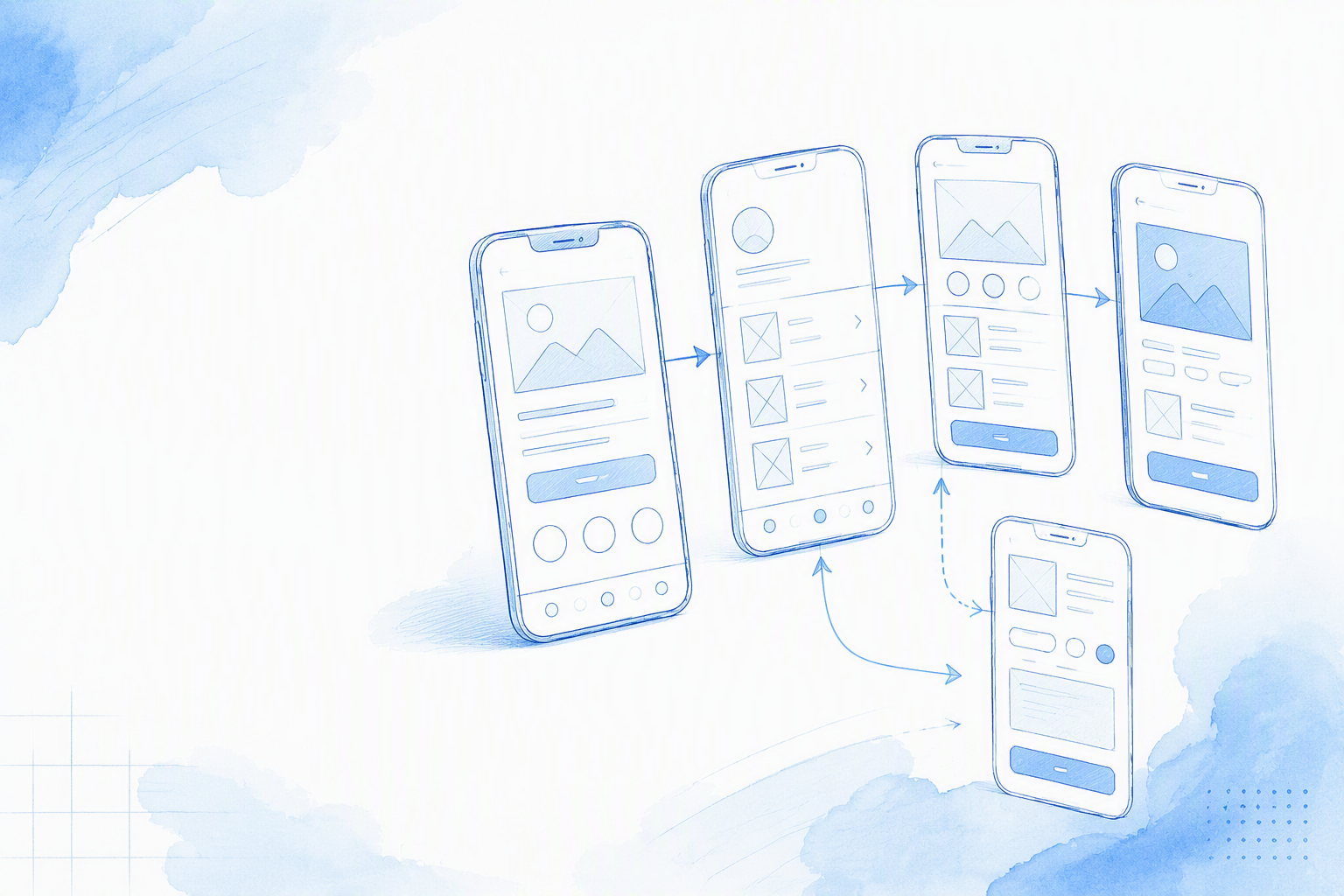
Many wireframe galleries focus on individual desktop pages. They often leave out the mobile decisions that affect the full experience: what stays fixed, what scrolls, what follows a tap, and how someone recovers when an action fails.
For a practical mobile gallery, we recommend connecting these screens:
- •Onboarding
- •Home
- •Searchable list
- •Detail
- •Checkout
- •Settings
- •Empty or error recovery
A polished standalone screen says less about a product than a rough but connected flow. Mobile experiences unfold across transitions, retained states, interruptions, and recovery paths.
Give every wireframe design example a compact specification:
- •Purpose: The problem the screen resolves
- •Entry point: How someone arrives
- •Actions: Primary, secondary, and destructive actions
- •Data: Static, dynamic, optional, and delayed content
- •Behaviour: Scrolling, persistence, validation, gestures, and transitions
- •States: Loading, empty, disabled, error, offline, and success
- •Platform notes: Relevant iOS or Android conventions
- •Completion criteria: The observable result of a successful task
How to Read Each Mobile Wireframe Example
Separate the visible layout from its implementation rules. The frame should show hierarchy and component placement. Structured notes can explain behaviour without covering the screen in arrows.
For each region, ask:
- •Does it scroll or remain fixed?
- •What does each tap trigger?
- •Does an action open a sheet, push a screen, or replace the current view?
- •What happens during loading or failure?
- •How does someone return?
- •Which state must the app retain?
One Connected Flow Beats Isolated Portfolio Screens
Trace a complete route. Onboarding might open home; home might lead to a filtered list; a row opens detail; detail begins checkout; and settings remains available through persistent navigation.
Back navigation also needs a rule. In many flows, it should restore the originating list’s scroll position, filters, sort order, and loaded results.
Use representative names, prices, descriptions, and labels where possible. Realistic content can expose truncation, localisation, hierarchy, and missing-media problems that generic placeholder text hides.
What Is a Mobile App Wireframe?
A mobile app wireframe represents screen structure, content priority, navigation, interaction rules, and important states before production styling. Balsamiq describes a wireframe as the structural foundation of a digital project. For mobile work, we extend that foundation across connected screens and platform behaviour.
Grey boxes alone do not define a useful wireframe. Its value comes from how clearly it communicates product decisions.
Common terms include:
- •User flow: A connected path through screens and decisions
- •Screen state: A version of a screen produced by data or system conditions
- •Safe area: Space that avoids system UI and device obstructions
- •Fixed region: Content that remains in place while another region moves
- •Scrollable region: Content that can move beyond the visible viewport
- •Developer handoff: Approved rules, assets, decisions, and acceptance criteria used for implementation
A wireframe is not a final specification for colour, typography, icons, spacing tokens, motion, imagery, or contrast. Those decisions still require detailed interface design.
Wireframe vs Mockup vs Prototype
A wireframe defines structure and behaviour. A mockup adds detailed visual treatment. A prototype allows the team to interact with simulated controls and transitions.
Connected wireframes can communicate substantial behaviour without becoming coded prototypes. Linked screens and concise state notes may be enough to review scope, discuss implementation, and uncover missing decisions.
For later stages, our guide to shippable mobile interface design explains how structural work progresses into production-ready UI.
Why Mobile Wireframes Need More Than Smaller Desktop Layouts
Shrinking a desktop grid does not produce a mobile experience. Mobile wireframes must account for safe areas, software keyboards, system bars, interruptions, permission prompts, touch input, and platform-specific navigation.
Remove assumptions that belong to desktop websites:
- •Browser headers
- •Hover interactions
- •Persistent desktop sidebars
- •Cursor-dependent controls
- •Desktop-oriented responsive breakpoints
We start mobile layouts with the target device, operating system, input method, and navigation model.
Low-, Mid-, and High-Fidelity Mobile Wireframe Examples
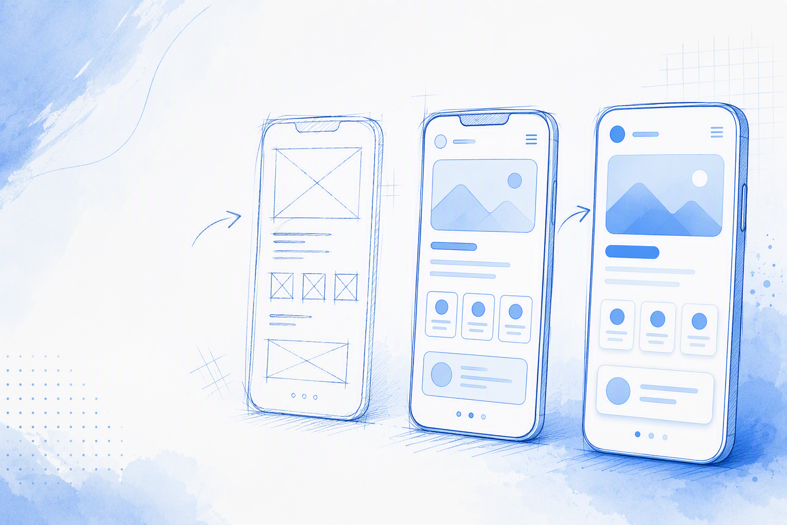
Wireframes are commonly grouped into low, mid, and high fidelity. We define these levels by communication precision rather than visual polish alone.
| Level | Visual detail | Best use | Main risk | Developer usefulness |
|---|---|---|---|---|
| Low | Basic regions and labels | Comparing structural alternatives | Behaviour may remain unclear | Low to moderate |
| Mid | Representative content and components | Flow reviews and early estimates | Some edge cases may be missing | High when annotated |
| High | Precise hierarchy and detailed states | Final structural review | May be mistaken for finished UI | High when annotated |
Consider a searchable list. A low-fidelity version might show a search bar, filter row, and repeated results. Mid fidelity adds representative content, pinned behaviour, loading, and empty states. High fidelity defines component variants, gestures, hierarchy, and transitions more precisely.
Low fidelity is not efficient if it leaves validation, loading, navigation, and errors unresolved. That work simply moves to a later stage.
Low-Fidelity Mobile Wireframe
Use low fidelity to compare structural directions quickly. Even rough frames should identify navigation, primary actions, fixed regions, and essential states.
A sketch that leaves every behaviour implicit may create more questions than it answers.
Mid-Fidelity Mobile Wireframe
Mid fidelity adds representative content, recognisable components, interaction rules, and state variations. In our experience, it is a useful default for flow reviews, stakeholder discussions, and early engineering estimates.
Include realistic content whenever its length or structure affects usability and hierarchy.
High-Fidelity Mobile Wireframe
A high-fidelity wireframe communicates precise structure and behaviour without claiming that branding or design-system tokens are final. We recommend stating that boundary during reviews.
Otherwise, stakeholders may treat the screen as finished while developers still lack essential implementation rules.
Onboarding and Home-Screen Wireframe Design Examples
Onboarding and home should form a continuous entry flow. The final onboarding action needs a defined destination. Skip behaviour should also clarify whether people enter as guests or meet account requirements later.
Onboarding Wireframe Example
Keep each onboarding screen focused on one decision. Show progress, an appropriate skip option, account creation, validation, and the route after completion.
Developer notes should define:
- •Whether progress persists after the app closes
- •When inline validation appears
- •How the keyboard affects the primary action
- •What follows permission denial
- •Whether skipped steps return later
- •Where successful completion leads
We generally recommend explaining the value of a permission before displaying the native system request. The wireframe should show that context as part of the flow.
Home-Screen Wireframe Example
The home wireframe should identify the primary action, personalised modules, and navigation hierarchy. Mark bottom navigation and persistent actions as fixed, then label the remaining content as scrollable.
Include loading and first-use states. If dynamic modules disappear when they have no data, specify whether nearby sections move up or preserve the original space.
List and Detail-Screen Wireframe Examples
List and detail screens show whether a flow preserves context. Opening an item and returning should not unexpectedly reset the list, filters, or position.
Searchable List Wireframe Example
Define row anatomy, search behaviour, filters, sorting, refresh, loading methods, and swipe actions where relevant. A useful handoff note is:
“List content scrolls beneath a pinned search and filter row.”
State whether refreshing preserves active filters and the current sort order. Define what happens when a search returns no results, loading stalls, or more results fail to load.
Mobile Detail-Screen Wireframe Example
Prioritise the title, status, key content, and primary action before secondary information. Define gallery gestures, expandable sections, sticky actions, missing media, delayed data, and confirmation for destructive actions.
Back navigation should preserve the relevant state from the originating list. We treat that behaviour as part of the product experience rather than an implementation detail to decide later.
Checkout, Settings, and Empty-State Wireframe Examples
Transactional and account-management screens need more behavioural detail than static content pages. Missing validation, failure recovery, or confirmation rules can create avoidable implementation and QA work.
Mobile Checkout Wireframe Example
A connected checkout may cover cart review, address, payment, totals, processing, failure, and confirmation. Show supported payment options, inline validation, and the layout with the software keyboard visible.
One possible rule is:
“Submit stays disabled until all required fields are valid.”
Then define duplicate-submit prevention, processing feedback, payment failure recovery, cancellation, and the success destination. Preserve valid input after recoverable failures unless there is a clear security or technical reason not to.
Settings Wireframe Example
Use grouped lists, appropriate toggles, drill-down rows, notification permissions, account controls, and a clear sign-out location. Keep routine preferences separate from destructive account actions.
Deleting an account or clearing data needs confirmation and an explicit result. Define whether failure returns to settings, leaves the account unchanged, and offers retry or support.
Six Empty States That Need Different Recovery Actions
“Nothing here” does not explain the cause or the next step. Match the response to the condition:
- •First use: Open the first-item creation flow
- •No results: Clear filters or revise the search
- •Cleared data: Create or restore content
- •Permission blocked: Open system settings
- •Offline: Reconnect and retry
- •Unexpected error: Retry the failed request
Each state needs distinct copy and behaviour because each represents a different problem.
Mobile Wireframe Sizes, Units, and Platform Constraints
Use a frame based on the target device rather than an arbitrary phone-shaped rectangle. For iOS, work in points; for Android, use density-independent pixels. Exported pixel dimensions depend on the target device and asset requirements.
Validate safe areas, system bars, software keyboards, readable type, and accessible controls. Apple’s Human Interface Guidelines and Material Design guidance should remain the reference for current platform requirements.
iOS Wireframe Canvas and Safe Areas
Place fixed bottom actions clear of system-owned areas. Test forms with the software keyboard visible so fields, validation messages, and submission controls remain reachable.
Platform notes should identify native iOS navigation, controls, permission prompts, sheets, and back behaviour. Avoid implying a custom interaction when a native convention is intended.
Android Wireframe Canvas and System UI
Account for status and navigation areas, including the relevant navigation mode. Define whether the keyboard resizes, moves, or overlays the content.
Identify Material components, Android back behaviour, permission handling, and system-owned UI. These notes help prevent teams from implementing an iOS-oriented wireframe unchanged on Android.
What to Label for Developers in Every Wireframe
A repeatable handoff template makes wireframes easier to discuss, estimate, and test. Include:
- •Purpose and entry point
- •Primary and secondary actions
- •Data and dependencies
- •Interaction and persistence rules
- •Loading, empty, offline, disabled, error, success, and cancellation states
- •Platform differences
- •Analytics requirements
- •Accessibility assumptions
- •Completion criteria
Label scroll direction, fixed elements, tap results, gestures, validation, component types, and back-navigation behaviour. Our guide to mobile app design from a blank page to developer handoff explains how these decisions become implementation-ready documentation.
Keep detailed rules beside the frame. Engineering can review them, while QA can turn completion criteria into acceptance tests without losing sight of the visible hierarchy.
Copyable Behaviour-First Annotation Examples
- •“Bottom action remains fixed above the system-owned area.”
- •“Refresh preserves active filters and the current sort order.”
- •“Empty-state CTA opens the first-item creation flow.”
- •“On success, return to detail and refresh its status.”
- •“Back navigation restores the previous scroll position.”
- •“Validation errors are announced, and focus moves to the first invalid field.”
What Annotations Should Not Do
Do not repeat labels already visible on the screen or describe decoration that belongs in production UI. “This is the blue button” adds no implementation value.
Do not leave native versus custom controls, dynamic data, accessibility behaviour, or edge cases implicit. An annotation should resolve a decision rather than narrate the canvas.
Create Mobile Wireframes With floow.design
Our floow.design workflow lets teams describe an app, generate connected screens, and revise hierarchy, navigation, content, and states through chat. Generated output still needs review; it does not replace product, design, accessibility, or engineering judgement.
Once the structure is approved, validate platform details and continue building or export to Figma. When choosing supporting tools, look for a mobile-focused user interface design application that preserves screen relationships and implementation context.
A Prompt for Generating a Connected App Flow
Include the platform, audience, screens, navigation, actions, representative content, states, and behaviour:
Create an iOS and Android wireframe flow for a shopping app used by busy parents. Include onboarding, home, searchable list, product detail, checkout, settings, and recovery states. Use bottom navigation, realistic product content, pinned search and filters, a sticky checkout action, and scrollable content. Include loading, offline, validation-error, zero-result, payment-failure, permission-denied, and success states. Preserve filters and scroll position after returning from detail.
A specific prompt gives the team more useful material to review than “make an app wireframe.”
Refine the Wireframe by Chat
Ask for alternative layouts before polishing one direction. Compare action priority, navigation depth, content density, and reachability.
Add missing cases with direct instructions:
- •“Show offline, validation-error, and zero-result versions.”
- •“Keep the checkout action visible above the keyboard.”
- •“Restore list filters after back navigation.”
- •“Create separate iOS and Android permission flows.”
Validate, Export, and Continue in Figma
Check safe areas, system bars, keyboard states, representative content, accessibility assumptions, and platform conventions. Walk through every route, including cancellation and failure.
Export after the team agrees on the structure. Keep behavioural notes attached so developers and QA receive more than a collection of polished static frames.
FAQ
What Is an Example of a Mobile App Wireframe?
A searchable list is a practical example. Pinned search and filters sit above scrolling rows, with separate loading, empty, and error states. Tapping a row opens detail, while back navigation restores the relevant list state.
How Do We Create a Wireframe for an App?
We start by defining the user flow, required screens, actions, data, and failure states. Teams can then generate or draw the connected flow, refine its hierarchy and behaviour, and validate keyboard, safe-area, navigation, and platform constraints before detailed visual design.
What Are the Three Types of Wireframes?
The common categories are low-, mid-, and high-fidelity wireframes. Low fidelity compares structural ideas, mid fidelity adds representative content and interaction rules, and high fidelity communicates more precise hierarchy and behaviour.
What Size Should a Mobile Wireframe Be?
Start with a canvas based on the target device and platform. Use logical layout units rather than relying only on export pixels, then validate safe areas, system UI, keyboards, and current platform guidance.
What Should We Label for Developers?
Label scrolling, fixed regions, tap results, gestures, validation, persistence, data dependencies, and important states. Include platform differences, accessibility assumptions, back behaviour, and completion criteria.
Can AI Create Mobile Wireframes From a Prompt?
AI tools can generate connected screens and alternatives when a prompt specifies the audience, platform, navigation, content, actions, and states. We still recommend reviewing conventions, edge cases, accessibility, and implementation notes before approving or exporting the flow.
Generate Your Connected Mobile Flow
Turn an app description into a connected set of screens, then refine the structure and states with your team. Create your mobile wireframe flow with floow.design and move into Figma when the flow is ready.