%20by%20%E2%80%9EPablo%20Stanley%E2%80%9D%2C%20licensed%20under%20%E2%80%9ECC0%201.0%E2%80%9D%20(https%3A%2F%2Fcreativecommons.org%2Fpublicdomain%2Fzero%2F1.0%2F)%3C%2Fdc%3Arights%3E%3C%2Frdf%3ADescription%3E%3C%2Frdf%3ARDF%3E%3C%2Fmetadata%3E%3Cmask%20id%3D%22viewboxMask%22%3E%3Crect%20width%3D%22704%22%20height%3D%22704%22%20rx%3D%220%22%20ry%3D%220%22%20x%3D%220%22%20y%3D%220%22%20fill%3D%22%23fff%22%20%2F%3E%3C%2Fmask%3E%3Cg%20mask%3D%22url(%23viewboxMask)%22%3E%3Cg%20fill-rule%3D%22evenodd%22%20clip-rule%3D%22evenodd%22%3E%3Cpath%20d%3D%22M705.3%201074a2351.1%202351.1%200%200%201-15.6-101c-1-7.7-2.5-16.4%202.7-22%207.3-8%2014-14.8%2014.8-26.2.8-10.7-2.8-22.4-5-32.8a809.4%20809.4%200%200%200-17.3-64.7c-6.6-21.7-13.9-43.2-21.3-64.6-6.9-20-13.5-40.3-22.5-59.5-17-36.5-46-63.5-81.6-81.6-9-4.5-27-20.5-36.3-24-8.5-3.4-8.5%206.3-16.9%202.6-6.7-2.9-13-6.7-16.7-13.2-4-7-14.3-16.9-15.9-25-3.3-17.4.3-32.2-12-45.3a90%2090%200%200%200-41.1-23.8c-33.7-9.3-78.5-2.8-98.8%2028.5-9.7%2014.9-13%2033-26.2%2045.1-11.4%2010.7-8.8%2018-23.6%2023.4-.9.3-23.6-4.5-24.4-4.2-16.2-3.5-31.7%206.2-46.5%2011.8a325.4%20325.4%200%200%200-63%2032.3%20399.2%20399.2%200%200%200-102.3%2098.5%20482.5%20482.5%200%200%200-76.4%20161c-1.7%206.4-3.5%2013-1.5%2019.4%201.7%205.3%205.4%209.2%209.8%2012.4%206%204.3%2018%207%2017.7%2015.7-.1%206.6-2.4%2013.5-3.5%2020-1.3%207.7-2.3%2015.5-3.4%2023.2-4.8%2035.4-8.6%2071-10.3%20106.6a920%20920%200%200%200-.5%20106c.1%202.3.8%204.5%202%206.2-1%20.4-1.2%202.4.1%202.7l2.7.5a12%2012%200%200%200%207%202.4l5.5.2c19.3%204%2038.6%207.9%2058.1%2010.8%2023.8%203.5%2047.6%206.3%2071.5%208.7%2049.2%204.8%2098%203.2%20147.1.6a1877%201877%200%200%201%20147.4-2c49.2%201.4%2098.4%203.5%20147.6%204.4%2055%201%20110-.5%20164.8-5%207.5-.5%2012.2-6.5%2010.7-14-8.9-44.7-19-89.1-27-134Z%22%20fill%3D%22%23694d3d%22%2F%3E%3Cpath%20d%3D%22m201%20597.5%201.2-.4c14.5-5.7%2029.6-14.8%2045.4-11.4.5-.2%2010.8%201.9%2017.9%203.2l-6.7%207L247%20598c40.7%2067.1%2088.8%20100.7%20144.3%20100.7%2055.5%200%2097.7-33.6%20126.4-100.7l4-1c.4%200%201%20.2%201.5.4%209.3%203.6%2027.4%2019.6%2036.3%2024.1%2035.6%2018%2064.5%2045%2081.6%2081.6%208.7%2018.6%2015.2%2038%2021.8%2057.5l.7%202c7.4%2021.4%2014.7%2043%2021.3%2064.6%206.3%2020.4%2012%2041%2016.6%2061.8l.7%202.9c2.2%2010.4%205.8%2022%205%2032.8a29%2029%200%200%201-3%2010.7l-80.4%2029%2038.4%20261.3c-35.1%201.5-70.3%202-105.5%201.3-49.2-.9-98.4-3-147.6-4.3-47.7-1.2-95.3-.7-143%201.7l-12%20.6a946.3%20946.3%200%200%201-139.5-1l-3.1-.3v-38.3l16.3-212.9-83-15.6-81.3-39.5a21.7%2021.7%200%200%201-5.6-8.8c-1.9-6-.5-12%201-18l.5-1.3a492.8%20492.8%200%200%201%2076.4-161A399.3%20399.3%200%200%201%20138%20629.7c19.8-13%2040.9-23.9%2063-32.3Z%22%20fill%3D%22%23ffcf77%22%2F%3E%3Cpath%20d%3D%22M232.2%20584.6c5.1-.3%2010.3.6%2015.4%201%20.4.1.6.8%200%20.9-9%201.9-18%204.5-26.9%207.1l-3.8%201.2c-10%203-19.8%206-29.6%2010-19.4%207.9-37.8%2018.5-54.8%2030.8C67.2%20682.8%2020%20754.3-9.9%20828.3a526%20526%200%200%200-24.3%2077c-.4%201.6-2%205.4-1%207%20.7%201.3%203.6%202.1%205%202.9l4.5%202.3%2025.2%2012.9%202.3%201.1c38%2018.6%2078.4%2034.4%20121%2035.5l.4-3.7a342%20342%200%200%201%209.9-60c.3-1%201.6-.6%201.7.3%203%2023.1%202%2046.4%201%2069.7-1.8%2041-4.3%2082.2-6.5%20123.3-1.2%2020.6-2.6%2041-3.9%2061.7-1.3%2020.5-1.7%2041.6-4.7%2062-.6%204.6-6%207-10%206.6-4.4-.5-7.9-4.5-8-9%200-11.9%201.5-24%202.4-35.8l2.5-33.8c3.1-41.1%206.8-82.2%2010.2-123.3a4771%204771%200%200%201%203.8-43.7C76.4%20979.8%2034.2%20963-6.1%20943.5c-.6%2013.2-2%2026.5-3.4%2039.6-3.8%2036.8-7.1%2073.6-9.6%20110.5a2254.2%202254.2%200%200%200-4.2%2092.7l-.2%207c0%204.4-.5%208.5-4.3%2011.7-3.7%203.3-8.9%203.5-12.6%200-5-4.6-4.2-10.9-4-17.1a1675.6%201675.6%200%200%201%201.8-47.2%201321%201321%200%200%201%2010.5-109.5l2-14c3.5-26%207.5-52.7%2015.5-77.9-3.1-1.5-6.2-3-9.3-4.7-5.5-2.7-11.2-5.4-16.6-8.4-4.2-2.5-7.9-5.8-9-10.8-1.4-5.5.6-11.5%202-16.9v-.4a502%20502%200%200%201%2026.6-80%20523.2%20523.2%200%200%201%2067.8-117%20353.8%20353.8%200%200%201%2088.7-83.3%20239%20239%200%200%201%2053.8-25.7%20142.6%20142.6%200%200%201%2042.8-7.5Zm90.1-66c6-6.5%2018.1.2%2015.2%208.8a108.2%20108.2%200%200%201-34.7%2052A79.4%2079.4%200%200%201%20247%20598l1.7%202.4a321.1%20321.1%200%200%200%2046.1%2052.6c36%2031.2%2084.8%2048%20132%2036%2037.1-9.4%2069.8-38.8%2079.4-76.2-1.3.6-3%20.9-4.8.5-7.7-1.7-15.3-9.8-20.3-15.6-5.3-6.3-9.5-13-12.6-20.7-5.6-14-7.4-32.1.3-45.7%201-1.7%203-.7%203.3%201l.3%202.5c1.5%2012.7%203.3%2025%209.3%2036.6a76%2076%200%200%200%2018.2%2023.1c2.6%202%205.8%203.6%208.1%206l.5.4c.6-5%204.1-7.3%207.6-7.2%203.3.2%207.3%201.6%208.8%202.3l.1.1a341%20341%200%200%201%2065.1%2042%20259%20259%200%200%201%2088.4%20129c7.5%2025.3%2011.8%2051.4%2016.3%2077.4l2.8%2016c4.2%2023.9%208.9%2048.4%2018.4%2070.7%202.5%205.7.6%2011.1-5.5%2013.4A1493%201493%200%200%201%20688%20953c3.7%2016%206%2032.5%208.7%2048.5%206%2034.1%2013.2%2068%2019.4%20102%203.2%2017.5%206.1%2035%209.3%2052.3l4.7%2025.2%202.4%2013.6.1.7c.5%202.4%201%204.9.4%207.3-.8%202.7-2.9%204.6-4.8%206.6-1.6%201.6-3.8%201.6-5.7.7l-.7-.3c-3.4-1.6-6-3.2-7.3-7-.7-2.5-1-5.2-1.5-7.7a3535.6%203535.6%200%200%201-7.8-43.6l-1.6-9.1c-5.2-31.4-10.2-62.9-12.8-94.5-1-14-2.3-28.1-3.5-42.2l-.9-10.5c-1.1-13.3-2.5-27-2.7-40.5l-4.5%201.6L657%20964c-5.5%202-12.5%206-18.4%205.2-2.9-.3-5-1.2-6.8-2.9%202%2028.8%204.8%2057.4%208.5%2086a1965.7%201965.7%200%200%200%2022%20135c.6%203.2%201.4%206.4%201.9%209.6.5%203.7-.5%205.9-2.5%209-1.7%202.4-5%203.7-7.8%202-3.6-2.3-5.5-4.3-6.5-8.4-1-3.7-1.6-7.6-2.3-11.4a1654.2%201654.2%200%200%201-11.4-65.2c-7.8-52-12.7-104.4-15.2-156.8a1388%201388%200%200%201-1.4-77.8c0-13.3.5-26.6%201.4-39.9%201-13.4%203-26.5%204.8-39.8%200-.5.7-.5.7%200%20.8%2014.9%202.1%2029.8%202.8%2044.7.6%2014.3.9%2028.5%201.4%2042.8.6%2018.7%201.5%2037.5%202.7%2056.2a9.6%209.6%200%200%201%208.5-3.1c4.7-1%209.7-3.4%2014.1-5l16.8-5.5%2026.4-8.7a679%20679%200%200%201-18-80.8l-2-12.3c-4-24.2-8.5-48.5-15.8-72a229.8%20229.8%200%200%200-34.8-68.2%20370.2%20370.2%200%200%200-52.7-55.3C557%20627%20539.7%20614%20523%20600c.1.9.2%202%200%203-3.5%2025.9-17%2050-35.8%2067.9-37.7%2036-93.6%2043.4-142%2026.5-46.7-16.3-88-55-102.6-102.8-.3-.8.8-1%201.3-.5l2.4%203.3c0-.4.2-.9.7-1a129%20129%200%200%200%2046.6-29.2%20100.2%20100.2%200%200%200%2021.3-33.3l.4-1c1.7-5%203.2-10.2%207-14.2Z%22%20fill%3D%22%23000%22%2F%3E%3C%2Fg%3E%3Cg%20transform%3D%22matrix(.99789%200%200%201%20156%2062)%22%3E%3Cg%20fill-rule%3D%22evenodd%22%20clip-rule%3D%22evenodd%22%3E%3Cpath%20d%3D%22m154%2059.3%208.6%2010.3c-4.7%203.4-9.2%206.8-13.5%2010.2a118%20118%200%200%201%2065-20.5c45.3%200%20137.4%2039%20158.2%2067%2010.3%2014%2029.5%2056.8%2039.5%20103.3%208%2037.4%2019.9%20143%208%20182.7-15.2%2050.7-65.3%2097.7-117%2097.7s-131.9-37.3-189-119c-2.6-3.8-32.5-8.1-54-22.2l5.7%2061.9%204.3%2036-1%202.5c-15.3%2041.4-27.4%2063-36.4%2064.8-9.1%201.9-27.7-13.1-55.8-44.9l-3.6-15c-9.1-38.5-13.7-59.1-13.7-62v-.5c.2-6.5%202.4-43.3%202.4-53.2V210C-8%20109.5%2020.7%2059.3%2048.2%2059.3H154Z%22%20fill%3D%22%23694d3d%22%2F%3E%3Cpath%20d%3D%22M82.4%2025.1a31.3%2031.3%200%200%201%2027.6%202.4%2048%2048%200%200%201%2041.7%2023.1l.5.6%201.8%202.2c1.8%202%203.6%204.2%205%206.6-7%20.1-13%203-17%208.8-3%204.2%203.7%208.2%206.7%204.2l.1-.1c2.5-3.5%206.3-4.9%2010.4-5%201.2%200%202.1-.4%202.8-1.1l.6%202.8c21-8.1%2043.6-10.3%2066-8.4-1%201.6-1.8%203.3-2.4%205.1-.7%202%20.8%204.4%202.8%205%202.1.5%204-.7%204.9-2.6v-.2c.9-2.5%202.3-4.6%204.2-6.2%2010.6%201.4%2021%203.7%2031.3%206.6%2012.4%203.6%2024.6%208%2036.5%2012.9-2%20.7-3.8%202-5%204.3-2.4%204.5%204.3%208.5%206.8%204.2l.1-.1.7-1%20.4-.1.6-.2h.3l.9-.2h2.3c1.8%200%203-1%203.5-2.3%206%202.6%2011.7%205.4%2017.5%208.3l1.3.8c17.7%209.2%2034.4%2021.3%2044%2039%20.7%201.3.9%202.6.7%203.8l6%207.6c5.9%208%2010.2%2017%2014.2%2026a282%20282%200%200%201%2018%2056c4.1%2018.5%207.5%2037.3%2010.6%2056.2%203.4%2020.9%206.3%2042%207%2063.2%201%2037.8-6.4%2075.8-27.6%20107.6-19%2028.4-47.5%2051-81.3%2058.2a114%20114%200%200%201-98-22.7c-4.3-3.7-3.7-11.2%200-15%204.3-4.2%2010.6-3.6%2015%200%2025.5%2021.6%2062.7%2025%2093.4%2014%2028.5-10.2%2050.8-33.7%2064.4-60%2016.7-32.2%2019.5-69.2%2017-104.7-1.4-19.6-4.4-39-7.4-58.3l-1.8-11.6c-2-12.7-4-25.3-6.7-37.8l-.7-2.9a256%20256%200%200%200-13.1-44.6%20240.2%20240.2%200%200%200-13.1-25.8c-1%20.3-2.3.4-3.6%200a145.6%20145.6%200%200%200-49.2-6.7c-9-.5-18%20.3-26.6%203a187%20187%200%200%200-2.5-2%206.6%206.6%200%200%201-5.4-4.3c-1-.9-2.2-1.7-3.3-2.5-2.7.7-5-1.6-5.7-4l-1.8-1.2-1.4.2c-2%20.2-4-.1-5.7-1a10.5%2010.5%200%200%201-4.6-5.4c-3.3.2-6.8-.9-9.8-2.9a29.7%2029.7%200%200%201-6.1-6%20209.5%20209.5%200%200%200-72-17.6%2099%2099%200%200%200-9.6%202.5c5.5-.7%2011-.8%2016.7%200%2026.9%204%2047.8%2024%2065.8%2043%204.3-.8%208.6%204.7%204.7%208.4l-31%2028.6c.8%203.2-2.9%206.4-6%205.6l-16.3-3.8a17.2%2017.2%200%200%201-17.8-1.7l-1.2-.8-1.2.9a8.7%208.7%200%200%201-6.2%201.2c-2.2-.3-4.2-1.5-5.9-2.8-1-1-3.6-4.6-5-4.9h-.1c1%200-2%202.9-2.9%203.4a9%209%200%200%201-6.3%201.8c-4.1-.4-7.6-4.1-9.6-7.6l-.2-.3v-.1.2h-.1c-.3.9-1.3%201.8-2%202.4a7.6%207.6%200%200%201-6.4%201.9c-2-.4-3.8-1.6-5.1-3.1l-.3-.3c-.4-.4-3-4-2.6-5h-.1c-1.7.4-3%200-4-.8-5.6-1.3-11.2-2.7-16.5-4.5l-1.3%203.5c3%201.8%205.7%204.4%208.1%206.2l14.2%2010.5%2018.7%2013.8%202-.6c2.8-.7%205.2.8%206.2%203.3v.2l1.5%203a9.8%209.8%200%200%201%209.9%206.8l3.5.1c3.2.4%205.4%202.8%204.8%206.1V211c1.8.8%203.2%202.4%203.5%204.7.5.8.9%201.6%201.2%202.5%201.3%204.8-1.3%2010.7-2.7%2015.3l-.2.3-2.7%209-2.4%207.5c-6.6%2020.7-13%2042.6-7.7%2064.3%201.2%204.6-4.7%206.7-7.3%203-6.1-8.6-12.8-16.8-19.8-24.7h-.4c-4.9-1-6.8-4.5-9-8-1.4.3-2.8.4-4.2.2-2-.4-3.8-1.6-5.2-3-1.2-1.2-2.3-4.4-3.7-5.1-1.8-1-5.3.4-7.4%200-1.7-.2-3.3-.8-5-1.5a27%2027%200%200%200-5.1%2013.4%2011%2011%200%200%201-1.6%204.8c3-.1%206%200%209%20.6%2010.9%202%2018.7%208.8%2023%2018.9.3.4-.3.8-.6.3-6.5-10-20.7-10.5-31-7-11%203.8-17.1%2013.4-19.3%2024.4-2.4%2012.1.7%2025.1%207.2%2035.4%203%204.8%207.2%209.1%2012.8%2010.9%206.5%202%2012.6-1.7%2019.3.3%204.6%201.3%206.7%205.7%205.8%2010.1-.3%201.8-1%203.3-1.7%204.6%202.4%204.8%204.6%209.8%207.5%2014.3%204.4%207%209.7%2012.8%2015.5%2018.7%206%206%2012%2012%2018.5%2017.5%206.1%205.4%2013.2%209.2%2019.6%2014.1%204.5%203.5%206.8%208.3%204.5%2013.9-1.8%204.5-8%208.4-13%206.4-9.6-4-18-10.7-25.7-17.7a89.8%2089.8%200%200%201-18-22.5c-4.4-7.8-7.6-16.8-10.3-25.4l-.4-1c-1.3-4.2-2.6-8.8-3.5-13.5a30.8%2030.8%200%200%201-18%202.6A40.2%2040.2%200%200%201%2074.2%20387c-2.9-3-5.5-6.6-7.7-10.5l.4%206.7c5.3%205.7%207.3%2014%205.5%2021.5a16%2016%200%200%201%203.3%2017c4.8%204.7%204.6%2012.3%202.5%2019.1a19.9%2019.9%200%200%201%201.8%2023.3l-.1.5c4.4%207.5%203.4%2017.1-2.1%2023.7%203.8%207.4%203.2%2017.3-6.4%2020.2-3.4%201-6.8.2-9.3-1.8%202.3%2011.5%203.3%2023%20.2%2034.6a11%2011%200%200%201-10.3%207.9c-4%200-6.8-2-8.8-5%20.3%205.9%200%2011.7-1.3%2017.5-.8%203.5-4%206.3-7.5%207.1a4.6%204.6%200%200%201%20.5%205.6c-5%209-17.4%205.3-18.2-3.3-3.5-2.6-5.1-6.9-5.8-11.5-1-6.7-1.3-13.3-2.4-20l-.4.4-.3.2v.5a10%2010%200%200%201-5%207c.6%205.7-.4%2011.5-4%2015.8-2.4%203-6.5%204-10%203.4h-.7c-8-1-12.7-8.6-10.6-15.6-3.2-4-4.5-9-3.6-13.9-6.2-4.1-6-13.2-4-20.5-6.5-5.1-9-14.7-5.6-22.4a24.5%2024.5%200%200%201-2.7-25.8%2013.9%2013.9%200%200%201%200-21c-3.5-6.9-5.5-15-2.1-21.2a13.8%2013.8%200%200%201-3.5-10.1c.4-5.4%204-9.1%208.4-11.6l.3-1.7c1%20.1%202.2-.2%203.1-1%201-1%202-1.8%203-2.4%201.2%200%202.2-.5%202.9-1.3%202-.7%204-1%206.3-1%205%200%205.1-7.5.5-8a4%204%200%200%200-2.8-1.1h-.9c-2%200-4%20.1-5.8%201a6.6%206.6%200%200%200-2.8%202.1c-.2%201.5-1%203-2.6%204a6.3%206.3%200%200%201-6.7.4c-3-1.8-3-4.4-2.7-7.4.8-6.4-3-12.4-2-19%20.4-2.9%201.3-5.4%202.9-7.4-3.3-5-4-11.4-1.4-16.9a19.4%2019.4%200%200%201-2.8-21.4l.1-.5c.4-1.2%201-2.3%201.5-3.3-3-5.1-3-11.5.1-16.6a16.4%2016.4%200%200%201-.6-19.7v-1.4a18.3%2018.3%200%200%201%201-15c-.8-1.9-1.5-4-1.9-6.2a36.8%2036.8%200%200%201%202-19.7c0-3.9.1-7.7.3-11.6-.7-3.2-.9-6.8-.9-10.1v-2.2c0-5.4-.4-13.4%203-18-2.2-5.1-1.2-11.4%202.5-15.4a15.2%2015.2%200%200%201%20.9-17.2c-.2-4.6.7-9.2%203.1-13.8%201.6-3%204-5.5%206.8-7.5l-.1-1.8c0-2.6.6-5.3%201.6-7.8-1.8-3-2.6-6.4-1.5-10%201.1-4.2%204.2-7.8%208-9.8.3-4%20.9-7.9%201.8-11.7-2.4-5.2-.5-12.1%204.8-15.2-.7-4.1%200-8.5%203-11.7%201.1-1.2%202.5-2.2%204-2.8A13.8%2013.8%200%200%201%204.8%2058a15.4%2015.4%200%200%201%2015.6-12.3%2011.2%2011.2%200%200%201%209.2-8.1%2052%2052%200%200%201%2022.5-12.2%2037%2037%200%200%201%2022.2%200l.5.3h.5c2.4-.4%204.7-.5%207-.6ZM23.8%20519c-2-.7-4.4.7-5%202.8a4%204%200%200%200%202.8%204.9c2.6.8%205.3%201%208%201a4%204%200%200%200%204-4%204%204%200%200%200-4-4%2018%2018%200%200%201-5.8-.7ZM5.4%20476.4c-3%200-5.7.7-8%202.9-1.5%201.4-1.5%204.2%200%205.7a4%204%200%200%200%205.5.1l.3-.3h.1l.4-.3-.3.2.6-.2h.3l1.1-.1c2.1%200%204.1-1.8%204-4a4%204%200%200%200-4-4ZM63.6%20451c4.3-2.6.5-9.4-3.9-7l-.1.1c-2.3%201.4-5%201.2-7.5%201.2-5.2%200-5.2%208%200%208h.8c3.7%200%207.5-.3%2010.7-2.3Zm-34-29.2c-3.3-.6-7-1.1-10.4-.8h-1.6a4%204%200%200%200-2.6%201c-1.1.5-2.2%201.2-3.2%202-3.9%203.4%201.8%209%205.7%205.7l.7-.5.2-.1h4.3c.4%200%20.8%200%201.1-.2l3.6.6c5%201%207.2-6.7%202.1-7.7ZM25.8%20345c-6.3-2.9-13.2-2.8-19%201.2-4.2%202.9-.3%209.7%203.9%207l.1-.1%201.6-1c3%201%206%201%208.7%200l.4-.2h.2c4.7%202.2%208.7-4.7%204-6.9Zm68.3-12.5c-6.4-.7-6.4-10.7%200-10a53.1%2053.1%200%200%201%2034.6%2017.8c4.2%204.8-2.7%2011.8-7%207.2v-.1a43%2043%200%200%200-27.6-14.9Zm-71-51.4c-1.4-.1-2.8-.2-4.2-.1-3.3.1-7.4%202.3-6%206.3%201.3%203.3%205%203.4%207%201.7l2.3.1c2.1.2%204.2.6%206.3%201%205%201%207.1-6.7%202-7.7l-2.2-.4a107.6%20107.6%200%200%200-3.7-.9h-1.5Zm-39.8-62h-.4c-6.8-1-17.6-.2-18.4%208.4-.5%204.8%206.4%205%207.7%201%205-.9%2010-1%2015-.5%202-2%202-5.6-1.2-6.5-.5-1.2-1.4-2.3-2.7-2.4ZM138%20204.5c-1.6-1.4-4.2-1.6-5.7%200-.9%201-1.6%202-2.2%203.2l-.4.7-.2.4-.4.7h-.1l-.2.2c-1.4%201.5-1.6%204.2%200%205.7%201.6%201.4%204.2%201.6%205.7%200%20.9-1%201.6-2%202.2-3.1l.4-.8.2-.4.4-.7.2-.1v-.1c1.5-1.5%201.7-4.2%200-5.7Zm-82-10.4c-5.7-4-12.4-4.2-17.6.7-3.7%203.4%201.8%209%205.5%205.7h.2l.4-.4c.7.5%201.5%201%202.5%201h1.6c.3.2.7.4.1%200%20.2%200%20.3.2.4.3l.3.2c1.5%201.4%204%201.6%205.6%200%202.6-.9%204-5.3%201-7.5Zm55-13%20.1-.1c5-1.4%202.9-9.1-2-7.7-5.4%201.5-7.9%206.4-9%2011.4-.4%202.1.7%204.3%202.9%205%202%20.5%204.4-.7%204.9-2.9.3-1.5.7-2.7%201.2-4l.4-.6c.1-.3.2-.3.7-.8l.8-.4Zm-83.7-40.4-.7-.1c-4.9-1.1-11.3-1.7-14.2%203.1-2.6%204.4%204%208.3%206.8%204.2h1.5c1.5%200%203%20.2%204.5.5%205%201.2%207.1-6.5%202.1-7.7ZM200.1%20110c3.6-3.7-2-9.3-5.7-5.7a38.4%2038.4%200%200%200-7.5%209.5c-1%201.9-.5%204.3%201.4%205.4%201.8%201%204.5.5%205.5-1.4%201.6-3.2%203.6-5.2%206.3-7.8Zm-46-9.6c-3.6%202.1-6%205.7-7.4%209.7-.7%202%20.8%204.4%202.8%205%202.1.5%204-.7%204.9-2.7v-.2c.4-1%201-2.3%201.8-3.3.6-.8%201.6-1.7%202.4-2%201.8-.6%203-2.2%202.9-4.1-3%201-5.8-.2-7.4-2.4ZM46.3%2083a11.4%2011.4%200%200%200-13-1.8c-2%201-2.4%203.8-1.4%205.5%201.2%202%203.5%202.4%205.5%201.4-.5.3.4%200%20.8-.1h1.2-.2l.6.1h.2l.6.5c3.8%203.6%209.5-2%205.7-5.6Z%22%20fill%3D%22%23000%22%2F%3E%3C%2Fg%3E%3C%2Fg%3E%3Cg%20transform%3D%22translate(315%20248)%22%3E%3Cpath%20fill-rule%3D%22evenodd%22%20clip-rule%3D%22evenodd%22%20d%3D%22M146.6%20241a40.7%2040.7%200%200%201-17.1-13.2c-1.5-2-2-4.2-1.6-6.2a8.9%208.9%200%200%201%209.6-7.2c1.9.3%203.7%201.3%205.2%203.5l.3.4a27%2027%200%200%200%2010%208.3c3.6%201.8%207.8%202.6%2012.1%202.1%208.3-1%2014-5.4%2020-11.4l2.2-2.3c.5-.8%201.1-1.2%201.9-1.5a4%204%200%200%201%204.6%201.6c.4.7.7%201.5.6%202.5a25.7%2025.7%200%200%201-8.5%2016.2c-5.1%204.9-12%208.2-18.4%209.4-7.1%201.3-14.4.4-21-2.3Zm24.2-96.6c7.6%204.6%2019%2015.3%2011%2026.6-9.6%2010-23.4-1.4-30.2-6.6-6.3-4-13.3%206.3-7.5%2011%2049%2036.3%2069-29.8%2030.5-36.4-4.2-.8-5.8%204-3.8%205.4ZM83%20102c.8-10.3%2016.6-12.7%2018.1-2.4a42%2042%200%200%201-4.3%2025.9c-4%207.9-14%204.2-14.7-3-1-9.7.3-14%20.9-20.5Zm120-4.5c2.2-3%205.4-4.9%209.2-3.8%2011.9%203.5%208.4%2020.4%204.2%2028.6-2.3%204.4-9.6%205.6-12.9%201.6-5.4-6.4-8-19.1-1.1-25.5l.6-1ZM96.6%2056.8l1.9-.3c5.8-1%2013-2%2017.1%202.7%202.2%202.5%203%207%200%209.4-5.1%204.2-10.8%202.6-17%203-5.1.2-10%201-14.9%202.5C73%2077%2064.2%2082.8%2055%2088.9c-1.2.8-2.4-.7-1.9-1.8a59.3%2059.3%200%200%201%2026-24.1%2064%2064%200%200%201%2017.5-6.2Zm95.6-4.6%201.4.3c15.7%203.2%2036%209.8%2043.4%2025.1.3%202.2%200%202.7-.3%203-.2.3-.4.7-1.4%201A36%2036%200%200%201%20226%2078l-2.8-1.4a77.7%2077.7%200%200%200-10.1-4.3c-7.5-2.4-15.1-4.1-23-5a9.4%209.4%200%200%201-4.5-1.8%207%207%200%200%201-2.6-4%207%207%200%200%201%20.8-5.8%207.4%207.4%200%200%201%203.6-3.1c1.5-.6%203.2-.8%204.9-.4Z%22%20fill%3D%22%23000%22%2F%3E%3C%2Fg%3E%3Cg%20transform%3D%22translate(279%20400)%22%3E%3C%2Fg%3E%3Cg%20transform%3D%22translate(179%20343)%22%3E%3C%2Fg%3E%3Cg%20transform%3D%22translate(203%20303)%22%3E%3C%2Fg%3E%3C%2Fg%3E%3C%2Fsvg%3E)
Most Gemini 3.1 design guides focus on web. Landing pages, dashboards, marketing sites.
But if you're building a mobile app — and you want to use Gemini 3.1 to speed up your design process — those guides leave out exactly what you need to know.
Mobile UI design has different rules. Touch targets need to be 44px minimum. Navigation patterns are different from web. Content density is lower. Thumb zones matter. And the model that produces a beautiful SaaS dashboard doesn't always produce a usable mobile screen.
I ran 4 specific mobile app UI prompts through Gemini 3.1 Pro — a fitness tracker, a food delivery app, a fintech wallet, and a meditation app — and documented exactly what worked, what didn't, and the prompting techniques that consistently produced better mobile results.
What Is Gemini 3.1 Pro and Why Does It Matter for Mobile Design?
Gemini 3.1 Pro is Google's February 2026 reasoning upgrade to the Gemini 3 series. It scored 77.1% on ARC-AGI-2 — more than double the reasoning performance of Gemini 3 Pro from November 2025. For designers, that improved reasoning translates directly to better spatial understanding, more coherent layout logic, and significantly better handling of complex prompt instructions.
What's new for UI/UX designers specifically:
- •SVG generation that actually works — Gemini 3.1 generates website-ready, animated SVGs directly from text prompts — icons, illustrations, loading states
- •1 million token context window — throw in a full design brief, screenshots, reference apps, and a detailed spec in one prompt
- •Generative UI — Google's new dynamic view feature generates custom interactive interfaces on the fly directly from prompts
- •Stronger aesthetic reasoning — Reddit's vibe coding community noted it "finally understands 'aesthetic' instructions without needing 10 prompt revisions" and produces output that looks "a level less AI-designed"
Where to access Gemini 3.1 Pro for design:
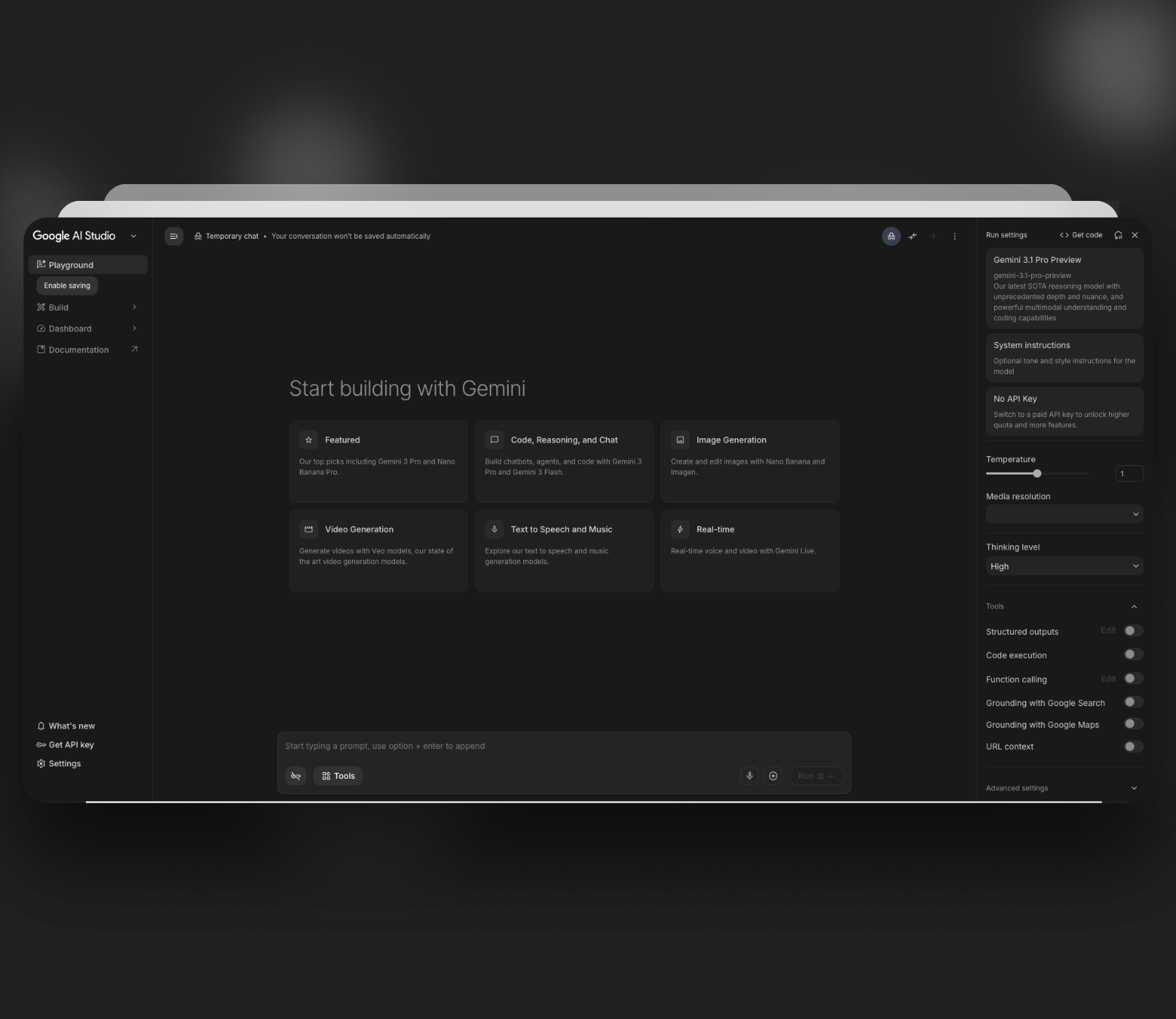
- •Google AI Studio — Free with rate limits. The "Build" section is your full-stack prototyping sandbox — go from prompt to working React app
- •Google Stitch — Prompt-to-UI generation with Figma export. Built on Gemini models, it generates complete interface designs with exportable HTML/CSS
- •Gemini app (Canvas mode) — Available for AI Pro and Ultra users. Regionally locked outside the US as of March 2026
- •Gemini CLI — Open-source terminal agent, free with 1,000 requests/day
Before You Start: The Mobile Prompting Mindset
Gemini 3.1 is powerful, but mobile UI prompts need a different structure than web prompts.
Here's what consistently produces better mobile results:
1. Specify the platform explicitly Don't say "design an app." Say "design an iOS mobile screen in portrait orientation" or "design a React Native screen using Material Design 3 principles."
2. Use markdown format for your prompt Markdown naturally creates content hierarchy, logical section grouping, and better AI readability. Ask Gemini to reformat your first prompt as markdown, then use that version for the actual generation.
3. Reference real apps you admire The quality of Gemini's output highly depends on how many details and references you provide. Mentioning "inspired by the navigation pattern of Instagram" or "card style similar to Airbnb" anchors the output in established mobile patterns.
4. Include mobile-specific constraints in every prompt
- •"Touch targets minimum 44x44pt"
- •"Bottom navigation bar for primary actions"
- •"Thumb-friendly layout — critical actions in the bottom third"
- •"Single-column layout"
5. Use the Thinking Level setting Gemini 3.1 Pro has a "thinking level" setting in AI Studio. For mobile UI, use medium or high thinking — it produces better spatial reasoning for screen layouts.
The 4 Mobile App UI Tests
Test 1: Fitness Tracker App — Home Screen
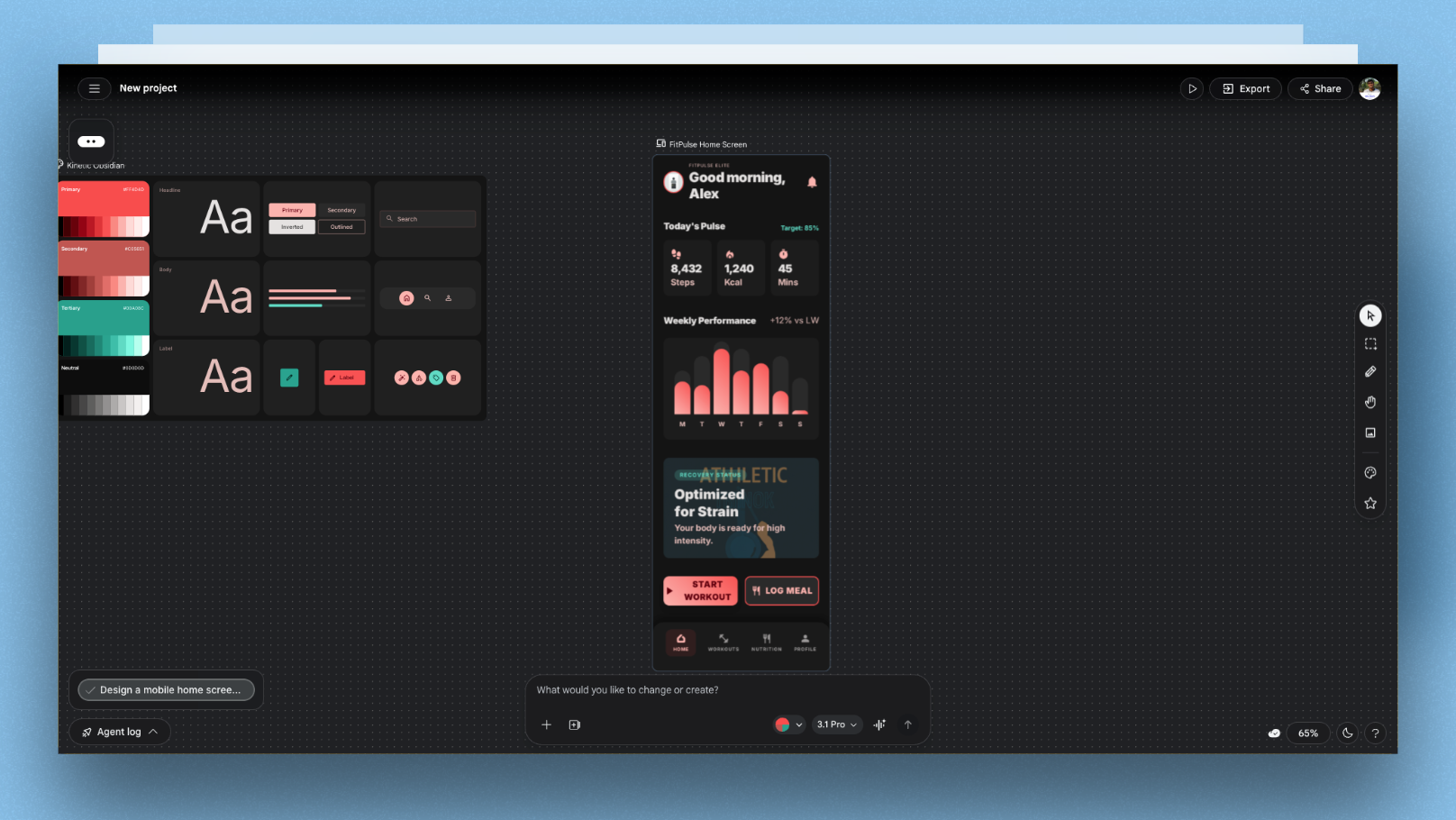
My prompt:
Design a mobile home screen for a fitness tracking app called FitPulse.

Platform: iOS, portrait orientation
Color: Dark background (#0D0D0D) with electric coral (#FF4D4D) accents
Typography: Bold, high-contrast headings

Layout (top to bottom):
- Header: greeting + avatar (top bar)
- Today's stats: 3 cards in a row (Steps, Calories, Active Minutes)
- Weekly progress: horizontal bar chart showing 7 days
- Quick actions: 2 large buttons — "Start Workout" and "Log Meal"
- Bottom navigation: Home, Workouts, Nutrition, Profile

Constraints:
- All touch targets minimum 44x44pt
- Critical actions in bottom 40% of screen
- Card corner radius 16px
- No text smaller than 14pt
- Inspired by the clean data density of Whoop
What happened:
Gemini 3.1 produced a layout with correct dark background, coral accents, and proper bottom navigation. The weekly chart rendered accurately with 7 bars. The stat cards were well-sized and readable.
Where it fell short: the "Start Workout" button was placed in the middle of the screen, not the bottom third as specified. A follow-up prompt fixing this — "move the quick action buttons to the bottom 40% of the screen above the navigation bar" — corrected it in one iteration.
Mobile-specific win: The touch target constraint was respected — buttons were generously sized and well-spaced.
Score for this test: 8/10
Test 2: Food Delivery App — Restaurant Listing Screen
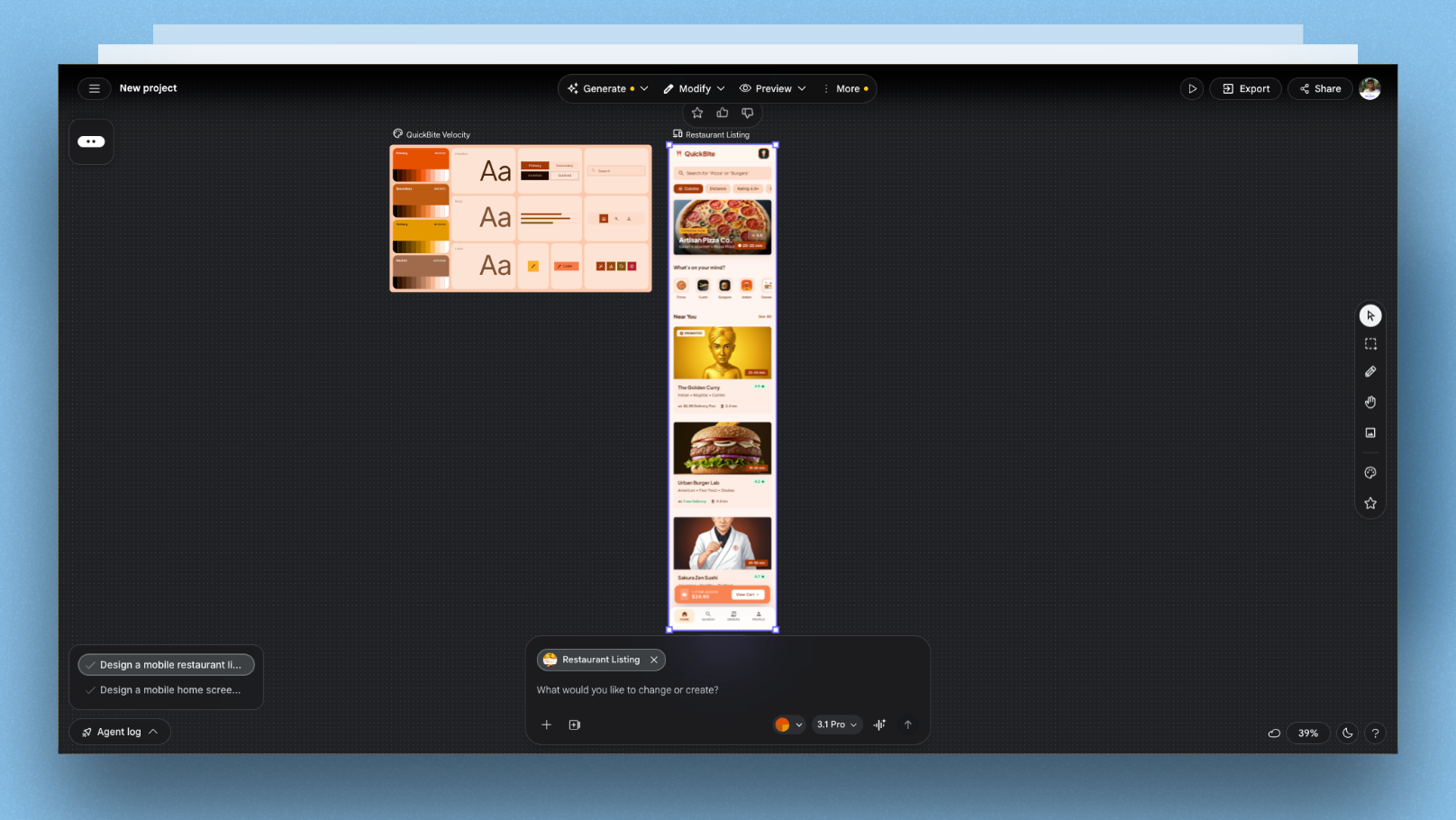
My prompt:
Design a mobile restaurant listing screen for a food delivery app called QuickBite.

Platform: Android, Material Design 3
Color: White background, deep orange (#E65100) primary, light grey cards
Typography: Google Sans, 16pt body

Layout (top to bottom):
- Search bar with filter chips below (Cuisine, Distance, Rating, Price)
- Featured restaurant card (full-width, image + name + rating + delivery time)
- Section header: "Near You" with See All link
- Horizontal scroll of category icons (Pizza, Sushi, Burgers, Indian, etc.)
- Vertical list of restaurant cards (image, name, cuisine tags, rating, delivery time + fee)

Constraints:
- Sticky search bar on scroll
- Category icons: 56x56dp touch target with label below
- Cards: 8dp corner radius, 2dp elevation shadow
- Delivery time badge visible on every card
- Reference: Swiggy's information density and card style
What happened:
This was the strongest output of the four tests. The filter chips were correctly rendered below the search bar. The category icon section had proper proportions. The restaurant cards included all required information elements with correct hierarchy — name most prominent, then rating and delivery time.
The Material Design 3 system came through clearly — correct elevation, correct corner radii, correct typography scale. Referencing Swiggy seemed to help Gemini understand the content density level.
Mobile-specific win: Category icons had correct 56dp touch targets with labels — something many AI-generated mobile UIs get wrong by making icons too small.
Score for this test: 9/10
Test 3: Fintech Wallet App — Transaction History Screen
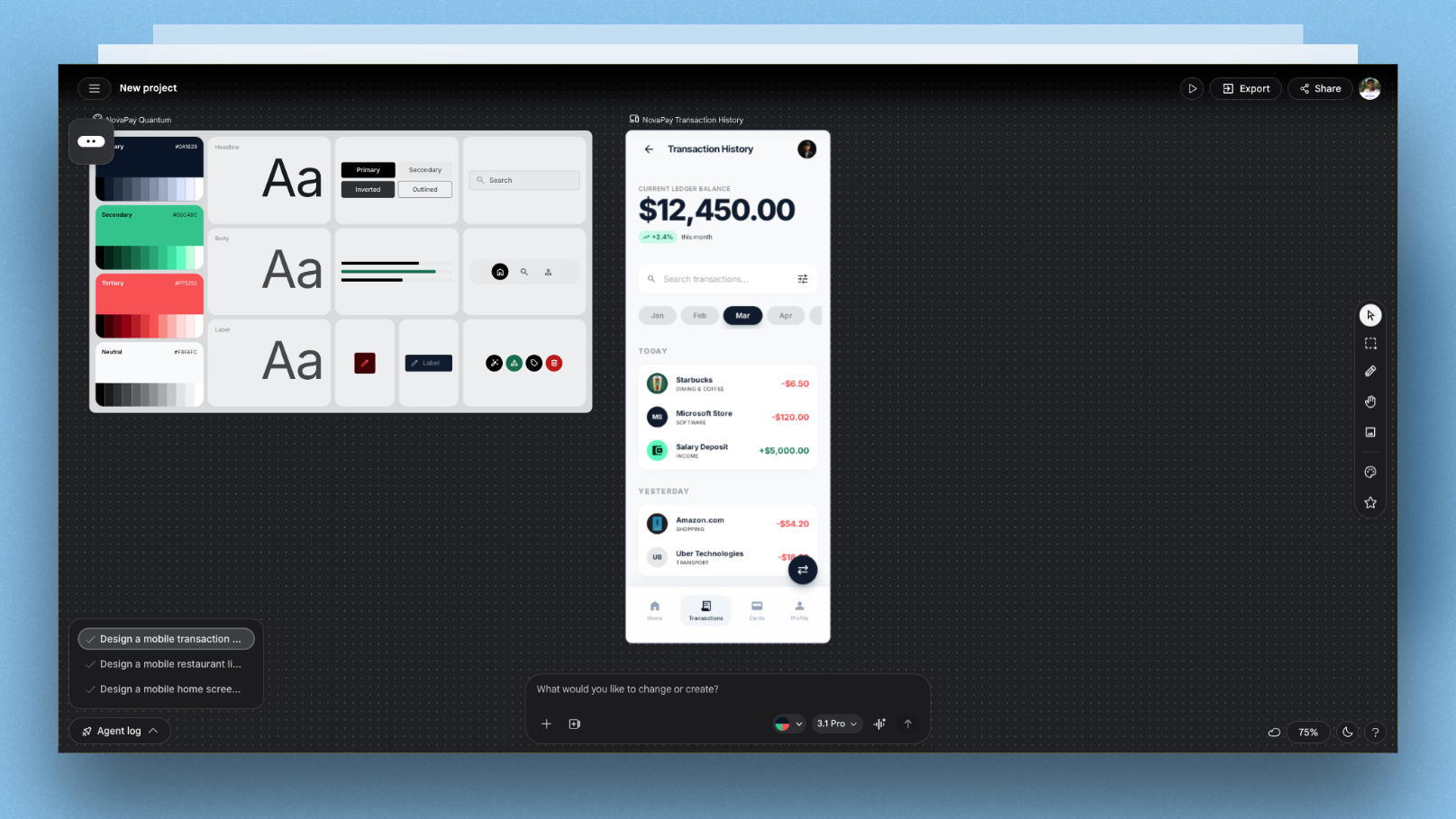
My prompt:
Design a mobile transaction history screen for a fintech wallet app called NovaPay.

Platform: iOS, portrait orientation
Color: Pure white background, deep navy (#0A1628) headings, green (#00C48C) for credits, red (#FF5252) for debits
Typography: SF Pro Display, bold balance at top

Layout (top to bottom):
- Balance card: large current balance + monthly change indicator
- Month filter: horizontal scrollable month chips (Jan, Feb, Mar...)
- Search bar with filter icon
- Transaction list: grouped by date, each item shows merchant icon + name + category + amount
- Floating "Transfer" CTA button at bottom right (FAB pattern)

Constraints:
- Transaction amounts: right-aligned, green for incoming, red for outgoing
- Date group headers: sticky while scrolling
- Merchant icons: 40x40pt circles, placeholder if no logo
- FAB: 56pt diameter, above navigation bar by 16pt
- Accessibility: minimum 4.5:1 contrast ratio for all text
What happened:
The balance card rendered well with the correct large-number treatment. The month filter chips were well-spaced. The transaction list had correct color-coding for credits and debits.
Two issues: the sticky date headers weren't clearly differentiated from transaction rows — they needed more visual weight. And the FAB position was correct but Gemini placed it at 8pt above the nav bar instead of 16pt as specified.
The accessibility constraint appeared to be respected — contrast levels looked strong across the screen.
Follow-up needed: One prompt to increase date header weight and adjust FAB spacing resolved both issues.
Score for this test: 7/10
Test 4: Meditation App — Session Player Screen
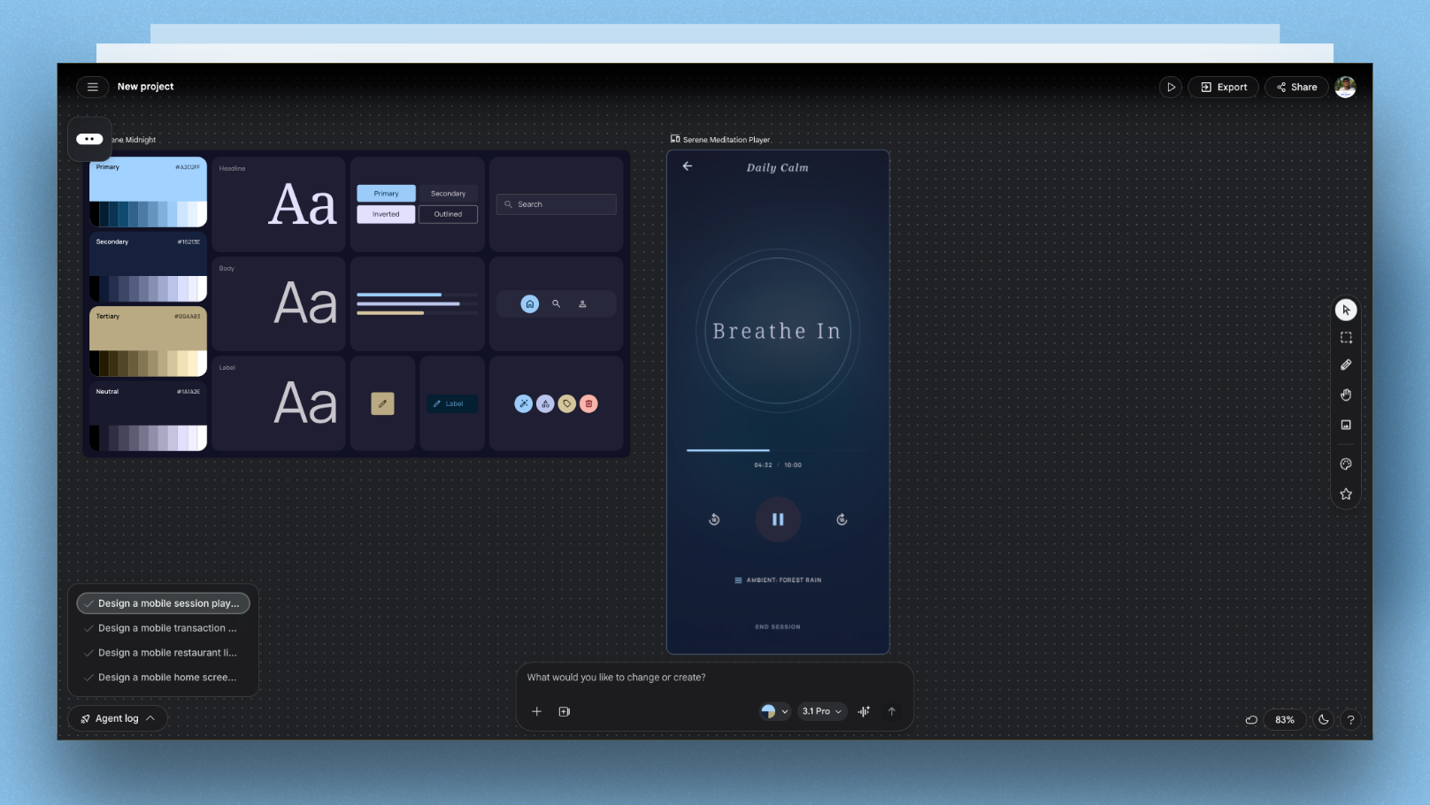
My prompt:
Design a mobile session player screen for a meditation app called Serene.

Platform: iOS, portrait orientation
Color: Deep gradient background (midnight blue #1A1A2E to dark teal #16213E)
Typography: Thin, serif headings for calm energy — use a light weight

Layout (top to bottom):
- Back arrow + "Daily Calm" session title (minimal top bar)
- Large circular breathing animation (pulsing ring — describe the state, not the animation)
- Breathing instruction: large text "Breathe In" / "Hold" / "Breathe Out"
- Session progress: subtle arc progress bar below the circle
- Timer: current time elapsed / total duration
- Controls row: skip back, play/pause (large), skip forward + ambient sound toggle
- Bottom: end session text link (not a button)

Constraints:
- Maximum 6 UI elements visible at once — keep it calm
- No cards, no containers — elements float on gradient
- Control buttons: 48x48pt touch targets
- Mood: think Calm app meets Headspace — minimal, focused
What happened:
This was Gemini 3.1's most impressive mobile output. The gradient was correctly applied and genuinely looked atmospheric. The breathing animation was described as a pulsing ring with inner and outer radius correctly referenced in the code. The floating-on-gradient aesthetic worked — no cards or containers appeared.
The constraint of maximum 6 UI elements kept the screen uncluttered. The end session text link (not a button) was correctly implemented without a border or fill.
Mobile-specific win: The "describe the state, not the animation" approach for the breathing ring worked well. The overall calm, minimal quality of the screen was genuinely impressive — it felt designed, not generated.
Score for this test: 9/10
Gemini 3.1 Mobile UI Scorecard
| Dimension | Score | Notes |
|---|---|---|
| Touch target accuracy | 8/10 | Generally respected when explicitly specified |
| Navigation pattern correctness | 8/10 | iOS and Android patterns mostly accurate |
| Mobile typography hierarchy | 7/10 | Good on first draft, needs tuning on complex screens |
| Aesthetic quality | 9/10 | Genuinely improved vs Gemini 3 — less "AI-looking" |
| Constraint adherence | 7/10 | Follows most but misses 1-2 specifics per prompt |
| Overall for mobile UI | 7.8/10 | Strong starting point — expect 1-2 follow-up prompts |
7 Prompting Techniques That Improved Every Mobile Output
Based on all 4 tests, these techniques consistently produced better mobile UI results:
1. Specify exact measurements "Corner radius 16px" works better than "rounded cards." "FAB 56pt" works better than "floating button."
2. Reference real apps by name "Inspired by Whoop's data density" or "similar to Swiggy's card style" anchors Gemini in established mobile patterns — it understands these products and uses their design logic.
3. Limit element count explicitly "Maximum 6 UI elements visible" or "keep it to 3 sections" prevents Gemini from overcrowding the screen, which is the most common failure mode in AI-generated mobile UI.
4. State the mood, not just the layout "Calm, minimal, focused" or "high-energy, data-rich" gives Gemini aesthetic direction that improves typography weight, spacing, and color choices beyond what explicit specs produce.
5. Use the markdown prompt format Format your prompt as markdown before submitting. The hierarchy of headers and bullet points maps directly onto screen layout logic. Ask Gemini to reformat your plain English prompt as markdown first, then use that for generation.
6. Always specify the platform "iOS" or "Android Material Design 3" significantly changes the output. iOS prompts produce SF-style typography and navigation patterns. Android prompts produce Material Design components correctly.
7. Include a "don'ts" line "No cards on gradient screens" or "no text smaller than 14pt" prevents the most common AI mobile UI mistakes. Gemini respects explicit prohibitions reliably.
The 3-Step Gemini-to-Production Mobile UI Workflow
Here's how to use Gemini 3.1 effectively in a real mobile app design workflow — from idea to something handoff-ready:
Step 1: Rapid Ideation in Google AI Studio (free) Use Gemini 3.1 Pro in AI Studio's Build section to generate 2-3 screen variations from detailed markdown prompts. At this stage, you're exploring layout logic and visual direction — not polishing.
Step 2: Iterate via follow-up prompts (1-3 rounds) Correct the 1-2 issues that almost always appear in the first draft. Use specific, measurement-based corrections: "Move the CTA to 16pt above the navigation bar" not "move the button down."
Step 3: Polish in a dedicated mobile UI tool Gemini gets you to a strong ~70-80% first draft. The remaining 20-30% — precise component spacing, platform-specific component behavior, touch state animations, design system consistency — requires a dedicated mobile UI tool.
This is where Floow fits into the workflow. It's built specifically for mobile app UI design — so instead of fighting Gemini's generic defaults on fine-grained mobile details, you use Floow to finalize the screens with proper mobile-native components and patterns before handing off to engineering.
The combination is genuinely powerful: Gemini for speed and direction, Floow for mobile precision.
Gemini 3.1 vs Gemini 3 vs ChatGPT 5 for Mobile UI
| Gemini 3.1 Pro | Gemini 3 Pro | ChatGPT 5 | |
|---|---|---|---|
| Mobile layout logic | Strong | Good | Strong |
| Touch target accuracy | Good (when specified) | Moderate | Good |
| Aesthetic quality | Noticeably improved | Generic | Strong |
| Constraint adherence | 80-85% | 65-70% | 75-80% |
| Platform specificity (iOS/Android) | Strong | Moderate | Strong |
| SVG / icon generation | Good | Poor | Good |
| Context window | 1M tokens | 1M tokens | 128K tokens |
| Free access | Yes (AI Studio) | Yes (AI Studio) | Limited |
| Thinking loop risk | Moderate | Low | Low |
The thinking loop caveat: On complex mobile prompts, Gemini 3.1 Pro can get stuck planning forever — writing long, repetitive reasoning before producing actual code. If this happens, start a new chat with a shorter, more focused prompt. Break complex screens into individual sections rather than asking for everything at once.
When Gemini 3.1 Is the Right Choice for Mobile UI
Use Gemini 3.1 when:
- •You need to explore 3-4 layout directions quickly before committing to one
- •You're working in Google AI Studio and want to go from prompt to working code fast
- •You're referencing well-known apps (Uber, Instagram, Airbnb) — Gemini understands their design patterns
- •You're comfortable with 1-2 follow-up prompts to correct specifics
Use something else when:
- •You need pixel-perfect results from a single prompt
- •You need tight design system consistency across 10+ screens
- •You're outside the US and can't access Canvas mode
- •You need native component fidelity (Core Motion animations, exact Material Design 3 specs)
FAQ: Gemini 3.1 for Mobile App UI Design
Can Gemini 3.1 generate mobile app screens, or just web designs?
Yes — Gemini 3.1 Pro handles both mobile and web UI design. For mobile, you need to be explicit in your prompt: specify the platform (iOS or Android), screen orientation, and mobile-specific constraints like touch target sizes. Without these, the model tends to default toward web-style layouts that don't translate well to small screens.
Is Google AI Studio free for generating mobile UI with Gemini 3.1?
Yes, with rate limits. Google AI Studio provides free access to Gemini 3.1 Pro via the Build section. Paid access with higher limits is available through Google AI Pro and Ultra plans. The Canvas feature in the Gemini app — which provides a visual preview — is currently limited to users outside the US as of March 2026, so check regional availability before relying on it.
What's the biggest mistake designers make when prompting Gemini for mobile UI?
Using web-oriented prompts without mobile-specific constraints. The two most impactful things you can add to any mobile UI prompt are: explicit touch target sizes (minimum 44x44pt for iOS, 48x48dp for Android) and a statement about navigation pattern (bottom navigation bar, tab bar, etc.). Without these, Gemini defaults to web conventions that break mobile usability.
How does Gemini 3.1 compare to Google Stitch for mobile app UI design?
They solve different problems. Gemini 3.1 in AI Studio generates working code from prompts — React components, full pages, interactive logic. Google Stitch generates visual UI designs with Figma export but no backend logic. For mobile app design exploration, Stitch is faster for visual-only work. For designers who want a working interactive prototype, AI Studio with Gemini 3.1 is the stronger path.
What's the best workflow for using Gemini 3.1 to design a full mobile app?
Start with Gemini 3.1 in AI Studio for rapid screen ideation — 2-3 variations of each key screen using detailed markdown prompts and real app references. Follow up with 1-2 correction prompts to fix the specific issues that appear. Then move to a dedicated mobile UI design tool to refine spacing, component behavior, and design system consistency before handing off to engineering. Using Gemini for speed and a specialized mobile tool like Floow for precision gives you the best of both approaches.
Gemini 3.1 Pro features and availability verified March 2026. AI Studio access and regional availability may change — check ai.google.dev for current status.