
Balsamiq wireframe alternative: Balsamiq vs Figma
Choose Balsamiq for rough mobile flow decisions and Figma for components and handoff. See where each adds a costly second design pass for iOS and Android.

The best balsamiq wireframe alternative depends on the stage: pick Balsamiq for early mobile app wireframes when you need feedback on flow and structure, not visual taste. Pick Figma once the work needs reusable components, responsive layout rules, and developer handoff. For a single tool across both stages, Figma is stronger, but it invites premature polish.
The short version
Our pick: Balsamiq for the wireframe stage; Figma for the production-design and handoff stage.
Best for: Choose Balsamiq for fast stakeholder alignment on a mobile app’s screens, navigation, and content hierarchy before visual design begins.
Skip it if: Do not choose Balsamiq as your only design tool if engineers need current iOS or Android components, responsive rules, inspectable specs, or a maintainable design system.
Key takeaways
- •Balsamiq wins early-stage wireframing because its rough visual language keeps reviews focused on structure rather than colors and spacing.
- •Figma wins after wireframes because components, auto layout, and developer-facing inspection make the screen set usable by a product team.
- •Balsamiq’s mobile kits are useful for flows but do not track modern iOS and Android component libraries closely enough for production decisions.
- •Using Balsamiq and Figma together is sensible, but it creates a second design pass that must be planned and budgeted.
- •If stakeholders need near-final mobile screens to make decisions, generate those screens directly instead of paying for both a rough and polished pass.
What's on this page
- •Pick the fidelity that matches the decision in front of you
- •Why Balsamiq’s rough look changes stakeholder feedback
- •Figma wins when wireframes must become buildable screens
- •Mobile kits are where Balsamiq starts to show its age
- •The two-tool workflow is valid, but budget the second pass
- •Who should choose each tool for a mobile app project
- •Free and open-source options are useful, but solve a different problem
- •Skip low fidelity only when near-final screens answer the real question
Pick the fidelity that matches the decision in front of you
For mobile app wireframes, Balsamiq is the better choice at the beginning of a project. Its deliberately sketchy controls make a login screen, account flow, or checkout path look unfinished. That is useful. A stakeholder is less likely to spend 20 minutes debating the shade of a primary button when the button visibly looks like a placeholder.
Figma is the better choice once decisions must survive contact with engineering. A team can turn a screen into reusable components, define layout behavior, document states, and give developers a source they can inspect. It is not merely a prettier wireframe canvas; it is where a screen set becomes a product-design artifact.
The expensive mistake is asking one tool to do both jobs without acknowledging the trade-off. Starting in Figma can make a three-screen concept look approved before navigation, empty states, and error paths are settled. Staying in Balsamiq too long leaves the team with a flow that still needs to be redesigned before a developer can build it.
Use this rule: choose Balsamiq if the meeting asks, “Do users understand where to go next?” Choose Figma if it asks, “What exactly do we build at 390 points wide, with this component state and this spacing?” Balsamiq wins the former. Figma wins the latter.

Why Balsamiq’s rough look changes stakeholder feedback
Balsamiq’s hand-drawn aesthetic is not a limitation to work around. It is the product’s central discipline. A rough card, tab bar, and input field signal that the team is discussing placement, labels, sequence, and information priority—not the final visual language.
That distinction matters most with non-design stakeholders. Put two versions of a five-screen onboarding flow in front of a leadership group. The polished version often attracts feedback such as “Can the button be blue?” or “This illustration feels too corporate.” The Balsamiq version more often produces the feedback you need at this stage: “Why are we asking for notification permission before explaining the benefit?”
It also makes changes psychologically cheaper. Removing a screen from a sketch feels normal. Removing a carefully styled screen in a Figma file can feel like discarding finished work, even if its flow is wrong.
Balsamiq is especially effective for:
- •first-pass app navigation and tab structure;
- •content hierarchy on dense account, finance, or operations screens;
- •alternate flow reviews with product, support, and compliance teams;
- •testing whether a six-screen journey should really be three screens.
It loses value once a reviewer needs to judge visual hierarchy created by actual type scale, color, platform conventions, or component behavior. A sketch can prove that a settings screen has the right sections. It cannot reliably prove that the same screen is comfortable to scan on a current Android device or iPhone.

Figma wins when wireframes must become buildable screens
Figma should win the moment a wireframe needs to carry production intent. Its components let a team define one button, input, list row, or bottom sheet and reuse it across 20 or 80 screens. Auto layout makes content changes less destructive: add a longer localized label or an error message, and the screen can adapt instead of requiring manual nudges on every frame.
Those are not cosmetic conveniences. Without them, the third day of a mobile design task usually turns into drift. One screen has a 16-point gap, another has 18. A destructive action uses a different button treatment in two flows. The empty state is forgotten because it was not attached to the component or screen variant that needed it.
Figma also has the stronger path to engineering handoff. Developers can inspect dimensions, assets, styles, and states from the design source rather than interpreting a static wireframe. That does not eliminate product questions, but it reduces the number of “which version is current?” messages after a sprint starts.
The drawback is that Figma makes it easy to reach for polish before the underlying flow deserves it. A tidy component library and a good mobile UI kit can make an untested idea look more settled than it is. Counter that with a review rule: do not approve colors, type details, or illustration direction until the team has agreed on the critical path, failure path, and empty state.
For handoff, Figma beats Balsamiq decisively. For an early conversation, that same strength can be unnecessary weight.

Mobile kits are where Balsamiq starts to show its age
Balsamiq includes mobile-oriented controls and symbols, so you can map an iOS or Android flow quickly. They are enough to communicate that a screen has a navigation bar, form fields, a list, or a bottom action area. Do not mistake that for a current platform component library.
Mobile interface conventions change in small but consequential ways. Navigation patterns, sheet behavior, typography, permission prompts, accessibility expectations, and system surfaces evolve. A rough kit is intentionally generic; it cannot be your source of truth for current iOS and Android behavior. That gap is more visible on screens with search, filters, complex forms, notification settings, or account-management actions.
Figma has the advantage here because it can hold the actual component library your product uses. Your team can work from current platform guidance, an established internal system, or a vetted UI kit, then customize only where the product requires it. A bottom sheet can be a bottom sheet with documented sizes and states, not a rectangle labeled “sheet.”
This does not mean every early wireframe needs platform-accurate controls. It means you should identify the transition point. For a five-screen concept review, approximate controls are fine. For a screen that will determine whether Android and iOS diverge, move into a real component system before decisions harden.
If you are evaluating tools specifically for mobile UI—not web mockups—score them on platform fidelity, state coverage, and handoff. A tool that draws a convincing phone frame but cannot express your production patterns will create rework later.
The two-tool workflow is valid, but budget the second pass
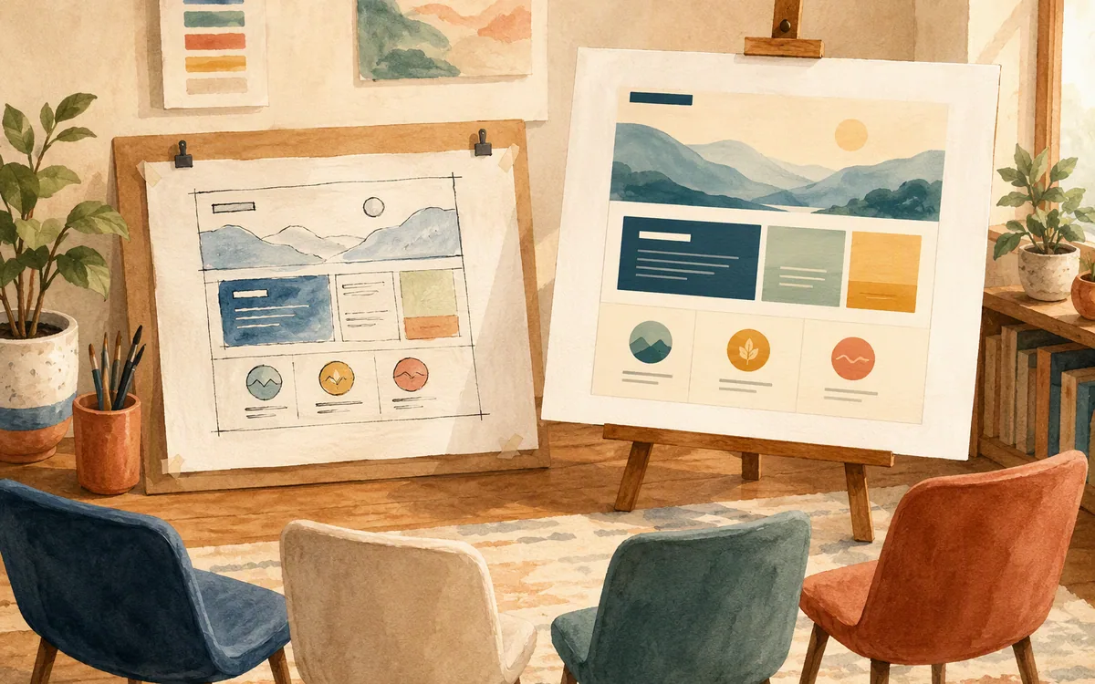
Many teams should use both tools. Start with Balsamiq to settle the job flow, then rebuild the approved set in Figma with real components and visual direction. That sequence protects the early review from pixel-level distractions while still giving engineering a reliable source of truth.
But call it what it is: a second design pass. It is not a file conversion problem. A rough six-screen flow often becomes 12 to 20 production frames after you add validation, loading, empty, success, permission-denied, and edge-case states. The Figma stage also requires decisions that the wireframe did not answer: typography, touch target sizes, truncation, token usage, visual priority, and Android-versus-iOS differences.
Plan for that cost before choosing Balsamiq as the default. It is cheap to make 15 rough screens in an afternoon. It is not cheap to turn those screens into a coherent, responsive, component-based product design after a stakeholder has approved only the happy path.
A practical workflow looks like this:
- •Sketch the core journey and two failure paths in Balsamiq.
- •Get written agreement on task order, content, and business rules.
- •Recreate only the approved direction in Figma.
- •Add component states and edge cases before engineering estimation.
Do not rebuild three competing wireframe directions in Figma “just in case.” Select one direction first. The handoff tool is where you should invest detail, not where you should keep every early option alive.
Who should choose each tool for a mobile app project
Choose Balsamiq if you are a product manager, founder, business analyst, or UX practitioner trying to answer structural questions fast. It is strongest when the team has an uncertain flow and an opinionated stakeholder group. You can show 10 account-management screens without accidentally turning a requirements review into a brand review.
Choose Figma if a designer and developers need to work from the same screen source. It is the right default for a team that already has a component library, expects multiple designers to contribute, or needs a serious handoff package. It also makes more sense if the first version must be close to a production UI because the design will be tested with users or reviewed against established brand rules.
Do not buy Balsamiq hoping it will replace production mobile design. It will not provide the component behavior, design-system governance, or developer-ready detail that a growing app team needs. Do not start every project in Figma just because the company already pays for it. A polished canvas can hide unresolved product thinking.
If your search is really for a figma alternative for android, separate two needs. You may mean an alternative for designing Android app screens, or you may mean an Android-native design application. Balsamiq addresses the first only at the wireframe level; it is not a production Android UI design and handoff system. Evaluate any alternative against the actual work your team needs to deliver, not the phone platform named in the search query.
Free and open-source options are useful, but solve a different problem
A balsamiq alternative open source option is usually attractive for ownership, self-hosting, or procurement reasons—not because it reproduces Balsamiq’s exact workshop dynamic. Penpot is the open-source design and prototyping product most buyers should assess first if they need collaborative interface design without committing to Figma. Test its component workflow, collaboration model, and export requirements against your team’s real project before standardizing on it.
For someone asking for a balsamiq mockups alternative free, start by defining “free.” A free plan may be suitable for a solo concept or a small internal exercise while placing limits on files, collaboration, or advanced workflow needs. An open-source product may avoid license fees but still require hosting, administration, and support time. Neither is automatically cheaper for a team of eight.
Free tools are often fine for a one-off flow map. They become risky when a design file becomes the record that product, design, and engineering all rely on. Before adopting one, test these four tasks with a real feature:
- •create 15 mobile screens and two alternate flows;
- •revise a shared list-row pattern everywhere;
- •review comments with people outside design;
- •give a developer the details needed to build one screen.
If the tool fails on the fourth task, keep it upstream for ideation rather than making it the delivery tool. The right purchase is not the cheapest editor. It is the one that prevents your team from rebuilding the same screens after every decision.
Skip low fidelity only when near-final screens answer the real question
There is a legitimate reason not to use Balsamiq at all: sometimes stakeholders cannot approve structure in the abstract. They need to see a near-final mobile screen to judge trust, content density, hierarchy, or whether a feature fits the product they already know. In that situation, rough sketches do not reduce debate; they postpone it.
floow.design is aimed at that case. You describe an iOS or Android screen set in plain English, iterate through chat, and generate near-final mobile screens rather than beginning with a deliberately rough wireframe. The output can move to Figma or code-oriented exports for Flutter, React Native, SwiftUI, and Jetpack Compose.
This is not a replacement for a whiteboard workshop, detailed vector work, a full interaction-prototyping suite, or an IDE. It is useful when your bottleneck is getting from a product brief to a credible set of mobile screens quickly. For example, a PM can specify a subscription-management flow with plan comparison, billing history, cancellation confirmation, and an error state, then review a coherent screen direction before commissioning a long manual buildout.
The trade-off is intentional: you lose some of the friction that makes Balsamiq excellent for purely structural conversations. Use the direct-to-screen approach when visual context is necessary for the decision. Use rough wireframes when visual context would distract from the decision.
Balsamiq vs Figma for mobile app wireframes and handoff
| Tool | Best stage | Mobile app strength | Main limitation |
|---|---|---|---|
| Balsamiq | Early flow and information-architecture review | Keeps feedback on task order, content, and structure | Dated mobile kits and no production-grade handoff workflow |
| Figma | Detailed design, systems, and engineering handoff | Components, auto layout, current UI libraries, and inspectable screens | Encourages visual polish before a flow is validated |
| Penpot | Teams evaluating an open-source collaborative option | Interface design and collaboration worth testing for a full workflow | Must be evaluated against your team’s specific handoff and operating needs |
| floow.design | Fast creation of near-final mobile screen directions | Plain-English generation, chat iteration, and exports to Figma and mobile code targets | Not a low-fidelity workshop tool, vector editor, IDE, or complex prototyping suite |
What it costs
Balsamiq is a paid product with trial access and licensing or subscription options that vary by product and team needs. Figma offers a free entry tier alongside paid per-editor and organization-oriented tiers. Penpot’s open-source and hosted options have different cost implications. floow.design uses paid plans beyond its trial. Published prices, limits, and plan names move, so check each vendor’s own pricing page before comparing a yearly team budget. More important than the headline price: include the time for a second Balsamiq-to-Figma pass if you expect engineering handoff.
Mistakes that cost you the most
Using a polished Figma screen as proof that the user flow works.
Review task order, missing states, and navigation separately before approving visual direction. A polished happy path can conceal a broken journey.
Treating a Balsamiq mobile symbol as a current platform specification.
Move flow-approved screens into a current iOS or Android component library before estimating engineering work.
Approving only the six happy-path wireframes.
Add loading, empty, error, permissions, destructive-action, and success states before the Figma handoff begins.
Choosing a free tool without testing collaboration and handoff.
Run one real feature through comments, revisions, component changes, and a developer build before making it the team standard.
Frequently asked questions
is balsamiq still worth using in 2026
Balsamiq is still worth using in 2026 for early mobile app flow discussions where stakeholders need to focus on structure, labels, and navigation rather than visual polish. It is not the right sole tool for production mobile design. Teams that need current iOS or Android patterns, reusable components, responsive layouts, and developer handoff should move their approved work into Figma or another production design system.
is there a free alternative to balsamiq
Yes, there are free alternatives to Balsamiq, but the best choice depends on whether you need solo wireframing, collaboration, or a full design workflow. Penpot is an open-source option worth evaluating for collaborative interface work. Free plans from other design tools can suit small projects, but file, collaborator, and handoff limits vary. Test a real 15-screen mobile feature before relying on any free plan.
balsamiq vs figma for wireframing mobile apps
For wireframing mobile apps, Balsamiq is better for early reviews because its sketch-like screens keep feedback centered on user flow and content hierarchy. Figma is better once the wireframes need to become detailed mobile UI with components, auto layout, platform-aware patterns, and developer handoff. Many teams use Balsamiq first and Figma second, but that creates a planned redesign pass rather than a direct conversion.
does balsamiq export to figma
Balsamiq does not provide a native workflow that turns a Balsamiq wireframe into an editable Figma design system file. You can export Balsamiq work as visual assets for reference and place those in Figma, but production screens, components, auto-layout rules, and states normally need to be recreated. Treat Balsamiq-to-Figma as a redesign step, not a clean editable export.
Should I skip wireframes and generate mobile screens directly?
Skip low-fidelity wireframes when stakeholders need near-final visual context to judge hierarchy, trust, content density, or fit with an existing product. floow.design can generate mobile app screens from a plain-English description and refine them through chat before export to Figma or supported code targets. Do not skip wireframes if the central risk is still basic task flow and you need to keep visual opinions out of the review.
Where this leaves you
Buy Balsamiq if your next decision is about structure. Buy Figma if your next decision is about building and maintaining the interface. If you are a PM tired of paying for rough wireframes and then a separate polished Figma pass, use floow.design to generate near-final mobile screens in one step—provided visual context, not low-fidelity discussion, is what your stakeholders need.
Design the screens before you commit to a tool
A PM tired of running two separate design passes, rough wireframes then polished Figma screens, wants a single generation step that produces near-final mobile screens.
If that is roughly your situation: describe the app in plain English and floow.design draws the iOS and Android screens, takes your changes by chat, and exports the result to Figma or to Flutter, React Native, SwiftUI and Jetpack Compose.
Free tools you can use right now
- •Color Picker from Image — free, no sign-up
- •iOS App Icon Sizes — free, no sign-up
- •Notch & Safe Area Simulator — free, no sign-up
Related reading
Design your mobile app with AI.
Generate pixel-perfect iOS and Android screens in seconds, then export to Figma or code.
You might also like…
 Guides24 September 2026Balsamiq Alternative for Higher Fidelity DesignMove beyond sketch-style wireframes without losing the flow work your team already did. Compare Figma, Google Stitch, and Uizard.By floow.design Team, Mobile Design
 Insights24 September 2026v0 app vs Lovable for Mobile App UICompare v0 and Lovable in three mobile UI jobs: React Native, Next.js mobile web, and visual iteration—plus the honest winner before you pay.By floow.design Team, Mobile Design
 Insights24 September 2026Lovable vs. Bolt for Website and Mobile App UILovable vs Bolt.new for mobile app UI: compare prompt fidelity, native patterns, code handoff, Figma workflows, and credit-based pricing before you buy.By floow.design Team, Mobile Design