
Lovable alternative free Reddit: Leaving Lovable
Leaving Lovable? Keep your content and screen inventory, then rebuild web-shaped UI as iOS and Android screens without carrying over the wrong navigation.

For people searching “lovable alternative free reddit,” use Figma’s free plan to document and redesign existing screens, but choose floow.design if the real job is regenerating iOS and Android screens from the same product brief. Lovable’s web-shaped output can preserve copy, entities, and a screen inventory; it should not be treated as mobile-ready code. v0 and Bolt.new are also web-first, not a clean native-mobile migration destination.
The short version
Our pick: floow.design for rebuilding the mobile screen layer; Figma for a free manual migration workspace.
Best for: Teams keeping a Lovable product concept and content model but rebuilding it as proper iOS and Android screens.
Skip it if: Do not pick it if you need to preserve Lovable’s generated web code, build a browser app, or create complex clickable prototypes with detailed interaction logic.
Key takeaways
- •Do not migrate a Lovable project by treating its generated web UI as a mobile app design; migrate the product information behind the UI.
- •Save the screen list, user flows, copy, entities, states, and asset references before rebuilding anything.
- •Lovable’s generated code can be useful as a content reference, but it is not organized around native tabs, stacks, sheets, safe areas, or platform conventions.
- •Figma is the best free place to inventory and manually redesign a migration; it is not an automatic conversion path from generated web code.
- •For a 12-screen product, re-describing the product for mobile-native screens can remove roughly four to eight hours of screen-by-screen web retrofit work, using a practical 20–40 minute planning allowance per screen.
What's on this page
- •Do not confuse a working Lovable app with a mobile design source file
- •What to save before you switch tools
- •What cannot be carried over cleanly
- •The practical migration path: inventory, map, regenerate, validate
- •Why re-describing the product is usually faster than retrofitting it
- •Where Figma fits—and where it does not
- •How v0 and Bolt.new compare after you leave
- •Make the switch without breaking the handoff to development
Do not confuse a working Lovable app with a mobile design source file
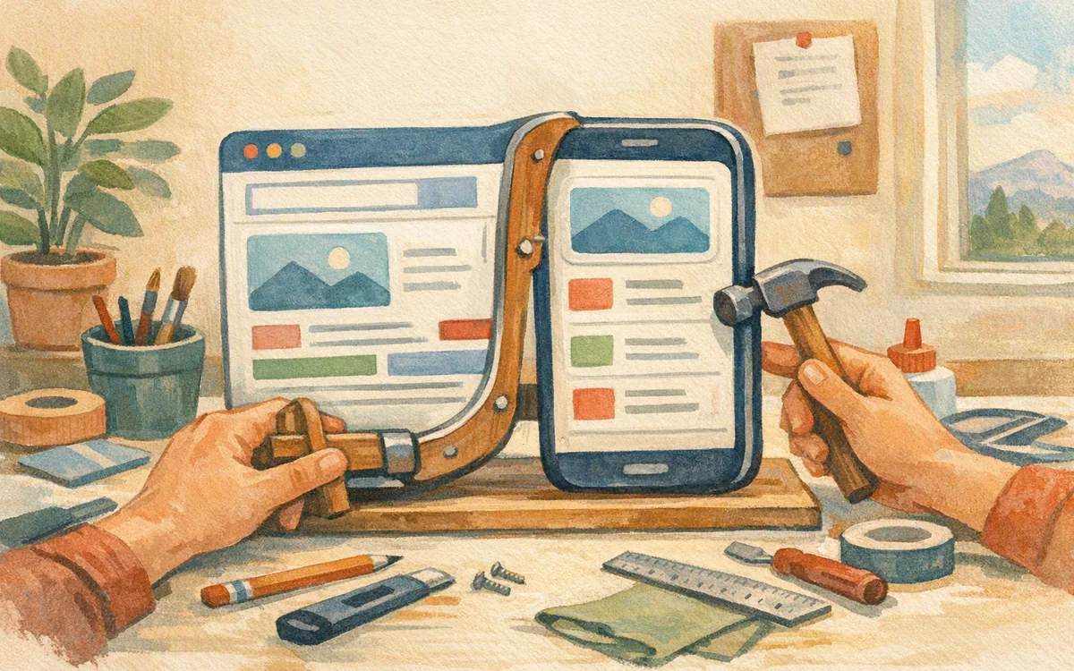
Lovable can get a browser-based product concept into view quickly. That is valuable. The trouble starts when you take a responsive web interface and call it an iOS or Android app.
Its output tends to carry web-app assumptions: persistent side navigation, wide cards, desktop-density tables, controls placed for a pointer, and pages that grow vertically because there is no mobile navigation hierarchy to protect. A narrow browser preview is not proof that the design follows mobile patterns.
On a real phone, the missing decisions show up immediately:
- •Is this destination a tab, a pushed screen, or a modal sheet?
- •Where does a user go after saving, cancelling, or completing a task?
- •Which action belongs in a bottom bar versus an overflow menu?
- •What happens when the keyboard covers the primary action?
- •Does the screen respect safe areas, compact headers, and platform back behavior?
You can keep the product idea. You should not keep the visual structure by default.
This matters most after screen six or seven. A web-first build may look acceptable on a dashboard and settings page. Then you add checkout, onboarding, search, detail views, empty states, permission prompts, and account recovery. Each web-shaped decision creates another mobile exception. By the third day of retrofitting, you are no longer adapting a design. You are replacing it one navigation decision at a time.
What to save before you switch tools
Treat the existing project as a discovery artifact. Before cancelling access, create a migration packet that another designer, developer, or AI screen tool can understand without opening the old project.
Save five things.
- •Screen inventory. List every route and state: home, search results, product detail, cart, checkout, sign-in, errors, empty states, loading, and success. A 12-screen product commonly becomes 20 or more screens once states are counted.
- •Content structure. Copy field labels, categories, card contents, list row data, filters, account settings, and repeated components. These are the parts that take longer to rediscover than to redraw.
- •Product copy. Preserve headings, helper text, button labels, validation messages, and onboarding language. Put it in a document, not only in screenshots.
- •Flow evidence. Capture the order of tasks: what starts a flow, what data is collected, and what success looks like. Annotated screenshots are enough.
- •Assets and references. Export or locate image files, icons you have rights to use, brand colors, and any API or data-model notes.
Generated source code can also be worth keeping as a reference for names and content relationships. It can show that an order has line items, that a profile has preference fields, or that a search result links to a detail view. That is useful salvage. It is not a reason to rebuild a native app around the code structure.

What cannot be carried over cleanly
The expensive assumption is that generated web code can be converted into a proper mobile app by changing the framework. It cannot, at least not without redesign work that is larger than the conversion suggests.
Lovable’s generated code is not built around mobile navigation or platform conventions. A React-style web page hierarchy does not answer how an iOS user expects back navigation to work, which destinations deserve bottom tabs, or whether Android should use a top app bar, a sheet, or a full-screen route. Responsive CSS does not turn mouse-sized targets into touch-friendly controls.
You also cannot safely carry over these decisions without review:
- •Desktop tables and multi-column dashboards
- •Sidebar information architecture
- •Hover-only affordances and tooltips
- •Wide modal dialogs
- •Browser-style forms with long, uninterrupted field stacks
- •Web loading, empty, and error treatments
v0 has the same core limitation for this migration. It is excellent for generating web UI ideas and code-oriented web interfaces, but it is not a v0 lovable alternative for someone who needs native mobile information architecture. Bolt.new likewise helps create web applications quickly; changing tools between two web-first generators does not solve a mobile-screen problem.
Keep the intent behind each screen, not the assumptions embedded in its layout. If you keep trying to preserve every component, you will produce a phone-sized website with native app packaging around it.
The practical migration path: inventory, map, regenerate, validate
A useful migration has four passes. Run them in order. Skipping the inventory pass is how teams spend a week recreating copy and edge states they already had.
First, inventory the old build. Make a spreadsheet with screen name, purpose, input, output, primary action, secondary action, and states. Do not begin with pixels. Start with what each screen must let a person accomplish.
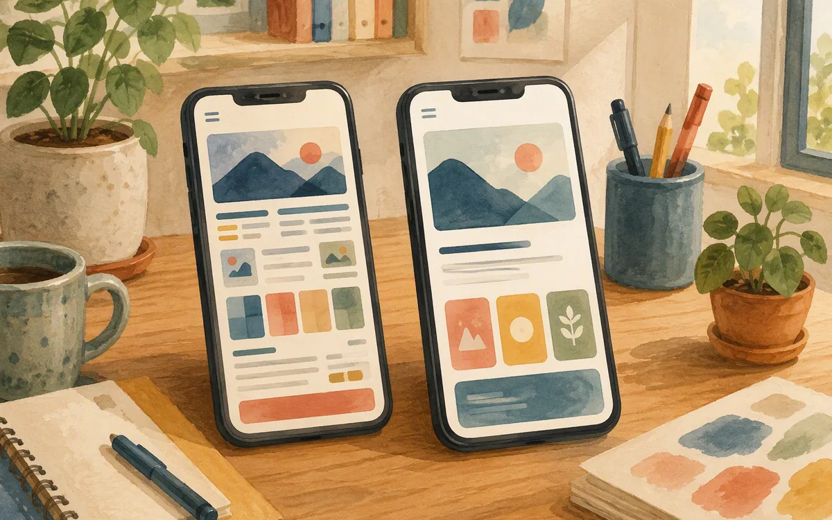
Second, redraw the flow as mobile navigation. Mark each destination as a bottom-tab root, pushed detail screen, modal sheet, full-screen task, or temporary state. For example, a web dashboard may become a tab-root summary; its individual cards become pushed detail screens; filters become a bottom sheet; account settings becomes a stacked settings flow.
Third, regenerate or design the screen set from the product brief. Give the new tool the same user, core task, content fields, and constraints. Ask for iOS and Android screen patterns explicitly. This is where floow.design fits: it can generate mobile app screens from a plain-English description, iterate by chat, and export the resulting work to Figma or mobile code targets.
Fourth, validate the seams. Review every transition: keyboard open, long text, empty data, failure, destructive action, sign-out, and return from a detail screen. A polished home screen does not prove that the app flow works.
The result is not a literal conversion. It is a faster rebuild based on validated product material. That distinction prevents the migration from becoming an endless CSS cleanup project.

Why re-describing the product is usually faster than retrofitting it
A team often resists regeneration because it sounds like starting over. It is not. Starting over means rediscovering users, flows, content, and business rules. You already have those. What you are discarding is the web layout that does not belong on a phone.
Use the old project to write a compact mobile brief. For each feature, state the user goal, the data shown, the action available, and the completion state. A brief for a shopping feature might say: “A signed-in customer browses categories, filters products, views product details, adds an item to cart, and checks out. Product cards show image, name, price, rating, and availability.” That is portable. “A three-column card grid beneath a sidebar” is not.
For planning, budget 20 to 40 minutes to inspect and rework each web-shaped screen into a mobile-native pattern. On a 12-screen core flow, that is roughly four to eight hours before you account for revisions and states. Re-describing the same product avoids much of that screen-by-screen correction because the output begins with a phone-sized hierarchy rather than a desktop page squeezed down.
The savings are not magic and they are not a guarantee. Complex workflows still need review. The point is narrower: you should spend your time deciding what belongs in a sheet, tab, or next screen—not moving a sidebar into a hamburger menu for the ninth time.
Where Figma fits—and where it does not
Figma is the best free workspace for this migration if your immediate need is control. Its free tier can be used to create a screen inventory, place reference screenshots, write annotations, build a component library, and manually redesign the highest-value flows. It gives you an editable design file rather than another generated codebase.
Use it for three jobs:
- •Build a one-page map of old screens and new mobile routes.
- •Create a small mobile component set: buttons, inputs, list rows, cards, navigation bars, and sheets.
- •Review consistency across iOS and Android variants before development starts.
Do not expect Figma to automatically convert a Lovable project into editable native mobile screens. A screenshot placed in Figma is a reference image, not a design system. Generated HTML or React code is also not a Figma file. Any direct export or integration option should be confirmed in the current vendor documentation for your workspace before you make it part of the plan.
The manual route is worth it for a small product, a design-led team, or a project with strict brand rules. It is slower if you have 15 to 30 screens with repeated content changes. In that case, use Figma as the review and handoff layer, not necessarily as the place where every first draft is drawn from scratch.
How v0 and Bolt.new compare after you leave
If the reason for leaving is mobile-native screens, neither v0 nor Bolt.new is the winner. Both are reasonable choices when your next product remains a web app and you want to move quickly from text to browser-oriented UI and implementation. They are not the clean answer to a web-to-mobile migration.
Choose v0 if you are still building a web product and want a fast route to web UI concepts that your engineering team can adapt. It can be a good companion for marketing pages, internal dashboards, or browser SaaS views that sit beside your mobile app.
Choose Bolt.new if you want to assemble and iterate on a web application in a browser-based environment. It may suit a prototype whose actual destination is the web, not the App Store or Google Play.
Choose Figma if cost is the primary constraint and you can accept manual mobile redesign. This is the honest answer behind many searches for the best lovable alternative reddit threads surface: free usually means you pay with design time, setup, and review.
Do not choose any of the three because you expect an automatic native conversion. That expectation is where a migration budget disappears. The decision is simpler than comparison grids make it look: web app next, choose a web tool; mobile screen system next, use a mobile-focused screen workflow; no budget, document and redraw in Figma.
Make the switch without breaking the handoff to development
Finish the migration with a deliverable your developer can use. A folder of attractive screens is not enough. For each flow, include the navigation map, screen states, content rules, and platform notes.
A minimum handoff package should contain:
- •A numbered list of screens and states
- •The primary user flow and alternate paths
- •Copy for labels, errors, and empty states
- •A component list with variants
- •Platform decisions, such as tabs, back behavior, date pickers, and destructive-action confirmation
- •Asset references and data-field names
Then review it on an actual phone-sized frame. Check whether a bottom action survives the keyboard, whether cards can display long names, whether a list has an empty state, and whether a user can get back from every detail page. These are small checks that prevent the familiar late-stage request: “Can we make it feel more like an app?”
If your team is stuck reshaping browser layouts into tabs, stacks, sheets, and touch targets, keep the old product brief and content rather than the old screen geometry. floow.design lets you regenerate mobile-native screens directly from that material, then take the work into Figma or export it toward Flutter, React Native, SwiftUI, or Jetpack Compose. That is the sensible handoff: preserve what the product knows, replace the web shell that no longer fits.
What survives a Lovable migration—and which tool solves the next job
| Tool | Best use after leaving Lovable | What you can carry over | Main limitation for mobile migration |
|---|---|---|---|
| Lovable | Keep it as the source of product intent and existing web-app reference | Copy, content structure, route list, asset references, rough screen inventory | Generated web UI and code are not a native mobile navigation system |
| Figma | Free manual redesign, review, and design handoff | Screenshots, copy, flow maps, components recreated by hand | Does not automatically turn generated web code into editable mobile screens |
| v0 | Continue building a web UI or browser product | Product brief, content model, web component ideas | Web-first output; not a native mobile screen-design migration path |
| Bolt.new | Prototype or build another web application | Product brief, flows, copy, and data relationships | Switching web-first generators does not create mobile platform conventions |
| floow.design | Regenerate iOS and Android screen sets from the retained product brief | Content, screen inventory, user flows, and product requirements | Not an IDE, vector illustration tool, or complex interaction-prototyping suite |
What it costs
Do not make a migration choice from an old pricing screenshot. Figma offers a free tier, while AI generation and development tools commonly use limited free access or credits alongside paid individual, team, and enterprise plans. floow.design is paid beyond its trial. What paid access buys differs: some plans buy generation capacity, some editors or collaboration controls, and some code or export workflows. Published prices and allowances change, so confirm the current plan, usage limits, export rights, and team-seat terms on each vendor’s own pricing page before moving a project.
Mistakes that cost you the most
Exporting screenshots and calling the migration complete.
Export screenshots, but also save text copy, field names, states, flow order, assets, and annotations. Screenshots alone do not explain why a screen exists or what happens after a user acts.
Porting the generated web code into a mobile framework unchanged.
Use the code as a content and relationship reference. Redesign navigation, touch targets, sheets, forms, and platform behaviors before implementation.
Making every existing route a bottom tab.
Limit tabs to stable top-level destinations. Put detail, edit, checkout, and one-time tasks in pushed screens or modal flows.
Testing only the happy path.
Review loading, empty, error, long-content, keyboard, permission, cancellation, and destructive-action states before you hand off the screens.
Frequently asked questions
Can I export my Lovable project to Figma?
Do not assume a Lovable project can be exported as a fully editable Figma design file. A generated web app, its source code, and screenshots are not the same as a structured Figma file with reusable components and auto layout. Check the current Lovable documentation for any workspace-specific export or integration options, but plan to bring over screenshots, copy, assets, and flow notes, then recreate or regenerate the mobile screens.
Does Lovable work for mobile app design?
Lovable can help visualize a mobile-sized interface and define a product concept, but its output is fundamentally web-app-shaped rather than a native iOS and Android screen system. For a production mobile app, you still need to decide mobile navigation, safe areas, touch targets, keyboard behavior, sheets, tabs, platform controls, and empty or error states. Treat it as product reference material, not final mobile design output.
What's a good free alternative to Lovable for mobile apps?
Figma is the strongest free alternative for planning and manually designing mobile app screens because its free tier gives you an editable workspace for flows, components, and review. It is not an AI-native conversion tool, so the trade-off is manual work. If you need AI-generated mobile screens and exports, expect paid access beyond a trial rather than a permanently free production workflow.
How do I migrate a Lovable project to another tool?
Migrate a Lovable project by first saving its screen inventory, copy, content fields, user flows, assets, and screen-state notes. Next, map every web route to a mobile pattern such as a tab, pushed screen, or bottom sheet. Then rebuild or regenerate screens from the preserved product brief, validate edge states on phone-sized frames, and hand developers a navigation map and component rules. Do not migrate generated web code as if it already defines native mobile behavior.
Is v0 a Lovable alternative for a mobile app rebuild?
v0 is a reasonable Lovable alternative if you are continuing to build a browser-based product, but it is not the right replacement for a native mobile app screen rebuild. It can preserve your product brief and help explore web UI, yet you still need to redesign navigation and controls for iOS and Android. Use it for web work, not as an automatic web-to-mobile conversion step.
Where this leaves you
Leaving Lovable does not mean throwing away the work that matters. Keep the copy, content model, route inventory, and task flows. Throw away the assumption that a web page hierarchy is a mobile app architecture. For a free, manual path, use Figma to map and redesign the system. For teams spending hours retrofitting web-shaped output into mobile patterns, floow.design provides the faster next step: regenerate the same product as mobile-native screens, then export the work for design review or implementation.
Design the screens before you commit to a tool
Readers stuck retrofitting web-shaped output into mobile patterns learn they can keep their content and regenerate mobile-native screens directly instead.
If that is roughly your situation: describe the app in plain English and floow.design draws the iOS and Android screens, takes your changes by chat, and exports the result to Figma or to Flutter, React Native, SwiftUI and Jetpack Compose.
Free tools you can use right now
- •CSS Grid Generator — free, no sign-up
- •px to rem Converter — free, no sign-up
- •Phone Mockup Generator — free, no sign-up
Related reading
Design your mobile app with AI.
Generate pixel-perfect iOS and Android screens in seconds, then export to Figma or code.
You might also like…
 Roundups24 September 2026Best AI app builder by prompt for mobile UICompare prompt-driven AI app builders by mobile UI quality, iteration, and export options before you pay for a web-first prototype.By floow.design Team, Mobile Design
 Insights24 September 2026Lovable vs Bolt vs v0 for Mobile App UILovable, Bolt.new and v0 can make convincing web prototypes. See which fits a demo, an engineer handoff, and mobile UI work.By floow.design Team, Mobile Design
 Insights24 September 2026Lovable AI Alternative Google: Design UI FirstCompare Lovable, Google Stitch, Figma, Bolt.new, v0 and Galileo AI for mobile UI work before you spend credits building a backend.By floow.design Team, Mobile Design