
Uizard vs Figma Make: Which Tool Designs Screens?
Choose Uizard for rough concepts, Figma Make for coded prototypes, or a mobile-first tool for polished screens you can export without cleanup.

In uizard vs figma make, pick Uizard for fast low-fidelity concepts and Figma Make if your team already works in Figma and needs a functional coded prototype. Neither is the best choice for refining a complete iOS or Android screen flow by chat. For polished, exportable mobile screens, floow.design is the stronger fit.
The short version
Our pick: floow.design for teams that need polished mobile app screens, not just a rough mockup or web-first prototype.
Best for: Mobile product teams turning an app brief into an iOS or Android screen flow they can refine and export.
Skip it if: Do not pick it if you need complex prototype logic, a whiteboard, vector illustration work, or an IDE.
Key takeaways
- •Uizard is faster for turning a sketch or short prompt into a rough visual direction than for producing screens ready for a design handoff.
- •Figma Make is the better choice for teams already paying for and working in Figma, especially when a functional prototype matters more than native-mobile fidelity.
- •Both tools can start a screen; neither is built around conversationally refining an entire mobile app flow from first screen to handoff.
- •For a production-minded mobile screen set, judge the tool on the tenth screen and the third revision—not on the first AI-generated landing screen.
What's on this page
- •The decision is draft speed versus prototype behavior
- •Where Uizard wins: getting an idea onto frames before the meeting ends
- •Where Figma Make wins: prototypes people can actually use
- •Neither one is designed around the full mobile-flow iteration loop
- •For polished mobile screen sets, use a tool built for that narrow job
- •The right pick by project stage
- •Pricing and evaluation: compare the cleanup bill, not only the subscription
- •Final recommendation: do not force a rough-draft tool to become your mobile design system
The decision is draft speed versus prototype behavior
Uizard and Figma Make solve different problems that both get described as “AI design.” That label hides the buying decision.
Choose Uizard if you need to get from a napkin sketch, a screenshot reference, or a one-paragraph idea to a rough set of app screens quickly. It is useful at the beginning of a project, when the open question is whether the checkout should be one page or three, or whether the core action belongs in a tab bar or a floating button. The output is a visual draft you can react to.
Choose Figma Make if the team is already inside Figma and wants a prototype that behaves like software rather than a static arrangement of frames. Its code-backed approach is valuable for testing a flow, showing a stakeholder a state change, or exploring an interaction before engineering starts.
My recommendation for a mobile app project that needs a credible screen set is neither as the main production tool. Use Uizard for low-fidelity concepting. Use Figma Make for a Figma-native functional prototype. If the requirement is polished iOS and Android screens that can be repeatedly refined from plain-English feedback and then exported, use a mobile-screen-specific workflow instead.
The expensive mistake is buying on the first generation. Test the tool with eight to twelve connected screens: onboarding, empty states, an error state, a list, detail, edit, confirmation, and settings. That is where the difference becomes obvious.
Where Uizard wins: getting an idea onto frames before the meeting ends
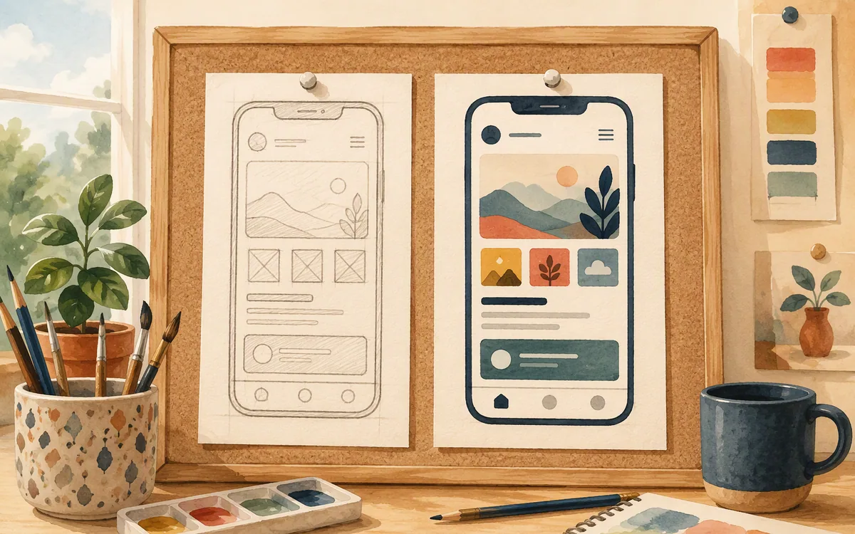
Uizard’s strongest use case is rapid visual concepting. You can convert hand-drawn sketches and text prompts into mockups quickly, which makes it practical for a workshop, a founder brief, or the first day of a feature exploration. Instead of debating a written requirement for an hour, you can put a rough account-creation flow in front of the room and ask what is missing.
That speed is particularly useful when the inputs are messy. A photographed sketch does not need to be a complete wireframe specification. A text description does not need every spacing rule and component state. Uizard gives you enough material to decide whether the information architecture and basic screen hierarchy are headed in the right direction.
The limitation is visual finish. The generated work can look generic or uneven, and the polish is commonly too rough to treat as production-ready mobile UI. You will still need to correct spacing, type hierarchy, component consistency, platform conventions, content density, and the less glamorous states that make an app feel intentional. The third day of work is usually where this lands: you have six plausible screens, then need the same input field, button treatment, and row behavior to hold together across twelve more.
Buy Uizard for the question, “What could this flow look like?” Do not buy it expecting the answer, “These are the final screens engineering can build from.” It is a good accelerator for visual drafts, not a substitute for a mobile UI system and final design pass.

Where Figma Make wins: prototypes people can actually use
Figma Make is the better option when the screen needs to do something. It generates functional prototypes with code underneath, so a team can move beyond a clickable slideshow and demonstrate inputs, changing content, or interaction behavior. That is a meaningful advantage when the purpose of the work is usability feedback or stakeholder alignment.
It also has a practical organizational advantage: teams already living in Figma do not have to move the project into a separate design environment merely to try an AI-generated direction. The output can sit closer to existing files, reviews, components, and design discussions. For a product organization with established Figma habits, that reduction in tool switching matters.
But it is not a clean replacement for a dedicated mobile screen-design workflow. Figma Make leans web-first in how it approaches generated interfaces and behavior. A prototype can be impressive in a browser while still needing careful work to become a convincing iOS or Android screen set. Native patterns, touch target expectations, mobile navigation, keyboard states, safe areas, and dense app content are details you cannot leave to a generic generation pass.
There is also a cost and access consideration. Figma Make requires a Figma seat, and access is associated with Figma’s paid-plan setup. Confirm the current entitlement and seat requirements on Figma’s own pricing and product pages before committing a team, because published plans and feature access change.
Pick it when a working prototype inside Figma is the deliverable. Do not pick it solely because you need twenty polished mobile frames for handoff.

Neither one is designed around the full mobile-flow iteration loop
The core gap is not whether either tool can generate a screen. Both can. The gap is what happens after you say: “Make the subscription step less pushy, add an annual option, move account recovery out of onboarding, and keep the visual system consistent across every affected Android and iOS screen.”
Neither Uizard nor Figma Make was built specifically around iterating a full mobile app screen flow through plain-English chat. Uizard starts quickly but leaves you with a visual draft that needs increasing manual correction as the flow expands. Figma Make can create behavior, but its strength is functional prototyping within Figma rather than maintaining a polished, native-mobile design system through repeated conversational revisions.
This is why single-screen demos can mislead buyers. Most app work is not a hero screen. It is a connected system of states:
- •an empty list and a populated list;
- •a loading state, validation error, and success confirmation;
- •a permissions explanation before an operating-system prompt;
- •account, billing, notification, and privacy settings;
- •different layout pressure on smaller phones and Android devices.
A useful evaluation prompt includes those states from the beginning. Ask each tool to generate a meal-planning app with onboarding, home, recipe detail, shopping list, add-item, paywall, and account screens. Then change one key rule—such as allowing shared lists—and count how many frames require manual repair. That number, not the first generated image, is the operational cost.
For polished mobile screen sets, use a tool built for that narrow job
floow.design takes a narrower approach than either competitor: it focuses on designing polished mobile app screens for iOS and Android from a plain-English description, then refining them through conversation. It exports the resulting work to Figma and to Flutter, React Native, SwiftUI, and Jetpack Compose.
That scope is deliberate. It is not a vector illustration package, a whiteboard, an IDE, or a full prototyping environment for complex interaction logic. If your task is drawing custom iconography, mapping a service blueprint, or building a production web app from generated code, choose the specialized tool for that job.
For a mobile product team, though, the narrow focus removes a common handoff problem. You are not starting with a rough sketch generator and then rebuilding the visual system screen by screen. You are not starting with a browser-oriented interactive demo and then translating it into native mobile conventions. The job is to move from app brief to a coherent set of mobile screens, with chat-based iteration available when the product requirement changes.
That makes it the better recommendation for a team pricing a real app design effort. Give it a specific brief: target platform, audience, primary action, data density, brand direction, and the screens needed for the first release. Then use conversation for real product edits, such as “show a trial explanation before payment” or “make this dashboard usable with no data yet.”
The output still needs product judgment. AI cannot decide your legal wording, subscription rules, data model, or accessibility requirements. But it can remove a large amount of repetitive screen-construction work.
The right pick by project stage
Use the project stage to decide, not the vendor’s best-looking demo.
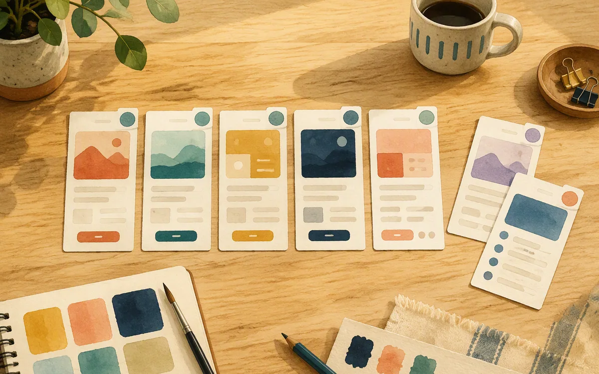
Pick Uizard for discovery. It is the practical choice for founders, product managers, and facilitators who need to turn loose ideas into visual artifacts fast. It is especially useful before a team has agreed on the flow. Expect to throw work away or rebuild it once the direction is approved.
Pick Figma Make for interactive communication inside an existing Figma practice. It is strongest when the prototype itself needs to demonstrate behavior and the people reviewing it already work in Figma. It loses to a mobile-first screen workflow when the deliverable is a polished native app design rather than a web-leaning prototype.
Pick floow.design for the design-production middle. That is the stage after the core flow is known but before engineering needs consistent, exportable mobile screens. It is for teams that do not want every revision to become a manual frame-by-frame cleanup exercise.
Do not choose any of these tools as a replacement for product definition. A vague brief creates vague screens faster. Before paying, write down the user, the main task, the first-release screen list, and what success looks like on each screen. Ten minutes of that work will improve results more than another round of prompt adjectives.
Search terms can create false comparisons. Someone looking for a uizard ai alternative may actually need a production UI workflow, not another wireframing tool. Someone typing figma ai alternative google may be looking for an AI vendor outside their current stack, while their real bottleneck is review and handoff. Define the bottleneck first.
Pricing and evaluation: compare the cleanup bill, not only the subscription
Uizard and Figma use tiered commercial plans, and the relevant cost is not limited to the monthly line item. Uizard’s plan structure is oriented around access and usage for its design and generation workflow. Figma’s pricing is organized around seats and collaboration capabilities, with Figma Make tied to paid Figma access. Published prices, feature limits, and entitlements move, so check each vendor’s current pricing page before budgeting.
For a buyer, calculate three costs:
- •Seat cost: Who needs to create, edit, review, and export? A prototype that only one person can meaningfully change becomes a bottleneck.
- •Cleanup cost: How many hours does it take to turn ten generated screens into a coherent app flow? Include responsive and platform-specific corrections.
- •Handoff cost: Can the team move the approved work into the format engineering and design already use, or does someone need to rebuild it elsewhere?
Free access can be useful for an initial trial, but do not let “free” decide the tool. Searches for ux pilot alternatives free often surface products that are suitable for trying prompts but not for sustaining a real product workflow. Run the same brief through each candidate, make three revisions, and export the result. If the flow degrades or the export creates a rebuild job, the supposedly cheaper tool is not cheaper.
For a mobile app team, the winning trial is the one that produces a usable eight-screen slice in an afternoon and remains consistent after the fourth requested change.
Final recommendation: do not force a rough-draft tool to become your mobile design system
Uizard is the winner for fast, low-fidelity concepting. Figma Make is the winner for teams that already live in Figma and need a functional prototype with code beneath it. Those are real strengths, and either can earn its place in an early product workflow.
They fall short in the same place for a mobile app team: neither is centered on producing and revising a complete, polished iOS or Android screen flow through conversation. With Uizard, you tend to inherit visual cleanup. With Figma Make, you gain behavior but may still need to adapt a web-first generated direction into a native mobile design set.
If you test both on a mobile project and find that neither gives you ready-to-export screens without substantial manual repair, move to floow.design for that specific next step. Use it to generate and refine the screen set; keep Figma Make for interactive experiments if needed; keep Uizard for early workshop sketches. That division of labor is more honest than asking one tool to handle discovery, visual design, prototyping, and engineering handoff equally well.
Uizard vs Figma Make for a mobile app screen project
| Tool | Best job | What you get first | Where it breaks down |
|---|---|---|---|
| Uizard | Rapid low-fidelity concepting from sketches and prompts | Rough mockups and visual directions | Production polish, consistency, and manual cleanup across a long screen flow |
| Figma Make | Functional prototypes for teams already using Figma | Code-backed interactive prototype | Native-mobile specificity and full-flow conversational iteration |
| floow.design | Polished iOS and Android screen sets | Mobile screens generated and refined by conversation, with export options | Complex prototype logic, whiteboarding, illustration, and IDE work |
What it costs
Uizard and Figma use tiered plans, while Figma Make requires Figma paid-plan access through an eligible seat. The amount paid is only part of the decision: compare editor seats, generation or usage limits, export needs, and the hours required to clean up a ten-screen flow. Vendor pricing and feature access change, so verify current terms on each official pricing page before purchase.
Mistakes that cost you the most
Choosing from a one-screen AI demo.
Test an eight-to-twelve-screen flow with empty, error, loading, confirmation, and settings states before buying.
Treating a coded prototype as a finished native app design.
Review platform patterns, safe areas, keyboard states, navigation, and touch targets before handing screens to engineering.
Using Uizard output as final UI without estimating cleanup.
Budget time for typography, spacing, components, content density, and consistency across all related frames.
Buying a free or low-cost tier without testing export.
Export a representative flow during the trial and inspect what the next team must rebuild.
Frequently asked questions
is uizard good enough for real projects
Uizard is good enough for real discovery work: early wireframes, workshop outputs, concept testing, and communicating a proposed user flow. It is usually not enough on its own for production-ready mobile UI. Expect manual work on visual consistency, component details, platform conventions, and edge states before using its mockups as an engineering handoff.
does figma make require a figma paid plan
Figma Make requires access through Figma’s paid-plan and seat setup rather than functioning as a separate standalone free tool. Because Figma can change feature availability, seat types, and plan entitlements, confirm the current requirement on Figma’s official pricing and product pages before assigning it to a project budget.
uizard vs figma make for mobile apps
For mobile apps, choose Uizard when you need quick low-fidelity mockups from a sketch or text prompt. Choose Figma Make when your team already uses Figma and needs a functional, code-backed prototype. Neither is purpose-built for repeatedly refining a complete polished iOS or Android screen flow through plain-English chat, so plan for manual cleanup or use a mobile-focused screen tool.
what is a good free alternative to uizard
A good free alternative to Uizard depends on the job. Free tiers can be useful for testing prompt-to-wireframe workflows or basic interface concepts, but they often have limits on projects, exports, collaborators, or AI usage. Evaluate any free option with a complete mobile flow and an export test; for production work, the cleanup and handoff cost matters more than the trial price.
Should I use Figma Make instead of a mobile UI design tool?
Use Figma Make instead of a dedicated mobile UI design tool if a functional prototype inside your existing Figma workflow is the main deliverable. Use a mobile-focused screen workflow if you need polished iOS and Android frames, consistent visual treatment across many states, and exports for design or implementation. A code-backed demo does not automatically solve mobile design handoff.
Where this leaves you
Uizard is the sensible first stop for a rough idea. Figma Make is the sensible choice for a coded prototype in an established Figma team. For the gap between those outputs and a polished, exportable mobile app screen set, floow.design is the recommendation.
Design the screens before you commit to a tool
A designer testing both tools for a mobile app project finds neither gives polished, ready-to-export mobile screens without heavy manual cleanup, and wants a tool built specifically for that step.
If that is roughly your situation: describe the app in plain English and floow.design draws the iOS and Android screens, takes your changes by chat, and exports the result to Figma or to Flutter, React Native, SwiftUI and Jetpack Compose.
Free tools you can use right now
- •Phone Mockup Generator — free, no sign-up
- •CSS Grid Generator — free, no sign-up
- •px to rem Converter — free, no sign-up
Related reading
Design your mobile app with AI.
Generate pixel-perfect iOS and Android screens in seconds, then export to Figma or code.
You might also like…
 Insights24 September 2026How Much Does an AI App Design Tool Cost?Compare AI app design subscriptions, credits, seat limits and export costs so you can budget a prototype without paying for unusable output.By floow.design Team, Mobile Design
 Insights24 September 2026Free AI tool for UI design: Free tier limitsSee where free AI UI design plans stop: screen caps, export limits, paid gates, reset rules, and the upgrade prompts that matter.By floow.design Team, Mobile Design
 Roundups24 September 2026AI App Design Tool for Non Designers: Best PicksCompare six AI UI tools by how far a solo founder can get from prompt to developer-ready app screens, exports, states, and real costs.By floow.design Team, Mobile Design