Linearity Curve app icon
DesignScreenshot teardown14 min read

Linearity Curve App Store screenshots

Designing App Store screenshots for a professional vector editor means solving a paradox: the asset has to prove desktop-grade depth on a 6.1-inch display, to a shopper who is mentally comparing your product against Adobe, Figma, and Sketch. The shopper is swiping at bus-stop speed, yet the product is a technical Bezier tool with node editing, boolean operations, and brush contour graphs. The challenge is not simply showing features—it is calibrating density so the interface looks capable without looking chaotic, and doing it across eight consecutive frames where fatigue sets in by frame three.

Set published by Linearity GmbH · 8 frames analysed

4.5 · 14K ratingsFreev6.9.1Updated 5mo ago
Linearity Curve App Store screenshot 1
01At a glance

The set in one screen

Framing
Asymmetric, aggressive crops with devices rotated or floating; never center-safe
Captions
Bold stacked grotesque, sentence-case for headlines, period-delimited staccato for secondary
Backdrop
Saturated tangerine (#FF7722) across all eight frames with occasional blueprint grids and decorative blue strokes
Type
Heavy black headlines, white subheads, in-app labels in iOS system styles
UI / copy split
Heavy interface; captions occupy roughly top 15-20% of each frame
Frame 1 job
Establish social authority without hiding the product entirely

Sampled palette

#FF7722#FF7722
#0A0A0A#0A0A0A
#FFFFFF#FFFFFF
#5B9ADE#5B9ADE
#007AFF#007AFF
02The challenge

What this screenshot set had to solve

The category is crowded with dark-mode design tools and white-background utilitarian previews. Linearity Curve had to signal 'professional vector editor' immediately, but also 'mobile-first.' The risk was either looking like a lightweight sketch toy (too much illustration, too little UI) or a shrunken desktop app (dense chrome, illegible nodes). The team chose to solve this not through feature lists, but through a visual system that treats the orange background as a constant stage and the device as a rotating performer.

The orange is not an accent; it is the container. Every screenshot is a window cut into the same wall.
03The approach

How the set argues its case

The approach relies on three constraints: one background color, one headline typeface, and one device treatment (black iPhone with rounded corners, occasionally translucent or rotated). Within those constraints, each frame varies the layout topology. Frame 2 rotates the device and clips its toolbar to force attention toward the node handles. Frame 3 splits the canvas into a conceptual before/after, using arrow strokes that belong to the marketing layer. Frame 4 adds a grid overlay and physical product mockups to prove logo application. Frame 5 layers a secondary device inset. Frame 6 returns to a centered, upright phone to anchor a feature that benefits from photographic clarity. Frame 7 breaks the single-device rule to broadcast ecosystem. Frame 8 brings back a centered device for a final technical punch. The strategy is essentially a modular design system: swap the UI texture, keep the frame architecture.

Positioned as a pro tool that fits in a pocket, but not a toy. The screenshots avoid lifestyle photography (no coffee shops, no hands holding pencils) and instead show the raw interface: transform handles, dimension callouts, dropdown chips, and slider values. The positioning is 'tool-first, context-second'—even the logo mockup in Frame 4 is presented as a construction diagram, not a brand story.

04Frame by frame

Every screenshot, and the job it does

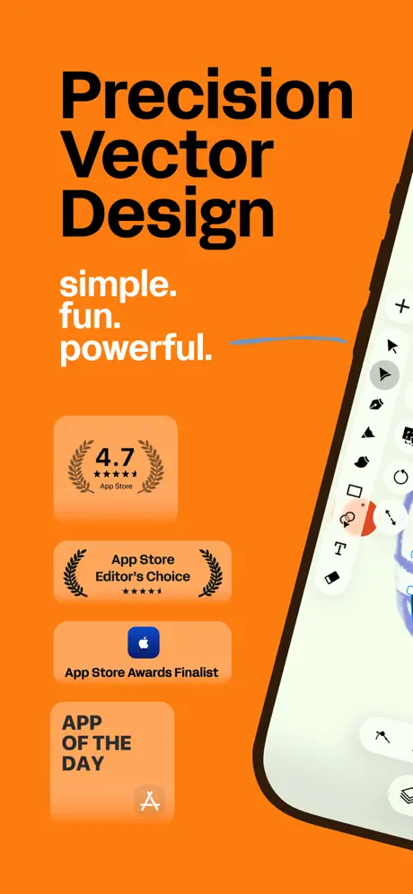
Linearity Curve App Store screenshot 1 — Proof Before Pixels
01

Proof Before Pixels

On-frame caption: “Precision Vector Design / simple. fun. powerful. / 4.7 App Store / App Store Editor's Choice / App Store Awards Finalist / APP OF THE DAY

The first frame is a study in deferred gratification. Against the saturated orange field, the upper-left quadrant is dominated by a near-black typographic lockup reading 'Precision Vector Design,' stacked three lines deep in a bold grotesque. Beneath it, a white secondary lockup—'simple. fun. powerful.'—uses periods as visual caesuras. The left margin carries a vertical cascade of four social-proof badges. The top badge displays '4.7' with five stars and 'App Store' in small caps, flanked by laurel wreaths. Below it sits 'App Store Editor's Choice,' then 'App Store Awards Finalist' with a blue Apple glyph, and finally 'APP OF THE DAY' in all caps. Each badge floats inside a rounded rectangle with a subtle warm tint slightly lighter than the background, near #FFA64D, creating a low-contrast separation without hard borders. The right edge is occupied by a tightly cropped device bezel—matte black, approximately #1A1A1A—revealing only a sliver of the app’s vertical toolbar against a pale off-white canvas. The decision to sacrifice interface real estate for social authority is deliberate but precarious: at thumbnail size, the badges compress into textured blurs, and the app itself is reduced to a narrow strip of chrome.
Linearity Curve App Store screenshot 2 — The Workshop
02

The Workshop

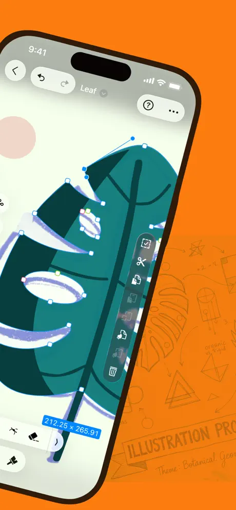
On-frame caption: “Leaf / 212.25 x 265.91 / ILLUSTRATION PRO (faint blueprint)

Frame 2 pivots from static badges to kinetic interface proof. The device rotates roughly twelve degrees counter-clockwise and fills the left two-thirds of the frame, its top-left corner clipped by the safe area. The status bar reads '9:41,' and the navigation bar shows a back chevron, grouped undo-redo pills, and a 'Leaf' breadcrumb with a dropdown caret. On the right edge of the device, a floating contextual toolbar hovers over the illustration, displaying icons for scissors, duplicate, and delete. The canvas itself is the hero: a deep-teal vector leaf locked in direct-selection mode, its Bezier handles and anchor points rendered as white squares with cerulean connectors. A dimension callout in system blue—approximating #007AFF—reads '212.25 x 265.91' near the bottom-left of the screen. Behind the phone, the orange backdrop is overlaid with faint blueprint line art and the words 'ILLUSTRATION PRO,' establishing a designer-at-work atmosphere. The crop is aggressive: the bottom toolbar and tab bar are entirely out of frame, forcing attention upward toward the node editing fidelity. The overall effect is a workshop mood rather than a finished portfolio piece.

Linearity Curve App Store screenshot 3 — Trace, Then Own
03

Trace, Then Own

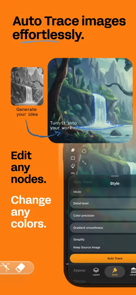
On-frame caption: “Auto Trace images effortlessly. / Generate your idea / Turn it into your work / Edit any nodes. / Change any colors. / Auto Trace / Detail level / Color precision / Gradient smoothness / Simplify / Keep Source Image

Here the layout splits into a conceptual before-and-after plus a live UI demo. The headline 'Auto Trace images effortlessly.' sits at the top in the same bold grotesque, underlined by a sweeping blue stroke—approximately #5B9ADE—that arcs beneath the word 'effortlessly.' Below, two rounded images float in a negative-space relationship: a smaller grayscale thumbnail on the left captioned 'Generate your idea,' and a larger, fully traced color landscape on the right captioned 'Turn it into your work,' connected by a looping blue arrow that belongs to the page layout rather than the app interface. Further down, two typographic statements—'Edit any nodes.' and 'Change any colors.'—stack in black and white, creating a ragged left edge that mirrors the before/after offset. A device enters from the bottom-right, cropped at the chin, showing a dark-mode bottom sheet with tabs for 'Effects,' 'Layers,' 'Style,' and 'Library.' The active 'Auto Trace' panel lists sliders: Mode, Detail level, Color precision, Gradient smoothness, Simplify, and Keep Source Image, culminating in a tangerine CTA button reading 'Auto Trace.' The orange button competes with the global orange background, which slightly dulls its sense of primacy inside the frame.

Linearity Curve App Store screenshot 4 — Construction Geometry
04

Construction Geometry

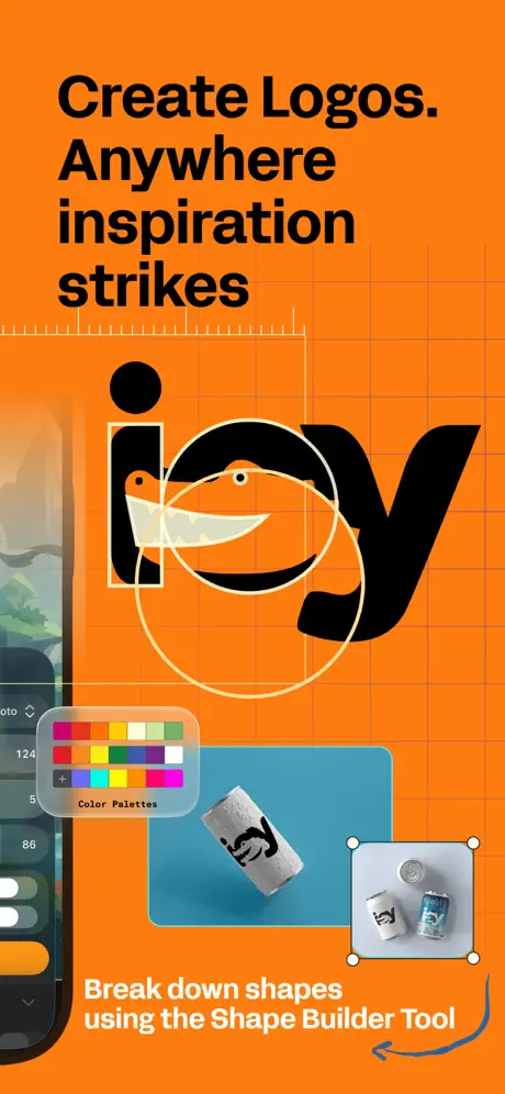
On-frame caption: “Create Logos. Anywhere inspiration strikes / Color Palettes / Break down shapes using the Shape Builder Tool

This frame introduces a more complex, multi-plane composition. The headline 'Create Logos. Anywhere inspiration strikes' occupies the upper third in black against the persistent orange ground. A faint engineering grid—pale peach lines at roughly 20 percent opacity—overlays the background, reinforcing the precision theme. The central visual is a bold, black logotype reading 'icy' constructed from geometric primitives: a knife blade integrated into the letter 'c' and constrained by circular construction guides in pale yellow. To the left, a vertical sliver of an iPhone shows a color-picker popover labeled 'Color Palettes,' with swatches in red, yellow, green, blue, violet, and grayscale. Below the logo, a product mockup—an aluminum can resting on a turquoise rectangle—anchors the scene in real-world application, while a smaller inset image in the bottom-right shows two cans with a bounding-box transform UI. The caption 'Break down shapes using the Shape Builder Tool' sits at the bottom in white, punctuated by a short blue arrow. The density is high: there are at least four distinct visual systems (typography construction, device UI, photography, vector shapes) sharing one frame, which risks cognitive overload but also signals pro-tool depth.

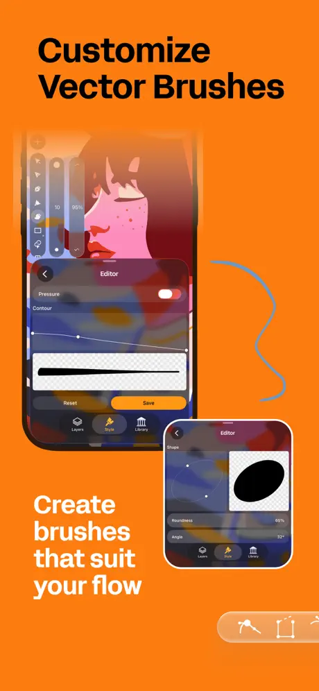
Linearity Curve App Store screenshot 5 — Pressure and Contour
05

Pressure and Contour

On-frame caption: “Customize Vector Brushes / Editor / Pressure / Contour / Reset / Save / Create brushes that suit your flow / Roundness 69% / Angle 32°

'Customize Vector Brushes' headlines a frame dedicated to tool personalization. The primary device occupies the left half, displaying a dark-mode brush editor with a 'Pressure' toggle switched on and a 'Contour' curve graph rendered as a white line with draggable control points. A stroke preview sits on a transparent checkerboard below the curve. The black shape of a brush stroke contrasts sharply against the warm orange bleeding through from behind the device. A secondary inset device—smaller, roughly 40 percent the scale of the main—floats at the bottom-right, showing a 'Shape' editor with 'Roundness 69%' and 'Angle 32°' labels and an oblique ellipse preview. Beneath the main device, the caption 'Create brushes that suit your flow' appears in white. A thin, wandering blue line acts as a decorative flourish on the right third of the frame. The layering here is muddy: the main device is partially translucent or has a blurred edge where it meets the background, and the smaller device casts no shadow, making it read as pasted rather than placed. The decision to show two states of the same editor (stroke vs. shape) is informative but demands that the viewer parse which is primary.

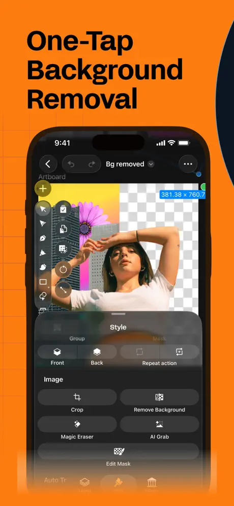
Linearity Curve App Store screenshot 6 — The Split Reality
06

The Split Reality

On-frame caption: “One-Tap Background Removal / Bg removed / 381.38 x 760.7 / Remove Background / Magic Eraser / AI Grab / Edit Mask

The sixth frame shifts into raster-meets-vector territory with 'One-Tap Background Removal.' The device is centered vertically, framed in black, and displays a split-screen photo edit: the left half shows a woman and a pink flower against a yellow-pink gradient, while the right half resolves into the standard transparency checkerboard. The top navigation reads 'Bg removed' in a dropdown chip. A dimension badge in system blue states '381.38 x 760.7.' A dark-mode bottom sheet slides up from the base, organized under a 'Style' tab and a 'Mask' context. Buttons include 'Crop,' 'Remove Background,' 'Magic Eraser,' 'AI Grab,' and 'Edit Mask.' The phone's left toolbar shows selection and shape tools. The bottom tab bar is partially visible with the 'Style' tab highlighted in orange. Notably, this is the first frame where the app's dark interface is allowed to dominate the screen, creating a strong figure-ground reversal against the tangerine page background. However, the text in the bottom sheet is small—sub-11pt in the screenshot—and the 'Group' row with 'Front' and 'Back' options is nearly lost in the downscaled presentation. The split-view edit is effective as a proof point, but the density of the UI chrome reduces the impact of the magic-act imagery.

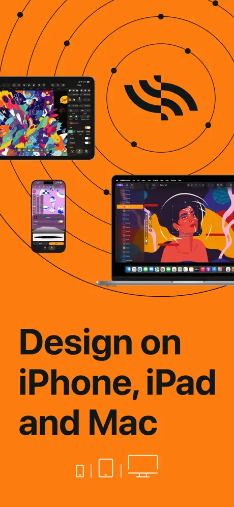
Linearity Curve App Store screenshot 7 — The Ecosystem Taxonomy
07

The Ecosystem Taxonomy

On-frame caption: “Design on iPhone, iPad and Mac

Frame 7 abandons the single-device thesis for an ecosystem tableau. The headline 'Design on iPhone, iPad and Mac' drops three devices onto the orange stage: an iPad in landscape at upper-left showing a complex multicolor illustration, an iPhone vertically at lower-left displaying a portrait canvas, and a MacBook Pro at lower-right revealing the full desktop UI with sidebar, canvas, and inspector. Behind them, a series of overlapping black concentric circles—construction rings with anchor points—emanate from a central abstract mark resembling a stylized black 'S' or wave form. At the very bottom, three minimal line icons denote phone, tablet, and desktop. The scale relationships are inconsistent: the iPhone appears roughly one-third the height of the MacBook, while the iPad floats in negative space without a baseline alignment. The illustration detail on the MacBook is illegible at this scale, turning the laptop into a silhouette rather than a proof of cross-platform fidelity. The radar circles add visual motion but compete with the headline's negative space. As a capstone frame, it communicates ubiquity at the expense of interface clarity.

Linearity Curve App Store screenshot 8 — Boolean Finality
08

Boolean Finality

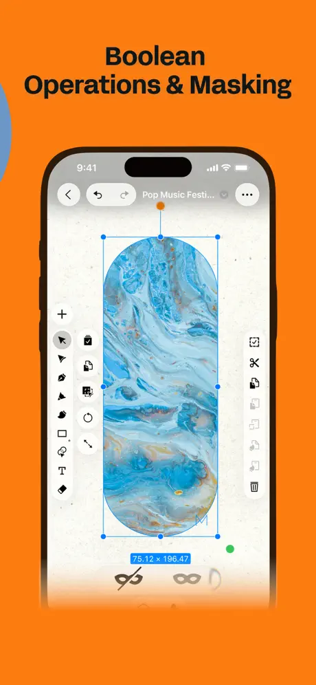
On-frame caption: “Boolean Operations & Masking / Pop Music Festi... / 75.12 x 196.47

The final frame returns to single-device focus with 'Boolean Operations & Masking.' The device displays a tall, rounded-rectangle art object filled with a blue-marble texture, constrained within an active selection bounding box with blue handles and a top-axis rotation indicator. The top bar reads 'Pop Music Festi...' (truncated), confirming this is a real project file rather than a blank demo. Left and right vertical toolbars frame the canvas; the right rail includes boolean operation icons at the bottom—subtract, intersect, and a mask icon—alongside a trash symbol. A dimension label at the bottom reads '75.12 x 196.47.' A large blue abstract shape intrudes from the left edge of the page, partially overlapping the headline and creating a depth layer between the viewer and the phone. The canvas background is an off-white grain texture, offering the lightest value in the entire sequence and providing a final contrast pivot against the campaign's dominant orange. The truncation of the filename is a nice touch of realism, though the boolean icons at the bottom of the screen are rendered at a size that makes their specific operations indistinguishable without prior knowledge.

05The craft

Captions, colour and the mechanics of the sell

Caption pattern

Headlines follow a strict hierarchy: one imperative statement in near-black, occasionally followed by a shorter white claim. Frame 1: 'Precision Vector Design' / 'simple. fun. powerful.' Frame 3: 'Auto Trace images effortlessly.' / 'Edit any nodes. Change any colors.' Frame 4: 'Create Logos. Anywhere inspiration strikes' / 'Break down shapes using the Shape Builder Tool.' The rhythm is punch-pause-punch, with periods used as breath marks rather than grammatical necessities. The copy avoids feature lists; it sells outcomes ('Create brushes that suit your flow') and permissions ('Anywhere inspiration strikes').

Visual system

The visual system is built on warm aggression. The orange ground is not a gentle gradient; it is a flat flood. Against it, black type gains weight, white type gains glow, and the occasional blue stroke acts as a cool counter-temperature. Devices are always dark, always iPhone-first, with thin black bezels that separate from the orange via subtle shadow softness rather than hard outlines. The app’s own dark-mode chrome (roughly #1C1C1E) in Frames 3, 5, and 6 reverses figure and ground, letting the interface feel recessed into the marketing page. Dimension labels inside the app—such as '212.25 x 265.91' in Frame 2 and '381.38 x 760.7' in Frame 6—are rendered in iOS system blue, approximating #007AFF, which creates an accidental but welcome rhyme with the marketing blue strokes.

The thumbnail test

At App Store thumbnail scale, the set reads as a bright orange ladder. The black headlines maintain enough contrast to survive compression, though Frame 7’s ecosystem collage collapses into a dark blob because the MacBook and iPad details disappear below readability thresholds. Frame 1 survives best because of the large typographic block; Frame 6 survives because of the photographic figure-ground split.

Conversion mechanics

The set is engineered for the second and third swipe, not the first glance. Frame 1’s badge wall slows the initial read but builds trust for shoppers who need validation before investigating features. The conversion logic assumes that a designer browsing the 'Graphics & Design' category knows what node editing looks like; therefore, Frame 2 does not label the Bezier handles—it simply shows them. Frame 6, by contrast, uses a literal split-screen because background removal is a consumer-friendly concept that needs no translation. The conversion path moves from credibility (Frame 1), to capability (Frames 2-5), to workflow integration (Frame 6-7), to power-user reassurance (Frame 8).

06Where it slips

What we would change

Social-proof inflation in Frame 1

Four separate badges consume roughly 40 percent of the vertical real estate. On smaller phones, the app UI peeking from the right edge becomes a sliver. The fix: consolidate the two most impactful metrics—rating and Editor's Choice—into a single horizontal lockup, reclaiming space to enlarge the device preview or introduce a canvas texture.

Decorative stroke tangents

The blue underlines and arrows in Frames 3, 4, 5, and 8 function as stylistic glue but often knot against image corners and text baselines. In Frame 3, the underline beneath 'effortlessly' nearly collides with the arrow connecting the two landscape images. The fix: enforce an 8pt minimum clearance rule between marketing strokes and image edges, or remove one of the two competing strokes.

Inconsistent cropping and safe margins

Frame 3 crops the phone at the bottom tab bar, Frame 5 uses a ghosted edge that dissolves into the background, and Frame 7’s devices float without grounding. The fix: establish a strict central safe-zone rectangle—perhaps 9:10 within the 9:16 canvas—and keep all critical interface actions inside it. This prevents tab labels and CTA buttons from bleeding off the page at thumbnail scale.

Orange-on-orange hierarchy collapse

In Frame 3 and Frame 6, the app's own orange buttons and active tabs sit against the marketing orange background, flattening foreground separation. The fix: shift in-app accent colors to cobalt or white for the screenshot build only, ensuring the interface reads as foreground rather than camouflage.

Frame 7’s density-to-legibility ratio

Three devices at three scales, overlaid with black construction circles, produce a noisy impression before the shopper reaches the cart. The MacBook screen detail is entirely lost. The fix: anchor exactly two devices—iPhone and MacBook—on a shared horizontal baseline, letting the iPad live in a separate frame or be implied through the bottom icons alone. This preserves the ecosystem message without visual cacophony.

07The recipe

How to apply this to your own app

  1. Pick one stage color and defend it

    Linearity Curve’s most effective decision is the refusal to change backgrounds. Choose one flat field color that is impossible to ignore, then let your devices and typography perform against it. The background is not decoration; it is the container.

  2. Separate marketing strokes from UI strokes

    The blue arrows and underlines never appear inside the app. This creates a clear contract: anything blue belongs to the App Store page, anything black/white/#007AFF belongs to the product. Establish a similar foreign-body color for your own marketing layer so shoppers learn to trust the boundary.

  3. Crop like a cinematographer, not a documentarian

    Frame 2 clips the toolbar; Frame 4 bleeds the iPhone off the left edge. These are deliberate cinematic crops that force the eye toward the hero detail. Do not frame the entire phone safely in every shot—decide which pixel matters most, then cut everything else.

  4. Diminish, do not remove, social proof for the main event

    If your first frame is a badge wall, treat it as a title card that expires quickly. Move to interface within the first two swipes, or consolidate proof into a single metric paired with a visible device. The app is the protagonist; awards are the opening crawl.

08Takeaways

Five things worth stealing

  • A single persistent background color creates brand recognition across the swipe sequence, but it requires strict discipline to prevent in-app oranges from flattening against it.
  • Headline copy should use typographic scale and punctuation—periods, line breaks—as percussion, not just grammar.
  • Before/after comparisons (Frame 3) and split-screen demos (Frame 6) are the highest-conversion layout archetypes for utility apps; they explain without captioning.
  • Multi-device ecosystem frames (Frame 7) almost always fail at thumbnail scale; if cross-platform parity is essential, show two devices maximum and align them to a shared baseline.
  • Decorative flourishes (blue strokes, blueprint grids) must be held to the same collision-avoidance standards as UI elements; tangents read as unpolished at design-review depth.
09The verdict

What the set actually achieves

The set communicates real functionality—Bezier nodes, auto-trace sliders, brush contour curves, boolean icons—while maintaining brand heat through its orange lockup. However, the uniformity that makes it recognizable also creates color fatigue, and several cropping decisions sacrifice legible UI detail for compositional swagger.

Intermediate to professional designers evaluating mobile vector tools, or prosumers migrating from Illustrator who need reassurance that node editing and boolean operations exist on iOS. The set is not for casual doodlers; there is no sticker, no cartoon avatar, no promise of effortlessness beyond the Auto Trace frame. The shopper is assumed to know what a Bezier handle is. Consequently, the screenshots function as a technical portfolio rather than a lifestyle promise.

10Questions

Frequently asked

Why does Frame 1 show almost no interface?

It treats social proof as the primary hook. In a category where trust is low and switching costs are high, stars and editorial badges act as the stop sign; the interface is deferred to Frame 2.

What is the significance of the blueprint texture behind Frame 2?

It rhetorically positions the app as an engineering or architectural tool rather than a freehand sketchpad, signaling precision before the user reads a word.

Why does Frame 5 use two overlapping devices?

To show two states of the brush editor—stroke contour and shape geometry—without animating. The overlap simulates depth, though the execution is muddy because the secondary device lacks shadow separation.

Is the orange background exact across all frames?

Visually it reads as a single value near #FF7722, though slight JPEG compression shifts may occur. The consistency杨家is close enough to create a seamless scroll environment.

11Keep reading

Build your own screenshot set

The full set

8 shots
Linearity Curve App Store screenshot 1Linearity Curve App Store screenshot 2Linearity Curve App Store screenshot 3Linearity Curve App Store screenshot 4Linearity Curve App Store screenshot 5Linearity Curve App Store screenshot 6Linearity Curve App Store screenshot 7Linearity Curve App Store screenshot 8

About the app

Professional vector art and graphic design software on iPad and iPhone! Linearity Curve (formerly Vectornator) is a powerful vector graphics editor built for iPad, Mac, and Linearity GmbH, via the App Store listing.

Screenshots and store metadata belong to Linearity GmbH. They are shown here for design commentary and criticism. The analysis on this page is original work by floow.design. View the original listing.