Sudoku a Day app icon
GamesScreenshot teardown15 min read

Sudoku a Day App Store screenshots

A Sudoku grid is the ultimate commodity interface: nine rows, nine columns, and a number pad. In the App Store Games category, that sameness is a conversion killer. The screenshot set for *Sudoku a Day* has to convince a swiper that this is not another ad-supported arcade reskin, but a restrained, daily ritual worth a home-screen slot. Ocho’s eight-frame sequence attempts to solve that by leaning hard into native iOS visual language—SF-style typography, Game Center integration, Home Screen widgets, and an almost achromatic palette—while using a single lifestyle render to inject human warmth. The result is a strategically paced set that understands the shopper’s swipe behavior, even if its visual cohesion wobbles between photorealistic aspiration and flat UI documentation.

Set published by Ocho · 10 frames analysed

4.9 · 303 ratingsFreev2.2.5Updated 4mo ago
Sudoku a Day App Store screenshot 1
01At a glance

The set in one screen

Framing
Mixed: one photorealistic 3D lifestyle render (Frame 1), one cropped frontal bezel-less crop (Frame 2), and six standard flat frontal device shots. The inconsistency weakens brand cohesion.
Captions
Split-weight sentence fragments. The first line is typically rendered in a muted gray (#888888) and the second in near-black (#111111), creating a scannable hierarchy without size change.
Backdrop
Predominantly pure white or near-white. Frame 1 uses a warm beige stucco wall; Frame 5 switches to a dark charcoal studio background; Frame 7 introduces a full lavender gradient. This is the most chromatically varied set in the category.
Type
Strict sans-serif, likely based on SF Pro. Large display headlines for app claims, small caps for UI labels. No serifs, no outlined type, no playful gaming-sector display faces.
UI / copy split
UI dominates. Roughly 70% of each frame is device screen, 20% is headline copy, and 10% is negative space. The exception is Frame 3, where floating testimonial cards occupy the top half.
Frame 1 job
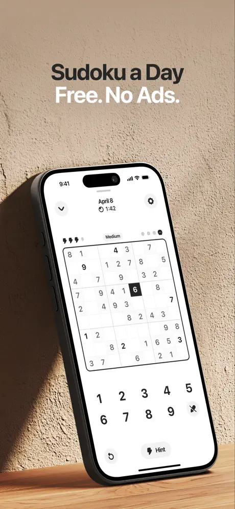
Frame 1 is doing three jobs simultaneously: category identification (this is a Sudoku game), value proposition ("Free. No Ads."), and aesthetic positioning (warm, analog, calm). The photorealistic iPhone on oak against textured beige stucco is the only lifestyle shot in the sequence, which makes it the de facto brand anchor.

Sampled palette

#F5F5F5#F5F5F5
#1A1A1A#1A1A1A
#888888#888888
#E8E8E8#E8E8E8
#1C1C1E#1C1C1E
#B488FF#B488FF
02The challenge

What this screenshot set had to solve

Sudoku is a solved visual problem. Every competitor shows the same 9×9 grid and the same 1-through-9 input row, which means differentiation has to happen at the margins: lighting, typography, negative space, and the rhythm of the story you tell in eight frames. For *Sudoku a Day*, the challenge is compounded by the product’s positioning as a daily ritual rather than an endless arcade. The screenshots cannot look like a feature list, yet they still have to communicate depth—social proof, leaderboards, customization, widgets—fast enough to stop a thumb. Ocho also has to signal that the app is native to iOS, not a cross-platform port, because the target audience likely values Apple’s design sensibility. The central tension, then, is how to sell minimalism and depth at the same time without either frame looking like a contradiction.

"The split-weight headline system—muted gray lead-in, heavy black punchline—is the set’s smartest rhetorical device. It trains the eye to read the second line first, which is exactly where the benefit lives."
03The approach

How the set argues its case

What we can learn from Ocho's approach, and key tradeoffs worth flagging before adapting any of it to your own listing. Ocho treats the sequence as a funnel rather than a gallery. Frame 1 is the hook (cost + aesthetic), Frames 2–4 are trust and habit, Frames 5–7 are feature defense, and Frame 8 is retention lock-in. This pacing is correct for a utility-forward game. The heavy reliance on native iOS components—Game Center tabs, iOS toggles, Home Screen widgets, Memoji—signals platform belonging, which lowers perceived risk for iPhone users. However, the strategy assumes that shoppers will view all eight frames in order; in reality, many will only see the first two before the fold truncates the gallery. By leading with a lifestyle render instead of immediate UI, Frame 1 sacrifices some instant readability for mood. That is a defensible trade, but only if the rest of the set sustains the mood, which the sharp pivot to white-background UI specimens does not. The decision to use a dark canvas for Frame 5 creates a needed visual beat, yet it is so divergent from the warm beige of Frame 1 that the two could belong to different apps. For your own set, the lesson is to choose a framing grammar—lifestyle, flat, or mixed—and apply it with at least one recurring motif (shadow, background texture, or color temperature) so that frame eight still feels like the same product as frame one.

Sudoku a Day positions itself as the anti-casino puzzler. There are no gems, no coins, no cartoon mascots, and no neon gradients. The category positioning is “Apple-native minimalism,” and the competitive framing is explicitly against “ad-saturated” alternatives, as stated in the opening headline. The daily-calendar mechanic (Frame 2) and streak widgets (Frame 8) position the app as a health-like habit rather than a time-killer. By using Game Center instead of a proprietary social system (Frame 4), it positions itself as frictionless and trustworthy. The customization frame (Frame 5) with emoji and shape themes is the only nod toward playfulness, but even that is presented under the controlled headline “Make it yours,” keeping the tone personal rather than juvenile.

04Frame by frame

Every screenshot, and the job it does

Sudoku a Day App Store screenshot 1 — Value Proposition and Vibe
01

Value Proposition and Vibe

On-frame caption: “Sudoku a Day / Free. No Ads.

The sequence opens with a photorealistic iPhone resting on light oak against a textured beige stucco wall, lit from the upper left. The headline sits in the top third: “Sudoku a Day” in a dense #1A1A1A, and beneath it, “Free. No Ads.” in an off-white #F5F5F5 that separates cleanly from the wall without a text shadow. The device screen shows active gameplay: the date “April 8,” a timer at “1:42,” a “Medium” label, heart-shaped life icons, and a board with the numeral 6 locked in a black inverted cell. Below the grid, a numpad runs 1 through 9 plus a backslash delete key, an undo arrow, and a “Hint” button. The shadow cast leftward onto the stucco is soft and physically plausible, lending the hardware weight. This frame does the heavy lifting of category identification and pricing simultaneously; before the shopper sees a single feature, they know the business model and the aesthetic temperature. It is the only lifestyle render in the set, making it the tonal anchor—though, as later frames reveal, an anchor that is quickly cut loose.
Sudoku a Day App Store screenshot 2 — The Daily Ritual
02

The Daily Ritual

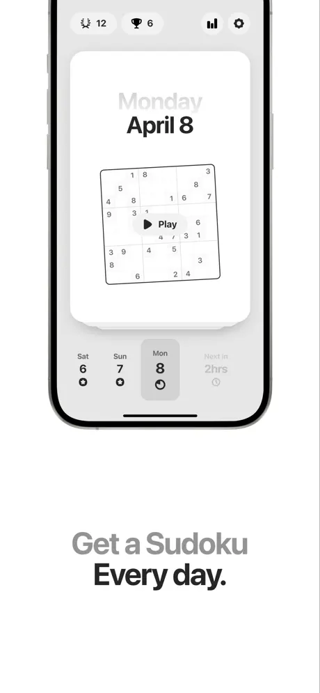
On-frame caption: “Get a Sudoku / Every day.

Frame two shifts abruptly to a flat, frontal device crop against pure white. The headline moves below the phone, split by weight: “Get a Sudoku” in a light #AAAAAA, followed by “Every day.” in a bold #111111. The UI shown is the calendar hub. A top bar carries a flame icon with “12,” a trophy with “6,” a bar chart, and a settings gear. A large card reads “Monday / April 8” above a miniature board overlaid with a circular “Play” button. Below, a horizontal calendar strip shows “Sat 6,” “Sun 7,” and an active “Mon 8” seated inside a gray pill—approximately #E8E8E8—with a small clock glyph beside it. A “Next in 2hrs” countdown sits to the right. The composition is tightly centered, cropped so close that the side bezels are invisible, pushing all attention to the calendar mechanic. This frame converts the abstract “daily puzzle” concept into a tangible streak-based appointment, though the extreme crop sacrifices hardware context.

Sudoku a Day App Store screenshot 3 — Social Proof
03

Social Proof

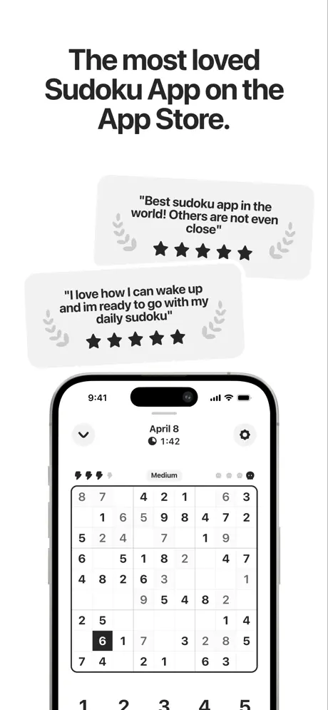
On-frame caption: “The most loved Sudoku App on the App Store.

The background stays white, but the hierarchy is inverted: two floating review cards hover above the device rather than below it. The headline anchors the top in a single dense block: “The most loved Sudoku App on the App Store.” The first card reads, “Best sudoku app in the world! Others are not even close,” flanked by gray laurel wreaths and five solid black stars. The second card reads, “I love how I can wake up and im ready to go with my daily sudoku,” with identical decoration. Both cards use a pale gray fill—around #F0F0F0—with 16–20 pt corner radii and soft drop shadows. The phone beneath shows a nearly complete board for April 8, implying competence. By placing quotes in the negative space above the device, the frame borrows chat-bubble spatial language, though the density risks crowding on an actual iPhone storefront preview. The superlative headline is the weakest copy choice in the set; it makes a claim the floating quotes could have made on their own.

Sudoku a Day App Store screenshot 4 — Game Center and Friends
04

Game Center and Friends

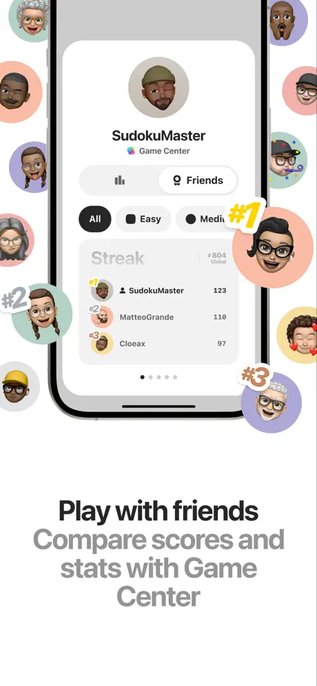
On-frame caption: “Play with friends / Compare scores and stats with Game Center

This frame introduces personality through Apple’s own social infrastructure. The device displays a profile for “SudokuMaster” with a Game Center badge, plus a “Streak” leaderboard showing “SudokuMaster 123,” “MatteoGrande 110,” and “Cloeax 97,” ranked #804 globally. A segmented control offers “All,” “Easy,” and “Medi…” (the “um” truncated by container width). Around the perimeter, Memoji heads float inside pastel discs—peach, mint, lavender, yellow—with hand-drawn “#1,” “#2,” and “#3” badges overlaid. The headline below splits again: “Play with friends” in #000000, “Compare scores and stats with Game Center” in #999999. The visual effect is demographic-broad and friendly, though the floating avatars break the clean edge of the device bezel where the yellow #1 badge overlaps the frame. The truncation of “Medium” is also a small but real polish defect visible at full resolution.

Sudoku a Day App Store screenshot 5 — Customization
05

Customization

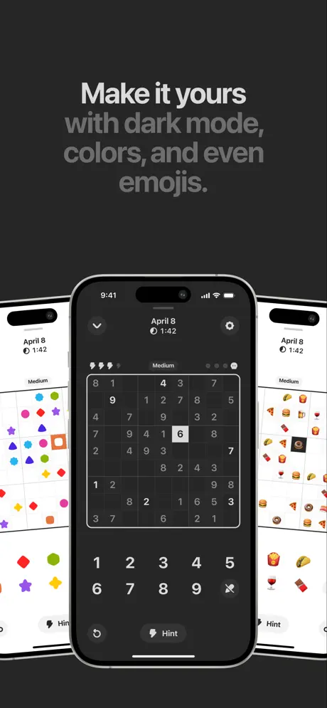
On-frame caption: “Make it yours with dark mode, colors, and even emojis.

The only frame with a dark canvas—approximately #1C1C1E—this shot serves as a palette cleanser. The headline reads “Make it yours” in white, with “with dark mode, colors, and even emojis.” in a muted gray. Three devices appear in a triptych: center is the standard dark-mode board (#121212 grid, white numerals), left is a shape theme (cyan stars, magenta circles, lime hexagons, orange squares), and right is a food-emoji theme (tacos, burgers, pizza slices, wine glasses, doughnuts). The center phone dominates; the flanking devices are partially cropped, acting as color swatches more than legible screens. This answers the customization objection decisively, though the jump from warm beige in frame one to dark studio here is abrupt and severs the lifestyle thread established at the opening. For shoppers who loved the analog warmth of frame one, this frame signals a different product—a clinical, feature-rich utility.

Sudoku a Day App Store screenshot 6 — Gameplay Settings
06

Gameplay Settings

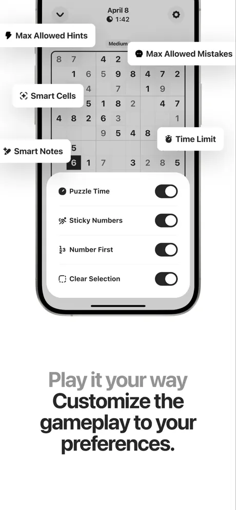
On-frame caption: “Play it your way / Customize the gameplay to your preferences.

Frame six returns to white and layers a settings sheet over a live board. Floating annotation pills ring the top half: “Max Allowed Hints,” “Max Allowed Mistakes,” “Smart Cells,” “Smart Notes,” and “Time Limit,” each with a small glyph and a soft shadow. The overlay inside the phone lists “Puzzle Time,” “Sticky Numbers,” “Number First,” and “Clear Selection,” each paired with an active iOS-style toggle. The headline below—“Play it your way” in light gray, “Customize the gameplay to your preferences.” in black—mirrors the earlier rhythm. While this proves depth, it is the busiest composition in the set; five external tags plus four internal toggles compete for attention, and the Sudoku grid behind them becomes visual noise. A shopper swiping at speed may register “settings” without parsing any individual option. The frame is informative but sacrifices the minimalism that the app’s name promises.

Sudoku a Day App Store screenshot 7 — Notes and Planning
07

Notes and Planning

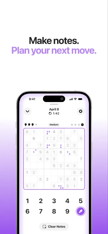
On-frame caption: “Make notes. / Plan your next move.

This is the only screenshot that introduces a full-color background gradient, shifting from white at the top to a medium lavender—roughly #B488FF—at the bottom. The headline, “Make notes.” in black and “Plan your next move.” in the same lavender, ties the typography to the UI feature. The board shows candidate numerals rendered in small purple digits inside cells, and the numpad’s pencil icon is selected, housed in a filled purple circle. A “Clear Notes” button sits at the bottom. The purple is functional—it maps directly to the note color in the interface—but the gradient wash feels less premium than the solid backgrounds used elsewhere. It reads as an outlier, suggesting a feature so important it required its own colorway, yet slightly disrupting the otherwise austere chromatic discipline. The frame succeeds at showing the mechanic, but it does so by breaking the environmental consistency of the sequence.

Sudoku a Day App Store screenshot 8 — Home Screen Widgets
08

Home Screen Widgets

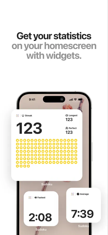
On-frame caption: “Get your statistics / on your homescreen with widgets.

The sequence closes with Home Screen widgets. A large rectangular widget dominates the upper half: “Streak” labeled at top left, a colossal “123” beneath it, and “Longest 123” plus “Perfect 123” aligned to the right. The bottom half of the widget is filled with a grid of yellow hollow rings—roughly #FFCC00—mimicking a contribution graph. Below, two smaller square widgets read “Fastest 2:08” and “Average 7:39,” each branded “Sudoku” in tiny type. The headline above—“Get your statistics” in black, “on your homescreen with widgets.” in gray—sells ecosystem stickiness. This frame solves the “why keep it installed?” question by showing ambient value. The yellow is the warmest accent in the entire set, providing a memorable exit note that loops back, chromatically, to the warm wood of frame one, even if the framing grammar does not.

05The craft

Captions, colour and the mechanics of the sell

Caption pattern

The captions follow a strict two-line formula. Line one is short, declarative, and rendered in a medium gray (#888888); line two carries the benefit or continuation in near-black (#111111). Examples: “Make notes. / Plan your next move.” and “Play it your way / Customize the gameplay to your preferences.” This creates a visual rhythm across the set that trains the shopper to read the second line as the payload. The only deviation is Frame 1, where the second line (“Free. No Ads.”) is lighter than the first, flipping the pattern because the product name is the anchor. The copy avoids gerunds and long clauses; every caption is a fragment, which respects the 3-second scan window.

Visual system

The color system is deliberately suppressed. The baseline is white, black, and warm gray, derived directly from iOS system materials. Accent colors appear only when tied to a specific feature: lavender for notes (Frame 7), yellow for streak widgets (Frame 8), pastel rings for Game Center avatars (Frame 4). This functional-color logic is strong, but it is violated by Frame 1’s warm beige environment and Frame 7’s full lavender gradient background, neither of which exists elsewhere in the sequence. Typography is uniformly sans-serif, likely SF Pro Display, with tight tracking on headlines and generous line height. Rounding is consistent with iOS standards: 22–27 pt corner radii on cards and widgets, full pills on toggles and segmented controls. There are no custom illustrations beyond the Memoji and laurel assets in Frame 3, which keeps the app feeling like a first-party Apple experience.

The thumbnail test

The first frame thumbnail—the static image a shopper sees before tapping—shows the top-left corner of the beige wall and the device angled away. At small scale, the headline “Sudoku a Day / Free. No Ads.” is still legible because of the high contrast between dark type and the light stucco. The grid itself is readable, though the angle introduces some perspective distortion. Against a category full of flat icon grids and neon badges, the warm lifestyle thumbnail will likely win attention, but it may also slightly obscure the UI details that hardcore Sudoku solvers want to inspect. A flat frontal thumbnail would have been more transparent, yet less seductive. It is a calculated gamble on mood over clarity.

Conversion mechanics

This set is built for conversion through clarity, not gimmick. The captions front-load benefits (“Free. No Ads.”, “Every day.”, “your homescreen with widgets”). The UI is always legible, never overlapped by text. However, conversion could be hurt by Frame 3’s unverifiable superlative, which may trigger skepticism in high-intent shoppers. The social proof frame would convert better with a quantitative anchor (e.g., “4.9★ from 12K ratings”) than an absolute claim. Frame 6’s clutter may also cause drop-off among minimalism-seekers who were attracted by Frame 1’s calm positioning. The widget frame is a strong closer because it answers retention before the user has even installed.

06Where it slips

What we would change

Framing whiplash between Frame 1 and the rest

Frame 1 establishes a photorealistic, lifestyle-oriented brand world: warm stucco, oak, natural shadow. Frames 2–8 abandon that world entirely for flat, white-background UI documentation. The tonal shift suggests two different art directors. The fix is not to remove the lifestyle shot, but to introduce a second lifestyle or textured frame later in the sequence—perhaps behind the widget screen—or to open with a flat frame and let the lifestyle shot live as a lifestyle-only end card.

Unverifiable superlative in Frame 3

The headline “The most loved Sudoku App on the App Store.” is a claim that the frame does not prove. The quotes below are strong enough on their own. A specific fix is to replace the headline with quantitative social proof—“4.9 stars, 12,000+ reviews”—or to drop the headline entirely and let the floating testimonial cards occupy the top half with more breathing room.

Over-annotation in Frame 6

Five floating tags plus four toggles create the highest clutter index in the set. This undercuts the minimalism promised by the app’s name. The fix is to reduce the floating tags from five to three, removing the two least distinct (e.g., “Smart Cells” and “Time Limit”), and instead let the toggles themselves carry the narrative. Alternatively, fade the board behind the settings sheet to 20% opacity so the overlay reads as modal, not competing.

Frame 7’s gradient departure

The full lavender gradient is the only non-achromatic, non-white background besides Frame 1 and 5. It feels like a template decision rather than a system choice. The fix is to return Frame 7 to a solid white background and express the note color only through the UI elements—the purple pencil icon, the purple candidate digits, and perhaps a subtle lavender drop shadow behind the phone.

Frame 2’s extreme crop

By cropping so tightly that the device bezels vanish, Frame 2 loses hardware context and reads like a UI component poster. The fix is to pull back to a standard frontal frame with visible bezels and Dynamic Island, maintaining consistency with Frames 3, 4, 6, 7, and 8.

07The recipe

How to apply this to your own app

  1. Lead with price and mood, not a feature grid.

    If your app competes on business model (free, no ads, no subscriptions), say it in the first headline before you show a single feature. Ocho does this correctly in Frame 1.

  2. Use native iOS components as trust signals.

    Game Center sheets, iOS toggles, and Home Screen widgets lower perceived risk because they prove you are building for the platform, not porting to it. Do not redesign what Apple has already legitimized.

  3. Split-weight headlines for scanability.

    A muted gray first line and a heavy black second line trains the eye to skip to the benefit while still providing context. Apply this consistently across all eight frames so the shopper knows where to look.

  4. Match your frame grammar to your brand promise.

    If you open with a lifestyle render promising calm and texture, ensure at least one later frame echoes that texture. If you prefer flat UI, open flat so the shopper is not misled by a mood that the product does not sustain.

  5. Let one frame do one job.

    Frame 6 tries to showcase five features at once and becomes noise. If you have many settings, split them across two frames or limit annotations to the three most defensible differentiators.

08Takeaways

Five things worth stealing

  • The sequence’s greatest strength is its narrative pacing: value → habit → trust → social → personalization → depth → ecosystem. That arc is correct for a utility game.
  • The split-weight headline system is the set’s smartest rhetorical device. It should be stolen, but only if applied consistently.
  • Native iOS visual language is used here as a competitive moat. In a category full of neon skins and custom iconography, looking like a first-party app is a legitimate strategy.
  • The biggest risk in the set is tonal inconsistency. Frame 1’s photorealism and Frame 7’s purple gradient feel like intrusions from different design systems.
  • For your own set, decide whether you are selling a mood or a feature list. Ocho tries to sell both and ends up slightly divided.
09The verdict

What the set actually achieves

The set achieves a coherent narrative arc. A shopper swiping left will first learn the price and vibe, then the daily calendar mechanic, then social validation, then social competition, then personalization, then mechanical depth, then ecosystem stickiness. The typography is disciplined, and the UI is consistently legible. However, the outcome is undercut by a lack of visual continuity: the opening lifestyle render promises an analog, object-in-space experience that the subsequent flat UI frames do not fulfill. Frame 3’s unverifiable superlative (”The most loved Sudoku App on the App Store.”) and Frame 6’s annotation clutter also introduce friction. The set reads as competent and native, but not quite art-directed.

This listing speaks directly to iPhone users who are tired of ad-heavy puzzle apps and who value streaks, widgets, and native Apple social features over deep multiplayer or arcade mechanics. The Game Center frame and the Memoji styling suggest an appeal to casual players aged 25–45 who are embedded in the Apple ecosystem. The minimalist typography and lack of cartoon mascots explicitly exclude children and hyper-casual arcade audiences. It is a listing for someone who treats Sudoku as a morning ritual—coffee, puzzle, done—and wants the app to feel as invisible and reliable as the Calendar or Weather app.

10Questions

Frequently asked

Why does Frame 1 use a lifestyle render when the rest are flat?

The lifestyle render is a conversion tactic meant to signal calm, premium quality, and physical presence. However, because it is not repeated, it creates a visual discontinuity. In practice, it works as a thumbnail attractor but weakens the set’s systemic cohesion.

Are the quotes in Frame 3 real user reviews?

The cards present them as such: “Best sudoku app in the world! Others are not even close” and “I love how I can wake up and im ready to go with my daily sudoku.” As a designer, you should treat these as attributed testimonials, though the frame omits attribution names, which slightly reduces credibility.

What is the purple accent in Frame 7 tied to?

The purple is functionally tied to the notes feature. Candidate numerals inside cells are rendered in purple, the pencil selection button is purple, and the headline “Plan your next move.” is colored to match. It is the only frame where a feature color bleeds into the background.

Does the set show the actual gameplay keyboard?

Yes. Frames 1, 5, and 7 all show a bottom-aligned numpad with digits 1–9, a delete key, and context buttons like “Hint” or “Clear Notes.” This reassures Sudoku purists that the input method is standard and visible.

11Keep reading

Build your own screenshot set

The full set

10 shots
Sudoku a Day App Store screenshot 1Sudoku a Day App Store screenshot 2Sudoku a Day App Store screenshot 3Sudoku a Day App Store screenshot 4Sudoku a Day App Store screenshot 5Sudoku a Day App Store screenshot 6Sudoku a Day App Store screenshot 7Sudoku a Day App Store screenshot 8Sudoku a Day App Store screenshot 9Sudoku a Day App Store screenshot 10

About the app

A beautiful Sudoku a day for iPhone. No ads, no clutter, no endless puzzle lists — just a calm daily ritual. Sudoku a Day is built for people who want a quick, satisfying puzzle Ocho, via the App Store listing.

Screenshots and store metadata belong to Ocho. They are shown here for design commentary and criticism. The analysis on this page is original work by floow.design. View the original listing.