
Bolt.new Review: Is Its UI Good Enough to Ship?
See where Bolt.new produces usable mobile UI, where spacing and components break down, and how much designer cleanup to budget before shipping.

This bolt.new review finds that Bolt.new is good enough to create a clickable mobile app starting point, especially for developers who will own the code. It is not good enough to treat as ship-ready UI without design review. Expect to correct hierarchy, spacing, type scale, and repeated components before release. Choose it for code-led prototypes; choose a design-first generator if visual polish is the buying criterion.
The short version
Our pick: Bolt.new for developer-led prototypes; not for final mobile UI design.
Best for: Developers who need a working app scaffold and can spend time correcting the interface in code.
Skip it if: Do not buy it as your primary mobile UI design tool if you need polished iOS or Android screens approved before engineering begins.
Key takeaways
- •Bolt.new generates an implemented interface, not a finished mobile design system.
- •Its strongest output is a credible first-pass app flow that developers can inspect and change immediately.
- •The recurring cleanup work is uneven spacing, weak type hierarchy, and components that drift between screens.
- •For a 5–10 screen mobile flow, plan a design pass before calling the UI ready for handoff or release.
- •Bolt.new’s code-first workflow is valuable when implementation speed matters more than strict visual consistency.
What's on this page
- •What Bolt.new generates from a mobile-screen prompt
- •The visual quality test: good first impression, uneven close-up
- •How much designer rework should you budget?
- •Where the code-first approach helps screen quality
- •Bolt.new for mobile app design: where it fits and where it does not
- •Verdict: good enough to test, not good enough to ship untouched
- •A practical buying checklist before you commit
What Bolt.new generates from a mobile-screen prompt
Bolt.new, from StackBlitz, takes a plain-English request and produces an application interface plus editable project code. For a prompt such as “make an iOS-style food delivery checkout with address, delivery time, payment method, and a place-order button,” the useful result is usually a populated screen rather than an empty wireframe: headings, cards, form controls, icons, buttons, sample data, and navigation structure.
That distinction matters. A design tool normally asks you to decide whether a payment selector is a bottom sheet, radio list, or separate route. Bolt.new makes that decision for you because it has to render something that works. You get momentum quickly, but you also inherit its choices.
The first screen often looks convincing at browser scale. The test is the next three screens. Ask for checkout, order tracking, account settings, and a saved-cards flow. Then compare the recurring elements:
- •Is the primary button the same height, radius, label weight, and bottom spacing everywhere?
- •Does a section title use the same type scale on every route?
- •Do cards retain the same padding and divider treatment?
- •Does the interface still respect a believable mobile safe area?
The answer is commonly “mostly, but not quite.” Bolt.new can create a functional mobile-shaped UI fast. It does not reliably establish the visual rules that make a seven-screen app feel designed as one product.
The visual quality test: good first impression, uneven close-up
Bolt.new UI quality is strongest in familiar patterns: lists, dashboards, simple settings pages, authentication, product cards, and forms. These are heavily represented interface conventions, and the generated result can give a founder or developer something concrete to react to within minutes.
Close inspection exposes the difference between plausible and production-ready. Spacing often follows local convenience rather than a defined scale. One card may have comfortable internal padding while the next feels compressed. A title may sit 24 pixels from its content on one screen and a visibly different distance on another. You may also see a dense cluster of labels, inputs, helper text, and buttons that technically fits but is tiring to scan on a phone.
Typography is another regular repair area. The screen may have too many weights, an oversized hero heading beside small, low-emphasis labels, or line heights that make a form look crowded. Components can drift as the app expands: one destructive action uses a text link, another uses a filled button; two modal-like panels have different corner radii.
None of these failures makes the output unusable. They do make a UI feel generated. A designer notices the missing rhythm before a user can name it. In a consumer app, that perception affects trust. In an internal admin utility, it may not matter.
The practical conclusion is simple: judge output at 390-pixel width, across multiple routes, not from the first attractive screenshot.
How much designer rework should you budget?
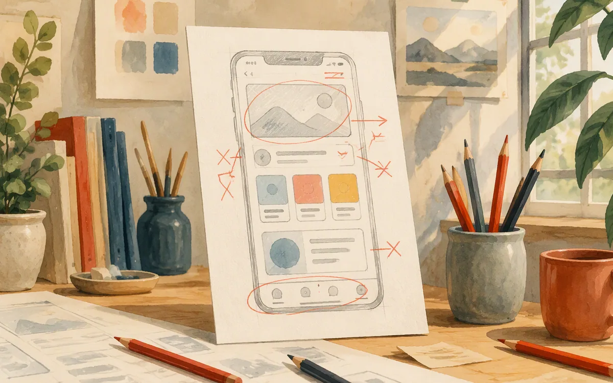
Treat the first generated screen as direction, not final art. For a small flow of five to ten screens, a designer can usually preserve the structure while doing a cleanup pass: define spacing tokens, settle a type scale, standardize buttons and inputs, repair alignment, and remove decorative noise. The amount of rework rises sharply if the product has an existing brand, accessibility requirements, or platform-specific conventions to respect.
The work is not just moving margins. A proper pass asks questions generation cannot settle from a short prompt: Which action deserves the sticky bottom button? What is the empty state? Does the form reveal validation at the field or after submit? Does an Android version use the same navigation pattern as iOS? What happens when a customer’s address is two lines long?
A reasonable planning rule is to reserve a full UI review cycle after generation. Do not schedule a Bolt.new output for direct release after a quick color swap. The third day is where the cost appears: a feature request adds a new screen, and you discover the original cards, buttons, and headers were copied as one-off markup rather than managed as a coherent component system.
If the app is an internal tool, prototype, hackathon build, or early customer demo, that trade-off can be sensible. If it is a paid consumer product or a client deliverable, budget a designer to normalize the full flow before QA.

Where the code-first approach helps screen quality
The best argument for Bolt.new is not that it replaces design review. It is that it removes the gap between an interface idea and a running implementation. A developer can prompt for a screen, inspect the result, change content, connect a data source, and test the path without manually rebuilding a mockup in another environment.
That is useful when UI decisions are still fluid. If a booking flow needs an extra step, a developer can test the change in the actual app structure instead of waiting for a static revision and then recreating it. The generated code also makes functional details visible early: whether state changes, error states, and navigation are being considered at all.
The same code-first behavior can hurt visual quality. The generator is rewarded for producing a rendered, working result. It is less likely to pause and create a deliberate token system, audit every component variant, or protect the visual constraints a design team uses. As prompts pile up, local changes can solve the immediate request while making the wider interface less consistent.
This is the core bolt.new vs design tool trade-off. A code-led generator compresses prototype-to-app time. A design-led workflow gives you better control over repeatable visual decisions before implementation. Neither is automatically better; the right choice depends on whether your immediate risk is engineering delay or a weak mobile experience.

Bolt.new for mobile app design: where it fits and where it does not
Bolt.new for mobile app design works best when “mobile” means a responsive app interface that a developer wants to build and iterate quickly. It is particularly practical for straightforward product patterns: account areas, CRUD flows, lightweight marketplaces, simple trackers, and operational tools. In those cases, usable behavior may be more valuable than immaculate visual refinement on day one.
It is a weaker fit for teams that need deliberate native iOS and Android design from the start. Mobile UI has small but important constraints: touch-target sizing, keyboard behavior, safe areas, long-form content, bottom navigation, sheets, and the distinct expectations users bring to each platform. A generic responsive layout can resemble an app screen without resolving those details.
It is also not the right tool for a brand-sensitive launch where design approval precedes engineering. If your process requires a design system, carefully reviewed states, stakeholder sign-off, and a handoff artifact that designers own, start with a dedicated design workflow. You can still use code generation later, but do not make generated markup the source of visual truth.
The question “is bolt.new good for ui design” has a narrow answer: it is good at proposing and implementing UI quickly. It is not a substitute for the craft of mobile UI design. Buy it for speed through early implementation, not because you expect it to make every screen release-ready.
Verdict: good enough to test, not good enough to ship untouched
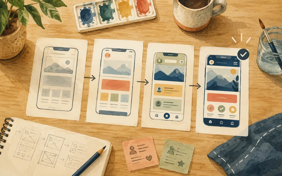
This review’s recommendation is clear: choose Bolt.new if a developer needs a working prototype or early product build and accepts a planned design cleanup pass. It wins over a design-only process when the team’s bottleneck is turning an idea into runnable software. Its output can be persuasive enough for user tests, internal reviews, and the first version of a simple workflow.
It loses to a design-first process when screen quality is the product. A finance app, health product, consumer subscription app, or branded client project needs tighter control of hierarchy, accessibility, states, and platform behavior than prompt-generated implementation usually provides unaided.
Do not buy Bolt.new expecting a polished mobile design system to emerge from one prompt. Its visual issues are repairable, but repair is part of the cost. The more screens you add, the more important it becomes to stop adding local fixes and establish shared rules.
Readers who find that cleanup burden too high should evaluate floow.design for the earlier screen-design stage. It generates iOS and Android app screens from a description, supports iteration by chat, and exports designs to Figma or code. That design-first route is better suited to teams that want to settle the screens before implementation, with less visual normalization left to do after export.
A practical buying checklist before you commit
Run your own test before choosing a subscription. Use one realistic feature, not a homepage prompt. Ask for six connected screens from your product: onboarding, a list, a detail view, create or edit, an empty state, and an error state. Add realistic long labels and awkward data. Then review on a phone-sized viewport.
Score the result against four questions:
- •Can a user understand the main action within a few seconds?
- •Are repeating controls genuinely the same across all six screens?
- •Would your developer know which pieces should become shared components?
- •Could your designer approve the visual system without rebuilding it?
If the first three are yes and the fourth is no, Bolt.new may still be a smart developer tool. Just price in the design work rather than calling it free output. If visual approval is the gate that holds your team back, use a screen generator built around design artifacts instead. floow.design is the better fit for that specific job: generate the mobile screens, refine them in chat, then export to Figma or your preferred implementation path.
Published plans and included usage can change, so verify current limits on each vendor’s pricing page. The important comparison is not the monthly figure alone. It is whether the tool removes a week of implementation work or creates a week of UI correction.
Bolt.new output quality for a typical mobile app flow
| Area tested | What Bolt.new does well | What commonly needs correction | Ship-ready without design review? |
|---|---|---|---|
| First screen from a prompt | Produces a populated, runnable interface quickly | Hierarchy, spacing rhythm, and visual emphasis | No |
| Repeated forms and settings screens | Establishes familiar controls and page structure | Input sizing, labels, helper text, button variants | No |
| Multi-screen app flow | Lets developers extend routes and behavior quickly | Component drift, inconsistent padding, uneven type rules | No |
| Internal tool or prototype | Often reaches a useful testable state fast | Minor polish depends on audience and duration of use | Sometimes, with clear limits |
| Branded consumer mobile app | Can accelerate the implementation starting point | Design system, accessibility states, platform detail, and visual QA | No |
What it costs
Bolt.new is a paid product after any available trial or included usage, and its plans are structured around access and usage rather than being a substitute for design labor. Check Bolt.new’s own pricing page for current limits and published prices, as they can change. Budget separately for the designer time required to review and standardize a generated multi-screen mobile flow; that is the cost buyers most often underestimate.
Mistakes that cost you the most
Judging the UI from one polished-looking screen.
Generate at least six connected screens, including an empty state and an error state, then compare every repeated component.
Treating generated markup as a design system.
Define shared type, spacing, color, and component rules before adding the second feature.
Testing only with short placeholder copy.
Use real labels, long names, validation text, and dense content before approving the layout.
Assuming a responsive interface is automatically native-mobile quality.
Review touch targets, safe areas, keyboard behavior, navigation, and platform conventions on phone-sized screens.
Frequently asked questions
is bolt.new good for ui design
Bolt.new is good for UI design exploration and fast implementation, but it is not the best choice for final mobile UI design without a designer involved. It produces credible layouts and common app patterns quickly. For a customer-facing iOS or Android product, expect to refine spacing, typography, component variants, accessibility states, and platform-specific behavior before shipping.
does bolt.new generate clean mobile screens
Bolt.new can generate clean-looking mobile screens at first glance, especially for standard forms, dashboards, lists, and account flows. Across several screens, visual consistency is less reliable. Designers commonly need to correct padding, type hierarchy, button treatments, card styles, and alignment. Treat the output as a strong first pass rather than a final production design.
how much editing does bolt.new output need
Bolt.new output usually needs a design cleanup pass for any app users will judge visually. A simple internal workflow may only need light corrections. A multi-screen consumer app needs broader work: standardizing components, setting spacing and typography rules, checking empty and error states, and testing real content. The more features added by separate prompts, the more consistency work tends to grow.
is bolt.new a design tool or a code tool
Bolt.new is primarily a code-first application-building tool from StackBlitz that generates an interface as part of a working project. It can help shape UI, but it is not a dedicated mobile design, vector-editing, or high-fidelity design-system tool. Its main advantage is moving quickly from a written request to editable implementation rather than producing final design artifacts first.
can designers use bolt.new without coding
Designers can use Bolt.new without writing code to prompt for screens, inspect ideas, and give a developer a concrete starting point. They will get more reliable results if they can describe states, content, and component rules precisely. However, designers who need precise control over layout, reusable components, and final handoff will still need a design-first tool or developer support to revise the generated implementation.
Where this leaves you
Bolt.new earns its place in a developer-led prototype workflow because it turns product requests into working UI fast. But the interface it generates is usually one design pass short of release quality. If that pass is acceptable, buy for implementation speed. If you need to approve polished mobile screens before code, start design-first with floow.design and export only after the UI rules are settled.
Design the screens before you commit to a tool
Readers who see how much manual cleanup Bolt.new's output needs are shown floow.design's screens are generated design-first, so there's less to fix before export.
If that is roughly your situation: describe the app in plain English and floow.design draws the iOS and Android screens, takes your changes by chat, and exports the result to Figma or to Flutter, React Native, SwiftUI and Jetpack Compose.
Free tools you can use right now
- •CSS Grid Generator — free, no sign-up
- •px to rem Converter — free, no sign-up
- •Phone Mockup Generator — free, no sign-up
Related reading
Design your mobile app with AI.
Generate pixel-perfect iOS and Android screens in seconds, then export to Figma or code.
You might also like…
 Roundups24 September 2026What is v0 by Vercel used for? ReviewSee where v0 by Vercel excels at React UI generation, where native mobile work breaks down, and which tool to choose for iOS and Android screens.By floow.design Team, Mobile Design
 Roundups24 September 2026Lovable app what does it do: Honest ReviewLovable can turn prompts into working web apps fast. See where its visual output holds up, where code takes over, and who should choose a design-first tool.By floow.design Team, Mobile Design
 Guides24 September 2026Lovable alternative free Reddit: Leaving LovableLeaving Lovable? Keep your content and screen inventory, then rebuild web-shaped UI as iOS and Android screens without carrying over the wrong navigation.By floow.design Team, Mobile Design