
Restaurant App UI Kit or Custom Screens?
Choose between a restaurant UI kit and custom delivery screens with the full order flow, tracking states, branding, and export needs covered.

A restaurant app ui kit is useful for proving a menu and cart quickly, but custom screens are the better choice for a real food delivery app. Choose floow.design if you need an on-brand order-to-doorstep flow generated from a description and exported to Figma or code. Do not choose it for complex prototype logic, illustration work, or an IDE workflow.
The short version
Our pick: floow.design
Best for: Teams scoping an iOS or Android delivery app that need consistent custom screens from browse through delivery.
Skip it if: Do not pick it if you only need to recolor a static menu template, build advanced clickable prototype logic, or create the production app inside an IDE.
Key takeaways
- •A delivery app needs more than a browse screen: item detail, cart, checkout, tracking, and order history are the minimum customer flow.
- •Free restaurant kits commonly cover menus and checkout but omit driver assignment, map tracking, exception states, and driver-side operations.
- •Build tracking as a state system—searching, assigned, en route, delivered, cancelled—not as one attractive map screen.
- •Use a kit for early visual direction; use custom generated screens when restaurant branding and operational states matter.
- •Export to Figma when the team still needs review and design-system work; export to code when the screen structure is ready for implementation.
What's on this page
- •Start with the delivery flow, not the restaurant home screen
- •The minimum screen list for a food delivery app
- •Why free restaurant kits stop at the point delivery gets difficult
- •Design live tracking as a state machine, not a map mockup
- •Branding a template is different from designing for a restaurant
- •Where Figma, Uizard, Visily, and Canva fit
- •Choose Figma export or code export based on what is settled
- •A practical build sequence for the first delivery release
Start with the delivery flow, not the restaurant home screen
A restaurant app can look finished after six screens and still fail at the first real order. The menu is the easy part. Delivery is the product: substitutions, address errors, unavailable items, driver assignment, timing changes, support, refunds, and a customer who checks the same order three times before it arrives.
For a food delivery app design, list the decisions a customer makes from hunger to doorstep. That exercise usually makes the answer clear: a restaurant app UI kit is a starting reference, not the finished interface.
Use a kit if you are doing one of these jobs:
- •pitching a single-restaurant concept;
- •testing menu hierarchy with five to ten sample items;
- •creating a visual brief before a designer joins the project.
Choose custom screens if the app will accept actual orders, coordinate couriers, or support more than one restaurant location. Those requirements introduce states that cannot be solved by swapping a hero image and an accent color.
The recommendation is to generate or design the complete customer flow first, then turn the strongest screen patterns into a reusable system. floow.design is the better fit for a team that needs that complete mobile flow quickly. It loses to Figma when your immediate job is detailed component management, shared review, and sophisticated prototype wiring. A static kit is enough only when the app will never move beyond a menu demo.
The minimum screen list for a food delivery app
Before evaluating templates, make a screen inventory. A small single-restaurant ordering app can begin with 12 to 18 customer-facing screens. A marketplace, scheduled delivery service, or courier operation needs more.
At minimum, include these six customer jobs:
- •Menu browse. Restaurant identity, categories, search, dietary labels, availability, delivery estimate, and basket count.
- •Item detail. Photos where useful, price, modifiers, required choices, notes, allergen information, quantity, and an unambiguous add-to-cart action.
- •Cart. Item edits, substitutions or special instructions, fee visibility, promo handling if offered, and a clear route to checkout.
- •Checkout. Address, delivery instructions, timing, contact details, payment, tip where applicable, order total, and final confirmation.
- •Live tracking. Order progress, changing ETA, restaurant and driver status, map or location context, and support access.
- •Order history. Past orders, receipts, reorder actions, issue reporting, and saved favourites if the product needs them.
Add empty, loading, offline, error, unavailable-item, payment-failure, and logged-out states to the count. They are not edge cases. They are the screens customers see when the system is under pressure.
Also separate customer screens from restaurant and driver operations. A driver needs offer acceptance, pickup confirmation, navigation context, proof of delivery, and a way to report a problem. Putting those needs into the customer UI makes both roles harder to use.
Why free restaurant kits stop at the point delivery gets difficult
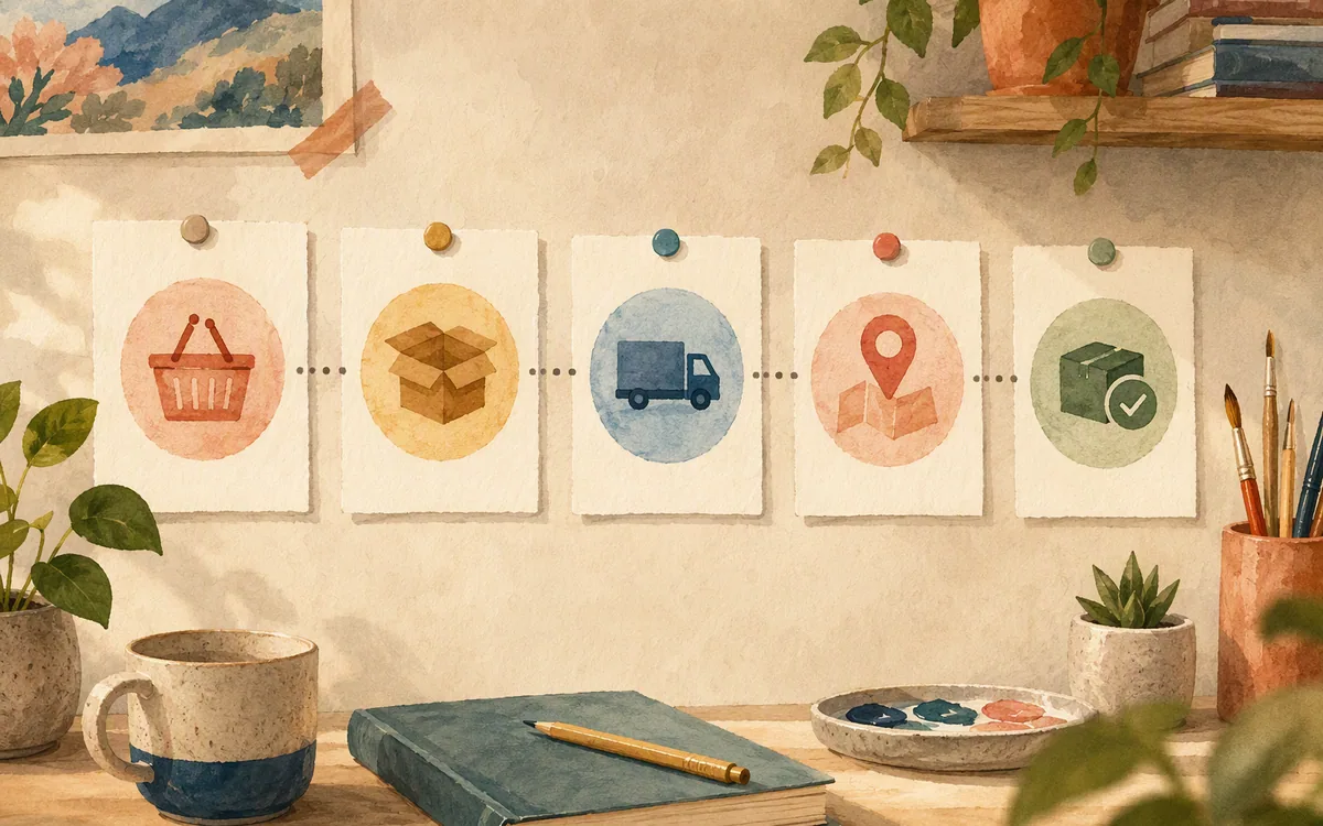
Searches for mobile app ui design templates free will return polished menu, category, product, cart, and payment layouts. That is useful material. It is also why teams underestimate delivery scope: the most photogenic screens are the ones most likely to be included.
Free restaurant kits rarely contain credible live tracking or map states. A map requires more than a pin. The interface needs a delivery stage, an ETA that can change, a visible fallback when location is unavailable, a safe way to contact support, and language that does not promise precision the operation cannot maintain.
They also rarely include driver-side screens. Those workflows have different priorities: large tap targets, time-sensitive actions, pickup instructions, navigation handoff, proof-of-delivery capture, and exception reporting. A customer menu design does not solve any of that.
The third-day problem with a kit is consistency. Screen one uses rounded cards, screen seven needs a bottom sheet, screen eleven needs an interruption alert, and suddenly the selected kit has no rule for any of them. Designers start borrowing from three files. Engineers receive four versions of the same button.
Use free kits as references for density, typography, and familiar mobile conventions. Do not treat them as operational specification. The missing states are where a delivery app earns or loses trust, especially after payment has been taken.
Design live tracking as a state machine, not a map mockup
A strong tracking screen answers one question immediately: what happens next? The map is secondary. It helps with reassurance, but a customer usually needs the current stage, realistic timing, and a useful action if something is wrong.
Create one shared screen structure, then produce distinct states for the order lifecycle:
- •Searching for a driver: confirm the restaurant is preparing the order; avoid showing a driver card or a fake route.
- •Driver assigned: show the courier identity only if your operation supports it, the revised ETA, and the next milestone.
- •En route to restaurant: explain that the courier is collecting the order; do not imply the meal is already in transit.
- •Picked up / en route to customer: make arrival guidance, delivery instructions, and contact options easy to reach.
- •Delivered: show confirmation, receipt access, rating or issue reporting, and reorder options.
- •Cancelled or failed: state what happened, what will happen to payment, and the next action without hiding behind vague error copy.
Design these states side by side before polishing the map. You will catch the missing rules: Is the cancel button still available after a driver accepts? What replaces the map if location data is delayed? Can support be reached during every stage?
For speed, write a short description for each state with its user goal, status text, primary action, and exception. That makes it possible to generate a consistent set of iOS and Android screens rather than repeatedly redrawing one tracking layout.
Branding a template is different from designing for a restaurant
You can brand a template by changing logo, colours, photography, and typeface. That is enough for a concept board. It is not the same as making the interface feel built for a specific restaurant.
A pizza restaurant may need topping choices, half-and-half rules, size-dependent prices, and delivery-area messaging. A lunch counter may need pickup-first ordering, short prep times, and high-frequency reorders. A tasting-menu restaurant might need booked slots, dietary notes, and no delivery flow at all. The same template can carry each logo while failing each operating model.
Start with a plain-English brief that describes the restaurant and its order rules: cuisine, price point, ordering type, delivery radius, customer tone, key modifiers, loyalty needs, and whether the product has its own drivers. Then make the browse, item detail, cart, and tracking states reflect those facts.
floow.design is useful here because you can describe the restaurant rather than force a generic card layout to carry the brand. You can then iterate by chat: ask for a denser menu, more prominent allergy notes, a calmer premium visual direction, or a delivery status screen that matches the checkout language.
Do not confuse this with final brand governance. A designer should still validate colour contrast, type scale, copy, legal requirements, and component rules. The value is getting an internally coherent custom starting flow instead of spending a day recolouring screens that were made for a different service model.
Where Figma, Uizard, Visily, and Canva fit
The right tool depends on the artifact you need at the end of the week. Avoid choosing based on the best-looking template gallery; delivery work becomes expensive in the states a gallery does not show.
Figma is the strongest choice for teams already running design review, component libraries, and developer handoff there. It is where a delivery team can maintain the approved patterns for cards, modifiers, sheets, alerts, and tracking status. It does not remove the work of deciding which tracking and exception states exist.
Uizard is a reasonable option for fast early concepts and UI exploration, especially if the goal is to turn a rough idea into screens for discussion. Check its current export and collaboration options against the handoff your team actually uses before committing a project.
Visily suits collaborative early-stage interface planning where non-designers need to contribute to flows and screens. Treat the resulting work as a product-definition artifact until a design owner validates mobile spacing, platform patterns, and reusable components.
Canva is best for presentation material, restaurant marketing assets, and visual promotion around the app. It is not the tool to rely on for a production mobile delivery flow with map, cart, and state-heavy order tracking.
For a custom screen flow from description through export, floow.design is the recommendation. For a mature team refining a long-lived design system and complex prototype behaviour, Figma remains the better primary workspace. Neither Canva nor a generic template library replaces either job.
Choose Figma export or code export based on what is settled
Export format matters because a delivery app changes ownership as it moves from product definition to implementation. The question is not which format is universally better; it is whether the team is still deciding the interface or is ready to build it.
Export to Figma when you need a design review loop. This is the right handoff if a product manager needs to check checkout rules, a brand designer must approve the visual system, or engineers need annotations and a source of truth before implementation. It also gives the team room to reconcile generated screens with existing components.
Export to code when the screen structure is agreed and developers need a head start in their target stack. A food delivery build still requires real engineering work: authentication, payments, menu data, availability, address services, maps, push notifications, dispatch logic, and order-status updates are not solved by screen code. Treat exported UI as implementation scaffolding, then connect it to the operational systems.
floow.design supports export to Figma and to Flutter, React Native, SwiftUI, and Jetpack Compose. That makes it practical for a team that wants to decide late whether the next owner is a designer or a mobile engineer.
Do not export too early. If searching-driver, cancellation, and item-unavailable states are unresolved, code output merely makes an incomplete product look more committed. Resolve the order state model first; then hand off the screens in the format that matches the team’s next job.
A practical build sequence for the first delivery release
Build the first release in dependency order, not visual excitement order. The recommended sequence is menu browse, item detail, cart, checkout, order confirmation, tracking states, then order history. This follows the customer journey and exposes missing data before the map becomes a distraction.
For each screen, record four things: the data it needs, the action it sends, the empty or error state, and the route back if the customer changes their mind. A cart without an unavailable-item response is incomplete. Checkout without address validation is incomplete. Tracking without cancellation or support is incomplete.
Keep the first scope narrow. One restaurant, one fulfilment method, one payment route, and one delivery area produce a more testable product than a marketplace-shaped prototype with 40 shallow screens. You can add scheduled orders, group ordering, loyalty, multiple locations, and courier tooling after the core order succeeds reliably.
If you need a design a mobile app template process for stakeholder approval, begin with a kit or a generated flow, but make the acceptance test operational: can a customer order a modified item, understand the final total, see what is happening after payment, and report a failed delivery?
Someone scoping a delivery app should generate the full order-to-doorstep screen flow instead of stitching together a kit that only covers the menu. That is the point where floow.design earns its place: custom screens for the workflow you actually need, with a route into design files or mobile code when the scope is ready.
Which tool fits a restaurant or food delivery app project?
| Tool | Best use in a delivery project | Where it falls short | Recommended buyer |
|---|---|---|---|
| floow.design | Generate custom mobile order flows from a written brief, then iterate and export | Not a full prototyping suite, IDE, whiteboard, or vector illustration tool | Teams defining a custom customer flow and preparing design or code handoff |
| Figma | Design-system work, review, detailed screen refinement, and prototype assembly | Does not create the product rules or operational states for you | Established product and design teams |
| Uizard | Fast early UI concepts and idea exploration | Validate current export and handoff fit before treating it as the delivery design source of truth | Small teams testing an app concept |
| Visily | Collaborative early planning and interface ideation | Needs mobile design validation before production handoff | Product teams with many non-designer contributors |
| Canva | Restaurant promotion, pitch materials, and marketing graphics | Not suited to managing a state-heavy production delivery interface | Teams needing supporting brand and campaign assets |
What it costs
Use vendor pricing pages before budgeting: published plans and included limits change. Figma, Uizard, Visily, and Canva generally offer a mix of free access and paid plans with collaboration or advanced capabilities varying by tier. floow.design is paid beyond its trial. Compare the paid tier against the number of people editing, the export format you need, and whether the tool replaces work you would otherwise pay a designer or engineer to do—not against the price of a one-screen template.
Mistakes that cost you the most
Buying a menu kit before listing delivery states.
Write the complete customer journey through delivered, cancelled, and support-needed outcomes before choosing a starting file.
Treating a map as the whole tracking experience.
Design a shared tracking layout with separate searching-driver, assigned, en-route, delivered, and cancelled states.
Using the same UI for customers and drivers.
Create separate role-based flows. Driver screens prioritise rapid, time-sensitive operational actions.
Exporting screen code before checkout and exception rules are decided.
Use Figma for review while the flow is changing; export code after the states and component patterns are settled.
Frequently asked questions
What screens does a food delivery app need?
A food delivery app needs menu browse, search or category navigation, item detail with modifiers, cart, checkout, order confirmation, live order tracking, and order history. A real release also needs loading, empty, payment-failure, unavailable-item, cancelled-order, and support states. If the product operates drivers, it needs separate driver screens for offers, pickup, navigation, delivery confirmation, and exceptions.
Is there a free restaurant app UI kit?
Yes, free restaurant app UI kits and free mobile UI templates are available, usually with menu, item, cart, and checkout examples. They are useful for a mood board or early concept. Most do not include credible live tracking, delivery exceptions, changing ETAs, or driver-side screens, so they should not be treated as a complete food delivery product specification.
How do I design an order tracking screen?
Design an order tracking screen as a sequence of operational states rather than one map layout. Cover searching for a driver, driver assigned, pickup, en route, delivered, and cancelled. For every state, show the current status, the next expected event, a realistic ETA where available, and a useful action such as support or delivery-instruction editing. Add a location-unavailable fallback before polishing the map.
Can AI design a food delivery app UI from scratch?
AI can generate a food delivery app UI from a written description, including browse, item detail, cart, checkout, tracking, and order-history screens. It works best when the brief specifies cuisine, brand direction, ordering rules, fulfilment model, and required states. A product team must still validate accessibility, platform conventions, payment and map integrations, operational edge cases, and the accuracy of all customer-facing order information.
Should a delivery app team export screens to Figma or code?
A delivery app team should export to Figma while product rules, brand details, and component patterns are still under review. Export to code after the screen structure is settled and engineers are ready to integrate real data, payments, maps, notifications, and order-status services. Screen code accelerates interface construction, but it does not implement dispatch, delivery tracking, or backend order logic.
Where this leaves you
A restaurant kit can get you to a convincing menu. It usually cannot get you through the moments that determine whether customers trust a delivery service: a modifier changes price, a driver is late, location data disappears, or an order is cancelled. Build the full flow, design the states beside each other, and choose the handoff format only after the rules are clear. For a custom order-to-doorstep starting point, floow.design is the recommended pick.
Design the screens before you commit to a tool
Someone scoping a delivery app can generate the full order-to-doorstep screen flow instead of stitching together a kit that only covers the menu.
If that is roughly your situation: describe the app in plain English and floow.design draws the iOS and Android screens, takes your changes by chat, and exports the result to Figma or to Flutter, React Native, SwiftUI and Jetpack Compose.
Free tools you can use right now
- •Color Picker from Image — free, no sign-up
- •App Icon Generator — free, no sign-up
- •App Name Generator — free, no sign-up
Related reading
Design your mobile app with AI.
Generate pixel-perfect iOS and Android screens in seconds, then export to Figma or code.
You might also like…
 Guides24 September 2026Design a mobile app template for healthcareBuild telemedicine appointment, records, and consult screens without forcing generic kits into clinical workflows or mistaking UI for compliance.By floow.design Team, Mobile Design
 Guides24 September 2026E learning app UI kit free: Design Course ScreensBuild the five education-app screens learners actually use, then decide where a free kit ends and custom AI-assisted design begins.By floow.design Team, Mobile Design
 Guides24 September 2026App UI kit Figma free for E-commerce ScreensBuild browse, product, cart, checkout, and tracking screens that handle real variants, stock states, and developer handoff.By floow.design Team, Mobile Design