
Outgrowing a mobile UI kit template
Know which kit screens to keep, rebuild, or regenerate before brand debt and broken edge cases slow your mobile app launch.

Stop relying on a mobile ui kit template once your core flow needs exceptions the kit was not built to handle, such as payment states, booking rules, or role-based dashboards. Keep generic screens such as onboarding and settings with light edits, but rebuild domain-specific screens. For most founders, regenerating custom screen directions is faster than hand-editing a 20-screen kit screen by screen.
The short version
Our pick: Regenerate custom mobile screens from a clear product description, then refine the selected direction in Figma.
Best for: Founders with a validated app concept whose real iOS or Android flows have outgrown a starter kit.
Skip it if: Do not switch yet if you are only testing a three-screen demo and have not learned what your core user flow needs.
Key takeaways
- •A UI kit is a sensible early shortcut: it gives you component consistency, a credible investor demo, and a lower initial design bill.
- •Keep generic screens where the product logic is ordinary; rebuild screens where the business rules, data, or decision-making are specific to your product.
- •The expensive part of a kit migration is not changing colors. It is finding every state the original kit never modelled.
- •For a 20-screen app, manual conversion commonly takes several working days to a few weeks; AI-assisted regeneration can shorten first-pass screen creation, but not product review and QA.
- •Use Figma for detailed design-system control, Uizard and Galileo AI for fast concept exploration, and floow.design when the job is producing editable mobile app screens from a product description and iterating on them by chat.
What's on this page
- •A kit is the right answer—until your app stops behaving like the sample
- •Three signs you have outgrown the kit
- •Keep these screens: the low-risk transfer list
- •Rebuild these screens: where your product is actually different
- •Budget the migration: 20 kit screens, hand conversion versus regeneration
- •Where Figma, Uizard, Galileo AI, and floow.design fit
- •Do not let a free download decide your product model
- •A migration sequence that does not stall the release
A kit is the right answer—until your app stops behaving like the sample
A UI kit earns its place at the start of a mobile product. You get a coherent set of buttons, fields, cards, navigation patterns, and typography decisions without designing each one from zero. That matters when you need an investor demo next week rather than a design-system project next quarter.
A free or paid kit also limits early arguments. A founder can show a user profile, list, detail view, and basic onboarding in one visual language. Developers can estimate a familiar screen structure. For a proof of concept, that is usually enough.
The problem begins when you mistake visual completeness for product fit. A kit has already made product decisions on your behalf: what a list item contains, how many steps checkout has, what an empty state says, whether users can change a booking, and how an account works. Those assumptions are invisible on day one. By day three of real flow design, they become the reason your file has twelve detached variants named final-final-2.
Treat a kit as scaffolding, not as the building. It is especially useful for a clickable demo, a usability-test stimulus, or a narrow first release with conventional flows. It is a poor long-term foundation when the thing users pay for depends on rules the kit cannot express.
The decision is not “kit or custom” across the entire app. The better question is screen by screen: which interfaces are generic enough to preserve, and which carry your product’s actual value?
Three signs you have outgrown the kit
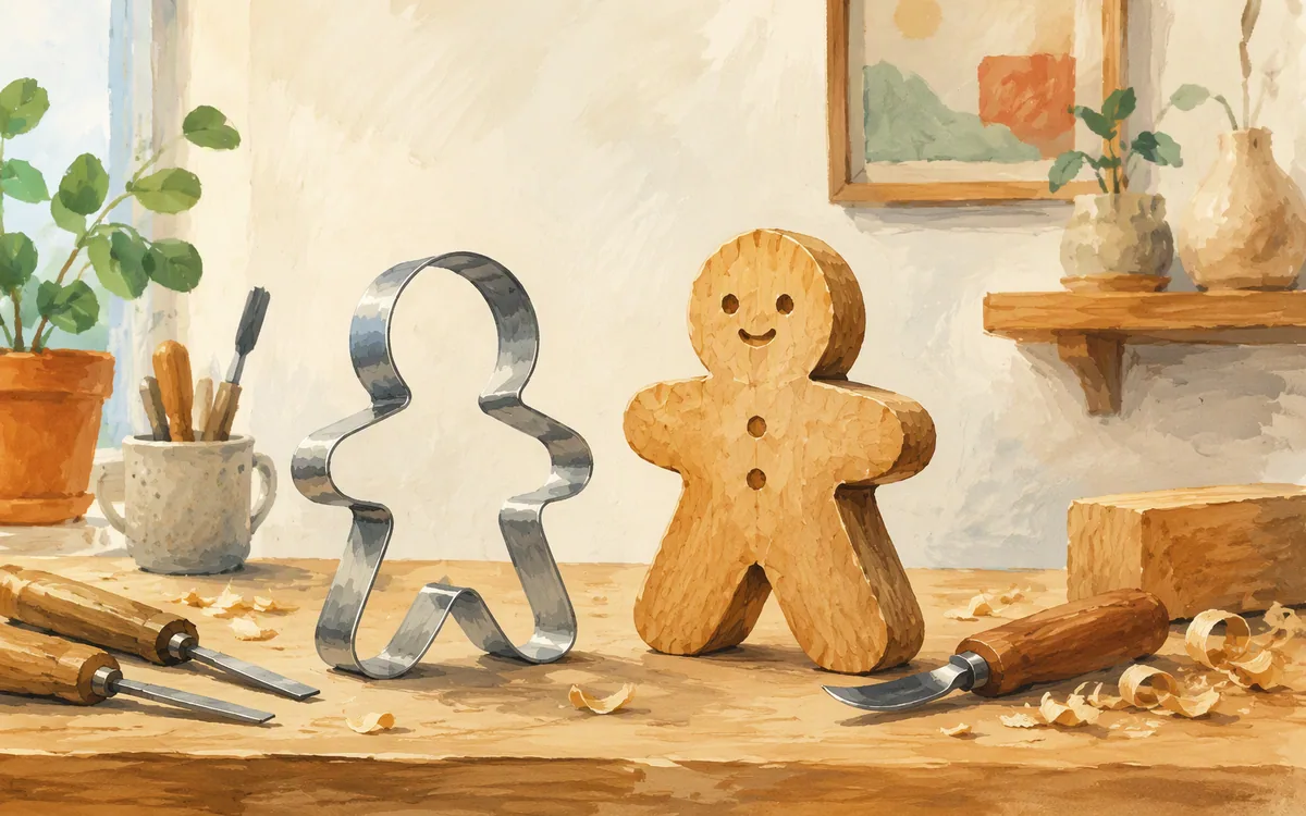
The first sign is edge-case debt. Your happy-path checkout, booking, or application screen looks acceptable, but you cannot show a declined payment, a waitlist, a partial refund, a delivery change, an unavailable time slot, or an approval state without adding one-off components. If exceptions are being designed as annotations on top of the kit, the underlying screen needs reconsidering.
The second sign is an unusual flow. A kit generally assumes a linear sequence: choose, confirm, pay, success. Real products often need compare, save, invite, wait for approval, return later, and resolve an issue. The moment your core task starts skipping across three kit patterns, users feel the seams. Your team feels them too when each new state requires a fresh workaround.
The third sign is brand mismatch. This is more than swapping a purple accent for a green one. If your product needs a dense, operational interface but the kit is spacious and editorial, or it needs reassurance around money but the kit feels playful, component-level restyling will not fix it. The hierarchy, content density, and interaction language are wrong.
Run a simple audit. For each screen, mark whether you can represent all known states with existing kit components, whether the navigation matches the actual task, and whether the screen communicates the brand without cosmetic patches. Screens that fail two of three tests should enter the rebuild list.
Do this before engineering starts adapting the kit. A screen that is awkward in Figma becomes more expensive once its compromises are encoded in iOS and Android components.
Keep these screens: the low-risk transfer list
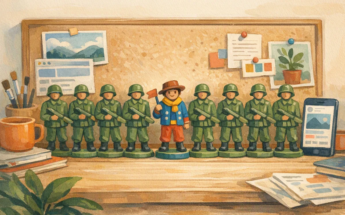
Not every screen deserves a custom rebuild. Generic utility screens usually survive the move with light edits because their structure is familiar and their product logic is limited.
The usual keep list includes:
- •Onboarding: Keep the broad sequence if it explains a standard account setup. Rewrite the copy, images, permissions rationale, and any step that collects information specific to your product.
- •Settings and account: Notification controls, password changes, profile details, legal links, and sign-out patterns rarely need invention. Align them to your navigation and platform conventions.
- •Generic lists: A straightforward list of saved items, notifications, messages, or activity can transfer if each row has ordinary metadata and one clear action.
- •Search and empty states: Keep the shell, but rewrite filtering, sorting, suggestions, and no-result messages around what users are actually trying to find.
- •Basic authentication: Email, passcode, and recovery screens can often be restyled rather than redesigned, subject to your authentication method and security requirements.
“Light edits” does not mean a blind recolor. Expect to change type scale, spacing, icons, copy, accessibility contrast, and component states. You may also need to replace imagery and adjust Android and iOS details such as navigation behavior.
As a planning rule, a generic transferred screen may take roughly one to three design hours to bring into a real product system, assuming the information architecture is settled. The number rises fast if the kit lacks responsive variants, error states, or an organised component library. Check those before promising a migration date.

Rebuild these screens: where your product is actually different
Rebuild any screen that contains the rule set people are paying you for. These screens are where a template’s hidden assumptions become visible to users.
Checkout almost always needs a full rebuild. Taxes, discounts, shipping or delivery choices, payment failures, subscriptions, receipts, and regional requirements alter both content and sequence. A generic commerce layout may inspire hierarchy, but it should not dictate your transaction flow.
Booking and scheduling also deserve custom work. Availability, time zones, staff or resource selection, cancellation windows, recurring appointments, waitlists, and confirmation rules create states that a generic calendar mockup does not cover.
Dashboards need rebuilding when they show product-specific data. A generic card grid can start a discussion, but a real dashboard must answer: what requires action now, what can wait, what changed, and what does this number mean? That hierarchy is your product strategy rendered on a screen.
The same applies to onboarding that determines eligibility, insurance or banking-style account flows, multi-party approvals, creator workflows, and any screen where users compare consequential options. A search result in a marketplace is not merely a list; its filters, trust signals, ranking explanation, and saved-search behavior are part of the service.
A useful test: remove your logo and colors. If a competitor could use the same screen without changing the task logic, it may be transferable. If the screen would make no sense outside your business, rebuild it. That is where custom design earns its cost.

Budget the migration: 20 kit screens, hand conversion versus regeneration
For a 20-screen kit-based mobile app, budget in ranges rather than pretending every screen takes the same effort. A manual conversion usually includes a screen audit, component cleanup, visual direction, redesign of core flows, state coverage, prototype checks, and handoff preparation.
For a relatively conventional 20-screen app, a capable product designer may spend roughly 60 to 140 hours converting the kit into a coherent custom set. The low end assumes many generic screens survive and the information architecture is already decided. The high end is more realistic when checkout, booking, dashboards, permissions, empty states, and error cases are still unresolved. Research, usability testing, copywriting, and developer changes are additional work.
Regenerating first-pass screens from a detailed description can reduce the drawing and layout portion. Plan roughly 15 to 40 hours to describe flows, generate directions, select a route, and refine 20 screens, then add 20 to 60 hours for product review, edge states, accessibility, brand decisions, and export or handoff. That is not a promise of an automatic finished app. It is a way to avoid spending the first week manually rearranging template layers.
The critical input is specificity. “A fitness app dashboard” produces generic output. “A gym member app showing class credits, a waitlisted Saturday class, barcode check-in, and a trainer message” gives a screen generator useful constraints.
Use the estimate to compare methods honestly. If your flow is still changing, speed of iteration has more value than polishing a kit screen that will be deleted next month.
Where Figma, Uizard, Galileo AI, and floow.design fit
These products solve adjacent jobs, so choosing one by brand recognition causes avoidable rework.
Figma is the strongest choice when you need precise design-system work, shared editing, detailed component variants, and a file that a designer will maintain over time. It is where many teams will finish and document a mobile interface. It does not remove the work of deciding what your custom checkout or dashboard should contain.
Uizard is useful for getting an early interface concept into view quickly, particularly when the team wants to explore before investing in a polished design file. Check its current plan limits and export options against the deliverable you need; concept speed and production-ready design-system maintenance are different jobs.
Galileo AI is also aimed at rapid AI-assisted interface ideation. Use it to explore directions and communicate an idea, then assess whether the output gives you the mobile screen detail, editability, and handoff path required for your build. Do not assume any generated concept contains all states needed for release.
floow.design is the better fit for founders replacing a kit with custom iOS and Android screens from a plain-English product description, then iterating by chat. It can export to Figma and to Flutter, React Native, SwiftUI, and Jetpack Compose. It is not a full interaction-prototyping suite, an IDE, or a substitute for validating difficult flows.
The practical recommendation: use floow.design to get out of template-shaped screens quickly, use Figma where your team needs exact ongoing control, and do not buy an AI tool expecting it to resolve product decisions you have not made.
Do not let a free download decide your product model
Search terms such as “mobile app ui kit free download” are attractive because they solve an immediate visual problem at little or no upfront cost. That can be a rational prototype choice. It is not evidence that the kit has permission for commercial use, includes every state you need, or is maintained for current platform conventions. Read the licence, inspect the component structure, and confirm that your developer can use the output.
Be especially careful with niche searches such as “bank app ui kit free download.” Financial-looking screens create false confidence. A polished balance card says nothing about authentication, transaction disputes, compliance copy, sensitive-data handling, consent, or error recovery. For a financial product, a kit should be reference material, not the product specification.
The same applies to a gym app ui kit. It may cover class cards and trainer profiles well enough for a pitch. The actual app may need membership entitlements, guest passes, class capacity, no-show rules, location access, freezes, and payment recovery. Those are not styling details; they determine the screen states.
Before extending any kit, ask for its licence terms, whether it includes iOS and Android variants, whether components are editable, and whether error, loading, disabled, empty, and offline states exist. Missing states are a migration warning.
If the kit has helped you learn the basic product, it has done its job. Do not keep it alive solely because changing direction feels like wasting the original purchase. Shipping the wrong interaction model costs more than replacing a cheap starting file.
A migration sequence that does not stall the release
Start with a one-hour screen inventory, not a redesign sprint. Put every existing screen in a list and label it keep, light edit, or rebuild. Include the states hidden behind the happy path: loading, empty, validation error, permission denied, cancellation, expired content, and offline behavior.
Next, write the core flow in plain language. For example: “A member finds a nearby class, sees that it is waitlisted, joins the waitlist, receives a place, confirms before the deadline, and checks in at the venue.” This exposes decisions that a kit file does not show. It also gives you a useful prompt for generating a custom direction.
Then set a small visual foundation before touching all 20 screens: type scale, color roles, spacing, elevation, icon approach, input states, and platform navigation choices. Without this step, each regenerated or rebuilt screen becomes its own small design system.
Build the highest-risk flow first—usually checkout, booking, or the primary dashboard. Test that flow with five to eight relevant users if you can. You will learn more from people attempting the real task than from polishing ten settings screens.
Only after that should you migrate the transfer list. Move onboarding, account, settings, generic lists, and search into the new system. Keep a decision log for components you change so engineering does not implement obsolete kit patterns.
The goal is not to make every screen look custom. The goal is to make the screens that carry your business logic feel intentional, while preserving the boring interfaces users already know how to use.
Choosing the right path after a UI kit stops fitting
| Approach | Best use after a kit | What it does not solve |
|---|---|---|
| Keep and restyle the kit | Fast demo or conventional utility screens | Domain-specific rules, edge states, and a distinct product hierarchy |
| Figma custom design | Detailed component systems and long-term designer control | It still requires someone to define every custom flow and state |
| Uizard | Quick early interface concepts and exploration | Do not assume a rapid concept is a complete production design system |
| Galileo AI | Exploring AI-assisted UI directions | Generated concepts still need flow, state, and handoff review |
| floow.design | Regenerating custom mobile screens from a description and refining by chat | Complex interaction logic, full IDE work, and product validation |
What it costs
A kit is commonly a one-time purchase or free download, while custom design is paid for in designer time and AI products generally use paid plans after any trial. Figma, Uizard, Galileo AI, and floow.design each publish their own plan structures and limits, which can change; check the vendor’s current pricing page before budgeting. Compare the total cost of reaching a buildable 20-screen flow, including states and revisions, rather than comparing a kit’s sticker price with a monthly tool subscription.
Mistakes that cost you the most
Recoloring the kit before mapping the real user flow.
Audit states and decisions first. Change the structure before spending time on cosmetic brand work.
Migrating all 20 screens at once.
Rebuild the highest-risk revenue or retention flow first, test it, then move generic screens into the new system.
Calling a screen custom because its colors and logo changed.
Change hierarchy, content, states, and navigation where the product task differs from the template assumption.
Using a free kit without checking its licence or missing states.
Confirm commercial rights, editability, platform fit, and coverage for loading, error, empty, disabled, and offline conditions.
Frequently asked questions
When should I stop using a UI kit and go custom?
Stop using a UI kit and go custom when your core user flow needs rules, states, or navigation the kit cannot represent cleanly. Common triggers are a custom checkout, booking availability, role-based dashboard, approval process, or repeated edge-case workarounds. Keep a kit for generic settings and lists, but rebuild screens that determine how users buy, book, decide, or complete the main task.
Can I edit a UI kit to match my brand?
You can edit a UI kit to match your brand at a basic level by changing color roles, typography, spacing, imagery, icons, and component states. That is enough for a simple demo or conventional app. It is not enough if the kit’s information hierarchy, content density, navigation, or flow logic conflicts with how your product works. Brand is behavior as well as appearance.
What's the cost difference between a UI kit and custom design?
A UI kit usually costs far less upfront because it is a reusable file or download, while custom design costs designer time or paid AI-assisted screen generation and review. For a 20-screen app, manual conversion can take roughly 60 to 140 design hours; AI-assisted first-pass generation can reduce layout work but still requires review, edge-state design, and QA. Check current vendor pricing directly because plans change.
Are free mobile app UI kits good enough to launch with?
Free mobile app UI kits can be good enough to launch a narrow, conventional MVP if you verify the licence, accessibility, platform fit, and missing states. They are rarely enough by themselves for an app with payment, scheduling, sensitive data, complex permissions, or differentiated workflows. A free kit is best treated as a starting point for generic screens, not as a complete product design.
How do I decide which kit screens need a full rebuild?
A kit screen needs a full rebuild if it contains your product’s unique rules or if users must make a consequential decision there. Checkout, booking, dashboards, eligibility steps, approvals, and marketplace results usually qualify. Generic onboarding, settings, profiles, and simple lists often transfer with light edits. Review each screen for edge cases, real navigation, and whether a competitor could use it unchanged.
Where this leaves you
A kit should get you to the first useful conversation, not trap you in somebody else’s product model. Keep the ordinary screens, rebuild the screens that carry your rules, and test the core flow before migrating everything else. If your real flows no longer fit the template, floow.design lets you regenerate custom mobile screens from a description instead of hand-editing kit files one screen at a time.
Design the screens before you commit to a tool
Founders realizing their kit no longer fits their real flows see they can regenerate custom screens from a description instead of hand-editing kit files screen by screen.
If that is roughly your situation: describe the app in plain English and floow.design draws the iOS and Android screens, takes your changes by chat, and exports the result to Figma or to Flutter, React Native, SwiftUI and Jetpack Compose.
Free tools you can use right now
- •App Development Cost Calculator — free, no sign-up
- •Color Picker from Image — free, no sign-up
- •App Name Generator — free, no sign-up
Related reading
Design your mobile app with AI.
Generate pixel-perfect iOS and Android screens in seconds, then export to Figma or code.
You might also like…
 Insights24 September 2026How much does it cost to design an app: 2026 pricesPrice a 5-, 10-, or 40-screen mobile app with freelancer, agency, and AI-tool cost ranges—and see what revisions really add.By floow.design Team, Mobile Design
 Insights24 September 2026Free Mobile App Design Tool Limits: What Free MissesCompare free mobile UI tools by screen caps, exports, platform components, and the upgrade point that can stall an iOS or Android project.By floow.design Team, Mobile Design
 Guides24 September 2026Design a mobile app template for healthcareBuild telemedicine appointment, records, and consult screens without forcing generic kits into clinical workflows or mistaking UI for compliance.By floow.design Team, Mobile Design