
FigJam alternative for app design: What to Use Next
Stop using a brainstorming board as a screen-design tool. Compare FigJam, Miro, Figma, and a faster route to real iOS and Android screens.

The best figjam alternative for app design is not another whiteboard: use Figma for detailed, component-led UI work, or floow.design when you need to turn an app concept into editable iOS and Android screens quickly. FigJam and Miro are useful for mapping flows and collecting ideas, but neither is the right place to finish production-ready screen layouts.
The short version
Our pick: Figma for teams building a detailed design system; floow.design for getting from an app brief to mobile screens faster.
Best for: Pick a mobile screen-design tool once your user flow is agreed and you need real layouts, reusable UI, and developer handoff.
Skip it if: Do not replace a whiteboard if your immediate job is a workshop, journey map, or early flow discussion with no screen decisions yet.
Key takeaways
- •FigJam and Miro help teams think through an app; they do not replace a tool for designing its iOS and Android screens.
- •A freeform board is useful before you know the flow. It becomes a detour once you are debating spacing, input states, navigation, or platform patterns.
- •Figma is the stronger choice for component systems and detailed manual UI design.
- •Use an AI mobile screen-design tool after ideation if you need a first set of real screens without rebuilding every sticky-note decision by hand.
What's on this page
- •A FigJam alternative is often the wrong thing to search for
- •Whiteboard vs UI design tool: the line that affects delivery
- •Where FigJam and Miro are genuinely useful in an app project
- •What a freeform board cannot finish for you
- •The recommendation: use Figma for systems, or generate your first screen set
- •How FigJam, Miro, and Figma compare for mobile app work
- •A practical handoff from board to real screens
- •What to buy based on the work left to do
A FigJam alternative is often the wrong thing to search for
If you searched for a figma board alternative, you may be trying to solve one of two very different problems.
The first is collaborative thinking. You need to put a signup flow on a wall, sort research notes, vote on features, sketch a rough checkout path, or get five people aligned before anyone commits to a layout. FigJam and Miro are made for that job.
The second is making the app. You need a login screen that respects iOS or Android conventions, a home screen with a clear visual hierarchy, a bottom navigation pattern, empty states, error states, and a handoff your developer can act on. That is UI design, not whiteboarding.
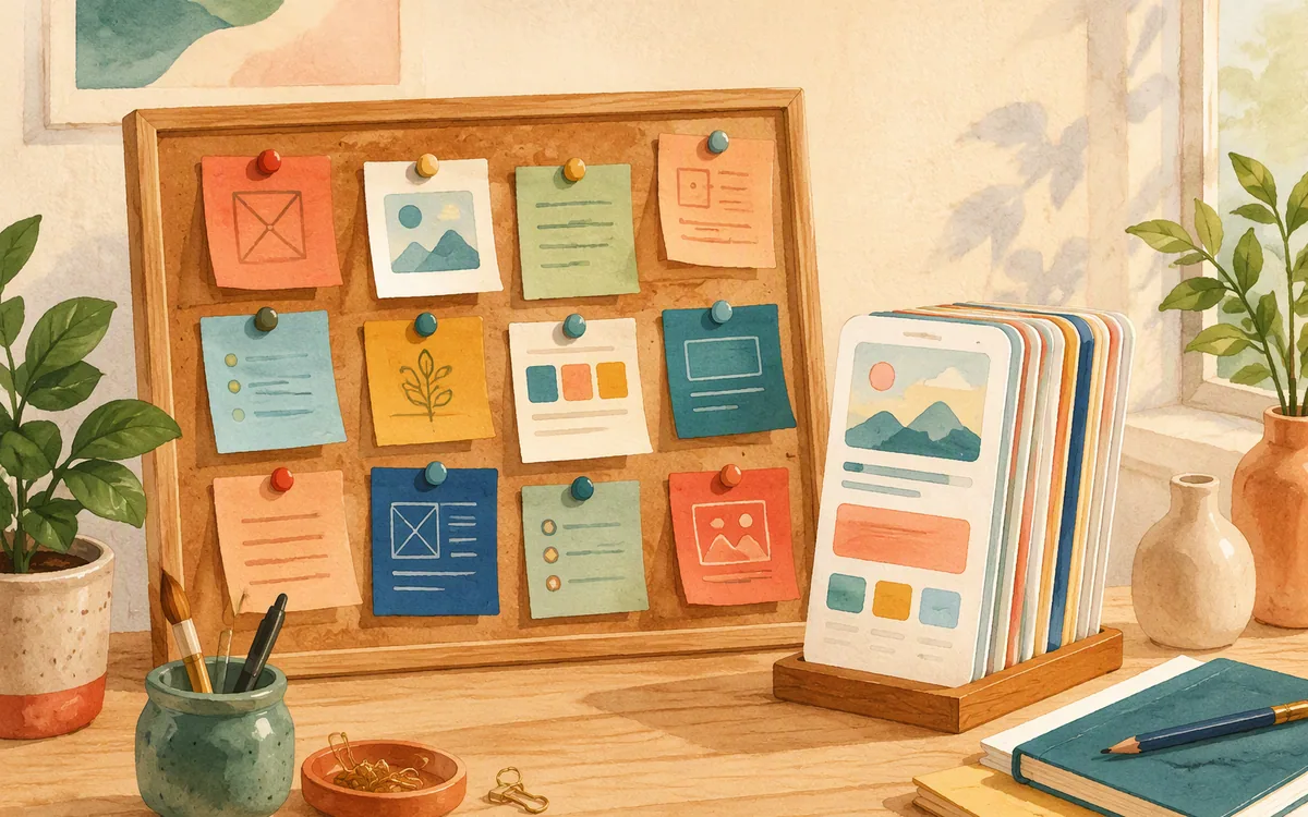
The confusion starts because both tasks involve rectangles, arrows, and comments. By day one, a board full of rough frames can feel like a design file. By day three, it usually becomes hard to answer basic questions: Which version is current? What does this button look like when disabled? Is that card reused elsewhere? What are the exact dimensions of the screen?
A board can describe an app. It cannot reliably specify one. If your team has already agreed on the flow and is now deciding what users will tap, read, enter, and recover from, do not buy another board. Move to a tool built for actual mobile screens.
Whiteboard vs UI design tool: the line that affects delivery
The practical distinction in the whiteboard vs ui design tool decision is whether the tool helps you make decisions or helps you preserve them accurately.
A whiteboard is deliberately loose. FigJam gives you an open canvas for sticky notes, connectors, drawings, workshop templates, and quick collaboration. Miro serves a similar purpose, particularly for larger planning sessions, mapping exercises, and documentation spread across a broad workspace. The point is speed of discussion, not visual consistency.
A UI design tool works from constraints. It needs frames with device-sized dimensions, text styles, spacing rules, reusable components, images, icons, and screen states. It should let you keep the same navigation bar, button treatment, and card pattern consistent across 20 or 50 screens. That consistency is what prevents a developer from having to interpret every screen as a separate one-off.
This difference shows up in mundane work. On a board, changing a button label may mean moving three nearby objects by hand. In a UI file, a properly built component can update throughout the product. On a board, a connector can imply a transition. In a UI design tool, you can define screens precisely enough to review the layout and hand it off.
Do not judge the tools by whether they can draw a phone-shaped rectangle. Judge them by what happens after the tenth screen changes.
Where FigJam and Miro are genuinely useful in an app project
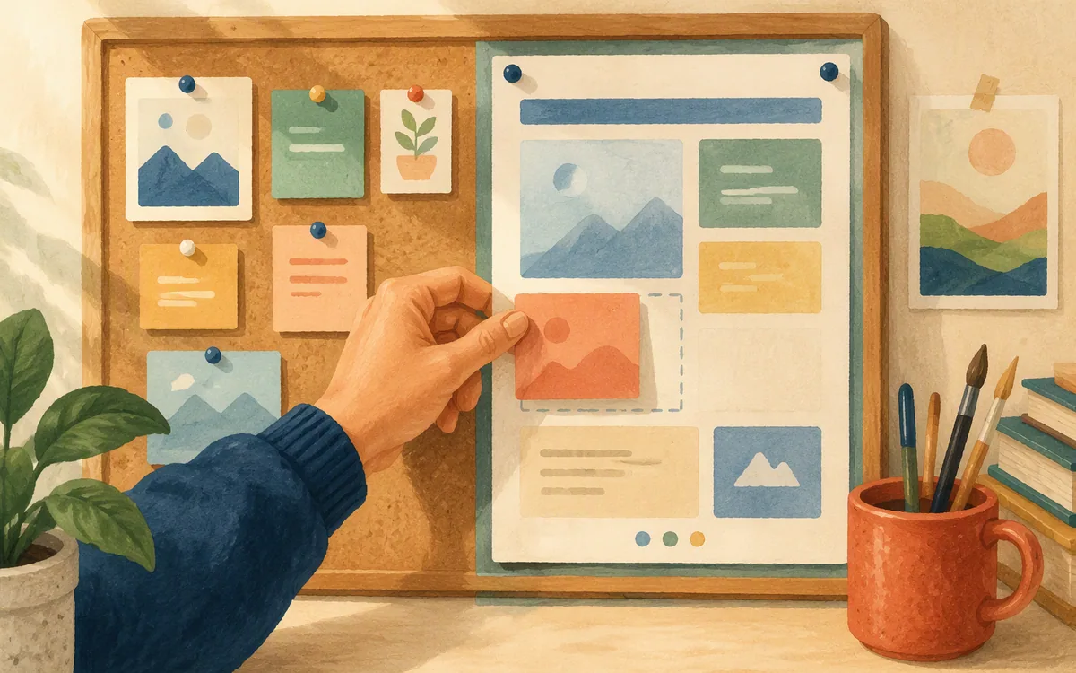
A board earns its place early in a mobile app project. The best use is to reduce uncertainty before your team spends time polishing screens.
Use FigJam or Miro for work such as:
- •Mapping a user journey from first launch through a successful outcome
- •Sorting interview quotes, support tickets, or usability findings into themes
- •Listing the screens required for a flow before deciding their final layout
- •Running a feature-priority workshop with product, engineering, and support
- •Marking decision points: sign in, permission requests, payment, confirmation, and recovery
- •Sketching a happy path and the two or three failure paths that cannot be ignored
For example, a team planning a meal-planning app may use a board to establish that a new user chooses dietary preferences, saves recipes, builds a weekly plan, and sees a grocery list. That is valuable work. It can prevent you from designing six screens for a feature that does not belong in version one.
The board should produce a short, actionable output: an agreed flow, a screen inventory, priority notes, and open questions. A useful handoff might say: “Design 12 core screens, with onboarding optional, and include offline and empty states for the grocery list.”
That is the point to stop arranging sticky notes. Continuing to decorate the board after this stage rarely improves the app. It delays the screen-level decisions that reveal whether the flow is actually usable.
What a freeform board cannot finish for you
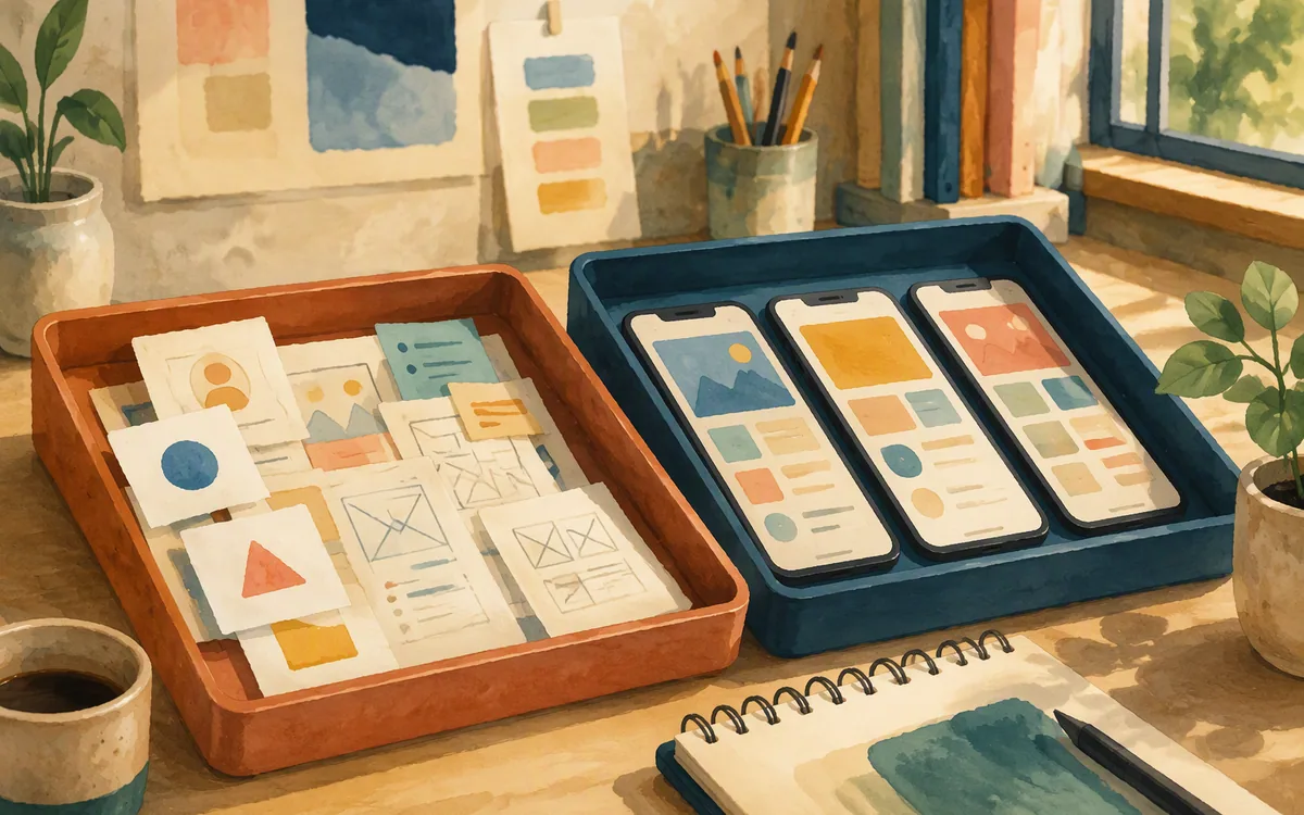
A freeform board mobile app plan can look convincing in a review meeting because it shows the route through the product. It still leaves most of the design work undone.
Neither FigJam nor Miro is a substitute for a screen-design environment that can establish real mobile layouts. A board cannot give you a dependable system for:
- •Designing accurate iOS and Android screen frames with intentional layout structure
- •Creating and maintaining reusable buttons, fields, cards, tabs, and navigation patterns
- •Showing the visual states that affect implementation: loading, empty, selected, disabled, invalid, and error
- •Reviewing typography, touch-target spacing, hierarchy, and content density at screen scale
- •Preparing a design file as a component-based source of truth for developers
- •Exporting a finished set of mobile screens to Figma or generating mobile app code from the board itself
You can paste screenshots onto a board, annotate them, and link rough steps with arrows. That can be helpful for critique. But it does not turn the screenshot into an editable interface, and it does not resolve what happens when a long user name wraps, an API returns no results, or a modal appears above a keyboard.
This is why teams often feel they have “designed” a feature after a board workshop, then discover a week later that they still need to create every actual screen. Treat the board as a planning artifact. Treat the UI file or screen generator as the place where the product becomes specific enough to build.
The recommendation: use Figma for systems, or generate your first screen set
For detailed mobile product design, Figma is the better next step after a board. It is the right choice when you need a shared component library, careful visual control, responsive layout rules, design-system governance, and a file that designers will actively maintain as the product grows.
It does require real design time. Starting from an empty file means choosing frames, building repeated UI, laying out each screen, and maintaining consistency as the flow changes. That investment makes sense for a mature product team or an agency delivering a custom visual system.
If your immediate problem is getting from a written brief to a credible first set of app screens, use floow.design instead of rebuilding the plan manually. Describe the app, target platform, audience, and key flow in plain English; then iterate on the generated mobile screens in chat. It is especially useful when you need to test the shape of a 10-to-20-screen feature before deciding how much bespoke design work it deserves.
The recommendation is not to abandon Figma. Use the faster route to create and revise the initial mobile direction, then export to Figma when your team needs to refine it inside an established design workflow. It can also export to Flutter, React Native, SwiftUI, and Jetpack Compose for teams that want a code starting point.
Do not expect either route to replace user research or product judgment. A generated screen set can make a weak flow visible quickly; it cannot decide whether the feature should exist.
How FigJam, Miro, and Figma compare for mobile app work
FigJam and Miro compete most directly with each other as collaborative boards. Figma is the stronger choice once the deliverable is a mobile interface rather than a workshop artifact.
FigJam is a sensible option if your team already works in Figma and wants brainstorming close to its design files. The lower context-switching cost matters: a product manager can map a flow, and a designer can move into the screen file without hunting across another workspace. It is still a board first.
Miro is a sensible choice when your process is wider than design. Large planning canvases, research synthesis, service mapping, and cross-functional workshops can all live there. That breadth can be useful for a complex organization. It also means Miro is not the answer if what you need next is a polished iPhone or Android screen.
Figma is where you should work when detailed screen design is the ongoing job. It gives a designer the precision to define a system and revise it without losing control after the fifteenth variant. Its drawback is that it does not eliminate the blank-page problem. Someone still has to turn the brief into a first interface.
Choose based on the artifact you need to own next week. A workshop board should remain editable as a discussion record. A UI file should remain editable as the source of truth for the app.
A practical handoff from board to real screens
Do not try to convert every sticky note into a screen. That creates bloated flows and turns a useful workshop into a design backlog nobody can finish.
Instead, end the board session with four decisions:
- •The primary user and their first successful outcome. Write this in one sentence.
- •The core path. Usually five to eight screens for a first-pass feature, not every possible edge case.
- •The screen inventory. Name each screen and identify which ones need loading, empty, error, or permission states.
- •The platform assumptions. Decide whether you are designing for iOS, Android, or both, and note any established brand or component rules.
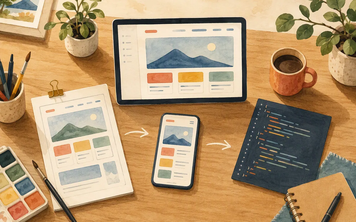
Then turn that output into screens. For a manual Figma workflow, create the core frames first and build repeated UI as components before you duplicate patterns across the flow. For a faster first pass, give the same brief to floow.design and review the generated screens as a connected set rather than judging one attractive screen in isolation.
Review the first set with a realistic task: “A new user adds an item, changes their mind, and returns tomorrow.” That task exposes the gaps boards hide: back navigation, persistence, empty content, confirmation feedback, and unclear labels.
The key is not which tool holds the notes. The key is whether the next tool lets you make screen-level decisions without retyping, redrawing, and reinterpreting the work your team already agreed.
What to buy based on the work left to do
Buy a board tool if the outcome you need is alignment. You are still choosing the problem, organizing research, mapping a service, or getting stakeholders to agree on a flow. A board is cheap compared with building the wrong feature, and the looseness is an advantage at this stage.
Buy or keep Figma if your outcome is a maintained design system. You have designers who need control over layout, styles, components, variants, and detailed review. It is the better long-term home for a product with repeated patterns and regular design changes.
Choose a mobile screen-generation workflow if your bottleneck is the jump from approved concept to the first 10, 15, or 20 screens. This is common for founders, product managers, small teams, and agencies scoping a project before committing to a full design engagement.
Avoid buying a board as a workaround for missing UI design capacity. The apparent savings disappear when someone has to recreate all the work later in a screen tool. Also avoid treating a generated result as a finished product design if you have complex permissions, dense data views, accessibility requirements, or a mature existing design system. Those projects need deliberate design review.
Published plan names, limits, and prices change, so check each vendor’s current pricing page. In general, board products sell collaboration and workspace access; UI tools sell editor access and design-workflow capabilities; AI screen tools sell paid generation and iteration capacity. Pay for the constraint that is currently slowing delivery.
Which tool fits the next artifact in your mobile app process?
| Tool | Best job | Where it stops | Use it after brainstorming? |
|---|---|---|---|
| FigJam | Workshops, user flows, research notes, and rough app concepts | Does not create a production-ready mobile UI system or export finished screens to code | No; use it to define the work first |
| Miro | Broad cross-functional planning, mapping, and collaborative workshops | A flexible board, not a mobile screen-design and handoff environment | No; move to a dedicated screen tool |
| Figma | Detailed iOS and Android UI, components, and maintained design systems | Requires manual design work to turn a brief into an initial screen set | Yes; best for precise, ongoing UI work |
| floow.design | Prompt-led creation and chat iteration of mobile app screens | Not a whiteboard, vector illustration tool, IDE, or complex interaction-prototyping suite | Yes; use it to turn an agreed plan into screens quickly |
What it costs
FigJam, Miro, and Figma offer different plan structures that typically separate free or limited access from paid collaboration, editor, or organizational capabilities. floow.design is paid beyond its trial. Do not choose on an old price screenshot: published plans, usage limits, and included features move. Check each vendor’s own pricing page, then compare the cost against the hours required to recreate a board concept as real mobile screens.
Mistakes that cost you the most
Using a board as the final design deliverable.
Stop after the flow and screen inventory are agreed, then create editable iOS and Android screens in a dedicated UI tool.
Designing only the happy path on the board.
List loading, empty, error, permission, and confirmation states before screen work begins.
Starting a Figma file without a defined screen inventory.
Name the core five to eight screens first, then build shared patterns before adding variations.
Buying another whiteboard because the team needs screens faster.
Use a board for alignment and a mobile screen-design workflow for the next deliverable; they solve different bottlenecks.
Frequently asked questions
Is FigJam good enough for designing app screens?
FigJam is good enough for rough app-flow sketches, screen inventories, and team discussion, but it is not enough for final iOS or Android screen design. It does not provide the component-based UI workflow, precise layout control, screen-state management, or code export needed for a build-ready mobile interface. Move to Figma or a dedicated mobile screen-design tool after the flow is agreed.
What's the difference between a whiteboard tool and a UI design tool?
A whiteboard tool helps a team explore and organize ideas with notes, arrows, sketches, and diagrams. A UI design tool helps a team define the exact screens users see and interact with, including layout, typography, reusable components, navigation, and states such as loading or error. Whiteboards decide the flow; UI tools specify the interface that developers build.
Can I turn a FigJam board into real app screens?
You can use a FigJam board as the brief for real app screens, but the board itself does not automatically become a finished mobile UI. Extract the agreed user flow, screen list, content priorities, and platform requirements, then create the screens in Figma or use floow.design to generate an editable first pass. Expect to review spacing, states, navigation, and accessibility after the conversion.
What should I use after brainstorming on a board to design my app?
Use Figma after brainstorming if you need detailed manual control, reusable components, and a maintained design system for iOS and Android. Use floow.design if you need to turn an agreed app brief into a first set of mobile screens quickly, then iterate by chat and export the result to Figma or supported code formats. Keep the board as a planning record, not the final design file.
Should I choose Miro or FigJam for app UI design?
Choose Miro or FigJam for planning app UI design, not for finishing it. FigJam is convenient for teams already working in Figma, while Miro is useful for broader workshops and research mapping. Once the team needs actual screen layouts, reusable interface patterns, and developer-ready detail, use Figma or a mobile screen-design tool instead.
Where this leaves you
A board is where your team decides what the app should do. Real screens are where you find out whether users can actually do it. Once the brainstorming board is full of sticky notes, move the agreed plan into a mobile screen workflow rather than starting over with manual boxes and arrows. floow.design is built for that handoff: turn the plan into actual iOS and Android screens, revise them in chat, and export the result when the direction is ready.
Design the screens before you commit to a tool
Once the brainstorming board is full of sticky notes, readers need a tool that turns the plan into actual iOS/Android screens without starting over in a new app.
If that is roughly your situation: describe the app in plain English and floow.design draws the iOS and Android screens, takes your changes by chat, and exports the result to Figma or to Flutter, React Native, SwiftUI and Jetpack Compose.
Free tools you can use right now
- •CSS Grid Generator — free, no sign-up
- •px to rem Converter — free, no sign-up
- •WebP Converter — free, no sign-up
Related reading
Design your mobile app with AI.
Generate pixel-perfect iOS and Android screens in seconds, then export to Figma or code.
You might also like…
 Insights24 September 2026Uizard alternative free: What You Get Without PayingCompare Uizard’s free-tier ceiling with Figma, Canva, Visily, Banani and Moqups before an export limit turns a free project into rework.By floow.design Team, Mobile Design
 Insights24 September 2026Sketch alternative with AI: Build Mobile Screens FasterCompare AI tools that replace manual Sketch screen work, keep a practical Figma path, and generate iOS and Android UI from prompts.By floow.design Team, Mobile Design
 Insights24 September 2026Galileo AI or Uizard: Mobile App AlternativesCompare Galileo AI, Uizard, Visily, Banani, Stitch and more for mobile UI work—then pick the right tool for screens you can actually refine.By floow.design Team, Mobile Design