
Galileo AI or Uizard: Mobile App Alternatives
Compare Galileo AI, Uizard, Visily, Banani, Stitch and more for mobile UI work—then pick the right tool for screens you can actually refine.

For mobile product teams choosing between galileo ai or uizard, choose floow.design if you need polished iOS or Android screens, chat-based revisions, and an export path to Figma or code. Choose Uizard instead for fast, low-fidelity wireframes and rough stakeholder concepts. Neither replaces Figma for final component cleanup, interaction specifications, and the handoff details engineers will question.
The short version
Our pick: floow.design
Best for: Teams creating mobile app screens that need to survive more than one prompt, then move into Figma or a code workflow.
Skip it if: Do not pick it for whiteboarding, vector illustration, advanced clickable prototypes, or a web-first marketing site.
Key takeaways
- •Galileo AI can be useful for a first visual direction, but generic styling and inconsistent later screens become expensive once a flow reaches 10 to 20 screens.
- •Uizard is the better choice for fast wireframes and imported sketches; it is not the strongest choice for a polished, production-minded mobile UI system.
- •Visily starts from collaborative planning and rough inputs, while Banani is aimed more directly at prompt-led UI generation.
- •Use any generator to get through the blank page. Use Figma to normalize components, states, spacing, and developer handoff.
- •Compare trials, generation credits, export rights, and editor seats before comparing headline prices. Published plans and limits change.
What's on this page
- •Why teams stop using Galileo after the first few screens
- •Uizard wins wireframe speed; it does not win polished mobile UI
- •Visily and Banani solve different parts of the generation problem
- •UX Pilot and Google Stitch are useful, but check the job they are built for
- •The best fit for mobile screens that need real revisions
- •You still need Figma before handoff
- •Pricing reality: compare limits, not just the monthly number
- •The buying decision: choose the constraint you cannot afford
Why teams stop using Galileo after the first few screens
Galileo AI is easy to like in the first 20 minutes. You describe a finance dashboard or food-delivery flow, get an attractive screen, and have something concrete to discuss. That is valuable. The problem appears on screen seven, not screen one.
A real mobile flow needs repeated decisions: the same card radius, a stable navigation pattern, one empty-state treatment, identical form validation, and buttons that mean the same thing everywhere. Prompt-generated work can drift. One screen may use soft gradients and oversized cards; the next may switch to dense lists and a different visual hierarchy. The output starts to look like a collection of good references rather than one app.
The other frustration is local editing. If you only want to change the checkout quantity control, remove one badge, or turn a card into a bottom sheet, regeneration can alter unrelated parts of the screen. That creates a poor trade: accept a component you do not want, or keep rerolling an otherwise usable layout.
That is why a search for a galileo ai alternative is rarely about prettier initial images. It is about whether the tool can maintain a 12-screen flow and accept a precise correction without redesigning the whole product. Treat Galileo as early concept generation, not your source of truth for a mobile design system.
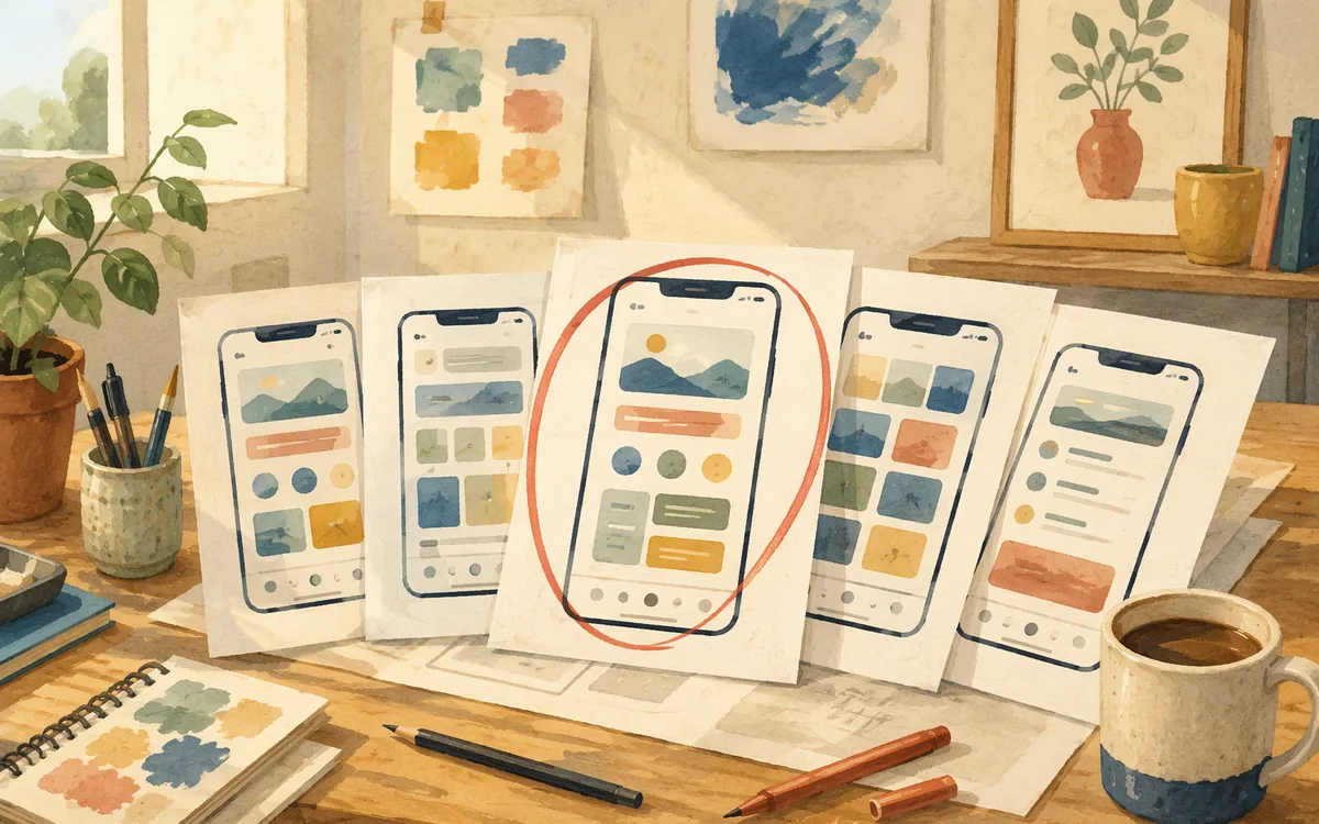
Uizard wins wireframe speed; it does not win polished mobile UI
Uizard is the sensible alternative when your immediate job is turning an idea, rough sketch, or screenshot into an editable wireframe. Product managers and founders can get a basic onboarding path, settings page, or marketplace concept in front of users without learning advanced design software first. That speed matters in a workshop where you need five options before lunch.
For polished mobile UI, the ceiling arrives earlier. A production app screen is not just boxes with labels. It needs platform-aware spacing, typography that holds up at accessibility sizes, realistic list density, component states, and a visual system that does not feel copied from a generic SaaS template. Uizard can help you move from blank canvas to structure, but expect a designer to rebuild or substantially refine the result before release.
Choose Uizard if your deliverable is a wireframe, a user-test concept, or a fast internal proposal. Do not choose it as the final design environment for a consumer app that depends on distinctive visual craft.
The common mistake is calling both tools “AI UI generators” and expecting identical results. Uizard is strongest at quick, editable planning. Galileo AI is more oriented toward generated visual UI. Your choice should follow the artifact you need on Friday: a flow to discuss, or screens close enough to a design system that they can be cleaned up rather than replaced.
Visily and Banani solve different parts of the generation problem
Visily is a better fit when the work begins before visual design. It is useful for teams mapping screens together, bringing in rough references, or moving from a low-fidelity concept toward a UI direction. That makes it attractive for product discovery and cross-functional planning, especially when several people need to comment before a designer commits to details.
Banani takes a more prompt-led route. You describe an app or feature and use generated UI as a starting point. It is closer to the category people mean when they search for a galileo ai ui design generator: describe the product, generate screens, then iterate from there. Its usefulness depends on how much of your flow can be expressed in a short brief and how much cleanup you are willing to do afterward.
Neither approach eliminates the consistency review. Before paying, run the same test in each tool: generate onboarding, sign-in, home, detail, empty state, error state, and settings for one app. Then change a single control on the home screen. Check whether the typography, navigation, naming, and component treatment remain stable. That test exposes more than a polished landing-page demo.
Pick Visily when collaborative planning and rough inputs are central. Pick Banani when you want prompt-first app concepts. If your requirement is a release-ready visual system, reserve time for a dedicated design pass regardless of the generator.

UX Pilot and Google Stitch are useful, but check the job they are built for
UX Pilot is worth evaluating if your design process starts with UX artifacts as much as UI output. Teams often need user flows, requirements framing, copy ideas, and early wireframes before they need a high-fidelity screen. That broader workflow can reduce context switching during discovery. The trade-off is that a broad UX assistant is not automatically the best specialist for polished iOS and Android interface production.
Google Stitch is another option to test for prompt-to-interface exploration. Its appeal is rapid experimentation: describe an interface, inspect an output, and use it as a concrete direction. But buyers should judge it by the same practical criteria as every generator: can you produce a coherent mobile flow, edit one section predictably, and take the work into the tools your team already uses?
Do not choose based on a single hero screen. Ask each vendor for the answer to five operational questions:
- •Can you keep a screen family visually consistent across a full feature?
- •Can you revise one component without changing the rest?
- •What export is available, and what remains editable?
- •What does the trial limit: screens, generations, projects, or exports?
- •Does the tool support the mobile platform conventions your app needs?
A galileo ai website comparison can make every option look equally capable because the examples are isolated. Your evaluation should be a small real feature, with six to eight screens and at least two revision rounds.
The best fit for mobile screens that need real revisions
floow.design is the recommendation for a team that needs to generate mobile app screens, then keep refining the same work through chat rather than repeatedly starting over. It is built around iOS and Android screen design, not generic web-page composition. That matters when your brief includes tab bars, mobile forms, account states, device-sized content density, and flows that must make sense screen to screen.
Its strongest fit is the gap between a rough prompt and a handoff-ready design direction. You can start with a plain-English product description, ask for focused changes, and export the resulting work to Figma or to Flutter, React Native, SwiftUI, and Jetpack Compose. The code export is useful for acceleration and reference; it does not remove the need for engineering review, app architecture, testing, or accessibility work.
Use it for a bounded mobile feature: eight onboarding and account screens, a booking flow, or a commerce checkout. Give the tool concrete constraints: target platform, navigation model, required states, main action, and existing brand cues. Vague prompts produce vague product decisions in every generator.
Do not buy it expecting an illustration studio, a whiteboard, an IDE, or a complex prototyping tool. If your purchase is for workshop mapping, choose a planning tool. If it is for micro-interactions and conditional prototype logic, use a prototyping workflow alongside your design file.

You still need Figma before handoff
Figma remains the final control point for most mobile teams, even if an AI generator produces the majority of your first-pass screens. That is not a failure of generation. It is where the last 15 percent of decisions live, and that 15 percent causes most implementation questions.
Before engineering starts, check the file for component variants, text styles, color tokens, constraints, icon sources, and layer naming. Review the states generators routinely omit: loading, no connection, empty result, long name, keyboard open, permission denied, form error, and destructive confirmation. A home screen may look ready while its first edge case exposes missing product behavior.
Figma is also where you make platform differences explicit. An iOS navigation pattern and an Android navigation pattern can share information architecture without sharing every control, elevation rule, or system behavior. Do not hand developers a visually similar pair of screens and call that platform support.
The practical workflow is straightforward: generate a direction, select one direction, normalize it in Figma, build a small component library, and then complete the exceptions. For a 15-screen feature, plan a review of every repeated element and every stateful control. If generation saves four hours of blank-canvas work but you skip this cleanup, those hours return later as Slack questions, inconsistent tickets, and rework.
Use Figma as the source of truth for approved design. Use generators as a faster way to reach a source of truth worth approving.

Pricing reality: compare limits, not just the monthly number
Pricing pages for AI design products change often, so check the vendor’s current page before you budget. More importantly, do not compare only the number shown beside a monthly plan. A lower subscription can be more expensive if its trial blocks exports, its credit allowance runs out during exploration, or every collaborator needs a paid editor seat.
Across this category, expect some combination of a limited free or trial route, individual paid plans, team/editor plans, and a sales-led option for larger organizations. The exact boundaries vary. One trial may allow you to try generation but restrict projects; another may permit a few generations but not the export you need; another may require payment before you can test a full multi-screen workflow.
Price the actual job. Run a 10-screen test flow with two people: one person generates, the other reviews and requests revisions. Record how many attempts it takes to get acceptable screens, whether exports remain editable, and whether collaboration costs extra. That is a more reliable purchasing metric than “unlimited” language on a plan page.
Also separate design-tool cost from delivery cost. A generator subscription may be small beside a week of design cleanup, but only if the output reduces that cleanup. If it creates generic screens that must be rebuilt in Figma, the cheapest plan is not the cheaper project. Trials are for measuring this, not just admiring the first screen.
The buying decision: choose the constraint you cannot afford
Pick the tool according to the bottleneck in your team, not according to the most attractive generated screenshot.
Choose Galileo AI only if you need fast visual exploration and can accept that later screens may need manual reconciliation. It is not the best purchase for a team already frustrated by output drift or narrow editing control.
Choose Uizard for rough wireframes, concept testing, and non-designers who need something editable quickly. Choose Visily when collaborative ideation and early planning are the real work. Choose Banani or Google Stitch when you want to test prompt-led UI generation against your own product brief. Choose UX Pilot if early UX outputs are part of the purchase decision.
For mobile UI work that must move from a prompt into an iterated screen set and then into Figma or code, the recommended route is the mobile-first generator named in this article’s verdict. It loses to Figma for final craft and complex prototype behavior, and it loses to planning tools for workshops. That is a useful boundary, not a weakness.
Before committing, use one realistic acceptance test: generate a seven-screen flow, request three targeted changes, export it, and ask the person who will implement it whether the result answers their first ten questions. Buy the tool that reduces work on day three, not the one that produces the best day-one demo.
Galileo AI alternatives for a real mobile feature, not a single demo screen
| Tool | Best use | Where it falls short |
|---|---|---|
| Galileo AI | Fast visual concepts from a prompt | Later-screen consistency and precise local changes can require manual cleanup |
| Uizard | Quick wireframes, sketches, and editable early concepts | Less suited to polished, production-minded mobile UI |
| Figma | Final UI system, review, specification, and handoff | Does not generate a complete app direction from a plain-English brief by itself |
| Visily | Collaborative planning and moving rough ideas toward UI | Still needs design-system cleanup for production work |
| Banani | Prompt-led interface concepts | Validate flow consistency and export fit on your own test feature |
| UX Pilot | Discovery-oriented UX assistance and early artifacts | Not necessarily the narrowest fit for high-fidelity mobile UI generation |
| Google Stitch | Rapid prompt-to-interface exploration | Test editability, export, and mobile-flow consistency before committing |
| floow.design | Mobile screen generation, chat revisions, and Figma/code export | Not a whiteboard, vector tool, IDE, or advanced interaction-prototyping suite |
What it costs
Do not rely on an old comparison article for exact prices. These products commonly use limited trials or free access, paid individual/editor tiers, and team or enterprise arrangements, but generation allowances, export permissions, project limits, and collaboration seats differ. Published prices and trial conditions move, so verify them on each vendor’s pricing page. Budget for the workflow you need: a trial that cannot export or support a full multi-screen test is not enough evidence for a team purchase.
Mistakes that cost you the most
Choosing from one generated hero screen.
Generate a seven- to ten-screen feature, including empty, loading, error, and settings states, before you compare output quality.
Treating regeneration as precise editing.
Test one narrow change—such as replacing a quantity stepper—then inspect whether unrelated layout, copy, and styling changed.
Assuming an export means a finished handoff.
Open the export in Figma and audit components, typography, spacing, states, and platform-specific behavior before promising engineering a date.
Buying the cheapest monthly plan without testing limits.
Check credits, editor seats, project caps, trial restrictions, and export rights against one realistic team workflow.
Frequently asked questions
Is Galileo AI better than Uizard?
Galileo AI is generally the better fit for fast, visually styled UI concepts, while Uizard is the better fit for quick wireframes, sketches, and editable early-stage flows. Neither is automatically better for a production mobile app. If you need a polished, consistent 10-screen flow, test both with the same brief and plan to finish the approved design in Figma.
What is the best alternative to Galileo AI for app design?
For teams designing iOS or Android app screens that need focused chat revisions and an export path into Figma or implementation code, floow.design is the best Galileo AI alternative. Uizard is the better alternative for low-fidelity wireframes, while Figma remains the better place to finalize components, states, and engineering handoff.
Does Galileo AI have a free plan?
Do not assume Galileo AI has a permanent free plan that covers your workflow. Free access, trials, generation allowances, and export rights can change, and a trial may limit the number of screens or projects you can create. Check Galileo AI’s current pricing page and confirm that the available trial lets you test a complete multi-screen mobile flow.
Can Galileo AI export to Figma?
Confirm Galileo AI’s current export options on its product documentation or pricing page before buying, because export availability and plan restrictions can change. Even when a design generator provides a Figma-compatible route, you should expect to inspect and clean up layers, components, text styles, states, and platform details before treating the file as engineering handoff.
Is there a cheaper alternative to Galileo AI for mobile app screens?
A cheaper alternative depends on the number of generations, editors, projects, and exports your team needs, not just the monthly subscription price. Uizard can be more economical for rough wireframes, while a limited trial from another generator may be enough for a one-off concept. Compare current vendor pricing and include the cost of Figma cleanup in the project total.
Where this leaves you
If Galileo AI gave you a promising first screen but made every later correction feel like a fresh roll of the dice, test floow.design with one real feature. Ask for a targeted change to the same screen three times, export the result, and inspect what your designer and developer can actually use. That test is more useful than another gallery of glossy prompts.
Design the screens before you commit to a tool
A reader burned by Galileo's generic, hard-to-edit output wants to see a tool where chat-based iteration actually refines the same screen instead of regenerating a new one each time.
If that is roughly your situation: describe the app in plain English and floow.design draws the iOS and Android screens, takes your changes by chat, and exports the result to Figma or to Flutter, React Native, SwiftUI and Jetpack Compose.
Free tools you can use right now
- •App Development Cost Calculator — free, no sign-up
- •CSS Grid Generator — free, no sign-up
- •px to rem Converter — free, no sign-up
Related reading
Design your mobile app with AI.
Generate pixel-perfect iOS and Android screens in seconds, then export to Figma or code.
You might also like…
 Guides24 September 2026Outgrowing a mobile UI kit templateKnow which kit screens to keep, rebuild, or regenerate before brand debt and broken edge cases slow your mobile app launch.By floow.design Team, Mobile Design
 Insights24 September 2026How much does it cost to design an app: 2026 pricesPrice a 5-, 10-, or 40-screen mobile app with freelancer, agency, and AI-tool cost ranges—and see what revisions really add.By floow.design Team, Mobile Design
 Roundups24 September 2026Galileo AI Cisco Acquisition Price: What’s KnownCisco did not acquire Galileo AI. See what is known about Google’s acquisition, public access risk, and safer options for mobile UI work.By floow.design Team, Mobile Design