Box Box Club app icon
SportsScreenshot teardown13 min read

Box Box Club App Store screenshots

When you are selling a Formula 1 companion app, you are not selling spreadsheets. You are selling obsession: the kind that has a user unlocking their phone forty times during a Grand Prix to check gap times, tyre wear, and whether their favorite driver has climbed from P15. The App Store screenshot set for Box Box Club understands this emotional register. Across eight frames, the sequence moves from theatrical fanaticism to pixel-level utility, using a consistent color temperature derived from brake-glow red and sunset orange. It is a study in how to make raw data feel like a grandstand.

Set published by ARKADE CLUB PRIVATE LIMITED · 9 frames analysed

4.7 · 3.4K ratingsFreev5.3.6Updated 5mo ago
Box Box Club App Store screenshot 1
01At a glance

The set in one screen

Framing
iPhone 16 Pro devices with warm right-edge rim light; Apple Watch Ultra stack in Frame 6; no device in Frame 1
Captions
Heavy bold white sans-serif, sentence case, with selective yellow (#FFD60A) emphasis
Backdrop
Continuous radial gradient from true black through deep crimson (#7A0A00) to tungsten orange (#FF9500)
Type
Oversized numerals for stats (80–120pt), compact caption labels in grey (#8E8E93), blue accent (#3B82F6) for circuit names
UI / copy split
60/40 in later frames; Frame 1 is 100% brand
Frame 1 job
Social proof + tribal identity before any interface is shown

Sampled palette

#000000#000000
#1C1C1E#1C1C1E
#FF2A00#FF2A00
#FF9500#FF9500
#FFD60A#FFD60A
#30D158#30D158
02The challenge

What this screenshot set had to solve

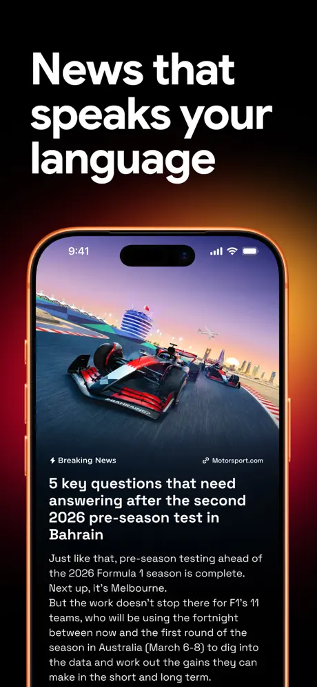
Sports widget apps face a unique merchandising problem. Their value is distributed: a little on the Lock Screen, a little in the Watch complication, a little in the race-weekend timeline. No single screen captures the whole product. The designer’s challenge, therefore, is to sequence the promise so that a swiper understands the ecosystem without seeing every permutation. The product is also inherently textual—abbreviations, numerals, lap counts, championship points—so the screenshots risk becoming walls of tiny figures. Box Box Club needed a visual system that would let numbers shout rather than whisper, while still conveying trustworthiness to a notoriously detail-oriented audience.

The set mirrors the fan’s own journey from Sunday-morning passion to Wednesday-evening analysis.
03The approach

How the set argues its case

The strategic sequencing is emotion → utility → ecosystem. Frame 1 buys tribal membership with social proof. Frames 2–5 demonstrate iPhone-native depth: constructor stats, widgets, live activities, circuit detail. Frame 6 widens the net to Apple Watch. Frames 7–8 close with driver affinity and pre-race tactical depth. By withholding the hardware for exactly one frame, the designers force the shopper to feel the brand before they audit the feature list.

This is positioning as premium fan infrastructure, not a free news aggregator. The use of licensed-style car renders, driver photography, and 3D track wireframes signals that the makers speak the same visual language as the broadcast.

04Frame by frame

Every screenshot, and the job it does

Box Box Club App Store screenshot 1 — Social Proof & Obsession
01

Social Proof & Obsession

On-frame caption: “3 million+

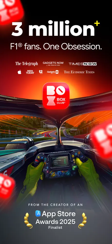
The opening shot contains no device at all—only a cockpit point-of-view render, a stacked headline, and credentials. “3 million+” sits at the top in colossal bold white, the plus sign rendered in a hot yellow (#FFD60A) that functions as a spark plug. Below, “F1® fans. One Obsession.” tightens the framing: this is not a casual app. A row of publication logotypes—The Telegraph, GADGETS NOW, TIMESNOW, INDIA TODAY, t2, Gadgets 360, The Economic Times—is locked to the upper third, their varying optical widths creating a texture of third-party trust. Center mass is occupied by the app icon: a red rounded square with a white, angular “BOX” logomark and the smaller subtitle “BOX CLUB.” The bottom of the frame carries the laurel device for “App Store Awards 2025 Finalist.” Structurally, this frame is pure theater. It establishes the brand colorway—deep crimson grading through #FF2A00 to #FF8C00—and primes the shopper that they are joining a tribe, not downloading a utility. The absence of UI is deliberate; it buys emotional permission before showing interfaces.
Box Box Club App Store screenshot 2 — One Stop Destination for F1®
02

One Stop Destination for F1®

On-frame caption: “One stop destination for F1®

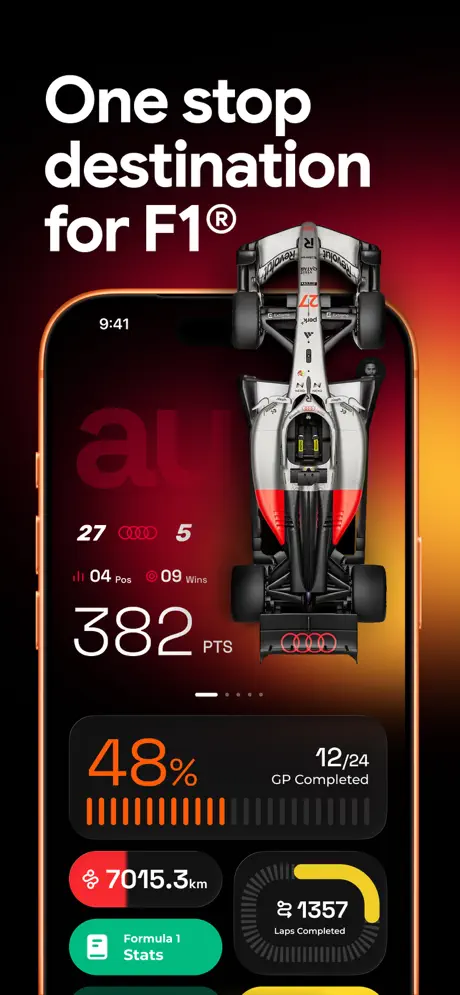
The headline “One stop destination for F1®” is left-aligned in the same heavy white, occupying the top quarter and leaving the lower three-quarters for a device frame that appears for the first time. The phone is a black iPhone with a subtle orange rim light. On its screen lives a constructor profile: a top-down 3D render of a silver-and-red F1 car that physically breaches the top bezel of the phone, hovering in the negative space above the hardware. Inside the UI, numerals dominate: “27” and “5” flank the Audi rings, while “04 Pos” and “09 Wins” sit above the enormous “382 PTS” in roughly 80pt weight. Further down, a segmented progress bar in #FF9500 orange reads “48%,” paired with “12/24 GP Completed.” A dark card at the bottom left shows “7015.3km” beside a route icon, and a circular widget on the right tracks “1357 Laps Completed” in white against a charcoal dial with a yellow (#FFD60A) progress ring. A green (#30D158) pill labeled “Formula 1 Stats” anchors the bottom. The crop is tight: no tab bar, no home indicator, just the content region. This frame teaches the shopper that the app thinks in large numerals and respects the car as an object of desire.

Box Box Club App Store screenshot 3 — Best Lock & Home Screen Widgets
03

Best Lock & Home Screen Widgets

On-frame caption: “Best lock & home screen widgets

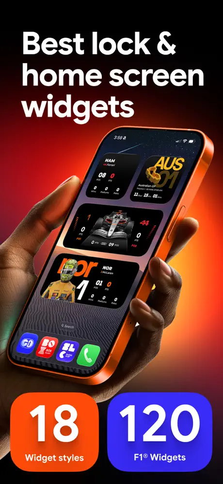
Here the set shifts to human scale. A hand with dark skin holds the iPhone at a slight backward tilt, thumb grazing the Action button. The headline reads “Best lock & home screen widgets,” and the screen inside the phone displays the iOS Lock Screen populated with four distinct Box Box widgets. The top-left widget shows “HAM” above “44 Ferrari” with a red accent dot and small figures “08 0 0” for points, positions, and poles. Beside it, an “AUS GP 01” widget carries a gold track glyph and race dates. A third widget centers a silver car render flanked by “0” and “44.” The fourth shows “nor” in McLaren papaya above “NOR” and “1 McLaren” with identical stat micro-figures. The dock at the bottom of the Lock Screen is visible, showing a generic green Phone icon alongside others, which grounds the shot in reality at the cost of brand immersion. Below the device, two oversized rounded rectangles function as quantitative proof: a #FF3B30 orange tile reads “18 Widget styles,” and a #5856D6 purple tile reads “120 F1® Widgets.” The background gradient here warms to #FF6B00 near the bottom right, keeping the environmental light consistent.

Box Box Club App Store screenshot 4 — Missed the Race? Never Again.
04

Missed the Race? Never Again.

On-frame caption: “Missed the race? Never again.

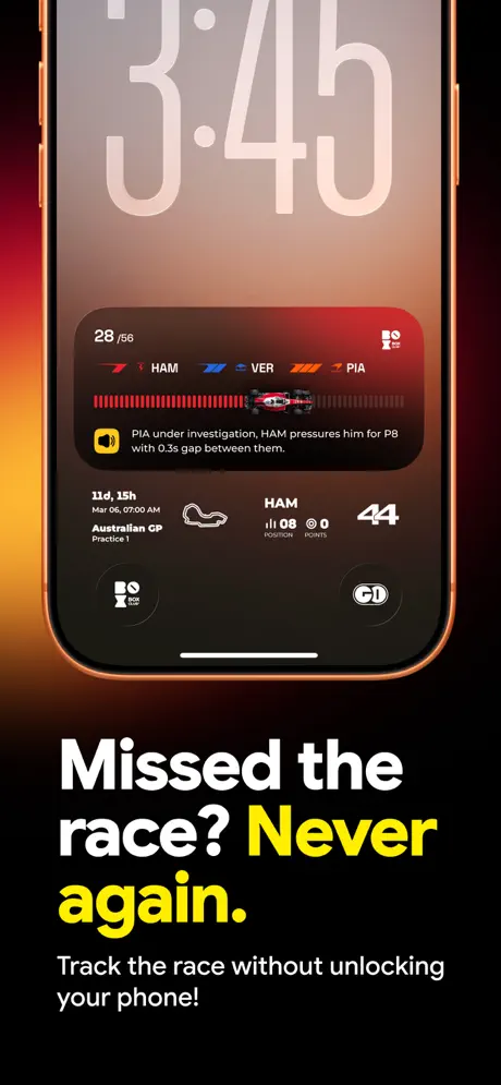
The layout inverts: text moves to the bottom, surrendering the top seventy percent to the device. The headline “Missed the race? Never again.” splits across three lines, with “Never again.” picked out in #FFD60A yellow—a call-and-response rhythm. The subhead, “Track the race without unlocking your phone!,” explains the contract. The phone displays a Lock Screen live-activity interface. At the top, the iOS clock reads “3:40” in the large condensed typographic style native to iOS 17+. Below that, a wide widget shows “28/56” laps, then a constructor-color bar: red for Ferrari (“HAM”), blue for Red Bull (“VER”), orange for McLaren (“PIA”). A miniature red car icon sits on a segmented progress bar. Underneath, a narrative alert line states: “PIA under investigation, HAM pressures him for P8 with 0.3s gap between them.” A schedule row follows: “11d, 15h,” “Mar 06, 07:00 AM,” “Australian GP Practice 1,” beside a circuit outline glyph. To the right, “HAM” appears again with “08,” “0,” and “44” under position and points headers. The hardware frame is nearly complete, cropped only at the extreme top. This frame is the strongest argument for the widget use-case because it shows information density without unlock gesture.

Box Box Club App Store screenshot 5 — All the Race Stats That Matter!
05

All the Race Stats That Matter!

On-frame caption: “All the race stats that matter!

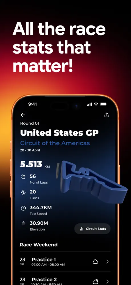
“All the race stats that matter!” returns to the upright, hands-free device staging. The screen shows a circuit detail page for the “United States GP.” The hierarchy is geographic: “United States GP” in ~40pt bold white, “Circuit of the Americas” in #3B82F6 blue beneath it, and the date “28 - 30 April” in secondary grey. The key stat “5.513 KM” is oversized. Below, a vertical list pairs white numerals—“56,” “20,” “344.7KM,” “30.90M”—with grey labels: “No. of Laps,” “Turns,” “Top Speed,” “Elevation.” A 3D extruded wireframe of the Circuit of the Americas floats on the right third of the screen, casting a soft shadow against the black background. The “Race Weekend” section uses hairline separators (#38383A) to list “Practice 1” and “Practice 2” with cloud icons and chevrons. A bottom-right pill, “Circuit Stats,” sits in a #2C2C2E surface. This frame proves the app’s depth for the planner archetype—the fan who studies elevation and turn count before the lights go out.

Box Box Club App Store screenshot 6 — Apple Watch App and Widgets
06

Apple Watch App and Widgets

On-frame caption: “Watch app and widgets

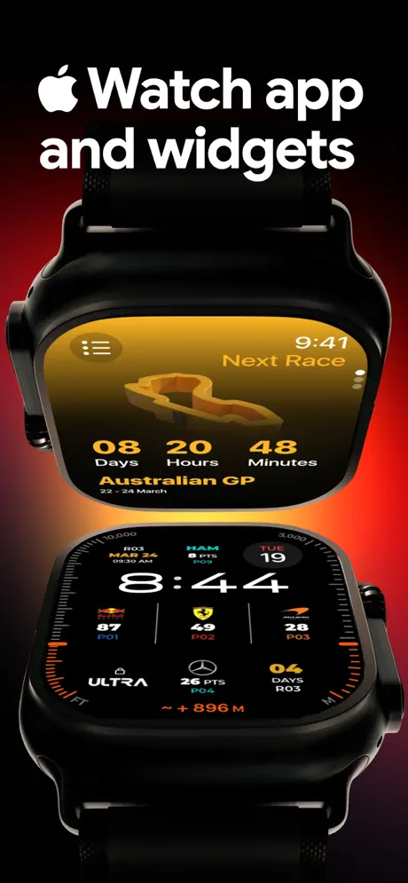
The Apple Watch frame breaks the iPhone monopoly. The headline “ Watch app and widgets” uses the Apple logotype as the first character, immediately signaling platform legitimacy. Two Watch renders stack vertically. The upper watch shows a countdown face with a gold-to-black gradient (#F5B700 fading to #000000), wireframe track map, and “08 Days 20 Hours 48 Minutes” until the “Australian GP 22 - 24 March.” The lower watch shows an information-dense modular face: time “8:44” dominates, surrounded by complications for “HUL MAR 24 09:30 AM,” “HAM 8 PTS P09,” and team standings—“87 P01” for Red Bull, “49 P02” for Ferrari, “28 P03” for McLaren. The hardware is rendered in black titanium with the Action Button and Digital Crown visible. The background is a radial red glow, but the dominant hue is gold, creating a tonal break from the crimson family that governs the other frames. Structurally, this frame is necessary for ecosystem completeness, though it sacrifices some chromatic continuity.

Box Box Club App Store screenshot 7 — Track Your Fav Driver & Team
07

Track Your Fav Driver & Team

On-frame caption: “Track your fav driver & team

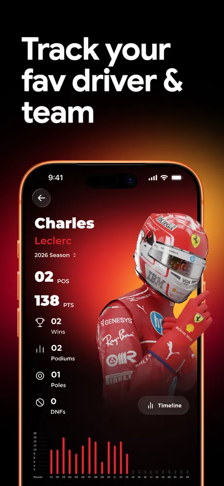
“Track your fav driver & team” reintroduces the iPhone and brings a human face into the set. The screen displays a Charles Leclerc profile. “Charles” sits in #FFFFFF bold, “Leclerc” in #FF1A1A red beneath it. A “2026 Season” dropdown provides temporal context. The stats stack vertically on the left: “02 POS,” “138 PTS,” then smaller rows iconographed with a trophy (“02 Wins”), podium bars (“02 Podiums”), a target (“01 Poles”), and a crossed circle (“0 DNFs”). The right half is occupied by a photographic cutout of Leclerc in Ferrari red, his helmet and gloved hand bleeding past the right edge of the device’s visible canvas. At the bottom, a red sparkline bar chart tracks round-by-round performance across sixteen rounds, with x-axis ticks from 01 to 16. A “Timeline” pill button anchors the lower right. The background behind the phone is a radial red wash centered on the driver’s torso. This frame leverages parasocial attachment; it tells the fan that their favorite driver is not just a row in a database but a portrait in the UI.

Box Box Club App Store screenshot 8 — Master the Track Before the Race
08

Master the Track Before the Race

On-frame caption: “Master the track before the race

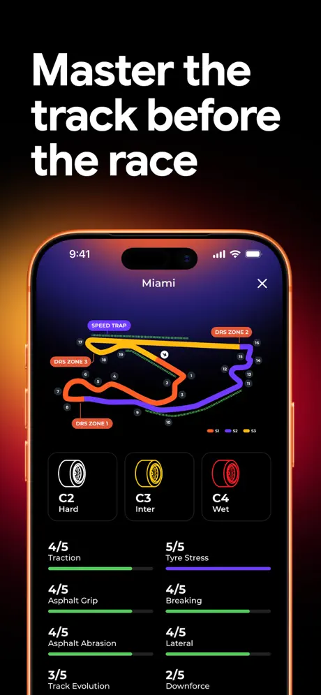
The final frame, “Master the track before the race,” shows the Miami circuit in schematic form. The top of the screen carries “Miami” centered, with an “X” dismiss to the right. The track map is an annotated line drawing: corners 1 through 19 are numbered, DRS zones are flagged in #FF3B30 red labels, and the speed trap is marked in #AF52DE purple. The track itself segments into S1 (#FF9500), S2 (#BF5AF2), and S3 (#30D158). Below the map, three tyre compound tiles appear: “C2 Hard” in white, “C3 Inter” in yellow, and “C4 Wet” in red. Underneath, seven track characteristic ratings are displayed with horizontal progress bars: “4/5 Traction,” “5/5 Tyre Stress,” “4/5 Asphalt Grip,” “4/5 Breaking,” “4/5 Asphalt Abrasion,” “4/5 Lateral,” “3/5 Track Evolution,” and “2/5 Downforce.” The bars use green (#30D158) and purple (#AF52DE) fills against #1C1C1E track backgrounds. The true-black screen canvas makes the colored map and bars flare outward. This is the set’s most information-dense frame, functioning as the closer for the analytically minded shopper.

05The craft

Captions, colour and the mechanics of the sell

Caption pattern

Each caption is 3–5 words, left-aligned, heavy weight, pure white. Only Frame 4 breaks the pattern by moving text to the bottom third and coloring a fragment in yellow (#FFD60A). The lack of exclamation marks after Frame 5 is a subtle tonal shift toward seriousness.

Visual system

The visual system is built on heat. Backgrounds grade from #000000 at the edges through #7A0A00 to #FF9500. Inside the phone, surfaces are #000000 or #1C1C1E. Accent colors are strictly functional: green (#30D158) for confirmation or ‘Stats’ pills, blue (#3B82F6) for circuit identifiers, purple (#AF52DE) for track sectors, and yellow (#FFD60A) for emphasis and progress rings. The hardware itself is treated as an object in the scene, not a neutral frame.

The thumbnail test

At small scale, the set reads as a red-black stripe with white headlines. The oversized numerals (382, 48%, 1357) remain legible because they are digitally extracted from the UI and rendered at maximum contrast. The consistent right-edge orange glow also creates a recognizable silhouette when swiping quickly.

Conversion mechanics

The conversion arc begins with social proof (3M+), demonstrates the primary UI value (stats), moves to passive value (widgets), then to ambient value (Watch), and finally anchors the user in the two deepest emotional hooks: driver identity and circuit expertise. The set never repeats the same screen type twice; each frame introduces a new surface (home screen, Lock Screen, Watch face, track map), which maximizes perceived surface area of the product.

06Where it slips

What we would change

Frame 1 media alignment and logical hierarchy

The publication logotype row in Frame 1 suffers from uneven optical alignment. GADGETS NOW rides higher than TIMESNOW, and the Apple logo sits lower than the INDIA TODAY wordmark. The fix is to impose a rigid 24pt cap-height bounding box and baseline-align every mark to a single horizontal guide.

Frame 3 dock distraction

Frame 3 leaves the generic iOS dock visible, including the green Phone icon. This pulls the eye out of the app’s ecosystem. A cleaner fix is to composite the Lock Screen onto a template with a hidden dock, or to populate the dock with Box Box branded icons that echo the red and black palette.

Frame 4 typographic rag

Frame 4’s headline creates an awkward rag: “again.” hangs alone after the period, and the yellow emphasis on “Never again.” is slightly undermined by the proximity of the question mark. Forcing a line break after “race?” and keeping “Never again.” intact on the following line would restore the punch.

Frame 6 chromatic isolation

Frame 6, the Apple Watch shot, is chromatically isolated; its gold-yellow dominant is a full hue rotation away from the red-orange axis that unites the other seven frames. Introducing a faint #7A0A00 environmental bounce light onto the watch band and background would knit it back into the family.

Frame 8 credibility fracture: spelling

The most immediately fixable flaw lives in Frame 8: the label “Breaking” appears where “Braking” is intended. In a product whose credibility rests on technical precision, a spelling error in a screenshot is a fracture. The fix is to correct the string in the design file and re-export.

07The recipe

How to apply this to your own app

  1. Sequence emotion before interface

    Give yourself permission to show zero UI in Frame 1 if you can replace it with culture, social proof, or atmosphere. You are asking for a download; earn the right to show settings screens later.

  2. Build a single environmental light source

    Pick one gradient direction and color temperature, then let it hit your hardware consistently. This turns disparate device frames into a single stage set.

  3. Let 3D assets bleed past screen edges

    If you have renders, don’t trap them inside the bezel. Let cars, tracks, or characters overlap the hardware frame. It creates depth at thumbnail scale.

  4. Audit for domain accuracy

    Sports fans are ruthless about color codes and terminology. If you show tyre compounds, match the governing body’s palette. If you show stats, proofread every unit and label.

08Takeaways

Five things worth stealing

  • Social proof belongs in Frame 1 when the audience is tribal
  • Dark-mode UI screenshots read as premium against warm environmental lighting
  • Bleeding renders past the bezel adds cinematic depth without sacrificing legibility
  • Domain accuracy (spelling, color conventions) is a conversion factor, not just polish
  • Apple Watch frames need the same color grading as phone frames to feel like one product
09The verdict

What the set actually achieves

The team built the set around a single environmental light source: a warm, low-angle red-to-orange gradient that evokes tungsten halogen or a late-race Abu Dhabi sky. The gradient is not random decoration; it lands on the right-hand bezel of nearly every device frame, turning the hardware itself into a stage prop lit by the same fictional sun. Typography is uniformly heavy and white, set in a geometric sans-serif that reads at thumbnail scale. Against this, the UI inside the devices is locked to true black (#000000) and charcoal (#1C1C1E) surfaces, creating a cinematic letterbox effect. Three motifs repeat: 3D automotive geometry that bleeds past the screen edge, extruded circuit wireframes, and driver photography treated with a red environmental wash. The result is that each frame feels like a scene from the same garage.

Designers building companion apps for fandoms—especially sports, motorsport, and esports—where emotion and numeracy must coexist in the same scroll. The set is also instructive for anyone selling widget-centric utilities that span iPhone and Apple Watch.

10Questions

Frequently asked

Why is there no device in Frame 1?

Frame 1 is pure brand real estate. By removing the device, the team avoids narrowing the product to a single platform or screen type. It also forces the shopper to feel the category before they audit the UI.

Why does the iPhone bezel look orange?

The orange is environmental lighting from the persistent background gradient. It unifies the hardware with the scene, but in Frames 5 and 7 it is strong enough to tint the titanium finish. Dialing it back 20% would preserve the effect without distorting product color.

What font is used in the headlines?

The headlines appear to be set in SF Pro Display or a similarly geometric, heavy sans-serif. The key is the weight: it is thick enough to remain legible when the screenshot is viewed at App Store thumbnail size.

Why does Frame 4 put text at the bottom instead of the top?

The inversion creates rhythm across the scroll. After three frames of top-heavy type, moving the headline to the bottom refreshes the eye and dedicates maximum space to the Lock Screen UI, which is the feature being sold.

Is the Apple Watch frame necessary?

For a widget app, yes. The Watch frame signals ecosystem depth and justifies the subscription or download for users who live on complications. However, it needs tighter color grading to match the red-orange family of the phone frames.

11Keep reading

Build your own screenshot set

The full set

9 shots
Box Box Club App Store screenshot 1Box Box Club App Store screenshot 2Box Box Club App Store screenshot 3Box Box Club App Store screenshot 4Box Box Club App Store screenshot 5Box Box Club App Store screenshot 6Box Box Club App Store screenshot 7Box Box Club App Store screenshot 8Box Box Club App Store screenshot 9

About the app

Join 3M+ Racing Fans With The Best F1® Widgets & App We’ve got Lock Screen & Home Screen widgets for live F1 race updates, race schedules, and in-depth stats. Box Box is the ARKADE CLUB PRIVATE LIMITED, via the App Store listing.

Screenshots and store metadata belong to ARKADE CLUB PRIVATE LIMITED. They are shown here for design commentary and criticism. The analysis on this page is original work by floow.design. View the original listing.

More Sports teardowns

Browse all →