
Slopes app icon
SportsScreenshot teardown9 min read

Slopes App Store screenshots

How do you sell a momentum sport in static rectangles? The Slopes App Store screenshot set answers by freezing speed into data, then wrapping that data in alpine atmosphere.

Set published by Breakpoint Studio LLC · 10 frames analysed

4.9 · 88K ratingsFreev2026.12Updated 4mo ago
Slopes App Store screenshot 1
01At a glance

The set in one screen

Framing
iPhone 15 Pro with Dynamic Island from frame 2 onward; Apple Watch in frame 6. Lifestyle hero with no device in frame 1.
Captions
Bold geometric sans-serif, alternating between above-device (frames 4, 7, 8) and below-device (frames 2, 3, 5, 6) placement.
Backdrop
Rotating between full-bleed snow photography and solid dark navy (#0B1120 approx).
Type
Heavy display weight for captions; smaller tabular figures for in-app stats.
UI / copy split
Approximately 85% live UI once the device appears. Frame 1 is 0% UI; frame 5 adds annotation pills that mimic buttons.
Frame 1 job
Frame 1 is doing trust work. With no device and no interface, it borrows authority from the Apple Design Award badge and the single explosive moment of the airborne skier. It asks the viewer to buy into the fantasy before proving the utility exists.

Sampled palette

#FFFFFF#FFFFFF
#0B1120#0B1120
#007AFF#007AFF
(jacket only)#F5A01F
(highlights)#FEF3C7
(trails)#EF4444
02The challenge

What this screenshot set had to solve

Selling a seasonal, location-dependent utility through static storefront frames is a notoriously tight brief. The Slopes screenshot set faces that challenge head-on by constructing a narrative that moves from pure mountain adrenaline into dense cartographic data, then into social coordination, fitness telemetry, and spatial replay. Across eight frames, the developer alternates between full-bleed winter photography and deep navy voids, letting the device mockups float in negative space that feels authentically alpine rather than generically digital. The set never forgets its audience: skiers and snowboarders standing in lodge Wi-Fi or browsing between lifts, deciding whether this season’s tracker is worth the download and the battery drain. It leads with institutional credibility via an Apple Design Award badge, buries no interface behind abstract lifestyle vignettes, and treats the app’s Mapbox-powered trail maps as the visual hero they are. Color temperature stays frigid throughout—whites, slate navies, and glacial blues—while sparing use of red, orange, and yellow directs attention to danger, warmth, and alerts. The result is a storefront sequence that privileges function without abandoning atmosphere, though it asks the shopper to trust the UI density from the very first swipe.

The set never forgets its audience: skiers and snowboarders standing in lodge Wi-Fi, deciding whether this season’s tracker is worth the download.
03The approach

How the set argues its case

The structural choice to withhold the device until frame two is deliberate. Frame one is a purely emotional, full-bleed photograph paired with the Apple Design Award badge, borrowing prestige to compensate for the absence of interface. Once the phone enters at frame two, the set never removes it again, creating a handshake between lifestyle aspiration and software utility. Backgrounds alternate between photographic snowscapes and solid dark navy—approximately #0F1B2E—preventing visual fatigue and giving the white UI chrome room to pop. Typography is uniformly heavy and geometric, likely a custom sans-serif or SF Pro display weight, rendered in high contrast against whichever surface it sits. Caption placement, however, is intentionally or unintentionally erratic, shifting above and below the device to force the eye to travel. The palette is disciplined: Mapbox red (#EF4444 approx.) for recorded runs, system blue (#007AFF) for actions, and butter yellow (#FEF3C7) for highlights. Even the Apple Watch face in frame six adheres to the same data-dense language, reinforcing ecosystem coherence.

Slopes lives in the Sports category where users arrive with high intent but low patience. It competes against generalist fitness trackers by offering resort-specific intelligence: automatic lift detection, run replay, and friend location on trail maps. The screenshot set must convey that vertical-specific depth while signaling Apple Watch integration and social features. The developer appears to have prioritized three proof points: credible real-time maps, quantified self-data, and ecosystem accolades. Each frame doubles down on one of those pillars. There is no onboarding tutorial frame, no empty-state warmth, and no price anchoring—just UI views selected to suggest the app is already indispensable to anyone holding a season pass.

04Frame by frame

Every screenshot, and the job it does

Slopes App Store screenshot 1 — The emotional bribe
01

The emotional bribe

On-frame caption: “No device frame appears. The entire canvas is a single ski photograph anchored by a skier in a saturated orange jacket—roughly #F5A01F—caught mid-air against desaturated, snow-laden pines. The app icon, a minimalist goggle mark in white outline, sits alone in the top-right corner at roughly 40 × 40 pt. A curved snowdrift mask, soft and organic, bisects the lower third, transitioning from photographic detail into flat white negative space. Centered within that white field, the caption reads “Take Your Snow Days to the Next Level” in a bold, dark charcoal sans-serif, approximately #1F2937, at a large display size. Below it, the Apple Design Award Winner 2022 badge locks up with symmetrical laurel wreaths in the same dark ink. The choice to open with zero interface is risky; it forgoes immediate feature comprehension in favor of atmosphere and borrowed authority.

The curved mask is about 12% of frame height and uses a gentle sine-like curve rather than a hard diagonal, echoing actual snowdrift geometry. The only warm color in the entire frame is the jacket, forcing the eye to the human before descending to the copy.
Slopes App Store screenshot 2 — Proof of terrain
02

Proof of terrain

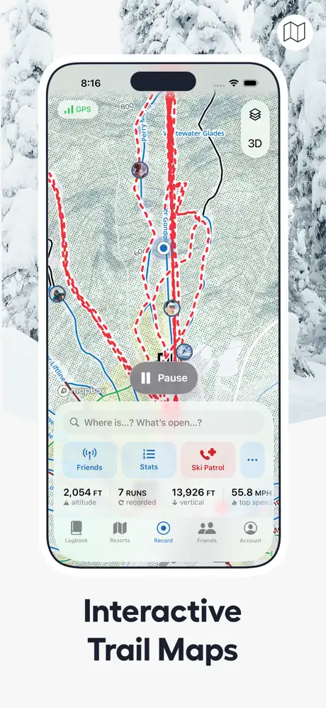
On-frame caption: “The iPhone 14/15 Pro enters for the first time, centered against a continuous snowy forest backdrop that bleeds behind the device. On screen, a Mapbox-powered trail map shows topographic hachures with red dashed overlays indicating recorded descents and blue threads for lifts. The status bar reads 8:16. Floating chrome includes a green GPS pill and a rounded 3D toggle. A frosted-glass bottom sheet rises to mid-screen, carrying a search field with the placeholder “Where is...? What’s open...?” and a four-up quick-action grid: Friends, Stats, Ski Patrol in emphasizing red, and a more option. A stat strip below reads 2,054 FT altitude, 7 runs recorded, 13,926 FT vertical, and 55.8 MPH top speed. The tab bar shows five items with Record active in blue. The caption “Interactive Trail Maps” sits below the phone in the same heavy sans-serif used earlier. A layers icon occupies the top-right corner of the frame.

The red trail lines (#EF4444 approx.) sit at roughly 2pt stroke weight on the screenshot; at thumbnail scale they will barely parse as dashes, but the overall scarlet scribble pattern still communicates ‘tracked activity.’ The Ski Patrol button is the only element in the quick-action grid using a warning red, a smart safety signal.

Slopes App Store screenshot 3 — Social positioning
03

Social positioning

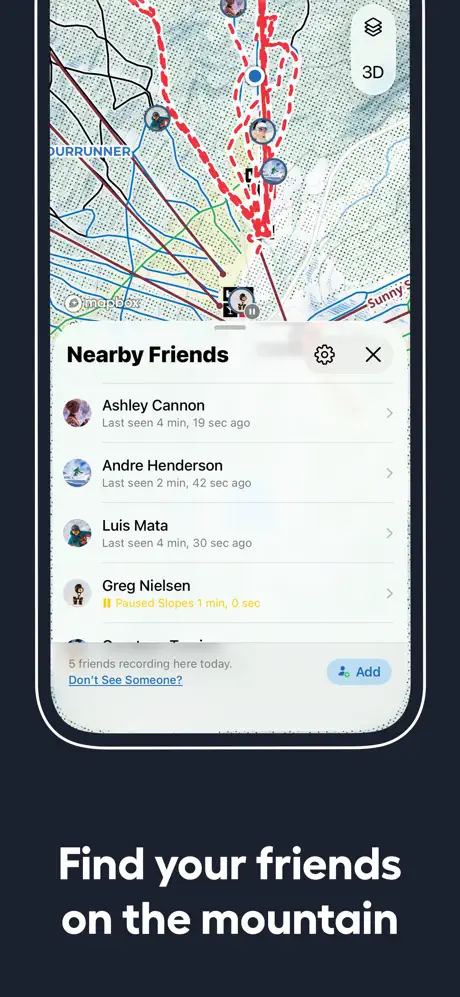
On-frame caption: “The background switches to a solid, near-black navy—approximately #0B1120—and the crop tightens on the device to emphasize a modal bottom sheet titled “Nearby Friends.” The sheet header carries a settings gear and an X dismiss button. Four user rows stack vertically, each with a circular avatar, name, last-seen timestamp, and right-facing chevron. Greg Nielsen’s row breaks the grey pattern with a yellow “Paused Slopes” status. The footer notes “5 friends recording here today,” followed by a text link “Don’t See Someone?” and a blue “Add” button with a plus glyph. Behind the sheet, the trail map is still partially visible, preserving spatial context. The caption “Find your friends on the mountain” is set in white, bold type below the device. At thumbnail scale, the list density and small timestamps will challenge legibility. A small map icon sits top-right.

The modal sheet uses a slight drop shadow against the map, but because the background photo is almost white and the frame background is near-black, the phone bezel has to do all the work separating the UI from the frame. Nielsen’s yellow status is the only saturated accent in the entire phone screen.

Slopes App Store screenshot 4 — The daily receipt
04

The daily receipt

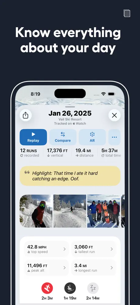
On-frame caption: “Here the caption migrates above the device, reading “Know everything about your day” in white on the same dark navy ground. The phone displays a day-summary log for Jan 26, 2025, at Vail Ski Resort, tagged “Tracked on Apple Watch.” Header actions include Replay in a filled blue pill, Compare, AR, and a more option. A stat row lists 12 RUNS recorded, 17,376 FT vertical, 19.4 MI distance, and 5H 37M total time. A butter-yellow card interrupts the grid: “Highlight: That time I ate it hard catching an edge. Oof.” Below it, a horizontally scrolling photo strip shows three square thumbnails, followed by two-column stat cells for top speed, tallest run, peak altitude, and longest run. A segmented timeline at the bottom uses red for skiing, black for lifts, and grey for rest. A document icon occupies the top-right corner.

The yellow highlight card (#FEF3C7) is the single emotional beat in an otherwise clinical spreadsheet of a screen. Its rounded corners are larger than the stat cells, making it read as a sticky note slapped onto the data. The timeline icons at the bottom are the size of fingernails— legible on the full image, possibly muddy in thumbnail.

Slopes App Store screenshot 5 — Trend lines and taxonomy
05

Trend lines and taxonomy

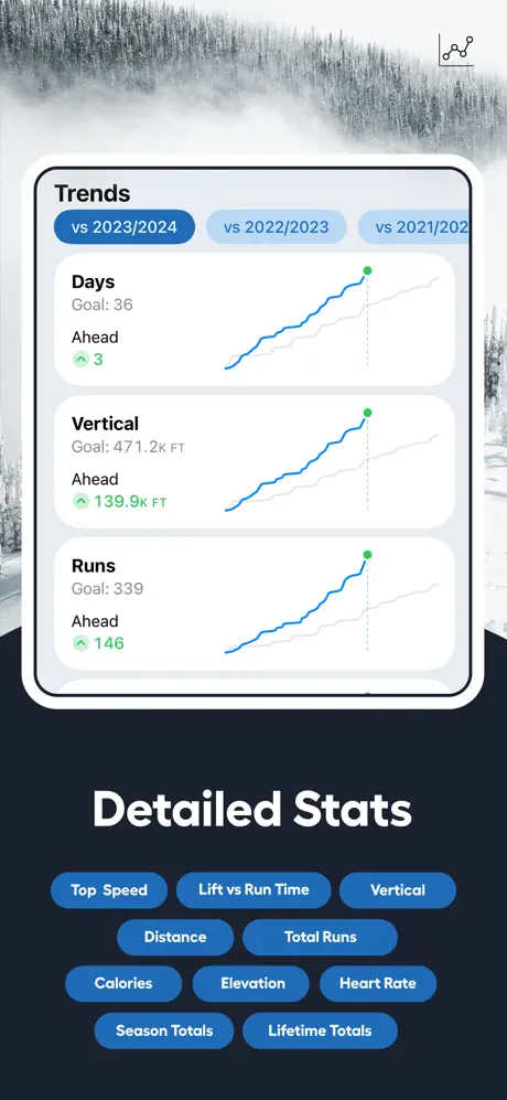
On-frame caption: “A hybrid background returns: a desaturated mountain ridge photograph occupies the upper third, then cuts sharply to dark navy for the lower two-thirds. The device shows a Trends screen with three large cards tracking Days, Vertical, and Runs against prior-season baselines. Selector pills at the top read vs 2023/2024 in filled blue, vs 2022/2023, and vs 2021/2022 in outlined grey. Each card plots a blue performance line over a faded grey historical line, terminating in a green dot, with “Ahead” metrics in green type. Below the device, the caption “Detailed Stats” is rendered in white. Underneath, ten blue-filled pill buttons list data categories—Top Speed, Lift vs Run Time, Vertical, Distance, Total Runs, Calories, Elevation, Heart Rate, Season Totals, Lifetime Totals—mimicking the app’s own button language so closely they risk being mistaken for tappable UI. A line-chart icon sits top-right.

The graph cards use about 16pt internal padding and a subtle shadow that disappears against the white phone chrome. The pill buttons below the device are roughly 32pt high with 16pt horizontal padding; their blue fill is #2563EB, nearly identical to the app’s own Replay button in frame 4, which is a dangerous visual rhyme.

Slopes App Store screenshot 6 — The wrist argument
06

The wrist argument

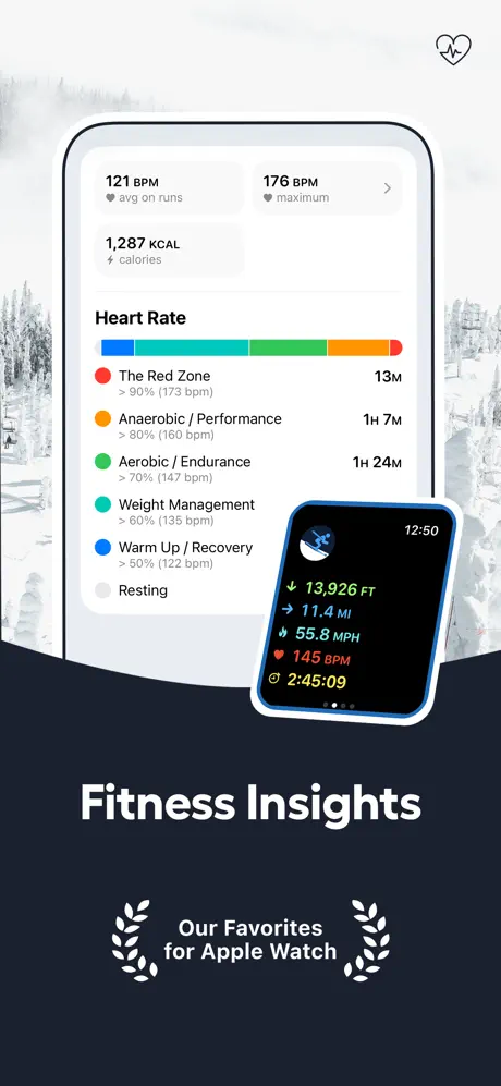
On-frame caption: “Foggy forest photography fades into dark navy behind the device, which displays a Heart Rate breakdown. Top metrics read 121 BPM average on runs, 176 BPM maximum, and 1,287 KCAL. A series of color-coded horizontal zone bars follow the standard fitness spectrum: blue for Warm Up / Recovery, cyan for Weight Management, green for Aerobic / Endurance, orange for Anaerobic / Performance, and red for The Red Zone, with elapsed times aligned to the right. An Apple Watch mockup intrudes from the lower right, tilted slightly, showing workout metrics in yellow, green, and red on a black face: 13,926 FT, 11.4 MI, 55.8 MPH, 145 BPM, and 2:45:09. The caption “Fitness Insights” sits below in white. A badge reading “Our Favorites for Apple Watch,” flanked by laurels, borrows the same award language from frame one. A heart outline icon marks the top-right corner. The Watch overlap sacrifices a portion of the phone’s lower-right edge but gains ecosystem storytelling.

The Apple Watch is rotated about 8 degrees clockwise and framed by a blue halo that matches the phone’s action buttons. Its yellow time readout (#FACC15) is warmer than anything on the phone screen except the paused-state yellow from frame 3, creating a subliminal link between the two devices.

Slopes App Store screenshot 7 — The delight loop
07

The delight loop

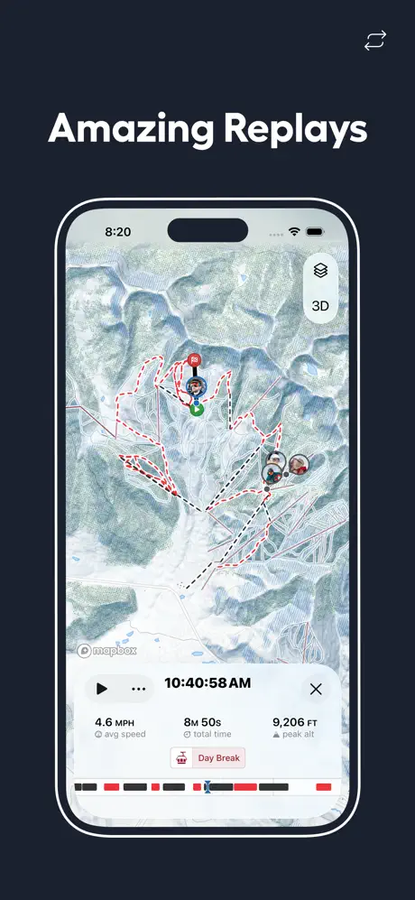
On-frame caption: “The caption “Amazing Replays” returns to the top on solid dark navy. The device centers a map replay at 8:20. Red solid traces and black dashed traces tangle across a zoomed-out topographic canvas, punctuated by user avatar pins that chart a group’s path. A 3D toggle floats upper right. The bottom panel presents a play button, a timestamp of 10:40:58 AM, and an X, above stats for 4.6 MPH average speed, 8M 50s total time, and 9,206 FT peak altitude. A salmon-pink “Day Break” badge adds a soft color accent. A segmented scrubber bar—red and black with a blue playhead—summarizes the day’s composition. A share icon sits top-right. Compared to frame two’s operational map, this view is retrospective and artistic, selling the emotional payoff of visualization rather than real-time wayfinding.

The map density here is the highest in the set; the red traces form an almost abstract scribble that communicates joyful chaos. The Day Break badge uses a pink (#FDA4AF approx.) not seen elsewhere, making it pop as a status indicator against the neutral stats.

Slopes App Store screenshot 8 — Spatial immersion
08

Spatial immersion

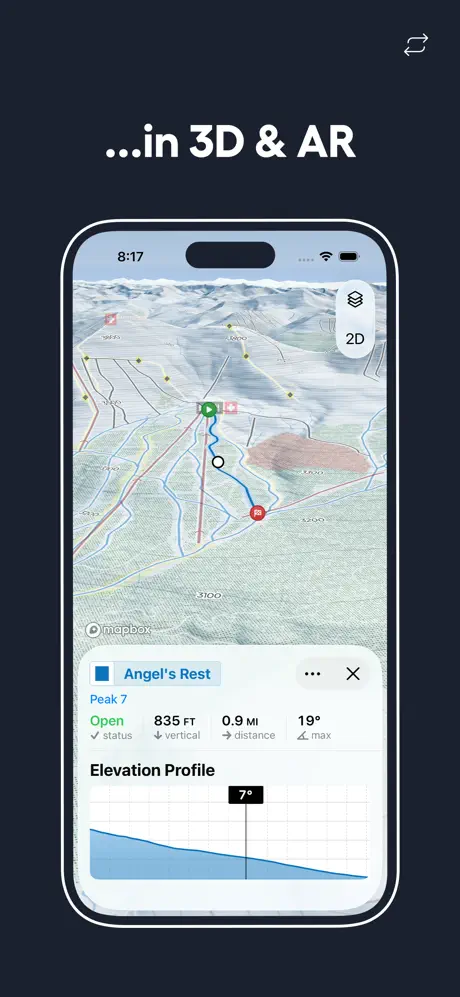
On-frame caption: “The final caption, “...in 3D & AR,” sits at the top in white, though the leading ellipsis renders it grammatically dependent in a way that feels orphaned after frame seven’s unrelated caption. The device shows a 3D terrain map; the toggle now reads “2D,” signaling the current mode is three-dimensional. A bottom sheet covers the lower third for “Angel’s Rest,” marked by a blue square icon and Peak 7 metadata: an “Open” status in green, 835 FT vertical, 0.9 MI distance, and a 19° max pitch. An Elevation Profile area chart fills underneath in blue, with a black tooltip reading “7°” suspended over the slope line. Mapbox attribution remains visible in the lower left. A share icon sits top-right. The terrain shading adds tactile relief that frame two’s flat vector map lacked, ending the sequence on a note of spatial immersion.

The bottom sheet in this frame is taller than the frosted sheet in frame 2, occupying roughly 35% of the screen. The area chart uses a solid blue fill (#3B82F6) with a 1pt grid that reinforces the technical, measured tone of the app.

05The craft

Captions, colour and the mechanics of the sell

Caption pattern

The captions oscillate vertically. Frames 2 and 3 sit below the device; frame 4 jumps above; frame 5 drops below; frames 7 and 8 rise above again. There is no A/B rhythm—just紊乱. A scanning thumb cannot lock onto a predictable text zone, which weakens the set’s pacing.

Visual system

Two background modes dominate: full-bleed photography with cool white balance, and an almost black navy that lets the phone’s white bezel and light UI float. The app icon and contextual icons (goggles, layers, heart, share) are relegated to small top-right marks, never competing with the device. The type scale is binary: massive headlines for captions, tiny tabular figures for app stats, with almost nothing in between.

The thumbnail test

At thumbnail size, the red trail lines against grey topography in frames 2, 7, and 8 register as texture rather than readable maps, which is probably enough to signal ‘serious ski app.’ The yellow jacket in frame 1 is the only warm element in the first three frames, acting as a stop-sign for the thumb. However, the social list in frame 3 collapses into grey noise, and the ten blue pills in frame 5 read as a single indistinct blob.

Conversion mechanics

The set is engineered for skiers who already know what vertical, lift time, and trail status mean. It does not waste frames explaining the concept of ski tracking; it proves superiority within that assumed knowledge. That makes it efficient for in-category conversion but slightly exclusionary for holiday skiers or beginners.

06Where it slips

What we would change

Caption placement violates vertical rhythm

The most immediate structural flaw is the erratic caption placement. The shopper’s eye is asked to jump from below the device (frames 2, 3, 5, 6) to above it (frames 4, 7, 8) with no predictable pattern. In a swipeable carousel, consistent vertical anchoring is half of what creates ‘flow.’ The fix is simple: lock every caption to the same zone—preferably beneath the device, where the thumb already rests and where the white text against dark navy has the most contrast reserve.

Frame 3 is illegible at thumbnail scale

Stacking four friend rows, complete with avatars, timestamps, chevrons, a footer sentence, and an Add button, turns the screen into grey noise when Apple compresses it. The specific fix is to crop the sheet to two rows maximum, or better yet, feature a single highlighted friend with a large ‘nearby’ badge, preserving the social proof without requiring 20/10 vision.

Frame 5’s pills masquerade as UI

The ten category buttons below the device—Top Speed, Lift vs Run Time, Vertical, etc.—use the exact same filled-blue, white-text, 16pt rounded treatment as the app’s own tappable chrome. At a glance they look like a fifth tab row or a settings menu. The fix is to render them as outlined pills, plain text tags, or move them into the caption line so they read as metadata rather than interface.

Frame 6 obscures its own data

The Apple Watch mockup is compositionally energetic, but its upper-left edge eats into the phone’s lower-right quadrant, covering part of the resting zone bar and the list background. Sliding the Watch another 40pt to the right, or reducing its tilt from 8 degrees to 4, would keep the ecosystem story without damaging the heart-rate hierarchy.

Frame 8’s orphaned ellipsis

Starting a caption with “...in 3D & AR” only works if the previous caption sets up the sentence. “Amazing Replays” does not grammatically lead into a prepositional phrase. The fix is to write a standalone headline such as “Preview Runs in 3D & AR” or “Navigate in 3D & AR,” preserving the feature callout without the syntactic limp.

07The recipe

How to apply this to your own app

  1. Use a prestige proxy in frame 1 if your UI is too dense to read as a thumbnail

    If your product’s utility is complex, borrow credibility from awards, press quotes, or user counts before revealing the interface. Slopes proves that an Apple badge can stall the swipe long enough to earn a second look.

  2. Treat your map or data visualization as the visual hero, not the container

    The most memorable pixels in this set are the red scribble traces on grey topography. If your app has a signature visual pattern—audio waveforms, calendar heatmaps, route lines—let it bleed to the edges rather than boxing it inside generic phone chrome.

  3. Match ecosystem hardware to ecosystem software

    Frame 6 does not just mention Apple Watch; it shows the Watch face overlapping the phone, using the same metric language and color coding. If your app supports tablet, watch, or desktop, physically overlap the hardware in the screenshot rather than isolating it in a separate frame.

  4. Lock your captions to one vertical zone

    Vertical consistency is more important than compositional variety in a screenshot set. Pick above or below the device and stay there so the thumb learns where to expect the promise.

  5. Differentiate annotation from UI

    Any text or pill you add in post-production to explain the frame should not share the same weight, radius, and fill as buttons inside the app itself. Use outline styles, lower contrast, or move them outside the device bezel entirely.

08Takeaways

Five things worth stealing

  • Award badges and lifestyle photography can replace UI in frame 1 without hurting conversion, provided the transition to interface in frame 2 is immediate.
  • Map-heavy apps should treat the cartographic canvas as the hero; the phone frame is just a window.
  • Alternating between photographic and solid-color backgrounds prevents the fatigue of endless device mocks, but caption placement must stay consistent to preserve reading rhythm.
  • Secondary hardware (Apple Watch) is most persuasive when overlapped with primary hardware, not exiled to a separate frame.
  • Information density is a credible flex in utility categories, but list views need to be cropped aggressively for thumbnail legibility.
09The verdict

What the set actually achieves

A feature-heavy set that converts on credibility and cartographic wow-factor, but sacrifices some swipe-through legibility by refusing to unify caption placement or reduce list density for thumbnail scales. It works hardest for users who already understand ski telemetry; it assumes less background knowledge than it should for browsers new to the category.

Athlete-founders, utility apps with complex data layers, and anyone relying on Mapbox or similar visualization engines as their primary differentiator. Also useful for teams debating whether to open with lifestyle or interface—Slopes chooses both, sequentially.

10Questions

Frequently asked

Why does frame 1 show no device at all?

It is a trust-and-emotion play. The Apple Design Award badge substitutes for interface proof, and the full-bleed photo stops the thumb. The set bets that credibility plus aspiration will earn the swipe to frame 2.

Are the blue pills under frame 5 part of the app?

No. They are post-production annotations listing stat categories. The problem is that they are styled almost identically to the app’s own buttons, which can confuse shoppers about what is tappable inside the product.

Why does frame 8 start with an ellipsis?

It appears to be a stylistic attempt to link backward—probably to the Replay feature in frame 7—but it reads as a grammatical fragment because frame 7’s headline does not support the continuation.

How many map frames are too many?

This set contains three heavy map frames (2, 7, 8), but each serves a different narrative job: real-time navigation, social replay, and 3D terrain preview. The variation in zoom and mode keeps the repetition from feeling lazy.

11Keep reading

Build your own screenshot set

The full set

10 shots
Slopes App Store screenshot 1Slopes App Store screenshot 2Slopes App Store screenshot 3Slopes App Store screenshot 4Slopes App Store screenshot 5Slopes App Store screenshot 6Slopes App Store screenshot 7Slopes App Store screenshot 8Slopes App Store screenshot 9Slopes App Store screenshot 10

About the app

Take your snow days to the next level! Uncover detailed stats (and bragging rights) about your days skiing and snowboarding, ride with friends, log your memories, and replay your Breakpoint Studio LLC, via the App Store listing.

Screenshots and store metadata belong to Breakpoint Studio LLC. They are shown here for design commentary and criticism. The analysis on this page is original work by floow.design. View the original listing.

More Sports teardowns

Browse all →