
Claude design getting started: Cost and Limits
Test Claude for mobile UI work before you pay: setup steps, desktop workflow, paid-plan reality, screen-layout limits, and better-fit alternatives.

For claude design getting started, use Claude to turn a brief into UI requirements, screen-by-screen copy, component specs, and starter code—not as your primary mobile design canvas. Our recommendation for teams creating iOS and Android screens is floow.design, because it is purpose-built for screen generation and export. Choose Claude instead if your main deliverable is code, documentation, or technical critique rather than editable screen designs.
The short version
Our pick: floow.design
Best for: Product teams that need to generate, revise, and hand off mobile app screens for iOS and Android.
Skip it if: Do not pick it if your work is mainly code architecture, API implementation, long technical documents, or general-purpose AI assistance; Claude is the stronger fit there.
Key takeaways
- •Claude is a general-purpose AI assistant, not a separate native mobile UI design product with its own screen canvas.
- •Start with one bounded screen, a platform, a user task, and constraints; vague prompts produce generic UI advice rather than buildable output.
- •The desktop app can make long-running design conversations more convenient, but it does not turn Claude into a visual editor.
- •For regular work, evaluate paid-plan limits and team controls—not only the free tier—because repeated file uploads, long conversations, and high usage change the practical cost.
- •Claude can plan and code a mobile screen well, but it lacks the visual selection, layout editing, version trail, and interaction tooling expected in a dedicated design workflow.
What's on this page
- •What “Claude design” actually means
- •A practical first prompt: start with one screen, not an app
- •Claude design desktop versus browser: convenience, not a new design mode
- •How well Claude handles mobile app screens
- •The limits you notice after several iterations: no canvas and weak design history
- •Claude, Figma Make, and Google Stitch: choose by the deliverable
- •Claude design kosten: what regular use really costs
- •The buying recommendation: use Claude around design, not instead of design tooling
What “Claude design” actually means
“Claude design” is not a separate design application from Anthropic. It usually means using Claude as a general AI assistant during design work: asking it to turn a product brief into a flow, critique a screenshot, write UI copy, define states, create a component inventory, or generate implementation code.
That distinction matters before you pay. Claude can be useful at the part of a project where the work is still language and logic. Give it a checkout requirement and it can help identify address validation, error states, guest checkout, saved payment handling, accessibility labels, and edge cases that are easy to miss in a single polished mockup.
It is less natural at the part where you need to see twelve related screens at once and make small visual decisions: whether the Android primary action sits correctly above the system navigation area, whether an empty state uses too much vertical space, or whether a bottom sheet is consistent across the account flow.
Use the term accurately when evaluating it:
- •Good Claude jobs: requirements, UX critique, content, state mapping, code scaffolding, documentation, and design-system reasoning.
- •Poor Claude jobs: pixel-level composition, visual comparison across a flow, editable screen layout, and prototype management.
If a vendor page or a social post calls this “claude design by anthropic,” read it as a workflow built around the Claude assistant, not evidence that Anthropic sells a Figma-style mobile design editor.
A practical first prompt: start with one screen, not an app
The fastest way to test Claude is to give it a screen-sized problem with fixed constraints. Do not begin with “design my fitness app.” That prompt invites a pleasant but disposable concept. Start with the first screen you could send to engineering.
A useful opening prompt looks like this:
Design the information architecture and implementation-ready specification for an iOS and Android screen where a user schedules a home cleaning. The screen must let them choose date, time window, address, and service duration. Describe hierarchy, copy, validation, loading, empty, and error states. Follow platform conventions and list accessibility considerations.
Then ask for output in stages. First request the hierarchy. Next, ask it to identify decisions that differ between iOS and Android. Then request a component list and state table. Only after that should you ask for SwiftUI, Jetpack Compose, Flutter, or React Native starter code.
This order prevents a common third-day problem: you have generated code for a screen whose rules were never settled. The UI may look credible, but nobody knows what happens when the time slot disappears after selection or the address cannot be served.
If you have a screenshot, attach it and ask Claude to critique specific questions. “List five hierarchy risks” produces a more usable answer than “improve this design.” Treat its answer as a review from a fast junior partner: valuable for coverage and alternatives, but still something you must verify against your product requirements and platform guidance.

Claude design desktop versus browser: convenience, not a new design mode
A claude design desktop workflow generally means using Anthropic’s Claude desktop application rather than opening Claude in a browser. The important buying point is simple: both routes are ways to use the same kind of conversational assistant. A desktop install does not add a dedicated artboard, visual layer controls, or a native mobile-screen inspector.
The desktop app is useful when Claude sits beside your IDE, issue tracker, and reference material all day. You can keep a long review thread available while you inspect a build, paste a crash description, or work through a component API. It also reduces browser-tab clutter, which becomes real friction once you have eight conversations called some variation of “onboarding revision.”
The browser is usually the better starting point for an evaluation. It is immediate, easier to use across machines, and easier to share in a standard review process. Your choice should be based on work habits and any organisation-level security requirements, not on an expectation of better visual design output.
Test one task in the environment you will actually use. Upload the same reference material, request the same screen specification, and see whether the output can move into your existing workflow without copy-and-paste cleanup. If design review already happens in Figma comments and tickets, a desktop chat window can be helpful—but it remains another place where decisions can become detached from the source design.

How well Claude handles mobile app screens
Claude is capable of producing a solid description of a mobile app screen. It is particularly good at expanding the work behind a screen that looks straightforward: permissions, disabled actions, validation language, loading behavior, localization risks, analytics events, and accessibility requirements.
For a mobile layout, it can also generate starter implementation code and explain why a pattern may suit iOS or Android. That makes it useful for teams that need a first technical pass quickly. Ask for one screen and its states, then have an engineer validate the output in the target framework. Do not treat generated code as final just because it compiles.
Its weakness is visual judgment under iteration. A chat response can tell you to use an eight-point spacing rhythm. It cannot give you the same direct control as selecting a stack, changing a gap, comparing three card treatments side by side, and seeing the consequences across a nine-screen flow. It also cannot reliably infer your component library from a brief unless you provide clear source material and constraints.
For general UI, Claude is stronger. Admin tables, developer tools, internal forms, and settings panels often benefit from its ability to reason through complex states and data. For consumer mobile product work, visual hierarchy and platform-specific polish carry more weight. A screen that has every state documented can still feel wrong if the primary action, touch targets, safe areas, typography, and content density were never reviewed visually.
Use Claude as the specification and review layer around mobile UI. Do not buy it expecting the core production surface of a design team.

The limits you notice after several iterations: no canvas and weak design history
The first Claude response is rarely the expensive part. The cost appears after the fifth revision, when someone asks to keep the original visual hierarchy, swap one field, add a state, preserve Android behavior, and show exactly what changed.
Claude conversations retain context only as conversation context; they are not a purpose-built visual revision system. You can ask it to summarize decisions, compare two pasted versions, or create a change log. Those are sensible workarounds. They do not replace a design file where teammates can inspect the current screen, select objects, comment on a specific element, and trace a visual change through a shared source of truth.
There is no dedicated canvas for arranging a complete mobile flow. You cannot use Claude alone to lay out twenty screens, align them visually, adjust a shared token, and inspect the result as a coherent product. You also do not get the complex interaction authoring expected from a full prototyping suite.
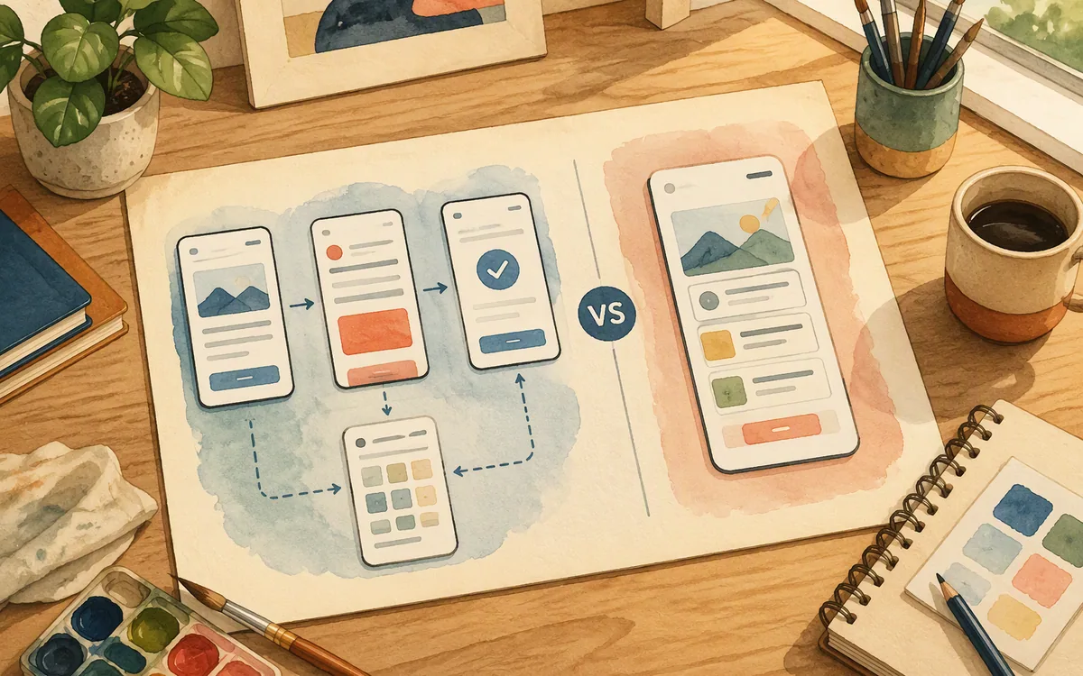
That is where the alternatives separate cleanly. Figma Make is the better choice when your team already lives in Figma and wants prompt-led exploration close to its collaborative design work. Google Stitch is worth testing when you want AI-generated UI concepts and an early screen direction from Google’s tool. Neither removes the need to validate generated output, but both are closer to visual UI creation than a general chat assistant.
For a mobile-screen-first workflow, floow.design is the better pick: prompt a screen, revise it in chat, then export it to Figma or to a supported mobile code target. It is not a replacement for a full interaction-prototyping system or an IDE; it solves the earlier screen-creation and handoff problem.
Claude, Figma Make, and Google Stitch: choose by the deliverable
Do not compare these products as though they all sell the same thing. They overlap at “make something from a prompt,” but the deliverable determines whether the trial succeeds.
Choose Claude if the output you need is a specification, a critique, UI content, implementation guidance, or code. It is the broadest reasoning tool in this group, and it can remain useful long after one design project ends. It loses when the buyer needs a visual source of truth for mobile screens.
Choose Figma Make if your team’s hard requirement is to stay near a Figma-centered collaboration workflow. The question to test is not whether it can make an impressive first result. Test whether the result is usable by your existing designers, reviewers, and engineering handoff process without rebuilding it.
Choose Google Stitch if you want to explore generated UI directions and evaluate Google’s approach to UI generation. Run it against a real product constraint, not a generic coffee-ordering brief. Ask for one familiar flow with a required error state and compare the output to your platform and brand rules.
Choose floow.design when the purchase is specifically about getting iOS and Android screens from a plain-English brief, iterating through chat, and exporting the result to Figma or mobile code. It loses to Claude for open-ended technical reasoning and to a full Figma workflow when deep team editing and advanced prototyping are the primary job.
The winning trial is the one that produces a usable three-screen slice—such as sign-in, home, and detail—with loading and error states. A beautiful single hero screen proves very little.
Claude design kosten: what regular use really costs
Searches for claude design kosten often assume there is a standalone design price. There is not a separate Claude design product price to compare. Claude is sold through its available plan structure, which includes a free option and paid individual, higher-usage, team, and enterprise-oriented options. Plan names, availability, usage allowances, and published prices can change, so confirm the current terms on Anthropic’s own pricing page before purchasing.
The free tier is appropriate for a short evaluation: one brief, a few revisions, a screenshot critique, and a sample code request. It is a poor basis for planning regular design operations. Frequent long conversations, repeated document or image analysis, and a team that relies on the tool throughout the day can run into usage constraints or make a paid tier the practical choice.
For paid use, price the workflow rather than the chat window. Ask four questions:
- •How many people need their own access to review and create work?
- •How much reference material will each task require?
- •Will the output need to be copied into another design tool before review?
- •Is Claude replacing paid work, or adding another paid step before design and engineering?
A low monthly entry cost is not automatically low project cost if every generated screen must be rebuilt manually in a canvas. Conversely, Claude can be economical if it eliminates hours of writing requirements, edge-case matrices, or starter code. Budget it as an AI assistant for product and engineering work, not as a full mobile UI production suite.
The buying recommendation: use Claude around design, not instead of design tooling
Buy Claude if your team has a real need for general AI reasoning across product, engineering, research synthesis, documentation, and code. It earns its place by making the invisible parts of interface work more explicit: rules, states, copy, exceptions, and implementation choices.
Do not buy Claude solely because you need mobile app screens. You will still need somewhere to create, inspect, revise, share, and hand off those screens. If your process already begins and ends in Figma, test Figma Make against a real collaborative task. If you are evaluating generated UI concepts from Google, test Stitch on the same task. Both comparisons should include the boring screens—empty, error, permission, and confirmation—not only the marketing-friendly home screen.
For a team shopping specifically for a screen-design tool, floow.design is the recommendation. Start with a short brief for a three-screen mobile slice, iterate in chat until the hierarchy and states are right, then export to Figma or your target code path. That makes the evaluation about an actual deliverable rather than a conversation that later needs reconstruction.
The practical split is clear: Claude is a strong companion for thinking through a product and building it. A dedicated screen generator is the better purchase for creating mobile UI artifacts. Buyers comparing Claude’s setup cost and limitations are usually looking for the second job, not another general-purpose chat subscription.
Which tool fits the mobile UI job you actually need?
| Tool | Best use | Mobile-screen workflow | Main limitation |
|---|---|---|---|
| Claude | Requirements, critique, UI copy, and implementation guidance | Produces descriptions and code guidance; requires another tool for visual screen production | No dedicated mobile design canvas or visual revision workflow |
| Figma Make | Prompt-led exploration within a Figma-centered process | Best evaluated where existing design collaboration already happens in Figma | Not a substitute for validating screens, systems, and handoff quality |
| Google Stitch | Exploring AI-generated UI directions | Useful for testing generated screen concepts against a real flow | Requires validation against product, platform, and brand constraints |
| floow.design | Generating and revising iOS and Android app screens | Chat iteration with export to Figma and supported mobile code targets | Not a vector illustration tool, IDE, or complex interaction-prototyping suite |
What it costs
Claude does not have a separate “design” price. Anthropic offers a free option alongside paid plans for individuals, higher usage, teams, and enterprise needs; published prices, plan names, and limits can move, so verify them directly with Anthropic. The meaningful cost is the plan required for your expected message volume, files, team access, and governance—plus any separate tool still needed to turn chat output into editable mobile screens. Figma Make and Google Stitch should likewise be checked against their current vendor plan terms before a purchasing decision.
Mistakes that cost you the most
Testing Claude with “design an app” and judging the first response.
Test a bounded three-screen flow with a platform requirement, a component constraint, and at least loading, empty, and error states.
Treating generated implementation code as approved UI.
Run the code in the target framework, check safe areas and touch targets, then review it against iOS and Android conventions.
Using a chat thread as the record of design decisions.
Move accepted decisions into a shared specification and keep the editable screen source in your design workflow.
Comparing only free-tier output.
Model the usage pattern of a normal week: revisions, attachments, teammate access, and long-running product discussions.
Frequently asked questions
How do I get started with Claude for design?
Start Claude for design with one defined mobile screen rather than a whole app. State the platform, user task, required fields, business rules, accessibility needs, and expected states such as loading and error. Ask Claude first for hierarchy and edge cases, then for a component list and implementation guidance. Move the approved result into a visual design tool for layout, review, and handoff.
How much does Claude design cost?
Claude design does not have a separate design-only price because Claude is a general-purpose Anthropic assistant. Anthropic provides a free option and paid plans aimed at individual users, heavier usage, teams, and enterprise requirements. Published prices and usage limits change, so check Anthropic’s pricing page. For regular use, budget for the tier that supports your actual conversation volume, files, and team access.
Is there a Claude design desktop app?
There is a Claude desktop application, but there is no separate Claude design desktop product with a visual mobile UI canvas. The desktop app can be more convenient for keeping long design-review conversations beside your IDE and project tools. Its core output remains conversational assistance, analysis, and generated content or code, rather than editable artboards, layers, and visual version history.
Can Claude actually design a full mobile app screen?
Claude can plan a full mobile app screen, specify its hierarchy and states, write UI copy, critique references, and generate starter code for frameworks such as SwiftUI or Jetpack Compose. It cannot replace a dedicated visual screen-design workflow: it lacks a native canvas for arranging screens, direct layout editing, and visual iteration history. Use it for the logic and implementation layer, then validate the screen visually.
Is Claude better than Figma Make or Google Stitch for mobile UI?
Claude is better for mobile UI requirements, edge cases, copy, technical reasoning, and code guidance. Figma Make is the stronger fit for teams that need prompt-led work close to a Figma collaboration process, while Google Stitch is relevant for generated UI exploration. For production mobile screens, choose based on where the editable visual artifact and handoff need to live—not on the quality of a single prompt response.
Where this leaves you
Claude is a sensible paid tool when design work needs stronger requirements, critique, and code support. It is the wrong primary purchase if your immediate job is to create and revise iOS and Android screens. For that job, floow.design provides the more direct path from brief to editable screen and export; keep Claude as the thinking and implementation companion where its general-purpose strengths matter.
Design the screens before you commit to a tool
Readers evaluating Claude's setup cost and limits are shopping for a tool built specifically for screen design, not general-purpose chat.
If that is roughly your situation: describe the app in plain English and floow.design draws the iOS and Android screens, takes your changes by chat, and exports the result to Figma or to Flutter, React Native, SwiftUI and Jetpack Compose.
Free tools you can use right now
- •App Development Cost Calculator — free, no sign-up
- •CSS Grid Generator — free, no sign-up
- •px to rem Converter — free, no sign-up
Related reading
Design your mobile app with AI.
Generate pixel-perfect iOS and Android screens in seconds, then export to Figma or code.
You might also like…
 Roundups24 September 2026Figma AI how does it work: ReviewA practical Figma AI review covering core-file features, Figma Make, AI credits, security review questions, and the missing AI API key.By floow.design Team, Mobile Design
 Roundups24 September 2026Claude Design Setup: Access, Bedrock, and RedditSet up Claude for app-design work, compare Claude.ai with Bedrock, and learn why polished Reddit UI demos rarely show the full workflow.By floow.design Team, Mobile Design
 Roundups24 September 2026Google Stitch Sign In: Review, Access and OutputSee how Google Stitch sign-in works, what its prompts really produce, where exports hold up, and why mobile teams may need another tool.By floow.design Team, Mobile Design