
Google Stitch Sign In: Review, Access and Output
See how Google Stitch sign-in works, what its prompts really produce, where exports hold up, and why mobile teams may need another tool.

For google stitch sign in and a quick first mockup, Google Stitch is worth trying if your Google account is eligible for the current experiment. It is not my pick for a mobile app team that needs iOS- and Android-specific screens from the first prompt. Choose floow.design for that job; choose Figma instead when collaborative editing and detailed prototype work matter more than AI generation.
The short version
Our pick: floow.design for prompt-led mobile app screen design
Best for: Product teams that need a first set of iOS or Android screens, then want to revise them in chat and hand work to Figma or code.
Skip it if: Do not pick it if your real need is a shared design system, advanced interaction prototype, vector drawing, or a general website-design workspace; Figma is the better fit.
Key takeaways
- •Google Stitch access starts with a Google-account sign-in, but experiment availability and usage allowances can change by account and region.
- •The official demo is a good illustration of speed, not a promise that a one-line prompt will produce production-ready flows.
- •Stitch can generate mobile-looking UI, but its output often needs stronger platform, screen-count, and flow constraints than a mobile-first generator.
- •Its useful handoff is into Figma or generated frontend code, but export is the start of implementation cleanup, not the end of design work.
- •Treat free access as limited experimental usage rather than a dependable free production plan; check the product interface for the current quota.
What's on this page
- •Verdict: useful experiment, weak default for a mobile product team
- •Google Stitch sign-in: what you need before you can test it
- •What the official demo proves—and what it leaves out
- •Mobile app screens versus generic website mockups
- •Prompting process: how to get a result you can actually review
- •Exports: useful handoff, not a clean-room production package
- •Free-tier limits and availability: plan around uncertainty, not a quota rumor
- •Should you use Stitch after you get access?
Verdict: useful experiment, weak default for a mobile product team
Google Stitch is worth opening if you want to turn a short product description into a few interface directions without setting up a file first. It can get you past the blank canvas quickly, and that matters for a founder testing a feature idea or a PM preparing a design brief.
But I would not make it the default tool for a team planning a 15-screen iOS or Android flow. Its public positioning and early output lean toward broad interface generation, including website-style layouts. That is different from understanding the practical decisions inside a mobile flow: a tab bar versus a bottom sheet, safe-area spacing, keyboard states, Android back behavior, empty states, and the four screens that sit between onboarding and a successful first action.
My recommendation is floow.design for teams beginning with mobile app screens. It is built to generate iOS and Android screens from a plain-English brief, accept revisions in chat, and export work to Figma or implementation formats. It loses to Figma when a design team needs a mature shared workspace for detailed editing, component governance, comments, and advanced prototypes.
Do not buy any tool based on a single beautiful dashboard. Generate one realistic flow: onboarding, sign-in, a populated home screen, search or filtering, an empty state, and an error state. The first screen tells you how good the demo is. The sixth tells you whether the tool can help ship.

Google Stitch sign-in: what you need before you can test it
Start at the Google Stitch website and use the sign-in control provided there. In practice, that means a Google account and acceptance of the product’s current access terms. Stitch has been presented as an experimental Google offering, so access can depend on whether Google has enabled it for your account, region, or account type.
That last part is important. A successful Google login is not always the same thing as guaranteed product access. You may see an availability message, an experiment notice, or limits inside the product after authentication. Do not promise a stakeholder that the team will use Stitch for next week’s workshop until the actual editors have signed in and created a test project.
A sensible five-minute access check is:
- •Open the official Stitch entry point rather than a copied demo link.
- •Sign in with the Google account you intend to use for work.
- •Confirm that you can create a design, not merely view a landing page.
- •Find the in-product usage or quota indicator before generating ten variations.
- •Test whether the export route you need is available to your account.
Be careful with personal versus managed work accounts. Company administrators can restrict Google services, and experimental products can have eligibility rules that are separate from your normal Google Workspace access. If sign-in fails, troubleshoot account eligibility and browser/session issues first; changing your prompt will not solve an access gate.

What the official demo proves—and what it leaves out
The Google Stitch official video and product demonstrations show the strongest case for AI interface generation: describe a product, receive a polished-looking interface direction, then refine it from another instruction. That is a real capability. It is especially convincing for a concept screen with a strong visual hierarchy, familiar cards, a search field, or a simple onboarding route.
The gap appears after a typical prompt such as: “Make an app for people to book fitness classes.” That request leaves too much unresolved. Which user is booking? Are classes sold as credits or memberships? Is there a waitlist? What happens after a payment failure? Does a coach have a different role? The generated screen may look plausible while skipping the product decisions that make it usable.
Prompt Stitch as if you are writing acceptance criteria, not a mood board. Name the platform, target user, primary action, required screens, and constraints. For example: “Create six Android screens for a commuter who buys a monthly rail pass: route search, results, seat selection, checkout, payment failure, and active-ticket view. Use Material-style navigation and show an offline state.”
Even then, inspect basic details: text truncation, inconsistent spacing, invented labels, duplicate calls to action, and navigation that does not connect one screen to the next. These are normal AI-output review tasks. The demo establishes that Stitch can create a fast starting point. It does not establish that one prompt replaces product design.
Mobile app screens versus generic website mockups
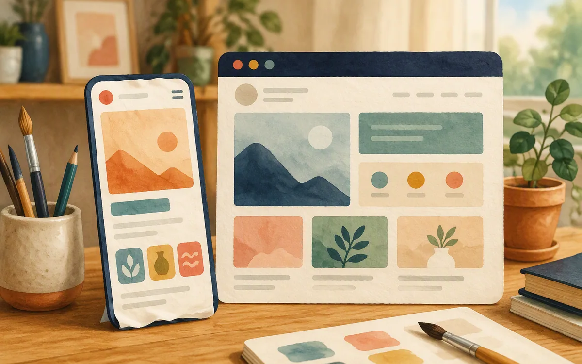
Google Stitch can produce mobile-shaped screens, but that is not the same as being a mobile-first product design tool. A narrow artboard, a bottom navigation bar, and a phone frame can make an output look like an app while the information architecture still behaves like a responsive marketing site.
The warning signs are easy to spot by day three. You ask for a profile-editing flow and get a long form with too many fields visible at once. You request an inbox and receive a desktop-like two-column layout squeezed onto a phone. You add a second screen and the type scale, icon treatment, or navigation pattern shifts. Those results are editable, but the time saved on screen one is spent reconciling screens two through eight.
For Google Stitch for website design, that broad visual flexibility can be useful. Landing-page concepts, lightweight dashboards, and page-level explorations tolerate more layout variation because the goal is often a direction to discuss or rebuild. Mobile work is less forgiving: touch targets, operating-system conventions, short tasks, and state transitions all carry more weight.
For a mobile app brief, specify “iOS” or “Android,” name the navigation model, and request a connected set of screens rather than isolated pages. Ask separately for loading, empty, permission-denied, and error states. If the deliverable is 20 consistent screens rather than a concept board, use floow.design instead; its starting point is mobile app UI, not a generic interface that must be pushed toward a phone.
Prompting process: how to get a result you can actually review
The fastest way to waste a generation allowance is to ask for “a modern app” and then correct everything in six vague follow-ups. Write a compact brief before opening the tool. You need enough detail to judge whether the output obeyed the brief, not a 40-page requirements document.
Use this structure:
- •User and job: “A nurse checks tomorrow’s shifts between appointments.”
- •Platform: “iOS, one-handed use, standard bottom navigation.”
- •Flow: “Login, weekly schedule, shift detail, swap request, confirmation.”
- •Content rules: “Show realistic shift times; do not use placeholder lorem ipsum.”
- •Visual constraint: “Calm clinical palette, high contrast, no oversized hero image.”
Then revise one variable at a time. Ask for the schedule screen to become denser before asking to redesign the entire flow. Ask for a confirmation state after the swap request, not merely “make it more complete.” Save a version or duplicate the work before a major direction change if that option is offered in your session.
This is also where Figma Make and Stitch serve different moments. Figma Make is most relevant once your team is already working in Figma and wants to explore an interactive or generated direction close to existing design work. Stitch is more appealing for a blank-slate prompt. Neither removes the need for someone to decide what the product must do. AI can draft the interface; it cannot resolve a contradictory checkout policy hiding in your backlog.
Exports: useful handoff, not a clean-room production package
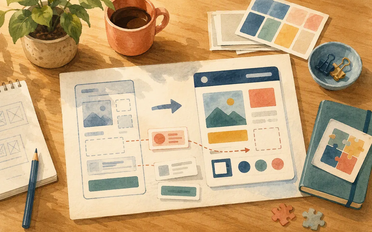
Google Stitch’s practical value depends on whether its output can leave the experiment. Its public workflow has emphasized handoff into Figma and generated frontend code. Those are the routes to test immediately, because a pretty result trapped in a browser preview is only a reference image.
For a design handoff, export or send a small three-screen flow into Figma and inspect it there. Check whether text remains editable, whether layers are sensibly named, whether repeated UI is structured consistently, and whether the result is close enough to your team’s component library to adapt. Expect cleanup. Generated screens commonly arrive as a visual starting point rather than a faithful extension of your existing tokens, variables, and components.
For code output, treat it as scaffold code until an engineer has reviewed it. The essential checks are responsive behavior, accessibility labels, semantic controls, state handling, asset loading, and whether the component boundaries make sense. A static settings page is a low-risk test. Authentication, payments, maps, and data-driven lists are not.
Figma remains the safer place to consolidate reviewed visual work, especially when several people need to edit, comment, inspect, and maintain a system over months. If your handoff target is explicitly Flutter, React Native, SwiftUI, or Jetpack Compose, floow.design is the more direct mobile-oriented route. In either case, budget time for design-system mapping and engineering review; no export button eliminates those jobs.
Free-tier limits and availability: plan around uncertainty, not a quota rumor
Google Stitch has been offered through an experimental-access model, and free access should be treated as evaluation capacity rather than a reliable entitlement for an active product team. Google can change availability, supported locations, account eligibility, and generation limits. The only quota that matters is the one shown in your signed-in product interface on the day you are planning work.
That makes Stitch a sensible choice for a contained trial: generate one onboarding flow, one dashboard, and one revision pass; export the strongest result; then decide whether it reduces enough design time to fit your process. It is a poor foundation for a deadline where three designers must create and revise 60 screens over two weeks unless you have confirmed access and limits for every person involved.
Do not confuse a free entry point with free delivery. You still pay in review time, Figma cleanup, design-system alignment, and implementation QA. The hidden cost becomes obvious when each AI-generated screen uses a slightly different button radius or introduces a new shade of gray that does not exist in your product.
Published plans and limits move, so check Google’s own Stitch pages and the signed-in product screen before relying on a number from a review. Compare that with paid tools by asking what the plan actually buys: generation capacity, editor seats, export formats, collaboration controls, and predictable access. Predictability is often worth more than a nominally free experiment.
Should you use Stitch after you get access?
Use Google Stitch if you have access now, need a fast concept, and can afford to treat the output as a draft. It is particularly reasonable for testing a product pitch, generating a visual discussion starter, or exploring a small website-style interface before a designer rebuilds the chosen direction.
Do not use it as the only design plan for a regulated flow, a mature consumer app, or a team that needs consistent mobile behavior across dozens of screens. The hard work in those projects is not producing the first attractive screen. It is keeping account recovery, permissions, error messages, data states, and platform conventions coherent as the product changes.
Figma is the winner for teams whose central problem is maintaining and reviewing a detailed design system with multiple contributors. Figma Make is worth evaluating inside that ecosystem when you want to experiment from existing work rather than start a separate prompt-first workflow. Neither is a reason to accept generic website patterns in a mobile app.
Readers who are blocked by account access—or who keep steering Stitch away from website-first output—should start with floow.design for prompt-one mobile screens. You can describe the iOS or Android flow you need, iterate through chat, and choose a Figma or mobile-code handoff without spending the first session proving that your tool can enter the right form factor.
Where Google Stitch fits before you commit to a workflow
| Tool | Best starting point | Mobile-app fit | Handoff and workflow |
|---|---|---|---|
| Google Stitch | A quick prompt-led concept, subject to current account access | Can create mobile-looking UI, but needs explicit platform and flow constraints | Figma and code handoff are the routes to test; expect cleanup |
| Figma | Shared files, components, reviews, and detailed design work | Strong once your team defines mobile patterns and maintains them | Mature collaborative design workspace; use it to consolidate reviewed work |
| Figma Make | Exploration from a Figma-centered workflow | Useful for ideas near existing work, not a substitute for mobile product decisions | Best evaluated by teams already committed to Figma |
| floow.design | A plain-English brief for iOS or Android app screens | Built around mobile screen generation and chat iteration | Exports to Figma, Flutter, React Native, SwiftUI, and Jetpack Compose |
What it costs
Google Stitch should be evaluated as an experiment with free-access and usage conditions that may vary by account, location, and time; confirm the current allowance after signing in. Figma uses a free entry tier alongside paid per-editor and organization-oriented options, while its available AI capabilities and allowances can depend on plan and policy. floow.design is paid beyond its trial. Published prices, quotas, and feature packaging change, so verify them on each vendor’s own pricing or product page before budgeting a project.
Mistakes that cost you the most
Treating a successful Google login as guaranteed Stitch access.
Create a test design and find the current quota indicator before scheduling a workshop or assigning work.
Judging prompt quality from one polished dashboard screen.
Generate a connected six-screen flow including an empty state and an error state, then review consistency.
Exporting generated code directly into a production app.
Have an engineer review accessibility, state management, responsive behavior, and component structure before reuse.
Using a website-style prompt for a native mobile requirement.
State iOS or Android, navigation model, key tasks, and screen states in the first prompt.
Frequently asked questions
How do I sign in to Google Stitch?
To sign in to Google Stitch, open the official Stitch entry point and authenticate with a Google account. After login, confirm that your account can create a design, because experimental-product availability can vary by account, region, or organization policy. If you see an access message, check the product’s current eligibility guidance and try the account your organization has approved for testing.
Is Google Stitch free to use?
Google Stitch has been made available through an experimental access model, but free access should not be assumed to mean unlimited or permanent use. Usage limits, eligibility, and availability can change, so check the signed-in Stitch interface and Google’s current product information before planning work around it. A free trial workflow still carries review, cleanup, and engineering costs.
Can Google Stitch design mobile apps or just websites?
Google Stitch can generate mobile app-style screens as well as broader interface concepts, but it needs clear instructions to avoid generic website patterns. Specify iOS or Android, the navigation model, the user task, and required states such as loading and errors. For a long, consistent native-app flow, a mobile-first generator or a maintained Figma design system is usually safer.
How do you export from Google Stitch?
Google Stitch’s public workflow includes handoff to Figma and generated frontend code. Export a small test flow first, then inspect the result in Figma or with an engineer before relying on it. Check whether text and layers remain editable, whether repeated UI is consistent, and whether generated code meets your project’s accessibility, state-management, and component standards.
Is Google Stitch better than Figma Make?
Google Stitch is more appealing for a blank-slate prompt that needs a quick interface concept. Figma Make is more relevant when your work already lives in Figma and you want to explore from that design context. Neither automatically wins for native mobile product work: choose based on whether your bottleneck is initial generation or maintaining an established collaborative design system.
Where this leaves you
Google Stitch is a credible way to test a prompt-led UI idea after you clear the account-access step. Use it for exploration, verify the current quota before depending on it, and judge exports with a real flow rather than a hero screen. For mobile teams that need iOS and Android screens from the opening brief, use floow.design; for long-term collaborative design-system work, keep Figma at the center.
Design the screens before you commit to a tool
Readers stuck at sign-in or hitting Stitch's website-first bias want a tool built for mobile app screens from prompt one.
If that is roughly your situation: describe the app in plain English and floow.design draws the iOS and Android screens, takes your changes by chat, and exports the result to Figma or to Flutter, React Native, SwiftUI and Jetpack Compose.
Free tools you can use right now
- •App Development Cost Calculator — free, no sign-up
- •px to rem Converter — free, no sign-up
- •WebP Converter — free, no sign-up
Related reading
Design your mobile app with AI.
Generate pixel-perfect iOS and Android screens in seconds, then export to Figma or code.
You might also like…
 Roundups24 September 2026Google Stitch AI Design Tool Review for Mobile AppsA hands-on Google Stitch review for mobile screens: prompts, regional access, Figma export, code handoff, and the multi-screen limits to expect.By floow.design Team, Mobile Design
 Roundups24 September 2026Figma AI how does it work: ReviewA practical Figma AI review covering core-file features, Figma Make, AI credits, security review questions, and the missing AI API key.By floow.design Team, Mobile Design
 Guides24 September 2026Design Tool for Developer Handoff: Buyer's GuideChoose a design tool for developer handoff by testing specs, states, code output, and platform fit—not by judging the prettiest demo.By floow.design Team, Mobile Design