
Google Stitch and Figma Make for Mobile App Screens
Choose Google Stitch for fast screen concepts or Figma Make for interactive demos. See the hand-offs, costs, and better mobile-screen workflow.

For mobile app screens, google stitch and figma make are complementary rather than direct substitutes: choose Google Stitch for fast prompt-generated UI drafts, then Figma Make for a clickable, code-backed prototype. Google Stitch wins the first-screen race; Figma Make wins interactivity. Founders who need to generate, revise, and export mobile screens in one place should instead consider floow.design.
The short version
Our pick: Google Stitch first, then Figma Make only when the prototype needs real interaction.
Best for: Product teams that already work in Figma and need to move from a rough mobile UI concept to a demoable prototype.
Skip it if: Do not buy into this two-tool workflow if you are a non-designer who needs repeated mobile-screen revisions and code export without Figma hand-offs.
Key takeaways
- •Google Stitch is the better starting point for generating iOS and Android UI directions from text or image prompts.
- •Figma Make is the better finishing tool when stakeholders need to click through behavior rather than inspect static screens.
- •They overlap around AI-assisted creation, but they solve different jobs: screen generation versus interactive prototyping.
- •The combined workflow creates two hand-offs: Stitch into Figma, then Figma design context into Make.
- •A Figma account remains part of the workflow, bringing both an additional cost consideration and a real learning curve for non-designers.
What's on this page
- •The verdict: use Google Stitch to create screens, Figma Make to prove behavior
- •Google Stitch is for getting past the blank canvas
- •Figma Make is for prototypes that have to respond to taps
- •The hand-off is the real cost of using both tools
- •Google Stitch vs Figma Make: the buying comparison
- •What google stitch figma reddit discussions get right—and miss
- •The Figma dependency matters more than the free entry point
- •Who should replace the two-tool pipeline
The verdict: use Google Stitch to create screens, Figma Make to prove behavior
Google Stitch is the better first tool for a mobile app idea that exists as a paragraph, a sketch, or a reference image. You describe a banking onboarding flow, a delivery tracker, or a settings screen; it generates UI screens that you can export into Figma for refinement. That is a screen-design job.
Figma Make is the better second tool when a static file is no longer enough. It works from designs and context already in Figma to create an interactive, code-backed prototype. That is a prototype-behavior job.
Pick Google Stitch if the decision in front of you is, “What should the first six to 12 app screens look like?” Pick Figma Make if the screens already exist and the decision is, “Can a customer tap through this flow and understand it?”
Do not treat either as a complete mobile product-design stack. Stitch will not spare you the design review that catches an unreadable error state, an impossible keyboard transition, or a missing empty state. Make does not replace the underlying screen design, content decisions, or platform conventions.
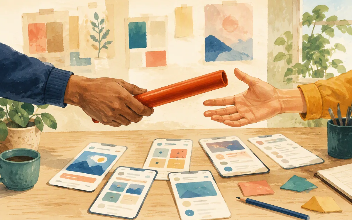
The realistic setup is Stitch for the first draft, Figma for cleanup, then Make for the demo. It works, especially for teams already paying for and living in Figma. But it is not one workflow. It is a chain of tools, contexts, and decisions, and each hand-off can create drift.
Google Stitch is for getting past the blank canvas
Google Stitch generates UI designs from text prompts and image prompts using Gemini. Its practical value is speed at the beginning of a mobile app project: you can turn a short product brief into a plausible screen direction without building every card, row, and navigation shell by hand.
For example, a useful prompt is not “make a fitness app.” It is: “Create three Android screens for a running coach: weekly plan, active run, and post-run summary. Use large touch targets, a bottom navigation bar, and a calm blue-and-white visual system.” Give it a reference image if you need a particular density or visual direction.
That output is a draft, not a design system. On day three, the weak spots are usually obvious: repeated components do not quite match, a long account name breaks a header, and the generated flow lacks the boring but necessary screens such as permissions, validation, offline states, and destructive-action confirmation.
Stitch exports to Figma, which is important because the generated work needs a place for review and refinement. A product designer can adjust spacing, replace placeholder copy, create reusable components, and add the missing states there.
Google Stitch is free to use with limits. That makes it a low-risk way to test whether prompt-based generation helps your team. It does not make the downstream design work free: exporting to Figma means you still need a Figma account and someone who can work competently in the file.

Figma Make is for prototypes that have to respond to taps
Figma Make turns designs already in Figma into interactive, code-backed prototypes. Its value is not that it produces the first attractive login screen. Its value is that it gives a design more behavior than a static frame can communicate.
That matters when the thing you are testing is conditional. A checkout needs a changed total after a promo code. A budgeting screen needs categories to expand. An onboarding flow needs users to choose a goal and see the next screen adapt. A static mockup can imply those moments; an interactive prototype lets a stakeholder experience them.
Use Make after the visual hierarchy and the important screen states are reasonably settled. Feeding it a messy early concept is a quick route to polishing the wrong flow. You may get a convincing demo, then discover that the navigation model, labels, or screen inventory need to change. That is expensive rework because behavior has now been attached to an unstable design.
Figma Make also does not remove the need for product judgment. Check every generated interaction against the intended logic. A pleasant-looking prototype can hide an incorrect validation rule, skipped back behavior, or a path that dead-ends after the second tap.
For a team already using Figma as the source of truth, Make is the clear winner for stakeholder demos and early usability sessions. It is not the best answer for a founder who has no Figma file and simply needs the first set of iOS or Android screens.
The hand-off is the real cost of using both tools
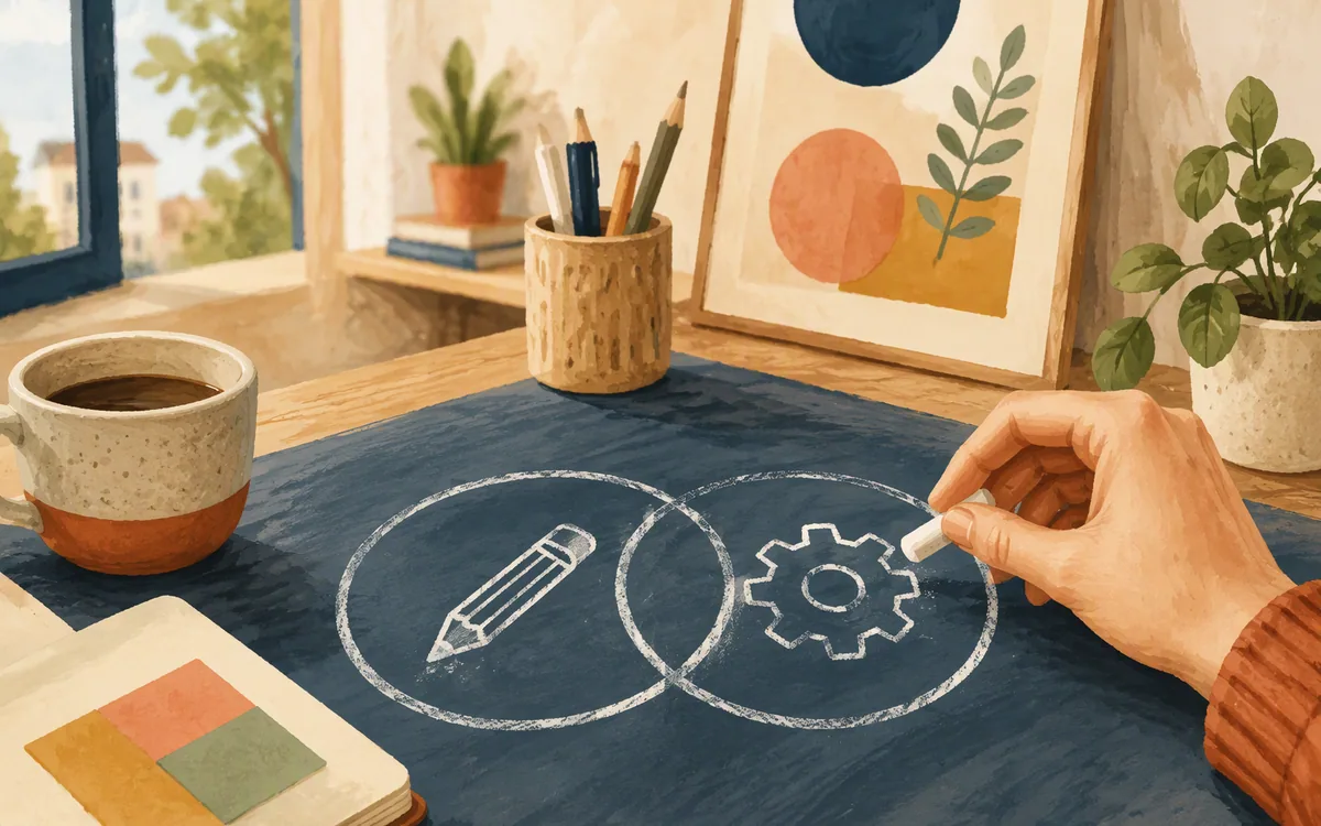
A combined Google Stitch and Figma Make pipeline is straightforward on paper:
- •Generate an initial set of screens in Google Stitch.
- •Export the chosen direction to Figma.
- •Clean up layout, content, components, and missing states.
- •Use Figma Make to create the interactive experience.
- •Review the prototype, then revise the source designs when the flow changes.
The problem is not that these steps are impossible. The problem is that the work does not stay synchronized by magic. Once a prototype has behavior, changing a label, a route, or a component in the source design can require another pass through the interactive work. The larger the flow, the more that friction shows up.
Expect this to be manageable for a five-screen investor demo. Expect it to become a recurring production task for a 25-screen app with authentication, search, filters, payment states, and account settings. The tool chain adds speed at the beginning, but it can add coordination later.
Both products also keep Figma in the middle of the job. Stitch needs Figma for the exported design to be properly refined; Make operates inside Figma. Non-designers should budget time for files, pages, layers, component choices, and review comments, not only for prompting.
This is why the right question is not “Which AI is better?” Ask where your team loses time: creating the first screen, keeping the file clean, or making the demo behave like an app.
Google Stitch vs Figma Make: the buying comparison
The two products are close enough to be compared in a purchase conversation, but they should not be scored as if they offered the same deliverable. Google Stitch produces a starting design direction. Figma Make turns a design direction into something a person can interact with.
For a founder preparing a concept review, Stitch is the better first spend because it can quickly expose whether the app’s information hierarchy makes sense. Generate more than one direction, then compare the actual task flow. If a user needs four screens to find their next appointment, the problem is likely structure, not visual polish.
For a product manager with a reviewed Figma file and an upcoming research session, Make is the more useful addition. Participants can tap through a representative path instead of being asked to imagine what would happen next.
For a designer maintaining a mature component library, neither tool should be allowed to bypass the library. Generated screens are useful inputs, but shipping teams need defined type styles, spacing rules, accessibility checks, and documented variants. Otherwise the apparent speed gain becomes a cleanup sprint.
The winner is therefore conditional but decisive: Google Stitch wins screen generation; Figma Make wins interactive prototype creation. Use both only if your demo needs both outputs. If you merely need a polished screen set, Make is unnecessary. If you only need a behavior demo from existing designs, Stitch is unnecessary.
What google stitch figma reddit discussions get right—and miss
Searches for google stitch figma reddit tend to surface the same understandable confusion: both are AI-assisted, both touch UI work, and both connect to Figma. But “uses AI” is not a product category that helps you choose a workflow.
The useful takeaway from community discussion is to judge the tools by the artifact you need at the end of the week. If you need a set of mobile UI frames to critique with a designer, Google Stitch is relevant. If you need a working-looking demo that can communicate screen-to-screen behavior, Figma Make is relevant.
What forum threads cannot tell you reliably is whether either output fits your specific app. Prompt quality, the complexity of the flow, your existing Figma library, and the reviewer’s standards matter more than a single impressive screenshot. Test with one real feature: onboarding, booking, a cart, or account recovery. Include an error state and a long-content state. Those are the screens that reveal whether a tool saves work or only creates a good first impression.
Be skeptical of claims that either tool replaces a product designer. A generated interface can make a rough brief feel finished before anyone has resolved edge cases. It is especially easy to overlook accessibility, localization length, Android-versus-iOS conventions, and what happens when a list is empty.
Use Reddit reviews to collect prompt ideas and failure modes. Use a small pilot in your own file to decide whether the workflow earns a place in your process.
The Figma dependency matters more than the free entry point
Google Stitch being free with limits lowers the cost of experimentation. You can find out whether its prompt-to-screen output is useful before committing to a larger process. That is a meaningful advantage over tools that require payment before you can evaluate their basic generation quality.
But a free starting point is not the same as a free workflow. To finish generated screens, you export them to Figma. To use Figma Make, you are already in Figma. In practice, you should account for a Figma account, the relevant plan capabilities for your team, and the time needed to manage the work there.
Published plans and included limits can change, so check Google’s and Figma’s own pricing pages before making a procurement decision. More importantly, ask what you are buying:
- •Stitch gives you a fast way to create and explore UI screen directions.
- •Figma gives you the environment to edit, organize, review, and prototype design work.
- •Make adds interactive prototype generation within that environment.
A solo founder can underestimate the learning curve because the first export looks editable. Editing well is different. You need to know what can be safely changed, which repeating elements should become components, and how to prevent 14 nearly identical buttons from becoming 14 maintenance problems.
If your company already has a design owner in Figma, that dependency is normal. If nobody does, a supposedly quick AI workflow can turn into a week of learning design-file hygiene rather than validating the app idea.
Who should replace the two-tool pipeline
The Stitch-to-Figma-to-Make route is sensible for a Figma-centered team that wants the best of prompt-generated starting screens and interactive stakeholder demos. It is not the cleanest route for every mobile app founder.
If your main loop is “describe a screen, see it, change it, and get it into the build,” consider floow.design instead. It generates iOS and Android mobile app screens from a plain-English description, lets you iterate by chat, and exports to Figma or to Flutter, React Native, SwiftUI, and Jetpack Compose. That removes the need to use one tool for the first draft and another tool just to keep revising the screen concept.
It is not a substitute for Figma Make if your immediate requirement is a sophisticated interactive prototype with complex interaction logic. It is also not a whiteboard, vector illustration app, IDE, or a full prototyping suite. Teams that need those jobs should keep the specialist tool.
The better fit is the founder who is currently piecing together Stitch and Make because they want a single place to generate and refine mobile screens before handing work to design or engineering. In that situation, floow.design reduces hand-offs rather than adding another one.
Choose Google Stitch plus Figma Make if you already have a Figma workflow and need interactivity. Choose a chat-based mobile-screen generator with direct code export if the bottleneck is repeated screen revision and the next destination is your app build, not an elaborate prototype.
Google Stitch vs Figma Make for mobile app screen work
| Tool | Best job | What you start with | Where it ends | Main limitation |
|---|---|---|---|---|
| Google Stitch | Generate initial mobile UI screens | Text prompt or image prompt | Exported Figma design for refinement | Does not by itself provide the full interactive prototype workflow |
| Figma Make | Create an interactive, code-backed prototype | Designs and context already in Figma | Interactive work inside Figma | It is not the fastest route from a blank brief to a full set of screens |
| Google Stitch + Figma Make | Move from concept screens to a clickable demo | Prompt, then exported and refined Figma screens | A Figma-based interactive prototype | Two tools, two hand-offs, and Figma skills are still required |
| floow.design | Generate and revise mobile screens by chat, then hand off to design or engineering | Plain-English mobile app brief | Figma or Flutter, React Native, SwiftUI, and Jetpack Compose export | Not a replacement for complex interaction prototyping |
What it costs
Google Stitch is free to use with limits. Figma uses a tiered plan structure, and Figma Make availability and included capabilities should be verified against Figma’s current plan details. A combined workflow can mean paying for Figma even if screen generation begins free, plus the internal cost of someone maintaining the Figma file. floow.design plans are paid beyond a trial. Published prices, limits, and plan features change, so confirm them on each vendor’s own pricing page before buying.
Mistakes that cost you the most
Using Google Stitch output as if it were production-ready mobile UI.
Treat it as a first draft. Review touch targets, long text, loading, errors, empty states, accessibility, and iOS or Android conventions before calling a flow complete.
Adding Figma Make before the screen flow is settled.
First agree on the screen inventory, navigation, labels, and major states. Add interactivity after the prototype is unlikely to change direction every day.
Assuming an exported Figma file needs no design-system cleanup.
Consolidate repeating elements into components, apply real type and color styles, and remove near-duplicate variants before the file becomes a shared source of truth.
Buying two AI tools to avoid design work.
Use AI to shorten first-draft work and prototype setup, but assign ownership for product logic, visual QA, accessibility, and final implementation decisions.
Frequently asked questions
is google stitch free to use
Google Stitch is free to use with limits. It can generate UI screens from text or image prompts and export designs to Figma for further work. Free access does not make the full workflow free, however: refining exported screens and using Figma Make requires a Figma account, and Figma plan details should be checked on Figma’s current pricing page.
does google stitch replace figma
Google Stitch does not replace Figma for most mobile app teams. It generates UI screen concepts from prompts and can export them to Figma, but Figma remains the place to refine layouts, organize reusable components, collect feedback, and use Figma Make for interactive prototypes. Google Stitch is best viewed as an AI-assisted starting point, not a complete design environment.
can figma make import from google stitch
Figma Make works from designs and context already in Figma. The practical route is to export a Google Stitch design to Figma, refine the screens there, then use Figma Make on that Figma work. This is not a one-click replacement for design review: check the exported screens, components, labels, and states before adding interactive behavior.
google stitch vs figma make reddit reviews
Google Stitch vs Figma Make Reddit reviews often compare them because both use AI and connect to Figma, but they address different work. Google Stitch is for generating initial UI screens from text or image prompts. Figma Make is for turning Figma designs into interactive, code-backed prototypes. Test each against one real app flow rather than relying on screenshots or broad community claims.
Which tool should a founder use for mobile app screens without a Figma designer?
A founder without a Figma designer should avoid assuming that Google Stitch plus Figma Make removes the need to manage Figma files. The workflow still requires refinement inside Figma. If the priority is generating and revising iOS or Android screens by conversation, then exporting to Figma or implementation code, a dedicated mobile-screen tool may create fewer hand-offs.
Where this leaves you
Google Stitch and Figma Make are not rivals for the same purchase. Stitch earns its place at the beginning of a mobile UI project; Make earns its place when an approved screen flow needs to behave like an app. Buy the pair only if your team already works comfortably in Figma and genuinely needs both a generated first draft and an interactive prototype. If you are assembling that pair because you need to generate, revise, and export mobile screens without living in two tools, floow.design is the cleaner fit.
Design the screens before you commit to a tool
A founder piecing together Stitch and Figma Make as a two-tool pipeline wants a single tool that generates and refines mobile screens without needing both.
If that is roughly your situation: describe the app in plain English and floow.design draws the iOS and Android screens, takes your changes by chat, and exports the result to Figma or to Flutter, React Native, SwiftUI and Jetpack Compose.
Free tools you can use right now
- •App Development Cost Calculator — free, no sign-up
- •CSS Grid Generator — free, no sign-up
- •px to rem Converter — free, no sign-up
Related reading
Design your mobile app with AI.
Generate pixel-perfect iOS and Android screens in seconds, then export to Figma or code.
You might also like…
 Insights24 September 2026How Much Does an AI App Design Tool Cost?Compare AI app design subscriptions, credits, seat limits and export costs so you can budget a prototype without paying for unusable output.By floow.design Team, Mobile Design
 Insights24 September 2026Free AI tool for UI design: Free tier limitsSee where free AI UI design plans stop: screen caps, export limits, paid gates, reset rules, and the upgrade prompts that matter.By floow.design Team, Mobile Design
 Guides24 September 2026Design Tool for Developer Handoff: Buyer's GuideChoose a design tool for developer handoff by testing specs, states, code output, and platform fit—not by judging the prettiest demo.By floow.design Team, Mobile Design