
Atoms app icon
ShoppingScreenshot teardown13 min read

Atoms App Store screenshots

A seven-frame study in how to sell philosophy before interface: how the official Atomic Habits app uses editorial spacing, organic geometry, and a strict typographic system to turn a self-help methodology into a tangible product promise on the App Store.

Set published by Cloud Solutions "Apps" · 7 frames analysed

0.0Freev1.7.5Updated 4mo ago
Atoms App Store screenshot 1
01At a glance

The set in one screen

Framing
Mixed — frame 1 is device-less; frames 2, 3, 6, 7 are centered iPhone 15 Pro-class hardware; frames 4 and 5 use aggressive lateral crops.
Captions
Large-format headline sentence or phrase, editorial serif, with strategic italic emphasis on the emotional or action-oriented keywords.
Backdrop
Warm off-white canvas (#FAFAF8) with abstract, amorphous blobs in sage, yellow, navy, and purple that loosely map to content zones.
Type
High-contrast serif for marketing copy and habit statements; clean sans-serif for UI chrome, labels, and metrics. Italic is used as an emphasis tool roughly once per headline.
UI / copy split
Roughly 55:45 in the center frames — the phone never swallows the canvas, and the headline always breathes in its own negative space.
Frame 1 job
Establish IP authority and App Store credibility before showing a single button or chart. The absence of a device forces the eye to the logotype, the Editors’ Choice laurel, and the tagline.

Sampled palette

#0F0F0F#0F0F0F
#FAFAF8#FAFAF8
#F5F5F0#F5F5F0
#F2C14E#F2C14E
#F5B747#F5B747
#D946EF#D946EF
02The challenge

What this screenshot set had to solve

The fundamental tension in merchandising a habits app tied to a blockbuster book is that the product is half philosophy, half utility. The App Store page cannot simply show a dashboard—it must first teach the shopper that the methodology inside is the same one they may already trust from the book, then prove that the digital experience is structured enough to actually change behavior. In seven frames, the design team had to resolve a sequencing problem: lead with brand recognition or lead with interface? They also had to carry the visual language of print editorial—the book’s covers and chapter openers rely on white space and classical typography—into a mobile-device context without turning the screenshots into generic mock-ups. Finally, the set needed to communicate four distinct value layers: the framework (the Four Laws), the daily mechanic (tracking), the adaptive coaching (intervention), and the social loop (accountability). Doing all of this while maintaining a calm, non-anxious aesthetic—the app is, after all, about reducing friction—is the core design challenge visible across the sequence.

"Tiny changes, remarkable results." — The anchor line that governs the entire visual hierarchy: small type, small devices, small habits, but composed with enough negative space to feel significant.
03The approach

How the set argues its case

The team chose to front-load brand authority. Frame 1 is deliberately device-free, trading immediate feature comprehension for credibility signaling. After that trust is established, the sequence alternates between philosophy captions and interface proof: the Four Laws appear as typography above the phone in Frame 2, while the phone itself demonstrates the habit-creation template. From Frame 3 onward, the narrative moves from daily use to emotional support to content depth to social sharing. A strict rule governs the captions: one thought per frame, set in a large editorial serif, with exactly one italicized phrase acting as the emotional pivot. The hardware framing alternates between centered presentation and aggressive lateral crops, which keeps the carousel from feeling like a static gallery, but the app UI itself remains consistent—warm off-white backgrounds, rounded pebble cards, and a black-plus-accent color system for primary actions.

The screenshots position Atoms not as a generic habit tracker with a celebrity license, but as the authoritative digital extension of a proven system. The serif logotype, the hand-drawn stone stack in Frame 1, and the editorial headline treatment all say “designed publication” rather than “startup productivity tool.”

04Frame by frame

Every screenshot, and the job it does

Atoms App Store screenshot 1 — Authority Before Interface
01

Authority Before Interface

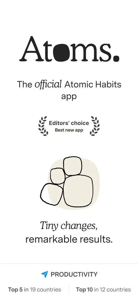
On-frame caption: “Atoms. / The official Atomic Habits app / Tiny changes, remarkable results.

No device frame appears. The composition is a vertical stack of trust signals on a warm off-white ground (#FAFAF8). At the top, the wordmark “Atoms.” is set in a heavy, high-contrast serif; the counter of the ‘o’ is fully filled in black (#0F0F0F), and a period lands hard after the ‘s’. Beneath it, the line “The official Atomic Habits app” carries “official” in italic, signaling licensed authenticity rather than a generic habit tracker. At roughly the vertical third, an App Store laurel badge reads “Editors’ choice Best new app,” flanked by symmetrical wheat vectors. Further down, a hand-drawn stack of four rounded stones sits inside a beige pebble shape (#EDE8DD or #F0EBE0), directly referencing the cairn motif associated with the brand. The line “Tiny changes, remarkable results.” anchors the lower half. A hairline divider separates the footer: a blue App Store arrow icon beside the word “PRODUCTIVITY,” followed by “Top 5 in 19 countries | Top 10 in 12 countries.” The spacing is luxurious; the negative space between elements is roughly equivalent to the height of the text blocks themselves. Because there is no chrome, no phone bezel, and no UI button, the frame forces a slow read—but it also risks losing shoppers who scroll for utility first.
Atoms App Store screenshot 2 — The Laws, Then the Screen
02

The Laws, Then the Screen

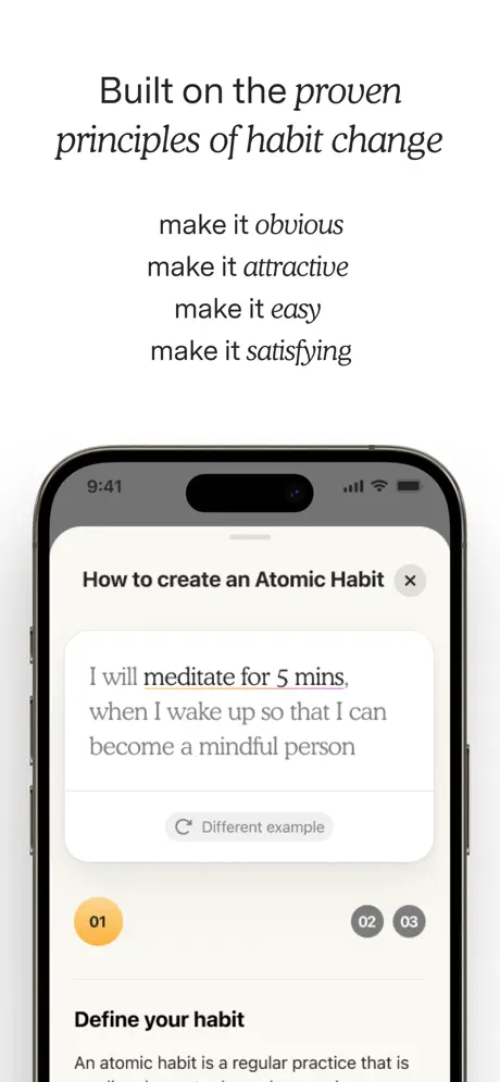
On-frame caption: “Built on the proven principles of habit change / make it obvious / make it attractive / make it easy / make it satisfying

An iPhone with a Dynamic Island appears for the first time, centered and occupying the lower 55 percent of the canvas; the bezel reads as natural titanium. Above the device, the headline “Built on the proven principles of habit change” sets “proven” and “habit change” in italic. Below that, the Four Laws are stacked in centered alignment: “make it obvious / make it attractive / make it easy / make it satisfying,” with each line-ending keyword italicized. On the screen itself, a rounded sheet titled “How to create an Atomic Habit” slides up. Inside, template text reads: “I will meditate for 5 mins. when I wake up so that I can become a mindful person.” The phrase “meditate for 5 mins.” carries a gradient underline shifting from orange to violet. A gray “Different example” button sits below. Near the bottom of the visible screen, a step indicator shows “01” inside a filled yellow-orange circle (#F2C14E), while “02” and “03” remain muted gray. The section header “Define your habit” appears just above the fold. The gap between the caption block and the hardware is roughly 60–80pt, creating two distinct reading zones: philosophy on top, proof below.

Atoms App Store screenshot 3 — The Daily Dashboard
03

The Daily Dashboard

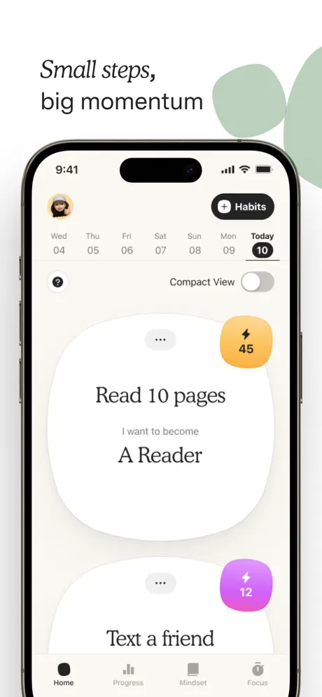
On-frame caption: “Small steps, big momentum

A full iPhone is centered against the white canvas. The caption at top left reads “Small steps,” in italic and “big momentum” in roman. The status bar shows 9:41. The app screen displays a home feed on a warm off-white background (#F5F5F0). A circular avatar sits top left; a black pill-shaped “+ Habits” button sits top right. A horizontal calendar strip runs beneath, from “Wed 04” through “Today 10,” the latter selected in a filled black circle. The main content is two large, organically shaped cards with heavy, non-uniform corner radii—almost pebble-like. The first card reads “Read 10 pages” in a dark serif, with the identity statement “I want to become / A Reader” beneath. A yellow-orange lightning badge (#F5B747) holds the number “45.” The second card, clipped at the bottom, shows “Text a friend” with a magenta-purple badge (#D946EF) holding “12.” The tab bar is visible: Home (filled), Progress, Mindset, Focus. A “Compact View” toggle sits near the top of the screen. Behind the phone, large sage-green abstract blobs (#B0CDB8) float in from the top right, echoing the card shapes but at lower contrast. The overall impression is soft, calm, and intentionally low-density.

Atoms App Store screenshot 4 — Coaching That Breaks the Frame
04

Coaching That Breaks the Frame

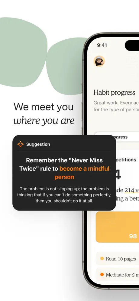
On-frame caption: “We meet you where you are

The iPhone is cropped hard to the right edge; only about 40 percent of the device is visible. The caption at left reads “We meet you / where you are,” with “where you are” italicized. A dark modal (#1C1C1E) breaks out of the phone bounds and floats over both the device and the white background, creating a 2.5D layer. Its header carries an orange sparkle icon and the word “Suggestion.” The modal headline states: “Remember the 'Never Miss Twice' rule to become a mindful person,” with “become a mindful person” rendered in warm orange (#F5A623). Body copy in mid-gray (#9F9F9F) reads: “The problem is not slipping up; the problem is thinking that if you can't do something perfectly, then you shouldn't do it at all.” Behind the modal, the visible phone screen shows the header “Habit progress” and a fragment of supporting copy. Sage-green blobs reappear in the top left, visually bridging this frame with the previous one. The modal casts no shadow; it relies entirely on contrast and scale to separate from the background, which keeps the look flat and editorial but slightly reduces depth cues.

Atoms App Store screenshot 5 — Adaptive Intervention
05

Adaptive Intervention

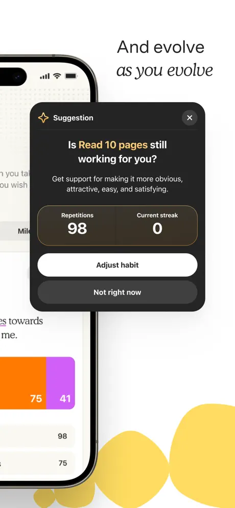
On-frame caption: “And evolve as you evolve

Mirroring Frame 4, the iPhone is now cropped to the left edge, showing roughly the leftmost 35 percent of the device. The caption sits at top right: “And evolve / as you evolve,” with “as you evolve” in italic. A dark modal (#1C1C1E) dominates the center, this time fully closed with an “X” dismiss button in its top-right corner. The headline asks, “Is Read 10 pages still working for you?” with “Read 10 pages” highlighted in yellow (#F5C542). Subcopy reads: “Get support for making it more obvious, attractive, easy, and satisfying.” Inside the modal, a dark stat bar (#2C2C2E) splits into two columns: “Repetitions 98” and “Current streak 0.” Two full-width buttons follow: “Adjust habit” in white (#FFFFFF), and “Not right now” in dark gray (#3A3A3C). Behind the device, yellow pebble shapes (#FCD34D) intrude from the bottom right. The visible portion of the phone screen shows a segmented bar chart in orange (#F97316) and purple (#A855F7), plus list counts “98” and “75.” The diagonal flow—from top-right caption to center-left phone to bottom-right blobs—creates a restless but energetic composition.

Atoms App Store screenshot 6 — Content as Habit Infrastructure
06

Content as Habit Infrastructure

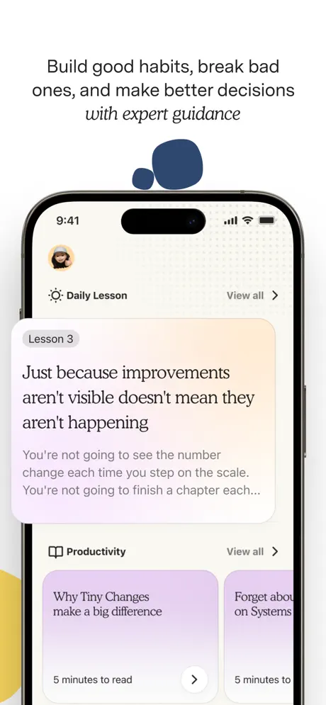
On-frame caption: “Build good habits, break bad ones, and make better decisions with expert guidance

The iPhone returns to a centered, fully visible position. The caption above spans three lines: “Build good habits, break bad / ones, and make better decisions / with expert guidance,” with “with expert guidance” italicized. The screen shows a content feed titled “Daily Lesson” beside a sparkle icon; a “View all >” chevron sits top right. A hero card labeled “Lesson 3” carries the headline “Just because improvements aren't visible doesn't mean they aren't happening,” set in the same dark serif used throughout the app. Gray body copy beneath is truncated mid-sentence: “You're not going to see the number change each time you step on the scale. You're not going to finish a chapter each...” Below, a “Productivity” section header introduces horizontally scrolling cards with a lavender-pink wash; the first reads “Why Tiny Changes make a big difference” with a “5 minutes to read” callout. The second card is partially visible: “Forget abou... on Systems.” In the canvas negative space, a dark navy blob (#2E4560) hovers above the phone, while a yellow form peeks from the bottom left, creating diagonal color balance. The dotted texture in the app’s header area adds subtle tactile grain.

Atoms App Store screenshot 7 — Identity and Social Proof
07

Identity and Social Proof

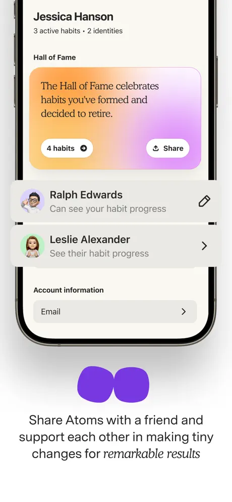
On-frame caption: “Share Atoms with a friend and support each other in making tiny changes for remarkable results

A centered iPhone displays a profile and social screen. Below the device—unlike every other frame—the caption reads: “Share Atoms with a friend and / support each other in making tiny / changes for remarkable results,” with “remarkable results” italicized. The screen lists “Jessica Hanson” in bold sans, with metadata “3 active habits · 2 identities” in muted gray. A gradient card spanning orange to purple (#FB923C to #C084FC) introduces the “Hall of Fame,” explaining: “The Hall of Fame celebrates habits you've formed and decided to retire.” Two pill buttons sit inside the card: “4 habits” with a dropdown arrow, and “Share” with an upload icon. Beneath, social connection rows show avatar bubbles for “Ralph Edwards” and “Leslie Alexander,” with permission subtitles “Can see your habit progress” and “See their habit progress.” An “Account information” section anchors the bottom with a chevron row for “Email.” Below the phone, two overlapping purple blobs (#7C3AED) mirror the card gradient above. By placing the caption under the hardware, the frame forces the viewer to scan dense UI before reaching the value proposition, which breaks the rhythm established in earlier frames.

05The craft

Captions, colour and the mechanics of the sell

Caption pattern

Every caption follows a two-register structure: a short, punchy clause followed by a longer explanatory clause. The shorter clause is almost always partially italicized. This creates a visual rhythm when swiping: the italic word becomes the hook, the roman text becomes the explanation.

Visual system

Organic pebble geometry is the unifying motif. It appears in the hand-drawn stones of Frame 1, in the soft rounded-square habit cards of Frame 3, in the abstract background blobs, and even in the modal corners. This abstracts the “atomic” idea into something tactile and friendly rather than scientific.

The thumbnail test

At thumbnail size, the black serif wordmark, the yellow-orange step indicator in Frame 2, and the high-contrast dark modals in Frames 4 and 5 remain legible. However, the body copy inside those dark modals risks becoming texture rather than text, and the sage-green blobs on Frames 3 and 4 flatten into vague gray shapes.

Conversion mechanics

The sequence is built for deliberation, not for a three-second glance. Frame 1 asks the shopper to recognize the brand; if they do, the rest of the sequence rewards that recognition with increasing depth. If they do not, Frames 2 and 3 do the heavy lifting of explaining the methodology and the mechanic. The dark modals in Frames 4 and 5 are the strongest conversion assets because they prove the app thinks for the user rather than merely recording data.

06Where it slips

What we would change

Accessibility in the dark modals

In Frame 4, the modal body text is rendered in mid-gray (#9F9F9F) on a near-black (#1C1C1E) ground at a size that becomes illegible at thumbnail scale. The fix is to lighten the body copy to at least #E0E0E0 or increase the font size by two points so the coaching message survives a quick scroll.

Erratic device crop logic

Frames 2 and 3 present fully contained devices. Frame 4 then crops the phone hard to the right, and Frame 5 crops hard to the left. Because the crop alternates without a predictable axis, the phone loses its anchor as a stable object. A tighter system—always bleeding from the right during coaching moments, for example—would create parallax continuity rather than visual whiplash.

Frame 1 offers zero functional context

A device-less hero is a credible choice for a known IP, but it sacrifices any hint of utility. Shoppers unfamiliar with Atomic Habits learn nothing about what the app does until Frame 2. Introducing a faint phone silhouette or a UI vignette at the bottom of Frame 1 would bridge the gap between brand promise and product function without destroying the minimalist impact.

Frame 7 inverts the caption hierarchy

Every other frame places the primary message in the upper half, where eye tracking naturally begins. Frame 7 buries the caption beneath a dense profile screen. The fix is to move the caption above the device and let the social UI serve as supporting evidence, matching the top-weighted rhythm of Frames 2, 3, and 6.

Background blob colors lack semantic discipline

Sage green appears on Frames 3 and 4, yellow on 5 and 6, navy on 6, purple on 7. Because these colors are not mapped to feature categories, they read as decorative noise. Restricting the palette—for example, sage for coaching, yellow for progress, purple for social—would turn the shapes into intuitive wayfinding devices rather than arbitrary ornament.

07The recipe

How to apply this to your own app

  1. Start with trust, then show chrome

    If your app carries a known brand—or even a strong methodology—consider leading with a device-less frame that establishes the promise. Just ensure the second frame delivers the UI proof immediately so scrollers do not bounce.

  2. Use italic as a rhythm tool

    Atoms treats italic not as an afterthought but as a structural emphasis device. Assign exactly one italicized phrase per marketing headline to train the shopper’s eye to land on the emotional keyword first.

  3. Let modals break the bezel

    Frames 4 and 5 float app UI outside the phone bounds. This is a low-effort, high-impact way to suggest layers of intelligence and depth without building custom 3D illustrations.

  4. Match background shapes to content themes

    If you use abstract blobs or shapes behind devices, assign each hue a semantic meaning. When the color repeats, the shopper subconsciously understands the category shift before reading the caption.

  5. Anchor your hardware

    If you crop devices, establish a rule and stick to it. Alternating left and right crops can feel energetic, but without a system it becomes chaotic. Choose a direction and let it signify a narrative turn.

08Takeaways

Five things worth stealing

  • A screenshot set can prioritize editorial voice over feature density if the typography and negative space are disciplined enough to carry it.
  • Breaking UI elements out of the device frame is an effective way to highlight coaching or interruption moments without cluttering the interface inside the phone.
  • Consistency in caption placement—always above or beside, never below—creates a swipe rhythm that reduces cognitive load.
  • Warm off-whites and organic shapes can differentiate a productivity app from the sea of dark-mode dashboards on the App Store.
  • When adapting a book or methodology to software, the screenshots must teach the framework before selling the tools; Atoms solves this by dedicating Frame 2 entirely to the Four Laws before showing the tracker in Frame 3.
09The verdict

What the set actually achieves

A cohesive, editorially driven carousel that reads more like a pitched magazine spread than a feature list. The set converts bookstore trust into app-install confidence by letting the brand promise sit in the same frame as the UI proof, and by using organic pebble shapes and a restrained warm palette to keep the tone human rather than clinical.

Designers building apps for behavioral change, coaching, or content-driven wellness products where trust and methodology matter as much as the interface itself. The set is especially instructive for teams working with existing IP that carries its own visual expectations.

10Questions

Frequently asked

Why is there no phone in the first screenshot?

The absence of hardware forces the viewer to process the brand name, the official licensing, the Editors’ Choice badge, and the tagline before evaluating features. It is a high-risk, high-reward move that depends on the shopper recognizing the Atomic Habits IP.

What is the significance of the pebble shapes?

They appear in the hand-drawn stone stack of Frame 1, the habit cards of Frame 3, the background blobs, and the modal corners. They visually unify the set around the idea of small, stacked, organic units—an abstraction of the ‘atomic’ concept that avoids scientific cliché.

How does the set handle text readability at small sizes?

The headline captions are large and high-contrast, so they survive thumbnail scaling. However, the body copy inside the dark modals (Frames 4 and 5) is small and mid-gray, which becomes illegible on smaller screens—a clear area for improvement.

How do the colors map to different features?

On first inspection, the mapping is loose. Sage green floats behind the home dashboard and the first coaching modal; yellow appears behind the intervention modal and the lesson screen; purple appears on the social frame. A stricter palette-to-feature lock would strengthen the narrative.

11Keep reading

Build your own screenshot set

The full set

7 shots
Atoms App Store screenshot 1Atoms App Store screenshot 2Atoms App Store screenshot 3Atoms App Store screenshot 4Atoms App Store screenshot 5Atoms App Store screenshot 6Atoms App Store screenshot 7

About the app

ATOMS App is an easy-to-use asset management software tool designed to help healthcare facilities and medical technology management service providers to effectively manage medical Cloud Solutions "Apps", via the App Store listing.

Screenshots and store metadata belong to Cloud Solutions "Apps". They are shown here for design commentary and criticism. The analysis on this page is original work by floow.design. View the original listing.

More Shopping teardowns

Browse all →