
StockX app icon
ShoppingScreenshot teardown14 min read

StockX App Store screenshots

StockX enters the App Store with a screenshot philosophy that treats the vertical canvas like a gallery plinth rather than a software demo. Across eight frames, the designers lock the viewer into a near-black environment—hovering around #070707 to #0B0B0D—where silver iPhone hardware and bright white iOS interfaces float above tactile sneaker textures. The set deliberately withholds breath; there are no gradient skies, no human presence, no lifestyle flat-lays beyond the final frame. Instead, the sequence leans on macro product photography, dense UI fidelity, and a strict two-color palette of absolute black and clean white, punctuated only by the brand’s forest-green accents. For any designer building a marketplace onboarding flow, this set offers a masterclass in using negative space to signal cultural positioning, though it also serves as a cautionary study in what happens when a tightly controlled system breaks its own rules at the finish line.

Set published by StockX LLC · 8 frames analysed

4.8 · 1.2M ratingsFreev5.10.2Updated 4mo ago
StockX App Store screenshot 1
01At a glance

The set in one screen

Framing
Captured on silver iPhone hardware, alternating between dramatic angled placements and frontal, centered lockups against near-black backgrounds.
Captions
Headline and subhead set in a bold, neutral sans-serif, always white, positioned in the safe zones above or below the device, never inside the screen area.
Backdrop
Macro sneaker and apparel photography—leather grain, rubber tread, verification tags, fabric weave—rendered in deep blacks with occasional color accents from the product.
Type
Large, tightly leaded white sans-serif for headlines; smaller white subheads with lighter weight beneath. UI text inside the device follows standard iOS black-on-white conventions.
UI / copy split
Approximately 70% device/UI to 30% external typography across the set, with Frame 8 flipping to 0% device and 100% photography.
Frame 1 job
Establishes the brand as a cultural marketplace before proving it is an app—product texture frames the phone, not the other way around.

Sampled palette

#070707#070707
#FFFFFF#FFFFFF
#006340#006340
#1E3A5C#1E3A5C
02The challenge

What this screenshot set had to solve

The central design problem is paradoxical: how do you sell an app that is fundamentally a white-background e-commerce grid without looking like every other resale storefront? StockX’s brand equity lives at the intersection of streetwear authenticity and stock-market mechanics, so the screenshots must communicate credibility, catalog depth, release-calendar urgency, pricing intelligence, logistics speed, category expansion, and buyer protection—all within eight swipes. The challenge is further complicated by the need to retain visual cohesion when the UI itself is predominantly iOS-standard white with black text. A purely dark-mode UI would have simplified the aesthetic, but the app ships in light mode, forcing the designers to solve contrast at the canvas level rather than the interface level. Additionally, the set must signal physical product quality; buyers are not downloading an abstract SaaS tool but a gateway to high-value goods where authentication matters. The team needed a wrapper that could make light-mode commerce frames feel aggressive, cultural, and editorial rather than clinical.

The chosen approach is best described as dark-field theater. Every frame grounds the device in absolute black negative space and anchors it with macro photography of sneaker materials—leather grain, rubber tread, verification tags, and fabric weave. This turns the App Store screenshot into a gallery wall: the phone becomes a lit aperture showcasing the UI, while the surrounding darkness absorbs visual noise. The designers alternate between two device postures to create rhythm without breaking the system. Frames one and two present the hardware at dramatic angles, the screen tilting away from the viewer like a glossy magazine spread. Frames three through seven shift to near-frontal presentations, letting the UI breathe and the typography dominate. Type is treated as architecture: large, white, sans-serif headlines sit in the safe zones above or below the device, never encroaching on the screen itself. The result is a scroll experience that feels like paging through a lookbook rather than evaluating software utilities.
03The approach

How the set argues its case

The set follows a narrative arc from brand positioning to social validation to functional proof, ending with trust. It opens with culture and physical product (Frame 1), moves to credibility stats and press logos (Frame 2), demonstrates catalog depth (Frame 3), highlights release-calendar utility (Frame 4), differentiates on financial data (Frame 5), sells logistics speed (Frame 6), expands into adjacent collectibles categories (Frame 7), and closes with buyer protection and authentication (Frame 8).

Marketplace positioning is handled entirely through framing cues rather than explicit claims. Frame 1’s headline, 'The Global Marketplace for Current Culture,' is paired with a pile of grails so close you can read stitching, while Frame 8’s sculptural product photography reframes the app as a guarantor of physical authenticity. The press logo stack in Frame 2 and the 'Award-Winning Marketplace Since 2016' badge do the institutional trust work without resorting to generic 'download now' commands.

04Frame by frame

Every screenshot, and the job it does

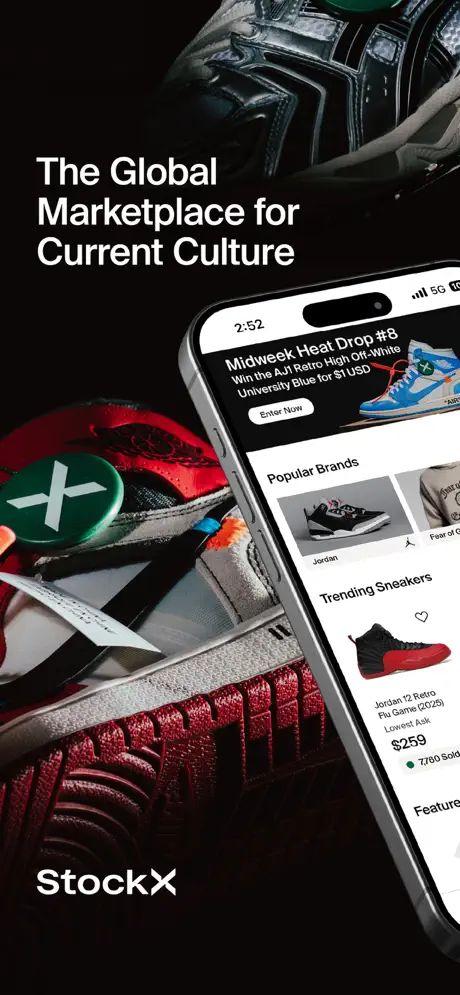
StockX App Store screenshot 1 — The Global Marketplace for Current Culture
01

The Global Marketplace for Current Culture

On-frame caption: “The Global Marketplace for Current Culture

This frame commits to physicality. A silver iPhone is angled from the lower right, its bezel catching subtle highlights against a background of stacked sneakers so close that individual stitches and suede fibers are legible. The canvas reads as approximately #070707, a near-black void broken only by crimson midsoles, metallic silver panels, and the kelly-green StockX verification tag. Above the device, the headline 'The Global Marketplace for Current Culture' is set in a bold, tightly leaded sans-serif and positioned in the upper-left quadrant, forcing the eye downward in a diagonal sweep toward the StockX logotype anchored at the bottom left. Inside the screen, the UI shows a 'Midweek Heat Drop #8' promotional banner with an 'Enter Now' call to action, followed by a 'Popular Brands' rail and a 'Trending Sneakers' list where the Jordan 12 Retro Flu Game sits at $259 beside a green dot and a '7,760 Sold' counter. The status bar reads 2:52 with standard 5G and battery indicators. The hierarchy is unmistakable: culture and commerce occupy the periphery, but the product stays center stage.
StockX App Store screenshot 2 — Trusted by Millions
02

Trusted by Millions

On-frame caption: “Trusted by Millions

Credibility is the brief here. The device slides to the left edge of the canvas, angled to reveal a browse page with product tiles—Nike Dunk Low SE Sail Dark Marina Blue at $122 and New Balance 9080 Black Cement at $147, the latter tagged with '1,822 Sold' and a green indicator. But the UI is only half the composition. Centered in the black negative space are two laurel-wreathed badges reading '35M+ Visitors Per Month' and 'Award-Winning Marketplace Since 2016', rendered in crisp white vector linework. Below them, stacked in the lower-right corner, is a block of publication logotypes—The New York Times, WSJ, VOGUE, Forbes, and the NBC peacock—functioning as a social-proof cluster. The background shoe shifts to an orange textured upper with another green StockX tag. The palette remains locked to #0B0B0D and white, yet the density of iconography makes this the most information-heavy frame in the set.

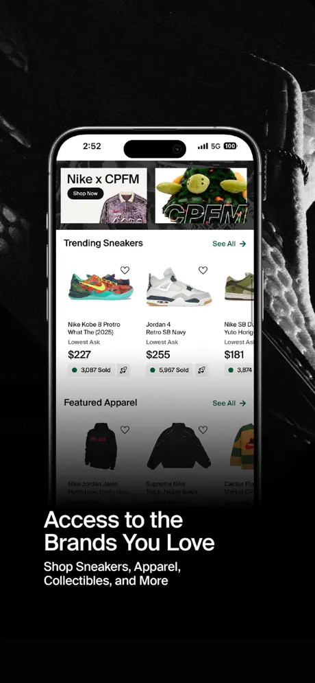
StockX App Store screenshot 3 — Access to the Brands You Love
03

Access to the Brands You Love

On-frame caption: “Access to the Brands You Love, Shop Sneakers, Apparel, Collectibles, and More

Catalog breadth is signaled, though somewhat evasively. The device goes frontal and centered, backed by a darkness that bleeds into soft fabric textures at the edges. Inside the screen, the app presents a 'Nike x CPFM' hero banner with a dark 'Shop Now' pill, followed by a 'Trending Sneakers' row: the Nike Kobe 8 Protro What The at $227, Jordan 4 Retro SB Navy at $255, and a truncated Nike SB Dunk Low at $181. The intentional design move is a heavy vignette that sweeps across the lower third of the phone display, fading the 'Featured Apparel' jackets into near-invisibility. Beneath the device, the caption reads 'Access to the Brands You Love' with the subhead 'Shop Sneakers, Apparel, Collectibles, and More'. By darkening the apparel section inside the UI, the designers force attention upward toward the high-heat sneakers while still claiming horizontal breadth in the copy. The iOS white screen background—standard #FFFFFF—creates a bright rectangle that punches cleanly through the #090909 environment.

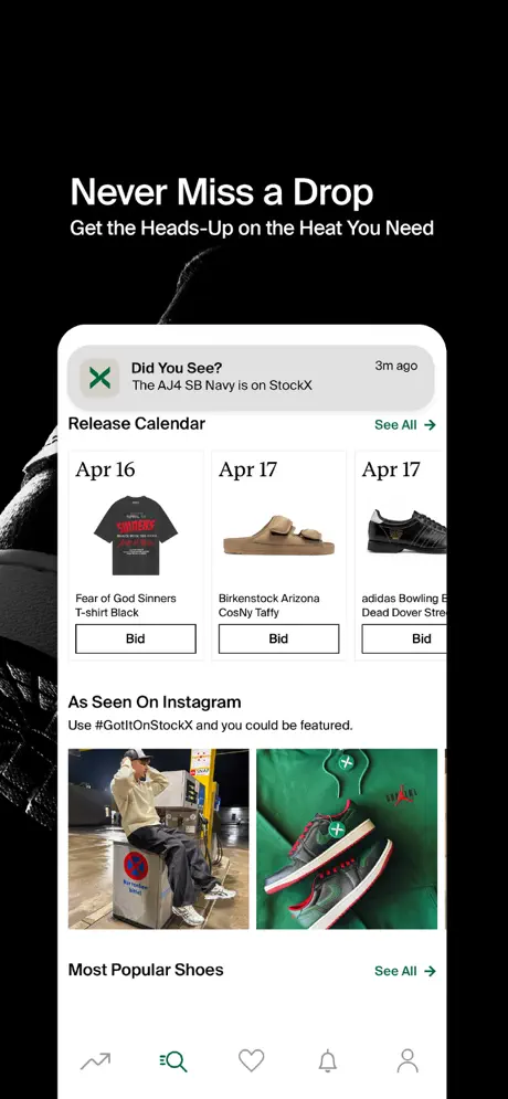
StockX App Store screenshot 4 — Never Miss a Drop
04

Never Miss a Drop

On-frame caption: “Never Miss a Drop, Get the Heads-Up on the Heat You Need

Discovery mechanics get the spotlight. The device remains centered, but the UI shifts to a notification use-case: a simulated push alert at the top reads, 'Did You See? The AJ4 SB Navy is on StockX' timestamped '3m ago' beside the green StockX mark. Below that sits a 'Release Calendar' with dated tiles—Apr 16, Apr 17—each pairing a product image with a black-outlined 'Bid' button. Further down, an 'As Seen On Instagram' section displays user-generated content with the prompt 'Use #GotItOnStockX and you could be featured.', followed by a 'Most Popular Shoes' header. The external headline, 'Never Miss a Drop' with the line 'Get the Heads-Up on the Heat You Need', occupies the top negative space. The composition is information-rich; the calendar grids are small but readable, and the bottom navigation bar is fully exposed, showing the search, saved, alerts, and profile icons grounded against white. The frame argues that the app is a time-sensitive utility, not just a catalog.

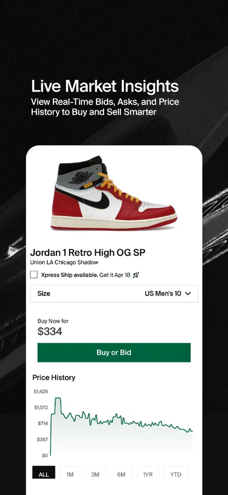
StockX App Store screenshot 5 — Live Market Insights
05

Live Market Insights

On-frame caption: “Live Market Insights, View Real-Time Bids, Asks, and Price History to Buy and Sell Smarter

This is the set’s data-visualization anchor. The device presents a product page for the 'Jordan 1 Retro High OG SP Union LA Chicago Shadow'. All interface chrome is stripped to essential commerce architecture: a size selector set to 'US Men's 10', a price lead-in reading 'Buy Now for $334', and a dominant forest-green CTA button—roughly #006340—bearing the text 'Buy or Bid'. Below the fold, a line graph labeled 'Price History' plots value decay over time in the same green tone, starting near $1,429 and tapering downward. Toggle pills—'ALL', '1M', '3M', '6M', '1YR', 'YTD'—sit beneath the graph, with 'ALL' rendered as white text on a black #000000 fill. The headline 'Live Market Insights' and subhead 'View Real-Time Bids, Asks, and Price History to Buy and Sell Smarter' float above in white. The background is nearly textureless here, letting the financial metaphor read like a Bloomberg terminal rendered in streetwear.

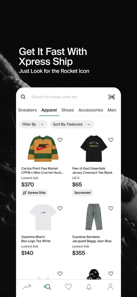
StockX App Store screenshot 6 — Get It Fast With Xpress Ship
06

Get It Fast With Xpress Ship

On-frame caption: “Get It Fast With Xpress Ship, Just Look for the Rocket Icon

Logistics and feature differentiation take over. The screen shows an apparel results page under the 'Apparel' tab, distinguished by an underline and a search bar reading 'Search by brand, color, etc'. Filter chips—'Filter By' and 'Sort By: Featured'—sit directly beneath the category row. The grid surfaces a Cactus Plant Flea Market CPFM x Nike Crochet Hock… jersey at $370 tagged with 'Xpress Ship' beside a rocket icon, a Fear of God Essentials Jersey Crewneck Tee Black at $65 labeled 'Sponsored', and two Supreme garments. The external headline reads 'Get It Fast With Xpress Ship' followed by 'Just Look for the Rocket Icon'. What complicates the composition is a graphic element—likely a fabric swatch or sticker graphic—bleeding across the bottom navigation bar, partially obscuring the tab icons. The white device frame against the #080808 background keeps the focus on the shipping promise, but the overlap introduces spatial noise where interface clarity should reign.

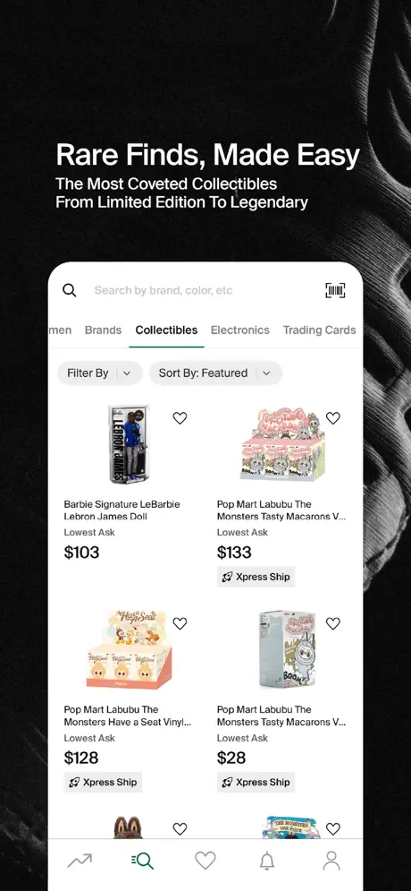
StockX App Store screenshot 7 — Rare Finds, Made Easy
07

Rare Finds, Made Easy

On-frame caption: “Rare Finds, Made Easy, The Most Coveted Collectibles From Limited Edition To Legendary

Category expansion is the narrative beat. The app is now browsing the 'Collectibles' tab, with 'Electronics' and 'Trading Cards' visible in the horizontal category switcher. The grid shows a Barbie Signature LeBarbie Lebron James Doll at $103 and multiple Pop Mart Labubu The Monsters blind-box sets ranging from $28 to $133, many carrying the Xpress Ship badge. The search bar and filter controls remain identical to Frame 6, establishing UI consistency. Behind the phone, the background texture shifts to what appears to be a ribbed knit or zippered fleece in grayscale. The caption states 'Rare Finds, Made Easy' and the subhead continues, 'The Most Coveted Collectibles From Limited Edition To Legendary'. By maintaining the same top navigation and filter paradigm across categories, the screenshot argues that the browsing architecture scales horizontally from sneakers to vinyl figures without friction, though the truncated tab labels at the left edge suggest the viewport is cropped tight.

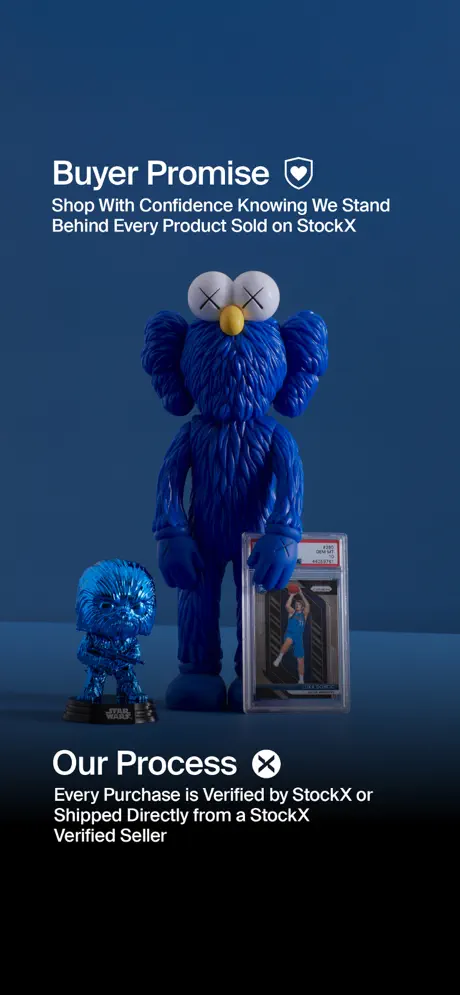
StockX App Store screenshot 8 — Buyer Promise
08

Buyer Promise

On-frame caption: “Buyer Promise, Shop With Confidence Knowing We Stand Behind Every Product Sold on StockX, Our Process, Every Purchase is Verified by StockX or Shipped Directly from a StockX Verified Seller

The sequence terminates with a radical palette break. After seven frames of black, the background switches to a solid deep navy—approximately #1E3A5C. There is no device. Instead, three physical products are staged like sculptures: a large blue KAWS BFF figure, a smaller blue Chewbacca statuette, and a PSA-graded basketball trading card in a clear slab. White text blocks are positioned at the top and bottom. The upper block reads 'Buyer Promise' accompanied by a shield icon, with the line 'Shop With Confidence Knowing We Stand Behind Every Product Sold on StockX'. The lower block reads 'Our Process' flanked by the StockX mark, and underneath: 'Every Purchase is Verified by StockX or Shipped Directly from a StockX Verified Seller'. The shift from UI to still-life photography reframes the app not as software but as a guarantor of physical authenticity, though the chromatic rupture undermines the carefully constructed darkness of the preceding frames.

05The craft

Captions, colour and the mechanics of the sell

Caption pattern

Headlines always lead with a verb or active phrase: 'Trusted by Millions,' 'Access to the Brands You Love,' 'Live Market Insights.' Subheads tend to rhyme in structure, often beginning with 'Shop,' 'Get,' or 'View' to reinforce the action model. The copy never exceeds two lines for the main headline and three for the subhead, keeping the typography block compact enough to avoid fighting the UI for dominance.

Visual system

The system is ruthlessly restrained. Environmental backgrounds stay within two degrees of #070707. The only chromatic accents come from the physical product photography—crimson midsoles, orange uppers, green verification tags—and the single forest-green CTA and punctuation color (#006340) inside the interface. White iPhone hardware is used consistently through Frame 7, providing a predictable border between the black void and the white UI. Frame 8 alone introduces a solid deep navy (#1E3A5C) and removes the device entirely, functioning as a visual full stop.

The thumbnail test

At thumbnail scale, the set reads as a black wall with a bright white rectangle in the middle. The first frame’s angled device and bold headline are the strongest thumb-stoppers because the diagonal creates tension against the grid of static storefront screenshots surrounding it in the App Store. Frames 3–7 risk blending together at small scale because the frontal devices flatten into similar white blocks, but Frame 8’s sudden blue background and absence of a phone would likely snap the eye back during a swipe.

Conversion mechanics

Frame 5’s price-history graph and Frame 6’s Xpress Ship rocket icon are the strongest conversion cues because they answer the two questions every resale buyer asks: 'Am I overpaying?' and 'When will it arrive?' The 'Buy or Bid' green button in Frame 5 is the only primary CTA visible across the entire sequence, making it a clear visual anchor. Frame 8’s lack of any device or UI, however, means the final swipe offers no next-step toward installation; it is purely a trust salve rather than a closing argument.

06Where it slips

What we would change

Vignette obscures the breadth claim in Frame 3

Frame 3 intentionally fades the 'Featured Apparel' section into a black vignette, which contradicts the external copy's promise of 'Shop Sneakers, Apparel, Collectibles, and More.' If the goal is to prove horizontal catalog depth, intentionally obscuring the apparel grid only reinforces that sneakers are the true focus. The fix would be to remove the bottom vignette and let the jackets read clearly, or to change the subhead to focus strictly on sneakers and drops.

Bottom-nav obstruction in Frame 6 introduces ambiguity

A background graphic bleeds over the bottom navigation bar in Frame 6, partially obscuring the tab icons. This creates confusion about whether the tab bar is part of the interface or decorative canvas chrome. The fix is straightforward: mask the background texture to respect the device bezel, or shift the graphic layer behind the phone entirely so the UI remains fully legible.

Frame 8 breaks the established environmental palette

After seven frames establishing a near-black #0A0A0A gallery environment, the hard cut to #1E3A5C in Frame 8 feels like a different app entirely. The still-life photography is effective for trust, but the blue stage destroys the chromatic continuity built across the sequence. The fix would be to retain the black background and light only the products, letting the sculpture read as a spotlight moment rather than a color-system reset.

Laurel wreath iconography clashes with brand tone in Frame 2

The '35M+ Visitors Per Month' and 'Award-Winning Marketplace Since 2016' badges are wrapped in generic laurel wreaths that read as institutional or governmental, which fights the streetwear edge established in Frame 1. Replacing the wreaths with custom typographic lockups or a simpler pill treatment would keep the social proof on-brand.

Inconsistent caption safe-zone spacing across the set

Frame 1 and 2 position headlines high in the upper safe zone, while Frames 3, 6, and 7 push copy dangerously close to the lower bezel. This makes the sequence feel bottom-heavy in its second half. Locking all external text to a consistent 60–80pt margin from the canvas edges would unify the rhythm.

07The recipe

How to apply this to your own app

  1. Use the background canvas to solve contrast, not the UI itself.

    If your app ships in light mode, resist the urge to fake a dark mode for screenshots. Instead, wrap the device in near-black negative space so the white screen becomes the brightest object on the canvas, naturally drawing the eye inward.

  2. Alternate device angles to create swipe rhythm.

    StockX alternates between dramatic diagonals and flat frontal presentations. This prevents the scroll from feeling like a static slideshow. If every frame is centered and upright, the set becomes monotonous; if every frame is angled, the UI becomes hard to read. A two-on, five-off rhythm works well.

  3. Let one data feature become the hero image.

    Frame 5 turns a price-history line graph into the visual centerpiece. For any app with analytics, dashboards, or unique dataviz, isolate that element in a centered, low-clutter frame. The graph itself becomes the marketing image.

  4. Sequence features like a story, not a spec sheet.

    The flow here is brand → proof → catalog → alerts → pricing → logistics → categories → trust. It mirrors how a curious buyer actually thinks. Avoid ordering screenshots by internal screen hierarchy; order them by the questions a user asks in the first ten seconds.

  5. Maintain environmental consistency through the finish line.

    Frame 8’s color shift shows how a single final frame can undermine an airtight sequence. Decide your background system—black, colored, or textured—and commit to it. If you must change color for impact, introduce the new hue earlier so it feels earned rather than accidental.

08Takeaways

Five things worth stealing

  • The locked color system—absolute black, iOS white, and a single forest-green accent (#006340)—creates instant brand recognition across the scroll.
  • Alternating device angles between Frames 1–2 and Frames 3–7 provides rhythm without disorientation, while frontal presentation of dense UI frames lets the interface tell the story.
  • Frame 5 proves that a data feature (price history) can serve as the hero image when isolated inside a centered device with minimal background distraction.
  • Copy restraint is a strength; by keeping external headlines short and letting the UI provide the detail, the designers respect the viewer’s scanning behavior.
  • Frame 8’s chromatic rupture demonstrates how a single anti-pattern can deflate an otherwise airtight environmental system.
09The verdict

What the set actually achieves

The set reads as a unified dark-field gallery. A near-black environmental palette (#070707–#0B0B0D), dramatic product photography, and locked white typography create instant brand recognition. The sequence successfully escalates from brand promise to social proof, catalog breadth, discovery tools, financial data, logistics, category expansion, and trust—though Frame 8’s chromatic rupture to navy disrupts the cohesion built across the previous seven frames.

Design leads building screenshot sets for marketplace, resale, or high-ticket commerce apps where trust and catalog depth must be communicated simultaneously. The approach is especially useful for light-mode apps that need to feel premium in the App Store.

10Questions

Frequently asked

Why is Frame 8 a different color from the rest?

It switches to a deep navy (#1E3A5C) and removes the device entirely to emphasize buyer trust and authentication. However, this breaks the dark gallery system established in the previous seven frames, making it feel visually disconnected.

What font is used for the external headlines?

The headlines appear to be set in a bold, geometric sans-serif similar to Helvetica Neue or a custom brand typeface. The key characteristic is tight leading and a neutral, Swiss-inspired stance that does not compete with the product photography.

Why does Frame 3 fade out the bottom of the screen?

A heavy vignette is applied to the lower third of the device display, obscuring the 'Featured Apparel' section. This likely directs attention toward the 'Trending Sneakers' row above, but it weakens the frame’s claim of broad catalog access.

How does the set handle social proof?

Frame 2 places stats ('35M+ Visitors Per Month', 'Award-Winning Marketplace Since 2016') inside laurel-wreath badges and stacks publication logos (NYT, WSJ, VOGUE, Forbes, NBC) in the lower right, external to the device.

What is the main conversion mechanism shown?

Frame 5’s 'Buy or Bid' button is the clearest transactional CTA visible in the set, rendered in StockX’s signature dark green (#006340) against a white product-detail card.

11Keep reading

Build your own screenshot set

The full set

8 shots
StockX App Store screenshot 1StockX App Store screenshot 2StockX App Store screenshot 3StockX App Store screenshot 4StockX App Store screenshot 5StockX App Store screenshot 6StockX App Store screenshot 7StockX App Store screenshot 8

About the app

Get your hands on exclusive drops, snag the latest releases, and stay in the loop with the hottest trends from the world’s top brands! Access the latest styles and take your StockX LLC, via the App Store listing.

Screenshots and store metadata belong to StockX LLC. They are shown here for design commentary and criticism. The analysis on this page is original work by floow.design. View the original listing.

More Shopping teardowns

Browse all →