Pieter Pot app icon
ShoppingScreenshot teardown13 min read

Pieter Pot App Store screenshots

The Pieter Pot screenshot set faces the classic vertical-commerce tension: how to signal sustainability without preaching, show assortment depth without overwhelming, and maintain warmth while presenting transactional interfaces. The seven frames must compress a full grocery loop—discovery, product detail, category browsing, alcohol assortment, checkout, search, and account features—into a single swipe narrative. Because the brand lacks instant recognition, the first frame shoulders logo establishment and mission definition simultaneously. The team chose a sticker-book aesthetic over soft, shifting background geometries, meaning color consistency and legibility become moving targets as the palette swings from warm cream to mint green to peach to periwinkle. The core tension is between playful, scrapbook-like brand expression and the need to present dense product information—prices per 100g, deposit fees, delivery slots, subtotals—with scannable clarity at thumbnail scale.

Set published by Pieter Pot · 7 frames analysed

0.0Freev1.27.0Updated 1y ago
Pieter Pot App Store screenshot 1
01At a glance

The set in one screen

Framing
Device mockups and illustration stickers.
Captions
Large serif headlines with smaller sans-serif subheads
Backdrop
Full-bleed gradients and geometric color fields.
Type
Pieter Pot pairs a bold, geometric wordmark with warm, friendly sans-serifs. The app interface uses clean, readable text with a focus on clarity.
UI / copy split
Mid. UI elements are clearly shown, but large headlines and decorative stickers also take up significant space.
Frame 1 job
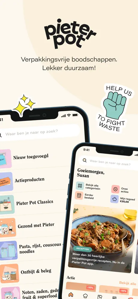
Distills the entire proposition into a single glance: logo, mission, breadth of range and personalisation without writing a paragraph of copy. More breadth than depth; while the shot communicates a lot, overlapping phones swallow the tab bar on the left device, trading legibility for atmosphere. The sticker and headline dominate more than the UI itself. Effective as a brand ad, weaker as a feature sell. A broad establishing shot that asks the user to trust the vibe before the utility.that's 125 words. We can try writing the final output now.sequence: [The opening canvas is a warm cream, roughly #F5F0E6, dominated by the black Pieter Pot logotype and the mission statement Verpakkingsvrije boodschappen. Lekker duurzaam! Two notched iPhones overlap below. The left phone exposes a vertical category list running from Nieuw toegevoegd down to Noten, zaden, gedroogd fruit & superfood under a search bar reading Waar ben je naar op zoek? The right phone surfaces a personalised home feed headed by Goeiemorgen, Susan, four quick-action tiles, and a recipe card captioned Meer dan 30 heerlijke verpakkingsvrije recepten. Nu in de Pieter Pot app. A yellow sparkle sticker sits above the left bezel, while a turquoise fist sticker reading HELP US TO FIGHT WASTE invades the upper right. The overlap conceals most of the left-hand tab bar, forcing breadth over interface legibility.The second frame keeps the cream ground. The headline In potten & flessen met statiegeld sits above the sub-head Lekker. Geen afval. A single centred iPhone displays the product page for Koekjes Bossuyt Belgische kokosrotjes, priced at €2.50 in a bold coral orange, #FF8C5A, with a matching circular add button. A pale peach band states Statiegeld pot: €2. The product photography shows a swing-top jar and wooden scoop against a seamless peach backdrop that echoes the frame’s accent colour. A mint recycling sticker floats top-left, and a yellow lightbulb sticker anchors the bottom right. The tab bar is fully visible, including a cart icon with a red 14 badge. By isolating one phone, the frame gives the deposit line room to read as a trust signal rather than footnote.The background shifts to a cool mint near #B4D3CB with abstract geometric leaf shapes. The headline Elke week nieuwe producten sits above Op basis van jouw wensen. A single iPhone tilts counter-clockwise to reveal the Groente & fruit aisle under Groente and Fruit tabs. Three products are legible: Komkommer at €0.89, Snack tomaat, 500 gram at €2.49, and Courgette, each with a square orange add button. The product cards carry peach-toned backgrounds that bridge back to the warmer frames. A white flower sticker with a yellow centre anchors the bottom right. The cart badge still shows 14, frozen across the set. The tilt introduces depth but foreshortens the tab bar slightly, making the icon labels harder to parse.The mint stage continues. A single iPhone presents a four-pack under the title Bio Lekere mix, 4-pack, priced at €6.95, with Statiegeld: €0.40 set in the same peach band used in the previous product frame. Here, the headline Van hartig tot zoet and the line Met als eerste in Nederland een circulair drankassortiment have dropped below the device, flanked by two clinking champagne-glass stickers. This inversion of text placement breaks the top-heavy rhythm of earlier frames, though it risks thumb occlusion at the bottom of a phone screen. The bottle photography is evenly lit against a warm studio backdrop, and the orange add button repeats at the same 44 pt extent, reinforcing a consistent tap target.The palette warms to a peach gradient near #F9B89C overlaid with darker terracotta shards. Two iPhones overlap: the rear device shows a Kies bezorgmoment screen with Vrijdag 12 april and time slots beginning at 8:00, while the foreground phone unveils the Mandje cart. Line items include Fusilli, volkoren at €0.99, a subtotal of €40.95, a statiegeld credit of -€12.00, and a final total of €28.95 above a full-width orange button reading Ik ga bestellen. A canvas tote sticker bearing the wordmark sits bottom left. Because the rear phone is dimmed and recessed, the eye lands immediately on the financial summary. The frame makes the deposit-return mechanic concrete by showing it as a live subtraction in checkout math rather than an abstract concept.The peach background persists. A tilted iPhone shows active search results for Muesli, surfaced in a list of three glass jars: Bio muesli, naturel at €2.99, Bio muesli koekjes at €1.99, and Bio muesli, noten. A PIETER POT WANTS YOU sticker with a pointing finger dominates the lower bezel, overlapping the tab bar and partially obscuring the third product card. The headline below reads Ontdek ons verpakkingsvrije assortiment! The search bar interior shows an active x clear icon. Because the sticker sits so low, the composition feels cramped compared with the airier single-device frames, and the forced perspective pushes the right-hand prices toward the edge of the frame.The closing frame switches to a periwinkle ground near #A8B5E0, abandoning the device entirely. Three feature blocks stack vertically, each fronted by a sticker: a shopping-bag icon for Samen je mandje vullen, an orange Korting badge for Altijd op de hoogte van nieuwe producten en korting, and a pink stopwatch for Makkelijk en snel opnieuw bestellen. Body copy explains shared-cart functionality, sale notifications, and reorder flows. Without a phone chassis, the illustrations and typography must carry the full visual load. The abrupt removal of the device after six frames of consistent staging creates a jarring spatial drop, though the vertical rhythm of headline-body, headline-body surfaces features that lack a compact single-screen UI.],


Sampled palette

#F5F0E6#F5F0E6
#FF8C5A#FF8C5A
#E6F0F5#E6F0F5
#FEF1EA#FEF1EA
#C8D9EF#C8D9EF
02The challenge

What this screenshot set had to solve

The Pieter Pot screenshot set faces the classic vertical-commerce tension: how to signal sustainability without preaching, show assortment depth without overwhelming, and maintain warmth while presenting transactional interfaces. The seven frames must compress a full grocery loop—discovery, product detail, category browsing, alcohol assortment, checkout, search, and account features—into a single swipe narrative. Because the brand lacks instant recognition, the first frame shoulders logo establishment and mission definition simultaneously. The team chose a sticker-book aesthetic over soft, shifting background geometries, meaning color consistency and legibility become moving targets as the palette swings from warm cream to mint green to peach to periwinkle. The core tension is between playful, scrapbook-like brand expression and the need to present dense product information—prices per 100g, deposit fees, delivery slots, subtotals—with scannable clarity at thumbnail scale.

The set’s greatest structural asset is the cyclical device-and-sticker motif, yet its rhythm is undermined by erratic headline placement. Frames 1, 2, and 3 anchor copy above the phone; frame 4 relocates it below; frame 5 hides text entirely until the lower thumb zone; frame 6 returns below. A scrolling shopper has no stable anchor. The background palette also jumps from cream to mint to peach to periwinkle without a narrative gradient, and frame 7’s cool purple reads as an outlier. A specific mechanical flaw is the frozen cart badge: every tab bar displays a red 14, betraying the composites as a single frozen snapshot rather than a progressive story. The statiegeld concept, while visually coded through peach bands, is never decoded for newcomers who may not recognize the Dutch deposit system; an inline glyph or parenthetical translation would reduce friction. Finally, frame 7’s text-only layout sacrifices all the dimensional warmth established by the physical devices; even a small inset of the shared-cart interface would preserve the vocabulary.
03The approach

How the set argues its case

The Pieter Pot screenshot set faces the classic vertical-commerce tension: how to signal sustainability without preaching, show assortment depth without overwhelming, and maintain warmth while presenting transactional interfaces. The seven frames must compress a full grocery loop—discovery, product detail, category browsing, alcohol assortment, checkout, search, and account features—into a single swipe narrative. Because the brand lacks instant recognition, the first frame shoulders logo establishment and mission definition simultaneously. The team chose a sticker-book aesthetic over soft, shifting background geometries, meaning color consistency and legibility become moving targets as the palette swings from warm cream to mint green to peach to periwinkle. The core tension is between playful, scrapbook-like brand expression and the need to present dense product information—prices per 100g, deposit fees, delivery slots, subtotals—with scannable clarity at thumbnail scale.

The set anchors itself on a repeating device-and-sticker motif that creates rhythm across disparate UI states. Rather than isolating features on flat backgrounds, each frame locks a physical iPhone into a choreographed stage of illustration and geometry. Typography stays in a high-contrast serif for headlines, set in near-black against pastel fields, while UI chrome inside the phones retreats to thin sans-serifs and soft peach icons. The approach front-loads brand personality: the first frame opens with the wordmark and a turquoise fist sticker reading HELP US TO FIGHT WASTE, establishing tone before any price appears. Subsequent frames alternate between single-device product heroes and dual-device narrative composites, letting background color signal thematic shifts—cream for the deposit system, mint for produce freshness, peach for checkout warmth. The seventh frame breaks the pattern entirely, dropping the phone to surface account-level features in a vertical scroll of illustrated points, functioning as a closing argument rather than a product demo.

04Frame by frame

Every screenshot, and the job it does

Pieter Pot App Store screenshot 1 — Pieter Pot
01

Pieter Pot

On-frame caption: “Verpakkingsvrije boodschappen. Lekker duurzaam!

The opening canvas is a warm cream, roughly #F5F0E6, dominated by the black Pieter Pot logotype. Two notched iPhones overlap below the wordmark. The left phone exposes a vertical category list running from Nieuw toegevoegd down to Noten, zaden, gedroogd fruit & superfood under a search bar reading Waar ben je naar op zoek? The right phone surfaces a personalised home feed headed by Goeiemorgen, Susan, four quick-action tiles, and a recipe card captioned Meer dan 30 heerlijke verpakkingsvrije recepten. Nu in de Pieter Pot app. A yellow sparkle sticker sits above the left bezel, while a turquoise fist sticker reading HELP US TO FIGHT WASTE invades the upper right. The overlap conceals most of the left-hand tab bar, forcing breadth over interface legibility.

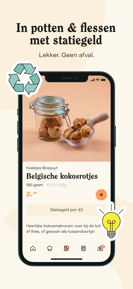
Pieter Pot App Store screenshot 2 — In potten & flessen met statiegeld
02

In potten & flessen met statiegeld

On-frame caption: “Lekker. Geen afval.

The second frame keeps the cream ground. The serif headline In potten & flessen met statiegeld sits above the sub-head Lekker. Geen afval. A single centred iPhone displays the product page for Koekjes Bossuyt Belgische kokosrotjes, priced at €2.50 in a bold coral orange, #FF8C5A, with a matching circular add button. A pale peach band states Statiegeld pot: €2. The product photography shows a swing-top jar and wooden scoop against a seamless peach backdrop that echoes the frame’s accent colour. A mint recycling sticker floats top-left, and a yellow lightbulb sticker anchors the bottom right. The tab bar is fully visible, including a cart icon with a red 14 badge. By isolating one phone, the frame gives the deposit line room to read as a trust signal rather than footnote.

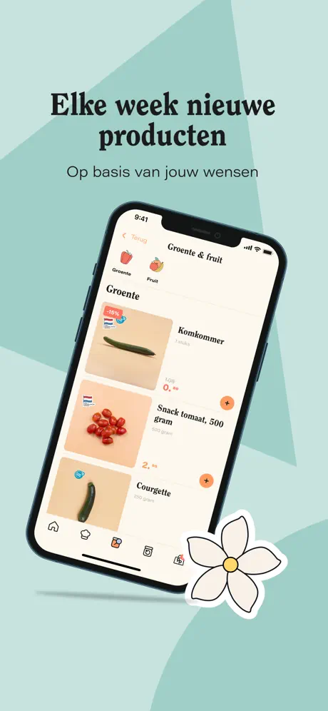
Pieter Pot App Store screenshot 3 — Elke week nieuwe producten
03

Elke week nieuwe producten

On-frame caption: “Op basis van jouw wensen

The background shifts to a cool mint near #B4D3CB with abstract geometric leaf shapes. The headline Elke week nieuwe producten sits above Op basis van jouw wensen. A single iPhone tilts counter-clockwise to reveal the Groente & fruit aisle under Groente and Fruit tabs. Three products are legible: Komkommer at €0.89, Snack tomaat, 500 gram at €2.49, and Courgette, each with a square orange add button. The product cards carry peach-toned backgrounds that bridge back to the warmer frames. A white flower sticker with a yellow centre anchors the bottom right. The cart badge still shows 14, frozen across the set. The tilt introduces depth but foreshortens the tab bar slightly, making the icon labels harder to parse.

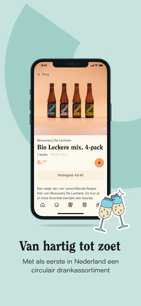
Pieter Pot App Store screenshot 4 — Van hartig tot zoet
04

Van hartig tot zoet

On-frame caption: “Met als eerste in Nederland een circulair drankassortiment

The mint stage continues. A single iPhone presents a four-pack under the title Bio Lekere mix, 4-pack, priced at €6.95, with Statiegeld: €0.40 set in the same peach band used in the previous product frame. Here, the headline Van hartig tot zoet and the line Met als eerste in Nederland een circulair drankassortiment have dropped below the device, flanked by two clinking champagne-glass stickers. This inversion of text placement breaks the top-heavy rhythm of earlier frames, though it risks thumb occlusion at the bottom of a phone screen. The bottle photography is evenly lit against a warm studio backdrop, and the orange add button repeats at the same 44 pt extent, reinforcing a consistent tap target.

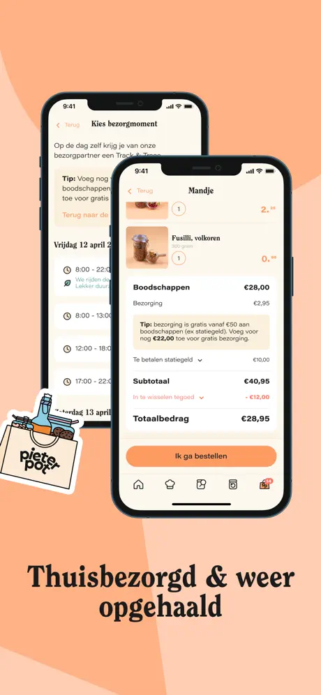
Pieter Pot App Store screenshot 5 — Thuisbezorgd & weer opgehaald
05

Thuisbezorgd & weer opgehaald

The palette warms to a peach gradient near #F9B89C overlaid with darker terracotta shards. Two iPhones overlap: the rear device shows a Kies bezorgmoment screen with Vrijdag 12 april and time slots beginning at 8:00, while the foreground phone unveils the Mandje cart. Line items include Fusilli, volkoren at €0.99, a subtotal of €40.95, a statiegeld credit of -€12.00, and a final total of €28.95 above a full-width orange button reading Ik ga bestellen. A canvas tote sticker bearing the wordmark sits bottom left. Because the rear phone is dimmed and recessed, the eye lands immediately on the financial summary. The frame makes the deposit-return mechanic concrete by showing it as a live subtraction in checkout math rather than an abstract concept.

Pieter Pot App Store screenshot 6 — Ontdek ons verpakkingsvrije assortiment!
06

Ontdek ons verpakkingsvrije assortiment!

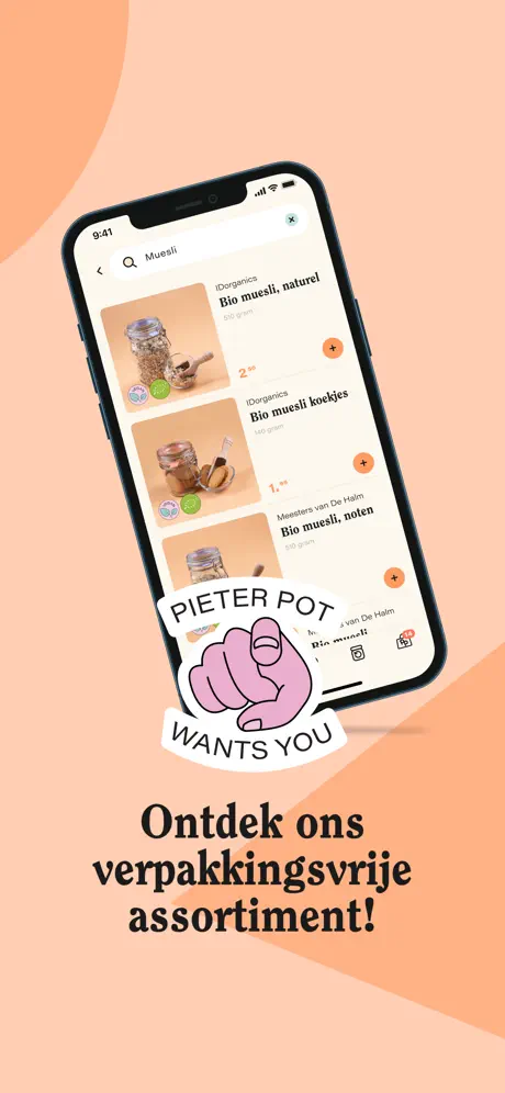
The peach background persists. A tilted iPhone shows active search results for Muesli, surfaced in a list of three glass jars: Bio muesli, naturel at €2.99, Bio muesli koekjes at €1.99, and Bio muesli, noten. A PIETER POT WANTS YOU sticker with a pointing finger dominates the lower bezel, overlapping the tab bar and partially obscuring the third product card. The headline below reads Ontdek ons verpakkingsvrije assortiment! The search bar interior shows an active x clear icon. Because the sticker sits so low, the composition feels cramped compared with the airier single-device frames, and the forced perspective pushes the right-hand prices toward the edge of the frame.

Pieter Pot App Store screenshot 7 — Samen je mandje vullen
07

Samen je mandje vullen

On-frame caption: “Deel je account met je partner, huisgenoot of familielid...

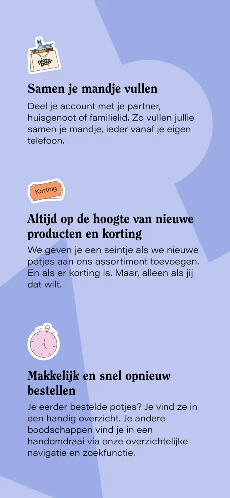
The closing frame switches to a periwinkle ground near #A8B5E0, abandoning the device entirely. Three feature blocks stack vertically, each fronted by a sticker: a shopping-bag icon for Samen je mandje vullen, an orange Korting badge for Altijd op de hoogte van nieuwe producten en korting, and a pink stopwatch for Makkelijk en snel opnieuw bestellen. Body copy explains shared-cart functionality, sale notifications, and reorder flows. Without a phone chassis, the illustrations and typography must carry the full visual load. The abrupt removal of the device after six frames of consistent staging creates a jarring spatial drop, though the vertical rhythm of headline-body, headline-body surfaces features that lack a compact single-screen UI.

05The craft

Captions, colour and the mechanics of the sell

Caption pattern

Each caption uses a large, bold serif headline followed by a shorter sans-serif subhead. The hierarchy is consistent: headline draws the emotional hook, subhead explains the functional benefit. The tone is friendly and direct, often addressing the user with phrases like Op basis van jouw wensen.

Visual system

The set uses a consistent visual system: a pastel background color that shifts per frame, a single or dual iPhone mockup, and hand-drawn stickers that float around the device. The UI inside the phone uses a warm off-white background with peach and coral accents for prices and CTAs. The typography pairs a bold, slightly quirky serif for captions with a clean sans-serif for UI elements.

The thumbnail test

On a small screen, the headline In potten & flessen met statiegeld in the second frame remains readable because the serif weight is heavy enough to hold against the cream ground. However, the sub-head Lekker. Geen afval. could disappear if cropped. The first frame’s overlapping phones reduce to a beige blur at thumbnail size. The mint frame with the single tilted device and large white flower sticker pops more because of the higher contrast between the cool background and the warm phone screen. The peach checkout frame is the most legible at small scale because the dark text on the light UI and the orange CTA create natural focal points.

Conversion mechanics

The set’s greatest structural asset is the cyclical device-and-sticker motif, yet its rhythm is undermined by erratic headline placement. Frames 1, 2, and 3 anchor copy above the phone; frame 4 relocates it below; frame 5 hides text entirely until the lower thumb zone; frame 6 returns below. A scrolling shopper has no stable anchor. The background palette also jumps from cream to mint to peach to periwinkle without a narrative gradient, and frame 7’s cool purple reads as an outlier. A specific mechanical flaw is the frozen cart badge: every tab bar displays a red 14, betraying the composites as a single frozen snapshot rather than a progressive story. The statiegeld concept, while visually coded through peach bands, is never decoded for newcomers who may not recognize the Dutch deposit system; an inline glyph or parenthetical translation would reduce friction. Finally, frame 7’s text-only layout sacrifices all the dimensional warmth established by the physical devices; even a small inset of the shared-cart interface would preserve the vocabulary.

06Where it slips

What we would change

Erratic Headlines

Frames 1, 2, and 3 anchor copy above the phone; frame 4 relocates it below; frame 5 hides text entirely until the lower thumb zone; frame 6 returns below. A scrolling shopper has no stable anchor.

Frozen Cart

Every tab bar displays a red 14, betraying the composites as a single frozen snapshot rather than a progressive story.

Statiegeld Clarity

The deposit concept is never decoded for newcomers who may not recognize the Dutch system; an inline glyph or parenthetical translation would reduce friction.

Frame 7 Drop-off

The text-only layout sacrifices all the dimensional warmth established by the physical devices; even a small inset of the shared-cart interface would preserve the vocabulary.

07The recipe

How to apply this to your own app

  1. Lock your headline to a consistent spatial zone—either always above the device or always below—so the viewer’s eye knows where to rest while swiping through the set.

    Frames 1, 2, and 3 anchor copy above the phone; frame 4 relocates it below; frame 5 hides text entirely until the lower thumb zone; frame 6 returns below. A scrolling shopper has no stable anchor.

  2. Audit every recurring UI element like a cart badge across all composites to ensure the story reads as a live sequence rather than a frozen snapshot.

    Every tab bar displays a red 14, betraying the composites as a single frozen snapshot rather than a progressive story.

  3. If six consecutive frames rely on a physical device frame, introduce abstract closing material gradually instead of eliminating the phone entirely on the final card.

    The text-only layout sacrifices all the dimensional warmth established by the physical devices; even a small inset of the shared-cart interface would preserve the vocabulary.

  4. Use a single accent color for all primary actions and financial highlights, as the coral add buttons do here, but test that same hue against every background to maintain contrast.

    The orange add button repeats at the same 44 pt extent, reinforcing a consistent tap target.

  5. When surfacing regional concepts like refundable deposits, pair the native term with a small visual glyph or numeric cue so the mechanic is legible to anyone unfamiliar with local infrastructure.

    The deposit concept is never decoded for newcomers who may not recognize the Dutch system; an inline glyph or parenthetical translation would reduce friction.

  6. Reserve dual-device layouts for direct state-to-state comparisons, because overlapping phones reduce legibility unless one screen is intentionally recessed and dimmed.

    Because the rear phone is dimmed and recessed, the eye lands immediately on the financial summary.

08Takeaways

Five things worth stealing

  • Lock your headline to a consistent spatial zone—either always above the device or always below—so the viewer’s eye knows where to rest while swiping through the set.
  • Audit every recurring UI element like a cart badge across all composites to ensure the story reads as a live sequence rather than a frozen snapshot.
  • If six consecutive frames rely on a physical device frame, introduce abstract closing material gradually instead of eliminating the phone entirely on the final card.
  • Use a single accent color for all primary actions and financial highlights, as the coral add buttons do here, but test that same hue against every background to maintain contrast.
  • When surfacing regional concepts like refundable deposits, pair the native term with a small visual glyph or numeric cue so the mechanic is legible to anyone unfamiliar with local infrastructure.
  • Reserve dual-device layouts for direct state-to-state comparisons, because overlapping phones reduce legibility unless one screen is intentionally recessed and dimmed.
09The verdict

What the set actually achieves

The set anchors itself on a repeating device-and-sticker motif that creates rhythm across disparate UI states. Rather than isolating features on flat backgrounds, each frame locks a physical iPhone into a choreographed stage of illustration and geometry. Typography stays in a high-contrast serif for headlines, set in near-black against pastel fields, while UI chrome inside the phones retreats to thin sans-serifs and soft peach icons. The approach front-loads brand personality: the first frame opens with the wordmark and a turquoise fist sticker reading HELP US TO FIGHT WASTE, establishing tone before any price appears. Subsequent frames alternate between single-device product heroes and dual-device narrative composites, letting background color signal thematic shifts—cream for the deposit system, mint for produce freshness, peach for checkout warmth. The seventh frame breaks the pattern entirely, dropping the phone to surface account-level features in a vertical scroll of illustrated points, functioning as a closing argument rather than a product demo.

Shoppers in the Netherlands interested in reducing packaging waste and buying groceries in reusable containers. The app targets environmentally conscious consumers who value convenience and sustainability. The friendly, approachable design appeals to a broad demographic, from young professionals to families looking to make greener choices without sacrificing ease of use.

10Questions

Frequently asked

What is the main value proposition?

Zero-waste grocery delivery using reusable jars and bottles with a deposit system.

What is the unique mechanism?

A statiegeld (deposit) system where customers pay a small fee for reusable packaging that is refunded upon return.

Who is the primary audience?

Environmentally conscious consumers in the Netherlands seeking convenient, packaging-free grocery shopping.

What is the visual style?

Warm, friendly, and playful with hand-drawn stickers, pastel backgrounds, and a mix of serif and sans-serif typography.

What is the screenshot strategy?

A mix of single and dual device mockups with large captions and decorative stickers to convey brand personality and key features like the deposit system and product range.

Are there any weaknesses in the screenshot set?

Inconsistent headline placement, a frozen cart badge across frames, and a lack of visual continuity in the final text-only frame.

11Keep reading

Build your own screenshot set

The full set

7 shots
Pieter Pot App Store screenshot 1Pieter Pot App Store screenshot 2Pieter Pot App Store screenshot 3Pieter Pot App Store screenshot 4Pieter Pot App Store screenshot 5Pieter Pot App Store screenshot 6Pieter Pot App Store screenshot 7

About the app

Bespaar afval én CO2-uitstoot. Bestel je verpakkingsvrije boodschappen met de Pieter Pot App en wij bezorgen ze bij jou aan huis, in heel Nederland. Start nu en ontvang 15 euro Pieter Pot, via the App Store listing.

Screenshots and store metadata belong to Pieter Pot. They are shown here for design commentary and criticism. The analysis on this page is original work by floow.design. View the original listing.

More Shopping teardowns

Browse all →