Filtru app icon
Food & DrinkScreenshot teardown13 min read

Filtru App Store screenshots

Filtru Brews an Eight-Frame Argument for Precision, Hardware, and Ecosystem Lock-In

Filtru App Store screenshot 1
01At a glance

The set in one screen

Framing
Alternating Dutch-angle heroics and orthogonal documentation shots
Captions
Heavy, tightly-tracked sans-serif; amber keyword isolation in every headline
Backdrop
True-black canvas with atmospheric teal or amber ground glows behind devices
Type
SF Pro-style weights; massive values inside the UI (50g, 91.4g) paired with small instructional captions
UI / copy split
Roughly 60% device chrome, 40% headline and social proof below the fold
Frame 1 job
Anchor authority immediately by pairing the brew timer with a James Hoffmann endorsement and a 4.8-star rating

Sampled palette

#050505#050505
#0A0A0A#0A0A0A
#121212#121212
#1C1C1E#1C1C1E
#F5A623#F5A623
#2E9DF5#2E9DF5
02The challenge

What this screenshot set had to solve

A coffee timer is not a casual download; it competes with free stopwatches and kitchen scales. The screenshot set must convince an enthusiast—someone who owns an Acaia scale and follows barista bloggers—that Filtru is a ritual companion, not a novelty. That means proving three things fast: credibility in the brew, credibility in the hardware stack, and credibility inside the iOS ecosystem. With eight frames to work through, the risk of a feature-list sprawl is high. The designer also faces a chromatic constraint: the app itself is overwhelmingly dark-mode OLED black, so any screenshot that falls back to a light stage would break immersion. The challenge, then, is to sequence eight distinct functional layers—timer, method grid, AR, Bluetooth sync, Live Activities, widgets, bean tracking, and analytics—into a narrative that feels like a single, escalating workflow rather than a bullet-point deck. Each frame needs to justify its swipe by either deepening the utility or widening the surface area of the user’s daily habit.

The designer treats the iPhone not as a display case but as a stage light in a dark kitchen, letting the UI emit its own colour against an unforgiving black canvas.
03The approach

How the set argues its case

The set is built on a rhythm of contrast and repetition. Every headline follows the same white-plus-amber rule: the functional verb phrase sits in white, while the payoff word or phrase is rendered in #F5A623 amber. This trains the scrolling eye to find the benefit within milliseconds. Device framing alternates between angled depth (Frames 1, 3, 4) and flat frontal documentation (Frames 2, 6, 7, 8) so that the more complex UIs are never distorted by perspective, while the hero moments feel dynamic. Backgrounds are never pure grey; they are true black with subtle atmospheric glows—cyan leaking from behind AR and widget frames, amber radiating from social-proof rows and bean-journal rings. The sequence itself mimics a usage funnel: start with the singular moment of brewing, expand to the method library, elevate with camera and hardware augmentation, then surround the user with iOS lock-screen and home-screen persistence.

Filtru positions itself as the default brewing OS for serious coffee people. It does not try to be friendly or playful; it speaks in grams, flow rates, and hardware compatibility lists. The screenshots assume the shopper already knows why a Bluetooth scale matters, then prove the app speaks that language natively.

04Frame by frame

Every screenshot, and the job it does

Filtru App Store screenshot 1 — The Authority Play
01

The Authority Play

On-frame caption: “Frame 1 captioned 'brew perfect coffee every time'

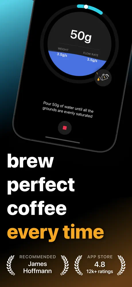
The hero frame pitches the iPhone backward at roughly 20 degrees, creating a receding perspective that reads as cinematic rather than utilitarian. A hard cyan gradient bleeds from the upper left, clipped by the device bezel, while a warm amber glow rises from the bottom right, planting the two accent colors that will govern the set. On screen, the circular brew timer dominates: '50g' in thick white numerals, with 'WEIGHT' and 'FLOW RATE' labels above a blue semi-circular gauge at roughly #4A7DE3. Beneath the gauge, the caption 'Pour 50g of water until all the grounds are evenly saturated' sits in small, neutral grey text. A red record button (#FF2D55) is centered below the instruction. The lower 40% of the canvas is reserved for trust architecture: twin laurel wreaths flank 'RECOMMENDED James Hoffmann' and 'APP STORE 4.8 12k+ ratings.' The headline uses 'brew perfect coffee' in white and 'every time' in amber, a syntactic split that puts the emotional promise in the warm color and the functional claim in the cold one.
Filtru App Store screenshot 2 — The Library
02

The Library

On-frame caption: “Frame 2 captioned 'Follow step-by-step brew guides'

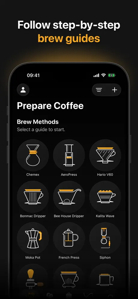
After the angled hero, the device snaps to a dead-frontal, orthogonal crop that maximises grid legibility. The status bar reads 09:41 with standard Apple signal and battery glyphs. The screen title 'Prepare Coffee' is followed by 'Brew Methods' and the directive 'Select a guide to start.' A 3x3 grid of circular method icons fills the viewport, each tile roughly 88pt in diameter with #1C1C1E fills, white 1.5pt strokes, and amber accent bands. Visible methods include Chemex, AeroPress, Hario V60, Bonmac Dripper, Bee House Dripper, Kalita Wave, Moka Pot, French Press, and Siphon; the bottom row is partially clipped to imply scroll depth. The headline above the phone, 'Follow step-by-step brew guides,' isolates 'brew guides' in amber. By withholding social proof and letting the density of the nine-method grid speak for itself, the frame transitions from promise to proof.

Filtru App Store screenshot 3 — The AR Elevator
03

The AR Elevator

On-frame caption: “Frame 3 captioned 'Discover new methods using Augmented Reality'

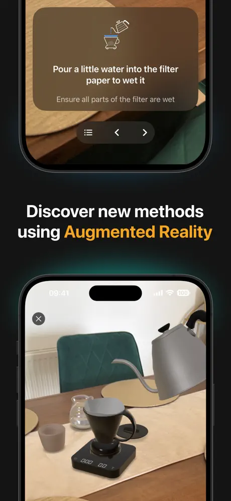
This frame splits the canvas vertically into two devices with a headline in the negative space between. The top phone shows an AR step card floating over a photographic wooden counter. The card is a translucent warm-grey panel with a line-art pour-over icon, the instruction 'Pour a little water into the filter paper to wet it,' and the secondary line 'Ensure all parts of the filter are wet.' Navigation lives in a dark, rounded pill containing a hamburger icon and chevrons. The bottom phone displays the live camera view: a grey gooseneck kettle and black V60 dripper on a table, with a white 'X' close button in the upper left and the Dynamic Island fully visible. The headline reads 'Discover new methods using Augmented Reality,' with only 'Augmented Reality' in amber. A faint teal atmospheric glow pools behind the lower device, chromatically linking this frame to the hero’s cyan accent while introducing photographic texture that no other frame possesses.

Filtru App Store screenshot 4 — The Hardware Bridge
04

The Hardware Bridge

On-frame caption: “Frame 4 captioned 'Connect Bluetooth scales for real-time assistance'

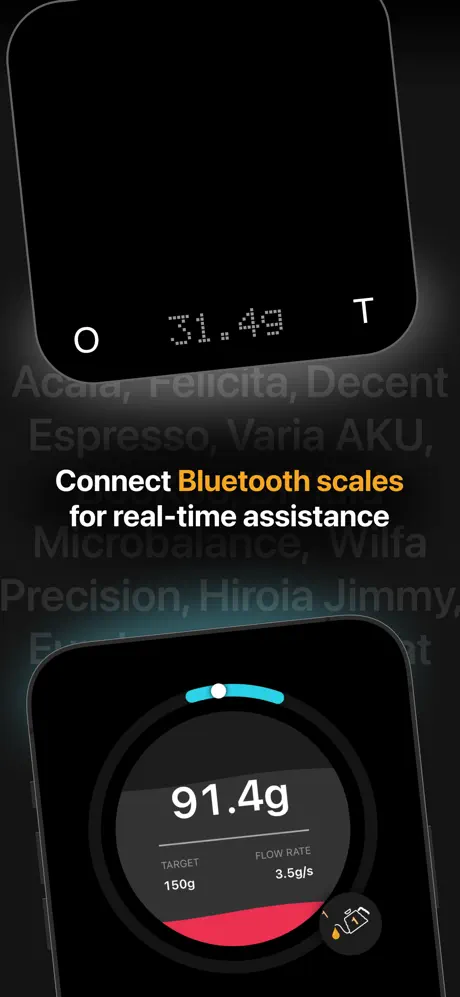
The composition stacks two devices with a centered headline, but the top element is an extreme close-up of a physical scale’s seven-segment display reading '31.4g,' flanked by 'O' and 'T' indicators. This hardware photography is treated as a UI element, occupying the upper third. The headline isolates 'Bluetooth scales' in amber: 'Connect Bluetooth scales for real-time assistance.' The bottom device resurrects the circular timer from Frame 1, now reading '91.4g' with 'TARGET 150g' and 'FLOW RATE 3.5g/s.' The gauge has shifted from blue to a warning red-pink (#FF375F), implying over-target or flow mismatch. Ghosted brand names—Acaia, Felicita, Decent, Varia AKU, Microbalance, Wilfa—float in the background at roughly 15% opacity, acting as environmental texture. The two devices are offset diagonally, forcing the eye to zig-zag from physical hardware to digital response.

Filtru App Store screenshot 5 — The Ecosystem Lock-In
05

The Ecosystem Lock-In

On-frame caption: “Frame 5 captioned 'In a hurry? Take a quick glance at your brewing progress thanks to new Live Activities, Stand By and Dynamic Island widgets.'

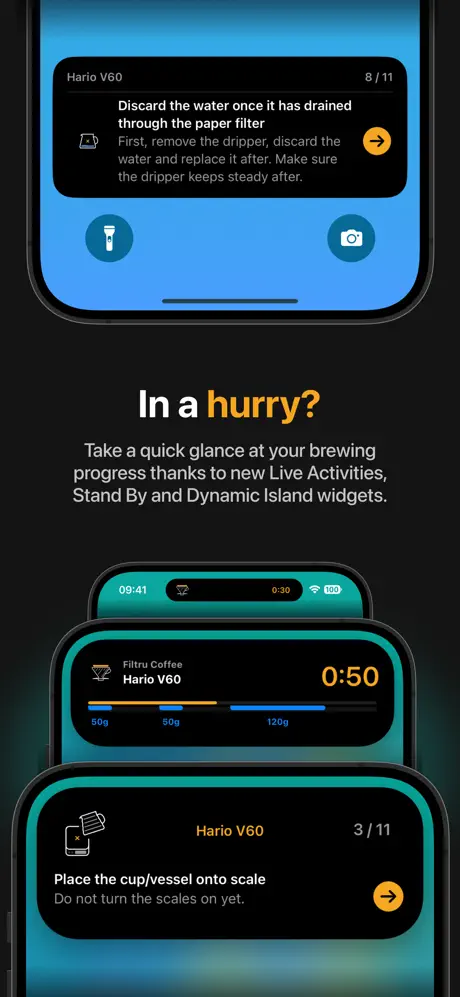
Apple system features get their own billboard. The top half shows a single phone against a saturated cyan-blue background (#2E9DF5 to #00C6FF) displaying step '8/11' of a Hario V60 guide. The instruction reads 'Discard the water once it has drained through the paper filter,' followed by a body paragraph: 'First, remove the dripper, discard the water and replace it after. Make sure the dripper keeps steady after.' A flashlight icon, camera icon, and a yellow arrow button (#FFC107) are anchored at the bottom of the card. The lower half abandons the single-device convention, stacking three ambient interfaces: a Dynamic Island sliver showing a filter icon and '0:30'; a StandBy-style landscape widget with segmented progress bars labelled 50g, 50g, and 120g alongside a timer at '0:50'; and a lock-screen step notification reading 'Place the cup/vessel onto scale' and 'Do not turn the scales on yet.' with a yellow arrow. The headline 'In a hurry?' breaks the declarative pattern with a question, before the subhead names every iOS 16/17 feature explicitly.

Filtru App Store screenshot 6 — The Home Screen Grid
06

The Home Screen Grid

On-frame caption: “Frame 6 captioned 'Interactive widgets. Newly designed widgets let you explore more brew guides from the community or roll the new Dice widget for an exciting variation of the AeroPress recipe'

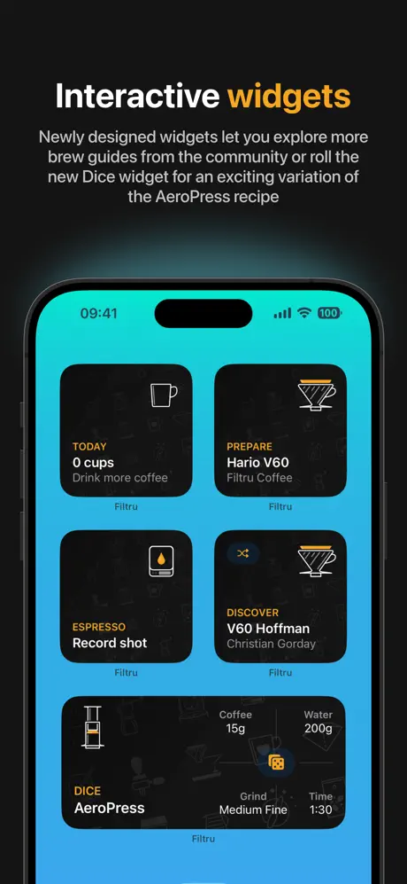
Widgets are displayed at true home-screen scale on a cyan-blue gradient wallpaper that matches Frame 5, cementing visual continuity. The headline places the amber accent on 'widgets': 'Interactive widgets.' Five Filtru widgets use #121212 rectangular backgrounds with 22pt corner radii. Top left: 'TODAY 0 cups / Drink more coffee' with a mug icon. Top right: 'PREPARE Hario V60 / Filtru Coffee.' Middle left: 'ESPRESSO Record shot' with a flame icon. Middle right: 'DISCOVER V60 Hoffman / Christian Gorday.' Bottom: a double-wide 'DICE AeroPress' widget showing 'Coffee 15g,' 'Water 200g,' 'Grind Medium Fine,' and 'Time 1:30' beside a dice icon. Each widget carries a small 'Filtru' caption beneath it. The status bar is fully visible, including the Dynamic Island, grounding the widgets in an authentic iOS context rather than a floating mockup.

Filtru App Store screenshot 7 — The Pantry Ledger
07

The Pantry Ledger

On-frame caption: “Frame 7 captioned 'Track freshness and keep a journal of your coffee beans'

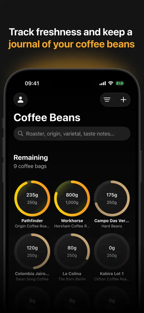
The set pivots from brewing to inventory with a frontal device shot of the 'Coffee Beans' screen. The search field is a #1C1C1E pill containing the placeholder 'Roaster, origin, varietal, taste notes...' Below, the section header 'Remaining' is followed by '9 coffee bags.' A 2x3 grid of circular progress rings dominates the viewport. Pathfinder shows 235g against 250g with an almost-complete amber ring (#F5A623). Workhorse shows 800g against 1,000g with a thick yellow-orange stroke. Campo Das Ver... shows 175g against 250g in desaturated tan. Colombia Jairo..., La Colina, and Kabira Lot 1 descend in completion, with Kabira at 0g displaying a dim, empty ring. The rings sit on #181818 discs. The headline splits across two lines—'Track freshness and keep a' in white, 'journal of your coffee beans' in amber—balanced by the fact that the second line is the longer of the two, creating a stable block.

Filtru App Store screenshot 8 — The Proof of Habit
08

The Proof of Habit

On-frame caption: “Frame 8 captioned 'Learn and improve from your coffee making activity'

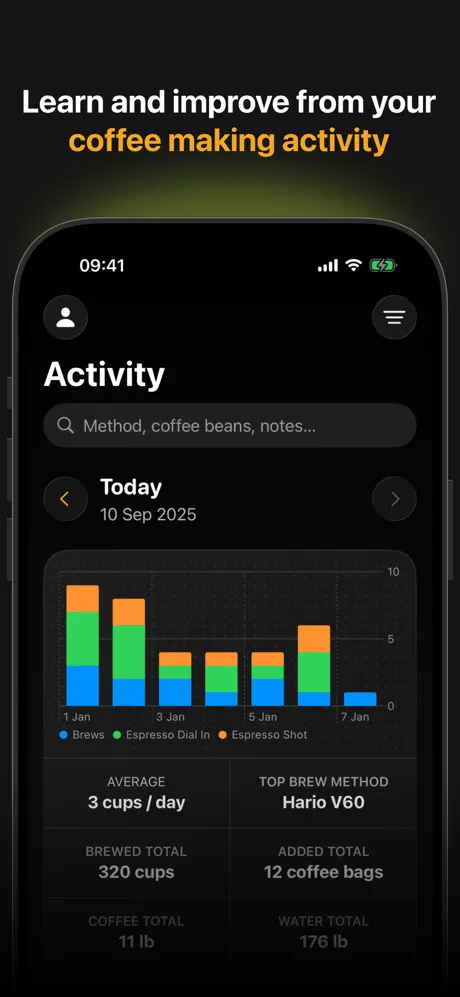
The closing argument is pure data. The 'Activity' screen fills a frontal device, anchored by a stacked bar chart with a faint dotted grid at roughly 10% opacity. Segments use blue (#0A84FF) for Brews, green (#30D158) for Espresso Dial In, and orange (#FF9F0A) for Espresso Shot across a January timeline. Below the chart, a four-quadrant stat grid reads 'AVERAGE 3 cups / day,' 'TOP BREW METHOD Hario V60,' 'BREWED TOTAL 320 cups,' 'ADDED TOTAL 12 coffee bags,' 'COFFEE TOTAL 11 lb,' and 'WATER TOTAL 176 lb.' A date navigation pill reads 'Today / 10 Sep 2025' with chevron arrows. The headline keeps the accent on the final words: 'Learn and improve from your' in white, 'coffee making activity' in amber. A faint greenish halo seems to leak from the chart’s green segment into the background, a chromatic echo unique to this frame that subtly reinforces the 'growth' narrative without adding new UI elements.

05The craft

Captions, colour and the mechanics of the sell

Caption pattern

Each frame uses a two-part caption: a large, bold white claim above the device, and a smaller functional explanation either inside the UI itself or directly beneath the headline. Frame 5 breaks this slightly by using a question headline ('In a hurry?') followed by a longer, three-line rationale that names Live Activities, Stand By, and Dynamic Island explicitly. This tonal shift to second-person empathy is deliberate—it interrupts the technical monologue to speak to a contextual pain point.

Visual system

The visual grammar is rigid in the best way. Circular progress rings, rounded rectangles for widgets, and seven-segment-display numerals on hardware scales all echo the same geometry of precision. The iconography inside the method grid (Frame 2) uses 1.5pt white strokes with amber accents on #1C1C1E circular tiles, a pattern that resurfaces in the bean-journal rings (Frame 7) and the widget icons (Frame 6). Even the red alert semicircle in Frame 4 (#FF375F) is an inversion of the blue brew gauge in Frame 1, creating an internal grammar of 'target' versus 'warning' through hue alone.

The thumbnail test

Frame 1 wins the thumbnail battle through sheer contrast. The 50g timer dial is the brightest object in a near-black field, and the James Hoffmann laurel plus the 4.8-star badge answer qualification questions before the shopper taps. The angled device creates diagonal tension that stands out against flat competitor thumbnails in the Food & Drink category.

Conversion mechanics

The sequence is front-loaded with credibility. Frame 1 answers 'is it accurate?' via the James Hoffmann laurel and the 4.8-star badge before the shopper can ask. Frames 2 through 4 establish functional depth (methods, AR, hardware), while Frames 5 and 6 pivot to ecosystem retention—arguing that the app persists even when the phone is locked or on a StandBy dock. Frames 7 and 8 switch from input to memory, suggesting that Filtru becomes a database of the user’s own consumption. The transition from active brewing to passive logging mirrors the actual habit loop of enthusiast coffee drinkers, who often weigh beans before they have had caffeine.

06Where it slips

What we would change

Contrast vulnerability on amber type

The amber headline accents (#F5A623) against warm dark backgrounds in Frames 2 and 7 likely fail WCAG AA contrast for small text, though the heavy weight partially compensates. A fix is to push the amber toward #FFB800 or apply a subtle dark drop shadow to maintain warmth while reliably hitting 4.5:1.

Photographic dissonance in the AR frame

Frame 3 introduces realistic photography of a wooden counter that carries a warmer, more desaturated lighting temperature than the synthetic studio lighting used elsewhere. A color-grade pass to cool the wood tones by roughly 8% would unify the set and prevent the AR frame from feeling like a foreign insert.

Ghosted text noise in the hardware frame

The ghosted scale brand names in Frame 4 sit at a opacity that competes with the foreground headline. They read as texture on first glance but as cluttered typography on second glance. Moving them to a bottom ticker at 8% opacity, or removing them entirely, would reduce noise without sacrificing the hardware-credibility message.

Missing focal hierarchy in the widget grid

Frame 6 presents five widgets of equal visual weight. The eye wanders because no single widget is dominant. Dimming the two smaller top widgets to 70% opacity, or applying a slight gaussian blur to the non-Dice widgets, would create the hierarchy the 'Dice' subheadline promises.

Sequence order risks early abandonment

The set front-loads specialized hardware sync and AR before establishing basic utility for users who may not own a Bluetooth scale. Swapping Frame 3 with Frame 6 would ground the browsing session in practical, free iOS features before asking the shopper to imagine an AR kitchen session, potentially flattening the drop-off curve.

07The recipe

How to apply this to your own app

  1. Isolate one keyword in amber (or your brand accent) on every headline so the scrolling thumb catches the benefit in <100ms.

    Filtru never breaks this rule: 'every time,' 'brew guides,' 'Augmented Reality,' 'Bluetooth scales,' 'widgets,' 'coffee beans,' and 'coffee making activity' are all amber. Mimic this by forcing your copy to contain a single payoff noun or verb phrase, then color-coding it consistently.

  2. Alternate perspective to manage cognitive load.

    Use dynamic angles for emotional, single-element hero frames, then snap to flat frontal crops for grids, lists, and data-dense screens. This tells the shopper when to feel and when to read.

  3. Let the UI background be the set background.

    Because Filtru is OLED-black, the screenshots use true-black canvases. If your app has a dominant background color, treat the App Store canvas as an extension of that color rather than a white card stock. The result is immersive framing that makes competitor screenshots look like printouts.

  4. Sequence for the habit loop, not the feature list.

    Filtru orders its frames as timer → methods → AR → hardware → widgets → beans → analytics. This is not alphabetical; it is chronological in the user relationship. Map your screenshots to the user's week-one journey, not your product's navigation hierarchy.

08Takeaways

Five things worth stealing

  • Credibility first: social proof and expert endorsements belong in Frame 1, not the footer.
  • Color discipline is more important than color variety. Restrict yourself to one warm action color, one cool system color, and true black.
  • Use hardware photography as UI texture, not decoration. The scale close-up in Frame 4 bridges physical and digital better than any caption could.
  • Ambient interfaces (Dynamic Island, StandBy, widgets) deserve their own frame only if you can render them at authentic scale and context.
  • End with data. A closing stats frame converts the emotional promise of Frame 1 into quantifiable habit proof.
09The verdict

What the set actually achieves

A vertically stacked, dark-mode sequence that uses hardware photography, native iOS widget contexts, and a strict amber-and-cyan accent system to turn a utility app into an aspirational kitchen instrument. The set converts by proving ecosystem depth before the shopper ever reads a review.

Designers building utility apps for enthusiast communities—cooking, fitness, music production, or maker tools—where the shopper evaluates craft credibility before price. The set is also a strong reference for apps that leverage hardware peripherals or iOS ecosystem features like Live Activities and widgets.

10Questions

Frequently asked

Why does Frame 1 use a Dutch angle when most App Store guidelines suggest flat, legible crops?

The Dutch angle creates diagonal tension that stops the swipe in a category full of flat food photography. It is a calculated risk: because the UI element inside (the circular timer) is radial and centered, the tilt does not distort readability. Reserve perspective shifts for frames with singular, centered hero objects, and never use them on grids.

How does the set handle text localization concerns?

The headline grammar is extremely short ('brew perfect coffee every time' is five words), and the amber keyword isolation reduces dependency on long phrases. Inside the UI, the visible text in early frames is either numeric (50g, 3.5g/s) or icon-based, which localizes more gracefully than dense paragraphs. Frame 5 is the wordiest, but by then the shopper is already committed.

What is the purpose of the ghosted scale brand names in Frame 4?

They act as semantic texture. At thumbnail size they register as 'stuff and compatibility'; at full size they name-drop hardware that signals expertise to the enthusiast buyer. The risk is visual clutter, which the critique addresses, but the intent is clear: prove native integration without building a separate compatibility slide.

Should the AR frame appear earlier or later in the sequence?

As noted in the critique, it currently sits at position 3, which may be too early for shoppers who do not yet own the full brewing kit. For most apps, AR is a delight feature, not a conversion driver. Test placing ecosystem or widget frames before AR to establish free value before asking the user to imagine an augmented workflow.

11Keep reading

Build your own screenshot set

The full set

8 shots
Filtru App Store screenshot 1Filtru App Store screenshot 2Filtru App Store screenshot 3Filtru App Store screenshot 4Filtru App Store screenshot 5Filtru App Store screenshot 6Filtru App Store screenshot 7Filtru App Store screenshot 8

About the app

Screenshots and store metadata belong to Filtru. They are shown here for design commentary and criticism. The analysis on this page is original work by floow.design. View the original listing.

More Food & Drink teardowns

Browse all →