
Franki app icon
Food & DrinkScreenshot teardown12 min read

Franki App Store screenshots

This case study examines the six-frame App Store screenshot sequence for Franki, a Food & Drink app that layers social discovery, user-generated lists, and cash-back earnings into a single product. The set is built on a radically restricted palette of muddy olive, high-voltage yellow, and warm cream, using lifestyle photography once and device-heavy proof for the remaining five frames. The design problem is not simply aesthetic; it is taxonomical. A shopper swiping through these frames must understand, within seconds, that Franki is neither a pure restaurant review network nor a pure financial rebate tool, but a hybrid of both. The screenshot set therefore has to manufacture trust and desirability simultaneously, using only six static images and a handful of caption words.

Set published by DANIEL SANTIAGO VIVAS SUAREZ · 6 frames analysed

5.0 · 1 ratingsFreev1.38.0Updated 4mo ago
Franki App Store screenshot 1
01At a glance

The set in one screen

Framing
Notch iPhones, no drop shadow, plain device chrome; frame 1 is device-free full-bleed photography.
Captions
Rounded geometric sans, sentence case, cream (~#FFFBE6) locked to the top third.
Backdrop
Consistent dark olive across frames 2–6 with abstract yellow blobs entering from corners.
Type
Extra-bold rounded sans for headlines; black for in-app currency; gray for metadata.
UI / copy split
1 lifestyle frame, 5 UI frames; 4 frames use overlapping dual devices.
Frame 1 job
Emotional hook and category positioning without showing app chrome.

Sampled palette

#7E7318#7E7318
#FFEA00#FFEA00
#FFFBE6#FFFBE6
#FFF9C4#FFF9C4
02The challenge

What this screenshot set had to solve

The central tension in Franki’s screenshot set is categorical: the app sits at the intersection of social networking and financial utility. A user hunting for a dinner recommendation expects discovery imagery, while a user hunting for cash back expects proof of real money. If the set leans too far into lifestyle, it risks looking like a generic Instagram clone; if it leans too far into ledgers and balances, it risks looking like a banking app with a food database. The designer has to communicate five distinct functional layers—cash-back earnings, restaurant discovery, offer activation, social leveling, and list-based curation—without letting the frames collapse into a feature list. Moreover, because the app’s UI is itself visually dense (user handles, percentage badges, XP bars, price descriptors, and tab bars), every screenshot is already information-rich before the caption is added. The challenge, then, is to sequence these dense screens so that a thumb-swiper grasps the value chain in the correct order: desire, discovery, mechanism, reward, and community. Finally, the set must do all of this within the constraints of Apple’s thumbnail gallery, where detail text shrinks to illegibility and only color, contrast, and composition survive.

Franki’s set proves that a single color hex can hold six disparate features together—but only if the compositions inside that frame vary enough to earn the next swipe.
03The approach

How the set argues its case

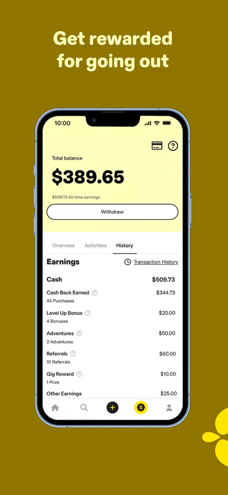
The set adopts a maximum-restriction palette strategy: one muddy olive ground, one canary yellow accent, and one cream type color repeat across every frame. That chromatic lockstep forces the viewer to associate each new feature with the same brand identity. Rather than alternating colors to signal mood shifts, the designer varies density—switching from a device-free lifestyle opener to a single-device ledger, then to four consecutive two-device frames. The captions function as blunt value propositions, never aspirational poetry. By keeping the background static and varying only the device count, overlap, and UI state, the sequence attempts to create rhythm through information architecture rather than through chromatic modulation. The choice to show real dollar figures ($389.65, $509.73, $327.25) rather than rounded placeholders is a deliberate trust-building move, anchoring the cash-back promise in specificity.

Franki positions itself as a social dining companion that pays you. The screenshots do not try to look like a traditional Yelp competitor; they foreground transaction history and cash-back modals alongside photos of cocktails and pasta. That hybrid positioning is communicated structurally: even the discovery frames (3 and 4) contain yellow “Get 5% Cash Back” bars, so the financial mechanism is never more than one glance away.

04Frame by frame

Every screenshot, and the job it does

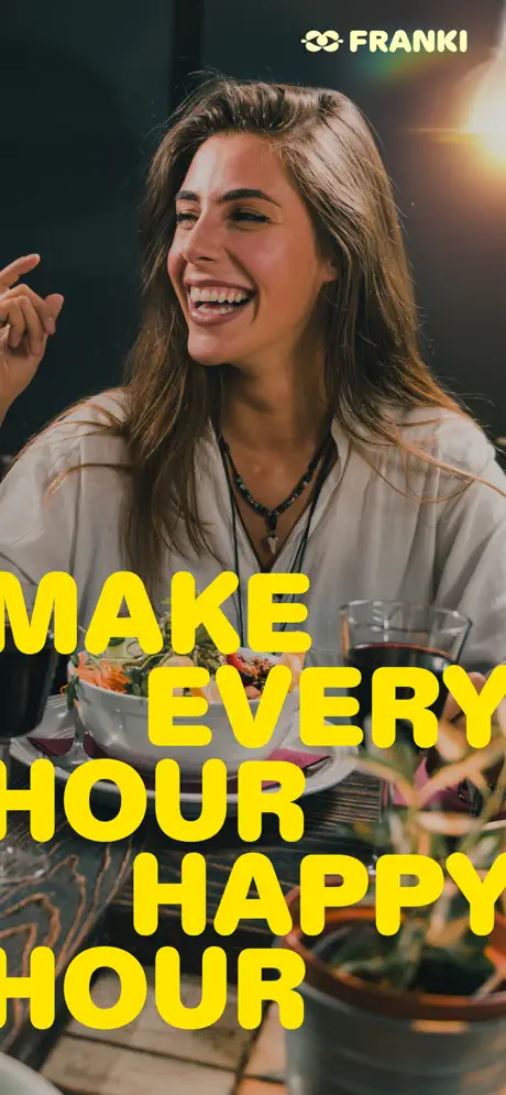
Franki App Store screenshot 1 — Lifestyle Billboard with Unprotected Type
01

Lifestyle Billboard with Unprotected Type

On-frame caption: “MAKE EVERY HOUR HAPPY HOUR

Frame 1 is a full-bleed photograph of a diner in a warm, low-lit restaurant. There is no device chrome. The Franki wordmark and a chain-link icon are locked to the upper-right corner in pale yellow, functioning as a watermark rather than a header. Dominating the lower two-thirds is the stacked headline “MAKE EVERY HOUR HAPPY HOUR,” set in an extra-heavy, rounded sans, centered, and cropped so aggressively that individual words breach the left and right frame edges. The type is rendered in a bright, warm yellow (~#FFEA00) that matches the brand’s accent system. Critically, there is no scrim, gradient, or drop shadow behind the text. The upper words land mostly against dark hair and background, but the lower words cross over glassware, a white ceramic bowl, and the subject’s off-white shirt. Because the photograph’s mid-tones sit so close to the headline’s luminosity, the letterforms lose definition wherever they overlap highlights. Structurally, the frame acts as a categorical billboard: it sacrifices UI legibility entirely for emotional positioning, betting that the shopper will accept the vibe before asking for the mechanism.

Franki App Store screenshot 2 — The Ledger as Trust Anchor
02

The Ledger as Trust Anchor

On-frame caption: “Get rewarded for going out

The second frame centers a single notch iPhone against the olive ground (~#7E7318). The caption “Get rewarded for going out” sits in cream, top-center. Inside the device, the UI displays an earnings-history screen. A pale-yellow header block (~#FFF9C4) contains the text “Total balance” in small gray, followed by “$389.65” in oversized black weight, and “$509.73 All-time earnings” in smaller gray beneath it. A white pill-shaped button with a thin black outline reads “Withdraw.” Below, on a white ground, a tab trio—“Overview Activities History”—shows “History” active with a black underline. The body is a two-column ledger: left-aligned descriptors such as “Cash Back Earned,” “Level Up Bonus,” “Adventures,” “Referrals,” “Gig Reward,” and “Other Earnings” are paired with right-aligned dollar amounts. The bottom tab bar shows five icons; the dollar-sign icon is highlighted inside a yellow circle. By placing a finance screen this early, the frame shifts the app’s center of gravity toward tangible reward. The single-device treatment makes the ledger text legible, though the hierarchy relies entirely on weight and indentation, with no horizontal rules to separate rows.

Franki App Store screenshot 3 — Dual-Device Discovery Gridlock
03

Dual-Device Discovery Gridlock

On-frame caption: “Discover the best spots to drink and dine

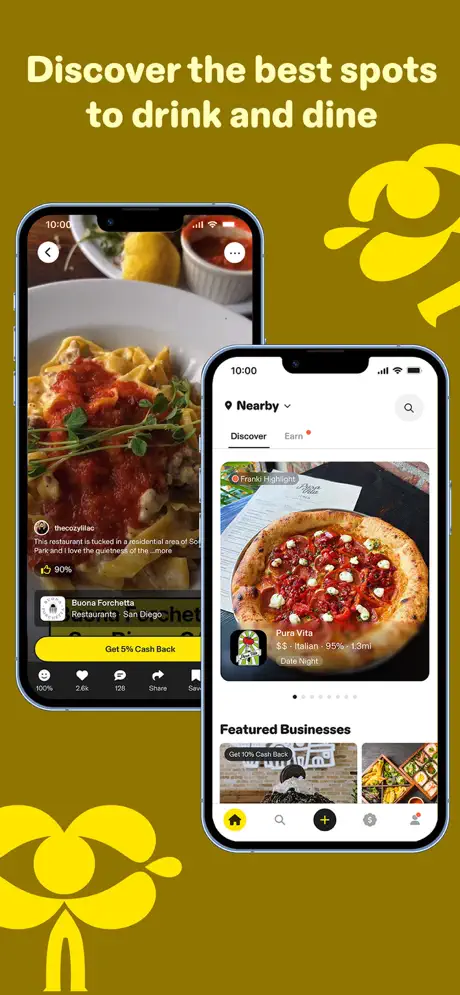
Frame 3 introduces the two-device motif that will dominate the rest of the set. The caption reads “Discover the best spots to drink and dine.” The rear/left phone shows a detail view of a pasta dish at “Buona Forchetta Restaurants - San Diego,” with a truncated review from “thecozylilac” and a yellow CTA reading “Get 5% Cash Back.” Engagement metrics (“2.6k” hearts) appear at the bottom. The front/right phone shows a discovery feed: a “Nearby” dropdown, a “Discover / Earn” segmented control, a “Franki Highlight” chip, and a card for “Pura Vita $$ - Italian - 95% - 1.3mi Date Night.” Its bottom nav shows the home icon active in yellow. The phones overlap by roughly twenty percent of their width, so the rear device’s midsection is structurally present but visually consumed. At thumbnail scale, the smaller text on the rear phone dissolves, meaning half the frame’s pixels serve only as atmospheric context. Two yellow abstract blobs—one entering from the top right, one from the bottom left—continue the brand wallpaper. The frame attempts to compress both social proof and browseability into one swipe, trading legibility for density.

Franki App Store screenshot 4 — Cash-Back Mechanism as Hero
04

Cash-Back Mechanism as Hero

On-frame caption: “Earn cash back at thousands of top restaurants

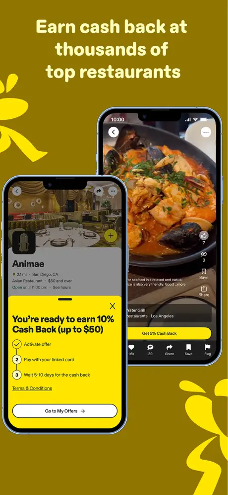
The fourth frame carries the caption “Earn cash back at thousands of top restaurants.” Two devices overlap again. The front/left phone displays a restaurant page for “Animae,” partially obscured by a bright-yellow bottom sheet (~#FFEA00) that states, verbatim, “You're ready to earn 10% Cash Back (up to $50).” Beneath, a vertical three-step checklist reads: “Activate offer,” “Pay with your linked card,” and “Wait 5-10 days for the cash back.” A small “Terms & Conditions” link sits above a white pill button: “Go to My Offers →.” The rear/right phone shows a full-bleed seafood dish at “Vater Grill - Los Angeles” with its own yellow “Get 5% Cash Back” bar. Because the modal sheet is the same yellow as the abstract brand blobs, it competes for attention across the entire frame; at small sizes the sheet flattens against the background graphic language and can be mistaken for a decorative shape rather than UI. The composition places the left device lower and forward, making the yellow sheet the dominant focal point. The right device, again, serves as proof of catalogue depth but is visually subordinate.

Franki App Store screenshot 5 — Gamification and the Palette Outlier
05

Gamification and the Palette Outlier

On-frame caption: “Share your experiences & level up

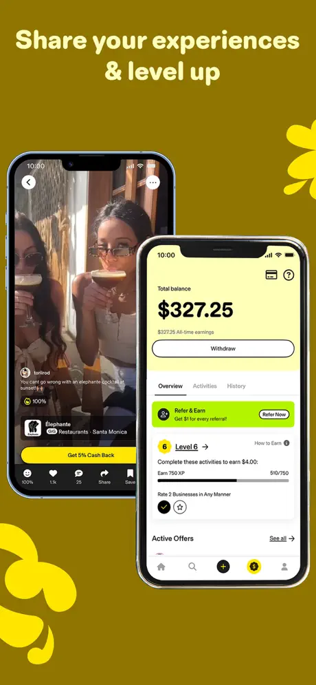
Frame 5 is captioned “Share your experiences & level up.” The left/rear phone shows a user-generated photo of two people holding cocktails, posted by “torirod” with the caption, “You can't go wrong with an elephant% cocktail at sunset! 🐘” The venue is listed as “Elephante GIG Restaurants - Santa Monica,” with a yellow “Get 5% Cash Back” button below. The front/right phone returns to the finance UI, now on the “Overview” tab. The balance reads “$327.25.” A neon-lime banner (~#C8FF00) promotes “Refer & Earn” with a “Refer Now” button—a hue that breaks the strict yellow-olive-cream system seen in every other frame. Below, a gamification module reads “Level 6 →” with an XP progress bar at 510/750 and the task “Rate 2 Businesses in Any Manner” checked off. The juxtaposition attempts to link content creation with progression, but the green banner introduces chromatic dissonance that fractures the palette. The bottom tab bar shows the dollar-sign icon active in yellow, maintaining navigational consistency. As with the previous two-device frames, the rear phone’s text is too small to survive thumbnail compression.

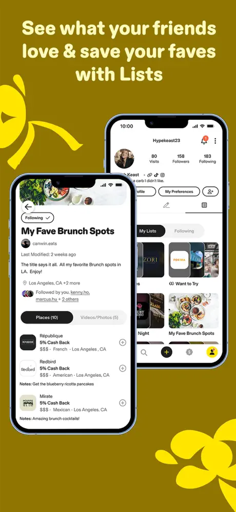
Franki App Store screenshot 6 — Social Curation and List Density
06

Social Curation and List Density

On-frame caption: “See what your friends love & save your faves with Lists

The final frame is captioned “See what your friends love & save your faves with Lists.” The front/left phone renders a list-detail page titled “My Fave Brunch Spots” by “canwin.eats.” The description reads, “The title says it all. All my favorite Brunch spots in LA. Enjoy!” Location metadata shows “Los Angeles, CA +2 more.” Three rows list “République,” “Redbird,” and “Mirate,” each with “5% Cash Back,” “$$$” price descriptors, cuisine tags, city tags, and user notes in gray: “Get the blueberry ricotta pancakes” and “Amazing brunch cocktails!” Circular add buttons sit at the right edge of each row. The rear/right phone shows a user profile for “Hypekeast23” with stats “80 Visits, 158 Followers, 183 Following,” and tabs for “My Lists” and “Following.” Grid thumbnails include “Want to Try” and the same brunch list. This frame finally surfaces the social graph explicitly. The list view is information-dense, using small gray meta text that approaches the limits of App Store thumbnail readability. The profile device shows the user icon active in the tab bar, reinforcing that the social layer is a first-class destination, not an afterthought.

05The craft

Captions, colour and the mechanics of the sell

Caption pattern

Every caption uses a top-centered, sentence-case lockup in cream. Frame 1 has no caption above the image; instead the headline sits on the photograph. Frames 2 through 6 follow the pattern: verb-forward promise, line break, functional qualifier. “Get rewarded for going out,” “Discover the best spots to drink and dine,” “Earn cash back at thousands of top restaurants,” “Share your experiences & level up,” and “See what your friends love & save your faves with Lists.” The tone is instructional rather than poetic.

Visual system

The app’s internal UI uses a pale-yellow header block (~#FFF9C4) for financial screens, white ground for lists, and black type for currency. In the App Store frames, this internal palette is wrapped in the external olive blanket. Abstract yellow blobs—amorphous floral shapes—bleed in from corners across frames 2–6, acting as brand wallpaper that prevents the olive ground from reading as a solid color block. The devices themselves are rendered without gloss, bezels, or drop shadows, giving them a flat, cutout quality.

The thumbnail test

At small scale, the olive-yellow pairing survives well, but the two-device frames compress poorly. The rear device in frames 3, 4, 5, and 6 becomes a grayish silhouette, and its UI text disappears entirely. Only the front device’s headline and the yellow CTA bars remain legible, which means half the pixel real estate in those frames is functionally decorative in the thumbnail view.

Conversion mechanics

The sequence follows a clear conversion logic: want, prove, find, act, share, save. The choice to place a ledger screen second is unusual—most food apps show discovery first—but it signals that Franki’s differentiation is financial, not purely editorial. The real dollar amounts ($389.65, $509.73) act as quantitative social proof, implying that other users are already earning. However, the lack of a human face or social context in frame 2 makes it feel like a hard pivot after the warm lifestyle opener. The transition from frame 2 to frame 3 is a return to photography, but frame 3’s two-device layout is already introducing the density fatigue that will echo through frames 4, 5, and 6.

06Where it slips

What we would change

Lifestyle Frame 1: Unprotected Yellow Type

The headline “MAKE EVERY HOUR HAPPY HOUR” is set directly on the photograph without a scrim, gradient, or text shadow. Where the yellow crosses the subject’s off-white shirt and the table’s reflective highlights, the contrast ratio drops below readable thresholds. Fix: Add a subtle 30–40% black gradient plate behind the lower two lines of type, or shift the text lockup into the darker upper-left quadrant where the background is already shadowed.

Repetitive Two-Device Layouts

Frames 3, 4, 5, and 6 all rely on overlapping iPhones. The rear device is consistently smaller and partially hidden, rendering its UI text illegible at thumbnail scale. This means four consecutive frames sacrifice half their pixel real estate to decorative context. Fix: Break the rhythm by switching at least one of these frames to a single, larger device hero shot. Reserve two-device compositions for moments when the rear screen is genuinely atmospheric—blur it or darken it so the front device’s message dominates without competition.

Frame 4’s Yellow Modal Competes with Brand Blobs

The cash-back activation sheet in frame 4 is rendered in the exact same yellow (~#FFEA00) as the abstract brand blobs. At small sizes, the sheet flattens into the background graphic language and no longer reads as a UI element. Fix: Either crop the screenshot to include more gray restaurant-page context above the sheet, or temporarily desaturate the corner blobs in this frame to create tonal separation between interface and wallpaper.

Frame 5’s Lime-Green Banner Breaks Palette Unity

The “Refer & Earn” banner introduces a neon-lime hue (~#C8FF00) that has not appeared in any other frame. Because every other frame relies on the olive-yellow-cream triad, this green feels like a system error rather than a deliberate accent. Fix: Replace the screenshot state with one that uses the standard yellow promotional banner, or recolor the banner in the screenshot asset to match the established accent.

Floating Device Chrome

The iPhones are rendered without drop shadows or grounding plates, so they hover weightlessly against the flat olive background. This reduces depth and makes the UI feel slightly detached. Fix: Add a subtle 8–12 point shadow at 8–10% black opacity beneath each device, or use a hairline ground plane to anchor the phones in space.

07The recipe

How to apply this to your own app

08Takeaways

Five things worth stealing

  • A single ground color and a single accent color can unify six disparate features, but only if the internal UI contrasts sharply enough to survive compression.
  • Showing real transactions ($389.65, $509.73) builds trust faster than rounded placeholder numbers.
  • Two-device compositions look rich on desktop galleries but lose legibility in thumbnail view; use them sparingly and treat the rear device as optional context.
  • Lifestyle openers need text protection; never let headline color compete with photographic mid-tones.
  • Gamification screens often introduce alien colors (neon greens, purples) that fracture a carefully restricted palette—audit screenshot states for chromatic consistency before export.
09The verdict

What the set actually achieves

By the final frame, the viewer has been walked through a complete loop: a night out is desirable (frame 1), money is trackable (frame 2), venues are findable (frame 3), offers are actionable (frame 4), sharing is rewarding (frame 5), and curation is social (frame 6). The set deposits proof of payment infrastructure, UGC depth, and social graph density in under six swipes.

Product designers working on hybrid consumer apps—particularly those blending social content, marketplace discovery, and financial incentives—who need to sequence proof points without diluting brand identity. The set is also instructive for teams debating whether to lead with lifestyle or utility in the App Store gallery.

10Questions

Frequently asked

Why does the set place a ledger screen so early?

Frame 2 leads with an earnings history and a “Withdraw” button rather than a restaurant photo. This anchors the app’s primary differentiator—cash back—before the viewer assumes Franki is just another food-review platform.

What is the purpose of the abstract yellow blobs?

The amorphous yellow shapes that bleed in from the corners act as brand wallpaper. They prevent the solid olive background from feeling like an empty void and tie the frames together into a single visual system.

Why is the lifestyle opener text cropped at the edges?

The extreme scale causes “MAKE” and “HOUR” to breach the frame edges. This is a deliberate graphic move to make the type feel immersive and poster-like, though it comes at the cost of full legibility.

What is the most critical weakness for thumbnail conversion?

The repetition of overlapping two-device frames. At small scale, the rear phone becomes a gray smudge and the front phone’s text is too small to communicate alone. A single-device frame would break this density and improve readability.

11Keep reading

Build your own screenshot set

The full set

6 shots
Franki App Store screenshot 1Franki App Store screenshot 2Franki App Store screenshot 3Franki App Store screenshot 4Franki App Store screenshot 5Franki App Store screenshot 6

About the app

Desbloquea el potencial: incorporación sin esfuerzo, capacitación personalizada Elimina las tareas repetitivas siguiendo el proceso de capacitación. Los nuevos empleados pueden DANIEL SANTIAGO VIVAS SUAREZ, via the App Store listing.

Screenshots and store metadata belong to DANIEL SANTIAGO VIVAS SUAREZ. They are shown here for design commentary and criticism. The analysis on this page is original work by floow.design. View the original listing.

More Food & Drink teardowns

Browse all →