

Flashfood app icon
Food & DrinkScreenshot teardown13 min read

Flashfood App Store screenshots

Flashfood’s App Store screenshot set runs seven frames deep, working a single accent color and a split identity—half photographic food collage, half rounded UI chrome—against the warm off-white noise of the Food & Drink category. The set oscillates between literal device frames and full-bleed brand posters, suggesting a team that wanted to show both personality and product. What follows is a structural reading of those seven frames, pulled directly from the pixels visible in each asset, plus an honest assessment of where the sequence holds together and where it frays under the thumb of a rapid swiper.

Set published by Flashfood Inc · 7 frames analysed

4.8 · 22K ratingsFreev3.5.1Updated 4mo ago
Flashfood App Store screenshot 1
01At a glance

The set in one screen

Framing
Five of seven frames use a dark navy device bezel (~#0D1D2E); two break the pattern entirely.
Captions
Single bold rounded sans-serif, tightly leaded, aligned flush-left, rendered in a saturated royal blue (~#2B68FF) against off-white (~#F5F5F0).
Backdrop
Off-white canvas with photographic food fragments and occasional flat vector still-lifes bleeding past the safe zone.
Type
Display type stays consistent across all seven frames: a heavy, friendly grotesque that reads at roughly 80–100 pt equivalent on the portrait canvas, with line breaks stacked into tight two- or three-word bricks.
UI / copy split
Roughly 70% device UI across the middle five frames, interrupted by Frame 1 (zero UI) and Frame 6 (logo grid only).
Frame 1 job
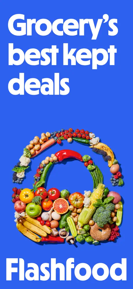
Pure brand hook: no phone, no store description, just type and a food-basket silhouette.

Sampled palette

(headlines / primary actions)#2B68FF
(device bezel)#0D1D2E
(background ground)#F5F5F0
(strikethrough / secondary text)#8E8E93
(hero text on blue)#FFFFFF
02The challenge

What this screenshot set had to solve

In the grocery-deals space, a screenshot set has to collapse an entire thrift-oriented ritual into a glance: discovery, inspection, transaction, fulfillment, and some reason to care about the brand beyond the transaction. Flashfood’s seven images attempt to tell that story while also nodding to retail ubiquity, geographic density, and post-purchase feel-good metrics. The structural risk is always dilution—trying to cover the full funnel in seven slides while keeping a recognizable visual hook. The design team landed on a near-monochromatic blue system and a recurring dark-navy device bezel to hold the set together. That discipline is admirable, but it also means any repeated layout or broken pattern is magnified, because the eye has so little else to chase.

A one-color headline system buys you instant recognizability, but it cannot mask redundant UI layouts when a shopper swipes fast.
03The approach

How the set argues its case

The dominant color is a saturated royal blue, sampled around #2B68FF, used almost exclusively for headlines and primary UI actions. It sits against an off-white ground somewhere near #F5F5F0, a choice that keeps the page from feeling clinical. Type is a single bold rounded sans-serif, set very large and tight, giving the headlines a bubble-letter weight that reads as friendly rather than corporate. Device frames are a deep navy bezel—approximately #0D1D2E—appearing in five of the seven shots and acting as a consistent window. Around those bezels, the team scattered photographic food fragments and occasional vector illustrations, creating an informal, scrapbook-style margin that bleeds off the canvas edges. The pacing follows a loose user journey: brand impression, browse, product detail, order confirmation, map coverage, retail proof, and savings summary.

The set positions the app as a mainstream grocery alternative rather than a niche eco-play. Even though Frame 7 nods to CO2 impact, the dominant visual language is price-led: blue discount prices, gray strikethroughs, and raw steaks in foam trays. That tension between thrift and sustainability is never fully resolved, but the priority is clearly the wallet.

04Frame by frame

Every screenshot, and the job it does

Flashfood App Store screenshot 1 — Grocery's best kept deals
01

Grocery's best kept deals

On-frame caption: “Grocery's best kept deals

Frame 1: The opening shot is a pure brand frame with no device chrome. The entire canvas is flooded in that saturated royal blue—roughly #2B68FF—leaving no border or gradient. Set flush left in the upper third is the headline lockup: 'Grocery's' on the first line, 'best kept' on the second, and 'deals' on the third, all in white (#FFFFFF) at a massive display size, perhaps the equivalent of 80–100 pt if scaled to a 1290 px width. The line breaks are aggressive, turning the headline into a tall rectangle of type. Centered vertically in the frame is a shopping-basket silhouette built entirely from photographic groceries—blueberries, peppers, salmon fillets, bananas, broccoli, corn, cherry tomatoes, and a bagel—arranged in a tight wreath so that the negative space inside the basket reads as a perfect circle of uninterrupted blue. At the bottom, the wordmark 'Flashfood' repeats in the same white weight, anchoring the composition. There is no supporting copy, no App Store feature callout, no phone frame. The hierarchy relies entirely on scale and contrast ratios that sit comfortably above WCAG AA for large text.
Flashfood App Store screenshot 2 — Browse daily deals
02

Browse daily deals

On-frame caption: “Browse daily deals

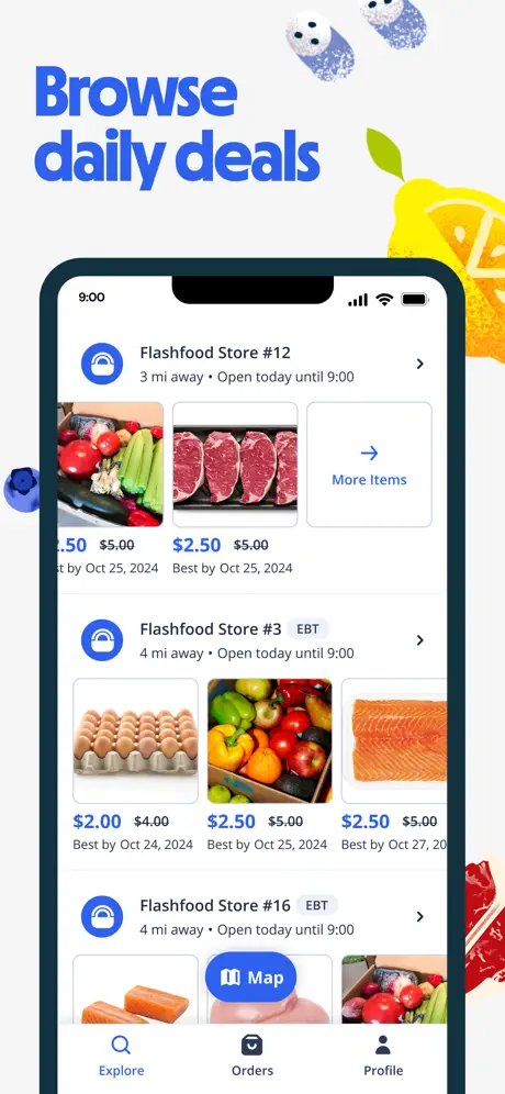
Frame 2: The background shifts to warm off-white, around #F5F5F0, and the device frame arrives. The headline 'Browse' sits above 'daily deals' in the same bold blue, aligned flush left in the top safe zone. Decorative food photography bleeds in from the edges—blueberries at the top-left and top-right, a sliced lemon at mid-right, a raw steak fragment at bottom-right, a single blueberry at mid-left—none touching the bezel. The device itself is a dark navy rectangle, roughly #0D1D2E, showing an iPhone-style status bar with '9:00'. Inside, the UI displays a vertical feed of store cards. The first cell reads 'Flashfood Store #12', '3 mi away • Open today until 9:00', followed by a horizontally scrolling row of thumbnails: mixed produce, raw steaks, and a terminal 'More Items' card carrying a right arrow. Prices are rendered in the headline blue for the discounted value—'$2.50'—and a muted gray for the struck-through '$5.00', with a gray 'Best by Oct 25, 2024' beneath. A second cell, 'Flashfood Store #3', adds a small gray 'EBT' pill. The native tab bar is visible at bottom: 'Explore' in active blue, 'Orders', and 'Profile'. The layout establishes the core discovery pattern but does so with the tab bar cropped to its label icons, implying a taller scroll captured in a static crop.

Flashfood App Store screenshot 3 — All the meats, fruits, veggies & more
03

All the meats, fruits, veggies & more

On-frame caption: “All the meats, fruits, veggies & more

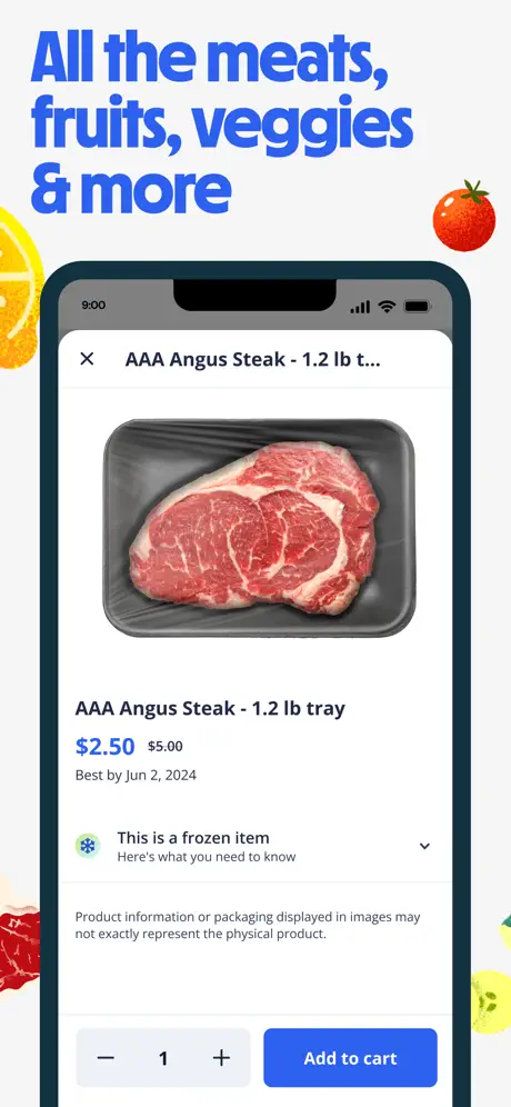
Frame 3: Again on the off-white ground, the frame now carries a lemon wedge at the top-left, a tomato at top-right, a meat cut at bottom-left, and a yellow squash flower at bottom-right. The headline spans three lines: 'All the meats,' 'fruits, veggies' and '& more'. The device presents a product detail modal. The header row shows an 'X' dismiss button left, the truncated title 'AAA Angus Steak - 1.2 lb t...' center, and the 9:00 status bar above. The hero image is a full-bleed photograph of raw AAA Angus Steak in a black foam tray, its marbling clearly visible. Below, the full title resolves to 'AAA Angus Steak - 1.2 lb tray', followed by the price pair: '$2.50' in headline blue against a gray strikethrough '$5.00'. The date 'Best by Jun 2, 2024' sits in secondary gray. An accordion row with a snowflake icon states 'This is a frozen item', with the sub-line 'Here's what you need to know' and a downward chevron. A disclaimer paragraph appears in small gray text. At the bottom, a gray stepper control ('−', '1', '+') and a blue 'Add to cart' button split the lower toolbar. The button blue matches the headline ink, locking the brand color to the primary action.

Flashfood App Store screenshot 4 — Same-day pickup, no long lines
04

Same-day pickup, no long lines

On-frame caption: “Same-day pickup, no long lines

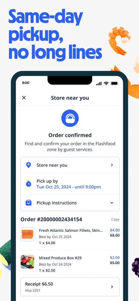
Frame 4: The off-white background continues, now with shrimp and salmon-orange curls entering from the top-right, broccoli and cucumber from the bottom-left, and blackberries from the bottom-right. The headline 'Same-day pickup,' and 'no long lines' sits in the familiar blue. The device shows a post-purchase confirmation. The header contains an 'X' and the text 'Store near you'. Centered beneath is a large solid-blue circle with a white shopping-bag glyph, followed by 'Order confirmed' and the gray subhead: 'Find and confirm your order in the Flashfood zone by guest services.' Three rows follow: a location pin labeled 'Store near you', a clock icon with 'Pick up by Tue Oct 25, 2024 - until 9:00pm' rendered in the headline blue rather than gray, and a checkmark icon with 'Pickup instructions' and a downward chevron. The order ID 'Order #20000002434154' appears left, with a gray 'Copy' text button right. Line-item rows show thumbnails, truncated product names—'Fresh Atlantic Salmon Fillets, Skin...' and 'Mixed Produce Box #29'—Best By dates, and discounted prices ($4.00 vs $8.00, $2.50 vs $5.00). At the bottom, a receipt row reads 'Receipt $6.50' above 'Visa 2251'. The frame functions as the set’s trust and fulfillment beat.

Flashfood App Store screenshot 5 — At more than 2000+ locations
05

At more than 2000+ locations

On-frame caption: “At more than 2000+ locations

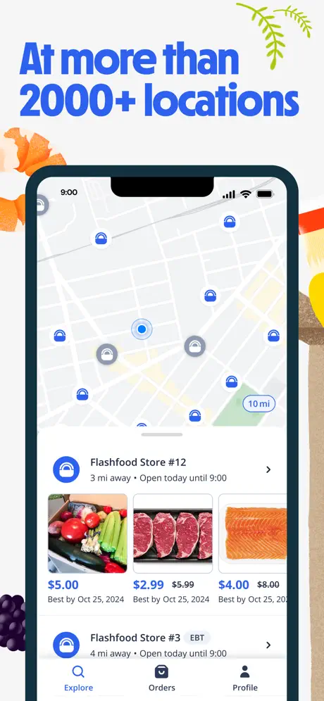
Frame 5: The decorative margin changes again—salmon curls at left, an herb sprig top-right, bell pepper at right, a baguette bottom-right, blackberries bottom-left—but the background remains the same off-white. The headline 'At more than 2000+ locations' occupies the upper-left. Inside the device, the top half of the screen is a map: light gray streets, a filled blue pin with a white ring indicating the selected store, and surrounding solid blue or gray pins. A white pill in the lower-right of the map holds '10 mi'. The bottom half is dominated by a bottom-sheet store list that mirrors Frame 2 almost exactly: 'Flashfood Store #12', '3 mi away • Open today until 9:00', and the same horizontal thumbnail row with blue strikethrough pricing. A second store cell, 'Flashfood Store #3', again carries the gray 'EBT' pill. The tab bar reappears. The intent is geographic proof, but the visual payload is heavily recycled from earlier in the sequence.

Flashfood App Store screenshot 6 — Find us at a grocery store near you
06

Find us at a grocery store near you

On-frame caption: “Find us at a grocery store near you

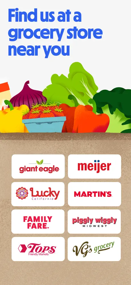
Frame 6: This frame breaks the pattern: there is no device bezel at all. The top third returns to off-white and carries the headline 'Find us at a grocery store near you' in the same blue. Below the headline sits a flat vector still-life of produce—a red onion, strawberries in a blue basket, lettuce, a red pepper, broccoli—resting on a horizontal shelf edge. The bottom two-thirds of the canvas switches to a kraft-paper brown texture. Against this paper field, eight retailer logos sit inside white rounded-rectangle cards with roughly 12 pt corner radius, arranged in a strict two-by-four grid. The logos are Giant Eagle, Meijer, Lucky California, MARTIN'S, FAMILY FARE., Piggly Wiggly Midwest, Tops Friendly Markets, and VG's Grocery, each preserved in native brand color. The spacing between cards appears even, with generous gutters that let the brown background read as negative space. It is the set’s only pure social-proof frame.

Flashfood App Store screenshot 7 — Rake in the savings
07

Rake in the savings

On-frame caption: “Rake in the savings

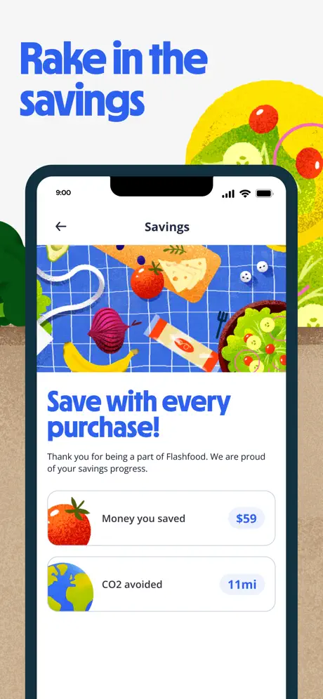
Frame 7: The final frame reintroduces the dark device bezel against the off-white ground, now overlaid with a large yellow vector lemon or sun disc at the top-right and an illustrated salad bowl nearby. The headline reads 'Rake in the savings'. Inside the phone, the 'Savings' screen begins with a back arrow and the screen title. A hero illustration fills the upper portion: food items—cheese, tomato, banana, onion, avocado, a salad bowl—arranged on a bright blue checkered picnic blanket. Below, 'Save with every purchase!' appears in the headline blue, followed by the gray body copy: 'Thank you for being a part of Flashfood. We are proud of your savings progress.' Two metric cards occupy the remainder: a tomato icon beside the label 'Money you saved', trailing the value '$59' inside a light blue pill; and an earth icon beside 'CO2 avoided', trailing '11mi' in an identical pill. The UI cards use a thin gray hairline border and generous internal padding, floating above the white screen ground.

05The craft

Captions, colour and the mechanics of the sell

Caption pattern

Each frame carries a single mega-headline at the top-left, stacked into short two- or three-word lines. There is no body copy, no feature bullets, and no App Store award callouts. The message is delivered entirely through UI context and headline implication.

Visual system

The visual system is held together by three rules: the royal blue headline color never shifts, the device bezel never changes radius or weight when present, and the off-white background stays constant. Within that cage, the team allows themselves to switch between photographic food fragments (Frames 2–5) and flat vector illustration (Frames 6–7), a flexibility that keeps the eye moving but also introduces stylistic inconsistency.

The thumbnail test

At small thumbnail scale, the blue headlines and dark device frames survive compression well. Frame 1’s white-on-blue silhouette is the most legible. Frame 6, however, collapses into a brown smear because the white logo cards lose their edge definition against the kraft paper when viewed at 20% scale.

Conversion mechanics

The conversion arc is explicit and well-sequenced: Frame 1 establishes the promise, Frame 2 shows inventory breadth, Frame 3 proves item-level transparency (frozen-state notice, exact Best By dates), Frame 4 removes checkout anxiety with confirmation details and pickup instructions, Frame 5 answers the 'is this near me?' objection, Frame 6 answers the 'is this legitimate?' objection with named retailers, and Frame 7 closes on retained value. That is a textbook AIDA progression. Where it stumbles is in the browse-to-map transition: Frame 5 does not advance the UI story far enough from Frame 2, so the middle of the set sags. A designer revising this should treat Frame 5 as a pure map state or a location-filter interaction, not a reprise of the store list.

06Where it slips

What we would change

Repetitive UI states between Frame 2 and Frame 5

The most obvious weakness is visual plagiarism within the set itself. Frame 2 and Frame 5 both show the same store list with the same horizontally scrolling product thumbnails, the same blue-over-gray pricing pattern, and the same Flashfood Store #12 / Store #3 hierarchy. When a shopper swipes in under two seconds, that repetition reads as a mistake or padding rather than emphasis. The fix is surgical: in Frame 5, crop the device to feature only the map pin density and a single location callout, or replace the bottom-sheet products with a search-radius filter UI that proves scale without duplicating content.

Frame 6 breaks the device-frame rhythm

Because Frames 2, 3, 4, 5, and 7 all rely on the dark navy bezel as a consistent window, Frame 6’s abrupt switch to a full-bleed logo grid severs the scroll rhythm. The kraft-paper texture also introduces a new material language that never appears elsewhere. Either commit to a no-device pattern earlier in the sequence, or pull the retail partners into a 'Find a Store' screen rendered inside the phone so the bezel survives uninterrupted.

Headline grammar in Frame 1

The text 'Grocery's best kept deals' is either a grammatically awkward singular possessive or an erroneous plural possessive. Unless the brand is referring to a single chain called Grocery, the apostrophe placement is confusing. The specific fix is to rewrite as 'Groceries' best-kept deals' or to reframe entirely as 'The grocery store's best-kept deals' so the possessive is unambiguous.

Dimensional confusion in Frame 7

The savings card reading 'CO2 avoided' carries the numeric badge '11mi'. Miles are a unit of distance, not carbon mass, and the juxtaposition undermines the credibility of an otherwise nice retention hook. If the metric represents driving equivalence, the label should explicitly read '11 mi driven' or similar; otherwise it should carry a mass unit like lbs or kg of CO2.

Decorative margin safe-zone inconsistency

The food fragments scattered around the device bezels vary wildly in proximity. The blueberries in Frame 2 and the steak in Frame 3 sit close enough to the bezel that, at thumbnail scale, they risk being mistaken for interactive UI. A 40 pt bleed exclusion zone around the device frame would solve this without killing the collage effect.

07The recipe

How to apply this to your own app

  1. The measurable lesson is that a single headline color and a single device frame style will carry a seven-frame set—but only if the interface states inside those frames change dramatically enough to earn the swipe. If you are building your own set, enforce a rule: no two frames may show the same primary UI component in the same configuration. Reuse the pattern, vary the state.

  2. If you must break the device-frame convention for a social-proof or partner slide, do it once and make it big enough to survive thumbnail compression. Frame 6’s white logo cards on brown paper lose definition at small scale; a higher-contrast treatment—native logos on the brand blue or deep navy—would retain legibility.

  3. Treat every unit and punctuation mark inside your UI mocks as if it were shipping code. A dimensionally mismatched metric ('11mi' for carbon) or a misplaced apostrophe in the hero headline will be screenshotted by users and held against the brand in reviews.

  4. Use the off-white ground deliberately. Flashfood’s warm gray-white keeps the set from feeling sterile, but it only works because the headline blue is aggressive enough to punch through. If your primary brand color is softer, you may need to invert to a darker background to maintain thumbnail contrast.

08Takeaways

Five things worth stealing

  • A single headline hue and a consistent device bezel create instant set cohesion, but they also expose any repeated layouts.
  • Frame 1 is the strongest anchor because it communicates the brand proposition without a single UI element—proof that a silhouette and a color flood can outperform a feature list.
  • The browse-to-map sequence in Frames 2 and 5 needs more differentiation; the bottom-sheet store list should not appear twice.
  • Frame 6’s abrupt stylistic break is a reminder that social-proof slides still need to obey the framing rules established by the rest of the sequence.
  • Small copy errors—apostrophe placement, unit mismatches—are magnified when the rest of the design is intentionally minimal.
09The verdict

What the set actually achieves

The result is a set that reads as friendly and immediately legible at thumbnail scale, with a strong opening brand frame and a clear-commerce arc. It sacrifices some scroll variety—two frames are nearly identical in their bottom-sheet UI—and it introduces a jarring device-to-no-device rhythm at the partnership slide. For designers building in the same space, Flashfood demonstrates the power of a single headline hue and a consistent device frame, while serving as a cautionary example of how repeating interface states can deflate an otherwise tight narrative.

This approach fits teams in transactional marketplaces—grocery, meal kits, localized delivery—where the goal is to collapse trust, proximity, and price into a quick swipe arc. It is less effective for apps that need to communicate complex editorial content or multi-tab architectures, because the set aggressively crops the UI into single-focus slices.

10Questions

Frequently asked

Why does Frame 1 work without showing any UI?

Because the food-basket silhouette literalizes the value proposition faster than a store list could. It trades information for recognition, which is exactly what a first impression frame should do.

Is the dark navy bezel a stock iPhone frame?

No—it reads as a custom or heavily tinted bezel, darker than standard Apple midnight and shifted toward navy. That tint is what makes it feel branded rather than generic.

Why do Frames 2 and 5 feel so similar?

They share the same bottom-sheet component: store name, distance string, horizontal thumbnail scroll, and tab bar. The map in Frame 5 is visually overwhelmed by that repeated sheet, so the eye skims without registering the geographic proof.

Does the illustration style inconsistency hurt the set?

Only at Frame 6. The jump from photographic food fragments to flat vector illustration is acceptable when it signals a mood shift, but Frame 6 also removes the device frame, compounding the discontinuity.

11Keep reading

Build your own screenshot set

The full set

7 shots
Flashfood App Store screenshot 1Flashfood App Store screenshot 2Flashfood App Store screenshot 3Flashfood App Store screenshot 4Flashfood App Store screenshot 5Flashfood App Store screenshot 6Flashfood App Store screenshot 7

About the app

Real food, realer prices. Flashfood gives you unbeatable deals on groceries at peak deliciousness. Want to save big on fruit, vegetables, meat, milk, cheese, pantry staples* and Flashfood Inc, via the App Store listing.

Screenshots and store metadata belong to Flashfood Inc. They are shown here for design commentary and criticism. The analysis on this page is original work by floow.design. View the original listing.

More Food & Drink teardowns

Browse all →