
Screenshot to Figma Free: Best Rebuild Tools
Compare screenshot reconstruction tools by UI fidelity, editable layers, code handoff, and the failure cases that matter on real mobile app screens.

For screenshot to figma free work, pick Figma as the best overall option: import the reference, rebuild the hierarchy with real layers, and use the free tier for the reconstruction itself. It is slower than AI conversion, but it produces the closest mobile UI match. Choose Builder.io instead if your priority is getting a first code draft quickly; avoid Figma if you need automatic screen conversion with no manual cleanup.
The short version
Our pick: Figma
Best for: Teams rebuilding iOS or Android screens where spacing, component structure, and an editable handoff matter more than a one-click result.
Skip it if: Do not pick Figma as your primary tool if you need a screenshot turned into production code immediately and cannot allocate time for layer-by-layer cleanup.
Key takeaways
- •Figma wins on reconstruction fidelity because you can correct every spacing, typography, and hierarchy decision instead of accepting an AI guess.
- •No screenshot converter perfectly understands overlays, sticky controls, native shadows, custom fonts, or hidden states; plan a review pass before calling a screen rebuilt.
- •Treat an imported screenshot as evidence, not a component library. Rebuild the visible structure, then replace copied patterns with your own tokens and components.
- •Choose the handoff before you start: Figma for design ownership, code output for a disposable implementation baseline, or both when design and engineering are working in parallel.
What's on this page
- •The ranking criterion: visual fidelity, not the prettiest AI demo
- •1. Figma — best for a faithful, editable reconstruction
- •2. Uizard — fastest visual starting point, weaker for exact matching
- •3. Builder.io, Locofy, and Anima — choose these for code-oriented handoff
- •Where every screenshot import breaks: overlaps, fonts, and states
- •How to rebuild the screen without rebuilding the original product
- •Pick the handoff format before you pay for a tool
- •A practical reconstruction workflow for an old build or competitor reference
The ranking criterion: visual fidelity, not the prettiest AI demo
For this job, fidelity means one thing: how closely the reconstructed screen matches the spacing and visual hierarchy of the original screenshot. That includes the left and right insets, baseline alignment, title-to-body contrast, card padding, image crops, tab-bar height, and which element visually wins first.
That is a harder test than producing a plausible shopping or banking screen. A tool can generate an attractive lookalike and still fail the rebuild because the search field is 8 points too tall, the primary action has moved below the fold, or the content rhythm has changed enough that your product team cannot compare the old and new flows.
I rank Figma first because it gives you direct control over the final artifact. You can place the screenshot on a locked reference layer, build the screen above it, reduce opacity, and inspect the mismatch at 200% zoom. That process is not glamorous. It is how you catch the errors that become obvious after the third day of implementation.
AI tools rank lower here not because they are useless, but because they infer structure from pixels. They do not know whether a 16-pixel gap is a deliberate token, an accidental crop, or a gap created by an unavailable font. Use AI to get a first pass; use editable structure and visual comparison to decide whether it is faithful enough to keep.

1. Figma — best for a faithful, editable reconstruction
Recommendation: choose Figma when the rebuilt screen will become a maintained design file. It is the best option in this roundup for reverse-engineering an old build or studying an existing app screen because the result can be genuine editable design work: frames, text layers, images, Auto Layout, color styles, and reusable components you control.
Figma does not magically understand a screenshot merely because you dragged one onto the canvas. That is its limitation and its advantage. You use the screenshot as a locked visual reference, then rebuild the actual structure. A 12-screen flow often starts with two anchor screens: one dense list screen and one detail screen. Once those are accurate, extract shared headers, cards, buttons, and navigation before rebuilding the remaining screens.
For screenshot to design in Figma, start by identifying the grid rather than tracing every rectangle. Mark the outer inset, column widths, repeated vertical gaps, and the type scale. Then recreate hierarchy in this order:
- •page regions and scroll content;
- •navigation and fixed controls;
- •repeated components;
- •text styles, icons, and image treatment.
The output is a Figma file, not a flattened image trace. That distinction matters when a product manager asks for the old information architecture with a new checkout card, or when engineering needs a changed Android variant. Figma loses to code-oriented tools on immediate code generation, but it wins when accuracy and future edits are the real deliverable.
2. Uizard — fastest visual starting point, weaker for exact matching
Uizard is useful when you need to turn a reference into a quick editable mockup and test a direction before investing in a careful rebuild. Its appeal is speed: a screenshot can become an interface starting point rather than a static image sitting beside a blank canvas.
For competitor or legacy-app reconstruction, that speed has a ceiling. The generated result may recognize obvious controls such as fields, buttons, cards, and navigation, but a generated screen is an interpretation. On a sparse marketing-style app screen, that can be enough. On a dense mobile account screen with inline warnings, unusual dividers, mixed font weights, and data-heavy rows, you should expect correction work.
The practical question is not whether Uizard made something editable. It is whether the resulting elements are editable in the tool and in the handoff format your team actually uses. Check the current export options before committing a flow to it. An editable mockup in one product is not the same as a clean, componentized Figma file with styles your designer can maintain.
Use Uizard for early exploration: import the reference, remove proprietary copy and brand assets, test a new structure, and decide whether the concept deserves a proper Figma rebuild. Do not use it as proof that measurements are accurate. Compare each important screen against the source before handing it to engineering. It loses to Figma for precise reconstruction, but beats manual work when you need a rough first draft today.
3. Builder.io, Locofy, and Anima — choose these for code-oriented handoff
Builder.io, Locofy, and Anima belong in the shortlist only if your next question after reconstruction is, “Can engineering start from this?” They are not interchangeable, and none should be mistaken for a full mobile design reconstruction environment.
Builder.io is the strongest fit here when you want an AI-assisted visual reference turned toward implementation. Its code-focused workflow can be useful for validating layout direction quickly. Review the generated output closely: a screen that looks right in a preview can still have poor component boundaries or unsuitable responsive rules.
Locofy is best known as a bridge from a structured design file toward code. That makes it more valuable after you have done the fidelity work in Figma than as the place to perfect a screenshot interpretation. For a figma screen to react native workflow, validate the currently supported export and framework options on Locofy’s documentation before buying; code generation capabilities and plan limits change.
Anima is also most useful after the design has real layers and constraints. Feed it a well-built Figma screen and it can help move the conversation into code. Feed it a screenshot-derived file full of arbitrary rectangles and absolute positions, and you often get code that mirrors the mess.
All three are code handoff tools first. They can save time on a disposable baseline, but they lose to Figma on the judgment calls that make a reconstructed mobile screen genuinely editable and maintainable.
Where every screenshot import breaks: overlaps, fonts, and states
The failure cases are predictable. Plan for them rather than judging a tool from its cleanest demo.
First, overlapping elements confuse pixel interpretation. A floating action button over a card, a badge crossing an image, a bottom sheet over scroll content, or text over a gradient can be read as one flattened region. The tool may put the badge inside the wrong group, crop the background incorrectly, or miss the elevation relationship altogether. Rebuild those areas manually with separate layers and test them against the reference.
Second, custom fonts break both measurement and hierarchy. If the original typeface is unavailable, the substitute can change line wrapping, label width, perceived weight, and vertical rhythm. Do not keep nudging every text box until it looks right at one width. Choose a licensed replacement, define a type scale, and recheck all screens. A single font substitution can add two lines to a settings row and push a primary action below the viewport.
Third, screenshots cannot reveal behavior. You cannot infer loading states, disabled states, keyboard behavior, dynamic text, accessibility sizes, or what lies below a cropped scroll area. Treat the visible screen as a single state, not a specification.
This is also why the search phrase ai screenshot to figma screen to design promises more than any tool can reliably deliver. AI can accelerate recognition. It cannot recover rules that were never visible in the pixels.
How to rebuild the screen without rebuilding the original product
A screenshot is a starting point, not permission to ship a clone. The productive workflow is to separate what you are learning from what you are carrying forward.
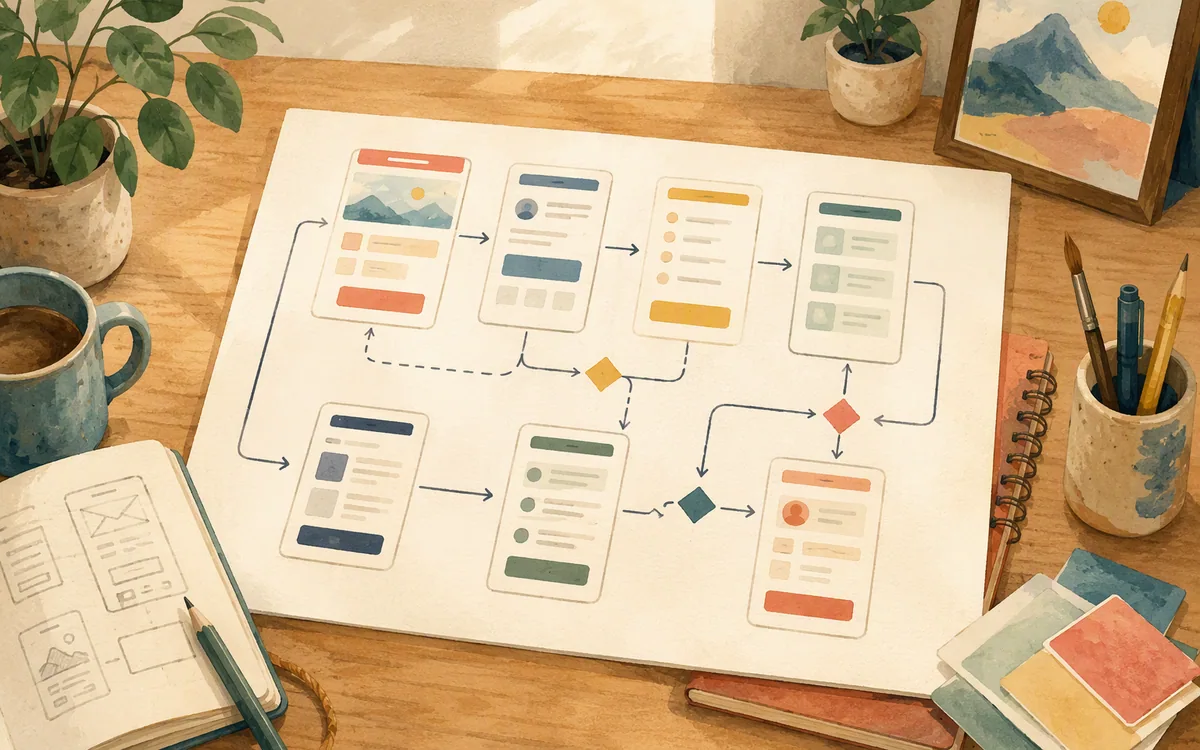
Start with a reference frame and document the observable facts: content order, density, navigation pattern, common control shapes, and where the screen directs attention. Then make a new component inventory. For example, the source may have a top bar, filter chips, an alert card, a two-line list row, and bottom navigation. Recreate those as your components with your own naming, colors, content, type choices, and interaction requirements.
After the first faithful reconstruction, deliberately diverge. Replace copied copy with realistic product copy. Swap visual tokens. Combine or remove sections that do not fit your user flow. If a competitor uses five card variants, you may discover that your app needs two. That is the point: the screenshot lets you inspect an existing solution while your component system becomes simpler and owned by you.
A useful checkpoint is after three screens. If every screen has a one-off button, padding value, or icon treatment, stop adding frames. Consolidate the repeated patterns before the file turns into a screenshot trace made of hundreds of unrelated layers.
For a legacy build, compare the new components against actual app behavior with the original team where possible. Screenshots often preserve the old visual result while losing the product rules that caused it.
Pick the handoff format before you pay for a tool
The right purchase depends on what must exist at the end of the reconstruction. A tool can produce a convincing preview and still fail your handoff requirement.
Choose a Figma file if a designer needs to revise the system, create variants, annotate edge cases, and retain ownership of the source of truth. This is the recommended handoff for most redesigns of 10 to 30 mobile screens.
Choose code if the screen is a technical spike, a disposable prototype, or a starting implementation that engineers will rewrite around existing architecture. Builder.io, Locofy, and Anima are relevant here, with the important caveat that generated code needs code review. Inspect semantics, assets, layout behavior, state handling, and the cost of integrating it into your app before treating it as a time estimate.
Choose both when design and engineering must work in parallel: reconstruct a clean Figma source, then use a code-oriented tool to accelerate a first implementation. This avoids the common failure mode where the team accepts uneditable generated output because it arrived quickly.
Figma is the winner because it gives you the durable source. Builder.io is the better pick if rapid code direction is the dominant need. Locofy and Anima fit best after a disciplined Figma rebuild, not before it. Uizard fits early concept work, where speed matters more than exact preservation.
A practical reconstruction workflow for an old build or competitor reference
Use this sequence for a screen set that has to survive review, not just impress in a demo.
- •Capture the reference at the target device size. Record platform, viewport, theme, and state. A cropped screenshot with no device context creates bad assumptions immediately.
- •Put the image in Figma on a locked reference layer. Create a reconstruction frame above it at the exact dimensions.
- •Rebuild two representative screens manually. Use them to establish spacing, typography, navigation, and component rules.
- •Use an AI or code-oriented tool only where it saves obvious setup time, then compare output against the reference and clean the structure.
- •Replace source branding, copy, and assets as you go. Do not leave this until the end; it hides layout problems.
- •Hand off a Figma file, code, or both according to the decision made before the rebuild began.
Once the base is imported and the first screen is structurally sound, floow.design is useful for the next phase: describe the changes you want in plain English and generate new iOS and Android screen directions, then export to Figma or supported code formats. It is not the tool for tracing a screenshot pixel by pixel. It is the faster route from a reconstructed baseline to editable, on-brand screens that no longer need to resemble the old app.
Best screenshot reconstruction tools ranked by mobile UI fidelity
| Tool | Fidelity for matching a screenshot | Editable result and handoff | Best use |
|---|---|---|---|
| Figma | Highest after manual reconstruction; every mismatch can be corrected | Native editable Figma layers and a Figma file | Rebuilding a durable mobile design source |
| Uizard | Good for a quick interpretation; weaker on dense or unusual UI | Editable mockup workflow; verify current export options | Early visual exploration |
| Builder.io | Useful first implementation direction, not the most controlled visual rebuild | Code-oriented output; verify current product export options | Fast technical prototypes |
| Locofy | Depends heavily on the quality of the input design | Code-oriented handoff from structured design work | Moving clean Figma screens toward implementation |
| Anima | Depends heavily on the quality of the input design | Code-oriented handoff from structured design work | Turning maintained design layers into a code baseline |
What it costs
Figma offers a free tier and paid plans with broader collaboration, administration, and usage allowances; it is the practical free starting point because you can import a screenshot and rebuild it manually without paying for a conversion engine. Uizard, Builder.io, Locofy, and Anima use their own free/trial and paid-plan structures, often with limits tied to projects, seats, AI use, exports, or code generation. floow.design is paid beyond its trial. Published prices, included exports, and AI allowances move, so check each vendor’s current pricing page before comparing a team purchase.
Mistakes that cost you the most
Accepting the first AI conversion as an editable design system.
Inspect layers, rebuild repeated controls as components, and compare the finished screen over the source screenshot at the target size.
Using screenshot measurements as universal design tokens.
Extract likely patterns from several screens, then define your own spacing and type rules instead of preserving every accidental pixel value.
Sending generated code straight into a production mobile app.
Treat generated code as a prototype baseline. Have engineering review layout behavior, state handling, accessibility, dependencies, and architecture fit.
Copying a competitor’s brand, copy, and distinctive assets into a redesign file.
Use the reference to study structure and behavior, then replace branding, content, imagery, and visual tokens with original work.
Frequently asked questions
Can I turn a screenshot of an app into an editable design?
Yes, but the level of editability depends on the method. In Figma, you can import the screenshot as a locked reference and rebuild it with real frames, text, components, and Auto Layout; that produces the most dependable editable result. AI converters can create an editable first draft, but overlapping elements, unusual icons, custom fonts, and hidden states usually require manual correction.
What's the best free tool to convert a screenshot to Figma?
Figma is the best free starting point for screenshot reconstruction because its free tier lets you import a reference and create a genuinely editable Figma design file. It is not a one-click automatic converter, so you must rebuild the screen manually or use an additional conversion tool for a draft. That manual work is why Figma produces better fidelity for serious mobile redesigns.
How accurate is AI screenshot-to-design conversion?
AI screenshot-to-design conversion is accurate enough to identify common layout regions and standard controls, but it is not reliable enough to treat as a finished mobile UI specification. It commonly misreads overlapping layers, shadows, custom fonts, image crops, and fixed versus scrolling elements. Expect a useful first draft, then budget a design review pass to correct spacing, hierarchy, components, and missing states.
Can I rebuild a competitor's app screen from a screenshot legally?
You can study a competitor’s app screen to understand patterns and evaluate product ideas, but shipping a close copy can create legal and commercial risk. Screenshots may contain copyrighted artwork, trademarked branding, proprietary copy, and distinctive visual expression. Use the reference for research, then create original components, copy, assets, branding, and flows. For a high-stakes product or close visual match, get advice from qualified legal counsel.
Should I use Figma or a code generator for a legacy app rebuild?
Use Figma first if the legacy app needs a maintainable design source, visual review, and deliberate component cleanup. Use a code generator after the Figma structure is sound when you need a prototype or implementation starting point. Starting with code from a screenshot often hardens incorrect assumptions about layout and state before the design team has agreed on what should change.
Where this leaves you
Pick Figma for the rebuild, not because it is the fastest first click, but because it leaves you with a screen your team can inspect, change, and hand off. Use Uizard for quick visual exploration and Builder.io, Locofy, or Anima when code handoff is the priority. Once the reference screen is rebuilt, use floow.design to describe the new direction and move from an old or competitor baseline to original, on-brand mobile screens faster.
Design the screens before you commit to a tool
A team rebuilding an old or competitor app wants to go from screenshot to editable, on-brand screens fast, and can describe changes to floow.design once the base is imported.
If that is roughly your situation: describe the app in plain English and floow.design draws the iOS and Android screens, takes your changes by chat, and exports the result to Figma or to Flutter, React Native, SwiftUI and Jetpack Compose.
Free tools you can use right now
- •App Store Screenshot Generator — free, no sign-up
- •App Store Screenshot Sizes — free, no sign-up
- •Type Scale Generator — free, no sign-up
Related reading
Design your mobile app with AI.
Generate pixel-perfect iOS and Android screens in seconds, then export to Figma or code.
You might also like…
 Roundups24 September 2026Figma to React Native conversion Tools, RankedCompare Figma-to-React-Native tools by cleanup work, not demos. See which exports become components and which remain handoff artifacts.By floow.design Team, Mobile Design
 Guides24 September 2026Convert Figma design to Flutter code free: RealitySee what free Figma-to-Flutter exports preserve, what breaks in production, and where paid tools reduce—but do not remove—manual cleanup.By floow.design Team, Mobile Design
 How-to24 September 2026Figma design to code AI tools for native handoffTest the native handoff before launch: what Figma files lose in SwiftUI and Jetpack Compose, and how to prevent expensive rebuilds.By floow.design Team, Mobile Design