
Best Android app UI kit Sources by Category
Find maintained mobile UI kits for fitness, music, booking, and niche apps—and learn when a custom AI starting point saves days of rework.

For a standard mobile product, choose Figma Community and established UI-kit marketplaces before any other android app ui kit source: they give you the most inspectable files and the widest category coverage. Choose floow.design instead when your flows are unusual or the downloaded kit is missing half the product; a prompt-built starting point is usually cheaper than forcing a generic kit to fit.
The short version
Our pick: Figma Community, supplemented by a reputable paid UI-kit marketplace when the license and update history are clear.
Best for: Teams building familiar fitness, music, booking, marketplace, or store flows that can start from an editable Figma file.
Skip it if: Do not start with a downloaded kit if your app has uncommon roles, compliance-heavy journeys, or a flow structure the kit does not already support.
Key takeaways
- •Figma Community is the best first stop for editable mobile UI kits, but inspect the author, recent edits, component structure, and license before committing.
- •A free kit often saves visual styling work, not product-design work. Once your real flow differs, expect to rebuild states, edge cases, and navigation.
- •“Free download” does not automatically mean commercial use is permitted; use the specific file or marketplace license, not the search-result label.
- •Prompt-generated screens are a better starting point for unusual products, then a selected kit can supply the visual direction and component rules.
What's on this page
- •The winner: use Figma for common app categories, not for every app
- •Where free niche kits are maintained—and where they quietly die
- •A downloaded kit usually solves 30% of the work, then exposes the other 70%
- •Free-download licensing is a procurement check, not a footnote
- •How Figma, Uizard, Visily, Canva, and Mockplus fit a mobile-kit workflow
- •Use a kit’s visual system, then generate the screens it does not cover
- •Best source by category: fitness, music, booking, podcast, and uncommon apps
The winner: use Figma for common app categories, not for every app
Figma Community is the best starting point for category-specific mobile kits because you can open the actual file before committing, inspect its components, and see whether the author has kept it current. For a conventional fitness tracker, music player, restaurant booking flow, or small marketplace, that is more useful than an AI-generated blank canvas.
Start with a kit only if it already contains the screens that make your product real. A useful kit has more than a home screen and a polished detail page. For example, a booking app should show search, availability, date selection, confirmation, cancellation, empty results, and a payment or deposit state. A fitness kit should cover workout detail, active workout, progress, rest, and account states.
Figma loses to a prompt-based screen generator when the category label hides a nonstandard product. An Islamic education app with prayer-time preferences, saved lessons, family profiles, and donation receipts is not just a “religion app.” A two-sided local-service product is not just a taxi template with different colors. In those cases, a generic kit becomes an expensive visual reference rather than a usable foundation.
Treat the kit as a shortcut for a familiar visual language. Do not treat it as proof that its navigation, data model, or states match the app you need to ship.
Where free niche kits are maintained—and where they quietly die
For free kits, look first at Figma Community files from identifiable creators or teams and at design-resource marketplaces that show the seller, license, file contents, and update history. Those are not guarantees of quality, but they give you evidence to evaluate. A file with named components, variants, styles, and a visible revision trail is far safer than an anonymous archive download.
Niche searches are where the quality drops fastest. Search results for an Islamic app, a podcast app UI kit, or a gym app UI kit often contain a single attractive concept rather than a maintained product kit. The visual design may still be usable. The trouble appears on day three, when you need a selected state, long Arabic text, a downloaded episode state, a failed payment, or an accessibility-sized label and discover that none exists.
Use this five-minute maintenance check before you duplicate or buy a file:
- •Open the layers: are screens built from reusable components rather than detached groups?
- •Check variants: do buttons, inputs, tabs, cards, and navigation have states?
- •Check recent activity and author identity where the source displays them.
- •Read comments or file notes for known gaps.
- •Compare the screen list against your first release flow, not against the thumbnail.
Abandoned kits are still fine as mood boards. They are poor foundations for 25 screens of production work. If you cannot identify the original creator or license, do not put the file into a commercial product repository.
A downloaded kit usually solves 30% of the work, then exposes the other 70%
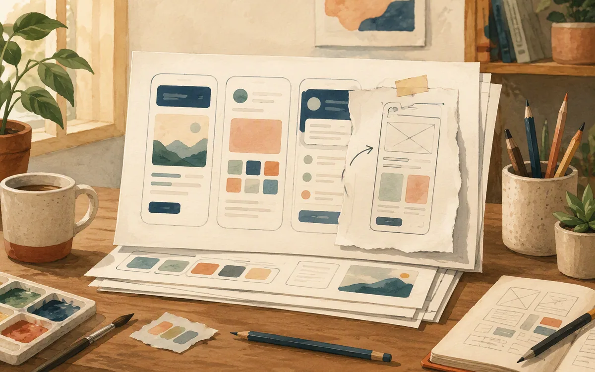
The usual mistake is counting screens instead of counting decisions. A kit may include 40 artboards, but if it assumes one account type, one currency, one booking rule, and one happy path, its coverage is shallow. Your product starts diverging as soon as you add real behavior.
Take a taxi booking app UI kit free download. It may include pickup, destination, driver matching, trip progress, and rating. Your actual scope may also require airport pickup instructions, scheduled rides, multiple stops, ride cancellation reasons, driver contact permissions, receipts, promotional credits, support, and no-driver availability. Those are not small edits. They change the information hierarchy and create new state combinations.
The same applies to a music app UI kit free download. Replacing artwork and track names is easy. Adding a subscription gate, offline downloads, queue management, lyrics, creator profiles, parental controls, or an audio-quality setting is not. You will spend time breaking apart fixed card layouts, repairing auto layout, and making components that the original author never needed.
For unfamiliar products, floow.design can create a closer first pass from your actual requirements: describe the user, task, platform, screens, and constraints, then iterate in chat. It will not replace product decisions or a final UX review. It does avoid the false economy of recoloring a kit whose core assumptions are wrong.

Free-download licensing is a procurement check, not a footnote
A file described as “free” can be free to view, free for personal use, free with attribution, free only under a platform’s asset terms, or free for commercial work with conditions. The only label that matters is the license attached to the exact file you download. Search snippets, reposts, and Pinterest images do not grant rights.
Before using an app store UI kit or any category kit in a client or paid product, record four things: the original source URL, the license version shown at download, the creator or seller, and whether the license covers commercial use and modification. If the kit includes photos, icons, typefaces, device mockups, or brand marks, check those assets separately. The kit author may have rights to the layout but not to every asset placed inside it.
Be especially cautious with free files copied between resource sites. The first upload may have a clear commercial license; the copied download may have none. If the source is unclear, recreate the visual direction from scratch rather than importing the source file.
Paid marketplace licenses also need reading. A purchase can cover one end product, one user, a particular client arrangement, or a limited distribution model. Terms differ by seller and marketplace and can change. Get the current terms from the vendor’s own page before purchase, particularly if you are making a white-label app or delivering source files to a client.
This is unglamorous work. It is still cheaper than explaining a rights problem after launch.
How Figma, Uizard, Visily, Canva, and Mockplus fit a mobile-kit workflow
These tools solve different parts of the job. Buying based on the word “AI” or “template” leads to the wrong expectation.
| Tool | Best role for mobile UI-kit work | Where it falls short |
|---|---|---|
| Figma | Editing imported kits, creating components, and handing off detailed screen designs | It does not decide missing product flows for you |
| Uizard | Fast early concepts and editable UI drafts from rough input | Treat the output as a starting point, not a complete design system |
| Visily | Collaborative low- to mid-fidelity planning and quick UI exploration | Check whether its generated patterns suit native mobile conventions before committing |
| Canva | Marketing assets and simple visual mockups around an app concept | It is not a strong choice for a production mobile UI component system |
| Mockplus | Wireframing, design collaboration, and prototype-oriented review workflows | It is not a substitute for a category-specific, production-ready screen kit |
For a team that already has a chosen kit, Figma is the practical winner because the file itself is the working artifact. You can replace styles, establish variants, and remove the screens you will never build. Uizard and Visily are more useful when you need to make a rough direction visible before settling on a kit. Canva is often useful beside the app project, not inside the app UI workflow. Mockplus is useful when review and prototype communication are the immediate bottleneck.
None of these tools makes a weak kit complete. Make that call from the screen inventory and your flow map.
Use a kit’s visual system, then generate the screens it does not cover
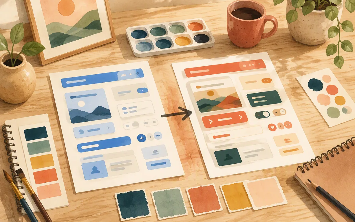
The most economical hybrid workflow is simple: keep the kit for its visual rules and replace its missing flows with screens designed around your actual product. You are not trying to preserve every original artboard. You are preserving the parts that create consistency: color roles, typography scale, spacing, card treatment, icon style, button hierarchy, navigation pattern, and form behavior.
First, extract a compact reference sheet from the kit. Include one primary button, one secondary button, one input, one card, one list row, one modal or sheet, the navigation elements, and examples of empty, loading, and error states. Then write a screen brief for each gap: user goal, required data, action, success state, failure state, and platform.
For example, a gym kit may cover plans, workout cards, and progress charts but omit trainer rescheduling, medical-profile confirmation, class waitlists, and membership freezes. Feed those requirements into floow.design along with the reference sheet’s visual rules. Generate the missing iOS or Android screens, review them against the chosen components, and export to Figma or code for the next step.
Do not ask an AI tool to “make it like this kit” and accept the first result. Give it named patterns: rounded 16-pixel cards, bottom navigation with four items, large metric type, outlined secondary actions, and compact list rows. Then check tap targets, contrast, text expansion, and state coverage. The result should look like one product, not a template glued to a separate concept.
Best source by category: fitness, music, booking, podcast, and uncommon apps
For fitness and gym apps, start in Figma Community or a paid marketplace with a clear license. A good gym app UI kit includes active workout states and progression, not only dashboard charts. If your app is a basic training tracker, a kit can get you moving quickly. If it includes coaching, health intake, wearables, classes, and subscriptions, budget for new screens.
For music and podcast products, prioritize playback states. A credible podcast app UI kit needs episode detail, queue or saved items, download status, search, playback, and empty library states. Music kits often look better in a gallery than they behave in a real player, so test long titles, explicit labels, offline content, and player controls before adopting one.
For taxi, travel, and booking apps, look for flow completeness over visual novelty. Search and filter are only the beginning. Calendar behavior, inventory or driver availability, changes, cancellation, receipts, and support determine whether the kit has value.
For an app store UI kit, use it as a pattern reference for browse, category, search, ratings, and product detail—not as a ready-made store product. Marketplace economics, seller tools, refunds, and moderation will require additional work.
For unusual categories, including localized community, education, faith, and regulated services, start from the flow instead of the category search. A generic kit is likely to give you a clean home screen and no answer for the screens that determine whether users can complete the task.
Where to start for category-specific mobile UI kits
| Starting point | Best use | Maintenance and licensing signal | Choose it over a generic kit when |
|---|---|---|---|
| Figma Community | Common fitness, music, booking, store, and dashboard patterns | Inspect the file structure, author, notes, and license on the original file page | The kit already covers most of your release flow |
| Reputable paid UI-kit marketplace | Polished visual systems and broader screen packs | Read the seller terms and asset licenses; check what files and updates are included | You need a strong visual direction and can verify commercial rights |
| Free resource-site download | Early inspiration or low-risk experiments | Often weakest; trace it to the original creator before use | Never, unless the source and commercial license are explicit |
| Prompt-based screen generation | Unusual categories and missing workflow screens | Output needs product, accessibility, and visual review | Your requirements differ materially from the kit’s assumptions |
| Tool-bundled templates | Quick concepts and simple internal demos | Evaluate export, editability, and whether templates are mobile-specific | You need a draft before investing in a design system |
What it costs
Do not make the decision on a “free” label alone. Figma, Uizard, Visily, Canva, and Mockplus each use their own plan structures, and UI-kit marketplaces may charge per asset, through subscriptions, or under separate commercial licenses. Paid plans generally buy collaboration capacity, export options, advanced features, or broader asset access; they do not automatically grant commercial rights to every downloaded kit. Published prices and terms move, so check each vendor’s current pricing and the exact asset license before buying.
Mistakes that cost you the most
Choosing a kit from its hero screen
Map your first-release flow and require matching screens for success, empty, loading, error, edit, and cancellation states.
Assuming a free download is commercially reusable
Use the license on the original file or marketplace listing, and retain a copy of the terms with the project records.
Recoloring a generic kit instead of changing the interaction model
Keep only the visual system if it fits; redesign navigation, data entry, and decision screens around the actual workflow.
Importing a kit without auditing components
Check auto layout, styles, variants, text behavior, and whether screens are editable rather than flattened artwork.
Frequently asked questions
Where can I download a free taxi booking app UI kit?
Start with Figma Community and search for taxi, ride-hailing, transport, or booking mobile UI files, then inspect the original file’s author, editability, and license. Free resource sites can also surface concepts, but trace every download back to its original creator. A taxi kit is useful only if it covers your real flow, including availability, cancellation, trip status, and receipts.
Are free mobile app UI kits safe to use commercially?
Free mobile app UI kits are safe for commercial use only when the license for that specific file explicitly permits commercial use and modification. “Free download” may mean personal use, attribution-required use, or access under separate platform terms. Check fonts, images, icons, and device mockups as well, because those assets can have separate rights from the UI layout.
What's a good UI kit for a gym or fitness app?
A good gym or fitness app UI kit is an editable Figma kit with workout detail, active-session, progress, rest, profile, and empty states—not just a dashboard and exercise cards. Figma Community is the best first place to inspect options. If your app includes trainers, class booking, medical intake, or membership changes, expect to design additional screens beyond the kit.
Can I customize a UI kit's screens without a designer?
You can customize a UI kit without a designer if the file uses editable components, styles, auto layout, and clear variants. You can safely change copy, imagery, colors, simple layouts, and screen order after learning the tool. Be more careful with navigation, accessibility, responsive text, complex forms, and unusual states; those changes require product-design decisions, not just visual editing.
Should I use a music or podcast kit for a commercial audio app?
Use a music or podcast kit for visual direction and standard playback patterns, but do not assume it covers a commercial audio product. Test playback controls, long titles, downloaded content, queues, search, subscription states, and empty libraries. Confirm commercial licensing on the original asset before reuse, then create any missing flows as part of your own product design.
Where this leaves you
If you found a free kit that has the right look but leaves you with missing booking, membership, player, or account screens, do not spend a week forcing it to fit. Keep its visual rules, define the uncovered flow, and use floow.design to generate matching mobile screens without hiring a separate designer for every gap.
Design the screens before you commit to a tool
Reader who found a mismatched free kit and needs missing screens designed to match without hiring anyone.
If that is roughly your situation: describe the app in plain English and floow.design draws the iOS and Android screens, takes your changes by chat, and exports the result to Figma or to Flutter, React Native, SwiftUI and Jetpack Compose.
Free tools you can use right now
- •App Store Screenshot Generator — free, no sign-up
- •App Store Screenshot Sizes — free, no sign-up
- •Device Size Reference — free, no sign-up
Related reading
Design your mobile app with AI.
Generate pixel-perfect iOS and Android screens in seconds, then export to Figma or code.
You might also like…
 Roundups24 September 2026Best mobile app mockup generator tools for pitch decksCompare app mockup tools by the first 30 seconds of investor impact: polish, clickable demos, speed, and where templates start to show.By floow.design Team, Mobile Design
 Roundups24 September 2026Mobile app UI template free download: License RulesRank mobile UI kit sources by the rights that matter at launch: commercial use, attribution, resale limits, and editable source files.By floow.design Team, Mobile Design
 Roundups24 September 2026Best AI UI Mockup Generator for Mobile ScreensCompare AI tools that turn screenshots and sketches into editable mobile screens, not static phone-frame images. See the best pick and its limits.By floow.design Team, Mobile Design