
Framer alternative Reddit: Mobile App UI Picks
Reddit’s Framer alternatives solve website problems. Compare the right tools for iOS and Android app screens, prototyping, and export.

For a framer alternative reddit readers can use for mobile app UI, pick floow.design if you need iOS or Android screens from a prompt and want to export the result to Figma or app code. Pick Webflow or stay with Framer for a marketing website instead. They solve different jobs: website publishing versus designing a 20-screen mobile product.
The short version
Our pick: floow.design for mobile app screen design
Best for: Product teams and founders who need a first set of iOS or Android screens quickly, then want to refine them and hand off to Figma or code.
Skip it if: Do not pick it for a marketing site, a CMS-driven content site, advanced web interactions, or a clickable prototype with complex branching logic.
Key takeaways
- •Most Reddit requests for a Framer replacement are really requests for a cheaper or less frustrating website builder—not a mobile app UI tool.
- •For marketing sites, compare Framer with Webflow and code-oriented tools such as v0; for app screens, compare dedicated UI-generation and wireframing tools instead.
- •Figma remains the safest shared workspace for detailed mobile UI design, design systems, review, and developer handoff.
- •A fast first draft is not the same as a working prototype: validate navigation, loading, empty, error, and permission states before treating generated screens as a product spec.
- •Published plans change often. Compare the paid tier you actually need: editors, projects, publishing, CMS capacity, exports, and commercial-use rights.
What's on this page
- •Reddit’s Framer question usually starts with the wrong category
- •What Reddit users actually complain about with Framer
- •Choose website alternatives and mobile-screen alternatives separately
- •The buyer’s comparison: output, handoff, and the work left after generation
- •Quick cost comparison: compare the plan shape, not a stale price
- •Where each tool loses—and why that matters on day three
- •A recommended workflow for a 20-screen mobile app
Reddit’s Framer question usually starts with the wrong category
Framer is primarily a website builder with visual design, publishing, responsive layout controls, and interaction features. It can be useful for showing an app concept inside a browser, but it is not the natural starting point for designing a native iOS or Android product.
That distinction gets blurred in Reddit threads. Someone asks for a Framer alternative, then lists problems such as publishing a portfolio, managing a blog, adding a CMS collection, hosting a landing page, or getting a responsive site live. Those are website-production problems. A mobile product team has another set of constraints: safe areas, tab bars, keyboard behavior, platform conventions, dense forms, permission prompts, empty states, and a handoff that developers can build.
If your deliverable is a homepage, pricing page, docs site, or startup launch site, compare website builders. If your deliverable is a 15- to 40-screen app flow, stop treating a website builder as the default benchmark.
This is also why generic lists of framer alternatives that are cheaper can waste a day. A lower-priced publishing plan is irrelevant if you still have to redraw every mobile screen in another tool. The useful question is: what must exist at the end of this week—an online marketing site, a reviewable app flow, or implementation-ready UI?
Alternative framing ideas help here: frame the purchase around the output, not the tool name. A published site needs hosting and content operations. A mobile app needs screen coverage, consistent components, platform-aware layouts, and a credible engineering handoff.

What Reddit users actually complain about with Framer
The recurring complaints are practical, not philosophical. Buyers often describe three pressure points.
- •Pricing changes or jumps at the point of growth. A project begins as a simple site, then needs another editor, more pages, a custom domain arrangement, localization, or CMS capacity. The bill changes because the scope changed, but the buyer still feels trapped after committing the design.
- •CMS limits and content workflow friction. Marketing teams want collections, filters, structured content, editorial access, and predictable publishing. Framer can be a good fit for a visually led site, but a content-heavy operation should test its exact collection model and editor workflow before migrating.
- •The learning curve for interactions. A polished hover, scroll, animation, or responsive behavior can look simple in a demo. Building it consistently across breakpoints takes time. The third day is where teams discover that one hero animation, one tablet layout, and one late copy change have created several things to recheck.
Those complaints are valid, but none says that Framer is bad at mobile app design. They say the team is evaluating the economics and operating model of a web tool.
Use the complaint to choose the category. If publishing and CMS management are the problem, test Webflow alongside Framer. If generating a web interface and code is the problem, test v0. If the real pain is producing a coherent onboarding, dashboard, checkout, and settings flow for a phone app, move to app-screen tools or Figma rather than searching for another website publisher.
A tool can be expensive for the wrong task even when its subscription is objectively lower than a competitor’s.

Choose website alternatives and mobile-screen alternatives separately
For websites, the closest decision is usually Framer versus Webflow. Both are web-first products, but the fit differs. Framer is often attractive when a small team wants to design and publish a visually distinctive marketing site in one place. Webflow is the stronger candidate when the site’s content model, CMS workflow, and longer-term web operations deserve more attention. v0 belongs in a different web-first lane: it is useful for generating interface ideas and code-oriented web work, not for replacing a visual website CMS by itself.
For mobile app screens, use a different shortlist:
- •floow.design: prompt-to-screen generation for iOS and Android UI, chat iteration, and export to Figma or supported app-code formats. Use it to get a product flow moving, not to publish a landing page.
- •Uizard: a practical option for quick wireframes, early mockups, and collaborative concept work. It is useful when fidelity matters less than getting stakeholders aligned on a flow.
- •Visily: aimed at rapid wireframing and UI ideation, especially for teams turning requirements into screens before a detailed design pass.
- •Figma: the control option. Use it for precise layout, components, variants, shared libraries, detailed review, and the design file a team will maintain over months.
These categories overlap at the edges, but the job is different. A website tool asks, “How do I publish this responsive page?” A mobile UI tool asks, “What happens after a user taps continue, denies permission, has no data, or returns tomorrow?”
That second question is the one that decides whether your app design survives development.
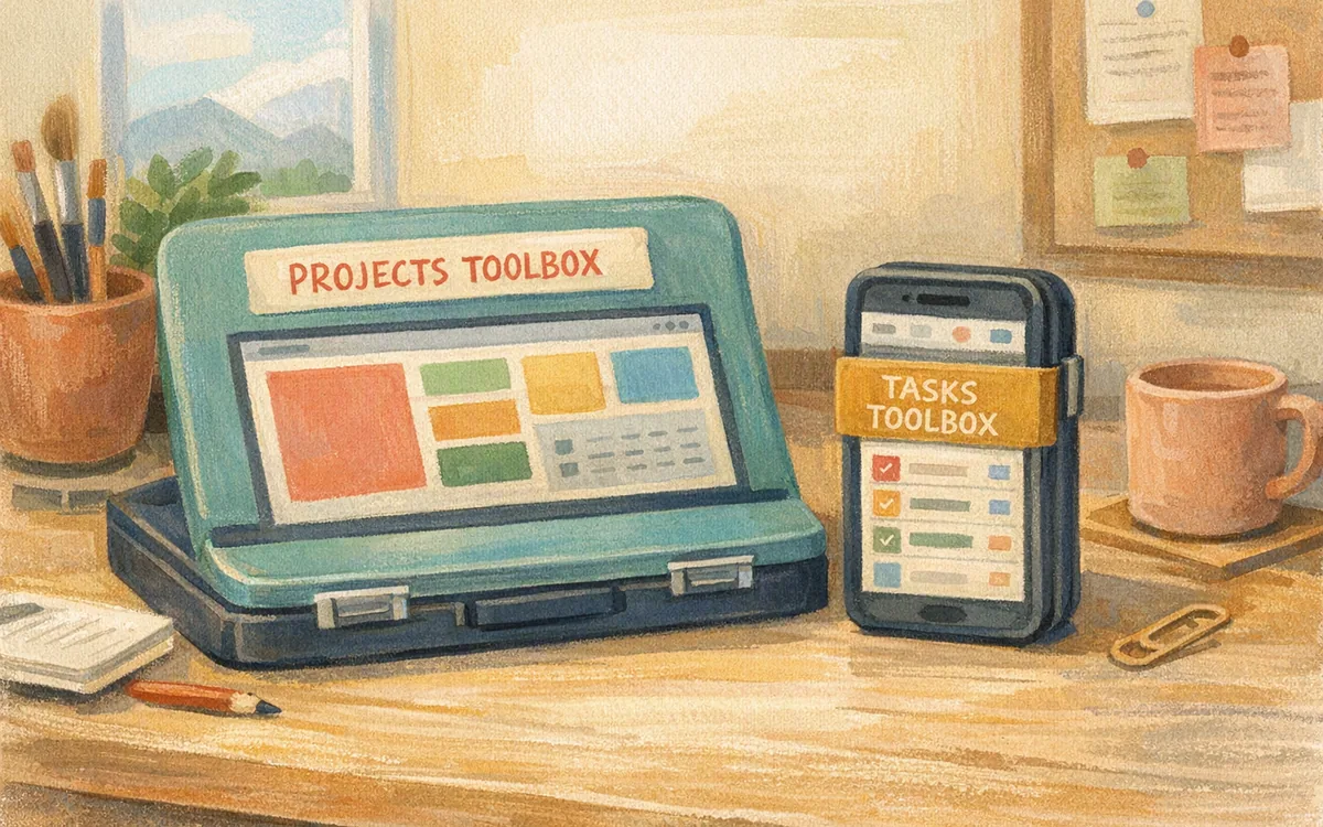
The buyer’s comparison: output, handoff, and the work left after generation
Do not buy on the quality of one screenshot. Run a small test that resembles your product: onboarding, sign-in, a primary task, a list, a detail view, an empty state, and settings. Seven screens reveal more than a beautiful dashboard prompt.
For a website project, test responsive behavior at desktop, tablet, and mobile widths; editing a CMS item; publishing a change; and reproducing one interaction from the design brief. Framer and Webflow should be judged there. Ask whether a non-designer can update the page safely without changing the layout.
For an app project, test a 12-screen flow. Include long names, validation errors, a disabled button, an offline or loading state, and a bottom sheet. Then ask a developer to inspect the handoff. The expensive failure is not a weak first draft. It is spending two days rebuilding a draft because the exported result has no useful structure, missing states, or inconsistent spacing.
Figma wins when your team already has a mature component library and needs pixel-level control. Uizard and Visily win when you need to make a low-risk concept visible before committing to detailed UI. A prompt-based app-screen generator wins when speed to a credible mobile-specific starting point matters and you will still review the result.
Neither a website builder nor an AI screen generator removes product design work. You still need to decide hierarchy, copy, states, accessibility, and which platform conventions to follow. The better tool simply reduces the blank-canvas phase.
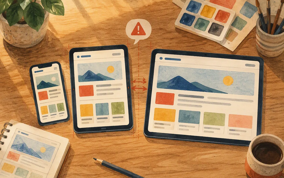
Quick cost comparison: compare the plan shape, not a stale price
Published prices, feature limits, and included usage change, so verify the current vendor pages before buying. The useful comparison is what each pricing structure makes you pay for as the project grows.
Framer and Webflow generally organize paid use around website production: site or workspace plans, publishing, collaborators, and, where applicable, CMS or traffic-related needs. The cheapest entry point may work for a single campaign page, then stop being adequate once you add editors, content collections, or multiple sites.
Figma typically separates individual or starter access from paid editor-oriented collaboration and larger organization or enterprise arrangements. Your cost rises with the number of people who need editing rights and with governance needs—not with a published website.
Uizard and Visily commonly use a free entry level plus paid individual or team tiers, with limits tied to projects, collaboration, and advanced capabilities. They are usually easier to justify for an early concept than a full product-design operation, but check whether the plan supports the number of teammates and projects you actually have.
v0’s cost model should be assessed as AI usage plus the workflow needed to take generated web code into production. A cheap first generation is not a cheap project if your team must heavily rework it.
For app-screen generation, paid plans should be evaluated against screen volume, iteration needs, export formats, and whether the output cuts time from your Figma and engineering process. Buy one month for a real 15-screen test before annualizing anything.
Where each tool loses—and why that matters on day three
Framer loses for native app work because its strongest capabilities are web layout, web interaction, and site publishing. You can mock up a phone interface there, but your team is still working in a web-shaped environment. That becomes obvious when the flow grows past the first few screens.
Webflow loses if you want fast mobile product exploration. Its web production strengths do not make it a shortcut to iOS and Android screen specifications. Use it for the site that explains the product, not automatically for the product itself.
Figma loses on speed when you have no starting point, no component library, and a deadline tomorrow. It gives you control, but control means someone must make hundreds of small choices. It remains the better purchase for teams whose design system and review process are the asset.
Uizard and Visily lose when you need a refined, implementation-minded visual system without a follow-up design pass. They can accelerate wireframes and discussion, but a founder should not mistake early-flow clarity for production-ready UI.
v0 loses if the desired output is a native mobile app flow rather than web code and web components. It can be valuable for web products, but it is not the direct answer to an Android settings flow or an iOS subscription paywall.
The practical rule: use one tool to produce the marketing site, another to establish the app UI, and a maintained design system to keep both coherent. Trying to force one subscription to do all three is how teams end up paying twice.
A recommended workflow for a 20-screen mobile app
Start with a written screen inventory. For a modest app, list 20 screens before designing: splash or auth, onboarding, home, search, list, detail, create or edit, confirmation, notifications, profile, settings, help, and the failure states around the core action. If you cannot list the states, a tool cannot generate them for you.
Use floow.design to turn that brief into an iOS or Android starting set, then iterate by chat on the parts that matter: navigation pattern, visual tone, data density, form behavior, and individual screen changes. Export the direction to Figma when the team needs formal review, shared components, annotations, or further polish. Exporting to supported code formats can also give engineering a concrete starting reference, but it does not replace code review, QA, or platform testing.
Then do a state pass in Figma or with your design system. Add loading, empty, error, permission-denied, success, long-content, and small-device cases. This is the pass that separates an attractive concept from an app developers can estimate.
Keep Framer for the public-facing site if that is part of the launch. Build the homepage, waitlist, case studies, and documentation where web publishing makes sense. Do not make the mobile team inherit a website-builder file just because the landing page was made there.
If your frustration with Framer came from trying to make a website tool produce app-specific results, open the app-screen tool and test one real flow before paying for another web subscription.
Framer alternatives: choose by the thing you must ship
| Tool | Best fit | What it does not replace | Plan structure to check |
|---|---|---|---|
| Framer | Marketing websites, visual web pages, and web interactions | Native mobile app UI workflow or a full app design system | Free entry options and paid publishing/workspace needs; verify current limits |
| Webflow | Content-rich or operationally complex marketing websites | Fast native mobile screen generation | Workspace and site plans, CMS needs, editors, and publishing requirements |
| Figma | Detailed mobile UI, components, design systems, and team handoff | Website hosting and CMS publishing | Starter access, paid editor seats, and organization controls |
| Uizard | Early wireframes and collaborative app concepts | A maintained high-fidelity design system or website publishing | Free entry and paid individual/team tiers; check project and collaboration limits |
| Visily | Rapid wireframing and product-flow ideation | Advanced web production or final engineering handoff by itself | Free entry and paid team-oriented tiers; confirm project and collaboration allowances |
| v0 | Web UI ideation and code-oriented web work | A visual CMS or native mobile product-design suite | AI usage and any surrounding development workflow costs |
| floow.design | Prompt-driven iOS and Android app screens with chat iteration and export | Marketing websites, CMS publishing, or complex web interactions | Paid plans after a trial; check current usage and export terms |
What it costs
There is no meaningful single “cheapest” winner because these tools charge for different units: website publishing and CMS operations, editor seats, collaboration, AI usage, or screen-generation and export capacity. Framer alternatives that are cheaper can become more expensive once you need more editors, content operations, or rework. Check each vendor’s current pricing page and run a paid-month test using one real project before choosing an annual plan.
Mistakes that cost you the most
Replacing Framer with another website builder for a native-app design problem.
Separate the marketing-site decision from the mobile-screen decision. Test an app-focused tool on a complete flow, including error and empty states.
Comparing the entry price while ignoring the first growth trigger.
Price the actual team: editors, projects, CMS collections, publishing, AI usage, exports, and expected review cycles.
Approving a generated dashboard without testing the rest of the flow.
Require at least 12 screens, including onboarding, forms, loading, errors, empty states, and settings before deciding.
Treating exported code as production code.
Use exports as an implementation starting point or reference, then apply engineering standards, tests, accessibility checks, and platform QA.
Frequently asked questions
Is Framer good for designing mobile apps or just websites?
Framer is best understood as a website builder and web-prototyping tool. It can display mobile-sized mockups and create web interactions, but it is not the strongest choice for a native iOS or Android app workflow with screen states, platform conventions, reusable app components, and engineering handoff. Use Framer for the product’s marketing site; use Figma or an app-screen tool for the app itself.
What do people on Reddit dislike most about Framer?
Reddit discussions about Framer commonly focus on pricing increases as a site grows, CMS limitations or content-management friction, and the time needed to learn and maintain polished interactions across responsive breakpoints. Those are mostly website-production concerns. They matter if you are publishing a marketing site, but they do not automatically identify the best tool for designing a native mobile app.
What's a cheaper alternative to Framer for prototyping?
For a cheap early mobile-app prototype, Uizard or Visily can be a sensible starting point because they focus on quick wireframes and collaborative concept screens. For a detailed, long-lived product prototype, Figma is usually the safer investment. For a marketing website prototype, compare Framer with Webflow instead; pricing depends on editors, publishing, and CMS requirements, so check current plans before deciding.
Can floow.design replace Framer for app design?
It can replace Framer for the specific job of generating and iterating on iOS and Android app screens, especially when you need a prompt-driven starting point and exports to Figma or supported code formats. It cannot replace Framer for marketing-site publishing, CMS content, or complex web interactions. Many teams should use separate tools for the public website and the mobile product.
Should I use v0 for a mobile app interface?
Use v0 if your target is primarily a web interface and your team wants code-oriented web UI exploration. It is not the direct substitute for a native mobile app design workflow. For an iOS or Android product, test the tool against mobile navigation, safe areas, forms, bottom sheets, and screen states, then keep Figma involved for system-level review and handoff.
Where this leaves you
The best Framer alternative depends on whether you are publishing a website or designing the product behind it. Pick Webflow when web content operations are the deciding factor. Keep Figma for a controlled, durable mobile design system. For a faster app-specific first pass, use floow.design, then validate the full flow before committing your team to a plan.
Design the screens before you commit to a tool
A reader who realizes their Framer frustration was about the wrong tool for mobile app screens opens floow.design to get app-specific results instead.
If that is roughly your situation: describe the app in plain English and floow.design draws the iOS and Android screens, takes your changes by chat, and exports the result to Figma or to Flutter, React Native, SwiftUI and Jetpack Compose.
Free tools you can use right now
- •App Development Cost Calculator — free, no sign-up
- •Phone Mockup Generator — free, no sign-up
- •Device Size Reference — free, no sign-up
Related reading
Design your mobile app with AI.
Generate pixel-perfect iOS and Android screens in seconds, then export to Figma or code.
You might also like…
 Insights24 September 2026Framer vs Webflow for app design: Why Neither FitsFramer and Webflow build responsive websites, not native app screens. See what breaks, where each helps, and what to use for iOS and Android UI.By floow.design Team, Mobile Design
 Insights24 September 2026Framer alternatives cheaper for Mobile App UICompare lower-cost Framer options for iOS and Android screens, including exports, fidelity limits, and the spend that matters for a small app team.By floow.design Team, Mobile Design
 Insights24 September 2026Figma alternatives for Linux: Mobile App DesignCompare Linux-ready mobile UI tools that avoid VMs: browser workflows, open-source options, handoff limits, and the best pick for AI screens.By floow.design Team, Mobile Design