Structural redundancy across device frames
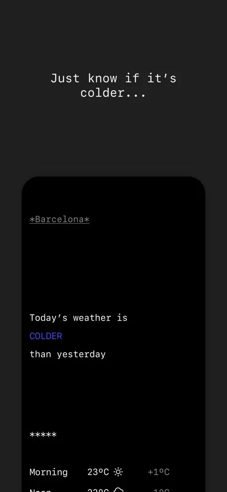
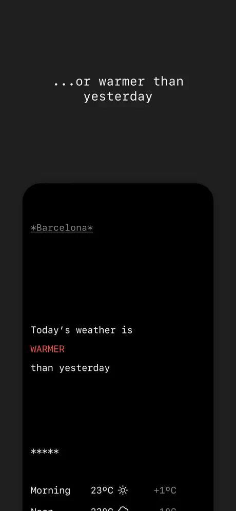
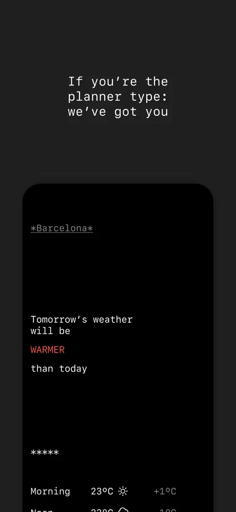
Frames 2, 3, and 7 share the same city, same vertical alignment, same asterisk divider, and same thermal row crop. In a swipeable carousel consumed in sub-second increments, this repetition threatens to stall the narrative. The shopper may swipe past frame 7 believing they have already seen it. The fix: in frame 7, change the sample location from “*Barcelona*” to a different city and shift the device crop upward to reveal more of the forecast table. Preserve the template, but introduce enough geographic and temporal variation that the temporal jump from today to tomorrow is scannable at a glance.
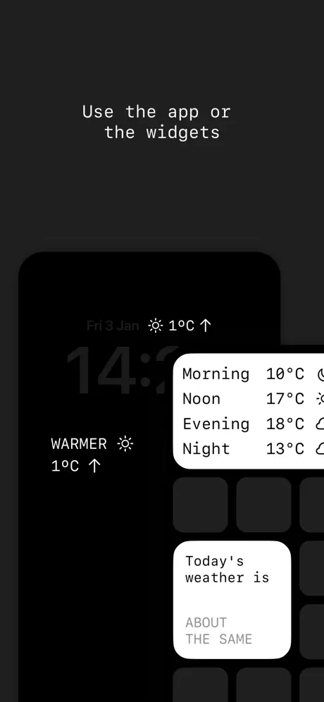
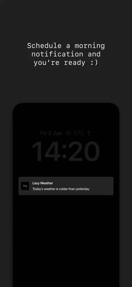
Widget frame is compositionally unstable
Frame 5 is the only high-contrast, busy shot, yet the white widgets bleed toward the right frame edge and the phone’s time display “14:” is cropped mid-character. The overlap reads as accidental rather than intentional. To correct this, the designer should pull the phone left by roughly 10% of the frame width, shrink the widgets by 8–10%, and add a subtle 1px #E5E5E5 border or 8% black drop shadow to the widget cards so they float above the dark device instead of colliding with it. This would maintain the proof-of-platform intent while restoring the spatial discipline seen in the rest of the set.
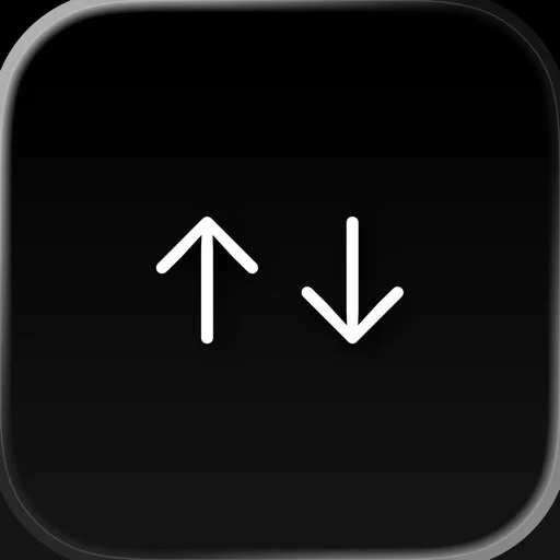
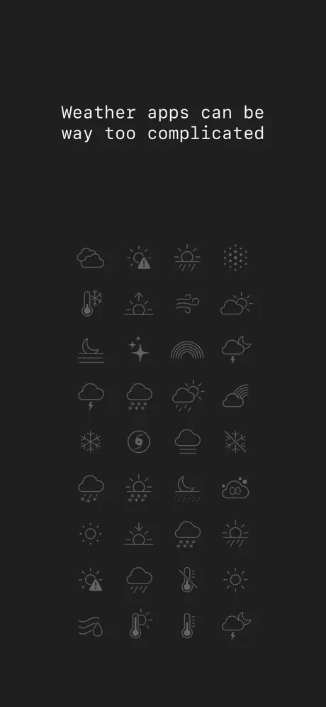
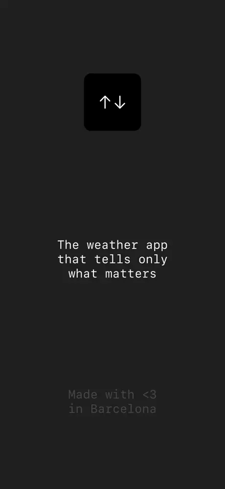
Frame 1 risks category failure at thumbnail scale
Because the opening frame contains no device, no temperature numeral, and no bold accent color, a browser scrolling search results may not identify the product category within the critical first second. The icon grid is too low-contrast to register as weather at small scale. The fix: preserve the manifesto intent, but introduce a faint, ghosted device silhouette or a large, semi-transparent temperature numeral behind the icon grid so the app’s function is legible even before the caption is read.
Localization frame lacks contextual proof
Frame 6 lists translations of “colder” in monochrome type, but it never shows the app interface localized. A list of words is less convincing than seeing “Más frío” inside the actual UI. The fix: replace the typographic poster with a side-by-side or faded swap of the device UI showing two different languages, or overlay the translated keywords directly onto the frame 2 layout in a second ghosted device. This would prove globalization without breaking the monochrome rule.
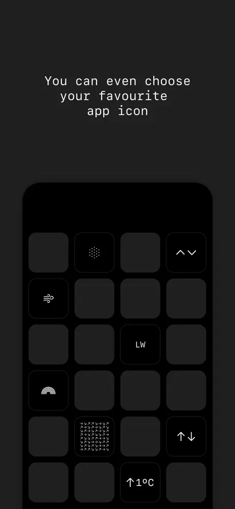
Icon grid legibility in frame 8
The alternate app icon grid in the final frame contains glyphs that dissolve at thumbnail size. The dense arrow matrix and small lettermarks become indistinguishable from dark squares. The fix: reduce the grid from sixteen visible slots to nine, increasing each cell by roughly 33%, and add a faint white selection ring around the active choice so the customization mechanic is immediately understandable. This also provides a clearer closing call to action for shoppers who have made it to the final frame.