Sunlitt app icon
WeatherScreenshot teardown12 min read

Sunlitt App Store screenshots

A product case study for a weather tool called Sunlitt. The set uses warm cream grounds and high-voltage yellow.

Set published by Flipping Hues Srls · 10 frames analysed

4.7 · 631 ratingsFreev4.10.1Updated 5mo ago
Sunlitt App Store screenshot 1
01At a glance

The set in one screen

Framing
iPhone 15 Pro with Dynamic Island, Apple Watch Ultra in Frame 7, no device in Frame 8.
Captions
Heavy sans-serif with dramatic weight contrast; first line often grey, second line near-black.
Backdrop
Warm off-white near #F2EFE6 across all frames.
Type
SF Pro Display-style heavy headlines; tracked uppercase for award badges and footer tags; in-app UI uses small rounded pills and 13-15pt metric labels.
UI / copy split
Most frames let the UI float over full-screen imagery or maps; Frame 4 is the only text-dense dark-mode table.
Frame 1 job
Proof and promise: awards, two contexts, and a category tag cloud all at once.

Sampled palette

#F2EFE6#F2EFE6
#FACC15#FACC15
#FF944D#FF944D
#121212#121212
#1C1C1E#1C1C1E
02The challenge

What this screenshot set had to solve

The central tension visible across the set is fragmentation of context. The app clearly operates in wildly different visual substrates—augmented-reality photography, vector city maps, topographic terrain, solid-colour 3D staging, dark-mode data tables, watch faces, and lock-screen widgets—and each substrate reads like a distinct product. The design challenge, therefore, was to invent a single UI syntax that could survive on top of a pine-tree panorama, a San Francisco skyline, and a flat yellow void without changing its silhouette. At the same time, Frame One is burdened with marketing proof: two Apple award badges, a double-line headline, a sub-footer of search tags, and two location sheets, all competing for the same glance. The team had to teach spatial wayfinding in under four seconds per swipe while ensuring the yellow brand anchor remained legible against both #FFFFFF text and photographic clutter.

The yellow-to-orange gradient functions as a chromic breadcrumb.
03The approach

How the set argues its case

Positional rigidity—arc, pills, sheet—and chromatic punctuation across disparate substrates. Sacrifice Frame One to marketing density so the rest can breathe. Frame Eight breaks the device convention to signal OS-level integration.

Designed for photographers, architects, and hikers who need sun position and shadow data across AR, map, and tabular contexts. The screenshot set sells breadth first, depth second. Frame One insists on awards and editorial validation before the shopper sees a feature. Frames Two through Six then methodically prove three distinct competencies—AR overlay, 3D urban shadow, and terrain shadow—before Frame Seven adds wearable context and Frame Eight closes with widget convenience. The positioning is 'pro-toolkit' rather than 'simple utility'.

04Frame by frame

Every screenshot, and the job it does

Sunlitt App Store screenshot 1 — Plan with Sun and Shade
01

Plan with Sun and Shade

On-frame caption: “Plan with Sun and Shade

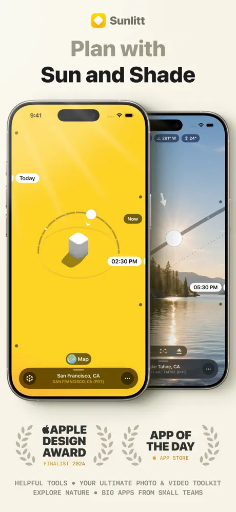
Frame One stacks two iPhone 15 Pro units on the warm cream ground near #F2EFE6. The front-left device floods its screen with a flat yellow near #FACC15, showing a white rounded 3D cube casting a brown shadow beneath an orbital arc. Caption pills read 'Today', 'Now', and '02:30 PM'. A bottom sheet reads 'San Francisco, CA' and 'SAN FRANCISCO, CA (PDT)' inside a translucent dark strip with a 'Map' button above it. The rear-right phone shows an AR photo of Lake Tahoe with the same arc and sun disc overlaid, plus '05:30 PM' and Lake Tahoe location data. Above the hardware, the word 'Sunlitt' sits beside a yellow diamond icon. Below it, the store headline reads 'Plan with' in grey and 'Sun and Shade' in near-black. Beneath the devices, two award badges are centred: 'APPLE DESIGN AWARD FINALIST 2024' and 'APP OF THE DAY' with 'APP STORE' sub-copy, flanked by grey laurels. A footer strip reads 'HELPFUL TOOLS • YOUR ULTIMATE PHOTO & VIDEO TOOLKIT EXPLORE NATURE • BIG APPS FROM SMALL TEAMS' in tracked small caps. The composition is dense: the overlapping phones create depth, but the location sheets are cropped by the lower frame edge and the footer tags compete with the award lockup for attention.
Sunlitt App Store screenshot 2 — Sun Path in AR
02

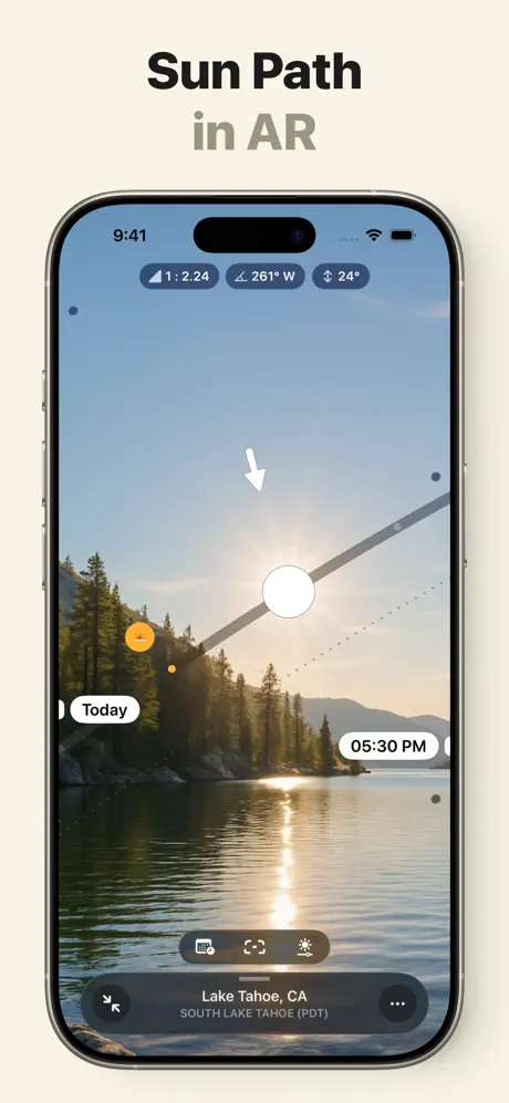
Sun Path in AR

On-frame caption: “Sun Path in AR

Frame Two isolates the AR camera view in a single centred iPhone against the same cream ground. The status bar reads 9:41. Across the top, three translucent charcoal pills display '1:2.24', '261° W', and '24°'. A thick white arrow points downward toward a large white sun disc that sits on a grey trajectory line slicing diagonally across the photograph of pine trees and lake water. UI pills are placed at the same cardinal positions as Frame One: 'Today' left, 'Now' upper-right, and '05:30 PM' lower-right. A bottom toolbar with three icons—calendar, AR glyph, and sun—sits inside a frosted dark strip, with the sheet below reading 'Lake Tahoe, CA' and 'SOUTH LAKE TAHOE (PDT)'. By pulling the AR view out of the collage and giving it a full frame, the designers make the value proposition instantly legible, though the downward arrow competes visually with the actual sun glare in the photograph.

Sunlitt App Store screenshot 3 — Shadow Map
03

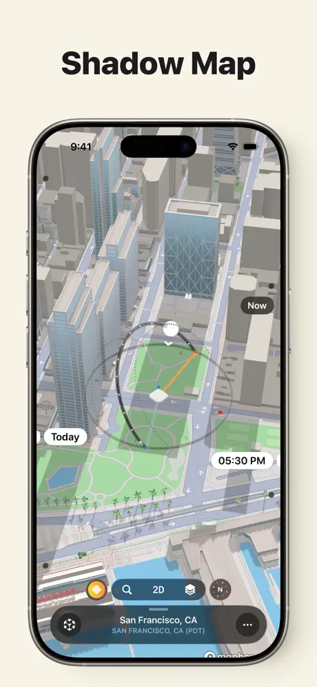
Shadow Map

On-frame caption: “Shadow Map

Frame Three swaps the camera feed for a 3D rendered map of downtown San Francisco, viewed from a steep oblique angle. The palette cools to desaturated concrete greys, steel blues, and park greens. The orbital arc is superimposed over the city grid, anchoring the interface language. The bottom toolbar introduces map-specific controls: an orange sun toggle, a magnifier, a '2D' mode button, a layers icon, and a compass marked 'N'. The location sheet at the bottom reads 'San Francisco, CA' and 'SAN FRANCISCO, CA (PDT)'. A small 'mapbox' attribution peeks out at the lower right edge. By retaining the 'Now', 'Today', and '05:30 PM' pills in identical positions, the designers establish a persistent dashboard hierarchy: time and mode on the periphery, spatial data in the centre. The crop is tight to the device, with no extraneous background, letting the isometric buildings fill the canvas.

Sunlitt App Store screenshot 4 — Solar Events Info & Timings
04

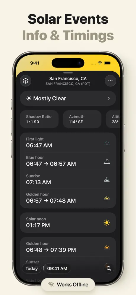
Solar Events Info & Timings

On-frame caption: “Solar Events Info & Timings

Frame Four abruptly shifts to a dark-mode list view. The header bleeds a golden-yellow gradient behind the status bar, echoing the brand colour from Frames One and Five, before dropping into a near-black surface around #121212. White text lists solar events with paired timestamps: 'First light 06:47 AM', 'Blue hour 06:47 → 06:57 AM', 'Sunrise 07:13 AM', 'Golden hour 06:57 → 07:48 AM', 'Solar noon 01:17 PM', 'Golden hour 06:48 → 07:39 PM', and 'Sunset' truncated at the bottom edge. A top summary card shows 'Mostly Clear' alongside metrics 'Shadow Ratio 1 : 1.90', 'Azimuth 114° SE', and 'Altit' cut off by the card edge. Each row carries a small illustrative icon on the right. A bottom navigation area reads 'Today | 09:41 AM' with a search icon, and a floating pill states 'Works Offline', overlapping the content slightly. The switch from vivid outdoor photography to dense data table proves utility, but the 'Altit' truncation and the cramped offline pill suggest the screenshot mockup was cropped without safe-area padding.

Sunlitt App Store screenshot 5 — Sun Position Shadow Preview
05

Sun Position Shadow Preview

On-frame caption: “Sun Position Shadow Preview

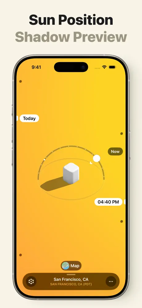
Frame Five returns to the saturated yellow ground near #FACC15 with a subtle gradient deepening toward the bottom near #FB923C. A white rounded cube sits at the centre, casting a long brown shadow across the screen. The orbital arc is dotted with small tick marks, and the current position is marked by a white disc at roughly two o'clock. 'Today' floats in a white pill on the left; 'Now' sits in a dark pill on the right; '04:40 PM' anchors the lower right. A 'Map' button with a globe icon is centred just above the location sheet, which again names 'San Francisco, CA' and 'SAN FRANCISCO, CA (PDT)'. By pulling back to this simplified, theatre-like staging, the designers make the sun-shadow relationship comprehensible without photographic distraction. The status bar remains fully visible, and the Dynamic Island sits cleanly in the yellow void, confirming the background was composed with safe-area awareness.

Sunlitt App Store screenshot 6 — Landform Shadows
06

Landform Shadows

On-frame caption: “Landform Shadows

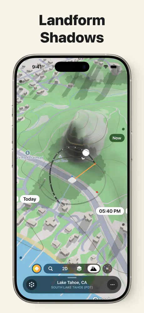
Frame Six extends the map concept into terrain visualisation. The iPhone displays a green topographic expanse around Lake Tahoe, with contour shading and a dominant rocky outcrop casting a soft rendered shadow across the valley. Labels like 'Eagle Rock Trailhead' appear natively on the map. The familiar orbital arc and time pills persist—'Today', 'Now', and '05:40 PM'—but the bottom toolbar gains a mountain icon beside the standard compass, 2D, and search controls. The palette is almost pastel: mint greens, slate roads, and pale building footprints. The location sheet reads 'Lake Tahoe, CA' and 'SOUTH LAKE TAHOE (PDT)'. This frame answers the question of scale: the app works at street level and at landscape level. The consistency of the sun-path overlay means the user can read the same visual grammar across radically different zoom contexts.

Sunlitt App Store screenshot 7 — Apple Watch App
07

Apple Watch App

On-frame caption: “Apple Watch App

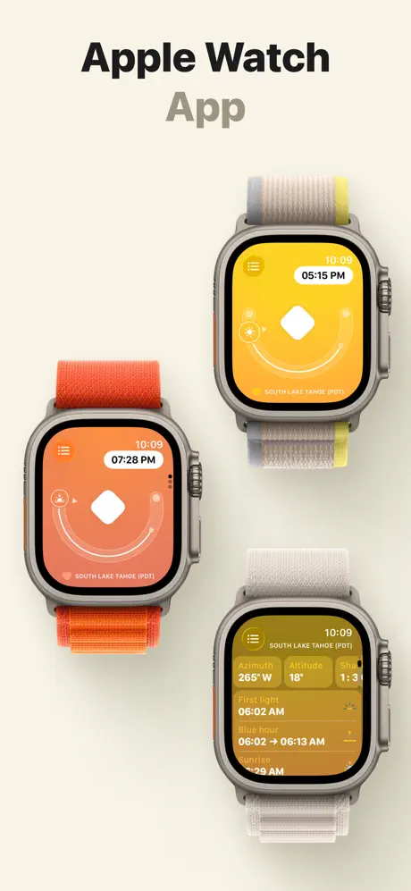
Frame Seven is the only non-iPhone frame, presenting three Apple Watch Ultra units in a loose triangular cluster against the cream ground. The top-right watch runs a yellow face showing '05:15 PM' with the white diamond glyph, an arc, and 'SOUTH LAKE TAHOE (PDT)' at the bottom; its time reads 10:09. The left watch shifts to a coral-orange face reading '07:28 PM' at the same 10:09 time. The bottom-right watch shows a compressed list view with 'Azimuth 265° W', 'Altitude 18°', and timing rows for 'First light 06:02 AM', 'Blue hour 06:02 → 06:13 AM', and 'Sunrise 06:29 AM', the latter truncated. By varying the band colours—orange, grey-yellow, and neutral—the Apple hardware itself becomes part of the colour story. The scattered placement breaks the single-device rhythm established earlier, signalling platform breadth, though the list text on the bottom watch is illegible at thumbnail size.

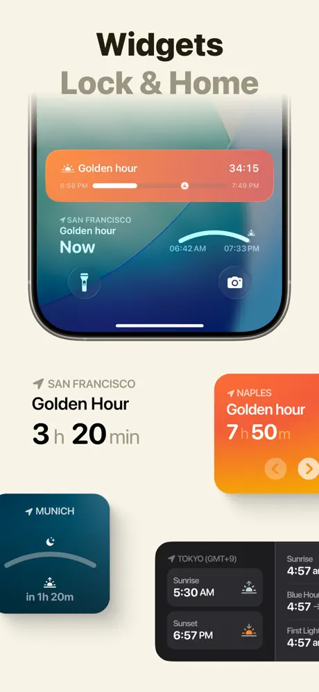
Sunlitt App Store screenshot 8 — Widgets Lock & Home
08

Widgets Lock & Home

On-frame caption: “Widgets Lock & Home

Frame Eight closes by abandoning device hardware entirely and floating four iOS widgets on the cream ground. A large upper widget blends coral and deep blue gradients to show 'Golden hour' with a countdown timer at '34:15', a segmented progress bar, and times '6:58 PM' to '7:49 PM'. Below that, a Lock-Screen-style widget reads 'SAN FRANCISCO Golden hour Now' with a half-arc spanning '06:42 AM' to '07:33 PM', plus flashlight and camera icons. Lower left, stark type reads 'SAN FRANCISCO Golden Hour 3 h 20 min' in black. A small square widget in navy displays 'MUNICH in 1h 20m' with a crescent moon, while a Naples widget glows orange reading 'Golden hour 7 h 50 m' with arrow buttons. A final dark rectangular widget lists 'TOKYO (GMT+9)' with 'Sunrise 5:30 AM' and 'Sunset 6:57 PM', plus a truncated right column. The variety of sizes demonstrates flexibility, but the composition is loose; the widgets do not align to a strict grid, and the negative space between them is uneven, making the frame feel more like a mood board than a deliberate layout.

05The craft

Captions, colour and the mechanics of the sell

Caption pattern

Nearly every frame uses a two-line headline on the cream ground: line one in near-black #111827 at heavy weight, line two in muted grey #9CA3AF at the same size but lower opacity or lighter weight. This pattern creates an automatic headline-to-subhead rhythm before the shopper even reaches the device image.

Visual system

Recurring elements visible across frames: the orbital arc with dotted tick marks, the white sun disc, the white rounded pill for timestamps, the dark translucent bottom sheet with location name and timezone, and the 'Now' badge in a dark rounded rectangle. The system also uses a small compass-rose or globe icon in the bottom-left of map frames and a 'Map' button in yellow frames. These tokens act like a kit-of-parts that let the shopper recognise the app instantly even as the background changes from photo to vector to solid colour.

The thumbnail test

At small scale the yellow in Frames One and Five punches hardest, but the white text inside the time pills risks vibrating against bright #FACC15. The dark-mode Frame Four collapses into a black rectangle with a gold streak, while Frame Eight reads as colourful confetti. The most legible thumbnail silhouette is Frame Two: a tall photo with a single white arrow and strong horizontal horizon line.

Conversion mechanics

The sequence moves from spectacle (AR, 3D city) to utility (data table, widgets), but Frame One tries to say everything at once. Frame Eight's widget scatter lacks focus. For higher conversion, Frame One should lose the footer tags and possibly the second phone, letting the AR or map frame carry the proof. Frame Eight should show widgets in situ on a Lock Screen or Home Screen rather than floating.

06Where it slips

What we would change

Frame One density collapse

The opener is overloaded: two overlapping phones, two award badges, a double headline, a sub-footer of tags, and two location sheets fighting for the lower safe zone. At thumbnail size the 'HELPFUL TOOLS • YOUR ULTIMATE PHOTO & VIDEO TOOLKIT...' strip becomes grey noise. Fix: remove the footer tags entirely, crop to a single phone, and let the awards breathe in the negative space below.

Frame Four safe-area breach

The 'Works Offline' pill overlaps list content and the bottom navigation row, and the metric label 'Altit' is visibly truncated in the top card. This reads as a rushed mockup export. Fix: choose a screenshot state where all labels are fully visible, or shorten 'Altitude' to 'Alt' in the screenshot build. Move the offline pill into the list as a standard row with safe-area padding.

Frame Eight compositional drift

The widgets float without a containing device or grid, and their spacing is irregular. The shopper sees four competing focal points instead of one readable story. Fix: composite the widgets onto a blurred Lock Screen or Home Screen background so the shopper understands context and scale, and align them to a strict two-column grid.

Frame Seven illegibility

The bottom Apple Watch list view contains event names and timestamps that dissolve into colour blocks at small scale. Fix: limit the watch frame to two units, or show the list view at a larger crop where '06:02 AM' remains readable.

Tonal whiplash between Frame One and Two

Frame One is a maximalist collage; Frame Two is a disciplined single-device portrait. The drop in complexity feels like two different design systems. Fix: reduce Frame One's overlay elements so the transition to Frame Two feels like a zoom-in rather than a channel change.

07The recipe

How to apply this to your own app

  1. Pick one frame for density

    If you must show awards and tags, confine them to Frame One. Every subsequent frame should answer exactly one question.

  2. Anchor with colour, not just UI

    Sunlitt uses a loud yellow near #FACC15 as a chromic signature. Choose one hex value that can survive on photos, maps, and solid backgrounds.

  3. Lock your dashboard rail

    The arc, the time pills, and the bottom sheet never move. Repeating these coordinates trains the eye to read new contexts faster.

  4. Respect thumbnail legibility

    If a frame contains small text—like the watch list or widget details—test it at 300 px wide. If it disappears, redesign or remove.

  5. Composite widgets in context

    Detached widget collages read as marketing abstraction. Always place them on a real Lock Screen or Home Screen so the shopper imagines using them.

08Takeaways

Five things worth stealing

  • A single loud brand colour can unify disparate substrates—AR photo, vector map, solid void—if repeated consistently.
  • Positional rigidity (arc, pills, bottom sheet) creates visual grammar that survives context switches.
  • Frame One should carry credibility, but dumping every proof point—awards, tags, two phones—reduces readability at thumbnail size.
  • Dark-mode data frames need extra safe-area scrutiny; truncated labels and floating pills signal haste.
  • Widgets sell better when shown in situ on a Lock Screen or Home Screen, not as scattered cards.
09The verdict

What the set actually achieves

The team enforces coherence through positional rigidity and chromatic punctuation. The orbital arc and the white sun disc appear in every iPhone frame except the dark-mode almanac, acting as a persistent logo-in-motion. Time pills—'Today' on the left, a timestamp lower-right, and 'Now' upper-right—never migrate, creating a dashboard rail that stabilises the eye even as the background shifts from photo to map to solid colour. The bottom location sheet is always dark, translucent, and seated at the same vertical rhythm. Colour acts as the brand signature: a yellow-to-orange gradient appears in Frame One, Frame Four’s header bleed, and Frame Five’s full-screen wash, functioning as a chromic breadcrumb. Frame One sacrifices cleanliness for credibility, freeing the remaining frames to tell single-feature stories.

Product designers and ASO managers building screenshot sets for utility or camera-overlay apps that span multiple contexts—AR, map, table, and widget—and need a case study in chromatic branding versus information density.

10Questions

Frequently asked

What is the dominant background colour?

A warm off-white or cream near #F2EFE6 used consistently behind every frame.

Why does Frame Four feel different?

It is the only dark-mode, text-dense table in the set, breaking the full-screen imagery pattern to prove utility.

How does the set handle platform breadth?

Frame Seven adds Apple Watch Ultra, and Frame Eight adds iOS widgets, but neither is shown in actual OS context.

What is the most honest weakness?

Frame One is informationally overcrowded, and Frame Eight lacks compositional grid discipline.

11Keep reading

Build your own screenshot set

The full set

10 shots
Sunlitt App Store screenshot 1Sunlitt App Store screenshot 2Sunlitt App Store screenshot 3Sunlitt App Store screenshot 4Sunlitt App Store screenshot 5Sunlitt App Store screenshot 6Sunlitt App Store screenshot 7Sunlitt App Store screenshot 8Sunlitt App Store screenshot 9Sunlitt App Store screenshot 10

About the app

# Apple Design Awards Finalist # Featured on the App Store # Great on iOS 26 # App of the Day # "Apps We Love" by Apple Harness the Power of the Sun with Sunlitt: your all-in-one Flipping Hues Srls, via the App Store listing.

Screenshots and store metadata belong to Flipping Hues Srls. They are shown here for design commentary and criticism. The analysis on this page is original work by floow.design. View the original listing.

More Weather teardowns

Browse all →