The Apple Intelligence Badge
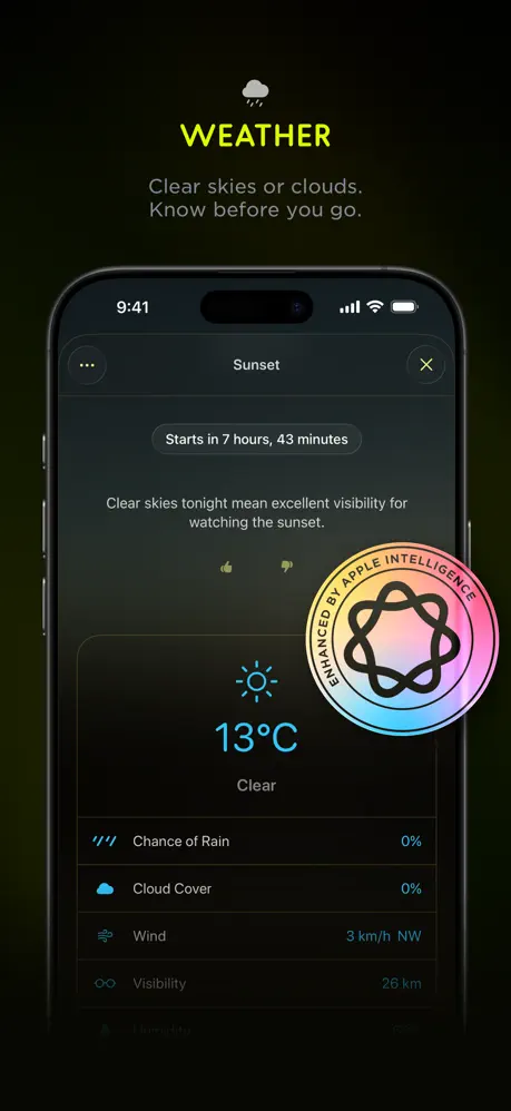
Frame 2 makes the weakest move in the set. The badge is roughly 160 pt in diameter, overlapping the lower rows of the weather list and occluding actual content. Its pastel iridescence—pink, cyan, and soft yellow—shatters the strict subtractive palette Lumy maintains everywhere else. It reads as a sticker slapped on by marketing rather than an integrated feature. The fix is simple: remove the physical badge from the device screen and place a smaller, monochrome Apple Intelligence glyph in the global header next to the cloud icon, or add a single line of text beneath the caption outside the phone frame. That preserves credibility without breaking the dark aesthetic or hiding functional data.
Hero Frame Typography
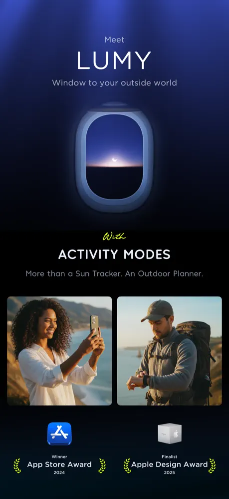
Frame 1 introduces a single script word—“With”—that never appears again. Because every other frame is locked to a neutral geometric sans, this one hand-drawn letterform fractures the typographic system. It also fails to bridge the two halves of the poster: the poetic 3D window above and the stock lifestyle photography below. The fix is to delete the script altogether and set “WITH ACTIVITY MODES” in the same all-caps sans used for the rest of the stack, or replace the lower lifestyle shots with UI chrome that visually rhymes with the rounded airplane window.
Background Chromatic Logic
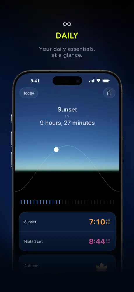
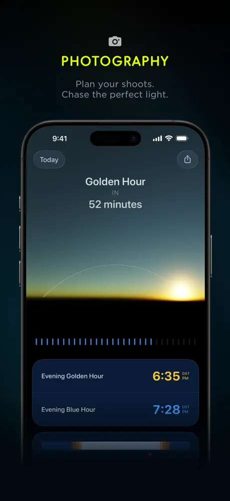
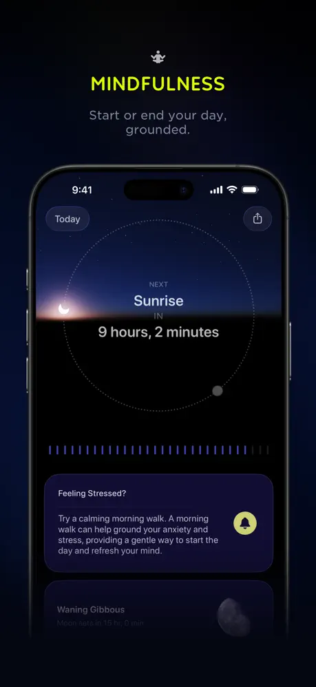
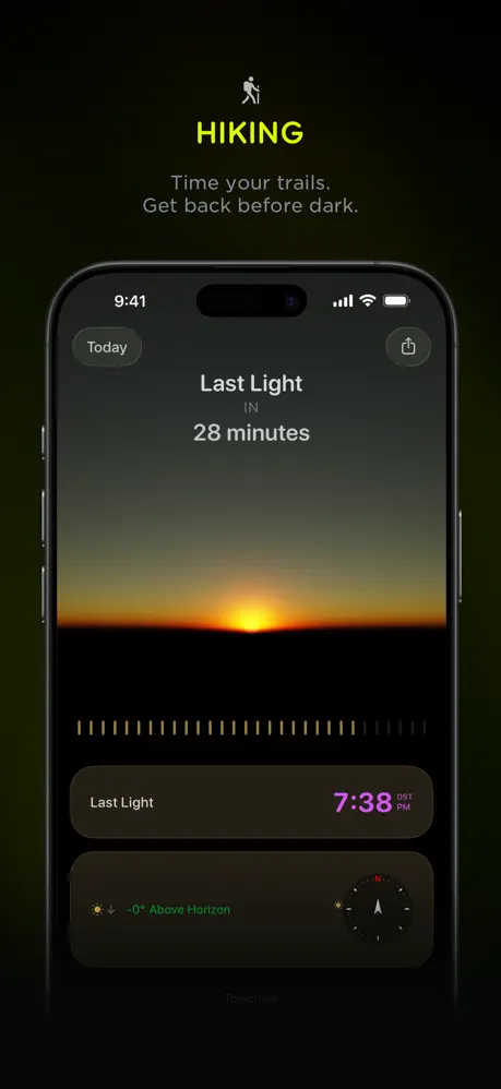
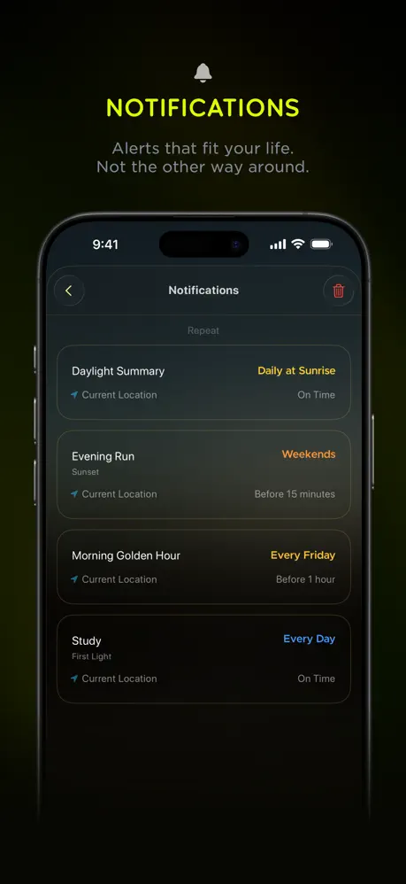
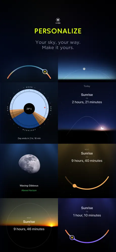
The grounds behind the phones shift between navy and olive-black without a perceptible system. Weather sits on olive, Daily on navy, Photography on teal-black, Mindfulness on navy, Hiking on olive, Notifications on olive, Date on olive. A shopper swiping briskly gets no semantic cue from these shifts; they look like export inconsistencies. The fix is to commit to one global near-black—say #050505—for every device frame, or else assign each mode a unique but explicit ambient tint that maps to its content (cool navy for Night/Daily, warm charcoal for Hiking/Photography). Without that logic, the variation undermines the cohesion the template is trying to build.
Modal Overlay Context
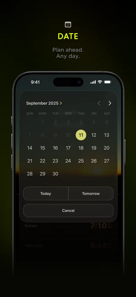
Frame 8 shows a calendar modal, but the dark scrim behind it erases almost all evidence of the host page. The viewer cannot tell whether the calendar is a full-screen push, a sheet, or a popover, which makes the feature harder to imagine using. The fix is to raise the scrim opacity to roughly 35% and leave a readable sliver of the underlying timeline and sunset cards visible. That spatial context would anchor the calendar in the architecture rather than letting it float.
Header Hierarchy at Thumbnail Scale
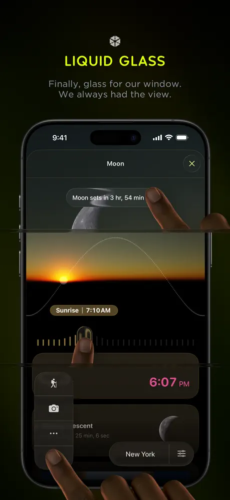
The external frame titles—“WEATHER,” “DAILY,” “PHOTOGRAPHY”—are set extremely large, roughly 48–54 pt, and because they sit only about 60 pt above the phone, they compete with the in-app headlines inside the screen. At thumbnail scale, the lime words fight the white UI text for attention. The fix is to reduce the external headers by 15–20% and increase the margin between caption and device to roughly 90 pt. That lets the UI breathe and shifts the shopper’s eye naturally from marketing label to product proof.