(Not Boring) Weather app icon
WeatherScreenshot teardown12 min read

(Not Boring) Weather App Store screenshots

How do you sell a weather app that looks like a pop-art gallery and behaves like a data dashboard? You throw out the device frame, blow up the 3D props, and accept that some shoppers will meet your brand before they meet your interface.

Set published by Not Boring Software LLC · 8 frames analysed

4.8 · 15K ratingsFreev3.49Updated 4mo ago
(Not Boring) Weather App Store screenshot 1
01At a glance

The set in one screen

Framing
None. No device chassis, notch, or bezel appears in any frame. UI is presented as floating dioramas or flat graphics.
Captions
Top-left (or top-center) bold sans headline, 28–34pt, black on light grounds and white on dark grounds. Most captions end with a punctuation mark.
Backdrop
Frames shift between pure white, cool gray, near-black, warm cream, and saturated yellow. No seamless background repeats across the set; each frame owns its own atmosphere.
Type
Condensed geometric sans for numerals; wide-tracked all-caps for metadata labels; heavy slab for AQI readings. Hierarchy is established almost entirely through weight and scale, not color.
UI / copy split
Roughly 60:40. Nearly every frame contains at least some functional UI (charts, toggles, widget layouts), but the surrounding 3D theatre is what dominates attention.
Frame 1 job
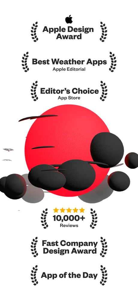
The first frame is entirely social proof. It does not show a forecast, a widget, or any interactive surface; it shows six award lockups flanking a red sun and black cloud sculpture. The implied job is to short-circuit skepticism before the user ever sees a data point.

Sampled palette

#FF3B30#FF3B30
#FFB800#FFB800
#00AEEF#00AEEF
#000000#000000
#FFFFFF#FFFFFF
#EFE6D5#EFE6D5
02The challenge

What this screenshot set had to solve

Weather is the ultimate commodity category: every smartphone ships with a free, competent default. That means a third-party weather app has to earn its home-screen slot in under three seconds. The product’s differentiation is a maximalist, tactile visual system—matte 3D clouds, exaggerated numerals, and high-contrast color fields—that reads as playful rather than clinical. The screenshot challenge, therefore, is to telegraph that personality while still proving the app can deliver serious meteorological data. The tension is credibility versus theater: too many polygons and the app looks like a toy; too many tables and it looks like every other forecast feed. Add to this the absence of motion (the real app leans heavily on animation), and the static screenshots must carry the full emotional weight of the experience. The designer also has to sequence information so that a user swiping horizontally can absorb feature depth—precipitation graphs, widgets, moon phases, alerts, customization—without ever seeing the same layout twice.

They replaced the safe phone-in-hand template with a gallery wall. That choice is either confident or evasive, depending on which frame you pause on.
03The approach

How the set argues its case

The set uses three synchronized tactics. First, a 'social proof first' opening that front-loads trust before any pixels of UI are revealed. Second, a repeating data-card grammar—dark pill headers, hairline rules, bottom toggle switches—that teaches the eye how to read subsequent frames. Third, abrupt background color shifts (white → black → cream → yellow) that act as chapter breaks, turning an eight-frame scroll into a curated exhibition rather than a feature list. Typography is handled with restraint: one sans family, two weights, and a strict top-left headline rule that lets the 3D illustration occupy center stage. The overall bet is that in a category drowning in blue-sky literalism, pure graphic audacity stops thumbs.

The screenshots argue that weather can be a collectible, customizable object rather than a utility. By displaying app-icon grids and character-themed skins alongside precipitation rates and AQI values, the set targets users who treat their home screen as an identity statement.

04Frame by frame

Every screenshot, and the job it does

(Not Boring) Weather App Store screenshot 1 — Award Lockup / Social Proof Hero
01

Award Lockup / Social Proof Hero

On-frame caption: “Apple Design Award, Best Weather Apps, Apple Editorial, Editor's Choice, App Store, 10,000+ Reviews, Fast Company Design Award, App of the Day

White background. Dead-center: a large, flat red circle (#FF3B30) acting as a sun, partially obscured by matte-black 3D spheres of varying diameters that read as clouds. Four tiny black bird silhouettes fly left of center. Above and below the sun, six lines of centered black copy are flanked symmetrically by laurel-wreath icons. From top: 'Apple Design Award' beneath a black Apple glyph; 'Best Weather Apps' with 'Apple Editorial' subscript; 'Editor's Choice' with 'App Store' subscript; five filled yellow stars above '10,000+' with 'Reviews' subscript; 'Fast Company Design Award'; 'App of the Day'. The type is a heavy geometric sans, roughly 24–32pt, with generous leading. No device frame or UI chrome appears; the canvas is treated as a letterpress poster. The red disc sits slightly low, bisected by the bottom crop, so the cloud spheres spill into the lower credit block.
(Not Boring) Weather App Store screenshot 2 — Precipitation Detail
02

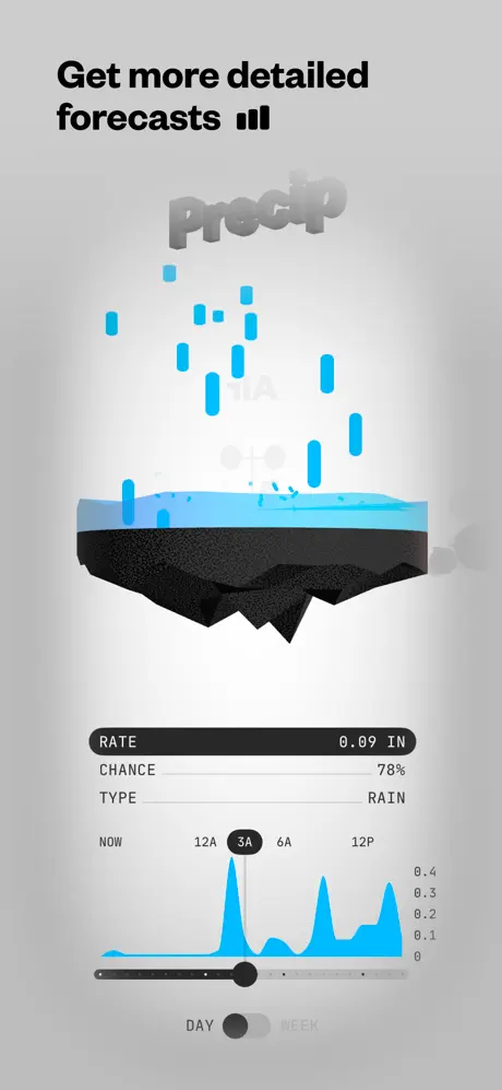
Precipitation Detail

On-frame caption: “Get more detailed forecasts

Gradient background shifts from nearly white at center to cool gray (#D1D1D6) at edges. Top-left headline reads 'Get more detailed forecasts' in black, followed by three vertical black bars of ascending height. Dominating center: a 3D diorama of a cross-section of terrain—charcoal jagged rock base, translucent cyan water layer, with bright cyan cylinders falling as rain. Behind the scene, the word 'Precip' is rendered in large, ghostly, extruded 3D letters with a white-to-gray gradient. Beneath: a dark charcoal (#2C2C2E) capsule spans most of the width, left-aligned label 'RATE' and right-aligned value '0.09 IN'. Two more metadata rows sit below in lighter gray: 'CHANCE 78%' and 'TYPE RAIN'. A cyan area chart tracks intensity against a horizontal axis marked 'NOW 12A 3A 6A 12P'; a thick black slider handle sits at 3A. At bottom, a toggle reads 'DAY' (filled black) and 'WEEK' (unfilled gray).

(Not Boring) Weather App Store screenshot 3 — Widget Ecosystem
03

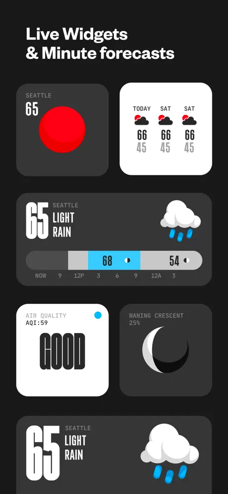
Widget Ecosystem

On-frame caption: “Live Widgets & Minute forecasts

Pure black background (#000000). Headline 'Live Widgets & Minute forecasts' in white. Five rounded-rectangle widgets arranged in an asymmetric grid. Top-left small widget: #2C2C2E fill, 'SEATTLE' in 10pt gray caps, '65' in 48pt white condensed numerals, solid red circle below. Top-right small widget: white fill, three columns titled 'TODAY SAT SAT', each with a black-and-red cloud icon above '66' high and '45' low. Center medium widget: #2C2C2E fill, giant white '65', 'SEATTLE LIGHT RAIN' in 14pt white, a horizontal segmented bar with a cyan-highlighted '68' block flanked by gray '54' segments, and time ticks 'NOW 9 12P 3 6 9 12A 3'. Bottom-left small widget: white fill, 'AIR QUALITY' and 'AQI:59' in black, cyan indicator dot, 'GOOD' in enormous black slab letters. Bottom-right small widget: #2C2C2E fill, 'WANING CRESCENT 25%' in white, 3D crescent moon icon. A final medium widget repeats the center layout at bottom. Corner radii are consistently ~22pt.

(Not Boring) Weather App Store screenshot 4 — Moon & Environmental Data
04

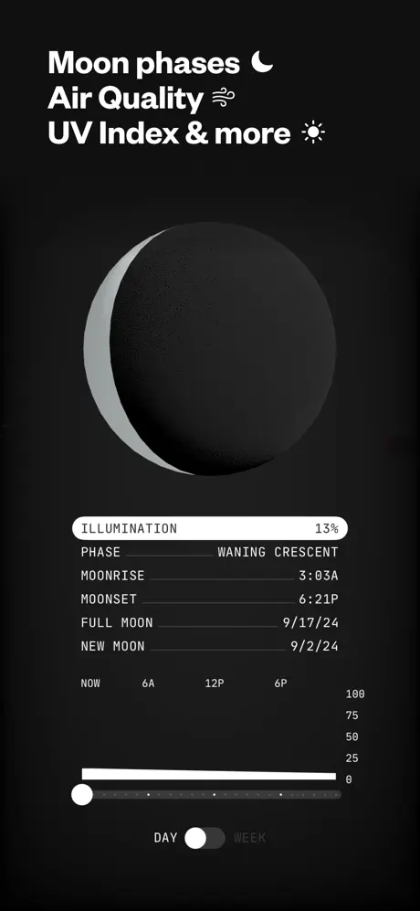
Moon & Environmental Data

On-frame caption: “Moon phases 🌙 Air Quality 🌬️ UV Index & more ☀️

Uniform black background. White headline: 'Moon phases 🌙 Air Quality 🌬️ UV Index & more ☀️'. Centered: a large, photorealistic waning crescent moon in matte gray and charcoal. Below, a white rounded data card. First capsule row: 'ILLUMINATION' left, '13%' right. Then hairline-separated rows: 'PHASE Waning Crescent', 'MOONRISE 3:03A', 'MOONSET 6:21P', 'FULL MOON 9/17/24', 'NEW MOON 9/2/24'. Beneath the card, a white horizontal bar chart represents illumination over time; a white circular handle sits at the far-left origin. Time axis: 'NOW 6A 12P 6P'. Vertical axis labels '0 25 50 75 100' on right. Bottom toggle: 'DAY' (white filled pill) / 'WEEK' (gray text).

(Not Boring) Weather App Store screenshot 5 — Severe Alert Poster
05

Severe Alert Poster

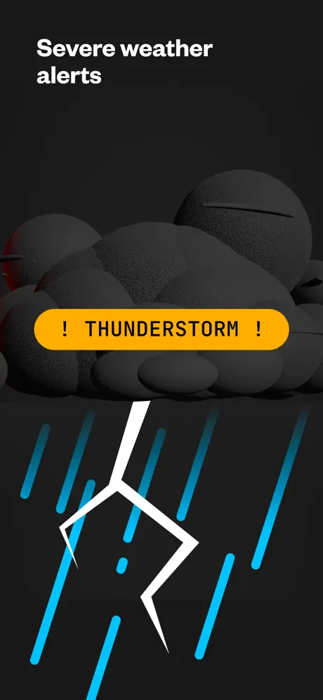
On-frame caption: “Severe weather alerts

Near-black background (#0B0B0B). Top-left white text: 'Severe weather alerts'. Upper two-thirds filled with massive matte-gray 3D cloud spheres, softly lit from upper left. Centered over the clouds: a horizontal yellow pill (#FFCC00) with black text reading '! THUNDERSTORM !'. Below the pill, a thick white lightning bolt with two jagged angles strikes downward. Surrounding the bolt: diagonal cyan rain streaks of varying lengths, some cropped by the canvas edge. No data metrics, timestamps, or secondary text appear. The composition relies entirely on graphic contrast: the yellow pill is the sole warm element against a sea of gray and black, functioning as an alarm color.

(Not Boring) Weather App Store screenshot 6 — Character Customization
06

Character Customization

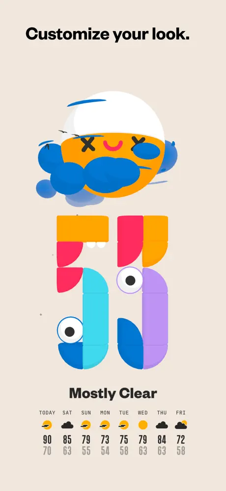
On-frame caption: “Customize your look.

Warm cream background (#EFE6D5). Top-left black text: 'Customize your look.'. Upper center: a whimsical 3D sun character with a white semicircle cap, orange circular face with X-shaped eyes and a pink curved smile, and blue cloud-tears. Below the character: giant numerals '56' built from modular rounded blocks in orange, pink, cyan, and lavender, each segment containing cartoon eyeballs. Under the numerals: 'Mostly Clear' in black. Bottom strip: an 8-day forecast table labeled 'TODAY SAT SUN MON TUE WED THU FRI'. Each day shows a small icon (yellow sun or black cloud) above a high temp in dark gray (90, 85, 79, 73, 75, 79, 84, 72) and a low temp in lighter gray (70, 63, 55, 54, 58, 63, 63, 58). The layout feels more like character branding than utility software.

(Not Boring) Weather App Store screenshot 7 — Icon & Wallpaper Grid
07

Icon & Wallpaper Grid

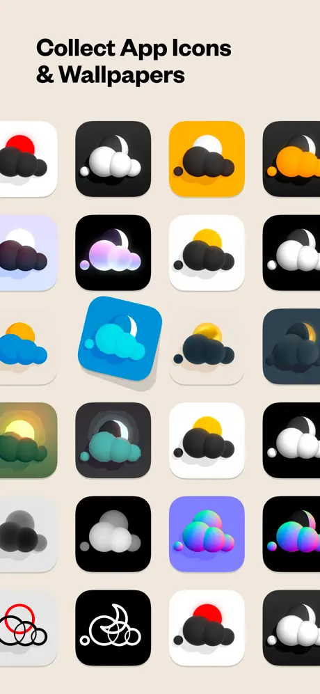
On-frame caption: “Collect App Icons & Wallpapers

Same cream background. Headline: 'Collect App Icons & Wallpapers'. A 4-column by 5-row grid of iOS app icons with consistent superellipse shapes. Icons alternate between white and black tiles, each featuring simplified 3D weather motifs: black cloud clusters, red sun discs, white moons, orange sunsets, cyan clouds, iridescent gradients, and one line-art cyclone in red and black. Third row, second column: a single cyan icon is rotated ~15° clockwise and given a soft shadow, breaking the grid orthogonality. The rest sit flush. No labels or text appear inside the grid. The sheer density—twenty variations—argues breadth, but the composition lacks negative space.

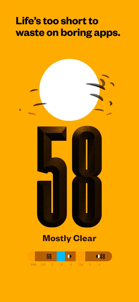
(Not Boring) Weather App Store screenshot 8 — Brand Manifesto
08

Brand Manifesto

On-frame caption: “Life's too short to waste on boring apps.

Saturated yellow background (#FFB800). Top-left black text: 'Life's too short to waste on boring apps.' Center-top: a flat white circle with black motion lines suggesting speed or glare. Dominating center: massive black 3D numerals '50' with thick bevels and a subtle noise texture. Below: 'Mostly Clear'. Near bottom: a horizontal temperature timeline in dark brown/sepia with a cyan segment center showing '66' and flanking brown blocks showing '48'. Tick labels underneath: 'NOW 12P 3 6 9 12A 3 6'. The type color is white on cyan and dark brown on yellow, creating varying contrast ratios. The frame acts as a stylistic exclamation point rather than a feature tutorial.

05The craft

Captions, colour and the mechanics of the sell

Caption pattern

Every caption is an imperative sentence or a feature headline positioned in the top 10% of the canvas: 'Get more detailed forecasts', 'Live Widgets & Minute forecasts', 'Customize your look.', 'Life's too short to waste on boring apps.' None attempt to explain mechanics; they declare intent.

Visual system

A 3D illustration language built from matte spheres, beveled extruded type, and flat color discs. Clouds are always black bubble clusters; the sun is a flat red or white circle; rain is cyan cylinders. This kit-of-parts approach lets the same assets read as both UI decoration and standalone marketing sculpture.

The thumbnail test

Frame 1 is a poor thumbnail. It reads as an awards poster, not an app. Frame 5, with its yellow thunderstorm pill and black clouds, is the strongest thumbnail candidate because it offers the highest contrast and simplest silhouette at 120×240pt.

Conversion mechanics

The sequence front-loads trust (awards) and back-loads attitude (brand manifesto). Functionality is clustered in the middle four frames. That structure assumes users swipe the full carousel; in practice, many will only see the first two frames. Frame 2 is the only early frame that proves functional value, and it happens to be the most data-dense, which may overwhelm a shopper who has not yet grasped the basic forecast metaphor.

06Where it slips

What we would change

The Missing Hero Interface

The most consequential weakness is the absence of the app's primary daily forecast screen. A shopper never sees the main 'today' view they will interact with every morning. Instead they see precipitation graphs, widget arrays, and moon phases. That omission forces the user to imagine the core experience. Fix: Replace Frame 1 with a hero shot of the main forecast view—large temperature, condition label, and hourly strip—while overlaying the awards as smaller semaphore badges in the corner. Prove the product first, then boast.

No Physical Anchor

Not a single frame includes a device bezel, notch, or even a generic phone silhouette. While this creates aesthetic freedom, it also removes scale context. Shoppers cannot tell if the 3D diorama fills an iPhone 15 Pro screen or a billboard. Fix: Introduce a framed device in Frame 2 or Frame 3, cropped tightly so the hardware does not compete with the art, but present enough to ground the UI in reality.

Alert Frame Breaks the Pattern

Frame 5 abandons the established data-card grammar entirely. After Frames 2 and 4 teach the user to look for pills, toggles, and hairline metrics, Frame 5 offers only a yellow thunderstorm banner with no timestamp, duration, or severity level. The '! THUNDERSTORM !' text is also redundant; the lightning bolt already reads as a storm. Fix: Keep the dramatic black clouds and yellow pill, but append a secondary line—'Until 4:30 PM • High Wind Warning'—inside the pill or immediately beneath it. Maintain credibility without killing the drama.

Contrast Failures on Yellow

Frame 8 places dark brown text and blocks over a #FFB800 yellow field. The '48' numerals and surrounding brown segments sit at a contrast ratio that likely falls below WCAG AA standards for small text. At thumbnail size, the fine tick labels '12P 3 6' may virtually disappear. Fix: Shift the timeline block to #1C1C1E black or deepen the brown to #3A2A00 so the white numerals pop with at least 4.5:1 contrast.

Icon Grid Overload

Frame 7 presents twenty icons in a dense grid. Without hierarchy, the eye rests nowhere, and the value of each individual design is diluted. The tilted icon, intended to imply depth, instead breaks the orthogonal rigor that iOS iconography demands. Fix: Reduce the grid to six hero icons arranged in a 2×3 formation with generous margins, and pair them with a visible wallpaper mockup on a lock-screen preview so the shopper understands the collectibles in context.

07The recipe

How to apply this to your own app

  1. 1. Anchor with the core screen.

    Never let your first frame be pure marketing copy or social proof. Lead with the interface the user will live in daily, then layer badges or accolades as secondary overlays so the product is the headline, not the footnote.

  2. 2. Repeat a readable UI grammar.

    If you introduce a data-card structure—pill headers, hairline rows, bottom toggles—repeat it across two or three frames. Shoppers learn your visual language on the second swipe and then read subsequent frames faster because the pattern is familiar.

  3. 3. Use color as chapter breaks, not decoration.

    When your screenshot set alternates between dark mode, light mode, and saturated brand skins, make sure the shifts correspond to feature shifts. The background color should telegraph a new chapter so the carousel feels curated rather than random.

  4. 4. Insert one hardware frame for scale.

    Even if your aesthetic demands full-bleed art, include at least one framed device screenshot early in the sequence. It answers the unconscious question 'What will this look like on my phone?' and prevents abstract art from being mistaken for the app itself.

  5. 5. Load alert frames with actionable metadata.

    A severe-weather screenshot must look urgent, but urgency without information reads as a siren with no context. Keep the bold color and graphic symbol, then add a single line of micro-copy—time, severity, or affected area—to prove the alert is functional, not just theatrical.

08Takeaways

Five things worth stealing

  • Lead your first screenshot with the interface users will interact with most, not a wall of awards, because a shopper cannot form an emotional attachment to a laurel wreath.
  • Establish a repeating data-card template—header pill, hairline rows, bottom toggle—across your first two feature frames so the eye learns the grammar before you vary it.
  • Insert at least one framed device render early in the set to provide physical scale and prevent abstract 3D illustrations from being mistaken for marketing art rather than UI.
  • When building a customization grid, spotlight three to six hero items with generous negative space instead of showing every variant at once, which dilutes focus and buries the strongest designs.
  • Test every accent color combination for WCAG AA contrast at small sizes, especially when placing dark text or UI blocks over saturated brand backgrounds like yellow or orange.
  • If you use an alert frame, pair the warning graphic with a single line of actionable metadata such as duration or severity level so the drama is backed by utility.
09The verdict

What the set actually achieves

The set opts for poster-like compositions over literal interface documentation. It wins on instant brand recognition but sacrifices immediate comprehension of daily use cases. A shopper leaves knowing the app has personality, awards, widgets, and alternate icons, yet may not know what the primary forecast screen actually looks like.

Designers building screenshot sets for personality-first apps in commodity categories where differentiation matters more than feature parity. The case study is especially useful if you are debating whether to hide the device frame or front-load social proof.

10Questions

Frequently asked

Why do these screenshots refuse to use a device frame?

The all-in bet is that the 3D art system is stronger than any aluminum bezel. Removing the phone turns the screenshot into a poster, which stands out in a feed full of generic phone mockups. The trade-off is a loss of immediate physical context.

Does Frame 1 actually hurt conversion?

It might. By showing zero UI, the frame asks the shopper to trust awards they have not yet verified through product interaction. In high-intent categories, that is a luxury; in entertainment or lifestyle apps, it can work because brand vibe is the product.

How does the set handle text legibility at thumbnail size?

Poorly in places. Frame 2's 'Precip' ghost type and Frame 8's brown-on-yellow timeline risk falling below readable contrast at 120pt width. The black-on-white captions survive best, which is why the top-left headline strategy is the set's smartest structural choice.

What is the strongest single frame?

Frame 5, the thunderstorm alert. It has the simplest silhouette—black clouds, yellow pill, white bolt—and the highest contrast, which means it communicates instantly at thumbnail scale. It also clearly telegraphs a concrete feature: severe weather notifications.

11Keep reading

Build your own screenshot set

The full set

8 shots
(Not Boring) Weather App Store screenshot 1(Not Boring) Weather App Store screenshot 2(Not Boring) Weather App Store screenshot 3(Not Boring) Weather App Store screenshot 4(Not Boring) Weather App Store screenshot 5(Not Boring) Weather App Store screenshot 6(Not Boring) Weather App Store screenshot 7(Not Boring) Weather App Store screenshot 8

About the app

~ WEATHER DOESN’T HAVE TO BE BORING ~ The simple weather app that’s winning awards (Apple Design Award, Best Weather Apps) and impressing tastemakers (MKBHD, Fast Company). ~ Not Boring Software LLC, via the App Store listing.

Screenshots and store metadata belong to Not Boring Software LLC. They are shown here for design commentary and criticism. The analysis on this page is original work by floow.design. View the original listing.

More Weather teardowns

Browse all →