
CanGoGo app icon
TravelScreenshot teardown10 min read

CanGoGo App Store screenshots

CanGoGo App Store Screenshot Set: A Frame-by-Frame Study in Character-Driven ASO

Set published by Zaozao Island Technology CO., Ltd · 7 frames analysed

4.8 · 62 ratingsFreevv1.24.1Updated 5mo ago
CanGoGo App Store screenshot 1
01At a glance

The set in one screen

Framing
Large cream bezel on frames 2–6; no device in frames 1 and 7
Captions
Dark brown rounded sans outside the device; feature headlines carried by emojis
Backdrop
Marigold for the home screen, taupe for the reward modal, cream for data, peach for collection and permissions
Type
Headlines sit in a bold, rounded sans-serif in near-black brown (#3E2723), often flanked by single emojis. Inside the UI, retro oval badges use red serif-style lettering for section titles such as “Data” and “FUR FRIENDS.”
UI / copy split
High emphasis on illustration. On average, 40 % of each frame is background color, 35 % is device chrome or illustration outside the device, and 25 % is interface.
Frame 1 job
Establish the fantasy world before proving the utility.

Sampled palette

#E85D04#E85D04
#FDE6A8#FDE6A8
#F5EDE3#F5EDE3
#E6D5C3#E6D5C3
#FFD6C1#FFD6C1
#3E2723#3E2723
02The challenge

What this screenshot set had to solve

The central tension in selling a step counter is believability versus delight. A shopper needs to see that the app can count steps accurately and display charts, yet the product experience clearly leans into a toy-like economy of cans and stray animals. The screenshot set therefore faces a three-way challenge: introduce the core mechanic (walking), the soft currency (cans), and the emotional payoff (collectible animals) without letting any single frame become a dense tutorial. Furthermore, the UI itself is intentionally sparse—large numbers, simple nav pills, and flat progress bars—so the designer cannot hide behind gradients or glassmorphism to create visual interest. The challenge is compositional: how do you make a minimal data screen feel exciting while also proving the app is a credible HealthKit companion? The set must establish trust in frame five, warmth in frame four, and habit-loop clarity in frame three, all while keeping the brand characters larger than the interface chrome.

03The approach

How the set argues its case

Character-first episodic narrative. The set alternates between pure brand poster and device proof, using color temperature to signal functional shifts rather than UI chrome alone. The thick device bezel becomes a recurring prop that unifies frames 2–6, while its sudden absence in frame 7 makes the permission ask feel soft and invisible.

This set is positioned for a casual Health & Fitness shopper who is motivated by collecting rather than athletic performance. The copy never mentions calories, pace, or heart rate. Instead it promises “Walking Companion,” “Joy for collectors,” and anthropomorphic animals to adopt. The positioning is emotional and habit-forming, not analytical.

04Frame by frame

Every screenshot, and the job it does

CanGoGo App Store screenshot 1 — Poster opener on warm cream with feature bullets and mascot trio
01

Poster opener on warm cream with feature bullets and mascot trio

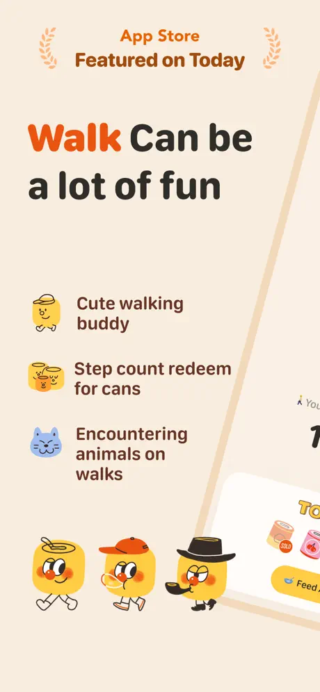
On-frame caption: “Walk Can be a lot of fun

Shot one abandons the device entirely. It is a vertical poster on a warm cream ground around #F5EDE3. At the top, small laurel wreath brackets surround “App Store” in orange and “Featured on Today” in brown. The hierarchy drops to a massive lockup: “Walk” in tangerine (#E85D04) and “Can be a lot of fun” in a dark brown. Below, three icon bullets introduce mechanics verbatim: “Cute walking buddy,” “Step count redeem for cans,” and “Encountering animals on walks.” Each bullet pairs a hand-drawn yellow or blue icon with short brown copy set in a medium weight. The bottom third is occupied by three walking can mascots, while the right edge is clipped by the cropped corner of an iPhone showing a yellow pill beginning with “Feed.” By leading with a poster, the frame establishes the brand world before the user sees a single status bar.
CanGoGo App Store screenshot 2 — Diagonal device on marigold with logotype outside the bezel
02

Diagonal device on marigold with logotype outside the bezel

On-frame caption: “CAN GOGO

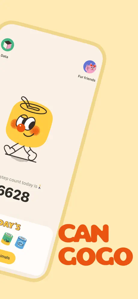
The background switches to solid marigold (#FDE6A8). A single device is rotated roughly twenty degrees counter-clockwise, its thick cream bezel dominating the center-left. Inside, the UI shows two nav pills—“Data” and “Fur friends”—and a large can character centered above a step counter. The visible digits read “6628,” cropped by the left bezel, with the preceding digit implied but off-screen. A white bottom card peeks in with “DAY’S” in yellow and two illustrated cans. The boldest move sits outside the device: the brand name “CAN GOGO” is set enormous in the bottom-right corner in a rounded orange sans, effectively turning the device into a texture rather than the hero. The status bar and home indicator are stripped away, forcing attention on the character and the dimensional border.

CanGoGo App Store screenshot 3 — Upright home screen with three mascot variants and daily can collection
03

Upright home screen with three mascot variants and daily can collection

On-frame caption: “Walking Companion

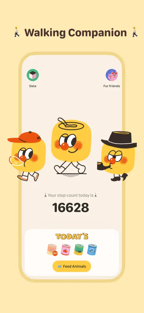
The device is now upright and centered against the identical marigold backdrop. The headline reads “🚶 Walking Companion 🚶” in the same brown sans, flanked by tiny pedestrian emojis. The UI inside is the home screen, showing the three can variants side-by-side—the red-capped runner, the straw-capped sitter, and the noir pipe-smoker—above the line “🚶 Your step count today is 🚶” and the numeral “16628.” Below, a white card with “TODAY’S” in a 3D yellow typeface displays four collectible cans, one stamped “SOLD,” and a yellow pill button reading “Feed Animals.” This is the set’s clearest value proposition. It proves the app is a functional step counter while surrounding the data with collectible candy, using the white card as a literal container for the reward economy.

CanGoGo App Store screenshot 4 — Modal reward reveal on taupe with animal adoption sheet
04

Modal reward reveal on taupe with animal adoption sheet

On-frame caption: “The more you walk the more animals you meet

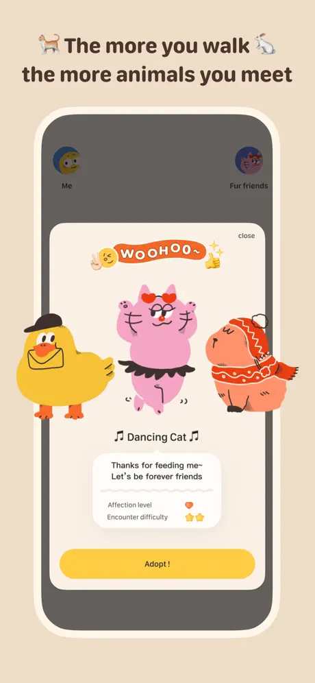
The background cools to a taupe-beige (#E6D5C3). The headline “🐕 The more you walk 🐇 the more animals you meet” is split across two lines with animal emojis bookending the first. Inside the device, the UI dims to a mid-grey (#5D5D5D) scrim, focusing attention on a modal sheet. The modal’s top-right reads “close,” followed by a banner sticker that says “WOOHOO” between a winking face, peace sign, and thumbs-up. The reward shows a yellow duck in a beret, a pink “Dancing Cat” in a tutu, and an orange capybara in a knit sweater. Beneath them, a dialogue card quotes, “Thanks for feeding me~ Let’s be forever friends,” with “Affection level” and “Encounter difficulty” metrics. A full-width yellow button reads “Adopt !” The depth is paper-craft: the modal floats over a darker plane, teaching the user that animals arrive through interaction loops.

CanGoGo App Store screenshot 5 — Data dashboard with weekly bar chart and animal encounter history
05

Data dashboard with weekly bar chart and animal encounter history

On-frame caption: “Accurate Data Recording

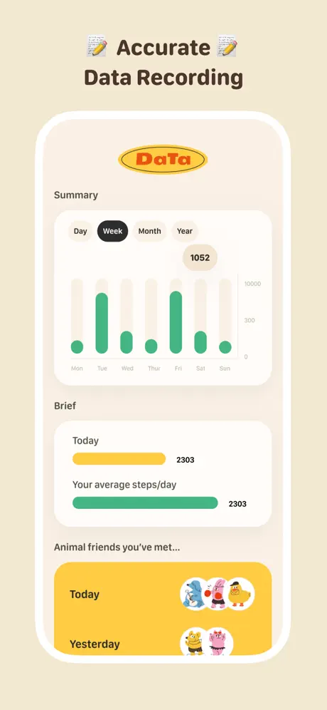
Back to neutral cream (#EEE5D8). The headline “📝 Accurate 📝 Data Recording” introduces accountability. Inside the device, a retro oval badge at the top reads “Data” in red serif-ish caps. A segmented control shows “Day,” “Week,” “Month,” “Year,” with “Week” filled in a dark pill (#1A1A1A). A vertical bar chart in mint green (#34D399) tracks seven days, with a callout bubble “1052” hovering near the right side. Below, the “Brief” section uses horizontal progress bars: “Today” in yellow at 2303 steps, and “Your average steps/day” in green, also at 2303. The bottom half is a social proof slide titled “Animal friends you’ve met…,” with yellow cards for “Today” and “Yesterday” showing small circular avatars. This frame risks dryness, but the yellow card inserts keep it chemically linked to the collection ecosystem rather than a disconnected analytics page.

CanGoGo App Store screenshot 6 — Collector grid inside peach surround with tabbed rarity filters
06

Collector grid inside peach surround with tabbed rarity filters

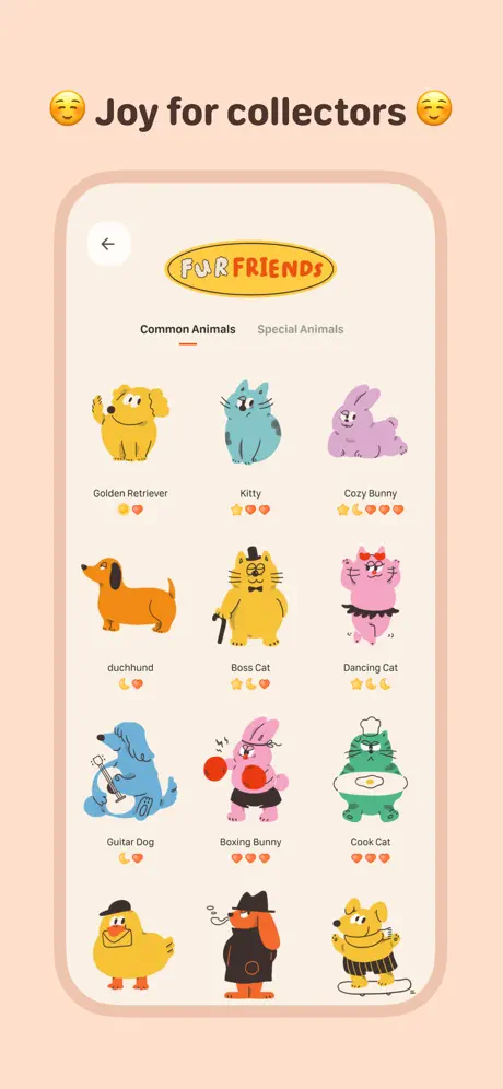
On-frame caption: “Joy for collectors

The background warms to soft peach (#FFD6C1). The headline “😊 Joy for collectors 😊” signals the gallery. The device shows a back-arrow in the upper-left, the “FUR FRIENDS” oval badge, and a tab switcher: “Common Animals” underlined in orange against “Special Animals.” A dense grid lists characters: “Golden Retriever,” “Kitty,” “Cozy Bunny,” “duchund,” “Boss Cat,” “Dancing Cat,” “Guitar Dog,” “Boxing Bunny,” and “Cook Cat.” Each cell pairs a full-color illustration with a name and a star-and-heart rating. The density is high—ten characters visible—but the generous beige padding inside the device and the peach surround prevent it from feeling like a catalog spreadsheet. The frame argues that the app is a collector’s destination, not just a utility.

CanGoGo App Store screenshot 7 — Permission screen with anthropomorphized Health icon and no device
07

Permission screen with anthropomorphized Health icon and no device

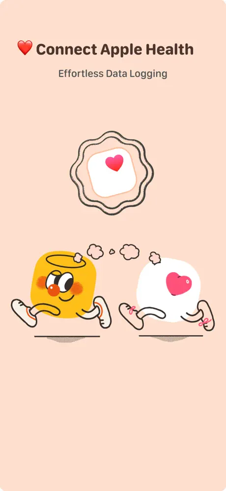
On-frame caption: “Connect Apple Health

The closing frame removes the device completely, returning to the peach (#FFD6C1) field. The headline “❤️ Connect Apple Health” sits above the sub “Effortless Data Logging” in a muted grey. The visual is a hand-drawn seal containing the Apple Health icon: a white rounded square with a pink heart (#FF6B81). Below, the can mascot runs beside an anthropomorphized Health-app square with stick legs and pink sneakers, connected by thought bubbles. There is no button, no status bar, no URL—just the trust signal. After six frames of thick device bezels, the sudden absence of hardware makes the integration feel invisible, which is exactly the promise of “effortless.” It is a soft ask, relying on brand warmth rather than technical screenshots to earn HealthKit permission.

05The craft

Captions, colour and the mechanics of the sell

Caption pattern

Every frame except the last uses a single headline sentence at the top. Frame 1 adds three bullet lines. Frame 7 introduces a subhead, breaking the one-liner convention. This inconsistency weakens the swipe rhythm because the eye has to recalibrate reading depth on the final frame.

Visual system

Flat illustration with halftone shadow dots, restrained drop shadows, and a strict two-tier palette: warm grounds outside the device and off-white cards inside. The app iconography inside the UI is geometric (the green “Data” cube, the pink “Fur friends” circle) while the characters are organic and wobbly. That contrast keeps the interface feeling like a stage for the characters rather than the main event.

The thumbnail test

At small thumbnail size, the can mascot’s yellow (#FBBF24) and the orange headline tint (#E85D04) read as a single warm mass against the cream background. The dark brown copy provides enough contrast to remain legible, though the beige frames (1, 4, 5) flatten into one another and lose distinct shape in a crowded search grid.

Conversion mechanics

The set is front-loaded with character charm and back-loaded with trust. Frame 3 delivers the core value (steps + feeding), frame 4 adds emotional payoff (adoption), and frame 7 removes friction by making the Health connection feel like a friendly run rather than a privacy form.

06Where it slips

What we would change

Beige frames bleed together in the swipe stream

Frame 1 uses a warm off-white (#F5EDE3), Frame 4 uses a nearly identical taupe (#E6D5C3), and Frame 5 drifts back to cream (#EEE5D8). On a quick swipe, these beige frames flatten into one another, killing the carousel rhythm. The fix is a sharper temperature shift—cooling Frame 5 to a pale sage or warming Frame 4 to the peach used in Frame 6—creating unmistakable color landmarks.

The Frame 2 logotype never returns

The massive “CAN GOGO” wordmark in Frame 2 is playful and dominates the corner, but it is an orphan: it never appears again, so it reads as a one-off sticker rather than a persistent brand stamp. The fix is to either repeat that logotype at small scale in Frame 3 or replace Frame 2’s device-agnostic text with a feature caption that matches the grammar of the rest of the set.

Frame 7 breaks the one-liner headline convention

Frame 7 is the only slide with a subhead (“Effortless Data Logging”). Every other frame relies on a single headline. That inconsistency makes the final slide feel like an onboarding graphic rather than a store screenshot. Removing the subhead and enlarging the icon seal to fill the negative space would keep the visual language rooted in illustration, not exposition.

Step counter in Frame 2 is aggressively cropped

The rotated device in Frame 2 slices off the first digit of the step count, leaving only “6628.” While context from Frame 3 suggests the full number is “16628,” the crop introduces a moment of dyslexia on the most important metric. Straightening the device ten degrees or shrinking the character to give the numerals clear margin would fix it.

07The recipe

How to apply this to your own app

  1. Introduce characters before UI when the value prop is emotional, not technical.

    Frame 1 is a poster; the device does not appear. This teaches the user the aesthetic promise before the utility proof.

  2. Map background color to emotional function, not just brand guidelines.

    Marigold for energy (frames 2–3), taupe for warmth (frame 4), cream for clarity (frame 5), peach for collection (frames 6–7). Each swipe signals a mood shift.

  3. Remove the device entirely for permission or trust frames.

    Frame 7 drops the bezel to make the Apple Health connection feel invisible and friendly rather than bureaucratic.

  4. Keep headlines outside the device so they survive thumbnail compression.

    The dark brown sans runs edge-to-edge above the phone, ensuring the value proposition is readable even when the App Store scales the screenshots down.

08Takeaways

Five things worth stealing

  • A thick, toy-like device bezel can unify a set while still allowing rotation and cropping.
  • Removing the device in the first and last frames creates bookend breathing room.
  • When utility UI is sparse, surround it with collectible cards and character illustrations so the frame never feels empty.
  • Caption copy should stay in one grammatical pattern; subheads in the final frame break swipe momentum.
  • Color temperature matters more than hue in a multi-frame carousel—beige, taupe, and cream are too close to read as distinct scenes.
09The verdict

What the set actually achieves

The designer solves this by treating the device frame as a prop rather than a pedestal. In frames two through six, the phone appears with an exaggerated cream bezel—almost toy-like in thickness—that floats at different rotations depending on the mood. Frame two tilts the device aggressively and plants the logotype outside it; frame three straightens it up to deliver a readable home screen. The color temperature is mapped to function: marigold yellow (#FDE6A8) for the energetic home screen, cool taupe (#E6D5C3) for the emotional reward reveal, neutral cream (#EEE5D8) for the data dashboard, and peach (#FFD6C1) for the collection grid and permission screen. Headlines live strictly outside the device in a dark brown (#3E2723) rounded sans, creating a consistent horizontal anchor no matter how the phone itself is cropped. Characters are never clipped by the device edge; they either live fully inside the UI or fully outside as illustrations, preserving their readability at thumbnail scale.

Designers building a utility app with a strong character IP, especially in Health & Fitness or Lifestyle where emotional motivation matters more than raw data density. Also useful for teams deciding whether to hide or expose the device bezel in their App Store art.

10Questions

Frequently asked

Why does the set use a device in some frames but not others?

The device appears when the frame needs to prove UI fidelity (frames 2–6) and disappears when the frame needs to sell brand promise (frame 1) or trust (frame 7). This alternating rhythm prevents bezel fatigue.

What typeface is used for the headlines?

The exact typeface is not identifiable from raster screenshots, but it behaves like a heavy geometric rounded sans—similar in personality to Varela Round or Quicksand—set in dark brown (#3E2723) against warm grounds.

How does the set handle HealthKit trust?

It avoids technical screenshots. Frame 7 anthropomorphizes the Apple Health icon as a running character beside the can mascot, turning a permission ask into a friendship moment.

Would this work in a darker palette?

Unlikely. The app’s core metaphor is a bright yellow can; a dark mode would mute the mascot and undermine the children’s-book aesthetic that makes the pedometer feel like a toy.

11Keep reading

Build your own screenshot set

The full set

7 shots
CanGoGo App Store screenshot 1CanGoGo App Store screenshot 2CanGoGo App Store screenshot 3CanGoGo App Store screenshot 4CanGoGo App Store screenshot 5CanGoGo App Store screenshot 6CanGoGo App Store screenshot 7

About the app

CanGoGo is a cute and easy-to-use pedometer. Walk 3,000 steps to unlock adorable animal friends. Perfect for those who want to make walking fun. 【Core Features】 • Automatically Zaozao Island Technology CO., Ltd, via the App Store listing.

Screenshots and store metadata belong to Zaozao Island Technology CO., Ltd. They are shown here for design commentary and criticism. The analysis on this page is original work by floow.design. View the original listing.

More Travel teardowns

Browse all →