Polestar app icon
TravelScreenshot teardown9 min read

Polestar App Store screenshots

Designing an App Store presence for a car brand means selling two products at once: the vehicle in the driveway and the phone in the hand. The shopper is not just evaluating iconography and onboarding; they are asking whether this pixel experience matches the metal one. Polestar’s seven-frame screenshot set attempts to bridge that gap by alternating between raw dashboard UI, typographic spec sheets, and staged device vignettes.

Set published by Polestar · 7 frames analysed

4.4 · 2.9K ratingsFreev5.6.0Updated 4mo ago
Polestar App Store screenshot 1
01At a glance

The set in one screen

Framing
Mixed — full-bleed raw screenshot, typographic list, then iPhone bezel compositions against black canvas
Captions
Large light-gray headline (~32 pt) with smaller white subhead (~17 pt) anchored top-left
Backdrop
Pure black #000000 for staged frames; warm gray #F2F2F2 for the typographic interlude
Type
Geometric sans-serif, heavy weight for numerals, regular for body, with temperature and range data at display scale
UI / copy split
High UI density; captions occupy roughly 12% of canvas height, leaving the rest for interface or feature lists
Frame 1 job
Drop the viewer straight into the dark dashboard — 50% charge, 230 km range, door-ajar alert — with no device mask or title card

Sampled palette

Black#050505
Brand orange#FF5C00
Charcoal card#1C1C1E
System gray#8E8E93
Paper white#FFFFFF
02The challenge

What this screenshot set had to solve

Automotive companion apps face a discoverability paradox. The App Store thumbnail viewer is small, the swipe window is measured in seconds, and the feature set is enormous: climate pre-conditioning, charge scheduling, digital keys, service booking, order tracking, and OS widgets. The challenge is not simply to list capabilities but to make them feel like extensions of a physical object that costs as much as a house. Polestar’s set must communicate premium Scandinavian restraint while still proving the app is utilitarian enough to open every morning.

The set tries to answer every shopper question in seven swipes. In doing so, it sacrifices the compositional consistency that would make the brand feel inevitable.
03The approach

How the set argues its case

The guiding strategy is brand-color austerity. By reserving orange almost exclusively for states that demand action — an open door, a heating toggle, a charge limit, a lock button — the palette borrows from automotive warning-light semantics. The sequence is also structurally honest: it shows both dark and light app modes, acknowledges that not every screen is cinematic, and closes on iOS system widgets to prove ecosystem integration. That honesty, however, is undermined by a framing language that shifts from full-bleed raw capture to device-isolated vignettes without warning, making the set feel like a composite of different presentations rather than a single authored narrative.

Positioned as a premium automotive utility, the screenshots avoid lifestyle photography of roads and forests. Instead, the car is rendered in CG top-down and cabin views, ensuring the vehicle reads as a controllable object rather than a lifestyle aspiration. This positions the app for existing owners and reservation-holders more than for casual browsers who have never sat in a Polestar.

04Frame by frame

Every screenshot, and the job it does

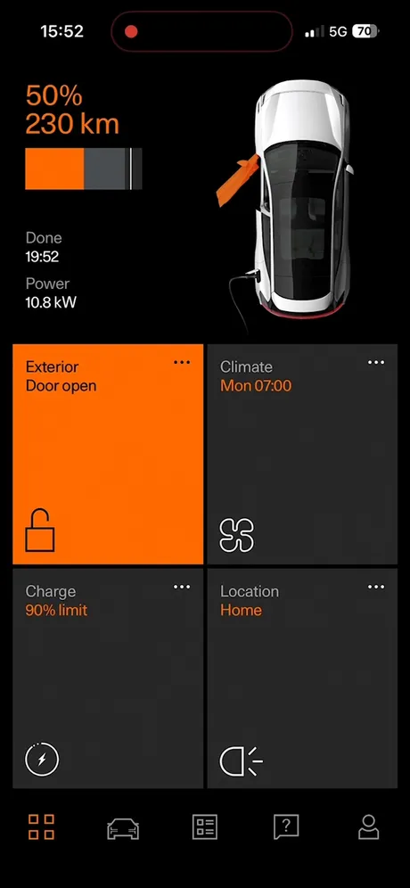
Polestar App Store screenshot 1 — The Dashboard as Hero
01

The Dashboard as Hero

On-frame caption: “Raw full-bleed iPhone screenshot. No device mask, no marketing title. Status bar visible: 15:52, 5G, 70% battery, Dynamic Island with red recording indicator. Dark ground at #050505. Top-left typographic stack: “50%” and “230 km” in #FF5C00 at display scale (~44 pt), with “Done / 19:52” and “Power / 10.8 kW” below in #8E8E93 at body size (~15 pt). A horizontal battery bar sits beneath: orange fill, charcoal empty segment #1C1C1E, 1-pt white divider. Top-right: 3D top-down vehicle render in white with black glass roof; orange arrow points to front-left door indicting open state. Lower half locked into a strict 2×2 grid. Top-left card flooded #FF5C00 with “Exterior / Door open” in white and a lock icon bottom-left. Top-right card in #1C1C1E: “Climate / Mon 07:00” with orange subhead and HVAC icon. Bottom-left card: “Charge / 90% limit” with lightning-bolt icon. Bottom-right: “Location / Home” with headlight icon. Bottom tab bar cropped with five icons; grid icon active in orange, others in #5C5C5E. The frame acts as an unfiltered live view of the app, but the recording dot in the status bar and carrier glyphs introduce real-world clutter that a masked presentation would have hidden.

top-level dashboard status with open door alert and charge metrics on dark UI ground without bezel mask or title card text overlay, relying on bold orange and charcoal card contrast to carry the hero message
Polestar App Store screenshot 2 — The Feature Interlude
02

The Feature Interlude

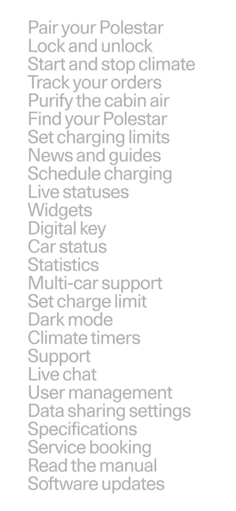
On-frame caption: “Centered typographic list on a warm-gray ground ~#F2F2F2. Text is a single weight and color, approximately #B0B0B0 at ~22 pt, with line spacing near 1.3×. The copy reads, in descending order: “Pair your Polestar / Lock and unlock / Start and stop climate / Track your orders / Purify the cabin air / Find your Polestar / Set charging limits / News and guides / Schedule charging / Live statuses / Widgets / Digital key / Car status / Statistics / Multi-car support / Set charge limit / Dark mode / Climate timers / Support / Live chat / User management / Data sharing settings / Specifications / Service booking / Read the manual / Software updates”. No imagery, no icons, no hierarchy beyond line breaks. The frame functions as a functional checklist, but visually it is dead air. At thumbnail size it reads as a gray smudge; at full size it sacrifices every lesson Frame 1 taught about color and hierarchy.

plain text list of capabilities centered on light gray background with no accompanying imagery or typographic hierarchy, acting as a feature checklist rather than a visual selling frame

Polestar App Store screenshot 3 — Preclimatisation Staging
03

Preclimatisation Staging

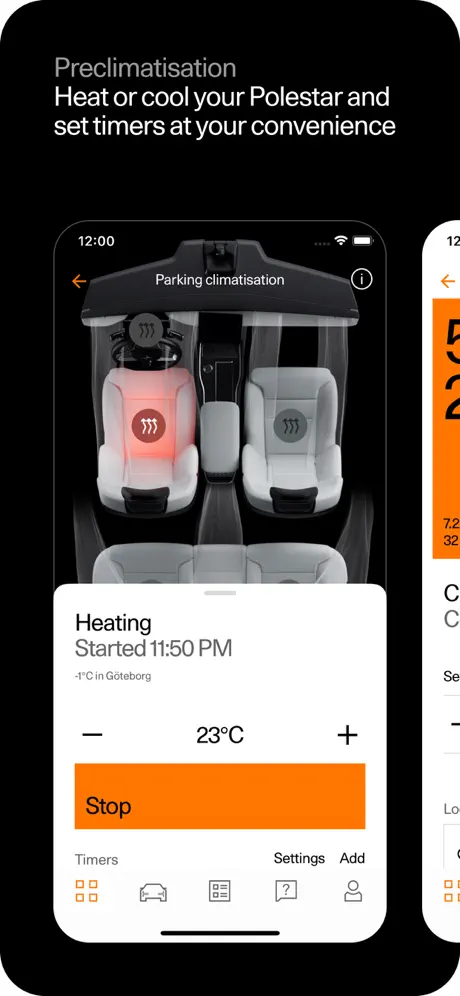
On-frame caption: “Black canvas with device-centered iPhone bezel. Caption top-left: “Preclimatisation” in large light-gray sans-serif (~#EBEBF5, 34 pt) with subhead “Heat or cool your Polestar and set timers at your convenience” in smaller white type beneath. Inside the device, the app switches to a light mode: white ground #FFFFFF. Header “Parking climatisation” with back arrow left and info icon right. A 3D cabin visualization occupies the upper portion: driver seat glowing with orange-red heat radiation on white upholstery; passenger seat neutral gray. Bottom sheet presents “Heating / Started 11:50 PM / -1°C in Göteborg” in black, then a stepper control (− / 23°C / +), and a full-width #FF5C00 rectangle button labeled “Stop” in black type. Segment control above tab bar: “Timers”, “Settings”, “Add”. Tab bar shows grid icon in orange. The negative space around the device is generous — roughly 20% canvas padding — isolating the climate story effectively.

single iPhone staging on black showing seat-heating 3D visualization and climate timer control sheet with full-width orange stop button, introducing light-mode UI for the first time

Polestar App Store screenshot 4 — Charge and Location Twin
04

Charge and Location Twin

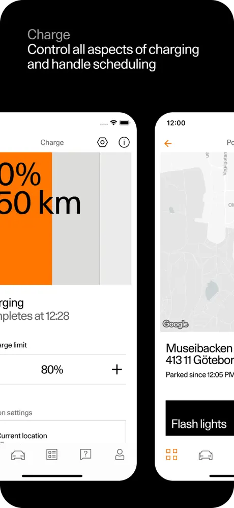
On-frame caption: “Title “Charge” with subhead “Control all aspects of charging and handle scheduling”. Two iPhone bezels sit side by side with a narrow black gutter (~24 pt). Left device: white-ground charge screen. Left edge of canvas crops the numerals; visible are “0%” and “50 km” in black at giant scale with a vertical orange fill bar behind them. Below: “Charging completes at 12:28”, a “Charge limit” row set to “80%” with a plus icon, and “Location settings” / “Current location” rows. Right device: map view with Google logo, location label “Museibacken / 413 11 Göteborg / Parked since 12:05 PM”, and a black pill button reading “Flash lights”. Status bar shows 12:00. The pairing tells a two-part story — data input and physical context — but the tight cropping and adjacent placement give neither device the breathing room of Frame 3. The left screen also suffers from edge cropping that obscures the full percentage numeral.

side-by-side iPhone bezels presenting charge scheduling UI paired with map location and flash-lights action, composition cramped by minimal gutter and partial cropping of left-edge type

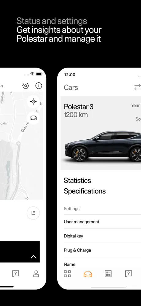
Polestar App Store screenshot 5 — Status and Settings
05

Status and Settings

On-frame caption: “Title “Status and settings” with subhead “Get insights about your Polestar and manage it”. Two devices again. Left device shows a grayscale map interface with road labels (e.g., “Övre H”) and a locate button; a bottom sheet handle is visible but the sheet content is cropped out. Right device displays the “Cars” profile: “Polestar 3 / 1200 km” beside a side-profile hero image of a dark SUV on a white card. Below, linked rows “Statistics” and “Specifications”, then a “Settings” section header in #8E8E93, followed by “User management”, “Digital key”, “Plug & Charge”, and a “Name” row. Tab bar highlights the car icon in #FF5C00. The left device feels like visual filler; without a clear focal point or readable label, it exists only to balance the right device compositionally. The right device is the clearer story, showing ownership hierarchy and multi-user management.

paired devices showing map fragment left and car profile with settings list right, where left device lacks readable focal point while right communicates vehicle management and statistics access

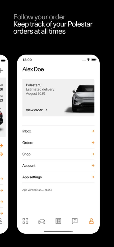
Polestar App Store screenshot 6 — Order Tracking
06

Order Tracking

On-frame caption: “Title “Follow your order” with subhead “Keep track of your Polestar orders at all times”. A second device bleeds off the left edge, showing truncated list rows. Center device dominates: screen header “Alex Doe”, then an order card with “Polestar 3 / Estimated delivery / August 2025” and a front-three-quarter vehicle render. Below the card: “View order →” with an orange chevron. Apparent table rows follow — “Inbox”, “Orders”, “Shop”, “Account”, “App settings” — each with an orange right chevron. Footer text: “App Version 4.20.0 (9320)” in small gray. Tab bar highlights the person icon in orange. The composition is weakened by the left-edge bleed, which shows only generic arrow icons and adds no narrative information. Removing the partial device would have centered the account story and let the delivery date read as the hero data point.

centered iPhone showing account profile and order card with August 2025 delivery estimate, flanked by a partially visible left device that obscures margin space without adding narrative value

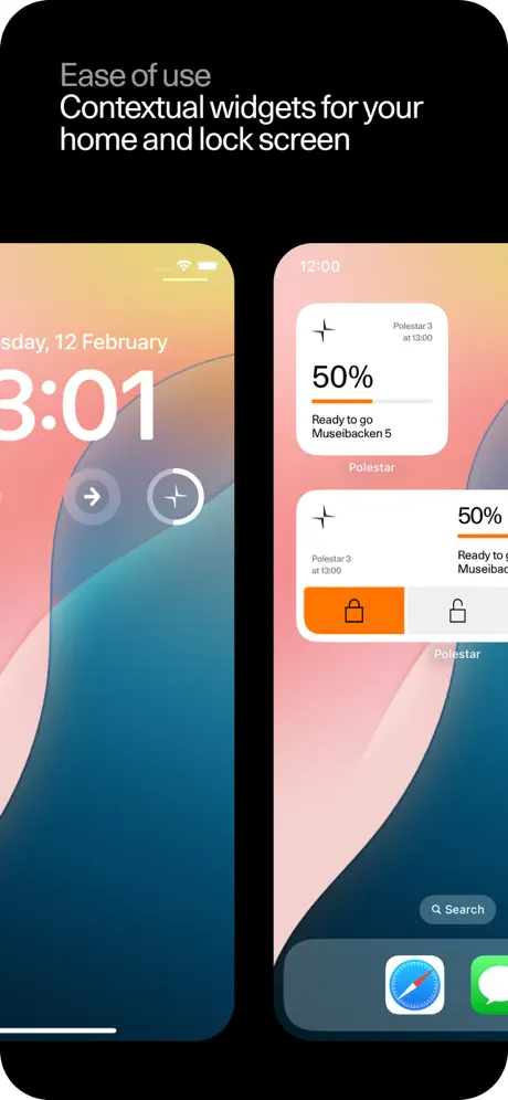
Polestar App Store screenshot 7 — Widget Ecosystem Proof
07

Widget Ecosystem Proof

On-frame caption: “Title “Ease of use” with subhead “Contextual widgets for your home and lock screen”. Left device presents an iOS lock screen: date “Tuesday, 12 February”, time “3:01”, and a circular Polestar quick-action button with a compass/star glyph beside the stock flashlight toggle. Right device shows the iOS home screen with default wallpaper. Two widgets are stacked: a compact widget reading “Polestar 3 at 13:00 / 50% / Ready to go / Museibacken 5” with an orange progress bar; and a wide split widget with an orange “lock” half and white “unlock” half. The orange translates cleanly into Apple’s widget chrome because the set’s accent color is already high-visibility. By exiting the app entirely, the frame answers a practical discovery question and closes the sequence with proof of native integration rather than another internal UI tour.

lock screen and home screen devices displaying Polestar widgets on native iOS surfaces, using orange accent consistently within Apple’s widget chrome to demonstrate outside-the-app utility

05The craft

Captions, colour and the mechanics of the sell

Caption pattern

Frames 3 through 7 share a strict caption pattern. A single word or short phrase — “Preclimatisation”, “Charge”, “Status and settings”, “Follow your order”, “Ease of use” — is set in a large, light-gray sans-serif (approximately #EBEBF5 at 34 pt), followed by a white subhead at ~17 pt. The captions are always top-left aligned, never centered, creating a consistent margin that the eye can lock onto even as the devices below change in number and arrangement. The problem is the contrast: on a black background, the gray headline is high enough in point size to be legal, but in the compressed App Store viewer it flirts with invisibility. Only the white subheads remain crisp.

Visual system

The visual system is split between two dialects: the raw UI of Frame 1 and the staged bezels of Frames 3–7. Inside the app, the component language is blocky and grid-based — 2×2 cards, full-width bottom sheets, hairline separators. Outside the app, the staging language is minimal: floating iPhones on black, no shadows, no environmental context. The orange accent (#FF5C00) is the only bridge between the two dialects. It appears in the dashboard cards, the climate stop button, the charge fill bar, the widget lock toggle, and the list chevrons. This consistency is the set’s greatest structural achievement; you could sample the orange from any frame and it would match within a few points.

The thumbnail test

At thumbnail scale, Frame 1 collapses into a high-contrast abstract: a bright orange square against black with white numerals. It is distinctive. Frame 2 collapses into illegible gray text on light gray — an instant swipe-past. Frame 7, the home-screen widget, reads as a colorful Apple advertisement, which may earn a tap from iOS enthusiasts but looks like an Apple marketing image rather than a third-party app. The strongest thumbnail after Frame 1 is Frame 4, where the orange charge bar creates a bold vertical stroke.

Conversion mechanics

The set attempts to convert both prospective buyers (order tracking, specifications) and existing owners (climate, charge, widgets). Frame 6’s order card with the August 2025 date is a direct conversion hook for reservation holders. Frame 7’s widget proof targets the convenience-oriented shopper who wants to know if the app earns a place on their home screen. However, Frame 2’s feature list does not convert; it informs. In App Store behavior, lists are scanned and skipped. A shopper deep enough to care about “Data sharing settings” will find that inside the app or on the web; the screenshot real estate is too expensive to spend on a gray wall of text.

06Where it slips

What we would change

Framing Grammar is Fragmented

Frame 1 is a raw screenshot. Frames 2 is pure text. Frames 3–6 are iPhone bezels on black. Frame 7 is iOS system chrome. The shopper is forced to re-learn the visual language on every swipe. A stronger set would commit to a single framing device — either every screen is masked in a bezel with a black stage, or everything is raw UI. If the raw Frame 1 is meant to feel like a live dashboard, it should be the only unmasked frame and should be visually differentiated by a gesture or environmental shadow that says “this is the real app, unfiltered.” As it stands, the inconsistency looks accidental rather than strategic.

Frame 2 Kills Momentum

The second slot is the most valuable real estate after the hero. Polestar spends it on a low-contrast, image-less feature list. Every item on that list — “Digital key”, “Climate timers”, “Live chat” — could have been communicated through a cropped UI detail or a small icon grid. The fix is to delete this frame and distribute its contents: show “Digital key” in a close-up of Frame 5’s settings list, show “Widgets” in Frame 7 (already done), and let “Multi-car support” appear as a second car row in Frame 5. The resulting set would be six frames instead of seven, each frame doing visual work rather than reading like release notes.

Headline Contrast is Too Low

The top-left captions in Frames 3–7 use a light gray (~#8E8E93 or #EBEBF5 at reduced opacity) on pure black. At the compressed scale of the App Store scroll, these headlines get lost. The subheads, rendered in solid white, fare better. The fix is to shift the headline color to #F2F2F5 or pure white, relying on weight rather than color value to create hierarchy. If the intent was to make the device the hero and the text merely contextual, the hierarchy succeeds; but contextual text that is unreadable fails its own purpose.

Partial Devices Add Noise, Not Story

Frame 4’s twin iPhones are crowded, and Frame 6’s left-edge bleed shows only anonymous list chevrons. These partial devices introduce compositional tension without narrative payoff. The fix for Frame 4 is to increase the gutter to 48 pt or separate the devices vertically. The fix for Frame 6 is to crop the left phone entirely and center the single account device, letting “Alex Doe” and the delivery date own the frame. Negative space is not wasted space; it is emphasis.

Status Bar Inconsistencies

Frame 1 shows a real-world status bar with carrier, 5G, battery, and a recording indicator dot. Frames 3–6 show a sterile 12:00 time with full Wi-Fi and battery, the classic design-comp default. Frame 7 shows lock-screen system time. This inconsistency signals that Frame 1 was captured live while the rest are staged renders. The fix is either to sanitize Frame 1 (remove the recording dot and carrier metadata) or to add realistic status-bar detail to the staged frames. Uniformity of finish matters in premium positioning.

07The recipe

How to apply this to your own app

  1. Commit to One Framing Language

    Decide whether your set is raw UI, staged devices, or environmental storytelling, and stick to it. If you must mix, use lighting, shadow, or background color to make the shift feel intentional, not like an export error.

  2. Kill the Feature List Frame

    Never spend an entire screenshot on plain text capabilities. If your feature set is large, let the UI across other frames demonstrate it implicitly. Shoppers do not read bullet lists in thumbnails; they scan color and shape.

  3. Reserve Accent Color for Action and Alarm

    Polestar’s orange works because it means something different every time — open door, active heating, charge bar, lock toggle. If your brand has one high-visibility hue, ration it. When it appears, the eye should know it is being told to act or notice.

  4. Design for Thumbnail Legibility

    Check your captions at 120 pt wide. If the headline disappears, bump the value toward white or increase the weight. Gray-on-black is elegant at full scale and invisible at small scale.

  5. Use Negative Space as emphasis

    When staging multiple devices, give each bezel room to breathe. Tight gutters and partial bleeds look sophisticated in portfolio decks but confusing in a six-second App Store swipe.

08Takeaways

Five things worth stealing

  • The set’s color discipline is its strongest asset; a single orange accent unifies dark mode, light mode, and system widgets across seven disparate screens.
  • Frame 1’s decision to show raw UI without a device mask is brave and effective, but the recording indicator and carrier status bar undercut the premium finish.
  • Frame 2 is a strategic error. It treats the second-most valuable frame like a settings menu, losing shoppers who decide within two swipes.
  • The caption system is structurally consistent but visually too dim; the gray-on-black headlines sacrifice legibility for subtlety.
  • Closing on home-screen widgets is a smart conversion move — it answers the shopper’s unspoken question about whether the app earns a place outside the app drawer.
09The verdict

What the set actually achieves

A seven-frame sequence that front-loads the dark-mode dashboard, attempts a feature-list pivot, then walks through climate, charging, settings, orders, and widgets. The set succeeds in color discipline and 3D asset integration, but fractures its own rhythm with inconsistent framing and a second frame that mistakes a bullet list for a selling proposition.

Existing Polestar owners, reservation holders awaiting delivery, and EV shoppers comparing OEM companion apps before purchase. The set assumes familiarity with the brand; there is no explanatory copy for what a Polestar is. That confidence is appropriate for a niche automotive product but would fail for a mass-market mobility app.

10Questions

Frequently asked

Why does Frame 1 look different from the others?

It is a raw, unmasked iPhone screenshot showing the actual status bar (15:52, 5G, battery, recording indicator), while Frames 3–6 use clean device bezels with a generic 12:00 status bar.

What is the exact text in the second frame?

A single-column list reading: Pair your Polestar, Lock and unlock, Start and stop climate, Track your orders, Purify the cabin air, Find your Polestar, Set charging limits, News and guides, Schedule charging, Live statuses, Widgets, Digital key, Car status, Statistics, Multi-car support, Set charge limit, Dark mode, Climate timers, Support, Live chat, User management, Data sharing settings, Specifications, Service booking, Read the manual, Software updates.

What is the dark-mode background color?

Approximately #050505 near-black, with card surfaces at #1C1C1E charcoal and accent color at #FF5C00 orange.

Does the set use real photography or 3D renders?

The vehicles and cabin interiors appear to be computer-generated 3D renders rather than photography, allowing UI elements to overlay cleanly against white backgrounds and transparent glass roofs.

11Keep reading

Build your own screenshot set

The full set

7 shots
Polestar App Store screenshot 1Polestar App Store screenshot 2Polestar App Store screenshot 3Polestar App Store screenshot 4Polestar App Store screenshot 5Polestar App Store screenshot 6Polestar App Store screenshot 7

About the app

Control your car Use the app to control in-car climate, door locks, locate your car, see battery and charging status, and keep track of software installations. Manage your Polestar, via the App Store listing.

Screenshots and store metadata belong to Polestar. They are shown here for design commentary and criticism. The analysis on this page is original work by floow.design. View the original listing.

More Travel teardowns

Browse all →