Roam app icon
TravelScreenshot teardown15 min read

Roam App Store screenshots

Designing a screenshot set for a utility app that also wants to feel like a game is a tightrope walk. You have to sell roaming data and router configuration in the same breath as sticker collections and coin jars. The eight-frame App Store set for Roam attempts exactly that: it pairs a dark-mode utility interface with a light, gradient-heavy stage, then layers 3D coins, cards, routers, and airplanes on top to keep the eye moving. Here is a full teardown of what that system does, frame by frame, and where the seams start to show.

Set published by Wonder Inventions - Roam LLC · 8 frames analysed

4.7 · 39 ratingsFreev210Updated 4mo ago
Roam App Store screenshot 1
01At a glance

The set in one screen

Framing
iPhone 15 Pro, mostly angled right-isometric with Dynamic Island visible; Frame 4 adds hands, Frame 8 goes flat-front.
Captions
Centered, bold sans-serif, large point size (~48–56pt equivalent), near-black (#111827); no sub-captions anywhere.
Backdrop
Fixed top-to-bottom wash: warm off-white (#F5F2F0) to vivid violet (#B47CFA); halftone world-map dots in lavender at ~12% opacity.
Type
Geometric sans, heavy weight; all-caps or sentence-case headlines mixed with SF Pro Text inside the UI.
UI / copy split
Interface dominates roughly 65% of each frame; headline and negative space take the remaining 35%.
Frame 1 job
Sell the core value proposition—eSIM connectivity—while introducing the gamified dashboard.

Sampled palette

#F5F2F0#F5F2F0
#B47CFA#B47CFA
#111827#111827
#050507#050507
#1C1C1E#1C1C1E
#3B82F6#3B82F6
02The challenge

What this screenshot set had to solve

The brief, implied by the sequencing, is to compress three distinct mental models into a single swipe journey. Frame 1 must establish that Roam is an eSIM provider with real prices and data top-ups. Frame 2 must pivot to geography and discovery—a map layer. Frames 3 through 6 must introduce a loyalty economy: points, quests, stickers, and ledgers. Frame 7 has to sell a physical infrastructure play (home-router sharing), and Frame 8 needs to deliver an emotional payoff (a reward modal). The risk is narrative whiplash: the viewer moves from a telecom utility to a Pokémon-style sticker album in four swipes. Roam’s answer is to bind everything together with a single background system and a recurring 3D coin motif so that, even when the UI jumps from WiFi maps to trading cards, the stage itself never changes.

They chose to never change the background. That decision keeps the set coherent, but by Frame 6 it also turns the scroll into a single long corridor rather than a paced story.
03The approach

How the set argues its case

Roam’s team clearly built a 3D asset kit first—coins, cards, chips, routers, airplane—then distributed those objects around the phone like stage props. The UI itself is always captured in dark mode, which punches against the light-purple surround and makes the phone screen feel like a lit aperture. By angling the device in most frames, they create diagonal sight-lines that let floating objects enter from the left (airplane, stickers, cards) or right (coins) without fully blocking the headline. The headlines are always centered and always high on the canvas, so even if the phone overlaps the lower portion of the text block, the leading words remain unobstructed.

The positioning sits somewhere between fintech and lifestyle gaming. The screenshots do not read like a traditional MVNO (mobile virtual network operator) listing because of the loot-box color accents and sticker grids. At the same time, the presence of router hardware and eSIM price tags prevents it from feeling like a pure social app. That duality is intentional: the set wants to signal that connectivity is the entry point and gamification is the retention layer.

04Frame by frame

Every screenshot, and the job it does

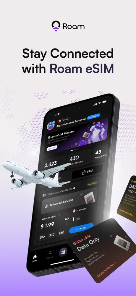
Roam App Store screenshot 1 — Stay Connected with Roam eSIM
01

Stay Connected with Roam eSIM

On-frame caption: “Stay Connected with Roam eSIM

The sequence opens with the Roam logomark centered at the top—a circular icon with a violet arc—followed by the headline in a heavy, near-black sans-serif (#111827) set flush center. The upper canvas is warm off-white (#F5F2F0) and relatively quiet, anchored only by the wordmark and the headline. Below that, the background shifts into a saturated violet wash (#B47CFA) that carries a halftone world-map dot pattern at low opacity. Dominating the lower two-thirds is an iPhone 15 Pro rotated roughly 25 degrees on the Y-axis, presenting a dark-mode dashboard. Inside the UI, the status bar reads 9:41. A profile row shows a Canadian flag, the name “Alex Herminio Schumm,” and a blue “Certified” badge pill. Beneath that, a hero card titled “Roam eSIM Mission” includes a white “Join Now!” button. A stats triad sits below: “2,323” (Roam Points), “430” (Total Stickers), and “43” (Added WiFi). Further down, a card displays “Global eSIM #123456789” as “Not Active,” with an “Activate Global eSIM” CTA and a price point of “$1.99” for 1 GB. A blue “Top-up” pill button sits at the bottom of that card. The tab bar is visible: Home (filled), Explore, Apps, Rewards, Account. Outside the phone, a 3D commercial airplane enters from the lower left, its fuselage overlapping the left bezel and its wing cutting across the stats row. A floating black product card reading “Global eSIM Data Only” hovers in the lower right, angled away from the viewer. Another partially visible yellow-black card on the far right edge reads “Premium DATA, VOICE + SMS.” The overall depth stack places the airplane and cards in front of the phone, which itself floats in front of the dotted map.
Roam App Store screenshot 2 — Discover WiFis Near You
02

Discover WiFis Near You

On-frame caption: “Discover WiFis Near You

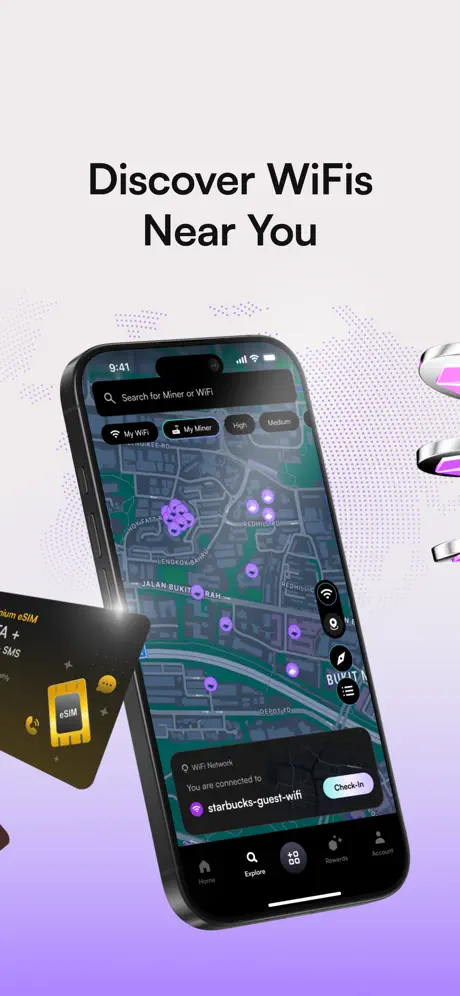
The second frame keeps the identical gradient and halftone backdrop, confirming that Roam is treating this as a theatrical stage rather than a per-screen environment. The headline is centered in the same weight and color. Here the iPhone is far less rotated—perhaps 8 to 10 degrees—so the screen content is easier to read. The UI shows a map view with a search bar at the top reading “Search for Miner or WiFi.” Below the search field are four filter pills: “My WiFi,” “My Miner,” “High,” and “Medium.” The map itself is dark-mode cartography with purple cluster pins. A bottom sheet overlaps the lower portion of the map, stating “WiFi Network” and “You are connected to” above the network name “starbucks-guest-wifi,” which carries a purple WiFi glyph. A “Check-In” button lives inside a white-stroke pill on the right side of that sheet. The tab bar shows Explore selected (magnifier icon). Floating props include a yellow-and-black eSIM card on the left, partially cropped by the frame edge, and a short stack of silver-violet coins tumbling in from the upper right. Because the phone is nearly frontal, the floating objects read as framing devices rather than obstructions.

Roam App Store screenshot 3 — Connect. Share. Earn.
03

Connect. Share. Earn.

On-frame caption: “Connect. Share. Earn.

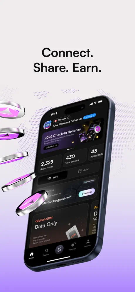
Frame 3 returns to a steeper device angle, similar to Frame 1, but swaps the headline voice to clipped imperatives. The text is still centered and large, but the periods give it the rhythm of a tagline rather than a feature callout. The UI on the phone is the same home dashboard as Frame 1, with the stats trio unchanged: 2,323 / 430 / 43. However, the top promotional card has been replaced with “2025 Check-In Bonanza,” again offering a “Join Now” CTA. A WiFi connection toast appears lower on the screen, reading “starbucks-guest-wifi” next to a “Check-In” pill. The primary 3D motif here is a vertical cascade of silver-violet coins tumbling down the left side of the canvas. No airplane appears, and no product cards float in the foreground. The result is a composition that feels slightly emptier than Frame 1, which may be intentional—a visual exhale after the denser opening shot. The tab bar and status bar remain consistent, reinforcing continuity.

Roam App Store screenshot 4 — Complete Quests and Get Rewards
04

Complete Quests and Get Rewards

On-frame caption: “Complete Quests and Get Rewards

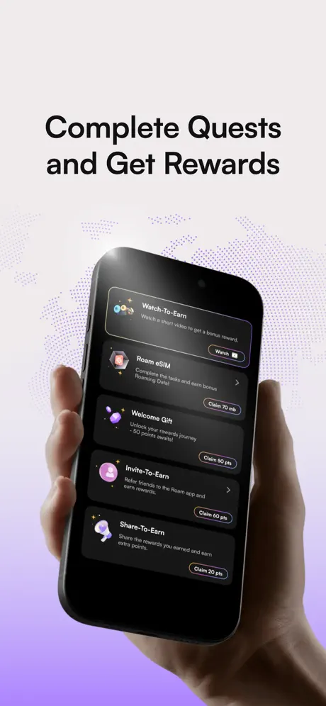
This frame introduces the first major break in framing convention: two human hands grip the phone from the left and right edges. The skin tones are warm and natural, lit with soft highlights that sit outside the cool violet studio environment used everywhere else. The phone is held almost vertically with minimal rotation, making the screen content exceptionally flat and legible. The UI is a scrollable list of quest cards on a dark background. From top to bottom, the rows are: “Watch-To-Earn” with a filmstrip icon and a “Watch” pill; “Roam eSIM” with a chip icon and a “Claim 70 mb” pill; “Welcome Gift” with a purple gift icon and a “Claim 50 pts” pill; “Invite-To-Earn” with a user-plus icon and a “Claim 60 pts” pill; and “Share-To-Earn” with a megaphone icon and a “Claim 20 pts” pill. Each row uses a subtle separator and a right-aligned CTA. Notably, there are no floating coins, cards, or 3D objects in this frame beyond the background dot pattern. The absence of props, combined with the organic hands, shifts the tone from digital product showcase to lifestyle photography—an abrupt but humanizing turn.

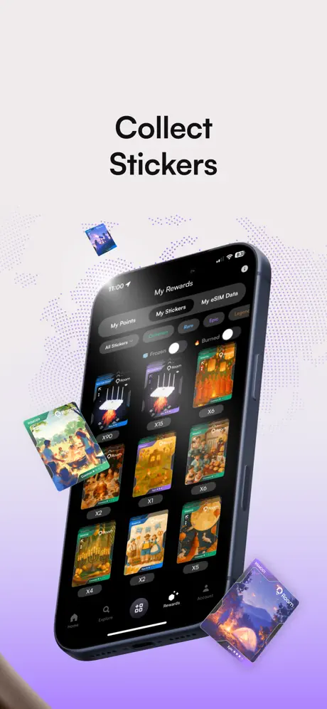
Roam App Store screenshot 5 — Collect Stickers
05

Collect Stickers

On-frame caption: “Collect Stickers

Frame 5 pivots hard into gamification. The headline is a simple two-word command: “Collect Stickers.” The phone is back to an angled float, tilting right. Inside, the app displays the “My Rewards” hub with three top tabs: “My Points,” “My Stickers,” and “My eSIM Data.” The active tab is “My Stickers,” underlined by a white pill. Below that, a rarity filter row reads “All Stickers,” “Common,” “Rare,” “Epic,” “Legendary,” with a secondary row showing “Frozen” and “Burned” states. The grid below contains illustrated trading-card assets depicting cultural scenes, each with a foil-like finish and a quantity badge: x90, x15, x6, x1, x6, x4, x2, x5. The status bar shows 11:00. Outside the phone, three loose sticker cards float in space: one near the top left (small, partially cropped), one along the left middle (angled steeply forward), and one at the bottom right (Resting on the violet gradient). The background gradient and halftone map remain unchanged. This frame is the most colorful inside the UI because the sticker illustrations introduce oranges, greens, and blues that the rest of the set does not have.

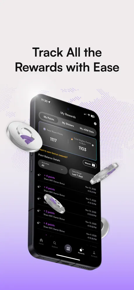
Roam App Store screenshot 6 — Track All the Rewards with Ease
06

Track All the Rewards with Ease

On-frame caption: “Track All the Rewards with Ease

The sixth frame returns to the My Rewards hub, but the active tab is now “My Points.” The headline is the longest in the set: “Track All the Rewards with Ease.” Inside the phone, a top card displays “Total Roam Points” as 1117, with a secondary metric “Total Eligible Points to Burn” at 1103, accompanied by a small flame icon in orange-red. Beneath that is a “Watch” button with a play glyph. The section header “Point Balance Details” is followed by a filter dropdown labeled “Activities” set to “All,” and a date range set to “Last 7 days.” The list below repeats the same line item: “+4 points” or “+2 points” for “Share WiFi Owner Bonus,” timestamped across November 9–12, 2025. The list items are separated by hairline dividers at roughly #2A2A2C. Floating silver-violet coins scatter around the phone—one large coin at the left, one clipping through the middle of the screen on the right, and others blurred in the periphery. The device angle and background are consistent with frames 1, 3, and 5, maintaining the right-isometric rotation.

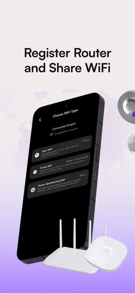
Roam App Store screenshot 7 — Register Router and Share WiFi
07

Register Router and Share WiFi

On-frame caption: “Register Router and Share WiFi

Frame 7 addresses infrastructure setup. The headline reads “Register Router and Share WiFi.” The phone is angled similarly to Frame 2—roughly 10 degrees—and displays a screen titled “Choose WiFi Type.” A green status line at the top reads “Connected Hotspot” with “Share3a9abc connected.” Three options appear as stacked dark cards: “Open WiFi” (100 pts), “Private WiFi” (100 pts + Mining Rewards), and “Partner OpenRoaming WiFi” (300 pts). Each option has a left glyph, a body description in muted gray, and a right-aligned points value in a rose-pink accent. The bottom of the canvas is occupied by two matte-white 3D router models: one traditional tower with three external antennas, and one low-profile hexagonal mesh node. A few silver-violet coins tumble in from the upper right. This is the only frame where the status bar is not clearly visible, because the top of the phone blends into the dark UI and the crop is slightly tighter. The background gradient and dot map remain locked, as always.

Roam App Store screenshot 8 — Check-In and Earn Rewards
08

Check-In and Earn Rewards

On-frame caption: “Check-In and Earn Rewards

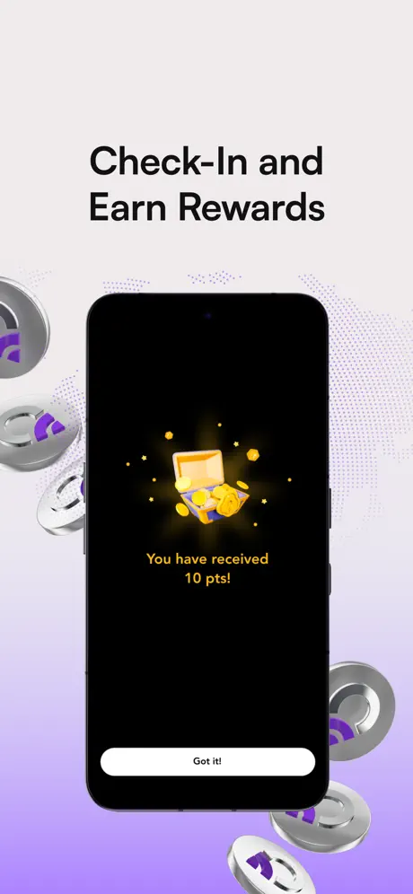
The final frame is the most structurally distinct. The phone is presented flat-front, with zero rotation, breaking the isometric convention used in six of the previous seven frames. The screen itself is a full-black modal (#000000) with a centered 3D illustration of an open treasure chest spilling gold coins and stars. Below the illustration, the text reads “You have received” in a warm yellow (#FBBF24), followed by “10 pts!” in the same hue. At the bottom of the screen is a white pill button reading “Got it!” in dark text. The phone’s black bezel merges almost seamlessly with the modal background, making the device boundaries harder to read than in other frames. Silver-violet coins float on both the left and right edges, some partially cropped, creating a symmetric frame around the central reward moment. The background gradient continues its usual off-white-to-violet fade, with the halftone map still present. The headline above the phone reads “Check-In and Earn Rewards,” closing the sequence with the payoff implied by Frames 3 and 4.

05The craft

Captions, colour and the mechanics of the sell

Caption pattern

The headlines alternate between descriptive sentences and imperative fragments. Frames 1, 2, 4, 6, 7, and 8 use full-sentence constructions (“Discover WiFis Near You,” “Complete Quests and Get Rewards”), while Frame 3 drops to telegraphic staccato (“Connect. Share. Earn.”). There are no secondary captions or body lines under any headline, which means the viewer must infer the benefit solely from the UI visible on the phone.

Visual system

The visual system is built on three locked layers: (1) the gradient + halftone map, (2) the angled phone, and (3) the floating 3D prop. Every frame obeys this stack. The halftone dots follow the curvature of a world map, implying global coverage without drawing literal borders. The 3D props use a shared material language: brushed silver with violet inserts for the coins; matte white plastic for the routers; glossy black substrate with magenta-to-orange gradients for the eSIM cards; and reflective die-cut stickers for the collectibles. The only outlier is Frame 4, which introduces human hands with warm skin tones that sit outside the otherwise synthetic material palette.

The thumbnail test

At thumbnail size, the first frame’s headline “Stay Connected with Roam eSIM” is legible because the dark text sits on the pale upper band. The 3D airplane on the left creates an asymmetrical silhouette that breaks the rectangle, which helps the icon stand out in a grid of travel apps. The violet lower third is bright enough to catch ambient browsing attention without clashing with Apple’s blue App Store chrome.

Conversion mechanics

From a conversion perspective, the set front-loads value (Frame 1 shows a $1.99 price and a top-up button) and ends on an emotional dopamine hit (Frame 8’s treasure chest). That is a classic cost-then-reward arc. However, because there is no secondary caption text under any headline, the viewer who is swiping quickly may miss the relationship between “Check-In” (Frame 2), “2025 Check-In Bonanza” (Frame 3), and the actual check-in reward (Frame 8). A sub-caption strategy—perhaps a 22pt gray line underneath each main headline—would bridge that narrative gap without adding clutter.

06Where it slips

What we would change

The background never breathes.

Using the exact same gradient, halftone density, and dot-map pattern across all eight frames creates a monolithic corridor. By Frame 6, the viewer’s eye has stopped registering the background entirely, which wastes the opportunity to punctuate mood shifts. The fix: introduce a subtle variation for the utility-heavy second half. For example, Frame 6 (ledger) and Frame 7 (router setup) could shift the gradient angle 90 degrees or reduce the dot opacity to 6%, signaling that the user has moved from discovery into account management without breaking brand.

Frame 1’s foreground fight.

The 3D airplane in Frame 1 is positioned so that its wing slices directly across the “2,323” and “430” numerals on the dashboard. Because the phone screen is already tilted in perspective, adding a foreground prop at a competing angle creates depth confusion. The fix: move the airplane behind the phone layer (lower opacity, desaturated slightly) so it reads as ambient travel context rather than a physical object occluding the UI. Alternatively, nudge the plane downward 60 px so the wing clears the stats row.

Headline cadence whiplash.

The captions swing between full sentences and abrupt fragments without a clear rhythmic logic. Frame 1 is a benefit statement; Frame 3 is three telegraphic verbs; Frame 4 returns to a full sentence. A shopper swiping at speed may perceive this as inconsistency rather than variety. The fix: adopt a two-tier system. Keep the main headline as a short imperative everywhere, and add a single 24pt subheadline in #4B5563 underneath to explain the benefit. For instance, under “Collect Stickers,” a line like “Trade rare country cards and burn duplicates for points” would clarify the gamification loop that the UI alone does not explain.

Frame 4’s hands break the lighting model.

The hands gripping the phone in Frame 4 are warm and naturally lit, while every other frame reads as a cool, synthetic studio environment. The clash is jarring because the skin tones introduce color temperatures (#E0AC69, #F5CBA7) that do not appear in the 3D prop material palette. The fix: run a subtle violet photo-filter over the hands at 8–10% multiply, or replace the hands with a soft shadow cast that implies a holder without introducing organic skin texture.

Frame 8 is a modal without context.

Showing a black reward modal on a flat-front phone tells the viewer what a success state looks like, but not how to get there. Because the phone bezel is black and the modal background is pure black, the edges of the device dissolve. The fix: composite the modal at 85–90% scale over a blurred home dashboard so the viewer sees the trigger and the reward simultaneously. This preserves the delight while adding spatial context.

07The recipe

How to apply this to your own app

  1. 1. Lock one background motif

    Pick a single gradient or texture and repeat it across every frame so the set feels like one continuous surface, but allow yourself one controlled variable—opacity, angle, or a secondary accent color—to mark transitions between discovery and utility modes.

  2. 2. Build a 3D prop vocabulary

    Roam’s coins and eSIM cards act as recurring characters. Choose two or three simple 3D primitives that map to your core verbs (earn, share, unlock) and distribute them with discipline; if a prop appears in one frame, let it echo in at least one more to establish visual grammar.

  3. 3. Don’t let props occlude proof

    If your UI contains numbers that prove value—prices, point balances, coverage maps—keep floating objects behind the phone plane or in the negative space above the headline. Proof points must survive a two-second glance.

  4. 4. Sub-caption everything

    One-line headlines are not enough for multi-feature apps. Add a 22–26pt secondary line in a slightly lighter weight to explain why the feature matters, especially when the UI is dense or novel (sticker albums, mining rewards).

  5. 5. Keep device framing consistent

    If you use angled phones for seven frames, reserve flat-front presentation for a deliberate reason—like a modal—and composite that modal over its parent screen so the framing logic remains intact.

  6. 6. Match lighting temperature across photography and 3D

    If you introduce human hands or real-world objects, run a color-grading pass to align their highlights and shadows with your synthetic assets. Warm skin against cool studio lighting reads as a composite mistake, not a feature.

08Takeaways

Five things worth stealing

  • A fixed background can unify a disparate feature set, but it needs micro-variations to pace the scroll.
  • Floating 3D props are effective brand signifiers until they start covering the UI that proves your value proposition.
  • Headline cadence is part of the UX; treat it like a typographic system, not a copywriting afterthought.
  • Flat-front modals in a tilted-phone sequence need extra care to avoid visual flatlines.
  • Dark-mode UI photography benefits enormously from a light surround, but the surround must remain secondary so the screen content stays the hero.
09The verdict

What the set actually achieves

The set reads as one continuous environment. The lavender gradient and dot-map background never reset, which keeps the brand pulse alive across utility-heavy screens like the points ledger (Frame 6) and the router-registration flow (Frame 7). The floating objects—specifically the silver-violet torus coins and the black eSIM product cards—create a recognizable visual vocabulary that separates Roam from generic dark-mode travel apps.

This teardown is written for product designers, ASO specialists, and brand leads who are building screenshot sets for apps that straddle utility and gamification. If your product mixes maps, commerce, and loyalty mechanics, Roam’s structural choices offer a usable template—as well as a cautionary tale about background monotony and framing inconsistency.

10Questions

Frequently asked

Why does the background stay identical across all frames?

Roam uses the lavender gradient and halftone dot map as a fixed stage. It guarantees brand recognition from frame to frame, but the trade-off is visual fatigue.

What is the main color palette?

The set is built on a warm off-white (#F5F2F0) to violet (#B47CFA) gradient, with near-black headlines (#111827) and a dark-mode UI interior (#050507 to #1C1C1E). Accents include blue (#3B82F6) for CTAs and yellow (#FBBF24) for rewards.

How does the set handle gamification screens?

Frames 3 through 6 introduce quests, stickers, and points ledgers. They keep the same device angle and background but swap the UI content, allowing the user to focus on the loyalty mechanics without reorienting to a new environment.

What is the biggest compositional risk?

The 3D airplane in Frame 1 overlaps key dashboard numbers, and the flat-front modal in Frame 8 breaks the isometric rhythm established elsewhere. Both moments risk obscuring the value proposition.

11Keep reading

Build your own screenshot set

The full set

8 shots
Roam App Store screenshot 1Roam App Store screenshot 2Roam App Store screenshot 3Roam App Store screenshot 4Roam App Store screenshot 5Roam App Store screenshot 6Roam App Store screenshot 7Roam App Store screenshot 8

About the app

Roam is The Office of the Future: People & AIs collaborating in a Virtual HQ to get more done, at greater speeds, higher accuracy, and lower costs than ever seen before. Wonder Inventions - Roam LLC, via the App Store listing.

Screenshots and store metadata belong to Wonder Inventions - Roam LLC. They are shown here for design commentary and criticism. The analysis on this page is original work by floow.design. View the original listing.

More Travel teardowns

Browse all →