Flighty app icon
TravelScreenshot teardown12 min read

Flighty App Store screenshots

Flighty App Store Screenshot Case Study

Set published by Flighty LLC · 10 frames analysed

4.8 · 126K ratingsFreev4.9.1Updated 5mo ago
Flighty App Store screenshot 1
01At a glance

The set in one screen

Framing
Rotated iPhone 15/16 Pro hardware with deep black bezels, interleaved with full-bleed environmental shots and close OS crops
Captions
Large white sans-serif headline (≈36–48 pt), lighter secondary line, occasional medium-weight subtitle beneath
Backdrop
Near-black charcoal (#121214) for six frames; bright cyan/teal (#06B6D4) for one social frame; sunset gradient (#BE185D → #7C33C4 → #C2410C) for one testimonial frame
Type
Bold display type for claims, lighter grey/lavender for mechanics, native iOS-style list typography inside devices
UI / copy split
Heavy UI in frames 2, 4, 6, 8; heavy illustration/environment in frames 1, 3, 5, 7
Frame 1 job
Establish premium atmosphere and institutional credibility before proving utility. The awards badges and 3D aircraft render are visible, but no app UI is shown; the value proposition is entirely atmospheric and trust-based.

Sampled palette

(headlines)#FFFFFF
(brand lavender)#A78BFA
(on-time green)#10B981
(alert amber)#FACC15
(disruption red)#EF4444
(action blue)#2563EB
02The challenge

What this screenshot set had to solve

How do you sell speed that cannot be photographed? Flighty’s core promise is that its data pipeline outperforms airline apps, but latency is invisible. The set must translate backend velocity into visual trust signals and platform-native proof while overcoming the inertia of shoppers who already have airline apps installed. There is also a formal tension between the opening environmental frames and the dense feature callouts that follow; the challenge is to keep eight disparate proofs—logbook, OS integration, delay forensics, ATC data, social graph, alerts, global coverage—from feeling like separate apps stitched together.

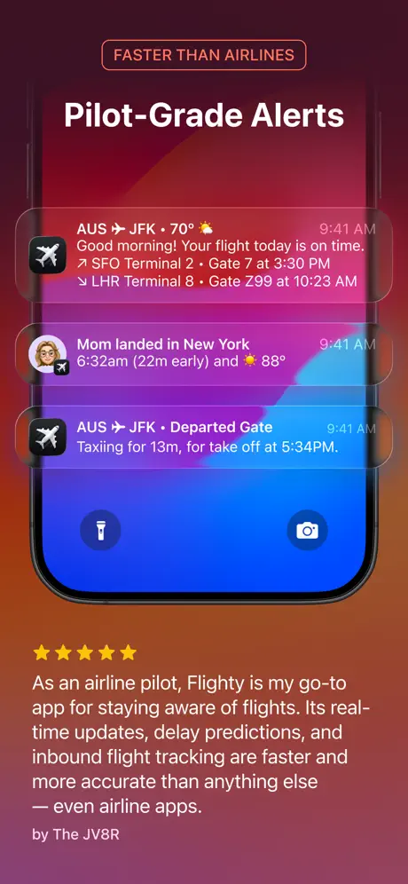
As an airline pilot, Flighty is my go-to app for staying aware of flights. Its real-time updates, delay predictions, and inbound flight tracking are faster and more accurate than anything else — even airline apps.
03The approach

How the set argues its case

The set adopts a modular chapter structure. Each frame isolates exactly one proof point, alternating between full-device rotations and cropped environmental shots to vary rhythm. A fixed 'dark runway' palette—near-black grounds with white headlines and repeating accent colors—anchors the sequence, while deliberate temperature shifts signal emotional beats. Typography is kept ruthless: a heavy headline in the upper third, a smaller subtitle explaining the mechanic, and the device or card occupying the center mass. This leaves the bottom edge open, protecting against carousel gradient overlays and keeping compositions breathable on smaller phones.

Positioned as a premium, Apple-native utility. The inclusion of Apple Design Award and App of the Year finalist badges, plus iOS 26 and Dynamic Island callouts, frames the app as an official tier above airline-first-party software.

04Frame by frame

Every screenshot, and the job it does

Flighty App Store screenshot 1 — The Hangar Door
01

The Hangar Door

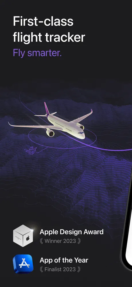
On-frame caption: “First-class flight tracker — Fly smarter.

The canvas opens on a near-black void, approximately #121214, with a wireframe topographic landscape rendered in translucent violet patches that peak around #6D28D9. A twin-engine 3D widebody aircraft floats center-frame, its fuselage catching a soft under-glow and its tail fin tinted magenta. The headline stack sits high in the left safe zone: “First-class flight tracker” in a bold, white sans-serif at roughly 48–56 pt, followed by “Fly smarter.” in a lighter lavender (#A78BFA). At the bottom left, two institutional badges are stacked vertically—a white Apple Design Award cube paired with “Apple Design Award / Winner 2023” and a blue App Store icon paired with “App of the Year / Finalist 2023.” On the far right, the curved black bezel of an iPhone intrudes slightly, grounding the render in hardware without revealing any UI. The composition is purely atmospheric, asking the viewer to trust the brand before proving utility.
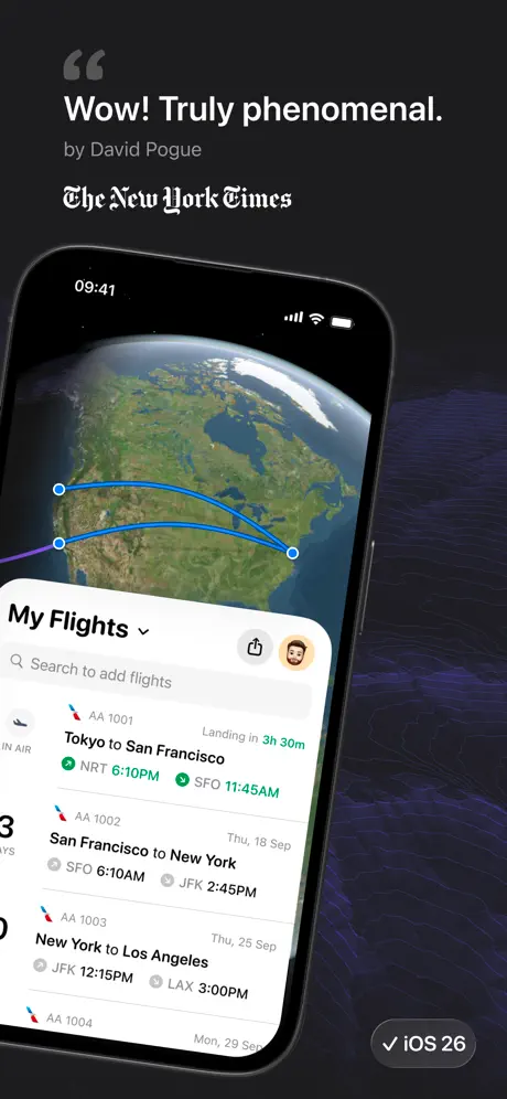
Flighty App Store screenshot 2 — The Logbook
02

The Logbook

On-frame caption: “Wow! Truly phenomenal. — by David Pogue, The New York Times

The frame introduces the app interface through an iPhone rotated roughly fifteen degrees counter-clockwise, its status bar reading 09:41 with full cellular, Wi-Fi, and battery. Above the device, a large grey quotation glyph introduces the verbatim text: “Wow! Truly phenomenal.” in white, attributed to “by David Pogue” and set below in The New York Times logotype. Inside the phone, a 3D globe shows cyan great-circle arcs traversing North America. A rounded bottom sheet titled “My Flights” with a chevron-down and circular avatar sits over the map. A search field reads “Search to add flights.” The list cells display AA 1001 through AA 1004; the active Tokyo-to-San Francisco leg uses emerald timestamps (#10B981) with “Landing in 3h 30m,” while upcoming legs fade to neutral grey. The right edge retains the purple topographic texture from frame 1, creating continuity, and a bottom-right pill reads “iOS 26” with a checkmark, signaling platform parity.

Flighty App Store screenshot 3 — The System Skin
03

The System Skin

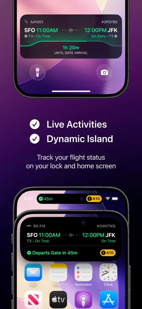
On-frame caption: “Live Activities & Dynamic Island — Track your flight status on your lock and home screen

The background shifts to a saturated purple gradient, approximately #4C1D87 fading darker, abandoning the wireframe motif. Instead of a single device, two hardware crops are stacked vertically. The upper crop isolates the Lock Screen Live Activity for flight AA1001: “SFO 11:00AM” to “12:00PM JFK,” with “T3 · On Time” and “1h 20m / UNTIL GATE ARRIVAL” rendered in green and white on a dark translucent card. Native torch and camera icons sit at the bottom of this crop. The lower crop focuses on the Dynamic Island—two merged black pills showing “45m” and “A10”—with the screen beneath displaying a flight card for B6 416, gate “A10,” and the same green-on-black typography, all above a home-screen grid of native app icons. Between the two images, two white checkmarks in grey circles lead the captions “Live Activities” and “Dynamic Island,” followed by the explanatory line. The density is high, but the vertical partition keeps each zone legible.

Flighty App Store screenshot 4 — Late Inbound Aircraft
04

Late Inbound Aircraft

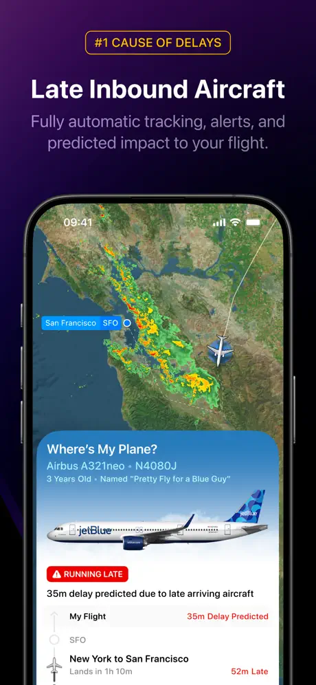
On-frame caption: “#1 CAUSE OF DELAYS — Late Inbound Aircraft — Fully automatic tracking, alerts, and predicted impact to your flight.

An outlined amber pill at top reads “#1 CAUSE OF DELAYS” in #F59E0B, followed by the white headline “Late Inbound Aircraft” and a two-line lavender-grey subtitle. The iPhone shows a satellite map of the San Francisco Bay Area with NEXRAD-style weather radar in green, yellow, and red clusters. A bottom sheet, “Where’s My Plane?”, identifies an “Airbus A321neo · N4080J” and a nameplate, followed by a side-profile jetBlue livery render. A scarlet pill states “RUNNING LATE,” with red text declaring “35m delay predicted due to late arriving aircraft.” A vertical timeline beneath pairs “My Flight” with “35m Delay Predicted” and “New York to San Francisco” with “52m Late.” The palette warms dramatically toward weather-map earth tones and alarm reds, signaling that this frame is about operational friction rather than aspirational travel.

Flighty App Store screenshot 5 — The Tower
05

The Tower

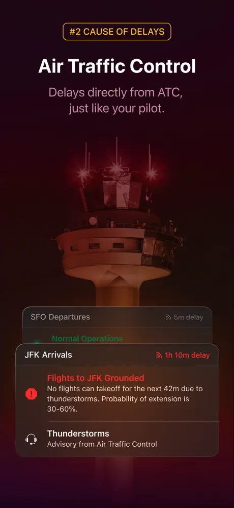
On-frame caption: “#2 CAUSE OF DELAYS — Air Traffic Control — Delays directly from ATC, just like your pilot.

This is the set’s most radical formal break. It discards the device bezel entirely and fills the canvas with a photographic air traffic control tower tinted in deep traffic-control red, approximately #7F1D1D, fading into a dark maroon vignette. The same amber pill returns, now reading “#2 CAUSE OF DELAYS,” with the headline “Air Traffic Control” and a two-line subtitle beneath. At the bottom, a floating translucent card with rounded corners holds airport status: “SFO Departures” opposite “5m delay” in grey, with “Normal Operations” in green below. “JFK Arrivals” shows “1h 10m delay” in red. A red warning block declares “Flights to JFK Grounded” and explains the thunderstorm hold with probability percentages. A headphone icon introduces “Thunderstorms / Advisory from Air Traffic Control.” By removing the phone frame, the composition argues the data is ambient and environmental, but it also risks breaking the visual contract of verisimilitude established by every other frame.

Flighty App Store screenshot 6 — Flighty Friends
06

Flighty Friends

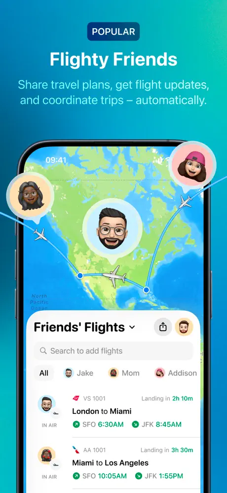
On-frame caption: “POPULAR — Flighty Friends — Share travel plans, get flight updates, and coordinate trips – automatically.

The palette pivots dramatically to a cyan-to-teal gradient, roughly #06B6D4 on the left falling toward #0E7490 on the right, making this the only frame that abandons the dark-runway motif. A navy pill at top reads “POPULAR” in white. The device displays a stylized political world map with Memoji bubbles—three distinct avatars—tethered to flight paths by thin grey arcs. The bottom sheet, “Friends’ Flights,” introduces filter chips for “All,” “Jake,” “Mom,” and “Addison,” each paired with a circular avatar. List rows for VS 1001 and AA 1001 show “Landing in” badges and green departure/arrival times. The vocabulary of the sheets is identical to frame 2—same corner radii, same search field, same status badges—but the daylight colors and playful avatars reframe the app from solitary utility to group coordination.

Flighty App Store screenshot 7 — Pilot-Grade Alerts
07

Pilot-Grade Alerts

On-frame caption: “FASTER THAN AIRLINES — Pilot-Grade Alerts

The frame functions as a testimonial interlude built around notification density. A red-orange outlined pill at top reads “FASTER THAN AIRLINES.” Inside the device, three iOS-style notification cards stack vertically. The first reads “AUS ✈ JFK · 70° ☀” and delivers a pre-flight brief with terminal and gate assignments. The second, from “Mom” (Memoji avatar), announces a landing in New York “22m early.” The third confirms “AUS ✈ JFK · Departed Gate” with taxi duration. Each card uses a small black app icon with a white aircraft glyph. Below the hardware, five filled gold stars lead into a long-form quote in light grey: “As an airline pilot, Flighty is my go-to app for staying aware of flights. Its real-time updates, delay predictions, and inbound flight tracking are faster and more accurate than anything else — even airline apps.” The attribution reads “by The JV8R.” The background bleeds from magenta (#BE185D) through violet (#7C33C4) to burnt orange (#C2410C), creating an emotional pause before the close.

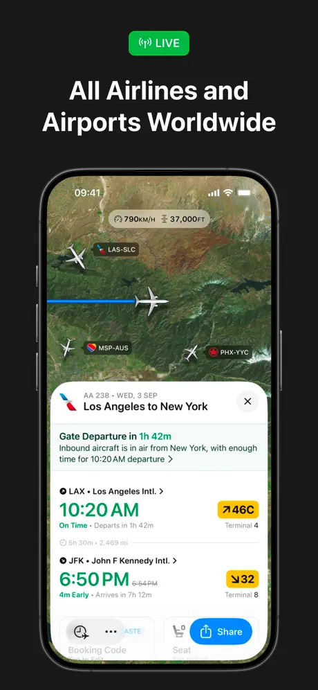
Flighty App Store screenshot 8 — All Airlines and Airports Worldwide
08

All Airlines and Airports Worldwide

On-frame caption: “LIVE — All Airlines and Airports Worldwide

The set returns to neutral ground with a pure black background. A green pill at top reads “LIVE” beside a broadcast-radiating icon. The headline “All Airlines and Airports Worldwide” is the most utilitarian in the set. The device displays a satellite map over the American Southwest with multiple white aircraft glyphs and route tags: “LAS-SLC,” “MSP-AUS,” “PHX-YYC.” Speed and altitude badges float in compact white lozenges. A modal card for AA 238, Los Angeles to New York, overlays the map with a countdown—“Gate Departure in 1h 42m”—and an inbound aircraft note. Departure from LAX is rendered in green (#10B981) with a yellow gate pill “46C”; arrival at JFK shows “6:50 PM” in green with “4m Early” and a yellow “32” gate pill. A blue “Share” button (#2563EB) anchors the bottom right of the card. By ending on a modal with a clear action, the set converts accumulated trust into a final, tactile interaction.

05The craft

Captions, colour and the mechanics of the sell

Caption pattern

Frame 1 uses a two-line headline + subhead stack. Frames 2 and 7 use pull-quote attribution. Frames 3–8 use a small outlined or filled pill as a categorical label, followed by a large white headline and a smaller grey explanatory subhead. This creates a predictable parsing rhythm across the set.

Visual system

A shared design language of rounded bottom sheets, translucent dark cards, and 3D aircraft renders ties the frames together. The wireframe topographic texture from frame 1 bleeds into frame 2’s right edge. Notification cards in frame 7 share the same corner radius and blur as the flight detail sheets in frames 2 and 4. The only break in this system is frame 5, which removes the device bezel entirely in favor of a full-bleed environmental photograph with a floating glass card.

The thumbnail test

The headline stack is large enough and high-contrast enough to read at carousel thumbnail size. The consistent left-aligned headline placement in frames 1 and 4–8 creates a vertical rhythm that the eye catches during fast swipes, while frame 6’s cyan background acts as a deliberate thumb-stopper.

Conversion mechanics

The sequence builds from atmosphere (frame 1) to core utility (frame 2), platform lock-in (frame 3), proprietary data depth (frames 4–5), social network effects (frame 6), social proof (frame 7), and finally global breadth with a share action (frame 8). The progression mirrors the psychological purchase path: trust → utility → ecosystem → data → social → action.

06Where it slips

What we would change

Frame 5 breaks the device contract

Removing the iPhone bezel entirely in frame 5 makes the ATC card look like a marketing composite rather than a screenshot. Shoppers trained to see hardware may dismiss it as conceptual art. Fix: retain a faint device silhouette or place the translucent card inside a phone frame to preserve visual parity with the rest of the set.

Frame 3 splits attention too aggressively

The dual-crop approach separates the Lock Screen and Dynamic Island by so much vertical space that a fast swipe could read them as two unrelated apps. Fix: use a single focused crop with a faint curved arrow or tether line connecting the Island to the card below, or isolate only one OS feature per frame.

The palette rupture between frames 5 and 6 is disorienting

The jump from deep maroon to tropical cyan is the most jarring transition in the sequence. Because six other frames ground themselves in near-black, the daylight social frame feels like a different product family. Fix: tint frame 6’s background to a muted midnight teal or desaturated navy so the social beat reads as an alternate lighting condition, not a different app.

The LIVE icon in frame 8 is ambiguous

The broadcast-radiating glyph next to “LIVE” resembles a Wi-Fi or audio waveform more than a flight-tracking signal. Fix: replace it with a radar sweep or satellite dish icon to instantly telegraph aircraft surveillance rather than streaming media.

07The recipe

How to apply this to your own app

  1. Lead with atmosphere, not UI

    If your app competes on trust or premium positioning, your first frame should sell mood and credibility before exposing the interface. Use environmental renders, topographic textures, or 3D objects that hint at your domain without showing a single list cell.

  2. Color-code your chapters

    Assign a distinct temperature to each value proposition. Flighty uses violet for brand, red for friction, cyan for social. When shoppers swipe quickly, they remember the emotional temperature of each frame even if they miss the text.

  3. Alternate device crops to maintain rhythm

    Eight identical full-device rotations become monotonous. Interleave complete hardware frames with close crops, environmental shots, and floating cards to keep the carousel visually alive without breaking the layout system.

  4. Repeat structural components to build a system

    The rounded bottom sheet, the pill-shaped labels, and the green-on-time / red-late color logic repeat across multiple frames. Identify three UI containers in your app and reuse them as consistent visual anchors so the set reads as one product, not eight separate ads.

  5. End on a frictionless action

    Frame 8 closes with a visible “Share” button and clear gate information because by the final swipe the user has already decided to install; the job of the last frame is to confirm that the app satisfies a specific immediate need. Always reserve your final slot for the broadest use case plus a UI element that implies completion.

08Takeaways

Five things worth stealing

  • Atmospheric first frames can do credibility work before any UI is revealed
  • Repeating a small set of UI containers (bottom sheets, pills, map cards) across frames unifies disparate features into a single product identity
  • OS-specific features (Dynamic Island, Live Activities, Memoji) should be shown in cropped hardware close-ups rather than full-device mockups to prove native integration
  • Color temperature is a faster parsing mechanism than text when shoppers swipe at thumbnail scale; use it as an information architecture layer
  • Removing the device bezel for dramatic effect is high-risk in an e-commerce context where shoppers equate bezel boundaries with real screenshots
09The verdict

What the set actually achieves

A confident, editorially coherent eight-frame narrative that uses color temperature to organize information: violet for authority, red for friction, cyan for social warmth, and black for global scale. The set treats the carousel as a magazine fold-out rather than a feature grid, maintaining a consistent typographic scale and safe-zone margin that preserves legibility at thumbnail size.

Frequent flyers, aviation enthusiasts, and nervous travelers who want earlier delay alerts than airline apps provide. The inclusion of ATC data, inbound aircraft tracking, and pilot testimonials signals that the app is built for people who treat flight logistics as a serious operational task rather than a casual search.

10Questions

Frequently asked

Why does the set use a dark background for most frames?

Dark backgrounds simulate the literal environment where the app is used—airports at night, dim cabins, early-morning departures—while making the white typography and green status colors pop at high contrast. The dark runway is also the app’s native UI theme, so the store frames preview the actual in-app experience.

Why is there no device bezel in frame 5?

The design team likely wanted to argue that the app’s data reach exceeds the handset—suggesting ambient, environmental awareness of airspace. However, this breaks the consistent hardware framing used in every other screenshot and risks feeling like a marketing illustration rather than a product screenshot.

How does the set handle social proof without cluttering the interface?

Testimonials are placed entirely outside the device canvas. Frame 2 floats the David Pogue quote above the hardware; frame 7 places the five-star pilot review beneath it. This separation keeps the UI sacrosanct while letting third-party validation occupy its own comfortable space.

What typography does Flighty use in the screenshots?

The headlines appear to be a large, bold sans-serif—likely SF Pro Display or a similar neo-grotesque—set in white against dark grounds. Subtitles use a lighter weight in lavender or grey. Inside the devices, the app mirrors native iOS conventions with semibold list titles and monospaced or regular tabular data for flight numbers and times.

11Keep reading

Build your own screenshot set

The full set

10 shots
Flighty App Store screenshot 1Flighty App Store screenshot 2Flighty App Store screenshot 3Flighty App Store screenshot 4Flighty App Store screenshot 5Flighty App Store screenshot 6Flighty App Store screenshot 7Flighty App Store screenshot 8Flighty App Store screenshot 9Flighty App Store screenshot 10

About the app

"Don't Fly Without This App" WSJ • Finalist for App of The Year • Winner of Apple Design Award The flight tracker your pilot uses. Free trial does not required credit card. No Flighty LLC, via the App Store listing.

Screenshots and store metadata belong to Flighty LLC. They are shown here for design commentary and criticism. The analysis on this page is original work by floow.design. View the original listing.

More Travel teardowns

Browse all →