Tripsy app icon
TravelScreenshot teardown14 min read

Tripsy App Store screenshots

Tripsy’s App Store screenshot set presents an eight-frame vertical narrative that moves from editorial credibility to functional depth. The sequence opens with a hero frame built around photography of the Manhattan Bridge, layers in trust badges, then steps through a carefully choreographed trip scenario—a LAX-JFK flight on DL934, stays at Aman New York, mapped activities, and collaborative planning. The designers consistently render the app inside a current-generation iPhone Pro chassis with Dynamic Island, using dark-mode UI against atmospheric backgrounds. Headers are set in a bold, large-scale sans-serif that often breaks the top safe zone. Color discipline shifts as the sequence progresses: desaturated teal and grey in the opener, warm brick tones in the companion frame, then a pivot to deep navy, purple, and maroon for the feature-specific frames. The result is a travel-app showcase that privileges continuity over variety, asking the shopper to read the set as a single itinerary rather than disconnected feature callouts.

Set published by Tripsy LLC · 9 frames analysed

4.7 · 5.4K ratingsFreev3.8.6Updated 4mo ago
Tripsy App Store screenshot 1
01At a glance

The set in one screen

Framing
Vertical storyboard. Frame 1 is a hero with no full device; frames 2–5 and 7–8 show complete iPhone Pro frontals; frame 6 crops the device to its lower two-thirds. The parallax effect of alternating straight-on and angled hardware creates physical depth without abandoning the vertical scroll format.
Captions
Massive white sans-serif display type, often two lines, anchored to the top third. Small-caps orange eyebrows appear from frame 5 onward to announce feature categories. There is no body copy; captions function as chapter titles.
Backdrop
Photographic plates for frames 1–3 (Manhattan Bridge, DUMBO alley), solid gradients for frames 4–8 (maroon, navy, purple, midnight-to-brown). The transition from photo to gradient at frame 4 deliberately shifts the set from real-world place to software feature space.
Type
San Francisco family throughout. Interface uses headline, body, and caption weights in white and grey; display type for airport codes and dollar totals. Orange is reserved for hyper-critical data: flight times, CTA links, eyebrow labels.
UI / copy split
:
Frame 1 job
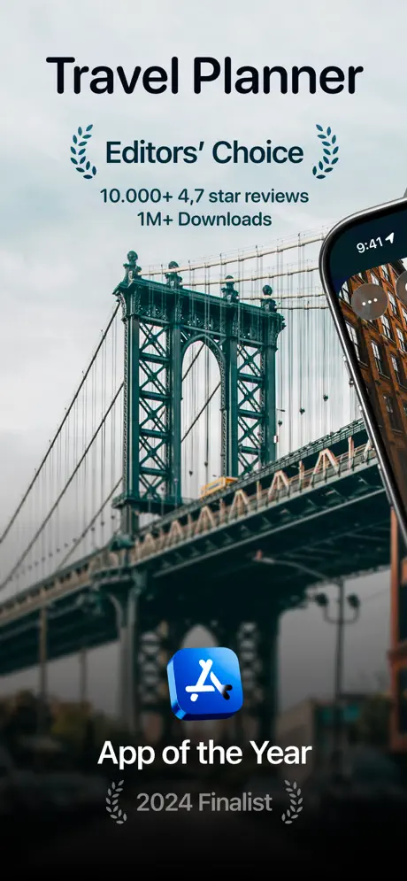
Establish editorial authority before showing product. Frame 1 is the only screenshot without a full device preview. It fills the canvas with a moody Manhattan Bridge photograph, then stacks social proof: 'Travel Planner' in heavy black sans-serif, 'Editors’ Choice' flanked by teal laurel vectors, '10.000+ 4,7 star reviews', and '1M+ Downloads'. A sliver of an iPhone bezel intrudes from the right edge, hinting at hardware context without revealing UI. At the bottom, a blue App Store squircle with a white A glyph anchors the text 'App of the Year' and '2024 Finalist' in grey. The palette is restrained—teal bridge ironwork against an overcast grey sky—so the metrics dominate. Notably, Tripsy’s actual app icon never appears here; the lockup uses Apple’s App Store badge instead, which trades brand recognition for platform credibility. ] } } } , } } } ] } , ] }, {

Sampled palette

#0B84FE#0B84FE
#FF9F0A#FF9F0A
#BF5AF2#BF5AF2
#FF375F#FF375F
#1C1C1E#1C1C1E
#F5F5F7#F5F5F7
02The challenge

What this screenshot set had to solve

The core design challenge for an itinerary organizer is density management. A travel app at scale touches flights, lodging, ground transport, expenses, real-time alerts, mapping, and social coordination. In the App Store viewport, each frame must resolve in roughly one to two seconds, which means the team had to suppress standard UI complexity in favor of readable storytelling. Tripsy’s screenshots need to communicate that the app is not just a list builder, but a live travel layer that persists from booking to baggage claim. At the same time, the category is visually noisy: competitors often default to bright whites, airy illustrations, or clashing destination photography. Tripsy chose to solve this by committing to a dark-mode aesthetic across every frame and anchoring the entire set to one continuous itinerary. This decision creates a throughline, but it also risks visual monotony if the transitions between frames do not vary background treatment, device rotation, or typographic scale enough to maintain scroll momentum. The challenge, then, was to balance forensic UI legibility with cinematic pacing across eight vertical canvases. The hero frame also carries the unique burden of justifying why a user should download yet another travel planner when native Apple and Google solutions already handle itineraries. Tripsy answers this by front-loading social proof—Editors’ Choice, 1M+ downloads, and an App of the Year finalist badge—before showing a single UI surface. That commercial imperative had to be reconciled with photographic atmosphere so the frame would not read as a sterile banner ad. Every subsequent frame then had to answer a specific objection: frame two establishes the dashboard, frame three the timeline density, frame four the geographic discovery layer, frame five the fidelity of flight data, frame six the proactive alert system, frame seven the financial tracking, and frame eight the multiplayer trip experience. Each of these objections requires distinct visual evidence, yet the brand palette and hardware framing must remain unmistakably consistent.

Tripsy’s sequence is essentially a comic book—dashboard, timeline, map, flight detail, push alert, expense receipt, and group invitation—where each panel assumes you remember the last.
03The approach

How the set argues its case

The team approached the set as a sequential storyboard rather than a bucket of features. They selected a single narrative scenario—a September trip from Los Angeles to New York—and threaded it through every frame where possible. The DL934 flight, the Aman New York destination, and the Sep 15 date range reappear with enough frequency that an attentive viewer can connect the itinerary dots. To prevent dark-mode fatigue, the backgrounds are treated as environmental stages: the opener uses a misty bridge photograph, frame two and three use warm DUMBO alley textures, frame four drops into a burgundy gradient, frame five and six pivot to deep naval twilight, and frame eight settles into a midnight-to-brown fade. Device positioning alternates between straight-on frontal cropping and aggressive three-quarter angles to suggest physicality. Typography is handled with a strict two-tier system: an oversized white display headline at the top, and smaller orange or grey secondary labels when needed. The UI inside the device relies on Apple’s SF Pro ecosystem—rounded list cells, pill buttons, and sheet modals—so the app reads as system-native. Crucially, the designers let the interface breathe by cropping the tab bar and navigation chrome out of most frames, focusing attention on cards, maps, and timeline rows.

Mid-market premium. The dark-mode treatment, editorial photography, and restraint in iconography position the app above ad-supported competitors. By showing dollar figures in the thousands and an Aman New York stay, the set signals luxury travel without stating it.

04Frame by frame

Every screenshot, and the job it does

Tripsy App Store screenshot 1 — Travel Planner
01

Travel Planner

On-frame caption: “Editorial credibility over product interface.

Frame one is the only screenshot that does not contain a full device mockup. Instead, it floats a sliver of an iPhone entering from the right edge, showing just enough bezel and status bar to establish hardware context without revealing UI. The composition is a centered typographic stack: 'Travel Planner' in a heavy, near-black sans-serif sits above a teal laurel lockup reading 'Editors’ Choice,' followed by metric lines '10.000+ 4,7 star reviews' and '1M+ Downloads.' The background is a desaturated photograph of the Manhattan Bridge under an overcast sky, with the teal ironwork echoing the laurel color. At the bottom, a blue gradient App Store squircle—white A glyph on a standard Apple blue—anchors the text 'App of the Year' and '2024 Finalist' flanked by grey laurels. The palette is restrained: the bridge provides a single cool accent against warm grey clouds, and nothing in the frame competes with the social-proof hierarchy.
Tripsy App Store screenshot 2 — Your Travel Companion
02

Your Travel Companion

On-frame caption: “The dashboard as travel poster.

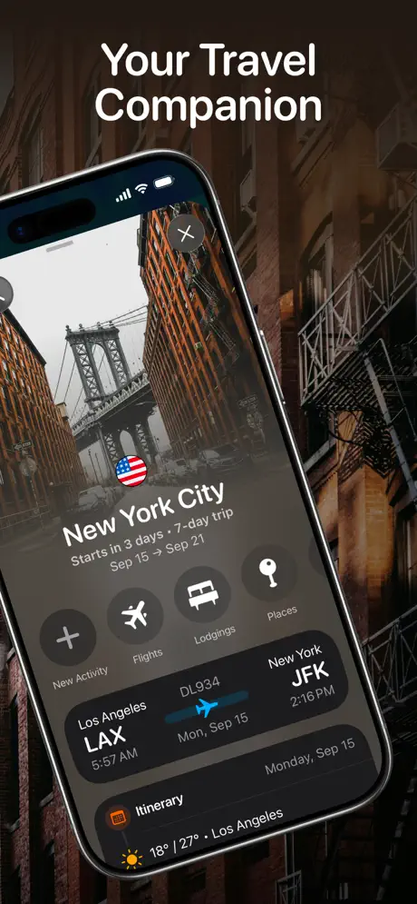
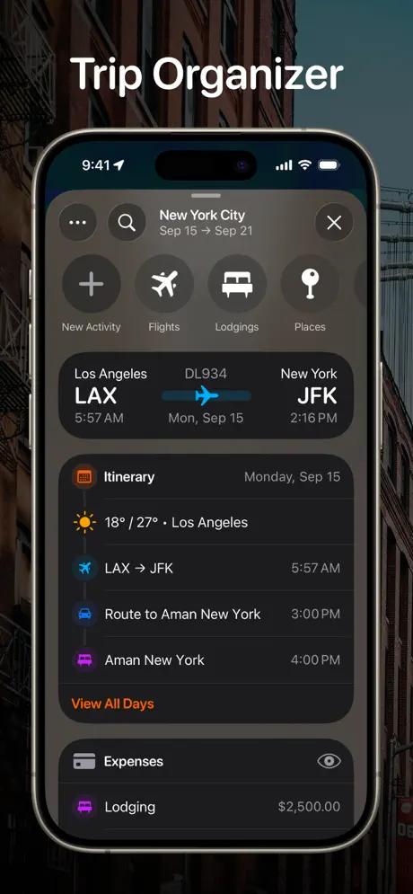
Frame two introduces the device as protagonist. The iPhone is rotated slightly counter-clockwise and floats left-of-center against a photograph of the DUMBO alley view toward the Manhattan Bridge. The status bar reads 9:41 with standard cellular and battery glyphs. Inside the screen, a dark hero card presents 'New York City' with a US flag emoji, trip metadata 'Starts in 3 days • 7-day trip,' and dates 'Sep 15 → Sep 21.' Below, four circular grey buttons—plus, airplane, bed, key—offer New Activity, Flights, Lodgings, and Places. A flight card shows the LAX to JFK route for DL934 on Mon, Sep 15, with 5:57 AM and 2:16 PM times. A bottom strip shows an Itinerary icon, weather '18° / 27° • Los Angeles,' and a sun glyph. The type hierarchy is pure San Francisco: large bold white for airport codes, smaller grey for cities and dates. Warm brick tones from the alley photograph bleed behind the dark UI, creating atmospheric depth without sacrificing contrast.

Tripsy App Store screenshot 3 — Trip Organizer
03

Trip Organizer

On-frame caption: “Density made legible.

Here the device snaps to a straight vertical orientation, cropping tightly at the top and bottom to show maximum interface. The header repeats the New York City trip title with a search icon and close button, reinforcing the sheet-modal pattern. The four action buttons from frame two return, now fully labeled underneath. The flight summary sits in a rounded black card with a cyan airplane icon on a blue track between LAX and JFK. Below, the Itinerary list unpacks the actual timeline: a weather row, the LAX → JFK flight at 5:57 AM, a car route to Aman New York at 3:00 PM, and the lodging check-in at 4:00 PM. An orange 'View All Days' link provides the only warm accent inside the UI. Beneath that, an Expenses teaser reveals a $2,500.00 lodging line item. The background is the same DUMBO alley but darkened further, functioning as a neutral matte. By holding the device dead-straight, the frame signals productivity and precision.

Tripsy App Store screenshot 4 — Activity Lists
04

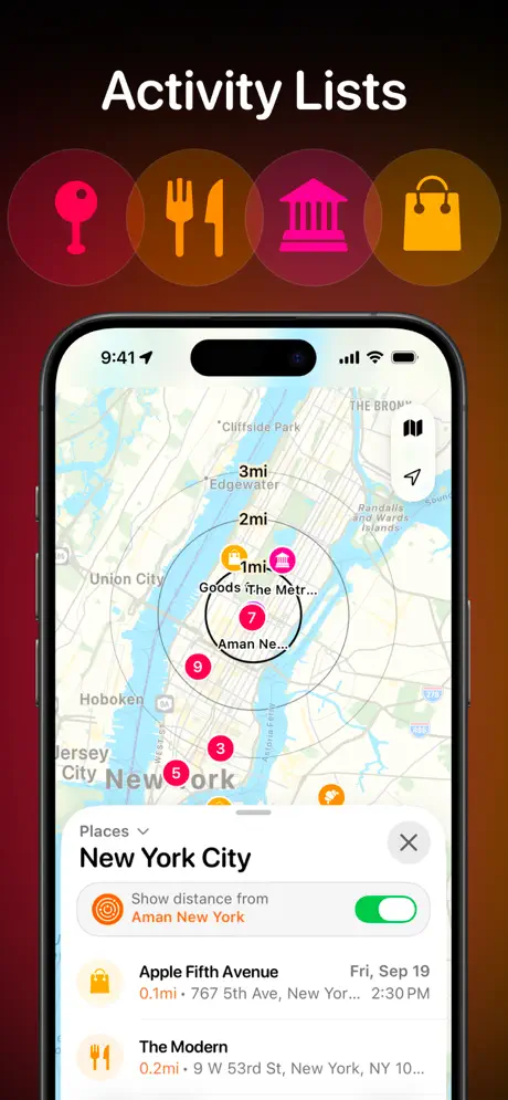
Activity Lists

On-frame caption: “Geography as interface.

The title 'Activity Lists' appears above a decorative row of four oversized category glyphs—location pin, utensils, classical building, shopping bag—rendered in hot pink, orange, and yellow inside translucent circles. This is the only frame where decorative graphics float entirely outside the device bounds. The phone itself displays a light-mode map of Manhattan with concentric distance circles emanating from a point near 'Aman Ne...' Pins carry numbered badges in brand colors. A bottom sheet overlays the lower half, showing a 'Places' dropdown, an active green toggle for 'Show distance from Aman New York,' and list rows for Apple Fifth Avenue and The Modern with orange distance figures. The background behind the device shifts to a deep maroon-to-black gradient. The contrast between the light map UI and the dark exterior gradient is the most extreme in the set, making this frame function as a visual palette cleanser.

Tripsy App Store screenshot 5 — Flight Detail
05

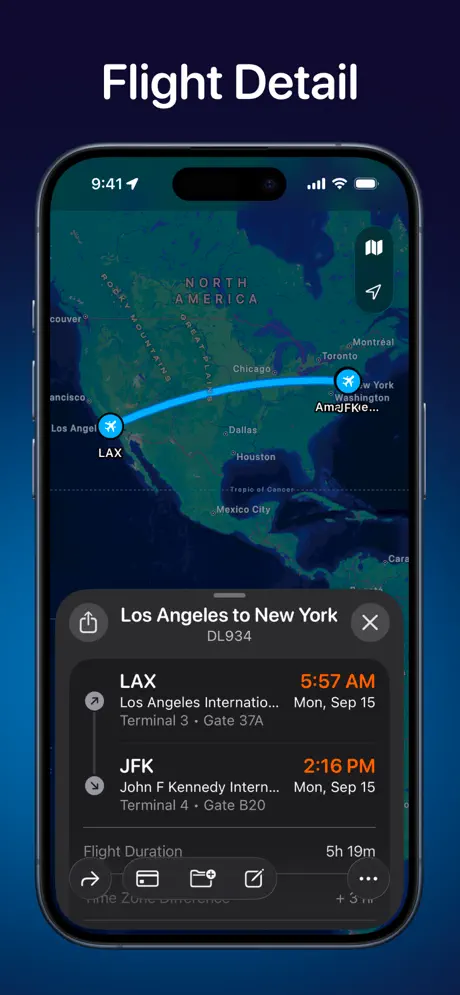
Flight Detail

On-frame caption: “Flight path as hero.

Frame five centers on the flight detail view. The background is a saturated navy gradient. The iPhone shows a full-screen hybrid map of North America with a cyan arc tracing the great-circle route from LAX to JFK; plane icons mark each endpoint. A bottom sheet with rounded top corners carries the header 'Los Angeles to New York' and flight number DL934. The timeline presents LAX departure at 5:57 AM from Terminal 3 Gate 37A, and JFK arrival at 2:16 PM at Terminal 4 Gate B20. Times are rendered in bright orange to separate them from location text. A vertical grey line connects the two airports with a mid-point plane glyph. The sheet also lists a 5h 19m duration and a bottom toolbar with share, wallet, calendar, edit, and more icons. The overall impression is data-rich but spatially intuitive, using the map canvas to justify the screen real estate.

Tripsy App Store screenshot 6 — Never be Late
06

Never be Late

On-frame caption: “Alert simulation outside the app chrome.

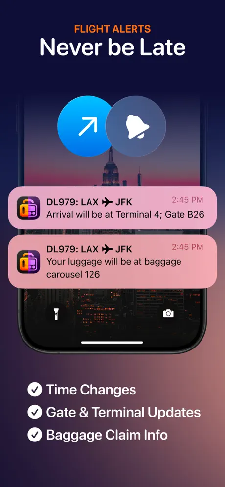
This frame departs from the full-device convention. The top carries an orange small-caps eyebrow 'FLIGHT ALERTS' and a bold white title 'Never be Late.' Two large circular icons—a blue gradient circle with a white arrow and a frosted grey circle with a white bell—hover above the hardware. The visible portion of the iPhone is cropped to show roughly the lower two-thirds of a lock screen; the wallpaper is a dusk photograph of the Empire State Building. Two notification stacks in a light pink material display DL979 flight alerts: one announcing Terminal 4 Gate B26 arrival, the other baggage carousel 126. Below the device, three checklist items—Time Changes, Gate & Terminal Updates, Baggage Claim Info—are paired with circled checkmarks. The background is a purple-pink gradient. The choice to simulate lock-screen notifications rather than in-app alerts is conceptually smart, but the crop sacrifices hardware readability.

Tripsy App Store screenshot 7 — Expenses
07

Expenses

On-frame caption: “Financial transparency via modal.

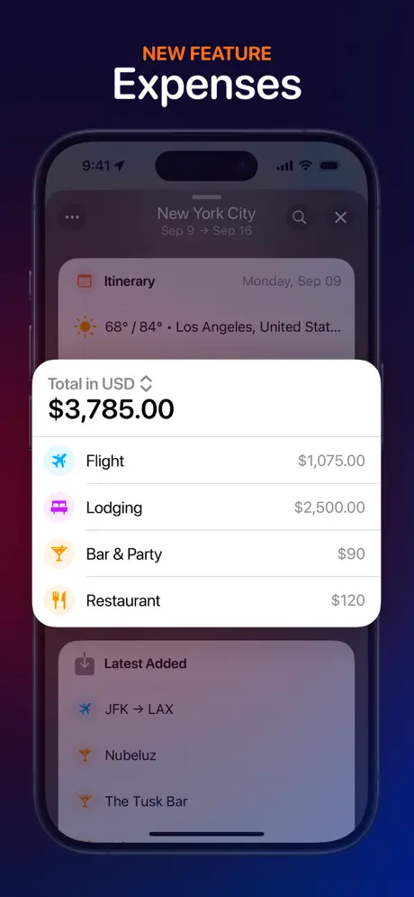
The frame introduces a new feature with the orange eyebrow 'NEW FEATURE' above 'Expenses.' The background is a deep purple-to-midnight gradient. The iPhone displays a blurred itinerary view behind a white system-modal card. The modal headline reads 'Total in USD' with a chevron, followed by '$3,785.00' in an outsized bold black weight. A list breaks this into Flight ($1,075.00), Lodging ($2,500.00), Bar & Party ($90), and Restaurant ($120), each prefixed with a colored category icon—blue plane, purple bed, orange cocktail, orange utensils. Behind the modal, the itinerary context remains legible: 'New York City Sep 9 → Sep 16,' a weather row showing '68° / 84° • Los Angeles, United Stat...,' and a 'Latest Added' section with JFK → LAX, Nubeluz, and The Tusk Bar. The use of a white modal against the dark app shell creates a taxonomic focal point that draws the eye immediately to the dollar total.

Tripsy App Store screenshot 8 — Trip Guests
08

Trip Guests

On-frame caption: “Social planning through presence, not just UI.

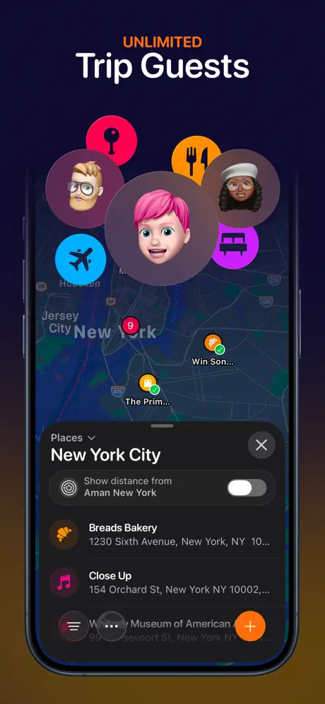
The final frame sells collaboration with the eyebrow 'UNLIMITED' above 'Trip Guests.' The device shows a dark-map view of New York with orange checkmarked pins and a bottom sheet listing Breads Bakery, Close Up, and a truncated museum entry. The toggle for 'Show distance from Aman New York' is now in the inactive grey position. Outside and above the device, four Memoji heads and four category icons float in a cloud formation, implying shared planning without showing actual shared UI states inside the app. The largest Memoji—a pink-haired avatar—sits dead center, overlapping the hardware bezel. The background gradient shifts from deep navy at top to a brown chocolate at bottom. An orange FAB with a white plus sign sits at the bottom right of the screen. The composition is playful, but the floating avatars obscure some of the map detail, trading functional evidence for emotional suggestion.

05The craft

Captions, colour and the mechanics of the sell

Caption pattern

Two-tier hierarchy: eyebrow + display. Frames 1–5 use white display only; frames 6–8 add an orange all-caps eyebrow ('FLIGHT ALERTS', 'NEW FEATURE', 'UNLIMITED') to create feature-article rhythm. No sub-body copy is used anywhere.

Visual system

Dark iOS chrome + warm gradient environments. Flight paths are cyan, lodging is purple, restaurants and alerts are orange, expenses are black-on-white modal. The system avoids pure black backgrounds, favoring navy, charcoal, and brown gradients that lift the devices off the canvas.

The thumbnail test

At thumbnail size, the white headlines against dark backgrounds retain legibility, but the first frame’s reliance on atmospheric photography might lose contrast on smaller devices. The orange eyebrows from frame 5 onward act as high-contrast anchors that rescue scroll-stopping power.

Conversion mechanics

The hero frame optimizes for social proof over feature demonstration, which may reduce immediate comprehension for users who have never heard of Tripsy. Frame three is the true conversion heavy-lifter: it proves density handling without looking like a spreadsheet. The expense frame acts as a wallet opener by showing a credible four-figure trip total, implying the app is used for serious travel budgets.

06Where it slips

What we would change

Brand identity is missing from frame one

The hero screenshot uses the Apple App Store glyph instead of Tripsy’s own app icon. A shopper who lands on the product page sees zero branded lockup in the first viewport, only platform endorsement. The fix would be to replace the generic App Store squircle with the app’s actual icon mark, or to pair the two marks rather than substituting one for the other.

Flight-number continuity error breaks narrative trust

Frames two, three, and five consistently show flight DL934. Frame six abruptly switches to DL979. Because the entire set is built around the illusion of a single real itinerary, this inconsistency reads as careless staging rather than varied example data. The fix is simple: change the lock-screen notifications in frame six to reference DL934, preserving the throughline.

Decorative glyphs in frame four feel off-brand

The translucent icon row above the device in frame four—hot pink location pin, orange utensils, magenta building, yellow bag—introduces a playful saturation that clashes with the restrained navy-charcoal-orange system used everywhere else. They look like stock assets rather than integral UI. The fix is to recolor these glyphs in the established palette or to remove them in favor of an inset UI crop that shows category filtering inside the app itself.

Memoji in frame eight obscure the collaborative interface

The floating Memoji heads cover the top portion of the iPhone screen, hiding the very map and pins that demonstrate group trip functionality. A shopper looking for evidence of permissions, shared cursors, or guest avatars inside the UI will find only decorative portraits outside it. The fix is to shrink or reposition the Memoji to the upper corners, or to show actual collaborative affordances inside the sheet—like shared-by names or guest count badges—rather than relying on metaphor.

Orange accent is overextended

Orange simultaneously signals eyebrow labels, flight times, CTA links, category icons, and toggle states. This semantic overload weakens the color’s ability to guide attention. The fix is to reserve orange strictly for time-critical data and primary actions, shifting eyebrow labels to white or muted grey so that the orange arrival times in frame five and the orange expenses in frame seven carry more weight.

07The recipe

How to apply this to your own app

  1. Choose one continuous user story and thread it through every frame rather than treating screenshots as independent billboards.

    Tripsy’s decision to follow a single LAX-JFK trip makes the set readable at a glance. When building your own sequence, write a micro-script: a user arrives, checks the dashboard, finds an activity, confirms a flight, receives an alert, tracks a cost, and invites a friend. Let each screenshot advance that script by one beat.

  2. Crop away navigation chrome to emphasize content surfaces.

    Tab bars, back buttons, and navigation titles are largely absent from these frames. The designers cropped tightly around cards, sheets, and timeline rows so that the shopper sees the information, not the container. Apply this by hiding or masking global UI that does not serve the story of that specific frame.

  3. Alternate device posture and background treatment to maintain scroll momentum.

    Frames 2 and 3 use the same DUMBO photograph, but frame 2 tilts the phone while frame 3 holds it straight. Frame 4 switches to a maroon gradient. Frame 5 goes navy. These shifts prevent dark-mode fatigue. In your own set, avoid placing two visually identical frames back-to-back; change the angle, the background hue, or the sheet height to create rhythm.

  4. Reserve your loudest accent color for the highest-value data.

    Tripsy uses orange for times, CTAs, and eyebrows. To improve hierarchy, assign each hue a single job: orange for money and deadlines, blue for routes and transport, purple for lodging. When a color has one meaning, the shopper reads faster.

  5. Show real data, and audit it for consistency.

    The DL934/DL979 error is a reminder that fictional data still needs copy-editing. When you stage screenshots, create a single source-of-truth document with dates, flight numbers, prices, and addresses, then reference it for every frame. Consistency sells credibility.

08Takeaways

Five things worth stealing

  • Narrative continuity converts faster than feature breadth.
  • Dark-mode UI photography signals system-native quality.
  • Hardware framing should alternate between straight-on and angled to sustain visual interest.
  • Eyebrow labels are an effective, low-effort way to create editorial rhythm in the second half of a set.
  • Decorative elements outside the device bounds should not obscure the interface they are meant to advertise.
09The verdict

What the set actually achieves

The set delivers a coherent narrative arc that converts a feature list into a story. A shopper swiping through learns the app’s mental model by watching the same September trip evolve from a top-line card to a mapped itinerary to a push-notification update. The hardware anchoring—Dynamic Island, rounded sheet modals, pill toggles—signals iOS-native craft. However, the execution undermines itself in three specific places: the flight-number discontinuity between DL934 and DL979 breaks the illusion of a real itinerary; frame one suppresses the app’s own identity in favor of Apple’s badge; and frame eight’s decorative Memoji obscure the collaborative UI they are meant to sell. Despite these lapses, the structural approach—one trip, eight chapters—is a strong template for any productivity app with dense feature surface area.

Designers building productivity, travel, or fintech screenshot sets who need to communicate dense feature surfaces through storyboarding rather than isolated feature callouts. The analysis is especially useful for teams debating whether to front-load social proof or product UI in frame one.

10Questions

Frequently asked

Why does frame one avoid showing the app interface?

It prioritizes editorial trust signals—Editors’ Choice, star ratings, download counts, and an App Store award finalist badge—before the shopper has formed an opinion about the product. This is a conversion wager: if the user needs social permission to try a new planner, the badge wall works. If they need to see the UI first, it may lose them.

How does the set avoid looking repetitive despite eight dark frames?

Background material changes every two to three frames: photographic plate, warm alley, burgundy gradient, navy gradient, purple-pink gradient, midnight-brown gradient. The device itself also shifts from angled to straight to cropped, so the silhouette changes even when the chrome stays constant.

What is the significance of the white modal in frame seven?

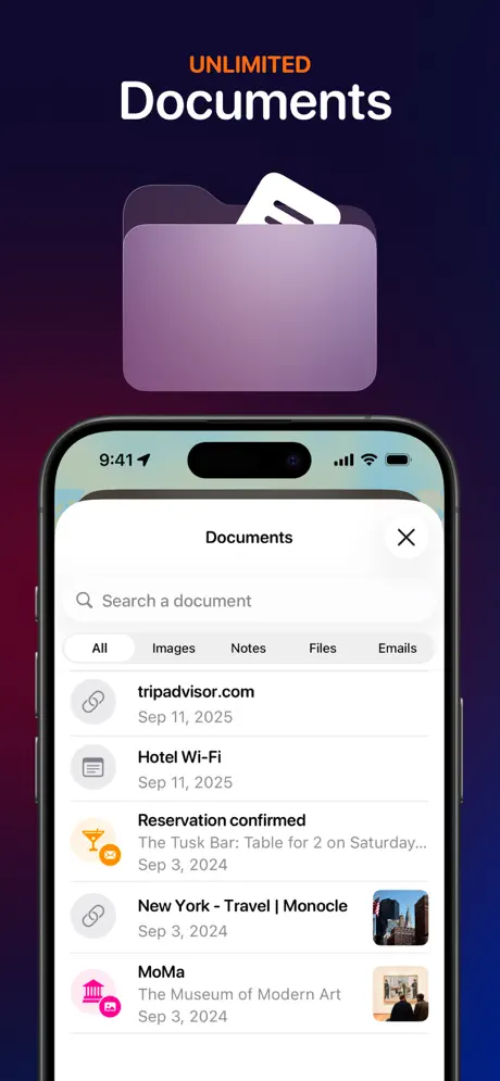
It is the only light-mode surface in the entire sequence. Against seven frames of dark UI, that white sheet acts as a spotlight, forcing the eye to the $3,785.00 total. It is a deliberate inversion of the established visual system to mark a feature launch.

Why does frame six crop the iPhone?

The crop simulates a lock-screen notification context, suggesting the app pushes critical flight data without requiring the user to open it. However, the execution is risky: removing the status bar and most of the bezel makes the hardware harder to identify at thumbnail size.

11Keep reading

Build your own screenshot set

The full set

9 shots
Tripsy App Store screenshot 1Tripsy App Store screenshot 2Tripsy App Store screenshot 3Tripsy App Store screenshot 4Tripsy App Store screenshot 5Tripsy App Store screenshot 6Tripsy App Store screenshot 7Tripsy App Store screenshot 8Tripsy App Store screenshot 9

About the app

Tripsy - Trip Planner & Itinerary Organizer is a free travel planner for creating detailed trip itineraries and organizing every aspect of your journey. Perfect for solo Tripsy LLC, via the App Store listing.

Screenshots and store metadata belong to Tripsy LLC. They are shown here for design commentary and criticism. The analysis on this page is original work by floow.design. View the original listing.

More Travel teardowns

Browse all →