The Outsiders app icon
EntertainmentScreenshot teardown15 min read

The Outsiders App Store screenshots

A disciplined, hardware-forward screenshot architecture that uses color-coded feature chapters and relentless social proof to sell a niche performance toolbox to self-coached athletes.

Set published by Gentler Stories LLC · 10 frames analysed

4.7 · 80 ratingsFreev1.6.2Updated 4mo ago
The Outsiders App Store screenshot 1
01At a glance

The set in one screen

Framing
Physical iPhone and Apple Watch Ultra hardware against dark, colored atmospheres; hands appear in Frame 2 to imply outdoor use.
Captions
Bold top-aligned sans-serif statements, roughly 36–44pt, in pure white (#FFFFFF); inside-app copy uses smaller, lighter weights.
Backdrop
Dark violet-to-black gradients (#0B0510 to #4C1D95) dominate; greens (#14532D), blues (#1E3A8A), and warm browns appear as functional accents.
Type
Marketing headlines are tightly tracked and heavy; UI data is set in monospaced or system neo-grotesque for metric scannability.
UI / copy split
Approximately 80% device UI, 20% marketing copy after the hero frame.
Frame 1 job
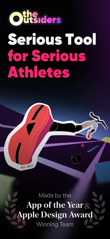
Establish tone and credentials before showing a single interface pixel. The hero is pure brand mythology: a vector runner with a disproportionately large crimson shoe stamped 'ALL OUT,' set against a near-black theatrical void. The headline 'Serious Tool for Serious Athletes' splits its message across white and hot magenta (~#FF0F7B), while the footer buries pedigree between two gray laurel wreaths: 'Made by the App of the Year & Apple Design Award Winning Team.' The gamble is that athletes will trust the promise before demanding proof.

Sampled palette

Hero magenta:#FF0F7B
Readiness purple:#9333EA
Training-load green:#22C55E
Anaerobic accent:#A855F7
High-aerobic warning:#EF4444
02The challenge

What this screenshot set had to solve

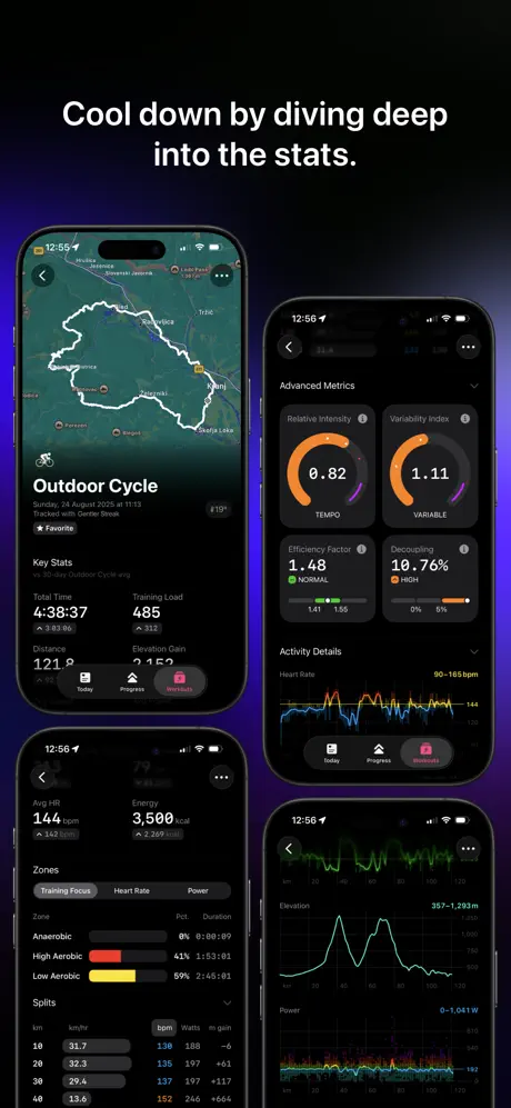
The App Store page for The Outsiders faces a multi-layered conversion challenge rooted in category skepticism and cognitive load. The app occupies a narrow but competitive niche at the intersection of quantified self and endurance sport; its target user is self-coached, data-literate, and already surrounded by incumbent tools with recognizable visual languages. The screenshot set must therefore answer four distinct questions in the first three seconds of the swipe: What is the object (a performance analytics dashboard, not a casual fitness game)? Why should I trust it (award pedigree and App Store editorial validation)? Where does my biometric data live (on-device, away from ad platforms and AI training models)? And what does it look like in the contexts where I actually train (iPhone for planning, Apple Watch for in-session reference)? Complicating this brief is the app’s reliance on esoteric metrics—Training Load Ratio, restorative sleep windows, polarized block periodization—that have no mainstream iconographic shorthand. The designers cannot assume users will recognize these abbreviations at a glance, yet they also cannot afford to waste a frame on a tutorial. There is a tonal tightrope to walk as well. The hero copy declares this a 'Serious Tool for Serious Athletes,' which immediately disqualifies playful illustration, gamified badges, or bubbly typography. Every frame after that opener has to feel like a coaching briefing, not a lifestyle advertisement. Finally, the set must bridge two dissimilar hardware canvases—the iPhone’s tall aspect ratio and the Watch’s square complications—without letting either feel like an afterthought.

The designers treat the App Store page not as a feature list, but as a coaching conversation—dense, deliberate, and unapologetically technical.
03The approach

How the set argues its case

The team anchored the set in a dark-mode-first, hardware-forward strategy. Rather than floating UIs in a void, every frame after the hero mounts the interface inside physical Apple devices—an iPhone cradled by gloved hands, paired Apple Watch Ultras with textured Ocean bands, or a standalone phone against a deep violet atmosphere. This grounds abstract metrics in tactile reality. The palette is disciplined by functional association: purple (~#9333EA) owns readiness and recovery contexts, green (~#166534 to #4ADE80) owns training load and strain, and a yellow-to-red spectrum charts aerobic intensity. The ambient background behind each device shifts to harmonize with the screen’s dominant hue, creating an immersive aura that collapses the boundary between marketing frame and software chrome. Typography operates on a strict hierarchy: marketing captions are bold, tight, and white, while in-app data labels rely on smaller system weights and monospaced figures for scannability. A persistent social-proof band—pale laurel wreaths flanking App Store accolades—anchors the bottom third of six consecutive frames, establishing rhythmic continuity. The overall narrative arc sequences from brand promise (Frame 1), daily utility (Frame 2), wrist convenience (Frame 3), and privacy ethos (Frame 4), then transitions into deep-feature proof: load management (Frame 5), recovery analytics (Frame 6), macro planning (Frame 7), and training methodology (Frame 8). By Frame 5, the set assumes the viewer is still reading; it abandons broad value props in favor of granular data density, trusting that the target user wants to inspect actual graph states before committing to a download.

Positioned explicitly against casual fitness apps through both copy ('Serious Tool for Serious Athletes') and visual density. The watchOS and Apple Health integrations are foregrounded immediately, staking a claim as a native-Cocoa ecosystem citizen rather than a cross-platform port. Privacy is treated as a feature, not an asterisk, earning an entire frame dedicated to on-device processing and zero accounts. The cumulative impression is that of a premium instrument for athletes who treat training as systems engineering.

04Frame by frame

Every screenshot, and the job it does

The Outsiders App Store screenshot 1 — Hero / Brand Posture
01

Hero / Brand Posture

On-frame caption: “Serious Tool for Serious Athletes

The opening frame contains zero interface. Instead, it commits entirely to tone and pedigree. A low-angle vector illustration fills the lower two-thirds: a stylized runner in mid-stride, one crimson shoe enlarged to monumental scale and stamped with the words 'ALL OUT' on the sole tread. The background is a theatrical gradient that shifts from near-black void (~#0B0510) at the top to deep indigo and violet at the horizon line where geometric ground planes recede. The wordmark sits top-left—'the' in small white letters tucked inside a yellow-white ringed 'O,' followed by 'Outsiders' in a purple-to-magenta gradient. The main headline fractures by weight and color: 'Serious Tool' renders in heavy white, while 'for Serious Athletes' switches to hot magenta (~#FF0F7B), resting on a baseline roughly aligned with the runner’s knee. At the very bottom, between two pale laurel wreaths, a caption reads: 'Made by the App of the Year & Apple Design Award Winning Team.' The structural bet is clear: establish credibility and attitude before surrendering to product pixels. The risk is that a shopper swiping quickly may not understand what the app actually looks like.
The Outsiders App Store screenshot 2 — Today Dashboard
02

Today Dashboard

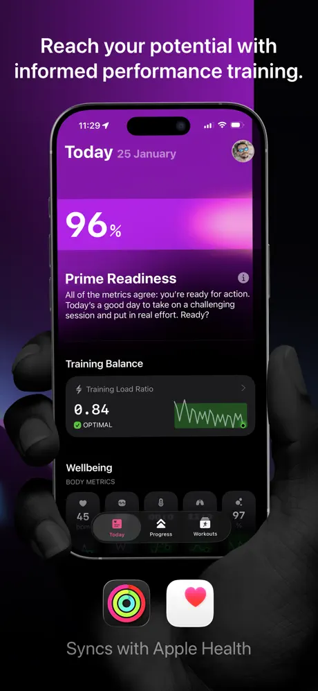
On-frame caption: “Reach your potential with informed performance training.

Here the product finally appears, held by matte-black gloved hands that emerge from the bottom edge, thumbs grazing the iPhone bezel—a stylistic choice implying outdoor or extreme-sport use. The phone displays the 'Today' dashboard: a purple-to-pink gradient header reads 'Today 25 January' beside a circular profile avatar. Below, a massive '96%' dominates the upper third, followed by 'Prime Readiness' and explanatory body copy. Further down, a 'Training Balance' card shows '0.84' with an 'OPTIMAL' badge and a small green sparkline graph. The bottom of the screen reveals a tab bar with three items—Today (selected, rendered in pink), Progress, and Workouts—and a 'Wellbeing' row with body-metric glyphs. Beneath the hardware, two icon tiles appear: the Apple Activity rings and the Apple Health heart, with the subtitle 'Syncs with Apple Health.' The ambient background is a radial magenta-purple wash that mirrors the app header, visually merging the marketing frame with the interface. The time on the status bar reads 11:29, and the battery icon sits at the right of the Dynamic Island notch. The hands partially obscure the bottom tab bar, which slightly reduces legibility.

The Outsiders App Store screenshot 3 — Wrist Ecosystem
03

Wrist Ecosystem

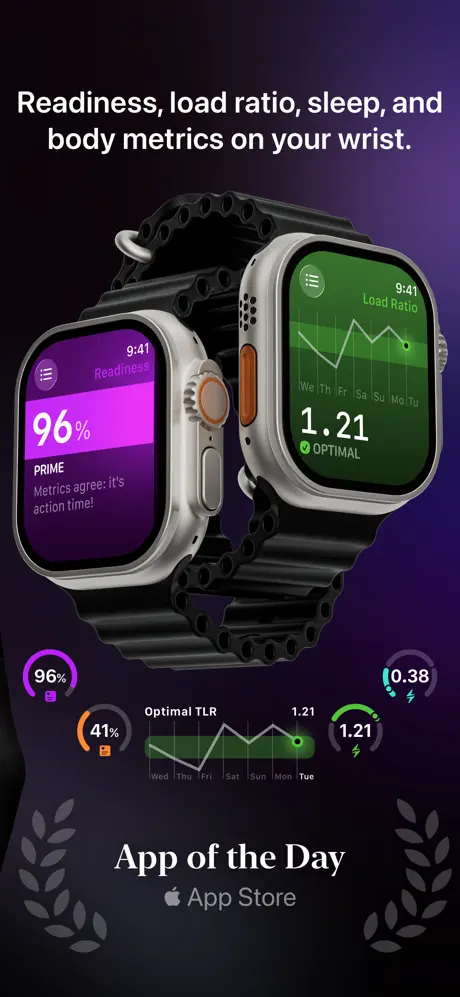
On-frame caption: “Readiness, load ratio, sleep, and body metrics on your wrist.

Two Apple Watch Ultra devices occupy center stage, slightly offset so the left watch’s face overlaps the right. The left screen shows a purple 'Readiness 96% | PRIME' readout with the sub-caption 'Metrics agree: it's action time!' The right screen shows a green 'Load Ratio 1.21 | OPTIMAL' with a line graph. Both units wear black Ocean bands, and the titanium cases with their orange Action buttons catch specular highlights that signal premium hardware. Below the watches, a scatter of small circular widgets echoes watch complications: '96%' in purple, '41%' in orange, '0.38' in cyan, and '1.21' in green. A miniature line graph labeled 'Optimal TLR' spans the bottom third with weekday ticks from Wed to Tue. Anchoring the base is 'App of the Day' with an Apple Store lockup, again flanked by laurels. The depth of field is shallow, with the nearer watch sharp and the background falling off to a dark plum gradient. These complications are difficult to parse at thumbnail size, but they reinforce the density promise.

The Outsiders App Store screenshot 4 — Privacy Manifesto
04

Privacy Manifesto

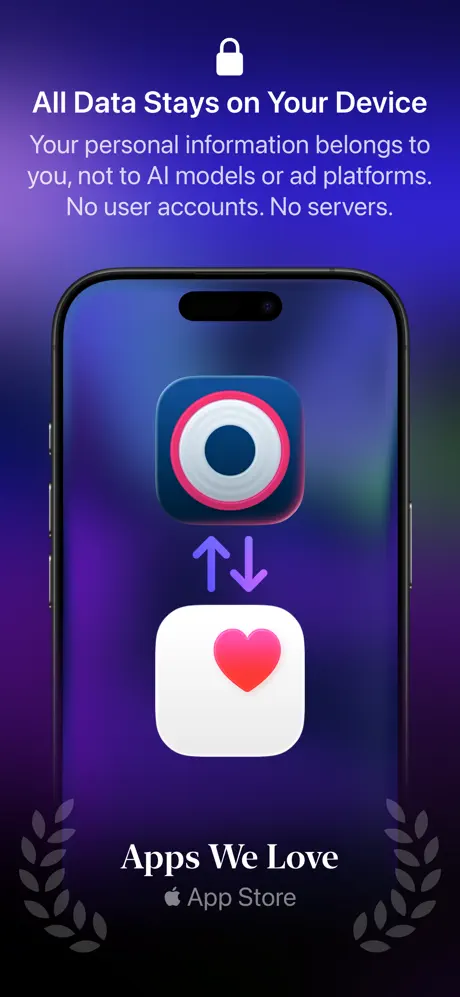
On-frame caption: “All Data Stays on Your Device

This frame breaks the interface rhythm for a conceptual statement. A white padlock icon sits above the headline. The subhead reads verbatim: 'Your personal information belongs to you, not to AI models or ad platforms. No user accounts. No servers.' The phone screen does not show app UI; instead, it presents two oversized icons—the app’s own concentric-ring icon (navy, pink, white) hovering above the Apple Health heart icon, connected by a purple bidirectional arrow. The background shifts to a cooler indigo-blue (~#312E81). At bottom, 'Apps We Love Apple App Store' repeats the laurel motif. By dedicating an entire screenshot to a privacy promise rendered as a symbolic diagram, the team signals that on-device processing is a primary differentiator. However, the abstraction costs them the 'real app' momentum built in Frame 2; the arrow iconography reads slightly generic, closer to a system settings illustration than to a premium third-party tool.

The Outsiders App Store screenshot 5 — Training Load Detail
05

Training Load Detail

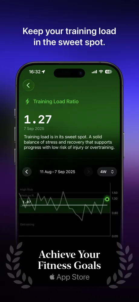
On-frame caption: “Keep your training load in the sweet spot.

The iPhone returns, now displaying a deep green interface. The header reads 'Training Load Ratio' with a back chevron at left. The hero metric '1.27' dominates the upper viewport, dated '7 Sep 2025,' followed by body copy that states: 'Training load is in its sweet spot. A solid balance of stress and recovery that supports progress with low risk of injury or overtraining.' A line graph tracks the range '11 Aug–7 Sep 2025,' toggled to '4W.' The Y-axis labels descend from 'High Risk' through 'Medium R,' 'Low,' to 'Detraining,' with numeric ticks at 0.00, 0.80, 1.30, and 1.50. A bright green dot marks the current data point. The surrounding environment is a deep violet-black gradient, causing the green UI to feel luminescent. The bottom carries 'Achieve Your Fitness Goals Apple App Store' with laurels. The structural hierarchy here is excellent: status (number), context (date), explanation (copy), and proof (trend line) stack in a single vertical scroll. The green-on-purple contrast is vibrant but avoids vibration because the surrounding gradient is desaturated.

The Outsiders App Store screenshot 6 — Sleep Recovery
06

Sleep Recovery

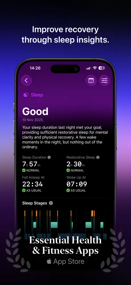
On-frame caption: “Improve recovery through sleep insights.

The interface switches to a purple sleep theme. At top, a back arrow, calendar icon, and sliders icon occupy the nav. The header says 'Sleep,' followed by a large 'Good' rating and the date '10 Nov 2025.' Body copy reads: 'Your sleep duration last night met your goal, providing sufficient restorative sleep for mental clarity and physical recovery. A few wake moments in the night, but nothing out of the ordinary.' Four data tiles appear in a two-by-two grid: 'Sleep Duration 7 h 57 m NORMAL,' 'Restorative Sleep 2 h 30 m NORMAL,' 'Fell Asleep At 22:34 AS USUAL,' and 'Woke Up At 07:09 AS USUAL,' each accompanied by a green checkmark. Below, a 'Sleep Stages' hypnogram uses orange, cyan, and dark blocks to represent cycles across the night. The background is a cool violet gradient, and the bottom carries 'Essential Health & Fitness Apps Apple App Store.' The frame demonstrates that the app applies the same data density to recovery as it does to exertion, reinforcing the balanced-intensity thesis.

The Outsiders App Store screenshot 7 — Macro Planning
07

Macro Planning

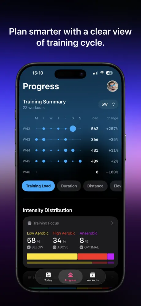
On-frame caption: “Plan smarter with a clear view of training cycle.

This frame showcases the 'Progress' tab. The header reads 'Progress' beside the same profile avatar seen in Frame 2. A 'Training Summary' lists 23 workouts across weeks W42 through W46, rendered as horizontal dot matrices where dot size likely encodes daily load magnitude. Columns to the right show 'load' and 'change' percentages: +257%, –35%, +31%, +2%, and –100%. A pill-shaped segmented control offers 'Training Load,' 'Duration,' 'Distance,' and 'Elev.' Below, an 'Intensity Distribution' module breaks out 'Low Aerobic 58% | BELOW' in yellow, 'High Aerobic 34% | ABOVE' in red, and 'Anaerobic 8% | OPTIMAL' in purple, capped by a stacked horizontal bar. The tab bar at the bottom shows 'Today,' 'Progress' (selected, in pink), and 'Workouts.' The ambient background returns to a blue-violet wash. This is the most information-dense frame in the set, functioning as a trust signal for spreadsheet-minded athletes. The dot-matrix weekly grid is a sophisticated choice, sacrificing immediate magnitude legibility for a compact calendar view.

The Outsiders App Store screenshot 8 — Methodology Focus
08

Methodology Focus

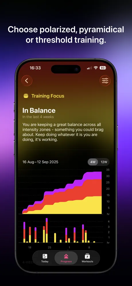
On-frame caption: “Choose polarized, pyramidal or threshold training.

The screen title is 'Training Focus,' with the status 'In Balance' scoped to 'In the last 4 weeks.' Body copy reads: 'You are keeping a great balance across all intensity zones - something you could brag about. Keep doing whatever it is you are doing, it's working.' A date range '16 Aug–12 Sep 2025' and a '4W | 12W' toggle frame a large stacked area chart: yellow at the base, red in the middle, purple on top, climbing to roughly 35 hours. A secondary bar chart below uses the same color blocks for daily intensity distribution. The nav includes a back arrow and a sliders icon. Notably, the ambient background behind this phone shifts to a warm brown-olive tone, departing from the cool purples that unify the previous seven frames. The tab bar again shows 'Progress' selected. This frame closes the sequence by proving the app understands training philosophy, not just raw data. However, the temperature shift in the background gradient creates a visual full-stop that feels accidental rather than intentional.

05The craft

Captions, colour and the mechanics of the sell

Caption pattern

Captions follow a consistent top-heavy architecture: one imperative sentence fragments across two lines, set in a geometric sans at roughly 40–48pt, separated from the device by 60–80pt of negative space. Body copy inside the app is smaller (14–16pt equivalent) and set in SF Pro or a close equivalent, with metrics rendered at a larger display size to create a scannable 'number first, explanation second' rhythm. The bottom badge text switches to an elegant serif ('App of the Day,' 'Achieve Your Fitness Goals') for editorial contrast against the tech-forward UI.

Visual system

The visual system is built on three pillars: chromatic atmosphere, physical hardware fidelity, and data-forward density. Each frame treats the phone or watch as a luminous object emerging from darkness. The surrounding gradient is never neutral; it amplifies the screen content. Shadows are soft and environmental rather than drop-shadow fake. Icons inside the UI use filled glyphs for primary navigation and outlined glyphs for secondary actions. Charts are thin-line or stacked-area styles with minimal grid lines, favoring data-ink ratio over decorative axes. The laurel wreath motif, while overused, acts as a consistent footer anchor that prevents the tall frames from feeling top-heavy.

The thumbnail test

Passes the silhouette test only at Frame 2 and Frame 5. The deep purple and green device frames read as distinct colored blobs in a busy search results grid, but the identical laurel-wreath footers across six frames create a striped visual pattern that may help serial recognition at the cost of individual frame differentiation. The hero frame’s black-on-void illustration risks disappearing into the store’s dark mode UI chrome unless the magenta headline catches the eye first. Frame 4’s cool indigo background is the most distinct in the sequence.

Conversion mechanics

The set trusts that its target user will read, not just glance. That is a high-conversion bet for a niche audience and a potential drop-off risk for casual browsers. By Frame 5, the user has seen three App Store badges and two Apple Health sync cues—enough social proof and ecosystem context to justify a download if the data density resonates. The weakest conversion moment is Frame 4, where the symbolic privacy diagram interrupts the product tour; shoppers may swipe past it looking for more UI. Frame 2 and Frame 5 are the strongest conversion engines because they pair a single headline with a single, legible metric above the fold.

06Where it slips

What we would change

The illustration-only hero breaks the 'show the product' rule too hard

Frame 1 contains zero pixels of the actual interface. For an app asking users to adopt a data-heavy ecosystem, an illustration-only opener risks feeling like a bait-and-switch when Frame 2 finally reveals dense dashboards. The fix is to composite a sliver of the Today screen into the lower third, or to fade the runner illustration into a device silhouette so the shopper sees both the brand attitude and the tool in the first beat.

Repetitive laurel wreaths become visual wallpaper

The gray laurel motif appears at identical scale and opacity across six consecutive frames (Frames 2 through 8). By Frame 5, the eye learns to treat it as decoration rather than proof. The fix is to vary the badge treatment: alternate between the laurel lockups, press quotes, and Apple Health attribution graphics, or modulate the wreath tint to harmonize with each frame’s dominant hue so it feels integrated rather than stamped.

Frame 4’s abstract iconography kills the 'real app' momentum

After Frame 2 establishes trust through real UI, Frame 4 sacrifices the device screen to a conceptual diagram of two oversized app icons joined by a purple arrow. This reads closer to a system preferences illustration than to a premium performance tool. The fix is to replace it with an actual Settings or Data Export screen that demonstrates local storage and Health sync inside the real interface chrome.

Frame 2’s gloved hands obscure critical navigation

The black gloves that cradle the phone in Frame 2 overlap the bottom tab bar and the lower dashboard tiles, making it harder to confirm the app’s navigational structure at a glance. The fix is to crop to a clean device presentation with a subtle environmental shadow, or to dramatically reduce the hand opacity so the UI remains the hero.

Frame 3’s floating watch widgets are illegible noise

The small circular widgets floating beneath the two Apple Watch Ultras—'96%,' '41%,' '0.38,' '1.21'—are too small to read in thumbnail view and add compositional clutter without informational payoff. The fix is to remove them and let the two watch faces dominate the frame, or to enlarge a single complication to full width.

07The recipe

How to apply this to your own app

  1. 1. Sequence by narrative arc, not by screen order.

    The Outsiders does not follow the app’s information architecture (Today → Progress → Workouts). Instead, it sequences by user question: brand, daily value, wrist context, privacy, then deep proof. Audit your own onboarding flow and re-sequence screenshots to match the shopper’s decision journey, not your tab bar.

  2. 2. Color-code features, but anchor the environment.

    If your app uses functional color (purple for sleep, green for load, etc.), let the marketing background echo that hue so the frame feels immersive. However, choose an overall family temperature—cool, warm, neutral—and stay within it so the set reads as one continuous world.

  3. 3. Use hardware as a stage, not a crutch.

    Physical devices ground abstract UI in reality, but they should not obscure the interface. If you include hands, environment, or watch bands, ensure they frame the screen rather than cover the chrome. Test every frame at 20% scale to confirm that the metric, not the hardware, is the first read.

  4. 4. Vary your social-proof treatment.

    A repeated badge at the bottom of every frame becomes invisible. Rotate between editorial quotes, award lockups, and integration logos, or change the footer typography to break rhythm. Proof points work best when they feel discovered, not mandatory.

  5. 5. Show data, not empty states.

    The Outsiders populates every graph with real-looking numbers and volatile trend lines. Empty charts signal a toy; populated charts signal a tool. If your app requires user input before data appears, manufacture a potent demo state for the store screenshots—serious users inspect the graph axes before tapping 'Get.'

08Takeaways

Five things worth stealing

  • A heroic illustration can open the sequence only if the subsequent frames immediately pay off with interface proof.
  • Matching the marketing background gradient to the in-app functional color creates an immersive, 'app-as-environment' effect.
  • Repeated social-proof badges work best when varied; identical stamps across six frames invite banner blindness.
  • Niche tools should prioritize data density over accessibility; the target audience wants to see the actual metrics, not sanitized marketing summaries.
  • Physical hardware (Watch Ultra, iPhone) signals ecosystem legitimacy, but hands and accessories must be cropped to avoid obscuring UI.
09The verdict

What the set actually achieves

A dark-environment, hardware-centric sequence that uses color-coded functional chapters (purple for readiness, green for load, warm charts for intensity) to teach users the app’s taxonomy while leaning on repeated App Store laurels to manufacture trust at swipe speed. The set moves from brand promise to platform breadth, from privacy ethics to feature depth, trusting that a serious athlete will pause to read the graphs rather than tapping the furthest screenshot for a quick exit.

Designers building screenshot sets for data-dense productivity, health, or finance apps where the target user is an enthusiast capable of reading charts. The Outsiders model is less relevant for casual consumer apps that must communicate value through emotion rather than metrics. Study this set if your app uses technical vocabulary (ratios, percentages, periodization) that requires on-screen proof before download.

10Questions

Frequently asked

Why is Frame 1 all illustration and no UI?

It establishes brand tone and pedigree (App of the Year / Apple Design Award) before the shopper demands interface proof. The trade-off is that a quick scroller may never see the actual app.

How does the set handle the jump from iPhone to Apple Watch?

Frame 3 places both Apple Watch Ultras in a shallow depth-of-field composition, using the same metric colors (purple readiness, green load) as the phone frames so the ecosystem relationship is immediate.

Why does Frame 4 look different from the rest?

It sacrifices UI realism for a privacy manifesto, using oversized icons and arrows to communicate that data stays local. Critics argue this breaks the 'real app' momentum; supporters argue it differentiates the app on an ethical dimension.

What makes the color system coherent across eight frames?

Each feature is assigned a functional hue—purple for readiness/recovery, green for training load, red-yellow-purple for intensity zones—and the marketing background is tinted to match. This teaches the user a visual taxonomy before they even open the app.

11Keep reading

Build your own screenshot set

The full set

10 shots
The Outsiders App Store screenshot 1The Outsiders App Store screenshot 2The Outsiders App Store screenshot 3The Outsiders App Store screenshot 4The Outsiders App Store screenshot 5The Outsiders App Store screenshot 6The Outsiders App Store screenshot 7The Outsiders App Store screenshot 8The Outsiders App Store screenshot 9The Outsiders App Store screenshot 10

About the app

For people who like to spend time outside. Outside of their comfort zone. The Outsiders comes with hand-picked metrics to help you improve performance in an informed way. Made Gentler Stories LLC, via the App Store listing.

Screenshots and store metadata belong to Gentler Stories LLC. They are shown here for design commentary and criticism. The analysis on this page is original work by floow.design. View the original listing.

More Entertainment teardowns

Browse all →