
YLAG app icon
EntertainmentScreenshot teardown13 min read

YLAG App Store screenshots

YLAG’s App Store screenshot set takes the habit-tracker archetype and wraps it in a character-driven visual identity. Across eight portrait frames, the listing oscillates between dark, mascot-heavy posters and cleanly cropped UI expositions, all locked to a narrow palette of near-black, warm gold, and signal yellow. The designers lead with brand before function: the first three frames bury the interface inside illustrations of a ninja mascot, while the remaining five step back to let the product speak through isolated phone renders on pure black stages. It is a deliberate sequence that front-loads personality and only later unpacks the rank system, streak tracker, journal, and habit stats. For any designer building a screenshot set for a character-forward utility app, this sequence offers a clear study in how to alternate between emotional spectacle and readable interface proof.

Set published by Applo · 9 frames analysed

4.8 · 1.3K ratingsFreev1.1.0Updated 7mo ago
YLAG App Store screenshot 1
01At a glance

The set in one screen

Framing
Device on stage; no device; device-in-hand; device centred on black; device centred on black; device centred on black; device centred on black; device centred on black
Captions
Large white sans-serif, top or bottom
Backdrop
Warm black-brown gradient #0D0A05 → #3A2505 for frames 1-3; pure #000000 for frames 4-8
Type
Bold, geometric sans-serif; sentence and title case mixed
UI / copy split
Brand/mascot heavy in frames 1-3; UI-dominant in frames 4-8
Frame 1 job
Brand promise + feature collage at once

Sampled palette

#0D0A05#0D0A05
#D4AF37#D4AF37
#FFB800#FFB800
#000000#000000
#34C759#34C759
02The challenge

What this screenshot set had to solve

The central tension in presenting a year-long habit tracker is that the interface itself is repetitive by design. Daily checklists, streak counters, and journal fields do not change dramatically from one session to the next, so a screenshot set risks looking like eight identical to-do lists. YLAG’s designers had to solve the visibility problem: how do you make disciplined repetition look like progression rather than monotony? At the same time, the app occupies the Entertainment category, which means the listing must telegraph a playful, game-like identity that separates it from clinical competitors. The challenge was twofold: first, establish an unmistakable brand vehicle—the masked ninja mascot and its amber-and-onyx color world—without letting that illustration work swamp the actual UI; second, sequence the functional proof so that each frame reveals a distinct surface (ranks, habits, journal, stats) rather than redundant calendar views. The set also needed to bridge different background treatments, moving from warm gradient illustrations to stark black UI stages, without feeling like two different apps.

The pivot to black-stage UI frames from Frame 4 onward is clinically effective for readability, even if the transition is unsoftened.
03The approach

How the set argues its case

The team solved the repetition problem by splitting the set into a 3-frame brand prologue and a 5-frame product demonstration. Frames 1 through 3 are treated as vertical posters: they place the ninja mascot and large headline type above or behind device renders, using warm brown-to-black gradients and gold laurel wreaths as stage dressing. The approach here is atmospheric rather than utilitarian; the phone is presented at oblique angles or nested inside a giant mascot hand so that the UI reads as a detail within a scene. From Frame 4 onward, the strategy shifts to editorial clarity. Each remaining screenshot places a single iPhone dead-center on a #000000 black field, fixes a small clipboard icon above the headline, and lets the interface fill roughly 70 percent of the vertical space. The color palette tightens to white type, yellow buttons, and the occasional green stats screen. By keeping the status bar present and cropping away the home indicator in some frames, the designers signal that these are sanitized, idealized product shots rather than raw screenshots. The result is a sequence that sacrifices UI visibility early for emotional hook, then switches to feature literacy once attention is captured.

Against other habit trackers that lead with calendar grids and wellness photography, YLAG positions itself as an entertainment product by foregrounding a mascot, rank badges, and gamified language. The screenshots treat discipline as lore rather than chore.

04Frame by frame

Every screenshot, and the job it does

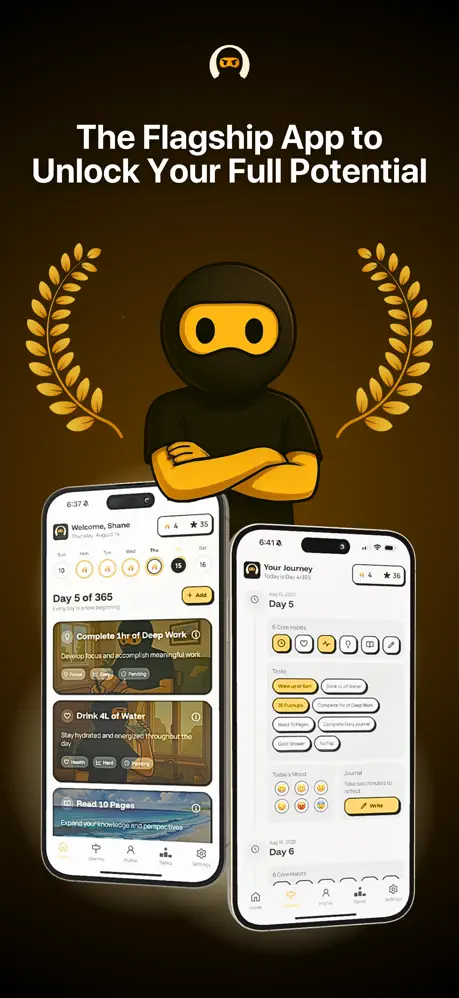
YLAG App Store screenshot 1 — The Flagship App to Unlock Your Full Potential
01

The Flagship App to Unlock Your Full Potential

On-frame caption: “The Flagship App to Unlock Your Full Potential

Frame 1 opens on a warm, near-black gradient that reads at roughly #0D0A05 at the edges, lightening toward the center. At top center sits a white, mask-shaped logo resembling an inverted horseshoe. Below it, the caption is set in a bold, sans-serif white face at a large display size. Flanking the central 3D ninja mascot are two gold laurel wreaths, each rendered as a flat vector illustration in a muted brass tone near #D4AF37. The mascot itself is fully dimensional, wearing a black hood and mask with a yellow-gold face. At the bottom, two iPhone 15 Pro devices sit in a slight V-formation. The left phone shows the home screen with granular habit cards for “Deep Work,” “Drink 4L of Water,” and “Read 10 Pages,” each with tags like Focus, Strategy, Pending, Hard, and Health. The right phone shows the “Your Journey” timeline with “6 Core Habits,” task chips, and a yellow “Write” journal button. The tab bar is visible on both, grounding the UI in a real five-section architecture. The overall impression is a brand poster that happens to contain devices.
YLAG App Store screenshot 2 — Make Discipline Daily Habit
02

Make Discipline Daily Habit

On-frame caption: “Make Discipline Daily Habit

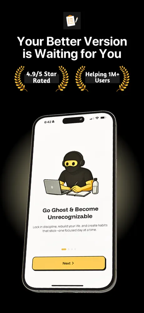
Frame 2 is a tight crop of the ninja mascot set against the same warm black-brown gradient. The illustration dominates the upper two-thirds, showing the character’s yellow mask and black hood at a scale that makes it feel like a movie poster. Centered across the lower chest are two more gold laurel wreaths bracketing the line “100k+ Users have gone Ghost Mode” in a compressed, bold sans serif. At the bottom edge, the caption appears in white, though the layout crops the final descenders and appears to omit the article “a,” reading slightly broken. There is no device render here at all—this is pure brand assertion. The lighting on the mascot’s shoulder suggests a three-point render that keeps the silhouette readable against the dark ground. The frame’s primary job is to telegraph the “Ghost Mode” concept and social proof before the viewer has seen a single interface element, doubling down on the entertainment positioning rather than utility.

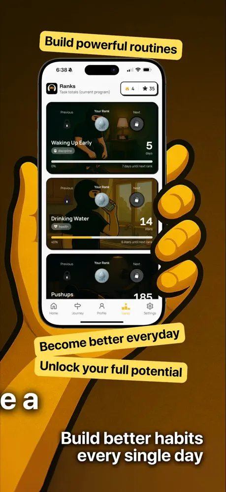
YLAG App Store screenshot 3 — Build better habits every single day
03

Build better habits every single day

On-frame caption: “Build better habits every single day

Frame 3 introduces a dramatic shift in scale: a giant yellow-gold ninja hand grips an iPhone from the right, casting a warm #E6A817 tone across the composition. The phone is presented upright, showing the “Ranks” screen with three stacked habit cards: “Waking Up Early” at 5 days and 0 percent progress, “Drinking Water” at 14 days and 40 percent progress, and “Pushups” at 185 days. The screen retains the fire-and-star meta-counters in the upper right. Overlaid on the image are three yellow lozenge labels with black text reading “Build powerful routines,” “Become better everyday,” and “Unlock your full potential,” positioned at roughly the top, middle, and lower-middle thirds. Below the device, the white caption anchors the frame. A stray fragment “e a” bleeds in from the lower left corner, likely a watermark or export artifact that should have been cropped. The warm orange-brown background unifies the frame with the first two, but the oversized hand makes this the most visually noisy shot in the sequence.

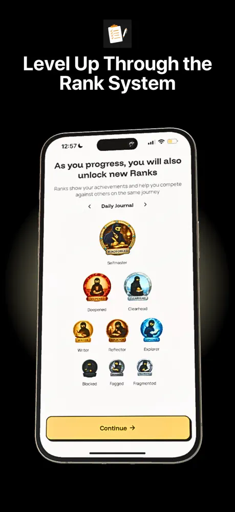
YLAG App Store screenshot 4 — Level Up Through the Rank System
04

Level Up Through the Rank System

On-frame caption: “Level Up Through the Rank System

Frame 4 switches to a pure #000000 black background, establishing the template for the remaining frames. A small clipboard-with-pencil icon sits centered above the caption. The phone is centered vertically, showing a white onboarding-style screen. At top, subhead copy reads “As you progress, you will also unlock new Ranks,” followed by a smaller gray explanation and a pill-shaped category switcher labeled “Daily Journal.” Below, nine circular rank badges are arranged in a 3-3-3 grid. The top badge, “Selfmaster” with subtitle “UNBOTHERED,” is largest and rendered in full gold and blue enamel detail. Lower rows show “Deepened” (red), “Clearhead” (blue), “Writer” (gold), “Reflector” (orange), “Explorer” (cyan), and three locked dark badges: “Blocked,” “Fogged,” and “Fragmented.” A yellow “Continue →” button sits at the bottom of the screen in a rounded rectangle. The frame is clean, symmetrical, and reads immediately as a gamification pitch.

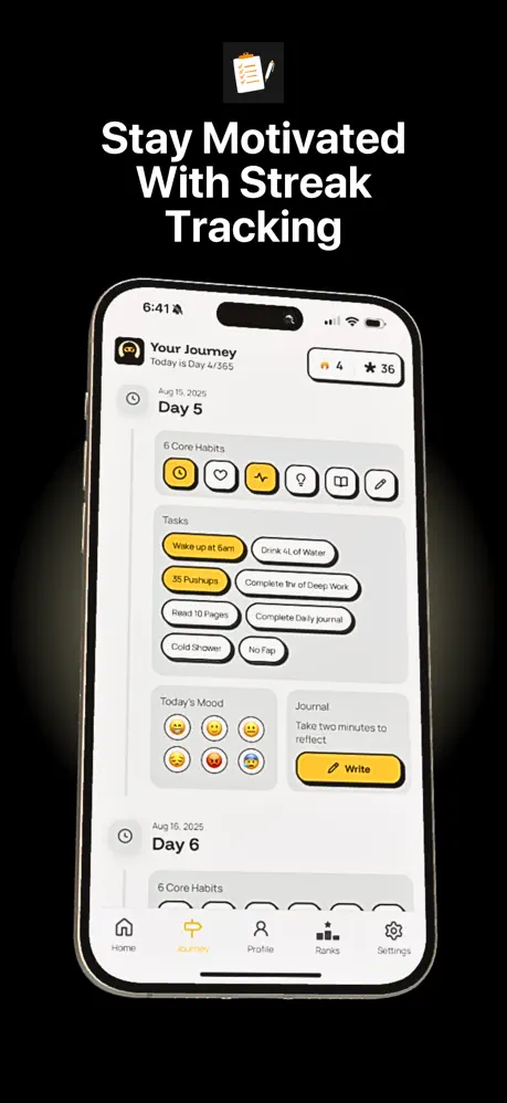
YLAG App Store screenshot 5 — Stay Motivated With Streak Tracking
05

Stay Motivated With Streak Tracking

On-frame caption: “Stay Motivated With Streak Tracking

Frame 5 keeps the black stage and clipboard icon, leading with the caption. The iPhone displays the “Your Journey” feed. The status bar shows 6:41 and the phone displays “Today is Day 4/365” beside fire and star counters. Below, “Day 5,” dated Aug 15, 2025, opens a section titled “6 Core Habits,” represented by six rounded-square icons—only the first, a yellow-filled power symbol, is selected. The Tasks module mixes solid yellow chips (“Wake up at 6am,” “35 Pushups”) with white outlined pills (“Drink 4L of Water,” “Complete 1hr of Deep Work,” “Read 10 Pages,” “Complete Daily Journal,” “Cold Shower,” “No Fap”). Further down, a “Today’s Mood” row shows six emoji faces, and a “Journal” prompt card carries a yellow “Write” button with a pencil icon. The bottom tab bar is fully visible, with Journey highlighted in yellow. The hierarchy is dense but scannable, and the date stamps reinforce the chronological promise of the app.

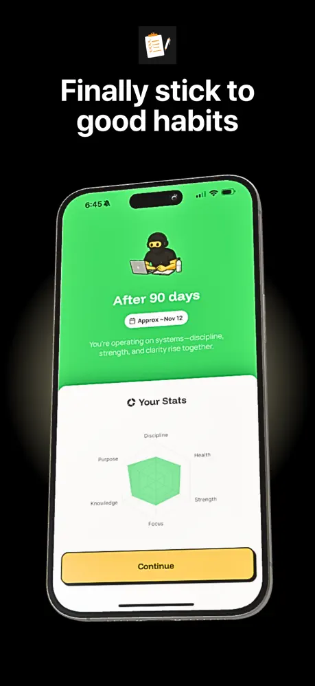
YLAG App Store screenshot 6 — Finally stick to good habits
06

Finally stick to good habits

On-frame caption: “Finally stick to good habits

Frame 6’s caption is prefixed by the clipboard icon. The phone screen is the most chromatically distinct in the entire set: a full-bleed #34C759 green background fills the upper half, breaking the yellow-black formula. A small ninja mascot sits above the text “After 90 days,” followed by a white pill reading “Approx - Nov 12.” Subcopy in white states, “You’re operating on systems—discipline, strength, and clarity rise together.” The lower half of the screen is a white sheet containing a radar chart labeled “Your Stats,” with six axes—Discipline, Health, Strength, Focus, Knowledge, and Purpose—filled with a pale green polygon. The yellow “Continue” button spans nearly the full width of the screen. The transition from green to white creates a clear horizon line within the interface, and the frame’s presence in the sequence reassures users that the app visualizes aggregate progress, not just daily tasks.

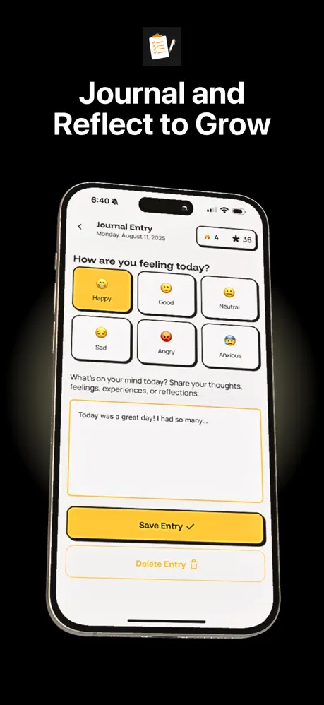
YLAG App Store screenshot 7 — Journal and Reflect to Grow
07

Journal and Reflect to Grow

On-frame caption: “Journal and Reflect to Grow

Frame 7 presents the caption at top. The phone shows the “Journal Entry” screen dated Monday, August 11, 2025, with fire and star counters matching the previous frame. A back arrow sits at upper left. The interface offers a 2×3 mood selector with rounded cards: “Happy” (selected with yellow fill and smiley emoji), “Good,” “Neutral,” “Sad,” “Angry,” and “Anxious.” Below, a label asks, “How are you feeling today?” followed by “What’s on your mind today? Share your thoughts, feelings, experiences, or reflections...” A large text area contains placeholder copy: “Today was a great day! I had so many...” The primary action is a yellow “Save Entry ✓” button, followed by a ghosted “Delete Entry” link with a trash icon. The form is long enough that the keyboard area is implied but not shown, keeping the layout tidy. This frame is the set’s proof of emotional check-in, not just mechanical habit tracking.

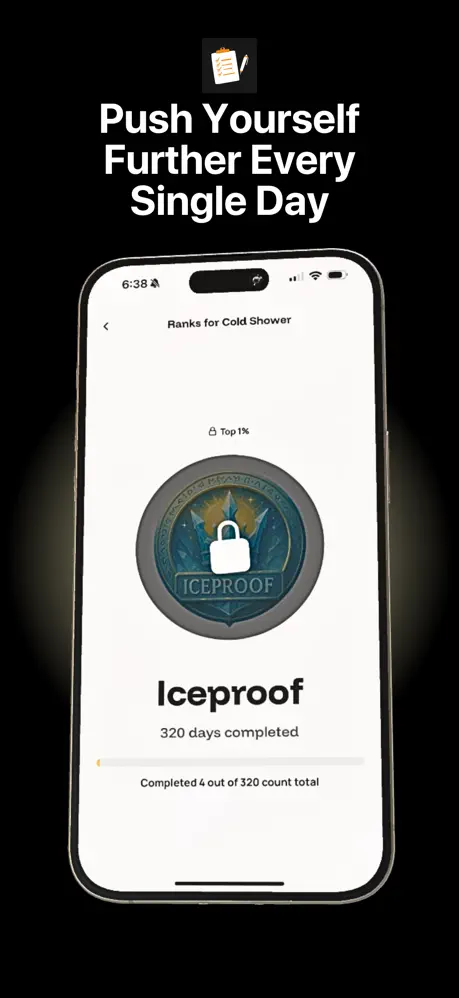
YLAG App Store screenshot 8 — Push Yourself Further Every Single Day
08

Push Yourself Further Every Single Day

On-frame caption: “Push Yourself Further Every Single Day

Frame 8 closes with the caption at top. The screen shows a single-habit rank view titled “Ranks for Cold Shower.” A back arrow appears at upper left. Centered beneath a “Top 1%” lock icon is a large circular medal rendered in slate blue and silver with the word “ICEPROOF” across its lower arc and a white padlock symbol in the center, indicating the rank is sealed. Below the badge, “Iceproof” appears in bold black, with “320 days completed” underneath. A thin progress bar sits almost empty, with a tiny yellow sliver at the left edge and the caption “Completed 4 out of 320 count total.” The minimal fill communicates aspirational distance rather than accomplishment. The frame leaves the viewer with a sense of long-term pursuit, reinforcing the 365-day narrative introduced in Frame 1. By isolating one extreme habit, the shot suggests depth for users who want to specialize.

05The craft

Captions, colour and the mechanics of the sell

Caption pattern

All frames lead with a five-to-seven-word headline in a heavy weight, anchored either top or bottom. The set alternates between title case and sentence case without a clear system, which introduces friction for readers scanning in a hurry.

Visual system

The first three frames build a warm, theatrical world—#0D0A05 gradients, gold laurels, and dimensional mascot art—then cut sharply to a pure black studio. That split keeps the UI clean but also severs the brand environment. A single repeated motif, such as a gold accent line or a ghosted mascot silhouette, would have threaded the two modes together.

The thumbnail test

Frames 1-3 read instantly as a branded character poster, but frames 4-8 collapse to generic black rectangles with white text at thumbnail width. The clipboard icon is too small to rescue the silhouette. A thumbnail optimization would keep the yellow button or a sliver of green from Frame 6 visible to break the monochrome.

Conversion mechanics

The set hits all major conversion beats—habits, streaks, ranks, journal, stats—without repeating a screen. However, the lack of a clear social or sharing frame, and the absence of any pricing or trial context, leaves the shopper guessing about monetization until they reach the description.

06Where it slips

What we would change

The 3-to-4 transition severs the brand world

The set’s biggest structural weakness is the jarring transition between Frame 3 and Frame 4. The first three frames share a warm illustrated world—gradients, laurels, and literal ninja hands—while the remaining five switch to sterile black backgrounds with no mascot presence. For a shopper swiping quickly, this can feel like two different apps stitched together. The fix would be to carry at least a ghosted watermark or a small mascot silhouette into Frames 4–8, or conversely to introduce one black-stage UI shot earlier so the shift feels intentional rather than abrupt.

Frame 3 is compositionally overloaded

Frame 3 suffers from compositional clutter. The giant hand, three floating pill labels, bottom caption, and stray “e a” fragment compete for attention. The text labels overlap the phone bezel and the hand, flattening the depth. A specific fix: remove the middle two lozenges and let the phone screen speak for itself, or move the caption to the top and keep only one label.

Typography inconsistencies undermine polish

Typography is inconsistent in ways that undermine polish. Frame 2’s caption reads “Make Discipline Daily Habit,” dropping the article “a,” unless it is hidden by a crop. Frame 3 repeats “Unlock your full potential” as a small label after Frame 1 already uses “Unlock Your Full Potential” as the main caption; repetitive phrasing wastes limited reading time. The rank names in Frame 4 (“Unbothered,” “Deepened,” “Clearhead”) are rendered in a heavily stylized badge art style that borders on unreadable at thumbnail size.

Status-bar grooming and color isolation

Finally, the status bars across the UI frames show mixed times (6:38, 12:57, 6:41, 6:45, 6:40), which is a minor but noticeable lack of fit-and-finish. Standardizing all clocks to a single time would make the set feel more deliberately art-directed. The green stats screen in Frame 6 is effective as a color break, yet it is the only place green appears, making it feel like a foreign element. If green is meant to signal success states, it should appear in at least one other frame to build pattern recognition.

07The recipe

How to apply this to your own app

  1. Lead with identity, not dashboard

    If your app has a mascot or strong character, dedicate the first frame to that persona before showing the UI. YLAG proves that shoppers will wait for feature proof if the poster is compelling.

  2. Split brand and UI into distinct acts

    Use a clear visual switch—background color, framing style, or scale—to separate emotional hooks from functional demos. Just soften the hinge so it does not feel like a different app.

  3. Never repeat the same surface twice

    YLAG shows ranks in Frame 3, then again in Frame 4 and Frame 8, but each time from a different depth: list view, grid unlock screen, and single-badge detail. That variety keeps the sequence from feeling like a slideshow.

  4. Sanitize the chrome

    Keeping the status bar consistent across UI frames, and cropping the home indicator when it does not serve the story, makes the shots feel designed rather than captured.

08Takeaways

Five things worth stealing

  • A character-driven poster sequence can outperform a sterile dashboard lead in the Entertainment category.
  • Warm gradient brand frames and pure-black UI frames can coexist, but they need a shared motif to bridge the gap.
  • Each screenshot should expose a distinct surface or depth of the app to avoid checklist fatigue.
  • Production details—status-bar times, stray pixels,重复的 captions—accumulate and erode trust at the margin.
  • verdictForDesignersToStealOrSkip
09The verdict

What the set actually achieves

The sequence converts the 3-frame mascot intro into a clear product walkthrough, landing on aspirational rank proof. The brand is immediately legible even at thumbnail scale, but the UI transition is abrupt enough to risk disorientation.

Character-forward lifestyle or productivity apps that need to telegraph personality before utility. This template is less useful for B2B, medical, or finance apps where trust is built through restraint and data density rather than mascot theatre.

10Questions

Frequently asked

Why does the first frame show two phones at once?

It is a density play: the designers wanted to prove breadth (home feed and journey timeline) immediately without burning two frames on separate dashboards. The risk is that each phone is too small to read; the saving grace is that the surrounding poster art carries the scroll.

Does the green stats screen help or hurt the set?

It helps as a wake-up call after five frames of yellow-black, but it hurts as a singleton. Without a second green accent elsewhere, it reads as an outlier rather than a system.

What is the most important fix a designer should copy?

The act structure: three emotional posters followed by five proof frames. That rhythm respects the App Store swipe behaviour without surrendering the entire sequence to UI minutiae.

Should the rank badges be more legible?

Yes. The stylised enamel text inside the badges is atmospheric at full resolution but becomes mud in thumbnail. Simpler iconography or a larger type size inside the badge would preserve readability.

11Keep reading

Build your own screenshot set

The full set

9 shots
YLAG App Store screenshot 1YLAG App Store screenshot 2YLAG App Store screenshot 3YLAG App Store screenshot 4YLAG App Store screenshot 5YLAG App Store screenshot 6YLAG App Store screenshot 7YLAG App Store screenshot 8YLAG App Store screenshot 9

About the app

Go Ghost. Build Yourself. Change Everything. Tired of distractions? Always starting over? YLAG: Ghost Mode Tracker is your year-long system to disappear from the noise and Applo, via the App Store listing.

Screenshots and store metadata belong to Applo. They are shown here for design commentary and criticism. The analysis on this page is original work by floow.design. View the original listing.

More Entertainment teardowns

Browse all →