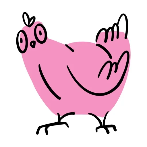
Caption pattern
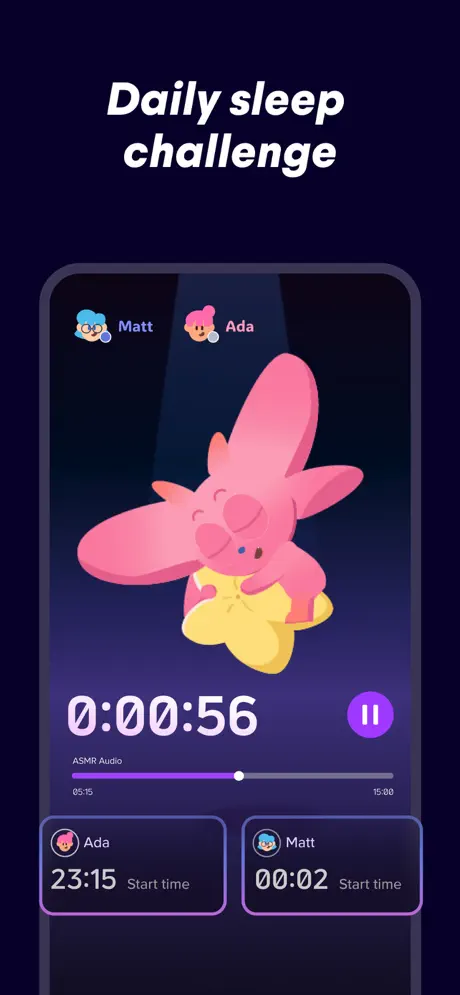
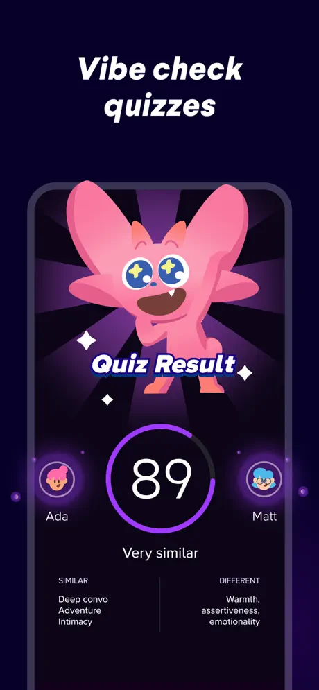
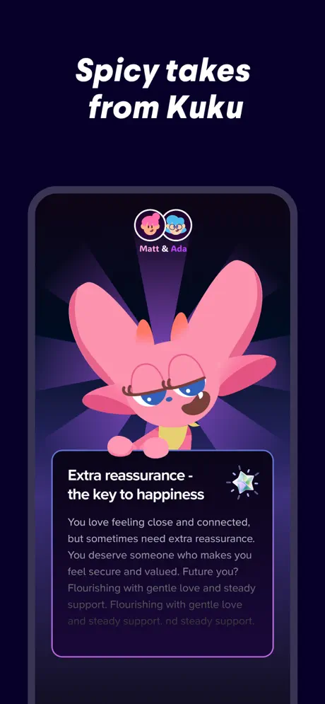
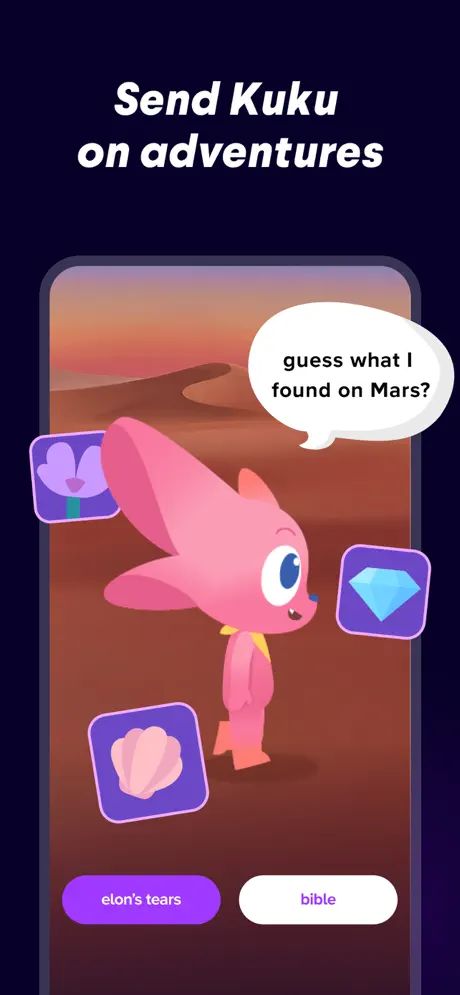
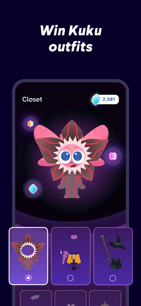
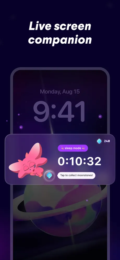
Every device-framed screenshot uses the same layout: two-line white italic headline centered in the top 12–15% of the canvas, followed by a vertically centered device. The copy itself is punchy and colloquial: 'Daily sleep challenge,' 'Vibe check quizzes,' 'Spicy takes from Kuku,' 'Send Kuku on adventures,' 'Win Kuku outfits,' 'Live screen companion.' The parallel structure—verb or verb-adjective noun phrases—creates a swipeable cadence, but it also refuses to vary; by frame six the reader has already learned the tune and may skip the lyrics.
Visual system
The system is governed by three rules. First, background depth: every frame sits on the same near-black navy, so the set feels like a contiguous environment rather than a slide deck. Second, violet hierarchy: interactive affordances (pause icons, progress segments, selected borders, primary buttons) pull from the same electric violet (~#8B5CF6), training the eye to read purple as 'live' and everything else as decorative. Third, Kuku expression: the mascot’s face changes state—sleepy, star-eyed excited, sassy unimpressed, curious side-profile—to telegraph the mood of the feature before the caption is even read. That non-verbal signaling is the smartest layer of the system, because it bypasses language barriers in international storefronts.
The thumbnail test
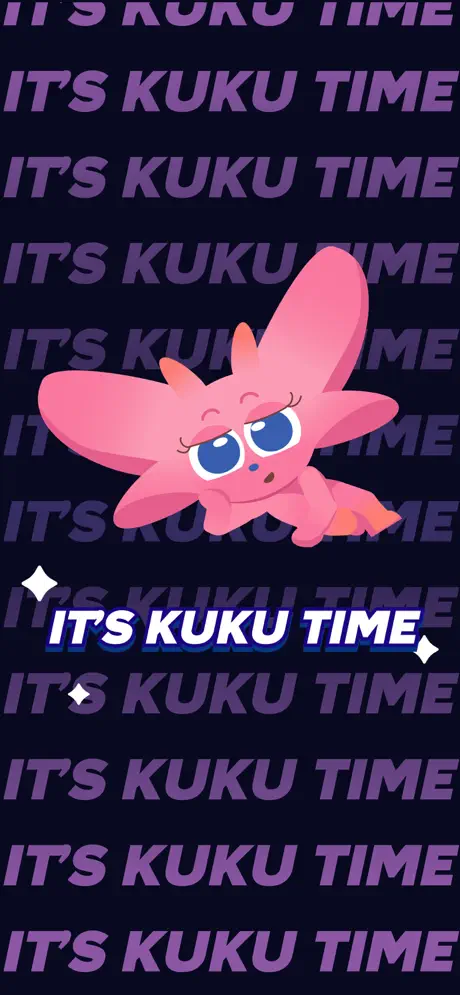
Frame 1 passes the thumbnail test only as a brand stamp. Because it contains no device frame and no recognizable iOS UI, it will register as an illustration rather than an app screenshot at small scale. Frames 2–7 fare better: the white italic caption and dark purple device read cleanly even at reduced resolution because the contrast between white text and dark ground is extreme. Kuku’s pink silhouette remains identifiable in every frame, which helps brand recall during a quick scroll.
Conversion mechanics
The set front-loads brand charm but delays interface proof until frame 2. For a shopper debating a download, the lack of recognizable UI in frame 1 may trigger a skip; the App Store viewer is trained to look for devices and buttons, not posters. Frames 2 through 7 recover by showing actual interactive surfaces, yet the copy error in frame 4 ('nd steady support') is a credibility leak that undermines the polish of the coaching feature. Frame 5's asymmetric button styling—one filled, one outlined—reads as a UI convention rather than a narrative choice, and may confuse users about whether 'bible' is selectable. Frame 6's currency is legible but diminutive; at small thumbnail sizes, '2,501' will dissolve into noise. Frame 7 demonstrates ecosystem value (Live Activity / lock screen) effectively, though the frosted card edges border on low contrast against the purple planet.