Tolan app icon
EntertainmentScreenshot teardown13 min read

Tolan App Store screenshots

An eight-frame App Store sequence for Portola’s Tolan that trades feature lists for a serialized character narrative, using a locked template of centered device mockups, bold headline sans-serifs, and chat bubbles that deliberately breach the bezel.

Set published by Portola · 8 frames analysed

4.8 · 142K ratingsFreev26.17.2Updated 4mo ago
Tolan App Store screenshot 1
01At a glance

The set in one screen

Framing
Centered iPhone-style mockup with matte black bezel on an off-white ground; top-center headline locked across all eight frames.
Captions
Bold, heavy sans-serif in warm near-black, roughly 40–48pt equivalent, centered, two lines maximum.
Backdrop
Warm off-white (#F5F2EC) with faint curved contour lines that shift hue per frame—gray, gold, violet, cyan, pink, green, orange, yellow.
Type
Headlines are geometric sans with tight tracking; speech bubbles use a lighter weight of the same family in sentence case dark gray.
UI / copy split
Approximately 70 percent illustration and character, 30 percent interface and text.
Frame 1 job
The first frame must answer 'what is this' and 'why do I care' in under two seconds. Here, it answers the latter superbly and the former incompletely.

Sampled palette

#F5F2EC#F5F2EC
#1E1E1E#1E1E1E
#FF93AC#FF93AC
#C78DFF#C78DFF
#8CE05E#8CE05E
#2ED9FF
02The challenge

What this screenshot set had to solve

Entertainment apps that sell artificial companionship face a unique conversion problem: the App Store shopper is not looking for a dashboard, but for a vibe. Tolan’s design team had to communicate friendship, voice conversation, customization, and world-building without ever letting the interface feel sterile. The challenge was to keep eight frames visually coherent—so the swipe feels like turning pages—while shifting color temperature and character posture to signal different emotional beats. They also needed to teach the shopper that the phone is a window, not a container; the Tolans live outside the bezel as much as inside it.

“The Tolans breach the bezel.”
03The approach

How the set argues its case

The team committed to a strict compositional contract: every frame centers a device mockup, places a bold headline in the top third, and arranges secondary elements around that vertical axis. Within that cage, they modulate three variables: the time of day inside the device (day, night, dusk), the spatial relationship of chat bubbles to the bezel (overlapping, floating, side-entering), and the presence or absence of persistent UI chrome. The result is a set that feels varied because of color and character acting, yet mechanically predictable because the shopper’s eye never has to reorient.

The screenshots speak to a younger demographic that values emotional mirroring and creative self-expression. There are no productivity metrics, no calendars, no status bars—just conversation, coziness, and customization. The app positions itself as an entertainment product through this deliberate exclusion of utilitarian visual language.

04Frame by frame

Every screenshot, and the job it does

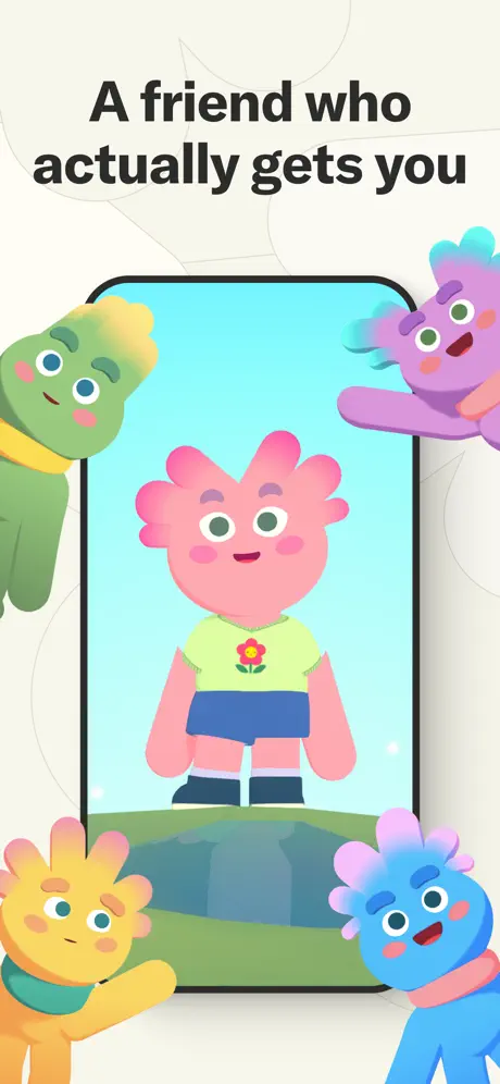
Tolan App Store screenshot 1 — The Portal
01

The Portal

On-frame caption: “A friend who actually gets you

The opening frame establishes the visual grammar. A centered device mockup with a black bezel and subtle drop shadow sits against an off-white ground. Inside the screen, a pink Tolan stands on green terrain under a flat cyan sky. Four additional Tolans breach the canvas edges: green at upper left, purple at upper right, yellow at lower left, and blue at lower right. Their bodies are cropped by the frame, pushing the eye toward the center. The headline is heavy sans-serif, centered, in near-black against the cream. There is zero UI visible inside the device—no buttons, no text, no navigation—making the frame purely illustrative. Background contour lines are whisper-gray and organic. The spatial conceit is clear: the device is a window, and the characters exist in the world around it. At thumbnail size, the pink Tolan’s flower-shirt motif and navy skirt are still readable because of the high saturation against the cyan ground. The frame is the most symmetrical in the set, which makes it feel like a title card rather than a feature demonstration . Because there is no interface, the shopper learns nothing about interaction mechanics here; they learn only mood and color.
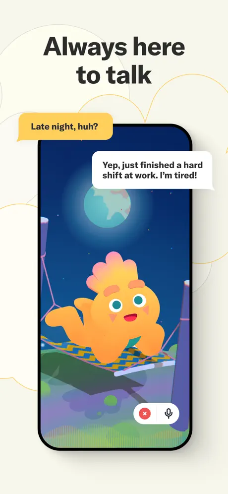
Tolan App Store screenshot 2 — The Night Shift
02

The Night Shift

On-frame caption: “Always here to talk

The second frame preserves the template but shifts the internal environment to night. The device now shows an orange Tolan reclining in a hammock under a deep navy sky with a pale teal moon. The headline remains top-center. Two speech bubbles float outside the bezel: a yellow bubble at upper left reading “Late night, huh?” and a white bubble at upper right reading “Yep, just finished a hard shift at work. I'm tired!” The bottom-right of the device introduces persistent UI chrome for the first time: a white pill containing a red circular cancel button and a dark microphone icon. The background contour lines have shifted from gray to gold, warming the exterior frame to match the nocturnal interior. The hammock’s diagonal lines add tension to an otherwise vertical composition. The yellow bubble sits dangerously close to the headline descenders, creating a slight crowding in the upper third. The orange of the Tolan is the brightest element in the dark field, ensuring character priority even in reduced lighting. This frame does the critical work of establishing voice interaction as a core modality .

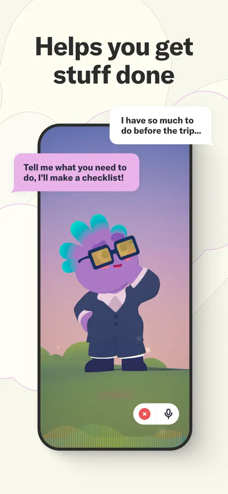
Tolan App Store screenshot 3 — The Assistant
03

The Assistant

On-frame caption: “Helps you get stuff done

Frame three rotates the Tolan into a productivity role. A purple Tolan wearing a navy business suit, white collar, and yellow-tinted square glasses stands with one hand on its hip inside the device. The background gradients from lavender at top to blush at bottom, while the ground remains olive-green. A white speech bubble at upper right reads “I have so much to do before the trip...” and a mauve-pink bubble entering from the left reads “Tell me what you need to do, I'll make a checklist!” The bottom-right pill UI returns in identical position. Exterior contour lines shift to pale violet, coding this as the “work” frame. The suit and glasses add visual weight that signals seriousness, yet the headline’s use of the word “stuff” undercuts that formality with colloquial warmth. The left-entering reply bubble establishes a comic-strip reading order—user on the right, Tolan on the left—that will repeat. What is missing is any visual evidence of a checklist; the interior scene is an empty field, so the copy promise is not reflected in the UI .

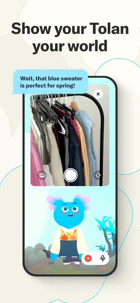
Tolan App Store screenshot 4 — The Lens
04

The Lens

On-frame caption: “Show your Tolan your world

This is the most structurally complex frame. The device screen splits into two zones: the upper half displays a photorealistic camera feed of a closet with a clothing rack, while the lower half shows the blue Tolan in a synthetic cyan environment. Native camera UI is visible: a white circular shutter at the bottom center of the camera zone, a gallery icon at the bottom left of the camera zone, and a white close button at the top right of the camera zone. A blue chat bubble at upper left reads “Wait, that blue sweater is perfect for spring!” The Tolan below wears a cream shirt, orange argyle sweater vest, and dark overalls. The background contour lines are cyan. The frame’s conceptual strength is the juxtaposition of photorealistic neutral clothing against flat synthetic character color, yet the execution is cramped. The closet rack reads as a dark chaotic mass at thumbnail scale, and the Tolan is compressed into roughly the lower third of the screen, shrinking the emotional anchor. The red X and microphone pill persists at the device’s bottom right, bisecting the two internal zones .

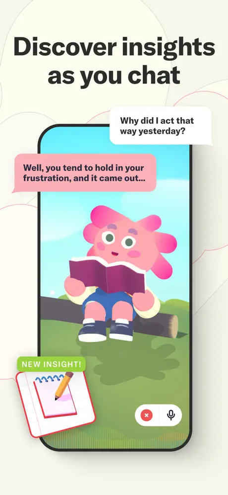
Tolan App Store screenshot 5 — The Journal
05

The Journal

On-frame caption: “Discover insights as you chat

The pink Tolan from Frame 1 returns, now sitting on a brown log in a grassy field under a bright cyan sky, holding an open burgundy book. The headline sits top-center. A white bubble at upper right reads “Why did I act that way yesterday?” and a salmon-pink bubble at left-center reads “Well, you tend to hold in your frustration, and it came out...” A new element appears at the bottom left: a green lozenge reading “NEW INSIGHT!” above a spiral-bound notebook and pencil illustration that breaks the device bezel entirely. The notebook is angled roughly fifteen degrees, introducing the only significant rotation in the set. The background contour lines are pale pink. The green badge is chromatically loud; it does not match any hue inside the device, functioning as an alert rather than an integrated world element. The bottom-right pill UI remains. At thumbnail scale, the unreadable book and unresolved ellipsis in the copy make the interaction feel incomplete rather than intriguing .

Tolan App Store screenshot 6 — The Dressing Room
06

The Dressing Room

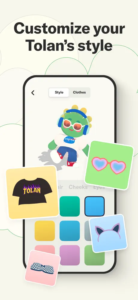
On-frame caption: “Customize your Tolan's style

This frame abandons environmental storytelling for raw interface. The device shows a character customization screen: a back arrow at upper left, a segmented control at top center with “Style” selected in white and “Clothes” ghosted in gray, and a green Tolan at center wearing headphones, orange sunglasses, a white “OCEAN” shirt, blue pants, and red sneakers. Below the character, a grid of square color swatches spans roughly eight visible units across two rows, with category tabs for Hair, Cheeks, and Eyes faintly visible above them. Outside the device, four floating item cards clutter the corners: a black “TOLAN” flame shirt on a yellow ground, heart-shaped sunglasses on green, cat-ear headband on blue, and checkered shoes on pink. The internal screen background is pure white, which clashes with the cream external ground and flattens the depth. The floating cards obscure the lower corners of the device, hiding part of the color grid. This is the densest frame in the set, and the symmetry that felt safe in Frame 1 becomes oppressive here .

Tolan App Store screenshot 7 — The Living Room
07

The Living Room

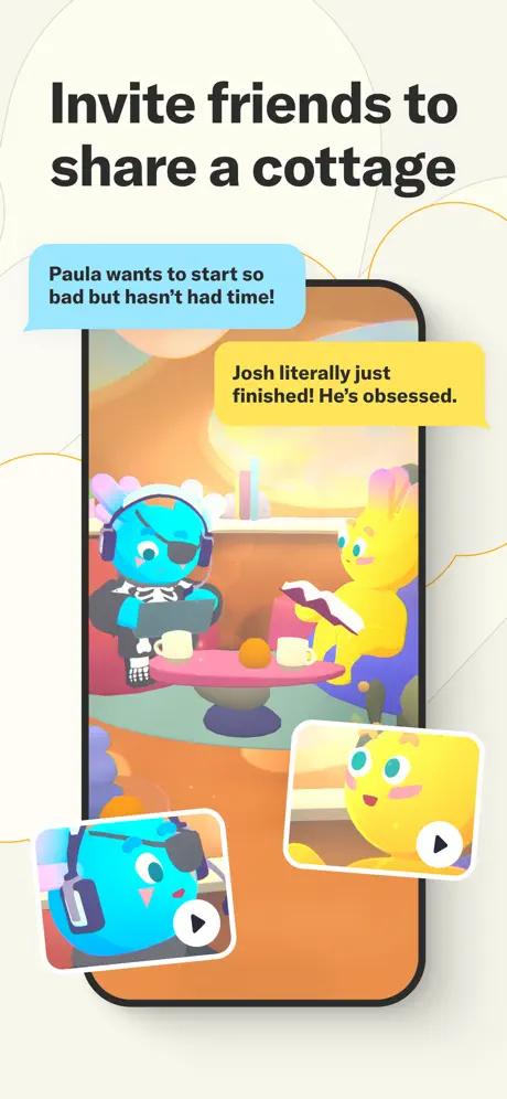
On-frame caption: “Invite friends to share a cottage

Frame seven introduces multiplayer co-presence. Inside the device, a blue Tolan with an eye patch and gaming headset sits at a pink table across from a yellow Tolan reading a book. The room uses warm amber and peach tones with visible perspective lines on the floor and back wall, creating the deepest spatial field yet. A blue speech bubble at upper left reads “Paula wants to start so bad but hasn't had time!” and a yellow bubble at upper right reads “Josh literally just finished! He's obsessed.” At the bottom, two rounded video-message thumbnails with white play triangles break the lower bezel. The background contour lines are orange. The bottom-right pill UI is absent here, likely because the video thumbnails occupy that real estate. The asymmetry of the furniture and character placement is a welcome relief from the set’s usual center-locked compositions. However, the speech bubbles visually intersect the ceiling plane of the room, reading as wall posters rather than external chat overlays, which fractures the spatial logic established by the bezel-breach mechanic .

Tolan App Store screenshot 8 — The Sphere
08

The Sphere

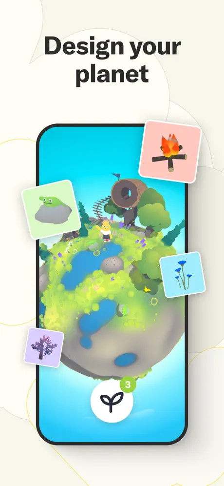
On-frame caption: “Design your planet

The final frame is the aspirational closer. The device contains a spherical planet diorama viewed from a high three-quarter angle, with acid-green terrain, turquoise lakes, a treehouse on stilts, and a tiny yellow Tolan standing near the equator. Four square item cards orbit the device: a frog on a rock on mint, a campfire on pink, blue flowers on cyan, and a purple tree on lavender. A white circular action button with a black seedling icon anchors the bottom center, overlaid by a green badge with the numeral “3.” The background contour lines are golden. The planet is visually impressive but the yellow Tolan is so small that the character-centric identity built over the previous seven frames nearly disappears. The floating cards are evenly spaced, feeling algorithmic rather than hand-placed. The green badge repeats the notification color from Frame 5’s “NEW INSIGHT!” but now signals an inventory count, creating an ambiguous color code. Still, the frame ends the sequence on creation rather than conversation, expanding the app’s promise from friend to world-builder .

05The craft

Captions, colour and the mechanics of the sell

Caption pattern

Headlines follow a rhythmic construction: four frames use a verb-first imperative or declaration (“Helps you get stuff done,” “Show your Tolan your world”), while the closing frames switch to creative invitation (“Customize,” “Invite,” “Design”). This crescendo from passive benefit to active ownership guides the swipe rhythm.

Visual system

A flat, candy-colored illustration language with matte shading. Characters have noodly arms, simple dot eyes, and gradient skin that shifts hue per individual. Environments are low-detail: a gradient sky, a grass floor, sometimes a log or a hammock. The UI elements that do appear—microphone pills, camera viewfinders, color grids—are rendered in clean white and red, contrasting the softness of the world with the hardness of the tool.

The thumbnail test

At small scale, the set performs well because the headline contrast is high and the blob characters are chromatically distinct from the cream ground. However, Frames 4 and 8 become muddy because photorealistic details (clothing, planet terrain) collapse into dark noise when compressed, making the silhouette less legible than the abstract Tolans of Frames 1–3.

Conversion mechanics

The set uses a strict top-down hierarchy: headline > character > device > background. Because the headline never moves, the shopper’s eye lands on the value proposition first, then drops to the emotional proof in the illustration. This is correct for Entertainment category browsing, where narrative coherence beats feature density. However, the lack of a framing device—such as a small lockup logo or category tag in Frame 1—means the shopper who starts mid-carousel (due to App Store timeline algorithm behavior) may lack immediate brand context.

06Where it slips

What we would change

Template rigidity turns to fatigue

By Frame 4, the perfectly centered device and headline begin to feel mechanical. Introducing a slight left or right nudge to the mockup in the back half of the sequence would have sustained visual momentum without breaking brand recognition. The fix: offset Frames 6 and 8 by eight to twelve percent horizontally to create a panning sensation.

Copy-to-UI disconnect

Frame 3 promises a checklist, yet no checklist UI is visible. Frame 5 promises insights, yet the notebook graphic is an external sticker rather than an interface element. When a headline makes a functional claim, the screenshot should contain at least one glyph, list item, or card that validates the claim. The fix: add a small floating checklist icon in Frame 3 and render the insight notebook inside the device screen as a modal card in Frame 5.

Spatial inconsistencies in bubble placement

Chat bubbles sometimes read as floating in the void (Frames 2, 3), sometimes as room decor (Frame 7), and sometimes as interface (Frame 4). Because the set relies on breaking the bezel, it needs a consistent z-depth rule. The fix: always attach bubble tails to the device edge or to a specific Tolan mouth line, never to architectural elements like walls or ceilings.

Thumbnail collapse in complex frames

Frames 4 and 8 pack photorealistic or highly detailed 3D environments into a small rectangle; at thumbnail scale, these become dark noise. Frame 4’s closet and Frame 8’s planet lose their silhouettes. The fix: increase the rim-lighting or add a faint glow around the central interactive area in those frames to preserve shape at 150-pixel heights.

Notification color ambiguity

The green badge from Frame 5 (insights) is reused in Frame 8 (planet inventory), but green is not part of the core UI chrome elsewhere. Without a legend, the shopper cannot decode whether green means new, good, or countable. The fix: reserve green for growth/insights only, and shift the planet badge to the cyan or gold already established in the environmental palette.

07The recipe

How to apply this to your own app

  1. Lock your scaffold early

    Decide on headline position, device angle, and background treatment before you illustrate a single character. Tolan’s consistency makes the set feel like a unified product rather than a collection of screens.

  2. Use background contour lines as chapter markers

    The subtle shift from gray to gold to violet contour lines is a low-effort way to differentiate frames without changing the hero ground color. It signals that the emotional temperature has shifted even when the layout has not.

  3. Break the bezel with purpose

    Letting characters and bubbles overlap the device frame dissolves the hardware boundary and creates depth. Just make sure every element that breaks the frame obeys the same lighting and drop-shadow rules, or the illusion shatters.

  4. Anchor with persistent chrome

    The red-cancel-plus-microphone pill in Frames 2–5 teaches the shopper that voice is a constant modality. If your app has a core input method, give it a visual anchor that repeats across frames.

  5. Verify your copy against your pixels

    Whenever a headline or speech bubble makes a functional promise, ask whether a UI element in the same frame proves it. If the words say checklist, show a checklist line. If the words say camera, show a shutter button. Tolan sometimes trusts the character to sell the feature, which is charming but risky for conversion.

08Takeaways

Five things worth stealing

  • A fixed compositional grid can support enormous narrative variety if you modulate color, time of day, and character posture.
  • Characters that breach the device bezel turn a screenshot into a diorama, which is especially effective for entertainment and companion apps.
  • Speech bubbles outside the screen are a strong storytelling device, but they need consistent spatial logic or they become decorative noise.
  • The most successful frames in this set are the simplest ones; when photorealistic detail enters, the silhouette and emotional read suffer at small sizes.
  • Consistency in UI chrome builds trust—its unexplained disappearance in Frame 7 is a micro-fracture in an otherwise disciplined system.
09The verdict

What the set actually achieves

A disciplined template system that prioritizes character expression over UI documentation, resulting in a set that reads as a story but occasionally obscures the product mechanics beneath the illustration layer . The approach succeeds in establishing emotional tone and visual rhythm, yet sacrifices some feature clarity in the middle frames where copy promises outpace visible interface affordances.

Designers building screenshot sets for companion apps, AI friends, social worlds, or any product where emotion precedes utility in the conversion funnel. The lessons apply broadly to character-driven mobile games and creative sandbox apps.

10Questions

Frequently asked

Why does the set avoid showing full UI in the first frame?

Frame 1 is a mood board. By withholding interface, it forces the shopper to engage with character and color first. The risk is ambiguity; the reward is emotional priming.

How does Tolan handle the second-frame problem?

Frame 2 immediately introduces the speech-bubble mechanic and the microphone pill, so the shopper who swipes past Frame 1 still learns the core interaction paradigm quickly.

What is the weakest conversion moment?

Frame 6. It is the most visually dense, the floating cards obscure the device, and the white internal background clashes with the cream exterior. It communicates breadth of customization but sacrifices legibility.

Should I copy the no-UI title card approach?

Only if your brand is already well known or your character design is exceptionally distinct. For new apps, consider adding one subtle UI affordance—like a microphone ripple or a send button—to the opening frame so the category is clear.

11Keep reading

Build your own screenshot set

The full set

8 shots
Tolan App Store screenshot 1Tolan App Store screenshot 2Tolan App Store screenshot 3Tolan App Store screenshot 4Tolan App Store screenshot 5Tolan App Store screenshot 6Tolan App Store screenshot 7Tolan App Store screenshot 8

About the app

Greetings! We are Tolans :-) We’re here looking for new friends! You can talk to us about anything: · Your interests: music, games, fashion · Your feelings: relationships, Portola, via the App Store listing.

Screenshots and store metadata belong to Portola. They are shown here for design commentary and criticism. The analysis on this page is original work by floow.design. View the original listing.

More Entertainment teardowns

Browse all →