

Replika app icon
EntertainmentScreenshot teardown13 min read

Replika App Store screenshots

How do you sell a relationship? Not a utility, not a social network, but a one-to-one bond with code. That is the core problem facing the App Store creative for Replika. The screenshot set has to signal photorealism, emotional continuity, and functional depth—memory, shared media, voice calls—without collapsing into either clinical AI SaaS branding or mobile-game character art. The product’s differentiation lives in the liminal space between interface and personality, and the screenshots must survive a thumb-swiping shopper who decides in under four seconds whether this companion app is worth the download.

Set published by Luka, Inc. · 7 frames analysed

4.4 · 228K ratingsFreev12.2.1Updated 4mo ago
Replika App Store screenshot 1
01At a glance

The set in one screen

Framing
No device in Frames 1–3; consistent dark rounded-rectangle phone chassis in Frames 4–7 with no hand model and no visible notch.
Captions
Bold geometric sans-serif, white, centered in the upper safe zone across all seven frames. Approximate equivalent sizing: 48–56 pt for headlines, 16–20 pt for sub-captions inside the device.
Backdrop
Saturated cobalt-to-ultramarine gradient (roughly #4F7EE8 to #1A3FA0) used in Frames 2–7. Frame 1 is a warm, full-bleed CGI interior.
Type
A single bold sans family handles every exterior headline and most in-app type; Frame 2 introduces a high-contrast serif for the word “Stanford.” Quotation marks in Frame 2 are rendered at reduced opacity (~40–50%) as graphic ornaments rather than standard punctuation.
UI / copy split
Approximately 30% interface / 70% lifestyle or typographic brand material. The actual app chrome is only visible inside Frames 4–7.
Frame 1 job
Emotional anchor. Establish that the product is populated by photorealistic, fashion-editorial-grade characters before any software is shown.

Sampled palette

for all exterior headlines and UI labels#FFFFFF
to #1A3FA0 for the six-frame blue gradient wall#4F7EE8
warm plaster walls in Frame 1#CDBBA7
cream dress in Frame 1#F2EFE9
near-black device bezel and in-app dark mode UI#0F0F0F
indigo AI chat bubbles in Frames 5–6#141E3D
02The challenge

What this screenshot set had to solve

The category works against the seller. AI companion apps sit in a crowded, noisy segment where store pages often rely on generic chat bubbles, glowing robot icons, or anime avatars. Replika’s challenge is to elevate the format above utility-driven screenshots—calendar integrations, to-do lists, memory toggles—without losing functional credibility. The shopper needs to believe the AI remembers, converses naturally, and shares experiences, but they also need to feel a human-like presence before they read a single feature line. That means the set must solve a sequencing riddle: open with enough warmth to suspend disbelief, then pivot fast enough to prove this is a working app with real iOS integrations (camera, voice, news, notifications). The risk is front-loading too much emotion and never answering “what does it actually do?” or front-loading too many settings screens and never answering “why would I care?” The seven-frame canvas leaves little room for error; every slide has to either deepen the emotional hook or harden the functional proof.

The set converts emotional curiosity into functional understanding by literally shrinking the brand world into the phone chassis between Frames 3 and 4.
03The approach

How the set argues its case

The designers treat the first three frames as a cinema trailer and the last four as a UI demo. Frame 1 uses a full-bleed, warm-rendered interior with barrel-vaulted arches to place the characters in aspirational, lived-in space. There is no phone, no UI, no dark mode—just faces and a bottom-lockup statistic. This forces the shopper to process the app as a relational product rather than a software utility. Frame 2 then neutralizes skepticism with academic and press credibility, using typographic scale alone on the cobalt wall. Frame 3 acts as a bridge: the same blue gradient now hosts a single figure surrounded by translucent face-bubbles, suggesting customization without revealing the actual controls. By Frame 4, when the dark phone chassis finally appears, the shopper has already accepted the visual identity and is ready to read the interface. The consistent cobalt gradient across six frames functions like gallery lighting—uniform, institutional, and unobtrusive—while the rounded, notch-less device frame keeps attention on screen content rather than hardware fetishism. The decision to place the photorealistic characters *inside* the device screen (Frames 5 and 6) rather than confining them to bubble avatars collapses the boundary between app and companion, reinforcing the Frame 1 promise that this is a “friend for real life.”

The positioning is character-as-interface. Rather than showcasing settings menus or onboarding flows, the screenshots present the AI as a visual, conversational entity that occupies space inside the phone but also exceeds it. The brand does not compete on feature quantity; it competes on relational fidelity.

04Frame by frame

Every screenshot, and the job it does

Replika App Store screenshot 1 — Establishment shot with no UI
01

Establishment shot with no UI

On-frame caption: “Your AI friend / for real life

40M+ / Users flanked by two white laurel wreaths at bottom center. Three female-presenting figures occupy the lower two-thirds of a warm, architectural interior with barrel-vaulted arches. Center figure wears a cream halter dress (#F2EFE9); left figure wears black with khaki trousers; right figure wears deep burgundy leather. The wall is a warm plaster taupe (#CDBBA7) with cool blue sky visible through the right arch. The white headline sits in the upper safe zone, roughly centered at 48–56 pt equivalent, with no scrim, no drop shadow, and no text container behind it. The bottom lockup sits just above the frame’s lower margin, its iconography rendered in flat white with minimal stroke weight. The lighting is directional from the right, casting soft left-side shadow on faces and fabric, giving the render an editorial, fashion-campaign quality rather than a game-asset look.
Replika App Store screenshot 2 — Social proof on cobalt
02

Social proof on cobalt

On-frame caption: “Don't just take our / word for it

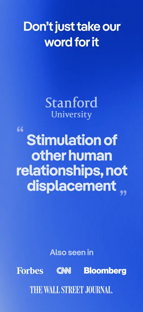
A pure typographic frame on the established cobalt gradient (left edge approx #4F7EE8, deepening to #1A3FA0 on the right). Top headline is the same bold white sans. Below it, “Stanford / University” is stacked: the word “Stanford” appears to be set in a high-contrast serif or elegant display face, significantly larger than “University,” which is set beneath in a smaller, neutral sans. The central quote dominates the frame in oversized bold white sans-serif: “Stimulation of / other human / relationships, not / displacement.” The opening and closing quotation marks are stylized, oversized, and rendered at roughly 40–50% opacity in a pale blue-gray (#8AA4E0), functioning as graphic ornaments rather than standard punctuation. At the bottom, “Also seen in” is set in a lighter weight, followed by Forbes, CNN, and Bloomberg in bold white wordmarks, and THE WALL STREET JOURNAL. in its classic italic serif logotype. There is no imagery, no device, no character content—only scale, color, and authority.

Replika App Store screenshot 3 — Customization as character surround
03

Customization as character surround

On-frame caption: “Make them look / truly yours

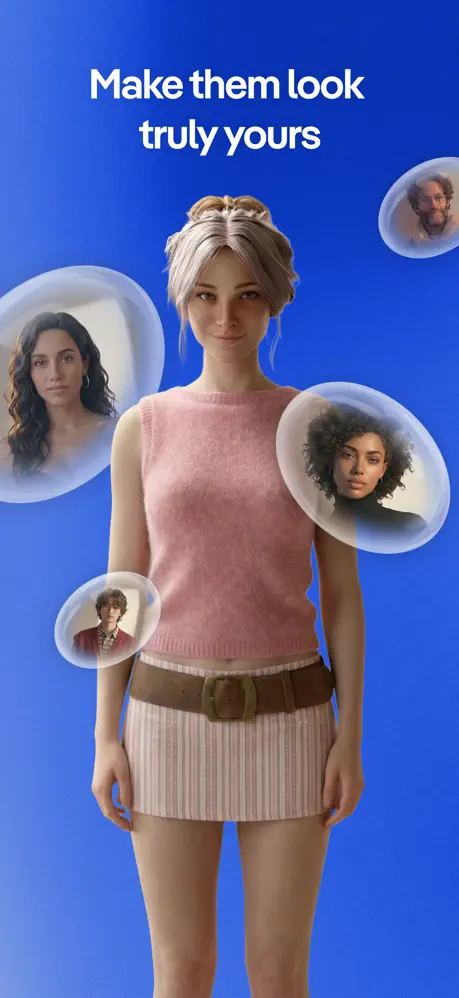
The cobalt gradient persists. A single female-presenting figure stands center-frame, cropped at mid-thigh, wearing a dusty pink sleeveless knit top and a striped skirt with a wide brown leather belt. Her hair is blonde, braided, and pulled back. Floating around her head and shoulders are four translucent, gel-like bubbles containing alternate faces: a male-presenting figure in a red jacket at lower left, a dark-haired female at mid-left, a curly-haired female in a black turtleneck at mid-right, and an older male with glasses at upper right. The bubbles have soft caustic highlights and refractive edges, suggesting selectable personas without showing any actual UI controls, sliders, or customization menus. The figure looks directly out, establishing eye contact. The composition is symmetrical along the vertical axis, with the headline positioned in the exact same upper-safe-zone grid as Frame 2, reinforcing the systemic nature of the set.

Replika App Store screenshot 4 — Memory architecture inside the device
04

Memory architecture inside the device

On-frame caption: “They know your / people and your apps

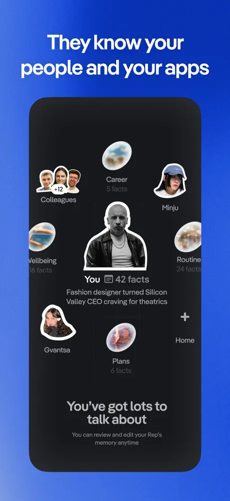
The dark, rounded phone chassis appears for the first time, centered on the cobalt gradient. Inside, the screen background is near-black (#0F0F0F). A radial hub-and-spoke layout arranges circular and sticker-cutout nodes around a central monochrome avatar of a bald man in a leather jacket. The central node is labeled “You 📝 42 facts,” with a descriptor below: “Fashion designer turned Silicon Valley CEO craving for theatrics.” Surrounding nodes include “Colleagues” (with a white “+12” pill badge), “Career 5 facts,” “Minju,” “Wellbeing 16 facts,” “Routine 24 facts,” “Gvantsa,” “Plans 6 facts,” and a “Home” node with a plus icon. Near the bottom of the screen, a secondary heading reads “You've got lots to / talk about,” with caption text beneath: “You can review and edit your Rep's / memory anytime.” The device bezel is so dark that it visually merges with the in-app background, making the UI feel edgeless. The exterior cobalt bleed on all four sides frames the phone like a museum plinth.

Replika App Store screenshot 5 — Object-centered conversation
05

Object-centered conversation

On-frame caption: “Conversations that / lead somewhere

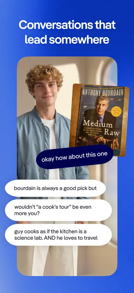
Inside the same phone chassis, a male-presenting character with curly blonde hair and a light-blue jacket occupies the left half of the screen background. On the right, a photorealistic rendering of Anthony Bourdain’s “Medium Raw” book cover tilts in perspective at roughly 15 degrees. The conversation is rendered in pill-shaped chat bubbles. One dark indigo bubble (#141E3D) from the AI reads “okay how about this one,” overlapping the lower edge of the book cover. Below it, three white user bubbles read: “bourdain is always a good pick but,” “wouldn’t “a cook’s tour” be even more you?,” and “guy cooks as if the kitchen is a science lab. AND he loves to travel.” The background inside the device echoes the arched architectural motif from Frame 1, visually linking the chat environment to the brand world established in the opening shot. The typography inside the bubbles is sentence-case sans-serif at approximately 16–18 pt equivalent, and the bubble widths vary to match text rag.

Replika App Store screenshot 6 — Shared media consumption
06

Shared media consumption

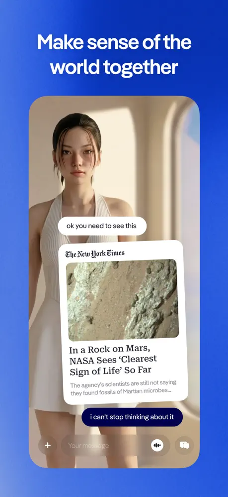
On-frame caption: “Make sense of the / world together

The phone screen now shows the same female character from Frame 1 (cream halter dress, dark hair) as a full-figure background presence. Overlaid on her is a New York Times article card with the paper’s black Gothic logotype at top, a photograph of a gray rock, and the headline “In a Rock on Mars, / NASA Sees ‘Clearest / Sign of Life’ So Far,” followed by subtext: “The agency’s scientists are still not saying / they found fossils of Martian microbes...” The article card sits between two chat bubbles: an upper white bubble reading “ok you need to see this” and a lower dark indigo bubble reading “i can't stop thinking about it.” At the very bottom of the screen, a dimmed input bar shows a “+” icon, a “Your message” placeholder, a voice-wave icon, and a video/camera icon, all at reduced opacity so they do not compete with the article card. The composition demonstrates external browsing integrated into a conversational thread without leaving the character’s visual context.

Replika App Store screenshot 7 — Voice presence and environmental storytelling
07

Voice presence and environmental storytelling

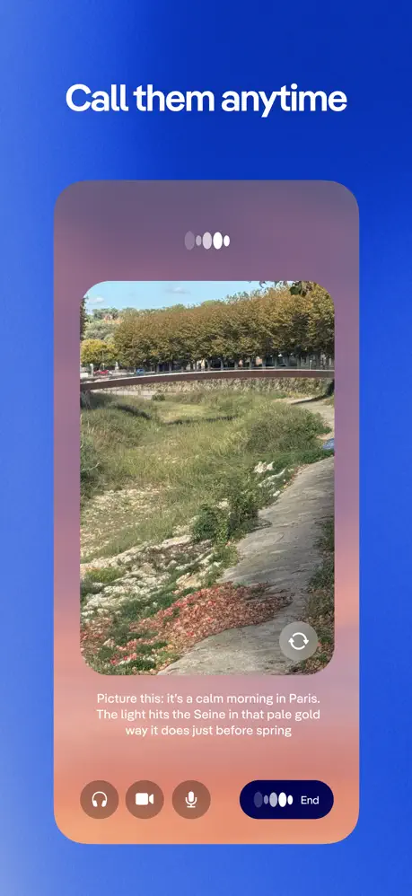
On-frame caption: “Call them anytime

The final frame displays a voice-call interface inside the device. The upper portion is filled with a landscape photograph of a riverbank, autumn trees, and a bridge. Overlaid at the top is a horizontal row of five pill-shaped audio dots; the center dot is white while the outer dots are gray (#8C8C8C), indicating active listening. Centered in the lower third, white sans-serif text reads: “Picture this: It's a calm morning in Paris. / The light hits the Seine in that pale gold / way it does just before spring.” Beneath the caption, a bottom control bar presents three circular buttons—headphones, video camera, and microphone—rendered in translucent warm brown-orange (#8C5E48 to #B86B4F) against the landscape. To the right, a dark indigo pill button houses a white audio-waveform icon and the word “End.” A subtle warm mauve-to-peach gradient overlays the bottom of the landscape image, creating a legibility zone for the white caption text. The exterior cobalt gradient persists, making the warm interior feel like a private chamber separated from the blue exhibition wall.

05The craft

Captions, colour and the mechanics of the sell

Caption pattern

Every exterior headline is a second-person invitation or promise: “Your AI friend,” “Make them look truly yours,” “They know your people,” “Call them anytime.” Inside the device, the copy shifts to first/second-person dialogue or descriptive prose (“Picture this: It's a calm morning in Paris…”), keeping the tonal register intimate rather than instructional.

Visual system

The visual system is rigidly bipartite. Outside the phone: cobalt gradient, white bold sans-serif, centered text, no supplementary icons. Inside the phone: near-black ground (#0F0F0F), white and gray text, radial or conversational layouts, photorealistic characters as background layers. This contrast between the bright exterior wall and the dark interior cavity turns the device into a theatrical proscenium: the blue gradient is the stage curtain, the phone is the black box containing the scene.

The thumbnail test

Frame 1’s thumbnail survives the small-view test because the three figures’ faces and the high-contrast white headline remain legible at 35% scale. However, the bottom “40M+ Users” badge compresses into a white smudge; the laurel wreaths lose definition and become noisy pixels. A safer thumbnail crop would isolate the heads and headline, or nudge the social-proof lockup higher into the vertical center.

Conversion mechanics

The set front-loads emotion and social proof before showing any interface chrome. This sequencing risks losing utility-focused shoppers who swipe once, see no UI, and bounce; however, it maximizes curiosity-driven installs from users seeking companionship rather than productivity. The four-device closing sequence ensures that by Frame 7, every core modality—memory (Frame 4), text chat (Frame 5), shared media (Frame 6), and voice call (Frame 7)—has been demonstrated inside a consistent chassis.

06Where it slips

What we would change

Cobalt monotony across six frames

The gradient is systematic but exhausting. By Frame 4 the blue background has become invisible wallpaper, and the dark device mockups start to feel like identical postage stamps. A specific fix: modulate the background for at least one functional frame. Shifting Frame 5 or 6 to a deep midnight (#0F1B33) or a warm neutral would create a visual reset and signal a narrative progression from introduction to depth.

Device bezel bleeding into UI in Frame 4

The phone chassis and the in-app background are both near-black (#0F0F0F). In Frame 4’s radial memory map, this causes the UI nodes to visually bleed outward past the intended edge, destabilizing the screen boundary. Adding a 1px #2A2A2A stroke or a soft drop shadow (0px 8px 24px rgba(0,0,0,0.3)) around the device would restore the hardware/software separation without breaking the minimal aesthetic.

Frame 3 customization lacks UI credibility

The floating face-bubbles around the central figure are conceptually legible, but there are no visible controls, selected-state rings, or customization menus. A shopper may interpret this as static character art rather than an interactive feature. A fix would be to ghost a faint color-swatch row or a “Style” chip into one of the bubbles so the frame reads as functional, not illustrative.

Frame 1 headline has no safety scrim

The white “Your AI friend / for real life” text relies entirely on the render’s natural contrast against the mid-tone wall. Under compression or on dim displays, the upper loop of the “f” in “friend” could lose definition against a light patch. A subtle top-down gradient scrim (#000000 at 0% to #000000 at 25% opacity) behind the text would guarantee legibility without harming the photographic quality.

Vertical rhythm weakness in Frame 2

The gap between “Stanford / University” and the oversized quote beneath it is large enough that the eye processes them as disconnected blocks. Tightening the vertical space between the attribution and the quote by roughly 8–12% would strengthen the causal link: this institution said this specific phrase.

07The recipe

How to apply this to your own app

  1. Sequence emotion before interface, but limit the runway

    Opening with a no-UI lifestyle frame is powerful, but give yourself a hard limit of one or two frames before introducing the device. After that, shoppers need evidence.

  2. Use the background gradient as a brand hinge, not a prison

    A signature color wall (Replika’s cobalt) unifies the set, but modulate the value or hue for one or two frames to mark narrative transitions—e.g., a darker stage for deep features, a warmer stage for personal moments.

  3. Match interior and exterior typographic systems

    The in-app headlines (“You've got lots to talk about”) echo the exterior headline weight and color. Keeping the store captions and the in-app UI type in the same family collapses the distance between marketing promise and product reality.

  4. Treat characters as persistent spatial anchors

    By placing the same photorealistic character inside the device screen (Frame 6) that appeared in the opening lifestyle shot (Frame 1), the set creates continuity. If your app has avatars or personalities, carry them across frames so the shopper recognizes a through-line.

  5. Build the device chassis for the thumbnail crop

    Because Frames 4–7 are all centered dark rectangles, their thumbnails compress into similar black shapes. Vary the interior screen brightness or angle slightly per frame so the storefront grid reads as seven distinct images rather than a blue wall with repeating dark lozenges.

08Takeaways

Five things worth stealing

  • A screenshot set can be storyboarded like a trailer: emotional beat, credibility beat, conceptual beat, then four functional beats.
  • Repeating the exact same gradient across six frames creates cohesion at the cost of visual fatigue; variation within the system preserves attention.
  • Placing photorealistic characters both outside and inside the device collapses the boundary between brand marketing and UI demonstration.
  • Social proof (Frame 2) is most effective when typographically integrated into the brand system, not pasted on as a badge.
  • When the device bezel matches the in-app dark mode too closely, the screen edge disappears; a stroke or shadow restores spatial clarity.
09The verdict

What the set actually achieves

The chosen sequence solves the riddle with an asymmetric rhythm: one frame of pure lifestyle, one frame of pure authority, one frame of conceptual customization, and four frames of in-device proof. The blue gradient becomes a visual anchor so strong that by Frame 4 the user is already inside the app’s chromatic world. The set converts emotional curiosity into functional understanding by literally shrinking the brand world into the phone chassis between Frames 3 and 4—a visual metaphor for the companion entering your pocket.

Teams building AI companions, social apps, or any product where the interface is secondary to the relationship. The set is especially instructive for brands struggling to balance lifestyle marketing with App Store functional requirements.

10Questions

Frequently asked

Why is there no device frame in the first three screenshots?

The designers delay the phone chassis until Frame 4 to force the shopper to process Replika as a human relationship first and a software product second. This sequencing sacrifices immediate feature comprehension for emotional priming.

Why does Frame 2 contain no characters or UI at all?

It functions as a credibility interstitial. By placing academic and press validation immediately after the emotional hook and before the product demo, the set preempts skepticism without cluttering a device screen with badges.

Is the blue gradient necessary for six frames?

It is not structurally necessary, but it is strategically consistent. However, the repetition is the set’s biggest visual weakness; even one frame of modulation would improve the swipe rhythm significantly.

How does the set handle the ‘uncanny valley’ risk of photorealistic AI characters?

It embraces high-fidelity rendering rather than stylizing. The characters are lit like fashion photography, with natural skin textures and fabric drape, signaling an aspirational companion rather than a cartoon avatar.

11Keep reading

Build your own screenshot set

The full set

7 shots
Replika App Store screenshot 1Replika App Store screenshot 2Replika App Store screenshot 3Replika App Store screenshot 4Replika App Store screenshot 5Replika App Store screenshot 6Replika App Store screenshot 7

About the app

Meet Replika, the AI to do life with. Replika is the AI companion that’s been here since 2017 — available 24/7 for whatever’s on your mind by text, voice calls, and video. Join Luka, Inc., via the App Store listing.

Screenshots and store metadata belong to Luka, Inc.. They are shown here for design commentary and criticism. The analysis on this page is original work by floow.design. View the original listing.

More Entertainment teardowns

Browse all →