Placify app icon
MusicScreenshot teardown16 min read

Placify App Store screenshots

Placify’s eight-frame App Store gallery is built around a single, stubborn aesthetic bet: that a travel-map app can sell itself through the texture of a leather-bound journal rather than the cold precision of a dashboard. The set unspools on a continuous warm-cream ground—approximating #F9F5F0—over which high-contrast serif headlines, occasional spot-color gradients, and carefully cropped iPhone frames are arranged like prints in a travel diary. It is a visually coherent package that nonetheless struggles with framing discipline, repeating the same import narrative twice and abandoning its own device-first grammar in the final frame. For a designer building a screenshot set, the lesson is instructive: a strong palette and typographic voice can carry emotion across eight swipes, but only if the spatial rules hold steady beneath the romance.

Set published by WHITESSPACE SDN. BHD. · 10 frames analysed

4.4 · 49 ratingsFreev1.7.1Updated 4mo ago
Placify App Store screenshot 1
01At a glance

The set in one screen

Framing
Primarily iPhone 14/15 Pro-style rectangles with rounded corners and visible status bars (9:41, signal, Wi-Fi, battery). Two frames break the pattern: Frame 2 rotates the device roughly 15° and lets UI elements bleed past its bounds; Frame 8 replaces the device with floating rounded cards and partial map snippets.
Captions
Large stacked serif, sentence-case, tightly leaded. Single headline per frame parked in the upper or lower third. Occasional words are singled out for color gradients—burnt sienna to chocolate, deep cobalt, teal, dusty rose—creating a rhythmic accent pattern across the gallery.
Backdrop
Universal off-white/cream (#F9F5F0) with subtle warm shadows beneath devices. No environmental photography, no gradients behind the headline type; the background is a quiet gallery wall.
Type
A high-contrast transitional serif dominates headlines at roughly 48–64 pt equivalent. Inside the device, the UI relies on the system sans-serif: bold for stats, regular for body, with SF Mono-style numerals on distance and time counters.
UI / copy split
Approximately 70/30. Most frames let the device occupy the vertical center, cropping bottom sheets at mid-height to imply scrollability. Captions rarely exceed three lines, preserving generous whitespace between words and the screen.
Frame 1 job
Establish trust (App Store editorial badge), establish taxonomy (Places vs. Routes), and establish the visual thesis (warm, serif-led cartography).

Sampled palette

(canvas)#F9F5F0
(primary text)#1C1C1E
(route lines / action blue)#2A8CFF
to #3E2723 (headline gradient 1)#A0522D
(headline accent blue)#1E5FAE
(teal accent in Frame 4/6)#4A7A6A
02The challenge

What this screenshot set had to solve

Travel and memory apps usually compete on density: more pins, more layers, more neon. Placify’s set chooses restraint. The challenge is to communicate that the product is a map, a planner, an AI importer, a statistical dashboard, and a personal journal—eight distinct functional promises—without letting the interface feel like a cluttered GIS terminal. The gallery must also signal emotion (memory, nostalgia) while still proving utility (routing, distance, time). That tension—between editorial warmth and cartographic clarity—is present in every crop, color choice, and device angle.

A strong palette and typographic voice can carry emotion across eight swipes, but only if the spatial rules hold steady beneath the romance.
03The approach

How the set argues its case

The designers rely on three repeating tactics. First, they crop every bottom sheet at roughly the 20% height mark, creating a visual motif that says the map is always primary and the details are always within reach. Second, they alternate between map-context frames and detail-log frames, so the sequence breathes between macro and micro. Third, they use headline color as a thematic marker—blue for routing, gold for memory, teal for statistics—though the execution of that marker is inconsistent. The set also front-loads social proof with an App Store laurel in Frame 1, a wise move for an indie developer seeking immediate credibility in a category full of Google and Apple defaults.

Against the literal, white-background utility of Apple Maps and the photo-saturated chaos of Instagram-location galleries, Placify positions itself as a curated middle space. The serif headlines, cream ground, and editorial cropping speak to travelers who journal rather than merely navigate. It is Pinterest-meets-cartography, and the screenshot set knows it: even the route-planning frame is softened with rounded thumbnails and a handwritten-house icon rather than stark turn-by-turn arrows.

04Frame by frame

Every screenshot, and the job it does

Placify App Store screenshot 1 — The Anchor
01

The Anchor

On-frame caption: “Your personal map for places and memories.

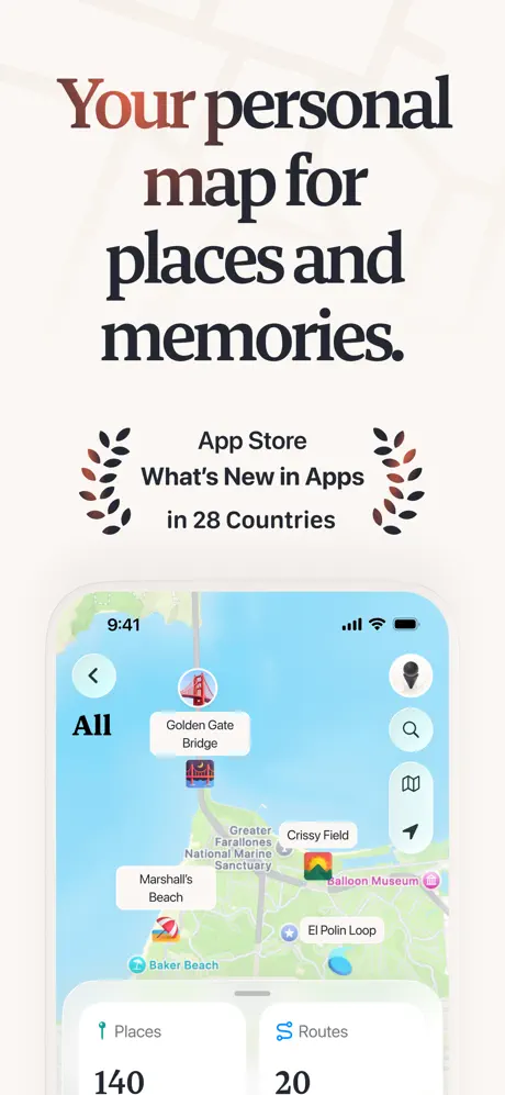
The first frame establishes the visual contract for the entire gallery. A massive serif headline occupies the upper third, rendered in near-black (#1C1C1E) except for the word 'Your,' which carries a horizontal gradient from burnt sienna to chocolate brown (#A0522D → #3E2723). Just beneath the headline, an editorial badge reads 'App Store What's New in Apps in 28 Countries,' flanked by symmetrical laurel wreaths in muted sage and rust. The device sits dead-center in the lower two-thirds, showing the main map canvas: water rendered in a soft cyan (#A3D8F4), land in pale spring green (#D4E6C3), and standard Apple Map typography for street names. White location bubbles pin 'Golden Gate Bridge,' 'Crissy Field,' 'Marshall's Beach,' 'Balloon Museum,' and 'El Polin Loop.' On the left, a back chevron and the word 'All' provide asymmetrical weight against the vertical stack of circular map controls on the right (location, search, layers, directions). A bottom sheet intrudes from the lower edge, cropped precisely at the stat line: 'Places' with a teal pin icon reads 140, and 'Routes' with a soft-blue route icon reads 20. The sheet has a centered 12 pt grabber and slightly rounded corners, implying a native iOS presentation. Frame 1 does three jobs at once: it proves social validity with the laurels, it proves scale with the 140/20 counts, and it proves personality with the warm serif and cream backdrop.
Placify App Store screenshot 2 — The Tilted Route
02

The Tilted Route

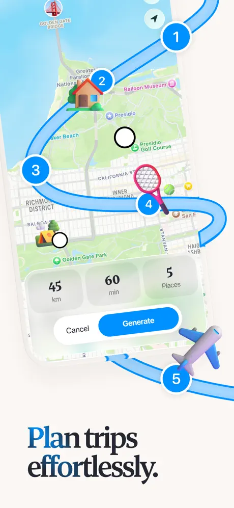
On-frame caption: “Plan trips effortlessly.

Here the set abandons the upright posture of Frame 1. The device is rotated roughly 15 degrees clockwise and floats above the baseline, casting a soft shadow onto the cream ground. Inside the screen, a thick blue route line (#2A8CFF) snakes through five numbered circular markers: 1, 2, 3, 4, 5. Stop 2 carries a house thumbnail; stop 4 carries what appears to be a tennis racket. A translucent bottom sheet hovers over the map displaying three metrics—'45 km,' '60 min,' and '5 Places'—followed by two buttons: a white 'Cancel' pill and a blue 'Generate' pill. The headline below the device splits color: 'Plan trips' in deep cobalt and 'effortlessly.' in the standard dark serif. A three-dimensional toy airplane trails the route line outside the device boundary, physically connecting stop 5 to the lower edge. The composition is the busiest in the set. The tilt makes the metric pills harder to scan; the external route line and airplane introduce visual noise that fights the 'effortlessly' promise. Where Frame 1 felt grounded, Frame 2 feels centrifugal.

Placify App Store screenshot 3 — The Link Converter
03

The Link Converter

On-frame caption: “Turn links into place highlights

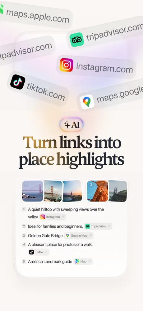
Frame 3 removes the device entirely and builds a feature diagram from UI primitives. Floating across the upper half are semi-transparent browser address bars at varying angles, each bearing a domain and favicon: maps.apple.com, tripadvisor.com, instagram.com, tiktok.com, and maps.google.com. Centered beneath them is a soft pill containing a sparkle icon and the letters 'AI.' The headline renders 'Turn' in a gold-to-brown gradient while 'links into place highlights' sits in solid near-black. Below, a large white rounded card contains a horizontally scrolling strip of five Golden Gate Bridge photographs, each numbered 1 through 5. Under each image is a text snippet paired with its source platform: 'A quiet hilltop with sweeping views over the valley' attributed to Instagram; 'Ideal for families and beginners.' attributed to Tripadvisor; 'Golden Gate Bridge' attributed to Google Map; 'A pleasant place for photos or a walk.' attributed to Tiktok; and 'America Landmark guide' attributed to Map. The spatial rhythm is loose and vertical, relying on the soft gradient background—cream bleeding into pale lavender—to separate layers. It reads as a conceptual explanation rather than a live app state, which is useful for communicating AI differentiation but less useful for showing interaction mechanics.

Placify App Store screenshot 4 — The Dashboard
04

The Dashboard

On-frame caption: “Take a glance, you've been by places, regions, and cities

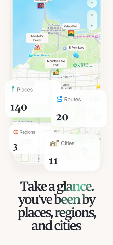
The device returns to an upright position, but the focal point is four white metric cards that overlap one another and the map in a staggered formation. 'Places' carries a teal pin icon and the figure 140; 'Routes' carries a blue squiggle and 20; 'Regions' carries an orange globe and 3; 'Cities' carries a brown building icon and 11. The numbers are set in a bold, large sans-serif—likely the system font at roughly 34 pt—while the labels above them are smaller and lighter. The cards cast only the faintest shadow, making them feel like frosted panes rather than physical objects. Behind them, the map shows familiar territory: 'Mountain Lake Park,' 'Presidio Golf Course,' and 'California St' are legible. The headline below renders 'glance' in a muted teal-green (#4A7A6A) and 'been' in a similar verdant tone, while the rest of the caption stays dark. The comma after 'glance' introduces an awkward syntactic pause, but the visual rhythm is steady. This frame is the set's only true 'stats' view, and it functions as a credibility beat: the app remembers scale.

Placify App Store screenshot 5 — The Journal Entry
05

The Journal Entry

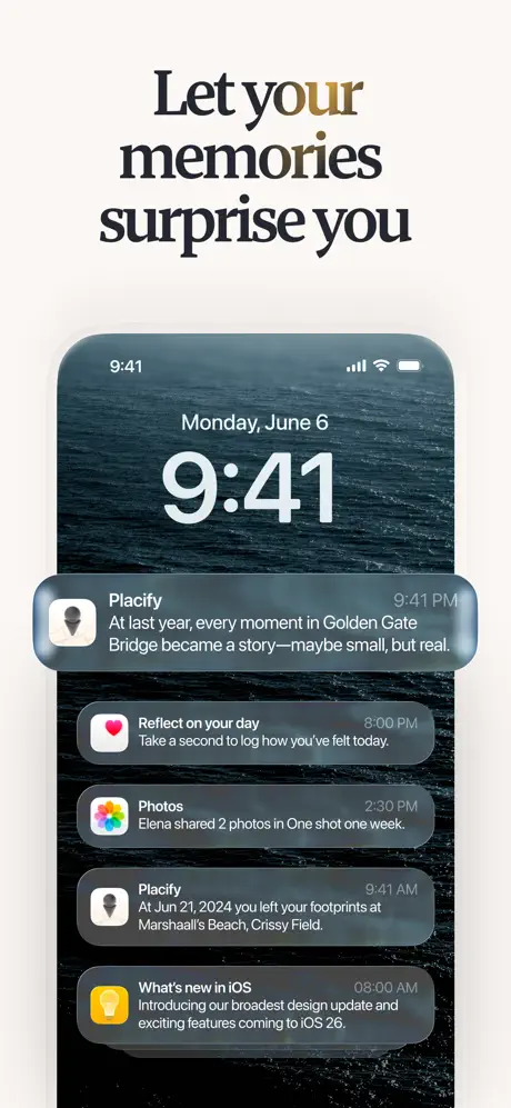
On-frame caption: “Trace your footsteps, every visit remembered

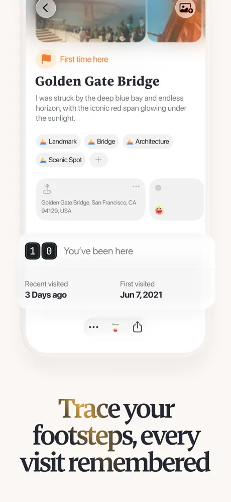
This is the most text-dense frame in the gallery. The device shows a place-detail screen for 'Golden Gate Bridge.' At the top, an orange flag badge reads 'First time here' in white sans-serif. The title sits beneath in the same bold dark serif used for headlines, but at a smaller app-scale size. A body paragraph follows: 'I was struck by the deep blue bay and endless horizon, with the iconic red span glowing under the sunlight.' Below that, four pill-shaped tags stretch horizontally—'Landmark,' 'Bridge,' 'Architecture,' 'Scenic Spot'—each prefixed by a tiny colored icon, plus a '+' pill for adding more. A location card pins the street address ('Golden Gate Bridge, San Francisco, CA 94129, USA') beside a user emoji avatar. A charcoal counter box displays two numerals, '1' and '0,' in a segmented display style, labeled 'You've been here.' Temporal metadata is cleanly columned: 'Recent visited / 3 Days ago' and 'First visited / Jun 7, 2021.' At the very bottom, a truncated action bar shows a 'more' ellipsis, a small avatar, and a share icon. The headline below the device colors 'Trace' in a gold-to-umber gradient and 'footsteps' in solid dark. Frame 5 is the emotional core of the set: it proves the app is not just a map but a diary, and the density of information is handled with enough whitespace to remain scannable.

Placify App Store screenshot 6 — The Import Revisited
06

The Import Revisited

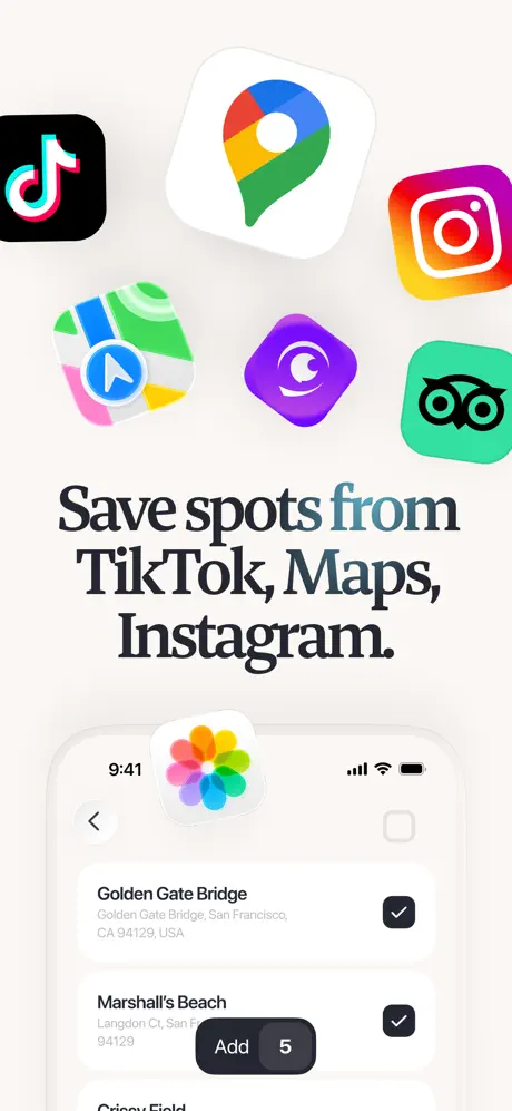
On-frame caption: “Save spots from TikTok, Maps, Instagram.

Frame 6 returns to the third-party import story first introduced in Frame 3, but from a different angle. The top half displays oversized app icons floating in space: TikTok, Google Maps, Instagram, Apple Maps, Tripadvisor, and a purple crescent-moon app. Each icon carries a soft drop shadow against the cream ground. The headline singles out the word 'from' in a muted teal-blue (#3A6A7A), while 'Save spots' and 'TikTok, Maps, Instagram.' remain in dark serif. The device below shows a checklist interface reminiscent of a photo-picker or share-extension sheet. Two rows are fully visible: 'Golden Gate Bridge' with its subtitle address and a blue checkmark, and 'Marshall's Beach' with its subtitle and checkmark. A dark floating action pill at the bottom reads 'Add' with a white '5' badge, overlapping the device frame. The status bar inside the device is notable: a colorful radial flower icon sits where a carrier logo might be, with standard signal, Wi-Fi, and battery glyphs on the right and '9:41' on the left. Because Frame 3 already showed link importing, this frame feels narratively redundant; it reinforces the promise without revealing a new screen state.

Placify App Store screenshot 7 — The Route Sheet
07

The Route Sheet

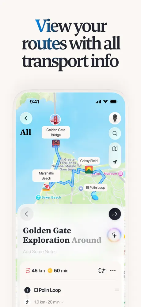
On-frame caption: “View your routes with all transport info

The upright device returns, showing the San Francisco map with a blue route line now explicitly zigzagging between Golden Gate Bridge, Marshall's Beach, Crissy Field, El Polin Loop, and Balloon Museum. The line is the same (#2A8CFF) used in Frame 2, providing visual continuity. A bottom route card is cropped higher than in previous frames, revealing more detail. In the card header, a light gray back chevron sits inside a circle on the left, and a black share arrow sits inside a circle on the right. The title reads 'Golden Gate Exploration Around' in mixed weight—'Golden Gate Exploration' in bold, 'Around' in a lighter gray. Beneath, placeholder text 'Add Some Notes' sits in a pale silver. Metadata is arranged horizontally: a route icon with '45 km' and a clock icon with '50 min,' flanked by reorder and more-options icons. The first list item shows a walking figure, 'El Polin Loop,' and '1.0 km · 20 min' with a disclosure chevron. Above the device, the headline renders 'View' in a saturated cobalt (#1E5FAE). Frame 7 is one of the most legible utility frames: the route is readable, the card is informative, and the crop teases a longer itinerary below.

Placify App Store screenshot 8 — The Collage
08

The Collage

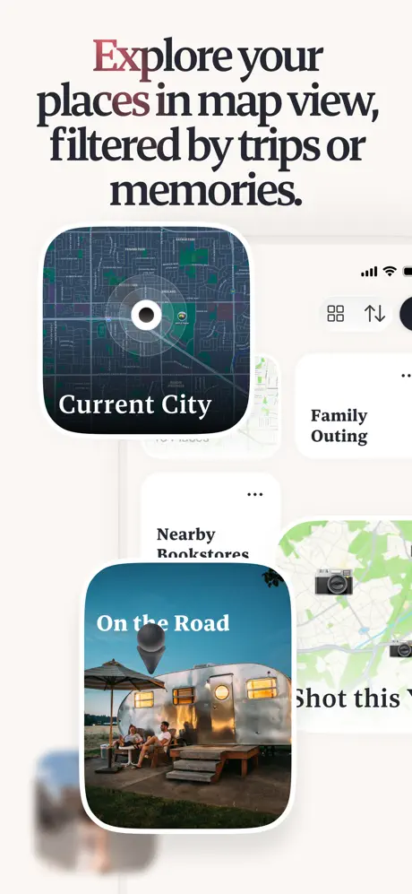
On-frame caption: “Explore your places in map view, filtered by trips or memories.

The final frame breaks the device-first grammar entirely. Instead of a phone, the viewer sees a masonry collage of rounded cards floating on the familiar cream ground. 'Current City' is a dark-mode map snippet with concentric radar rings and white serif text overlaid at the bottom. 'On the Road' is a photographic card showing an Airstream trailer at dusk, again with white serif text. 'Family Outing' and 'Nearby Bookstores' are white text-only cards with dark sans-serif labels. A blurred card intrudes from the bottom left, creating forced depth. In the upper right, partial UI chrome peeks in: a grid-toggle icon, an upload arrow, and a solid black circle, suggesting a device edge just outside the frame. The headline colors 'Explore' in a dusty rose-to-brown gradient (#8B4A4A → #A0522D) and leaves the remainder in dark. After seven frames of tangible, device-anchored UI, this abstract closure feels like a different app. The caption promises 'map view,' yet two of the three largest cards are photographic albums, not maps. As a final swipe, it introduces ambiguity rather than resolution.

05The craft

Captions, colour and the mechanics of the sell

Caption pattern

Every caption is a single declarative sentence fragment, sentence-cased, rarely longer than six words. Frame 1: 'Your personal map for places and memories.' Frame 4: 'Take a glance, you’ve been by places, regions, and cities.' Frame 5: 'Trace your footsteps, every visit remembered.' The rhythm is staccato and confident. The only frame that breaks the brevity pattern is Frame 8 ('Explore your places in map view, filtered by trips or memories.'), but even there the line breaks keep the footprint tight.

Visual system

The set operates on a 12-column grid implied by the consistent left/right margins around the device. Headlines align to the device width, creating a shared bounding box across frames. The only structural anomaly is Frame 2, where the rotated device breaks the implied column, and Frame 8, where the masonry cards ignore it entirely. Icons inside the app follow a soft, rounded, almost sticker-like language: a teal location pin, a blue route squiggle, an orange globe. These icons reappear in the stat cards of Frame 4, building internal consistency even when the framing wobbles.

The thumbnail test

Frame 1 wins the thumbnail test because the headline is massive, the device is upright, and the map is legible at small scale. The red Golden Gate Bridge icon provides a focal point of saturated color against the pastel bay (#A3D8F4). If only Frame 1 were displayed on search results, it would read instantly as a personal map. Frames 2, 3, 6, and 8 would fail the thumbnail test: they are either tilted, abstract, or too dependent on small UI text to register at 200 px wide.

Conversion mechanics

The gallery front-loads its strongest proof points. Frame 1 delivers editorial legitimacy (the App Store laurels) and scale (140 places, 20 routes). Frame 5 delivers emotional stickiness (journal entries, visit dates). Those two frames alone could close a download. The middle frames, however, ask the shopper to parse tilted devices, conceptual AI diagrams, and redundant import explanations. For conversion, the set would benefit from moving Frame 5 earlier—perhaps to the second position—to establish the memory-logging hook immediately after the map overview. Frame 2’s tilt and Frame 8’s abstraction should be tested against flat, device-true variants; in App Store analytics, clarity almost always outperforms cleverness.

06Where it slips

What we would change

Framing Inconsistency Undermines Spatial Trust

The gallery cannot decide whether it is selling an app on a phone or an ecosystem in abstract space. Frames 1, 4, 5, and 7 present upright, trustworthy devices. Frame 2 tilts the phone and lets route lines bleed past the bezel. Frames 3, 6, and 8 remove or dissolve the device into floating UI cards. For a shopper swiping in under three seconds per frame, this instability makes it harder to mentally model the interface. The fix is simple: commit to one grammar. Show every feature inside an upright device frame, and reserve abstraction—if at all—for a single lifestyle frame at the very end.

Import Narrative Is Told Twice

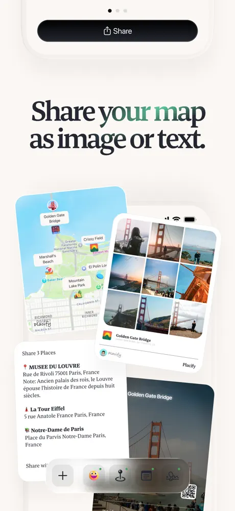
Frame 3 ('Turn links into place highlights') and Frame 6 ('Save spots from TikTok, Maps, Instagram.') both communicate external importing. Frame 3 shows the AI output; Frame 6 shows the source icons. In an eight-frame set, spending two frames on the same feature arc is wasteful, especially when critical mechanics like search, tagging, or sharing are never shown at all. The fix: merge them. Show the actual iOS share-extension flow in one frame—an Instagram link dropping directly into the Placify map—rather than a conceptual diagram and a generic checklist separated by two unrelated frames.

Frame 2's Composition Fights Readability

The tilted device, the 3D airplane toy, the external route line, and the dual buttons create a centrifugal mess. The 'Cancel' and 'Generate' targets are small and angled, making them harder to parse than a flat, upright presentation. The promise is 'Plan trips effortlessly,' yet the visual effort is maximal. Fix: level the device, keep the route strictly inside the screen bounds, and remove the airplane ornament. The numbered stops and the blue path already communicate travel without needing a toy prop.

Headline Color Logic Drifts

Accent colors in the captions appear to follow no semantic rule. Frame 2 uses cobalt for 'Plan trips.' Frame 3 uses gold for 'Turn.' Frame 4 uses teal for 'glance.' Frame 7 uses cobalt again for 'View.' Without a mapping—e.g., blue for routing, gold for memory, teal for import—the palette reads as arbitrary decoration. Fix: lock colors to feature families. Reserve the gold/brown gradient for archival or emotional frames (1, 5), blue for routing frames (2, 7), and a single accent for AI/import frames (3, 6). Consistency will help shoppers predict what each frame is about before they read the words.

Frame 8 Breaks the Device Tether

After seven frames of anchored UI, the final frame presents floating cards ('Current City,' 'On the Road,' 'Family Outing') that could be widgets, collections, or filters. There is no device to root them, and the caption's promise of 'map view' is undercut by the prominence of a photograph. Fix: redraw this frame inside an upright device showing the filter chips or collection tabs in their actual context. If the app supports custom map styles, show the map changing when a chip is tapped. Abstraction here costs credibility.

07The recipe

How to apply this to your own app

  1. Ground the set with a single, unusual canvas color.

    Placify's warm cream (#F9F5F0) is more memorable than a thousand white-backgroundUtility screenshots. If your category defaults to white or dark gray, find a neutral-adjacent ground that feels native to your brand and use it across every frame. The continuity alone will make your gallery feel premium.

  2. Write captions in one breath.

    Every Placify headline is a single sentence fragment, sentence-cased, rarely longer than six words. That restraint prevents the caption from competing with the UI. When writing your own set, impose a hard character limit—say, forty characters per line—and break lines manually to control rags and emphasis.

  3. Crop sheets, don't hide them.

    Placify consistently crops bottom sheets at mid-height. This signals that the interface is layered and scrollable without hiding the map canvas above. Use the same crop logic across your frames: always show enough of the sheet to read the first row of data, but never so much that the background context disappears.

  4. Tie headline accent color to feature families.

    If you color a headline word, do it for navigation, not decoration. Assign one hue to routing, one to creation, one to social proof. Shoppers will begin to scan by color before they read by word, which is exactly what you want in a high-velocity App Store swipe.

08Takeaways

Five things worth stealing

  • A distinctive ground color and editorial serif can differentiate a utility app in a saturated category, but only if maintained with discipline across all eight frames.
  • Bottom-sheet cropping is a powerful narrative tool: it keeps the map primary while implying depth below the fold.
  • App Store galleries are not the place for conceptual abstraction. If the shopper cannot picture the app in their hand, the frame is failing.
  • Headline color should encode meaning, not merely ornament type. Treat accent hues as wayfinding, not wallpaper.
  • Social proof belongs in Frame 1, but emotional payoff (journaling, memory, reflection) should appear by Frame 3 at the latest to justify the download.
  • When a feature is strong enough to show once, do not show it twice—especially not in a set of only eight frames.
  • Tilted devices and 3D props rarely survive the thumbnail test; keep the phone upright and the UI flat for maximum legibility.
09The verdict

What the set actually achieves

The set succeeds at atmospherics. A shopper swiping through will remember the cream background and the confident serif voice. It is less successful at narrative economy. Two frames spend capital on importing content from TikTok and Instagram; one frame tilts so aggressively that the UI becomes illegible; and the final frame dissolves into an abstract mood board that severs the device tether. Conversion likely depends on whether a user can mentally model the app after Frame 1 and Frame 5, while Frames 2 and 8 introduce friction for shoppers who want to see the interface flat and true.

This case study is written for mobile product designers and growth marketers who are building screenshot sets for travel, journaling, or location-based apps. It is especially relevant if you are weighing the trade-off between editorial styling and conversion clarity, or if you are tempted to let every frame 'pop' with a different composition angle. Placify's set shows that warmth and personality are achievable without abandoning the structural rules that make an App Store gallery scannable.

10Questions

Frequently asked

Why does the cream background matter so much?

Because the App Store search results page is overwhelmingly white. A warm ground creates instant visual separation in the horizontal scroll, signaling that the app belongs to a different aesthetic tier than stock-utility competitors.

Is the serif font a risk for App Store screenshots?

It is a calculated risk. Sans-serif remains the safer choice for pure legibility, but the high-contrast transitional serif used here aligns with the app's archival, memory-centric positioning. As long as the type is large enough—and in this set it is enormous—the readability cost is low while the brand dividend is high.

Should Frame 2's tilt ever be used?

Only if the tilt reveals information that an upright frame cannot. In this case, the tilt reveals nothing; it merely adds dynamism. Dynamism is better achieved through motion in video previews than through static rotation, which reduces tap-target legibility and breaks the shopper's mental model of the device.

How could Frames 3 and 6 be merged?

Show a single frame in which an Instagram link is received by the iOS share sheet, dropped into Placify, and resolved into a pinned place card on the map. That sequence would cover the same ground as both current frames in one clear, device-anchored narrative beat.

11Keep reading

Build your own screenshot set

The full set

10 shots
Placify App Store screenshot 1Placify App Store screenshot 2Placify App Store screenshot 3Placify App Store screenshot 4Placify App Store screenshot 5Placify App Store screenshot 6Placify App Store screenshot 7Placify App Store screenshot 8Placify App Store screenshot 9Placify App Store screenshot 10

About the app

The most beautiful things in life are not just things. They’re people, places, memories, and pictures. Placify is a travel planner, itinerary maker, and personal map designed to WHITESSPACE SDN. BHD., via the App Store listing.

Screenshots and store metadata belong to WHITESSPACE SDN. BHD.. They are shown here for design commentary and criticism. The analysis on this page is original work by floow.design. View the original listing.

More Music teardowns

Browse all →