Discogs app icon
MusicScreenshot teardown14 min read

Discogs App Store screenshots

When a music database app decides its App Store identity is a vinyl turntable, every screenshot has to wrestle with the same question: does the metaphor clarify the utility, or does it decorate over it? The Discogs screenshot set commits fully to a skeuomorphic record player as its visual anchor, then attempts to stretch that metaphor across light and dark modes, library lists, and third-party Apple Music integration. The result is a sequence that is unmistakably branded but narratively fragmented, alternating between immersive poster frames and dense catalog views without a clear path for the shopper’s eye.

Set published by Zink Media LLC · 10 frames analysed

4.8 · 67K ratingsFreev3.0.12Updated 5mo ago
Discogs App Store screenshot 1
01At a glance

The set in one screen

Framing
iPhone X-series aspect ratio, mix of full-bleed immersive crops and status-bar utility frames
Captions
No superimposed marketing captions; UI text must carry the story alone
Backdrop
Full-bleed gradients, off-white utility surfaces, pure black dark mode, and album-art-tinted ambient shadows
Type
San Francisco family throughout; bold display sizes for track titles, 13–15 pt secondary text for metadata
UI / copy split
UI-governed; no caption overlays means the interface itself must communicate value
Frame 1 job
Establish the analog brand promise with a poster-like immersive player before proving utility

Sampled palette

#FF2D55#FF2D55
#F5F5F7#F5F5F7
#000000#000000
#121212#121212
#E5E5EA#E5E5EA
#8E8E93#8E8E93
02The challenge

What this screenshot set had to solve

The core tension in this set is ontology. Discogs is, at its root, a database and collection-management tool for physical music. Its App Store screenshots, however, are dominated by a single skeuomorphic vinyl player. The design challenge is therefore spatial and rhetorical: how do you prove to a browser that this app can organize thousands of releases when the first three swipes keep landing on the same turntable face? The set must communicate both emotional player experience and dense library utility within eight frames, without the aid of external caption copy. Every list cell, tab label, and progress bar has to do explanatory work that other apps handle with a bold text overlay. The designer is forced to balance a nostalgic visual metaphor against the modern iOS user’s expectation of clean lists, dark mode, and native service integrations.

The vinyl record is a brutally strong visual anchor; no one will mistake this for another music app after frame two. But in a list view, that same record becomes pure chrome, consuming vertical space that could have sold the database.
03The approach

How the set argues its case

The designers adopted a 'system plus soul' strategy. The soul is the vinyl record and tonearm, rendered with metallic gradients and physical shadows, which appears in seven of the eight frames. The system is a strict iOS-native interface language: San Francisco type, pill-shaped segmented controls, #FF2D55 pink accents borrowed from Apple Music’s own palette, and standard iOS status-bar chrome. The approach alternates between immersive 'poster' frames—where the status bar is stripped away and the background becomes a full-bleed gradient—and utilitarian 'proof' frames that show real data density, dark mode, and third-party integration. By shifting backgrounds from sunset orange to off-white to orchid to black, the sequence tries to keep the eye interested through chromatic contrast alone.

Positioned explicitly as a music lover’s app rather than a sterile database. The tonearm is treated almost as a logo mark, while the use of real album art (Bombay Bicycle Club, London Grammar, Wolf Alice) signals credibility with indie- and alternative-leaning listeners.

04Frame by frame

Every screenshot, and the job it does

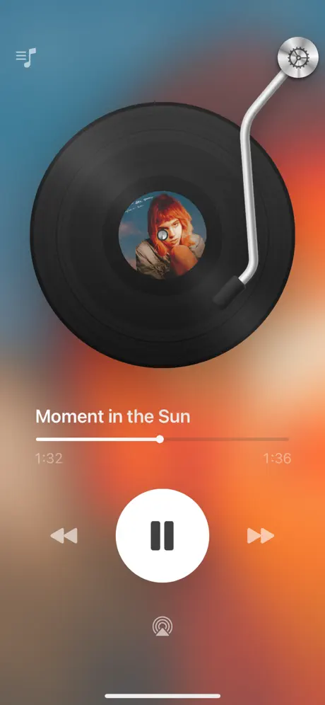
Discogs App Store screenshot 1 — Poster Gradient
01

Poster Gradient

On-frame caption: “Moment in the Sun

The first frame is a full-bleed immersive poster. There is no status bar; the canvas runs edge-to-edge with a sunset gradient that moves from a cool steel-blue at the top left—approximately #3A7A9C—through a rose-orange mid-band near #D66A3D, into a sandy beige at the bottom around #C49A78. The vinyl record dominates the center, its black grooves catching a specular highlight from the upper left. The label shows a red-haired figure against a blue sky. The tonearm enters from the upper right, anchored by a metallic gear housing with machined detail. Below the record, the title 'Moment in the Sun' is set in a bold, large sans-serif—likely SF Pro Display at roughly 32 pt—in pure white #FFFFFF. A 2 pt white progress track sits beneath, filled to about 48 percent, with a 12 pt white playhead. The timestamps read '1:32' and '1:36'; notably, the right value represents remaining time rather than total duration, a subtle break from convention. Transport controls—rewind, pause, fast-forward—use white glyphs at varying opacities. The only chrome that betrays this as a phone screenshot is the thin home indicator at the bottom. By stripping the status bar, the frame sacrifices instant 'app credibility' for atmospheric impact.
Discogs App Store screenshot 2 — Light Mode Player
02

Light Mode Player

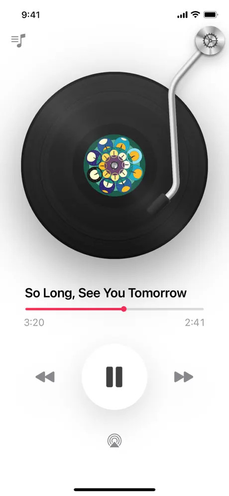
On-frame caption: “So Long, See You Tomorrow

The second frame snaps back to utility. A clean, neutral off-white background near #F5F5F7 fills the screen, and the iOS status bar is fully present: '9:41' in the left ear, cellular signal, Wi-Fi, and battery glyphs in the right. The tonearm and vinyl occupy the same compositional position as frame one, but the album label is now a dense, kaleidoscopic pattern that fights the minimalism of the chrome. The title 'So Long, See You Tomorrow' sits in pure black #000000, approximately 28 pt bold. The progress bar introduces the set’s signature accent: a vivid pink near #FF2D55 fills roughly the first half of the track, while the remainder is a pale gray #E5E5EA. The timestamps '3:20' and '2:41' are rendered in a lighter gray—likely #8E8E93—at 13 pt. Skip buttons and the AirPlay glyph are flat mid-gray. This frame does the essential work of proving the app runs on a real iPhone in light mode, but it is functionally the same screen as frame one, only inverted in tone.

Discogs App Store screenshot 3 — Albums List
03

Albums List

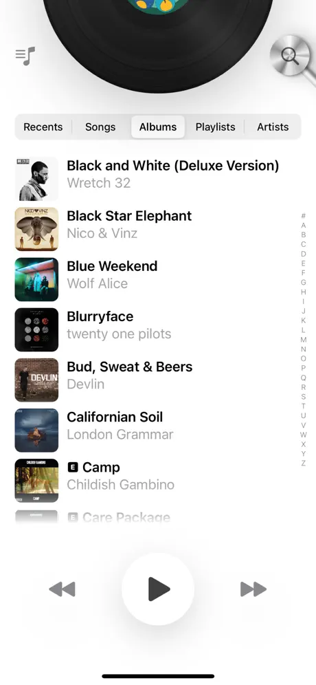
On-frame caption: “Library tabs: Recents, Songs, Albums, Playlists, Artists

Here the set finally moves beyond the player. The frame is split into two registers. The upper register retains the vinyl and tonearm, now cropped at the spindle, acting as a persistent decorative header that consumes roughly the top 20 percent of the vertical space. Below it, a five-segment tab bar reads 'Recents,' 'Songs,' 'Albums,' 'Playlists,' and 'Artists,' set in 13 pt SF Pro Text. The active tab, 'Albums,' sits inside a white pill with a subtle shadow against a light gray #E5E5EA track; the inactive tabs are unadorned black text. The list uses standard iOS two-line cells: square artwork thumbnails at roughly 56–60 pt, a 17 pt semibold title in #000000, and a 15 pt regular subtitle in #8E8E93. Real entries are visible: 'Black and White (Deluxe Version)' by Wretch 32, 'Black Star Elephant' by Nico & Vinz, 'Blue Weekend' by Wolf Alice, 'Blurryface' by twenty one pilots, 'Bud, Sweat & Beers' by Devlin, 'Californian Soil' by London Grammar, 'Camp' by Childish Gambino, and a truncated 'Care Package.' A section index in #C7C7CC clings to the right margin from # to Z. At the bottom, a translucent playback bar shows a white circle containing a gray play triangle, flanked by skip chevrons. This frame carries a heavy information load, but the vinyl header pushes the list down, reducing the number of visible rows and undercutting the density the app promises.

Discogs App Store screenshot 4 — Dark Mode Library
04

Dark Mode Library

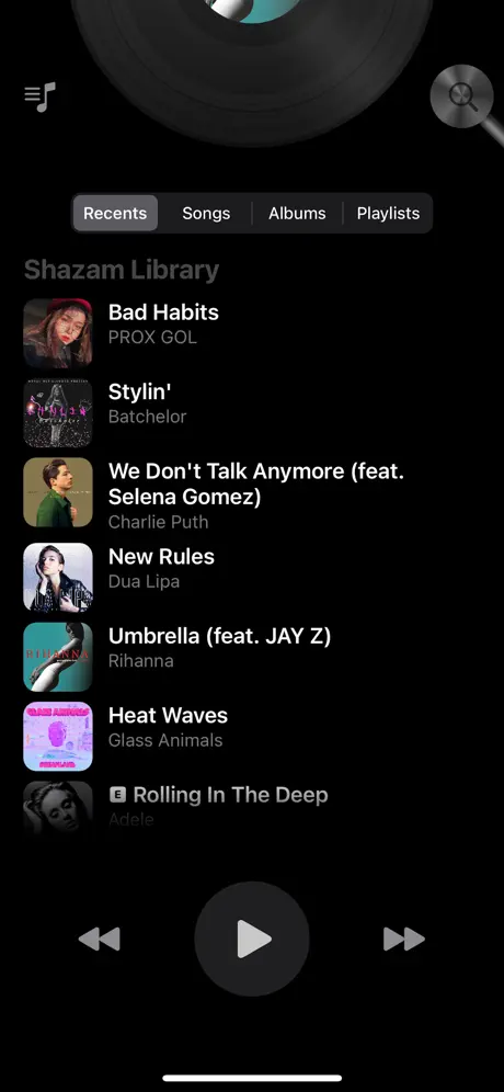
On-frame caption: “Shazam Library

The fourth frame executes a hard switch to pure black, approximately #000000. The tab bar strips down to four items—'Recents,' 'Songs,' 'Albums,' 'Playlists'—with 'Recents' selected in a dark gray #2C2C2E pill. The absence of the 'Artists' tab seen in frame three is either a contextual filter change or a truncation artifact; either way, it introduces instability. A header reading 'Shazam Library' in muted gray #8E8E93 sits above the list, introducing an external brand name into a sequence that otherwise belongs entirely to Discogs. The list inverts the contrast model: white #FFFFFF titles like 'Bad Habits,' 'Stylin',' 'We Don't Talk Anymore (feat. Selena Gomez),' 'New Rules,' 'Umbrella (feat. JAY Z),' 'Heat Waves,' and 'Rolling In The Deep' sit above gray subtitles. Album-art thumbnails generate the only color on the screen, popping against the void like a contact sheet. The bottom transport controls retreat into a dark gray #1C1C1E circle with a white play triangle. The vinyl peeks in at the very top, desaturated to near silhouette, reducing its visual weight but still claiming real estate that could have been given to another list row. The frame proves dark-mode support but raises more questions than it answers.

Discogs App Store screenshot 5 — Apple Music Tint
05

Apple Music Tint

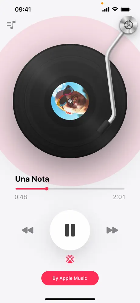
On-frame caption: “Una Nota / By Apple Music

Frame five shifts the background to a pale orchid tint near #F0E6F3, presumably extracted from the dominant hue of the album art for 'Una Nota.' The vinyl record is centered but reads slightly smaller, allowing a soft, diffuse shadow to spread outward like an aura that fills the canvas. The status bar returns, this time with an orange recording-indicator dot preceding '09:41.' The title 'Una Nota' is set in bold black. The progress bar is the same pink #FF2D55, showing '0:48' elapsed and '2:01' remaining. Below the large white pause button, the AirPlay icon switches from its usual neutral gray to solid pink, creating a vertical axis of accent color. A full-width pill button at the bottom reads 'By Apple Music' in white 17 pt type on a pink #FF2D55 ground, with a 44 pt touch height. This is the only frame that foregrounds a third-party service partnership, and it does so chromatically rather than through a modal or explanatory banner. The value proposition is implicit: this app plays with Apple Music. But because it is another player screen, it adds to the repetition problem rather than solving it.

Discogs App Store screenshot 6 — Discovery Sheet
06

Discovery Sheet

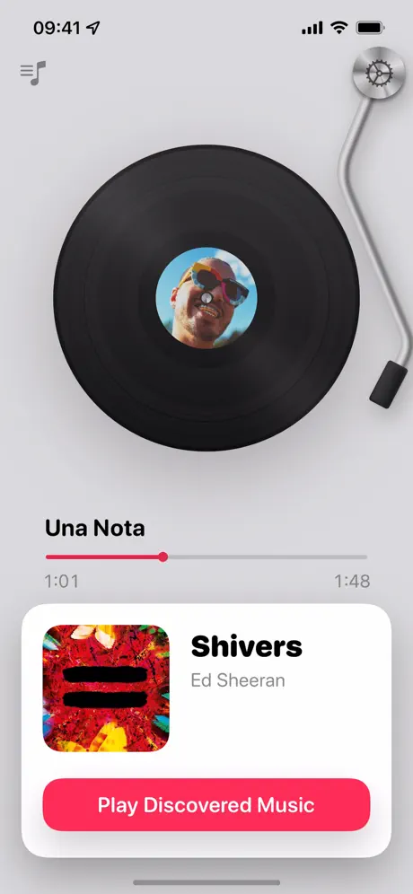
On-frame caption: “Shivers / Play Discovered Music

The sixth frame introduces a bottom-sheet interface against a cool light-gray background near #E5E5EA. The vinyl is scaled down and pushed upward to make room for the sheet, creating a crowded vertical composition where the record and the card compete for dominance. The sheet itself is pure white with 20 pt continuous corner radii and a soft upward shadow. Inside, a square thumbnail for 'Shivers' by Ed Sheeran sits left of a bold title and a gray artist credit. A full-width pink pill button labeled 'Play Discovered Music' occupies the bottom of the card. Above the sheet, the player still shows 'Una Nota' with a pink progress bar at '1:01' of '1:48.' This is the only frame that explicitly surfaces a music-discovery feature, yet the cramped middle ground between the vinyl and the card makes the metadata feel squeezed. The hierarchy is also ambiguous: is the user still listening to 'Una Nota,' or are they being asked to switch to 'Shivers'? The frame attempts to show recommendation intelligence, but the visual overlap muddies the narrative.

Discogs App Store screenshot 7 — Album Detail
07

Album Detail

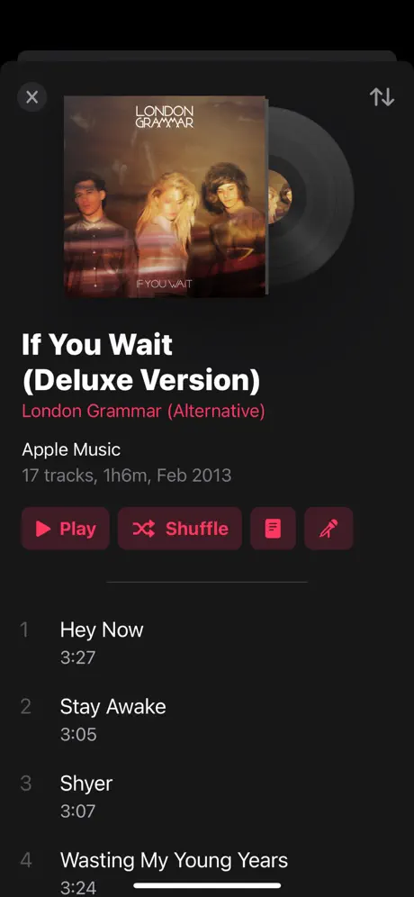
On-frame caption: “If You Wait (Deluxe Version)

This frame is the tonal break. There is no vinyl, no tonearm, and no player chrome—only a pure #121212 background establishing an album-detail view. The top navigation presents a circular close button on the left and a sort glyph on the right. The hero image shows physical-media specificity: the London Grammar sleeve for 'If You Wait' sits in front of a partially visible vinyl disc sliding out from the right edge, its label catching a faint light. The typography escalates to display size—likely 28 pt bold for 'If You Wait (Deluxe Version)'—with 'London Grammar (Alternative)' rendered in the same pink #FF375F used elsewhere. Metadata in #8E8E93 reads 'Apple Music' and '17 tracks, 1h6m, Feb 2013.' Action buttons occupy a row below: a solid pink 'Play' pill, an outlined pink 'Shuffle' pill with a subtle #2C2C2E fill, and two 36 pt square icon buttons. The tracklist begins with 'Hey Now' at 3:27, 'Stay Awake' at 3:05, 'Shyer' at 3:07, and 'Wasting My Young Years' at 3:24, set in 17 pt white with gray timing. This is the densest, most utility-driven frame in the set, and it feels grafted in from a stricter design system. Because the preceding seven frames established the tonearm as a brand constant, its total absence here is jarring.

Discogs App Store screenshot 8 — Track Metadata
08

Track Metadata

On-frame caption: “So Long, See You Tomorrow / Bombay Bicycle Club

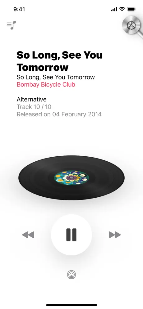
The final frame returns to a white background with the status bar present; the time reads '9:41' with standard signal, Wi-Fi, and battery glyphs. The upper half is dominated by a typographic stack: 'So Long, See You Tomorrow' appears twice in bold black—first as the track title, then identically as the album title—followed by 'Bombay Bicycle Club' in the accent pink. Below, a metadata cluster in #8E8E93 lists 'Alternative,' 'Track 10 / 10,' and 'Released on 04 February 2014' at roughly 15 pt with generous leading. The vinyl is rotated horizontally, lying flat like a platter, with the tonearm entering from the upper right at a steeper angle. The large white pause button and gray AirPlay glyph reinstate the player language. The duplication of the track and album title without any visual differentiation—no size shift, no weight change, no divider—forces the eye to read redundantly. The frame intends to show metadata depth, but the layout reads as a typographical accident rather than an intentional hierarchy.

05The craft

Captions, colour and the mechanics of the sell

Caption pattern

No external captions are used. The set relies entirely on in-UI text: track titles, tab labels, button text ('By Apple Music,' 'Play Discovered Music'), and metadata strings. This is a high-risk, high-reward choice—it keeps the frames clean, but it means no single frame can explain a feature the UI itself does not label.

Visual system

The visual system is built on three constants: the vinyl record as center-weighted anchor, the pink #FF2D55 accent for primary actions and progress, and a flat gray #8E8E93 for secondary metadata. Backgrounds are treated as variables—they shift to match album art tones or system mode—while the record itself remains compositionally fixed. The tonearm always enters from the upper right, creating a diagonal line that breaks the rectangular frame. Shadows are soft and diffuse in player views, hard and directional in list views. Type hierarchy is strictly binary: bold black (or white) for titles, regular gray for everything else.

The thumbnail test

A browser scrolling past the first static thumbnail sees a sunset gradient, a floating vinyl record, and 'Moment in the Sun.' It reads as a mood board for analog listening. Whether it reads as a cataloging tool depends entirely on whether the user swipes.

Conversion mechanics

The set’s strongest conversion asset is its instant visual differentiation: the vinyl player is memorable in a sea of waveform and playlist-grid competitors. However, the sequence undermines itself by front-loading three player variations before showing the library or album detail. A shopper who needs a cataloging tool may never swipe far enough to see frame 7’s tracklist density. The lack of external caption copy means the app is betting everything on UI recognition, which is risky for a utility-heavy product.

06Where it slips

What we would change

Narrative Sequencing

The order is fractured. Frames 1, 2, and 5 are all player screens with different backgrounds. A shopper swiping rapidly will see a pretty turntable three times before encountering the library in frame 3. For a database app, this is a storytelling inversion: utility should lead, or at least alternate, rather than hide behind atmosphere.

Inconsistent Status Bar

Frame 1 omits the status bar entirely for a poster effect. Frames 2, 5, 6, and 8 include it. Frames 3 and 4 crop ambiguously. This inconsistency breaks the illusion that these are slices from a single, coherent app session. The rule should be binary: either all frames show real chrome, or only the first hero frame is allowed to go immersive.

Tab Variance

Frame 3 displays five tabs including 'Artists.' Frame 4, the dark-mode library, shows only four tabs, with 'Artists' missing. This suggests either a conditional state or a cropping error, but in a screenshot set, it reads as interface instability.

Vinyl Chrome in Lists

In frames 3 and 4, the vinyl record functions as a decorative header above scrollable lists. It consumes roughly the top 20 percent of the frame without adding information. On a small phone canvas, that space could display an extra list row or a search bar—elements that would actually sell the cataloging experience.

Brand Dilution

Frame 4’s 'Shazam Library' header introduces a third-party brand name with no explanation. In a Discogs sequence, this dilutes ownership of the experience. If the app pulls from Shazam, the integration needs a visual explanation; as it stands, it looks like a placeholder or a mistake.

07The recipe

How to apply this to your own app

  1. Choose one 'hero' frame for atmosphere, then standardize chrome everywhere else.

    If you want an immersive poster frame, restrict it to position one. Every subsequent frame should include the status bar and standard navigation so the shopper recognizes a real app, not a concept render.

  2. Let utility breathe by collapsing decorative motifs in list views.

    A persistent skeuomorph is a strong brand move, but in a list context it becomes dead weight. Replace the full vinyl header with a slim collapsed player or a minimal navigation bar when showing database density.

  3. Deduplicate states across the sequence.

    If you have eight frames, do not spend three of them on the same screen with different album art. Each frame should prove a distinct capability: library, detail, player, dark mode, integration, discovery.

  4. Differentiate duplicated text with weight or size, not layout position alone.

    Frame 8 repeats 'So Long, See You Tomorrow' as both track and album title without visual distinction. Use a smaller size or lighter weight for one instance so the hierarchy is instant.

  5. Anchor dark-mode frames to the same navigation as light-mode frames.

    If frame 3 shows five tabs, frame 4 must show the same five tabs in the same order. Changing tab count between modes suggests the interface is unpredictable.

08Takeaways

Five things worth stealing

  • A single skeuomorphic motif can own a category, but only if it knows when to get out of the way.
  • Without caption overlays, the UI text must carry the entire value proposition—choose visible labels carefully.
  • Chromatic consistency (#FF2D55 across progress bars, buttons, and metadata) can unify wildly different backgrounds.
  • The status bar is a trust signal; removing it costs credibility unless the frame is explicitly a lifestyle poster.
  • Re-sequencing can fix repetition without redesigning a single pixel.
09The verdict

What the set actually achieves

The set successfully owns a distinctive visual signature—the vinyl record is instantly recognizable—but fails to sequence its capabilities into a coherent user journey. A shopper learns that the app has a beautiful player, but may not grasp the depth of the catalog or the collection-management features until the later frames, if at all.

This set is a study in brand-first App Store design for utility apps that want to feel like lifestyle products. It will resonate most with designers working on media, catalog, or niche database apps who need to balance nostalgia with native iOS patterns.

10Questions

Frequently asked

Why does the right-side timestamp change meaning between frames?

It appears to show remaining time rather than total duration—a valid design choice, but unconventional enough that it may confuse users who expect total length on the right.

Is the vinyl record a functional UI element or just decoration?

In these screenshots it reads as decoration in list views and as a player metaphor in playback views. There is no evidence in the frames that the user can interact with the tonearm directly.

Does the set communicate collection management?

Only obliquely. Frame 3 shows a library list and frame 7 shows an album tracklist, but there are no visible 'Add to Collection,' 'Wantlist,' or rating controls in any of the eight frames.

Why is frame 7 so different from the others?

It is the only frame that abandons the vinyl player motif entirely in favor of a standard album-detail view. This makes it the most information-dense frame, but also the most visually disconnected from the rest of the set.

Would adding text captions improve conversion?

Probably. Because the app relies entirely on in-UI text, features like 'Play Discovered Music' or 'Shazam Library' appear without context. A small, restrained caption overlay could clarify value without breaking the minimal aesthetic.

11Keep reading

Build your own screenshot set

The full set

10 shots
Discogs App Store screenshot 1Discogs App Store screenshot 2Discogs App Store screenshot 3Discogs App Store screenshot 4Discogs App Store screenshot 5Discogs App Store screenshot 6Discogs App Store screenshot 7Discogs App Store screenshot 8Discogs App Store screenshot 9Discogs App Store screenshot 10

About the app

The official Discogs App is the best way to catalog your music collection, find that hidden gem, check pricing and buy music from the world’s largest discography of physical Zink Media LLC, via the App Store listing.

Screenshots and store metadata belong to Zink Media LLC. They are shown here for design commentary and criticism. The analysis on this page is original work by floow.design. View the original listing.

More Music teardowns

Browse all →