MD Vinyl app icon
MusicScreenshot teardown14 min read

MD Vinyl App Store screenshots

This music player case study examines how MD Vinyl uses a two-act structure—device-framed feature cards followed by full-bleed player immersion—to sell a skeuomorphic vinyl experience on the App Store.

Set published by MD Studio · 10 frames analysed

4.6 · 24K ratingsFreev3.6.6Updated 4mo ago
MD Vinyl App Store screenshot 1
01At a glance

The set in one screen

Framing
Frames 1–3 use an abstract rounded-rectangle device shell with no physical bezel; Frames 4–8 abandon the shell entirely, shifting to collage, perspective stacks, and full-bleed UI.
Captions
Heavy, tightly-tracked sans-serif in near-black (#1A1A1A), top-aligned, ranging from 40–48 pt.
Backdrop
Full-bleed gradients, film grain, and flat color fields; no two frames share an identical background treatment.
Type
Bold geometric sans-serif for headlines and track titles; light weight for artist names and metadata.
UI / copy split
Approximately 40% marketing copy to 60% interface visualization across the set.
Frame 1 job
Establish the vinyl-as-object metaphor and front-load social proof before the shopper swipes.

Sampled palette

#1A1A1A#1A1A1A
#F3E8FA#F3E8FA
#5AB8E2#5AB8E2
#1E6FAE#1E6FAE
#52A8C7#52A8C7
#996B7AFFEAE5
02The challenge

What this screenshot set had to solve

For a designer merchandising a music app on the App Store, the canvas is static, narrow, and cropped by the scroll behavior of impatient shoppers. MD Vinyl compounds this problem because its value proposition is not utilitarian—it is ritualistic. The app asks users to believe that a screen can behave like a turntable, yet the screenshot gallery must communicate that fantasy in under three seconds without motion, haptics, or audio. The set therefore faces a sequencing challenge: it must introduce a skeuomorphic object language (vinyl discs, tone arms, sleeve art), prove native iOS integration (widgets), show social distribution (share cards), and expose catalog depth (a library view), all while preventing the gallery from feeling like eight disconnected marketing assets. There is also a formal problem: the first three frames invent their own boundary—a rounded-rectangle device proxy rather than a physical iPhone chassis—so the designer must sustain that visual contract or break it with intent. Finally, because the player UI is color-reactive, shifting to match each record’s art direction, the set must prove that these palette swings are systematic rather than random, while keeping headline and control legibility intact across burnt orange, bright amber, and near-black fields.

The set fractures its own logic when it abandons the device proxy in Frame 4 without warning. After three frames of centered rounded rectangles, the sudden shift to an unbounded card collage breaks the spatial contract with the viewer.
03The approach

How the set argues its case

The designer splits the gallery into two acts. Act One—Frames 1 through 3—establishes a rigid, scannable template: oversized top-aligned headline in a bold geometric sans-serif, a centered device container with generous outer padding, and a single hero object inside. This repetition trains the eye to read feature statements before any UI density arrives. Act Two—Frames 4 through 8—breaks the template to show depth: the device shell disappears, the perspective tilts, and the viewer is pushed inside the app’s environment. Color is deployed as a narrative thread, not decoration; each frame adopts a dominant hue that matches the vinyl record shown, creating an implicit promise that the app chrome adapts to the user’s library. Typography remains deliberately constrained: the same weight family handles the 48 pt marketing headers, the 32 pt track titles, and the 16 pt artist credits, unifying disparate scenes. The tone arm is treated as a recurring brand glyph, cropping up in nearly every frame to anchor the turntable metaphor. Social proof is front-loaded—Frame 1 drops “5M+ Happy Users” and Frame 2 drops “App Store Featured” inside the device safe zone—on the assumption that credibility must land before the first swipe.

MD Vinyl positions itself not as a streaming utility but as a collectible object. The screenshots treat the vinyl disc as a physical product: it catches light, casts shadows, and emerges from card sleeves. Even the widget frame frames the record as a trophy sitting inside a glass cube. This is a deliberate aesthetic bet that nostalgia and tactility can outcompete the sparse minimalism of default iOS music apps in the store listing context.

04Frame by frame

Every screenshot, and the job it does

MD Vinyl App Store screenshot 1 — Your Music on Records
01

Your Music on Records

On-frame caption: “Your Music on Records

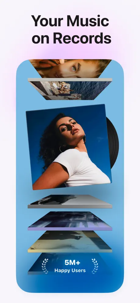
The frame opens with the headline “Your Music on Records” set in a heavy, tightly-leaded sans-serif at roughly 48 pt, colored #1A1A1A against a near-white backdrop that blooms with a faint violet wash around #F3E8FA at the top center. Below, a rounded-rectangle device proxy—no physical bezel, just a screen silhouette with roughly 56 pt corner radii—houses a vertical stack of album sleeves rendered in forced perspective. The interior gradient runs from a bright cyan #5AB8E2 at the top to a deeper cobalt #1E6FAE at the bottom. Five square art assets float along the Z-axis: the foremost sleeve, centered and in full focus, shows a woman in a white shirt photographed from below against a blue sky; the receding sleeves blur progressively. At the bottom of the device, a white social-proof lockup reads “5M+” in bold, followed by “Happy Users” in a lighter weight, flanked by symmetrical laurel vectors. The status bar is entirely cropped, and there is no tab bar or navigation chrome. The composition is vertically centered, leaving substantial negative space above the headline that isolates the text from the device.
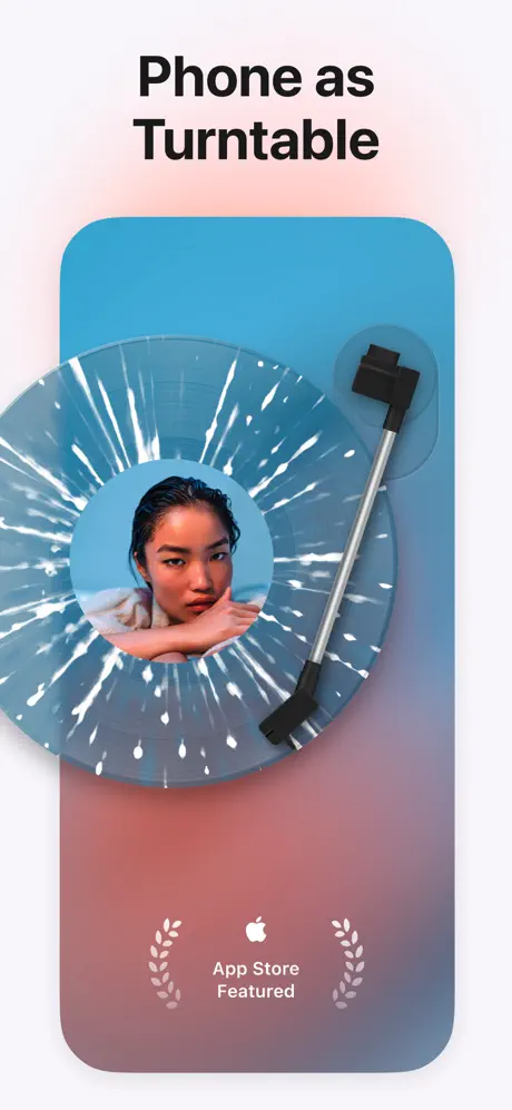
MD Vinyl App Store screenshot 2 — Phone as Turntable
02

Phone as Turntable

On-frame caption: “Phone as Turntable

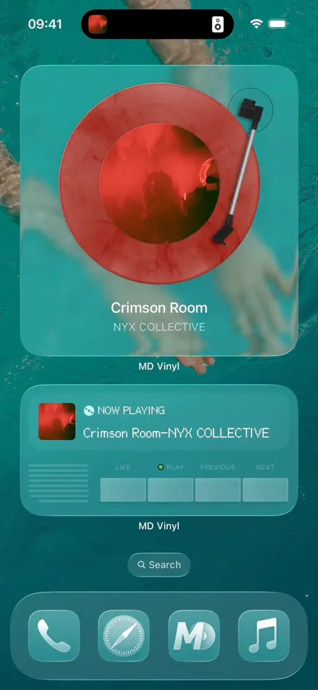
This frame repeats the headline-plus-device architecture, this time with the text “Phone as Turntable” in the same #1A1A1A weight and size. The outer canvas carries a faint peach tint—roughly #FFEAE5—at the top, cooler than Frame 1’s lavender. Inside the device shell, the background shifts to a duskier gradient, moving from a top-left cyan #52A8C7 down to a muted mauve #996B7A at the lower right. The hero object is a translucent blue vinyl disc with white radial splatter effects carved out of the grooves; the center label shows a portrait of a woman resting her chin on folded hands, cropped in a circle. A silver and black tone arm enters from the upper right, its counterweight and headshell rendered in matte black, casting a soft shadow onto the record surface. At the bottom center of the device, a white Apple glyph sits above the words “App Store Featured,” again flanked by laurel wreaths. The spatial balance is nearly identical to Frame 1, creating a rhythmic left-edge alignment that makes swiping feel like turning a page rather than jumping scenes.

MD Vinyl App Store screenshot 3 — Control Music with Widgets
03

Control Music with Widgets

On-frame caption: “Control Music with Widgets

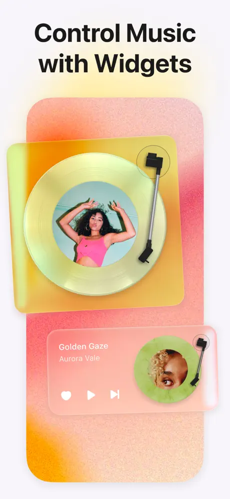
The third frame introduces the headline “Control Music with Widgets,” still in the same #1A1A1A sans-serif. Here the device interior abandons smooth gradients for a noisy, textured peach-to-pink field that spans roughly #FFAA80 to #FF8880, overlaid with visible film grain. Two widget containers appear. The upper widget is a large square with rounded corners and a translucent citrine backing—approximately #E6F095 at 30% opacity—behind a gold-tinted vinyl record. The record’s center label shows a woman in a pink top against a cyan sky, and a miniature tone arm sits at its upper right. The lower widget is a wider, horizontal rectangle in a frosted salmon tint, around #FFD4C4 at 50% opacity. Inside it, left-aligned white sans-serif text reads “Golden Gaze” in bold, with “Aurora Vale” beneath in a lighter weight. Three flush-left white icons—a heart, a play triangle, and a skip-forward glyph—sit below the text. At the right end of this widget, a miniature green vinyl circle with a cropped portrait acts as a thumbnail. This is the first frame to reveal actual player controls and in-UI typography.

MD Vinyl App Store screenshot 4 — Share Songs with Cards
04

Share Songs with Cards

On-frame caption: “Share Songs with Cards

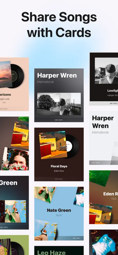
This frame abandons the device shell entirely. Instead, an asymmetrical collage of rectangular cards floats against a pale icy-blue-to-white gradient, roughly #E0F0F8 to #FFFFFF. Each card carries its own background color and a partial vinyl disc emerging from the right edge. Visible typographic lockups include “Harper Wren” in bold white sans-serif over a dark charcoal #2B2B2B card with a black-and-white landscape photograph, and “Floral Days” by “Eden Row” on a chocolate brown #3E2723 card with a saturated street photograph. “Nate Green” appears on a sky-blue backing with a portrait of someone in motion. Every card stamps a small “MD VINYL” watermark at its bottom edge. The cards overlap, rotate slightly, and bleed off the canvas on all four sides. Without a device boundary, this frame shifts the gallery from “here is the app on a phone” to “here is the artifact you create,” though the transition risks visual whiplash because the preceding three frames had trained the eye to look for a centered device.

MD Vinyl App Store screenshot 5 — The Perspective Library Stack
05

The Perspective Library Stack

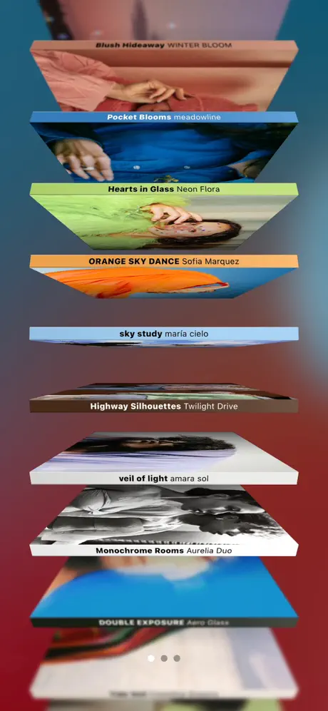
On-frame caption: “No marketing headline visible; in-UI text includes Blush Hideaway WINTER BLOOM, Pocket Blooms meadowline, Hearts in Glass Neon Flora, ORANGE SKY DANCE Sofia Marquez, sky study maria cielo, Highway Silhouettes Twilight Drive, veil of light amara sol, and Monochrome Rooms Aurelia Duo.

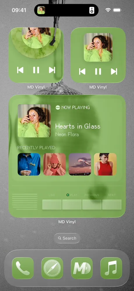
This frame contains no visible headline; the entire canvas is filled by a perspective stack of vinyl record spines viewed from below. The background is a vertical gradient descending from a deep teal-blue #1F4E5F at the top to a burgundy #6E1F2A at the bottom. The records are rendered as thick physical slabs, each angled downward along the Y-axis so that only the front-facing edges and spines are readable. Visible spine text includes “Blush Hideaway WINTER BLOOM” on a dusty pink slab, “Pocket Blooms meadowline” on blue, “Hearts in Glass Neon Flora” on lime, “ORANGE SKY DANCE Sofia Marquez” on orange, “sky study maria cielo” on powder blue, “Highway Silhouettes Twilight Drive” on dark brown, and “veil of light amara sol” on warm grey. A partial “DOUBLE EXPOSURE” slab appears at the bottom. At the lower center, four pagination dots indicate carousel position; the leftmost is filled white, the remaining three are dark grey. The perspective is steep enough that several spines are compressed and begin to blur, prioritizing spatial depth over readability.

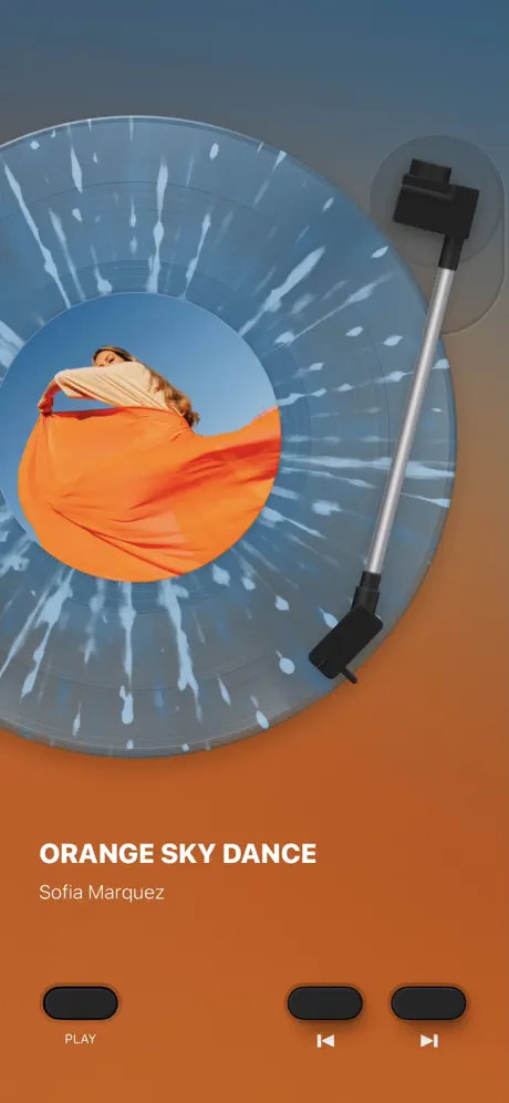
MD Vinyl App Store screenshot 6 — Orange Sky Dance Player
06

Orange Sky Dance Player

On-frame caption: “ORANGE SKY DANCE / Sofia Marquez

The sixth frame switches to a full-bleed player view with no device chrome and no marketing headline. The background is a flat, warm burnt orange at #D2692A. In the upper two-thirds, the translucent blue vinyl record with white radial splatter—visibly the same asset as Frame 2—dominates the left side. Its center label shows a woman enveloped in flowing orange fabric against a blue sky, echoing the background hue. The tone arm rests at the upper right, its matte black headshell and silver tube casting a shadow onto the record. Below the disc, left-aligned white sans-serif text reads “ORANGE SKY DANCE” in bold at approximately 32 pt, with “Sofia Marquez” in a lighter weight at roughly 18 pt beneath it. At the bottom edge, three charcoal pill-shaped buttons—#2C2C2C—are arranged horizontally: the leftmost contains a play icon with the label “PLAY” centered beneath it in small white caps; the center and right pills contain skip-backward and skip-forward icons. This is the first frame to reveal the player’s control row at full scale.

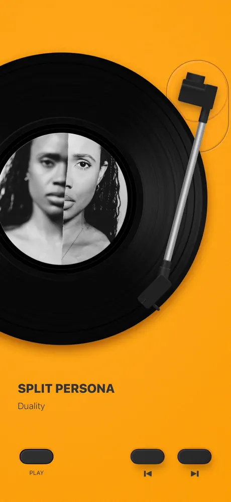
MD Vinyl App Store screenshot 7 — Split Persona Player
07

Split Persona Player

On-frame caption: “SPLIT PERSONA / Duality

This frame mirrors the player template but shifts the environment to a saturated amber background at #FF9F1C. Here the record is opaque black with visible concentric grooves, a material departure from the translucent colored pressings. The center label is a black-and-white diptych portrait split vertically down the middle. The tone arm occupies the same upper-right real estate as in Frame 6, though its shadow falls differently against the warmer field. Left-aligned text reads “SPLIT PERSONA” in bold dark sans-serif—#1A1A1A—and “Duality” in a lighter weight directly below. The bottom control row repeats the three charcoal pills, with the same play and skip icons and the “PLAY” label. The contrast between the dark record and the bright orange background is the highest in the set, making the groove texture and center label photography pop, though the dark control pills begin to feel like a default asset that has not been tuned for the amber field.

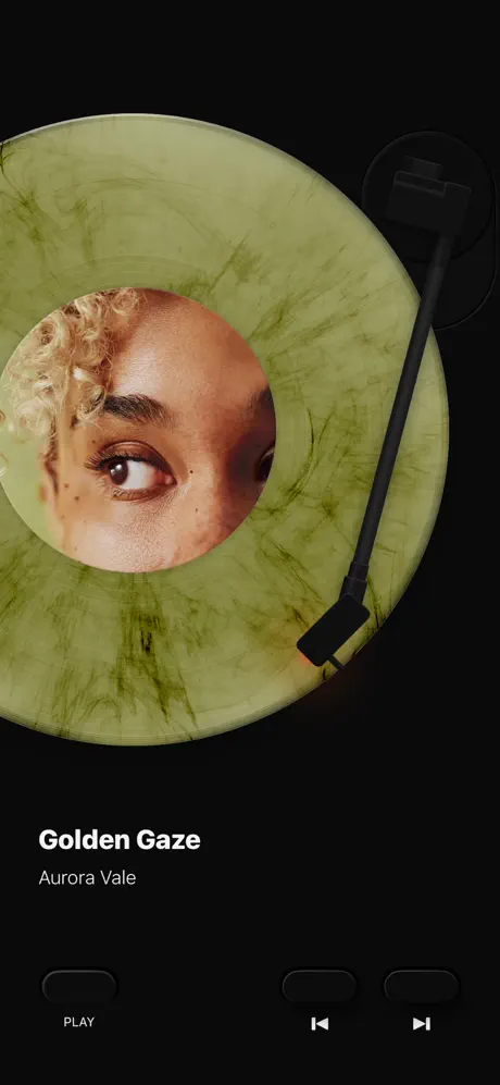
MD Vinyl App Store screenshot 8 — Golden Gaze Player
08

Golden Gaze Player

On-frame caption: “Golden Gaze / Aurora Vale

The final frame returns to a near-black background at #0A0A0A. An olive-green, marble-patterned translucent vinyl occupies the upper two-thirds; its center label is a tight crop of an eye and blonde curly hair. The tone arm is rendered almost entirely in black, causing it to sink into the shadowed upper right unless viewed at full brightness. White sans-serif text reads “Golden Gaze” in bold and “Aurora Vale” in a lighter weight below it. The bottom control pills are the darkest in the set at roughly #1C1C1C, with the glyphs and “PLAY” label rendered in a low-contrast grey that approaches the background value. By holding the player layout constant—record plus tone arm in the upper 65%, type in the lower left, controls anchored to the bottom edge—the frame proves the UI’s template rigidity, but it also exposes a critical legibility failure: the control row is nearly invisible against the black ground.

05The craft

Captions, colour and the mechanics of the sell

Caption pattern

Frames 1–4 use a two-line imperative headline in bold near-black sans-serif: “Your Music on Records,” “Phone as Turntable,” “Control Music with Widgets,” and “Share Songs with Cards.” Frames 5–8 drop the headline entirely, relying on in-UI typography (track titles and artist names) to deliver context. This creates a mid-gallery silence where the marketing voice stops and the product is forced to speak for itself.

Visual system

The system is built on three recurring ingredients: the vinyl disc asset, the tone arm, and a full-bleed color field. The disc mutates in material properties—translucent blue with white splatter, gold-tinted clear, opaque black, olive marble—while maintaining the same 1:1 aspect ratio and center label masking. The tone arm is replicated at the same angle across Frames 2, 3, 6, 7, and 8, acting as a compass point. Backgrounds alternate between smooth gradients (Frames 1, 2, 4, 5), textured grain (Frame 3), and flat color (Frames 6, 7, 8). The only typographic constant is the bold/light weight pairings within the same geometric sans-serif family.

The thumbnail test

On first glance, a browser sees a bright cyan stack of albums in Frame 1, followed immediately by a translucent blue disc in Frame 2. The combination of neon-tinged vinyl and saturated backgrounds reads as “design-forward music app” even before the shopper processes the headlines. However, the shift from device-framed cyan and peach in Frames 1–3 to the dark burgundy perspective stack in Frame 5 and the near-black player in Frame 8 creates a tonal zigzag that may break visual momentum when viewed as a grid.

Conversion mechanics

Frame 1 front-loads two trust signals—user count and editorial featuring—before the shopper has scrolled. Frame 4 is the only frame that demonstrates a shareable output, which is a strong conversion lever for social users. However, the absence of any pricing, trial, or download-value proposition means the set relies entirely on aesthetic desire to drive the tap. For conversion optimization, a designer might test adding a small lockup in the final frame indicating widget installation or offline playback capability.

06Where it slips

What we would change

Device-Framed Rhythm vs. Full-Bleed Whiplash

After training the viewer to look for a centered device proxy in Frames 1–3, the set removes it entirely in Frame 4 and never reintroduces it. The fix would be to either maintain the device boundary through Frame 5 or formally introduce the full-bleed language in Frame 3 so the transition feels intentional rather than accidental.

Perspective Distortion in the Library Stack

Frame 5’s spine text is compressed by extreme perspective distortion. “Highway Silhouettes” and “veil of light” are barely legible. The concrete fix is to flatten the camera angle by ten to fifteen degrees and increase the spine type by at least two points, or to reposition the focal plane so the middle three records front-face the viewer.

Dark-Mode Contrast Failure

Frame 8 places #1C1C1C control pills against a #0A0A0A background, rendering the “PLAY” label and skip icons nearly invisible. The fix is to lighten the pill fill to at least #333333 with a 1 pt inner stroke and force the glyphs to pure white #FFFFFF. Frame 7’s charcoal pills on amber fare better but still feel like untuned default assets.

Static Tone Arm Positioning

The tone arm sits at the same angle and elevation in Frames 6, 7, and 8, missing the opportunity to sell the app’s core drop-the-needle interaction. Lowering the arm by 8–12 pt in one frame would imply motion without breaking the layout.

Social Proof Iconography

The laurel wreaths in Frames 1 and 2 read as generic stock ornamentation. Replacing them with the official App Store Editor’s Choice badge typography or a starred testimonial quote would carry more institutional weight.

07The recipe

How to apply this to your own app

  1. Anchor your first frame with a teachable template

    Frames 1–3 use an identical headline-to-device spatial ratio. If you repeat a layout twice, the shopper learns how to read your gallery by the third frame. Do not break that container until you have established the pattern.

  2. Let color carry continuity when structure shifts

    MD Vinyl loses its device frame but keeps its palette tied to the hero object. If you must abandon a layout trope mid-gallery, tie the frames together with a recurring color or texture so the swipe still feels connected.

  3. Audit every dark frame for WCAG contrast

    Frame 8 is atmospheric but fails accessibility. Before shipping, overlay your darkest screenshot with a simulated dimming filter; if controls disappear, they need a lift in luminance or a subtle stroke.

  4. Vary your recurring asset by at least one degree

    The tone arm is copy-pasted across five frames. A single change in rotation or drop-shadow length would add life. Treat your recurring glyph like a character, not a stamp.

08Takeaways

Five things worth stealing

  • A rigid headline-plus-device template is an effective teaching tool for the first three frames, but abandoning it without warning causes spatial whiplash.
  • Color discipline—matching the app chrome to the record art—creates implicit quality signals without requiring extra copy.
  • Skeuomorphic objects (vinyl, tone arms) need micro-variations in positioning to feel alive; identical placement reads as static clipart.
  • Full-bleed dark frames must pass a contrast audit at 50% screen brightness, or the UI effectively disappears.
  • Perspective views are cinematic, but text compressed by steep angles becomes decorative rather than informative.
09The verdict

What the set actually achieves

The gallery establishes the vinyl record as the undisputed hero object and successfully communicates four distinct features (widget support, sharing, library browsing, and player visualization) across eight frames. However, the abandonment of the device shell after Frame 3 creates a spatial discontinuity, and the full-bleed player frames end with a dark-mode contrast failure that renders controls nearly invisible.

This case study is written for product designers preparing screenshot sets for media-heavy or skeuomorphic apps—particularly those where the core interaction is tactile and the value proposition relies on nostalgia, object beauty, or audio-visual synesthesia rather than utilitarian speed.

10Questions

Frequently asked

Why does the set drop the device frame after Frame 3?

The shift appears to be a deliberate move from ‘here is the app on your phone’ to ‘here is the experience,’ but the execution is abrupt. A smoother transition would keep a faint device outline or shadow in Frame 4 to bridge the gap.

How does the set handle typography?

It uses a single geometric sans-serif family across all frames, varying only weight and size. Headlines are near-black and roughly 48 pt; in-UI track titles are white or dark grey at roughly 32 pt; artist names are a lighter weight beneath.

What is the weakest frame for conversion?

Frame 5. The perspective stack is visually arresting but the spine text is largely unreadable, and the frame contains no headline or call-to-action. It communicates catalog depth at the cost of information clarity.

What hex values define the core palette?

The marketing headlines sit at #1A1A1A. The first device interior runs #5AB8E2 to #1E6FAE. The player backgrounds hit #D2692A, #FF9F1C, and #0A0A0A. The grainy widget field spans #FFAA80 to #FF8880.

How could the dark player frame be fixed?

Lighten the control pills to at least #333333, add a 1 pt inner stroke, and render the icons and ‘PLAY’ label in pure white #FFFFFF. Additionally, introducing a subtle rim light on the tone arm would prevent it from vanishing into the black background.

11Keep reading

Build your own screenshot set

The full set

10 shots
MD Vinyl App Store screenshot 1MD Vinyl App Store screenshot 2MD Vinyl App Store screenshot 3MD Vinyl App Store screenshot 4MD Vinyl App Store screenshot 5MD Vinyl App Store screenshot 6MD Vinyl App Store screenshot 7MD Vinyl App Store screenshot 8MD Vinyl App Store screenshot 9MD Vinyl App Store screenshot 10

About the app

Rediscover the essence of music with MD Vinyl – your digital gateway to the authentic experience of vinyl records. Immerse yourself in the sound and visuals, right from your MD Studio, via the App Store listing.

Screenshots and store metadata belong to MD Studio. They are shown here for design commentary and criticism. The analysis on this page is original work by floow.design. View the original listing.

More Music teardowns

Browse all →