Suno app icon
MusicScreenshot teardown11 min read

Suno App Store screenshots

Suno’s eight-frame App Store sequence attempts to merchandize an invisible product—AI-generated audio—by splitting its personality between a psychedelic brand collage and a disciplined, black-background device gallery.

Set published by Suno, Inc. · 9 frames analysed

4.9 · 229K ratingsFreev1.68.1Updated 4mo ago
Suno App Store screenshot 1
01At a glance

The set in one screen

Framing
Frame 1 is a full-bleed collage with no device; Frames 2–8 center an iPhone on absolute black.
Captions
White high-contrast serif headlines float above every frame, functioning as chapter titles.
Backdrop
Pure black (#000000) from Frame 3 onward, isolating the phone in a gallery void.
Type
Marketing layer uses an elegant editorial serif; product UI uses standard iOS sans-serif.
UI / copy split
Frames 2–7 are dominated by device screenshots; Frame 1 and 2’s review card are pure marketing collateral.
Frame 1 job
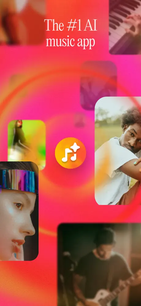
Brand promise and mood establishment without interface chrome. The headline claims category rank: The #1 AI music app.

Sampled palette

#FF0266#FF0266
#FF6D00#FF6D00
#EC008C#EC008C
#FF5E3A#FF5E3A
#FF2D55#FF2D55
#FFFFFF#FFFFFF
02The challenge

What this screenshot set had to solve

The challenge visible in this set is communication arbitrage. Because AI music has no physical artifact—no instrument to cradle, no canvas to stage—the screenshots must fabricate visual evidence of sonic creation. Suno attempts this by oscillating between four distinct proof types: text prompts, waveform visualization, social video, and library management. The risk inherent in this strategy is that familiar patterns dominate the message; Frame 3, for instance, borrows the structural grammar of a short-form video feed so faithfully that it could be mistaken for a browsing experience rather than a generative one. The designer must compress a wide funnel into eight swipes, moving the viewer from aspiration to input, output, sharing, editing, and archiving. At thumbnail scale, only the headline shape, the black background silhouette, and a single warm color swatch register, so each frame must telegraph its chapter instantly without relying on fine UI details that dissolve at small sizes.

The set’s core tension is the gulf between its aspirational marketing skin and its utilitarian product body.
03The approach

How the set argues its case

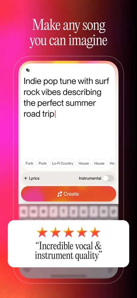
The approach is a narrative arc moving from brand promise to functional proof. Frame 1 opens with a pure mood board—musicians, instruments, and the serif headline The #1 AI music app against a hot-pink gradient—establishing an editorial voice before the user sees a single interface element. From Frame 2 onward, the set locks into a repeatable formula: a centered iPhone with thin bezels, set against absolute black, capped by a white serif headline that functions as a chapter title. Inside the device, every screen is staged. The prompt in Frame 2 reads Indie pop tune with surf rock vibes describing the perfect summer road trip. The review card floating below it displays five orange stars and the verbatim quote Incredible vocal & instrument quality. This rigid separation—marketing copy floats outside the device, functional fiction lives inside—creates a predictable rhythm that grocery-shoppers can parse in under two seconds per frame.

By leading with musician photography and ending with a personal library, Suno positions itself not merely as a tool but as an ecosystem. The implicit argument is that the music you make here lives, breathes, and travels through a complete pipeline.

04Frame by frame

Every screenshot, and the job it does

Suno App Store screenshot 1 — Shot 1 / The Brand Promise
01

Shot 1 / The Brand Promise

On-frame caption: “The #1 AI music app

The opening frame abandons device-framing conventions entirely. A swirling gradient background shifts from deep magenta (#FF0266) at the edges to tangerine (#FF6D00) near the center, blurred into soft concentric rings. Floating above this are six photographic rectangles with corner radii around 24pt, arranged in an asymmetric collage that bleeds off all four edges. The app icon sits dead center: a circle roughly 120pt in diameter, filled with an amber-to-orange gradient and a white musical-note glyph with a sparkle cutout. The headline is set in a white high-contrast serif, centered near the top tenth of the frame. No drop shadows separate the photos from the background; contrast alone does the work. By refusing to show chrome, the frame makes a deliberate bet on mood over mechanics, though the thin serif strokes begin to disappear when the image is compressed to thumbnail width.
Suno App Store screenshot 2 — Shot 2 / The Prompt Composer
02

Shot 2 / The Prompt Composer

On-frame caption: “Make any song you can imagine

Frame 2 introduces the product. The background is a near-black burgundy (#1A050A) that fades to pure black at the lower edge. Centered is an iPhone displaying the prompt composer. The input field contains the exact text: Indie pop tune with surf rock vibes describing the perfect summer road trip. Below the keyboard line, a horizontally scrolling chip rack shows genre tags—Funk, Punk, Lo-Fi Country, House—but the edge cropping is sloppy, revealing a duplicate House and a truncated Ho that breaks the illusion of polish. The primary CTA spans the screen width as a pill gradient from magenta (#EC008C) to orange (#FF5E3A), reading Create with a musical-note icon. Beneath the device, a white review card with a 20pt corner radius overlaps the bezel, carrying five orange stars and the black serif quote: Incredible vocal & instrument quality. A faint pink aura traces the phone’s perimeter, lifting it off the dark ground.

Suno App Store screenshot 3 — Shot 3 / The Social Video Feed
03

Shot 3 / The Social Video Feed

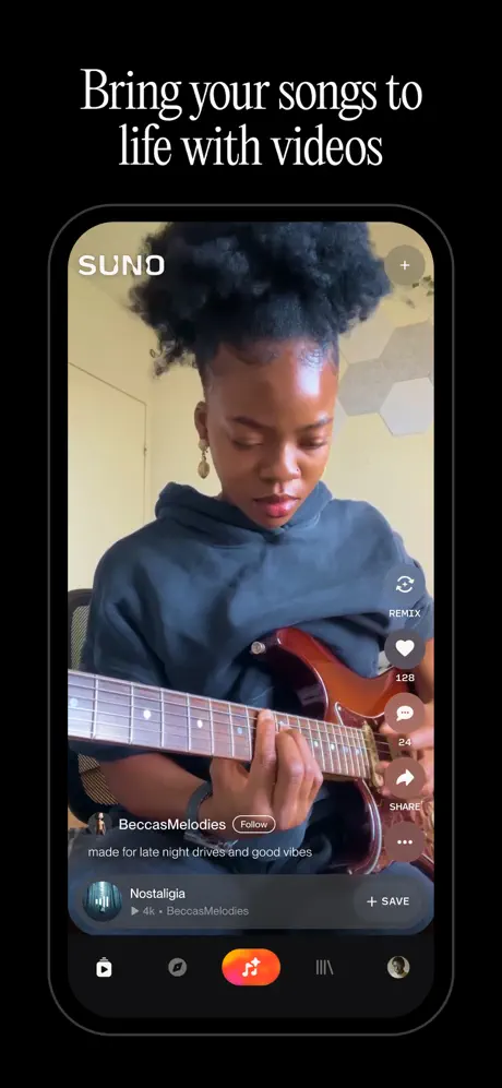
On-frame caption: “Bring your songs to life with videos

Here the device displays a full-screen vertical video of a guitarist against a DOM that reads like a social network. The top-left corner carries the white SUNO wordmark in a geometric sans-serif; the top-right shows a circular + button. Along the right edge, a vertical stack of white icons handles interaction: REMIX, a heart with count 128, a comment bubble with 24, SHARE, and an ellipsis. At the base, a dark scrim supports the username BeccasMelodies, a white-outline Follow pill, and the caption made for late night drives and good vibes. A floating mini-player above the tab bar shows a track called Nostalgia with a save toggle. The tab bar itself is dark, anchored by the gradient Suno icon at center. By burying the AI angle beneath familiar social conventions, the frame risks being read as a consumption app rather than a creation tool.

Suno App Store screenshot 4 — Shot 4 / The Genre Grid
04

Shot 4 / The Genre Grid

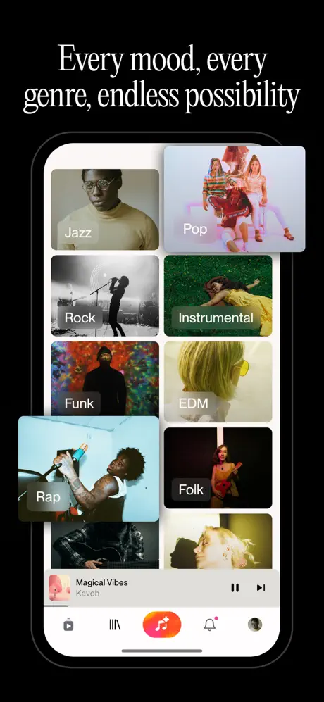
On-frame caption: “Every mood, every genre, endless possibility

The screen shows a genre-discovery grid on a white background, creating a harsh rectangular bright spot against the frame’s black surround. Tiles for Jazz, Pop, Rock, Instrumental, Funk, EDM, Rap, and Folk are arranged in a two-column layout with roughly 12pt corner radii. Each tile contains full-bleed photography and a white label at the bottom-left. The tonal range is deliberate: Jazz is sepia, Rock is black-and-white, Funk is psychedelic. At the bottom, the mini-player for Magical Vibes by Kaven matches the state shown in Frame 8, stitching the sequence together. The tab bar remains consistent, with the center gradient button persisting as a north star. The frame proves breadth, but the light UI theme clashes with the dark, cinematic envelope established by the surrounding marketing frames.

Suno App Store screenshot 5 — Shot 5 / The Audio Capture
05

Shot 5 / The Audio Capture

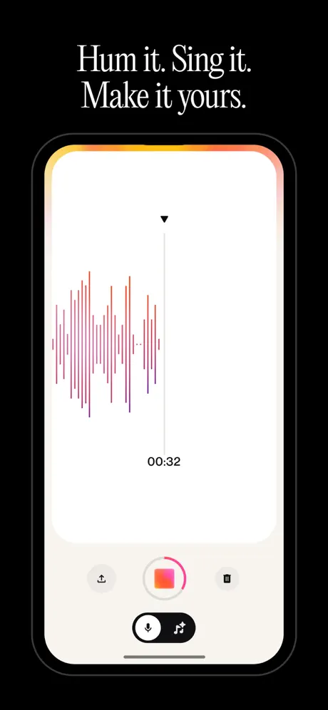
On-frame caption: “Hum it. Sing it. Make it yours.

This frame isolates the audio-input interface. The in-screen canvas is near-white (#FFFFFF), bisected by a vertical playhead topped with a black triangle. To the left, a waveform renders as a column of thin vertical bars graded from red (#FF2D55) at the crest to purple (#5856D6) at the trough. Beneath the playhead sits the timestamp 00:32 in grey sans-serif. The lower third of the screen uses an off-white panel (#F2F2F7) to hold three controls: a grey upload icon left, a 64pt central record button with gradient fill and white square stop glyph, and a grey pause icon right. A dark toggle pill (#1C1C1E) below switches between microphone and note icons. The device bezel emits a subtle warm glow—yellow melting to pink—that is the only organic warmth in an otherwise clinical composition. The white expanse above the waveform feels vacant; a ghosted prompt or listening indicator would clarify the input mode without adding clutter.

Suno App Store screenshot 6 — Shot 6 / The Video Export
06

Shot 6 / The Video Export

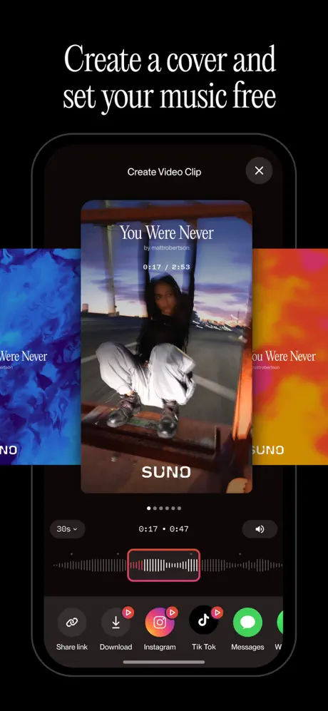
On-frame caption: “Create a cover and set your music free

The densest frame of the set presents a Create Video Clip modal. At top, a header bar with an X close button centers the title. The preview window is vertical 9:16, showing a track titled You Were Never by mattrobertson with a SUNO watermark at bottom. Left and right edges peek adjacent video thumbnails, implying a carousel. Below the preview, pagination dots, a 30s dropdown, and a waveform scrubber with a pink selection bracket (#FF2D55) compete for attention. The bottom row displays six equally sized circular export icons—Share link, Download, Instagram, TikTok, Messages—each roughly 56pt, several burdened with red notification badges. At thumbnail size, the density collapses; text like mattrobertson and the timecode becomes illegible. The frame wants to prove distribution breadth, yet the lack of hierarchy means the eye bounces between destinations without a clear landing point.

Suno App Store screenshot 7 — Shot 7 / The Remix Editor
07

Shot 7 / The Remix Editor

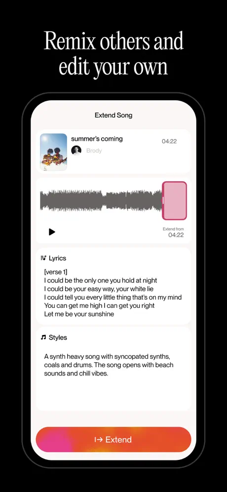
On-frame caption: “Remix others and edit your own

Frame 7 displays the extension workflow. A header reads Extend Song. Below, a track card shows summer's coming by Brody, timestamped 04:22. A grey waveform spans the card, its rightmost section highlighted in magenta-pink and labeled Extend from 04:22. A lyrics block follows, displaying five lines in black sans-serif beginning with I could be the only one you hold at night and ending with Let me be your sunshine. A Styles section underneath adds arrangement context. The frame ends with the familiar magenta-to-orange Extend CTA. While the layout is tidy, the screen is text-heavy and static. Unlike the dynamic waveform in Frame 5, this reads as a document editor. The small type size inside the lyrics block will challenge viewers browsing on smaller iPhones, and the functional value of extending a song is not immediately legible without reading the body copy.

Suno App Store screenshot 8 — Shot 8 / The Personal Library
08

Shot 8 / The Personal Library

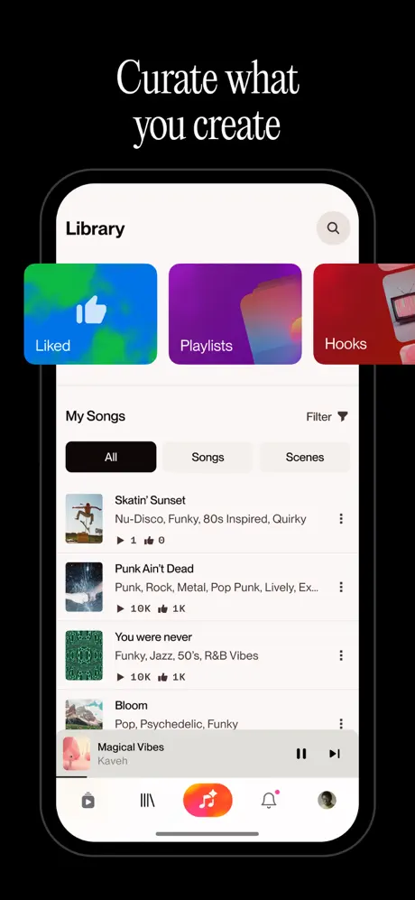
On-frame caption: “Curate what you create

The final frame settles on the Library, answering the question of where generated music is stored. The screen shows a white header with Library left and a search magnifier right. Three category cards—Liked, Playlists, and Hooks—sit in a horizontally scrolling row with blue-green, purple, and red gradients respectively. A segmented control beneath shows All in an active black fill (#000000) against inactive Songs and Scenes. The list displays four tracks with 48pt square thumbnails, grey genre tags, and play counts. The persistent mini-player for Magical Vibes matches Frame 4, confirming continuity. By ending on an administrative screen, the set provides a sense of closure, though the emotional temperature drops precipitously from creation to file management. The tab bar remains structurally consistent, yet the frame’s primary achievement is reassurance rather than inspiration.

05The craft

Captions, colour and the mechanics of the sell

Caption pattern

Every frame uses the same white serif type for its headline, always centered and always occupying the top 8–10% of the vertical canvas. This turns the captions into a consistent navigation layer, letting a scroller read the set like a table of contents.

Visual system

The only colors that survive across all eight frames are the magenta-to-orange gradient pair and absolute black. That gradient appears in the app icon (Frame 1), the Create button (Frame 2), the center tab icon (Frames 3, 4, 8), the waveform accents (Frame 5), the share badges (Frame 6), and the Extend CTA (Frame 7). The restraint is deliberate: even when the UI switches between light and dark themes inside the phone, the brand heat remains visible outside it.

The thumbnail test

At small scale, the black backgrounds unify Frames 2–8 into a single dark mass, while Frame 1’s blazing pink gradient acts as a visual stop sign. The white serif headlines remain legible, but Frame 1’s thin strokes against the busy collage begin to vibrate and lose definition.

Conversion mechanics

Frame 2 is the only frame that attempts social proof inside the screenshot set itself. The five-star card with Incredible vocal & instrument quality is physically pinned to the device bezel, creating a z-index that breaks the hardware silhouette. The technique borrows from e-commerce product pages more than from utility apps, suggesting the team treats the storefront as a landing page rather than a feature tour.

06Where it slips

What we would change

Frame 2’s sloppy chips

The genre chip rack shows a duplicate House and a truncated Ho at the trailing edge. In a product predicated on precision prompting, this visual sloppiness undermines trust. The fix is to either widen the device crop toshow a clean row or to stage exactly four chips with ample padding.

Frame 3’s modality confusion

By showing a human musician in a TikTok-style player, the screenshot suggests the user is browsing covers rather than generating original AI audio. The fix is to overlay a subtle generated-by-AI watermark or to replace the human performer with an abstract audio-reactive visual that cannot be mistaken for a cover upload.

Frame 5’s blank canvas

The white recording screen is featureless above the waveform. A first-time viewer may not understand whether the app is recording, analyzing, or generating. The fix is to insert a ghosted instruction line—e.g., Sing or hum your melody—at the center of the white space, preserving minimalism while adding clarity.

Frame 6’s density trap

Six export icons at identical scale create a picket fence of distraction. At thumbnail size, the row becomes illegible hash. The fix is to spotlight two primary destinations and collapse the rest behind an overflow affordance, freeing vertical space to enlarge the video preview and waveform.

Frame 8’s emotional flatline

Ending on a file-management screen is safe but uninspiring. The final frame is prime real estate for a closing argument. The fix is to either replace it with a share-completion celebration or to introduce the library earlier so the set can close on a more aspirational note, such as the video export moment.

07The recipe

How to apply this to your own app

  1. Define your only color

    The magenta-orange gradient functions as a brand heartbeat across eight screens. Pick one primary gradient and distribute it across every CTA, icon, and waveform accent to create continuity when screenshots change contexts.

  2. Split marketing copy from UI copy

    Suno never uses the product UI to deliver marketing messages. The editorials live in the frame’s headline; the phone only shows the interface. Apply this split to keep your product screenshots clean while still making emotional claims.

  3. Watch your hot-spot contrast

    Swinging between light and dark UI themes inside the phone creates harsh rectangular shapes against dark store-framing. Bright UI screenshots require more generous bezel padding or a subtle device shadow to prevent tone clashes.

  4. Audit for genetic permanence

    Every screenshot must contain at least one clue that your content is AI-generated, not aggregated. If a frame looks like a generic social feed, you have lost the plot. Add a generative artifact—waveform, prompt bar, or style chip—to every social-looking frame.

08Takeaways

Five things worth stealing

  • The serif headline treatment distinguishes the set from competing utilities, but it introduces a tension with the sans-serif product UI that is never fully resolved.
  • The decision to place Frame 1 without a device is a high-risk, high-reward gambit that buys brand heat at the cost of instant feature comprehension.
  • The gradient CTA is the single most effective reuse element, grounding the viewer across light and dark UI shifts.
  • The set would benefit from one fewer administrative frame and one more generative proof point to close the arc on sound rather than on file names.
  • verdictSuccesses
09The verdict

What the set actually achieves

The set delivers a coherent narrative arc—creation, consumption, editing, archiving—tethered by a consistent gradient identity and repeating device framing. However, several frames sacrifice thumbnail legibility for comprehensive feature documentation, and the social-video frame risks misreading the app’s core generative value proposition.

Designers preparing a screenshot set for a generative or social-creative tool that must communicate invisible output through visible interface staging. The study is especially relevant if your app mixes creation and consumption features and you need to prevent the storefront from reading as a passive media browser.

10Questions

Frequently asked

Why does Frame 1 omit the device entirely?

It is a pure brand-mood play. The absence of chrome forces the eye to absorb the gradient, the collage, and the serif headline as a single emotional statement before the shopper encounters any functional UI.

How does the set handle social proof?

Only Frame 2 uses an external review card. The rest rely on UI metrics—play counts, like counts, and follower numbers—embedded inside the product screens to imply popularity without breaking the device frame.

What is the biggest compositional risk in this sequence?

Frame 6’s export modal. It presents six equally weighted share destinations, a waveform, a video carousel, and metadata in a single viewport. At thumbnail scale the information collapses into noise, violating the scannability rule that governs successful App Store screenshot sets.

Does the light-UI screen in Frame 4 hurt the set?

Partially. The white genre grid creates a high-contrast rectangle against the black marketing background that feels visually loud. It does not break the sequence, but it interrupts the dark gallery rhythm that Frames 3, 5, 6, 7, and 8 maintain.

11Keep reading

Build your own screenshot set

The full set

9 shots
Suno App Store screenshot 1Suno App Store screenshot 2Suno App Store screenshot 3Suno App Store screenshot 4Suno App Store screenshot 5Suno App Store screenshot 6Suno App Store screenshot 7Suno App Store screenshot 8Suno App Store screenshot 9

About the app

Amplify your imagination. Powered by the world’s most advanced AI music model, Suno transforms your ideas into songs—no instruments needed, just your creative vision. Whether Suno, Inc., via the App Store listing.

Screenshots and store metadata belong to Suno, Inc.. They are shown here for design commentary and criticism. The analysis on this page is original work by floow.design. View the original listing.

More Music teardowns

Browse all →