Deezer app icon
MusicScreenshot teardown13 min read

Deezer App Store screenshots

Ask any music-streaming product designer what keeps them up at night and you’ll get the same answer: differentiation without distraction. The App Store Music category is a graveyard of indistinguishable dark-mode players, which makes Deezer’s eight-frame set an instructive outlier. It tries to solve the merchandising puzzle by splitting the sequence in two: the first three frames are pure Gen-Z illustration theater, while the remaining five pivot to hard UI features. The gambit is bold, but the seam shows.

Set published by DEEZER SA · 9 frames analysed

4.7 · 36K ratingsFreev11.12.1Updated 4mo ago
Deezer App Store screenshot 1
01At a glance

The set in one screen

Framing
Hybrid: full-bleed illustration for frames 1–3, floating dark device chrome for frames 4–8. No physical phone bezel or status bar is shown; devices are abstract rounded rectangles.
Captions
Bold, tightly tracked condensed sans-serif, black on white, sentence case (frame 1 is all-caps). Functionally behaves like magazine cover lines.
Backdrop
Electric violet (#9333EA) bleeds from the bottom edge in every frame, though frames 1–3 treat it as a full-bleed illustration floor while frames 4–8 reduce it to amorphous blob accents behind the device.
Type
Headlines are massive, near-impact weight with minimal line-height. In-app UI shifts to a clean geometric sans at smaller scales. Lyric translations use muted gray italic sub-lines (#9CA3AF).
UI / copy split
37.5% UI-free illustration; 62.5% device chrome. The product is invisible until frame 4.
Frame 1 job
Brand poster. No app chrome, no device, no explicit CTA. Sells vibe before utility.

Sampled palette

#000000#000000
#9333EA#9333EA
#0A0A0A#0A0A0A
#4F46E5#4F46E5
#2563EB#2563EB
#F97316#F97316
02The challenge

What this screenshot set had to solve

The central tension in merchandising a mature streaming app is that every competitor offers the same baseline—millions of songs, playlists, offline mode. Deezer’s design team faced the same constraint as Apple Music, Spotify, and YouTube Music: how do you signal ‘music’ without defaulting to the universal language of waveform thumbnails and dark lists? Their answer was to commission a distinct illustration system—oversized cartoon hands, tiny phones, neon wardrobes—and let that own the first half of the swipe journey. The risk, of course, is the ‘poster problem’: shoppers scrolling at speed may see three frames of brand marketing and still not know what the app looks like or does. The challenge, then, is whether the illustration system earns enough attention to justify delaying the product reveal until frame 4.

The sequence reads like two separate campaigns stapled together: a brand-awareness poster series followed by a feature checklist.
03The approach

How the set argues its case

The visual thesis is maximalist nostalgia. A recurring cast of cartoon figures with exaggerated proportions occupies the opening chapters, while the top-level captions function as magazine headlines rather than feature bullets. From frame four onward, the characters retreat and the device shell takes over, displaying Deezer’s dark UI against near-black backdrops. The intended rhythm is hook-with-vibe, then validate-with-features. The violet floor is meant to thread both acts together, but its treatment changes so radically—from full-bleed illustration pool to decorative UI blob—that it reads as two different sets sharing a paint color rather than one continuous narrative.

Deezer positions itself here as the streaming choice for listeners who want personalization (Flow, moods, quizzes) and cultural specificity (lyric translation, TikTok hits). The screenshots argue less about catalog size and more about behavior: identify songs, share to rival platforms, take quizzes, read translations. It is a feature-forward pitch dressed in brand clothing.

04Frame by frame

Every screenshot, and the job it does

Deezer App Store screenshot 1 — Frame 1
01

Frame 1

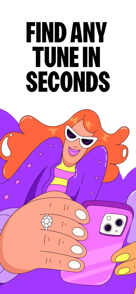
On-frame caption: “FIND ANY TUNE IN SECONDS

Frame 1 is pure brand poster. The top forty percent is bare white canvas carrying the words ‘FIND ANY TUNE IN SECONDS’ in black, all-caps, heavily condensed sans-serif, centered with generous line spacing. Below, a figure with flowing orange hair, white cat-eye sunglasses, and a purple jacket dominates the lower two-thirds. The character’s hands are comically large—one sports a diamond ring, the other grips a magenta smartphone with a dual-camera module. The background dissolves into a flat violet field sampled near #9333EA. There is no App Store device framing, no status bar, and no app chrome whatsoever. The choice turns the opening screenshot into tonal promise rather than functional proof. For the shopper who swipes fast, this frame answers ‘what is the vibe?’ but refuses to answer ‘what is the product?’.
Deezer App Store screenshot 2 — Frame 2
02

Frame 2

On-frame caption: “SongCatcher / Identifying the music around you...

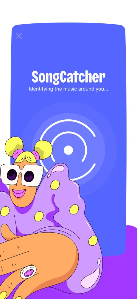
Frame 2 is the structural outlier. It is the only screenshot in the set that lacks a bold top-line caption; instead, all text lives inside a bright blue device shell sampled near #4F46E5. The shell is a flat rounded rectangle with no bezel depth, no notch, and no shadow. Inside the screen, a white ‘X’ sits top-left, followed by the product name ‘SongCatcher’ in a bold, slightly italic white sans-serif, and beneath it the lighter-weight subtitle ‘Identifying the music around you...’. Concentric white rings pulse from the center of the blue field, suggesting an active listening state. In the foreground, a new character with yellow double-buns, pink scrunchies, oversized white square sunglasses, and a purple polka-dot coat reaches upward from the bottom edge. A single hand with a purple-stoned ring breaks into the lower-left corner. The bottom background returns to the same electric violet. The absence of a bold headline makes this frame feel incomplete compared to its neighbors, and the flat blue device never reappears, creating a one-off chromatic disruption in the sequence.

Deezer App Store screenshot 3 — Frame 3
03

Frame 3

On-frame caption: “Share your music with everyone

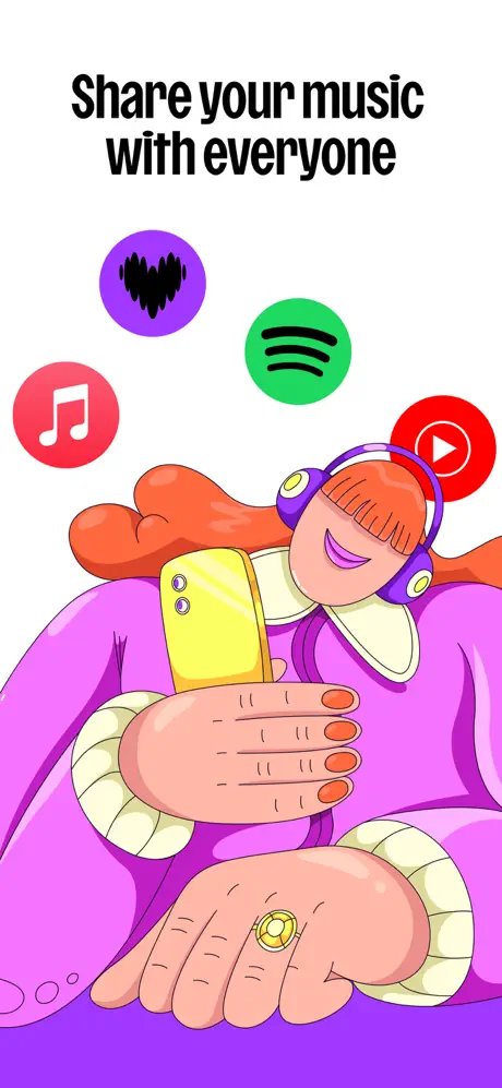
The headline ‘Share your music with everyone’ returns to the top in the same bold black condensed type, re-establishing the caption rhythm that frame 2 abandoned. Below, a red-haired figure wearing purple over-ear headphones and a cream ruffled collar cradles a yellow smartphone. The character sits against a white upper half that bleeds into a violet floor at the bottom. Floating above the figure are four circular platform icons: Apple Music in red (#FC3C48 on a white note), Spotify in green (#1DB954 on black lines), YouTube in red (#FF0000 on a white play triangle), and a purple circle (#A855F7) carrying a black waveform that reads as Deezer’s own mark. The icons are flat, evenly lit, and slightly overlap the character’s forehead. Again, there is no screenshot of an actual OS share sheet or in-app sharing dialog; the promise is communicated purely through competitor brand symbology. The frame spends its real estate advertising rival services as much as itself.

Deezer App Store screenshot 4 — Frame 4
04

Frame 4

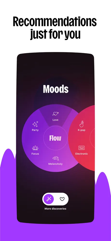
On-frame caption: “Recommendations just for you

This is the pivot frame. The caption ‘Recommendations just for you’ sits above a dark, rounded device shell—the first true product screenshot in the set. The screen shows a near-black background sampled near #0A0A0A with the word ‘Moods’ centered near the top in white. Dominating the interface is a radial Venn-diagram of overlapping circles: a large purple ring (#7C3AED) segmented into Party (sparkles icon), Love (heart arrow), Focus (lotus), and Melancholy (eye with tear), while adjacent red (#EF4444) and pink orbs carry K-pop and Electronic. At the center, the word ‘Flow’ anchors the diagram. A white pill button at the bottom contains a wand icon, a heart, and the label ‘More discoveries.’ Purple amorphous blobs rise from the bottom edge behind the device, a motif that will persist through the remaining frames. Frame 4 introduces the actual product interface, but the graphic is highly stylized rather than a literal tracklist or playback view, making the transition from illustration to UI feel abrupt.

Deezer App Store screenshot 5 — Frame 5
05

Frame 5

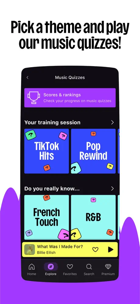
On-frame caption: “Pick a theme and play our music quizzes!

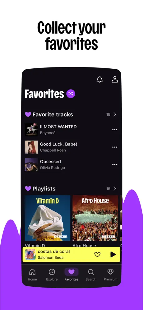
‘Pick a theme and play our music quizzes!’ headlines a dense dark-mode screen. The top of the device shows a back chevron and the header ‘Music Quizzes.’ A purple banner sampled near #9333EA holds a trophy outline and the text ‘Scores & rankings’ with the subline ‘Check your progress on music quizzes.’ Below, the heading ‘Your training session’ introduces horizontal cards: ‘TikTok Hits’ on a royal blue background (#2563EB) and ‘Pop Rewind’ on an identical blue, each peppered with floating 3D question-mark blocks in pink, green, yellow, and red. A second section, ‘Do you really know...’, presents ‘French Touch’ and ‘R&B’ on bright cyan fields (#67E8F9). At the bottom, a yellow mini-player (#FACC15) displays ‘What Was I Made For?’ by Billie Eilish. The tab bar is visible for the first time: Home, Explore (filled with purple), Favorites, Search, and Premium. The information density spikes here; five colors compete for attention, and the relationship between the active ‘Explore’ tab and the quizzes content is oblique, since quizzes are not a primary tab item.

Deezer App Store screenshot 6 — Frame 6
06

Frame 6

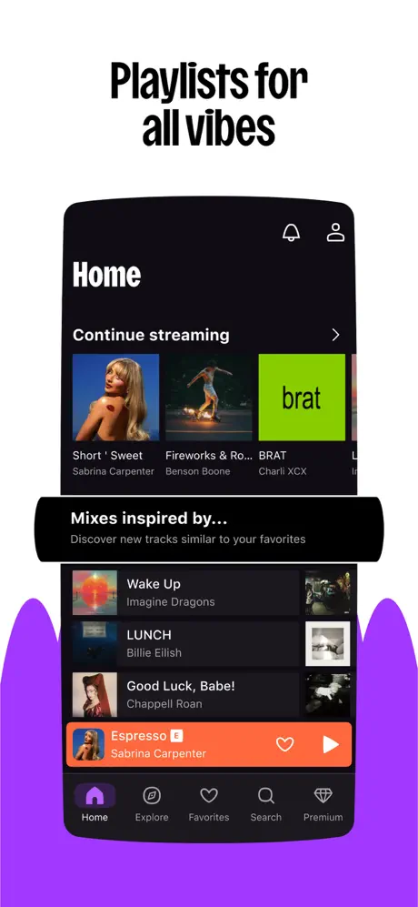
On-frame caption: “Playlists for all vibes

The caption ‘Playlists for all vibes’ tops a conventional home-screen view. Inside the dark device, a ‘Home’ header sits beside notification bell and profile icons. A ‘Continue streaming’ carousel shows album art for Sabrina Carpenter’s ‘Short ’ Sweet’, a Benson Boone cover, and Charli XCX’s ‘brat’ on a toxic-lime square (#84CC16). Below, a black banner reads ‘Mixes inspired by...’ followed by a vertical list: Imagine Dragons’ ‘Wake Up,’ Billie Eilish’s ‘LUNCH,’ and Chappell Roan’s ‘Good Luck, Babe!’ The bottom player is a saturated orange strip (#F97316) playing Sabrina Carpenter’s ‘Espresso.’ The tab bar shows Home as the active state, filled in purple. This frame is the most generically ‘streaming app’ screenshot of the set, doing the heavy lifting of catalog breadth and playlist merchandising. It is legible and confident, but stylistically interchangeable with any competitor’s home feed.

Deezer App Store screenshot 7 — Frame 7
07

Frame 7

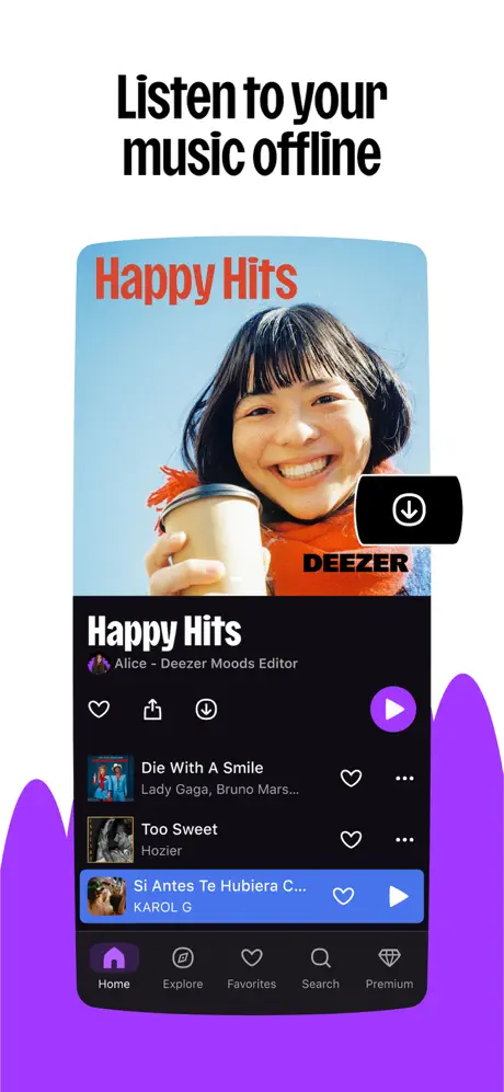
On-frame caption: “Listen to your music offline

‘Listen to your music offline’ is illustrated with a playlist view. The device hero image shows a woman with dark bangs, an orange scarf, and a coffee cup against a pale blue sky, overlaid with red-orange text reading ‘Happy Hits’ and a small ‘DEEZER’ watermark. A black download badge with a white downward arrow intrudes on the right side of the hero. Below the fold, playlist actions appear as white line icons—heart, share, download—while a purple play button (#A855F7) sits right. The tracklist begins with Lady Gaga and Bruno Mars’ ‘Die With A Smile,’ followed by Hozier’s ‘Too Sweet,’ and an active blue row (#3B82F6) for a KAROL G track. The tab bar again shows Home active. The frame successfully literalizes the offline benefit by foregrounding the download icon and the playlist context simultaneously, though the active track row draws the eye away from the download narrative.

Deezer App Store screenshot 8 — Frame 8
08

Frame 8

On-frame caption: “Instant translated lyrics

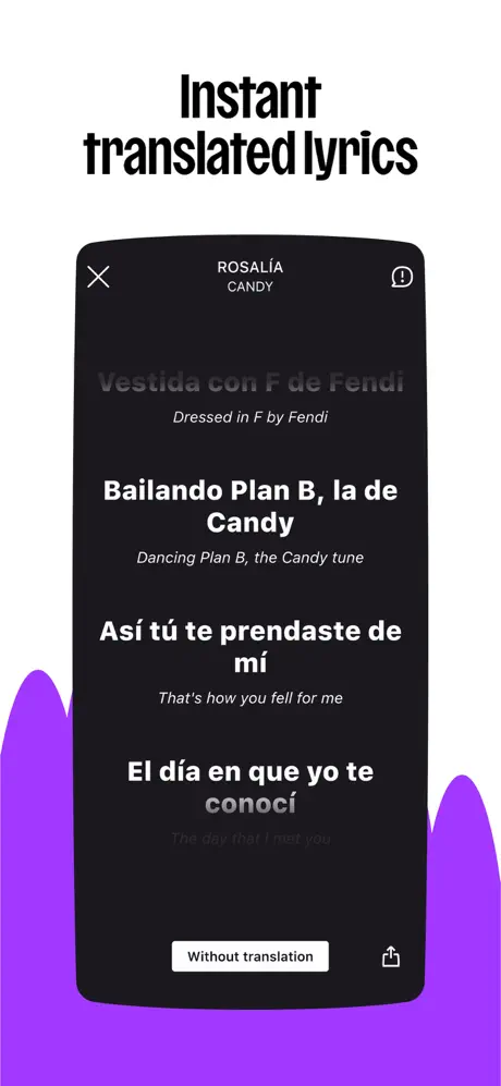
The final frame, ‘Instant translated lyrics,’ is the most text-forward and the strongest functional proof in the set. Inside the dark shell, a header displays ‘ROSALÍA’ and ‘CANDY’ with an ‘X’ and an info icon. The lyrics are set in a large white sans-serif—‘Vestida con F de Fendi,’ ‘Bailando Plan B, la de Candy,’ ‘Así tú te prendaste de mí,’ ‘El día en que yo te conocí’—with English translations rendered beneath in a smaller, muted gray (#9CA3AF) italic: ‘Dressed in F by Fendi,’ ‘Dancing Plan B, the Candy tune,’ ‘That’s how you fell for me,’ ‘The day that I met you.’ A white pill button at the bottom reads ‘Without translation,’ flanked by a share icon. The purple blobs return at the bottom edge. Because it uses a real artist, a real track, and a real bilingual use case, this screenshot answers the shopper’s ‘what do I actually get?’ question more convincingly than any mood illustration or playlist grid.

05The craft

Captions, colour and the mechanics of the sell

Caption pattern

The captions follow a strict two-line, left-aligned or centered block of bold condensed sans-serif. Frame 1 (‘FIND ANY TUNE IN SECONDS’) is the only all-caps instance. Frame 2 breaks the pattern entirely by omitting a top caption. The rest follow sentence case with occasional punctuation (frame 5 uses an exclamation mark). There is no sub-body copy under the headlines; the captions must carry the entire value proposition.

Visual system

Art direction relies on three non-negotiable elements: the electric violet ground, the black condensed headline, and the rounded device shell (once it appears). The illustration style is flat, thick-stroke cartooning with no shadows and no gradients on the characters—solid orange hair, solid purple coats, solid yellow accessories. When the UI arrives, it preserves the same flatness, but replaces organic shapes with rectilinear dark lists and saturated accent banners. The tension between organic illustration and rectilinear UI is never reconciled.

The thumbnail test

If every screenshot were cropped to a 120×120 thumbnail, only frame 1 and frame 4 would survive. Frame 1’s all-caps black headline on white is legible at postage-stamp size, and frame 4’s radial color wheel is graphically unique. Frames 2 and 3 would dissolve into purple and flesh-tone noise; frames 5–8 would become generic dark rectangles. The set as a whole is not optimized for thumbnail legibility—it bets on the viewer swiping in full screen.

Conversion mechanics

The set performs two jobs well: it establishes an unmistakable brand hue in the first second (the violet floor is instantly recognizable), and it closes with a feature—translated lyrics—that is non-obvious and culturally specific. However, the conversion funnel is front-loaded with abstraction. Frames 1–3 ask the shopper to trust the vibe; frames 4–8 ask them to parse functionality. A user deciding in three seconds may never reach the lyric proof.

06Where it slips

What we would change

The illustration-to-UI divorce

The first three frames are a self-contained brand campaign that hides the product entirely. Frame 1 contains zero app chrome. Frame 2 uses a one-off blue device that breaks the dark-mode continuity established in frames 4–8. Frame 3 litters competitor logos across the canvas. When the pivot to UI happens in frame 4, there is no narrative bridge—the full-bleed cartoon world is replaced by clinical dark screens. The fix is to integrate the characters with the device frame throughout, or to reduce the illustration intro from three frames to one, reserving the rest for product evidence.

Missing caption and broken cadence

Frame 2’s absent headline is a layout error in the context of a swipeable carousel. Every other frame anchors the eye with a bold top-line caption; frame 2 forces the viewer to hunt inside the illustration for the value proposition (‘SongCatcher’). Restoring a black condensed headline—‘Name any song in seconds’ or similar—would preserve the scan rhythm and reduce cognitive load.

Competitor logo dilution

Frame 3 places Apple Music, Spotify, and YouTube icons at equal visual weight to Deezer’s own mark. While this may telegraph interoperability, it also trains the shopper to think about rival platforms inside Deezer’s store listing. The specific fix is to replace the logo cloud with an actual OS share sheet or a Deezer-native sharing UI, keeping the visual ownership in-house.

Chromatic noise in the quiz frame

Frame 5’s quiz screen uses purple banners, royal-blue cards, cyan cards, a yellow player bar, and neon 3D blocks simultaneously. The hierarchy collapses into a color traffic jam. A stricter accent system—limiting the frame to two supporting colors beyond the dark base—would let the ‘TikTok Hits’ and ‘Pop Rewind’ cards breathe.

Tab bar narrative mismatch

In frame 5 the Explore tab is filled purple, yet the screen shows ‘Music Quizzes,’ which is not a root-level tab. In frames 6 and 7 the Home tab is active, which is correct, but the inconsistency in frame 5 introduces a subtle navigational dissonance. The fix is to ensure the active tab always matches the feature being merchandised, or to crop the tab bar out entirely if the feature lives outside the primary nav.

07The recipe

How to apply this to your own app

  1. Anchor with a signature color, but thread it consistently. Deezer’s violet appears in every frame, yet its treatment shifts from illustration flood to UI accent. Choose one application—behind the device, behind the text, or inside the buttons—and stick to it so the swipe feels like one environment.

    Apply to your app

  2. Never hide the product past frame 2. App Store shoppers swipe in milliseconds. If the first two frames are pure lifestyle, frame 3 must show a device with recognizable UI. Deezer waits until frame 4, which is one frame too late in a high-intent category.

    Apply to your app

  3. Competitor logos are not social proof in a screenshot. If your value prop is cross-platform sharing, show your own sharing UI rather than giving screen real estate to rival brands.

    Apply to your app

  4. headlines are scannable architecture. Maintain them in every frame. A missing headline breaks the swipe rhythm and forces the viewer to decode the image instead of reading the promise.

    Apply to your app

08Takeaways

Five things worth stealing

  • A signature color is worthless without consistent application. The violet anchor is present but not unified.
  • Illustration can open the sequence, but it must hand off to the product by frame 3 at the latest.
  • The strongest frame in the set is the simplest: literal lyric text with real artist names. Specificity converts better than abstraction.
  • Competitor logos in your own screenshots dilute brand ownership.
  • Tab bars are quiet narrators; if they contradict the feature on screen, they undermine trust.
09The verdict

What the set actually achieves

The set landed in the App Store as a high-contrast, personality-forward sequence. The violet background motif provides a recognisable color signature across all eight frames, and the final lyric-translation frame delivers a genuinely specific feature proof. However, the set never fully resolves the structural split between its illustrated front matter and its utilitarian back half. For designers building screenshot sets, Deezer’s sequence is a useful reference for-brand tone, but a cautionary tale about consistency in device framing, caption cadence, and the handoff from lifestyle to UI.

This set is aimed at Gen-Z listeners who discover music through TikTok, quizzes, and social sharing rather than through algorithmic radio. The translated lyrics frame nods at multilingual audiences, while the quiz and mood-wheel screens target lean-forward engagement over passive listening. It is not optimized for audiophiles or classical collectors; every visual cue points toward pop-culture currency.

10Questions

Frequently asked

Why does frame 2 have no top caption?

It appears to be a production oversight or an intentional break in rhythm, but the result is a weaker scan layer. Every other frame uses the bold condensed headline as the primary read; frame 2 forces the eye to hunt inside the illustration for ‘SongCatcher.’

Are those competitor logos allowed in App Store screenshots?

Apple’s guidelines discourage excessive use of third-party intellectual property. While interoperability is a real feature, placing Apple Music, Spotify, and YouTube icons at equal size to Deezer’s mark is risky and visually confusing.

Why is the device framing inconsistent?

Frame 2 uses a flat blue panel, while frames 4–8 use dark pseudo-bezels. None show a status bar or dynamic island. The lack of a single device rig makes the UI feel like abstracted mockups rather than screenshots from a real phone.

Which frame converts best?

Frame 8 is the strongest proof-of-value because it shows a differentiated feature—translated lyrics—with real content (ROSALÍA, ‘CANDY’). Frame 1 is the weakest because it shows no product at all.

11Keep reading

Build your own screenshot set

The full set

9 shots
Deezer App Store screenshot 1Deezer App Store screenshot 2Deezer App Store screenshot 3Deezer App Store screenshot 4Deezer App Store screenshot 5Deezer App Store screenshot 6Deezer App Store screenshot 7Deezer App Store screenshot 8Deezer App Store screenshot 9

About the app

Deezer is more than just a music platform. It’s a fully personalized listening experience that adapts to you. From mood-driven mixes to curated playlists, discover music that DEEZER SA, via the App Store listing.

Screenshots and store metadata belong to DEEZER SA. They are shown here for design commentary and criticism. The analysis on this page is original work by floow.design. View the original listing.

More Music teardowns

Browse all →