Wabi app icon
Photo & VideoScreenshot teardown12 min read

Wabi App Store screenshots

A disciplined grayscale frame meets glossy, AI-generated micro-apps: how Wabi turns a complex software platform into a swipeable product story.

Wabi App Store screenshot 1
01At a glance

The set in one screen

Framing
Centered iPhone with thick black bezel on warm off-white canvas
Captions
Bold, centered sans-serif, three-to-five words per line
Backdrop
~#F5F5F0 warm gray, completely empty
Type
System-style sans, heavy weight for headlines; regular inside UI
UI / copy split
UI occupies roughly 72% of each frame; caption copy sits in the remaining negative space above the device
Frame 1 job
Brand positioning: personal software platform, not app builder

Sampled palette

#111111#111111
#F5F5F0#F5F5F0
#FFFFFF#FFFFFF
#000000#000000
02The challenge

What this screenshot set had to solve

The challenge is structural: Wabi is a meta-platform that makes other apps, which means its screenshots have to do double duty. They must teach shoppers that the app is conversational, that it outputs real mini-apps, and that those mini-apps live inside a social feed with profiles and remixing. Doing all of that in eight frames risks becoming a tutorial rather than a storefront. The designer also has to compete with the visual noise of the App Store while using almost no color in the meta-frame. Every gradient and shadow lives inside the phone; everything outside is deliberately muted. The hardest part is proving the payoff—showing the finished software without breaking the monochrome frame.

If the screenshot set is a story, frames 2 and 3 are the setup—Wabi forgets to show the third act.
03The approach

How the set argues its case

The strategy is editorial isolation. By stripping the canvas to a warm off-white and framing every phone in a heavy black bezel, the designer forces the eye into the screen. The captions are short imperative sentences that read like chapter titles, not bullet points. The internal UI follows an iOS-native aesthetic—light gray keyboard, white chat bubbles, black pill buttons—so the screenshots feel like system screenshots rather than ads. The sequence itself mimics a first-use funnel: problem statement, input, output, social sharing, collaboration, discovery, identity. It is a conversion narrative disguised as a product tour.

Wabi positions itself as a social software platform, not a utility. That choice is visible in the ordering: creation comes before collaboration, but only just. Frame 4 introduces remixing before frame 6 introduces friends, suggesting that content virality is as important as the creation tool. The profile frame at the end reframes the user as a publisher with followers and a catalog of 'Wabis,' turning the shopper from a consumer of software into a potential creator with an audience. It is a clever, if slightly premature, identity prompt for someone who has not yet downloaded the app.

04Frame by frame

Every screenshot, and the job it does

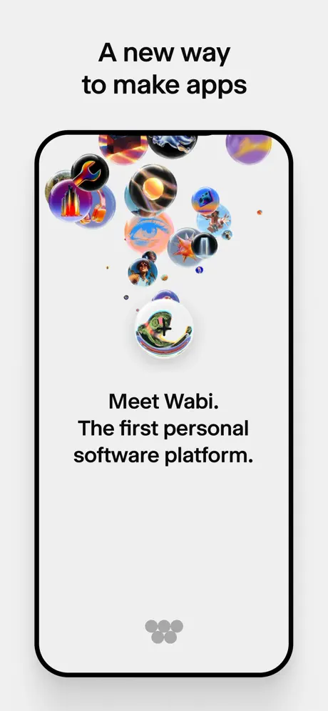
Wabi App Store screenshot 1 — A new way to make apps
01

A new way to make apps

On-frame caption: “A new way to make apps

Frame 1 opens with the phone centered on a warm off-white canvas. Above the device, the headline sits in a bold, tight sans-serif, two lines, centered. Inside the phone, the UI is almost empty white space. Clusters of glossy, 3D-rendered spheres—app icons—float in a loose constellation from the top bezel downward, bleeding slightly off-canvas. Near the bottom third, black text reads: 'Meet Wabi. The first personal software platform.' A five-dot pagination indicator sits centered at the very bottom of the screen in a muted gray (#B0B0B0), confirming this is an onboarding carousel. The spheres carry the only saturated color in the frame: purples, oranges, and teals with reflective highlights. The phone itself has a thick black bezel and no status bar, treating the device like a blank stage.
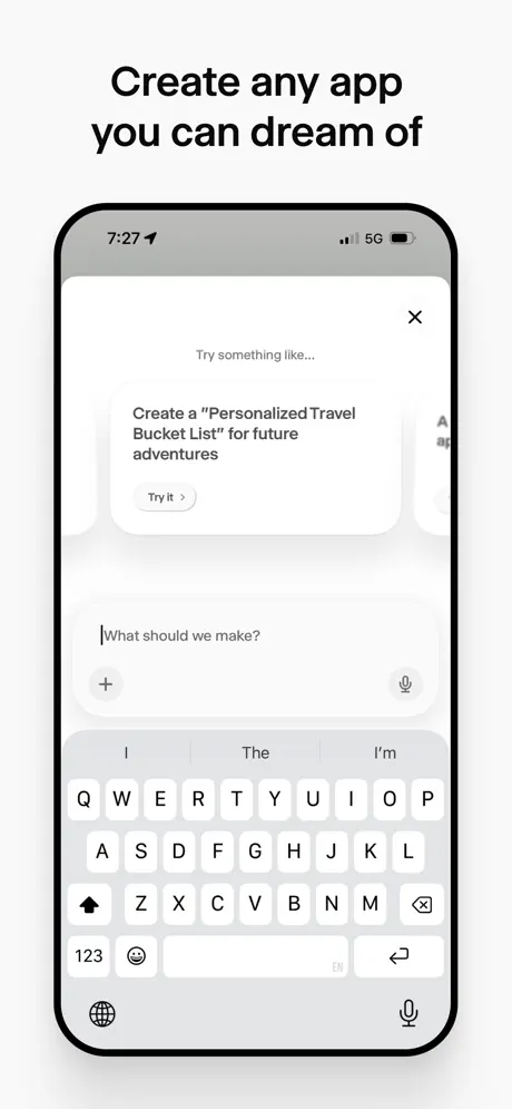
Wabi App Store screenshot 2 — Create any app you can dream of
02

Create any app you can dream of

On-frame caption: “Create any app you can dream of

Frame 2 switches to a production screenshot showing the iOS status bar at 7:27 with 5G and battery visible. The UI fills the screen with a chat-style sheet over a light gray (#F2F2F2) background. At top, ghost text reads 'Try something like...' followed by a white card containing the suggestion: 'Create a 'Personalized Travel Bucket List' for future adventures' with a small pill-shaped 'Try it >' button. Below, a text input field with a blinking cursor asks 'What should we make?' flanked by a plus icon and microphone icon. The system keyboard is fully visible, occupying the lower 40% of the frame, with QuickType suggestions ('I', 'The', 'I'm') reinforcing native iOS credibility.

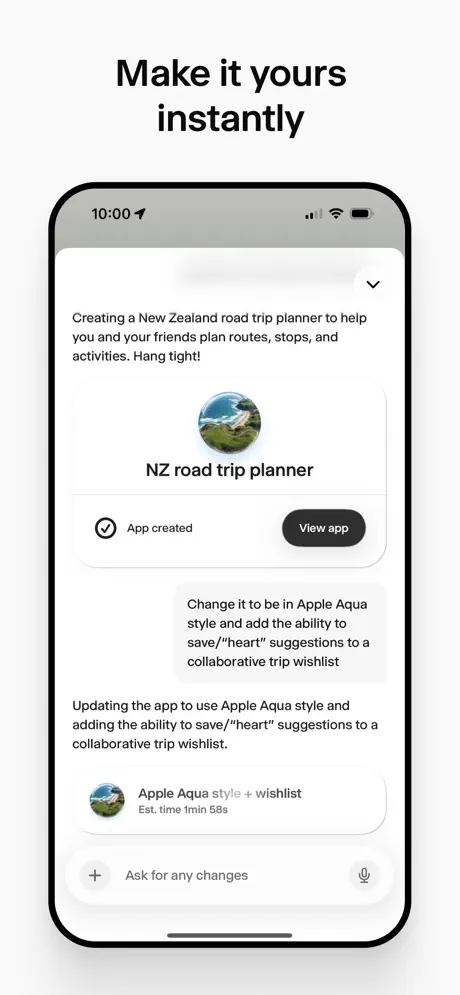
Wabi App Store screenshot 3 — Make it yours instantly
03

Make it yours instantly

On-frame caption: “Make it yours instantly

Frame 3 shows the conversational AI in mid-generation. At top, gray assistant text states: 'Creating a New Zealand road trip planner to help you and your friends plan routes, stops, and activities. Hang tight!' Below, a circular landscape thumbnail introduces 'NZ road trip planner' with a checkmark badge reading 'App created' and a solid black (#1A1A1A) pill button labeled 'View app.' A user request bubble follows: 'Change it to be in Apple Aqua style and add the ability to save/''heart' suggestions to a collaborative trip wishlist.' The AI responds with a progress card: 'Apple Aqua style + wishlist' with an estimated time of '1min 58s.' The bottom input bar reads 'Ask for any changes' with the same plus and microphone icons from frame 2, creating interface continuity.

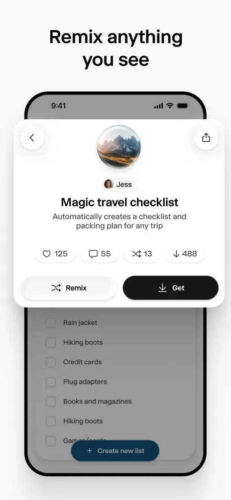
Wabi App Store screenshot 4 — Remix anything you see
04

Remix anything you see

On-frame caption: “Remix anything you see

Frame 4 introduces a modal overlay on top of a checklist app. A white card with 24px corner radius and heavy shadow sits in the upper portion, dimming the background to roughly 60% opacity. Inside the modal, a back arrow (left) and share icon (right) flank a circular landscape cover image. Below, a small avatar and the name 'Jess' appear above the bold title 'Magic travel checklist' and the subtitle 'Automatically creates a checklist and packing plan for any trip.' Four pill-shaped engagement badges read heart 125, comment 55, share 13, and download 488. At the bottom of the modal, two full-width buttons sit side by side: 'Remix' in white with a black border and black text, and 'Get' in solid black with white text and a download icon. Behind the modal, a grayed-out checklist shows items including 'Rain jacket,' 'Hiking boots,' and 'Credit cards.'

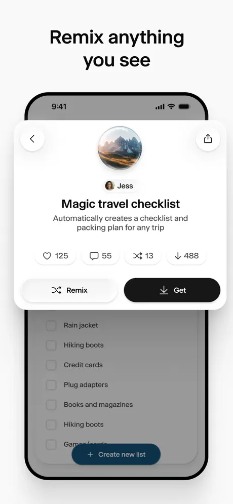
Wabi App Store screenshot 5 — Remix anything you see
05

Remix anything you see

On-frame caption: “Remix anything you see

Frame 5 is structurally identical to frame 4. The same modal for 'Jess' and 'Magic travel checklist' appears with the same engagement counts (125, 55, 13, 488), the same 'Remix' and 'Get' buttons, the same dimmed checklist background, and the same 9:41 status bar. The time, layout, iconography, and even the shadow values are unchanged. It is a duplicate frame in the screenshot sequence.

Wabi App Store screenshot 6 — Add your friends to your app
06

Add your friends to your app

On-frame caption: “Add your friends to your app

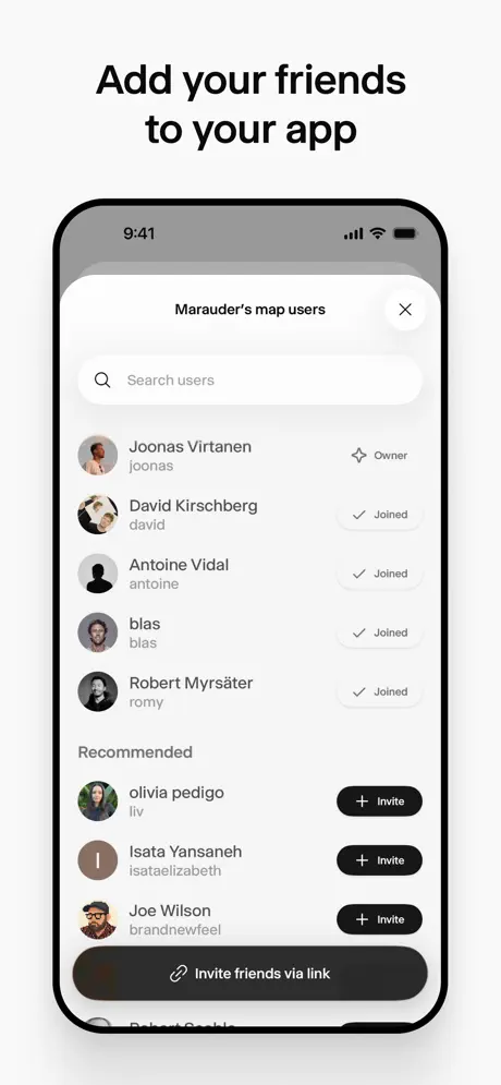
Frame 6 displays a user-management bottom sheet titled 'Marauder's map users' with an 'X' close button at top right. A search bar with a magnifying glass sits immediately below the header. The list is divided into two groups. The first group shows active members: 'Joonas Virtanen' with an 'Owner' sparkle badge, and four joined users—'David Kirschberg,' 'Antoine Vidal,' 'blas,' and 'Robert Myrsäter'—each marked with a checkmark inside a light gray pill. A 'Recommended' section follows, listing 'olivia pedigo,' 'Isata Yansaneh,' and 'Joe Wilson,' each with a black '+ Invite' pill button. At the bottom, a sticky black bar spans the width of the sheet with a chain-link icon and the text 'Invite friends via link.' Avatars are circular and mixed in style, from photography to illustration.

Wabi App Store screenshot 7 — Discover endless ideas
07

Discover endless ideas

On-frame caption: “Discover endless ideas

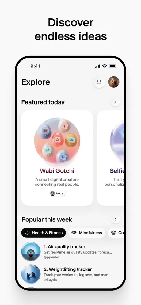
Frame 7 presents an 'Explore' feed. The header shows 'Explore' in bold sans-serif, a bell notification icon, and a circular profile avatar. A 'Featured today' horizontal carousel displays large rounded cards with 3D-rendered sphere graphics. The first visible card is titled 'Wabi Gotchi' in a dark burgundy/maroon (#7C2D2D) with the subtitle 'A small digital creature connecting real people.' and the handle '@tykra.' The second card is abruptly clipped at the right edge, showing only partial text beginning with 'Selfie...' and 'Turn y...' Below, a 'Popular this week' section introduces category filter pills: an active black 'Health & Fitness' pill with a heart icon, a white 'Mindfulness' pill, and a truncated 'Co...' pill cut off by the right bezel. Two numbered list items follow: '1. Air quality tracker' by '@pjourke' and '2. Weightlifting tracker' by '@kuyda,' each with a circular thumbnail and gray subtitle text.

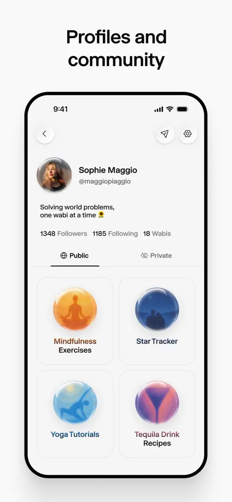
Wabi App Store screenshot 8 — Profiles and community
08

Profiles and community

On-frame caption: “Profiles and community

Frame 8 shows a profile page for 'Sophie Maggio' (@maggiopiaggio). The top-left holds a back arrow; the top-right holds a paper-plane share icon and a settings gear. A circular avatar sits left of the name stack. The bio reads 'Solving world problems, one wabi at a time 🌻' in a dark gray (#333333). Inline stats read '1348 Followers 1185 Following 18 Wabis' in near-black. Two segmented tabs follow: 'Public,' active with a black underline and globe icon, and 'Private,' inactive in light gray (#999999) with an eye icon. Below, a 2x2 grid of app cards displays glossy sphere icons: 'Mindfulness Exercises' on an orange (#F5A623) sphere, 'Star Tracker' on a deep navy (#1E3A5F) sphere, 'Yoga Tutorials' on a cyan (#87CEEB) sphere, and 'Tequila Drink Recipes' on a magenta/purple (#8B5CF6) sphere. Each card has a rounded-rectangle white container with a faint gray border.

05The craft

Captions, colour and the mechanics of the sell

Caption pattern

Each caption is a short imperative sentence in a heavy sans-serif, centered above the phone. The rhythm is consistent: verb-heavy commands ('Create,' 'Make,' 'Remix,' 'Add,' 'Discover') followed by a qualifying phrase. There are no subheads, no body copy, and no social proof outside the UI itself. The captions function as stage directions for the phone below.

Visual system

The visual system is binary: everything outside the phone is neutral and static; everything inside is allowed to move, glow, or gradient. The phone bezel is consistently thick and black across all frames, acting as a matting device. Status bars are visible in production frames (2-8), adding realism, though frame 1 strips the status bar for a cleaner onboarding illusion. Shadows under the device are soft and diffused, lifting the phone off the canvas by about 12-16px. There are no angled perspective shots, no floating hands, and no environmental context.

The thumbnail test

At thumbnail size, the bold black headlines survive well, but the chat-heavy frames (2 and 3) collapse into gray rectangles with unreadable text. Frame 1’s colorful spheres and frame 8’s glossy app icons are the only frames that read as distinct shapes in a grid. The beige background helps the black bezel pop against the white of the App Store results page, giving the set a physical object quality that stands out from typical gradient-drenched competitors.

Conversion mechanics

The sequence is built as a funnel: frame 1 promises novelty, frame 2 lowers the barrier ('any app you can dream of'), frame 3 proves speed ('instantly'), frames 4-5 add social proof through remix counts, frame 6 introduces collaboration, frame 7 handles the cold-start problem with discovery, and frame 8 anchors identity. The shopper is meant to imagine themselves as Sophie Maggio, a creator with 18 Wabis and a follower count. The set never asks for a download explicitly; the CTA is implied by the narrative completion. For a shopper debating whether this is a toy or a tool, frame 3's 'View app' button is the only hint of real utility, and it is visually underweight compared to the chat bubbles surrounding it.

06Where it slips

What we would change

The Duplicate Frame Burns Real Estate

Frames 4 and 5 are pixel-for-pixel duplicates. In an eight-frame set, that is a 12.5% loss of narrative space. The fix is immediate: replace the duplicate with a frame showing the result of tapping 'Get' or 'Remix.' Show the checklist inside the user's library, or show the AI editing the checklist after 'Remix' is pressed. Shoppers need to see the transition from social discovery to personal ownership.

The Factory Floor Obscures the Product

Frames 2 and 3 are compelling as process documentation, but they never show the finished road-trip planner. We read about New Zealand routes and Apple Aqua styling, yet the only UI proof is a chat thread. The fix is to insert a frame between 3 and 4 that shows the generated app in full fidelity—perhaps a map with pins, a booked itinerary, or the checklist in active use. Without that payoff frame, the set accidentally suggests the value is in the conversation, not the output.

Modal Contrast Hides the Background App

In frame 4, the white modal sits on a background dimmed to roughly 40% opacity. The checklist items behind it are legible only upon close inspection. The problem is that the shopper never sees what 'Magic travel checklist' actually looks like as a usable tool. The fix is to lighten the scrim to 70-75% opacity, or to crop the modal smaller so the underlying checklist UI remains partially readable. The modal should tease the product, not eclipse it.

Inconsistent Timecodes Break Immersion

Frame 2 shows 7:27, while frames 4-8 show 9:41. Frame 3 shows 10:00. The shifting time suggests these are captures from different sessions stitched together. The fix is standardizing the status bar to 9:41 across all frames, following Apple's own marketing convention. Consistent time and battery states signal a polished, intentional screenshot set.

Truncated Horizontal Scroll Feels Broken

Frame 7's 'Featured today' carousel cuts the second card mid-letter, and the category pills are severed at the right edge. This reads as a cropping error rather than an intentional peek. The fix is to adjust the scroll offset so that the partially visible item shows at least 20% of its width and fully renders its text. Horizontal scroll containers in screenshots should always look deliberate.

07The recipe

How to apply this to your own app

  1. Create early UI without interface distraction where possible

    Use frame 1 as a template: a near-empty canvas with a bold headline, a simple metaphor (the floating spheres), and no status bar. Early frames should answer 'what is this?' before 'how do I use it?' Remove chrome until the shopper understands the value proposition.

  2. Use iOS-native text fields and keyboards as trust signals

    Frame 2's fully visible QuickType keyboard and microphone glyph immediately signal that this is a real app, not a rendered concept. When showing input states, avoid mock keyboards; use real system UI or pixel-perfect replicas so the screenshot passes the authenticity test.

  3. Duplicate high-engagement UI components but change their state

    The set stumbles by duplicating frame 4 verbatim. If you need to show a modal twice, change the button state: show the default state, then show the pressed 'Remix' state with a loading spinner. This turns repetition into progression.

  4. Make social stats readable at thumbnail scale

    Frame 4's engagement pills (125, 55, 13, 488) use a compact design that remains legible because the numbers are black on white with ample padding. If your app has social proof, render counts in bold weights with high contrast; soft gray numbers disappear in the App Store grid.

  5. End on identity, not utility

    Frame 8 closes with a profile grid because it reframes the user as a creator with a portfolio. If your app has user-generated content, consider making the final screenshot a profile or dashboard rather than a feature screen. It positions the download as the start of an identity, not just a task.

08Takeaways

Five things worth stealing

  • A monochrome meta-frame makes colorful internal UI feel premium by contrast.
  • Chat-based creation flows are hard to screenshot; balance process frames with payoff frames.
  • Duplicate frames are never neutral—they always cost narrative momentum.
  • Status bar consistency (time, battery, carrier) is a hygiene factor that signals polish.
  • Ending on a profile page shifts the value proposition from tool to platform.
09The verdict

What the set actually achieves

Wabi lands a readable, sequential argument: onboarding → creation prompt → generation → remix → social → discovery → profile. The grayscale framing keeps the set from feeling like a marketing deck, and the consistent 9:41 timecode (except frame 2) suggests a unified, intentional presentation. However, the set includes a literal duplicate frame and never shows the inside of a generated app in its usable state, leaving the shopper to trust that the chat thread produces real tools.

Product designers building AI-native, social, or generative mobile tools who need to communicate complex creation workflows without turning the screenshot set into a tutorial. The set is especially useful for teams struggling to show 'invisible' AI output inside a tangible interface.

10Questions

Frequently asked

Why does frame 1 omit the status bar when the others include it?

Frame 1 is likely using a separate marketing render rather than a live system screenshot. The missing status bar creates a 'poster' effect that puts focus entirely on the floating spheres and the brand statement, but it breaks the realism established in subsequent frames.

What is the visual purpose of the glossy sphere icons?

The spheres act as a signature visual language for 'Wabis'—the mini-apps users create. They unify the brand across onboarding, profile grids, and discovery cards, giving the platform a tangible object to own and share.

Should I copy the duplicate frame strategy for emphasis?

No. In this set, frame 5 is clearly a mistake or placeholder. Repeating a frame without changing state wastes a swipe and suggests the product has fewer features than the store allows you to show. Always advance the narrative or remove the frame.

How readable is the chat text at thumbnail size?

It is not. The caption headlines carry the message at small sizes; the chat UI becomes a gray texture. If your product relies on conversational AI, lead with a headline that contains the value proposition, then use the in-frame text as supporting evidence for viewers who zoom in.

11Keep reading

Build your own screenshot set

The full set

8 shots
Wabi App Store screenshot 1Wabi App Store screenshot 2Wabi App Store screenshot 3Wabi App Store screenshot 4Wabi App Store screenshot 5Wabi App Store screenshot 6Wabi App Store screenshot 7Wabi App Store screenshot 8

About the app

Screenshots and store metadata belong to Wabi. They are shown here for design commentary and criticism. The analysis on this page is original work by floow.design. View the original listing.

More Photo & Video teardowns

Browse all →